When something new is coming through, I click my fingers. My thumb holds straight as my middle finger bends curving off and against it. Pressing to connect—straight lines and curves. The sound doesn’t really matter. It is to create tactility, to physically remind myself that the timing has changed, bringing forward a syncopated new speed (a short line translation between two creative processes). My fingers as these bodily outliers materialise the emergent asymmetry of a tipping point, where in close proximity they catch like tinder.
T consists of straight lines, Y consists of straight lines, P consists of straight lines and curves, O consists of curves, G consists of straight lines and curves, R consists of straight lines and curves, A consists of straight lines, P consists of straight lines and curves, H consists of straight lines, Y consists of straight lines.
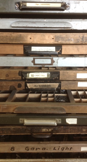
Setting type is a reminder of the potential of a physical process to imbed and implicate the content. As a structure it has the capacity to release the other qualities so they are open to explore, to be creative. As a process the structure is explicit (you feel the raised indentation of ink sitting on a surface and distinguish that it is not digital). This support enables decisions surrounding the form to be implicit as the smaller delights waiting to unfurl over time. The font style and point size establish the scale/ambition, tone and context. The ragging establishes a horizontal and vertical aesthetic and read; a key access point. The furniture locks the text in place to print well, a stabiliser that digital printing has abstracted (almost like the disappearing editor in journalism).
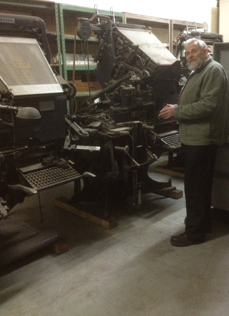
Setting type is a timely (costly?) process. The Melbourne Museum of Printing holds a collection of print presses, which have been left behind, often discarded. Thankfully director Michael Isaachsen has caringly held on and saved as many as he can. He has collected a group of Linotype presses in the back room, with the dream of one day re-establishing a typeset newspaper. Why set type when digital printing is so much faster, cheaper? Holding type in your hand you can feel its straight lines and curves. The process has the capacity to materially bring into focus the distinction between text and reading. Good typesetting encourages a good read. It is built.
Thanks to Will Holder, David Reinfurt, Abra Ancliffe and the Banff Centre for typesetting workshops and information during ALWAYS LIFT INKING ROLLERS WHEN PRESS IS NOT IN OPERATION. IF ROLLERS ARE LEFT TURNING ON THE DRUM THE INK WILL DRY FASTER AND THE ROLLERS WILL BE SUBJECT TO NEEDLESS WEAR residency.