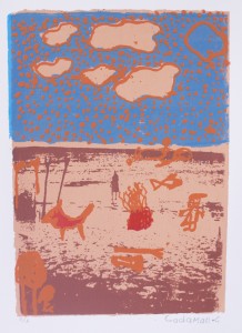
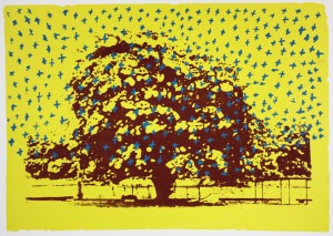
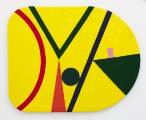
Prince screws

About a year ago I read the collection of essays, Pulphead, by the American magazine writer John Jeremiah Sullivan. I’d seen his work here and there, and knew he was good, but a collection presents the opportunity to see where the piecemeal work of a pen-for-hire might add up to something larger.

There are brilliant essays in Pulphead, and some not so brilliant, even one or two fillers. An essay on Bunny Wailer originally published in GQ is a standout. So too is Mr Lytle, Sullivan’s memoir of his eccentric early-career benefactor. Thinking about Sullivan’s writing now, and other writing like it, I realise a lot of it comes down to the treatment of character. Because he rarely takes the expected position, the people Sullivan profiles emerge as far more complicated than they otherwise might. The terms of engagement are reset, which seems especially meaningful for those figures who would elsewhere be easily pilloried.

The old adage goes that a certain kind of writer always betrays someone. They draw close to a subject, build something resembling trust, and then disclose as they see fit. But more than that, they map the narrative points and then argue the veracity of the lines they plot between them. This is, of course, a deeply subjective undertaking: if the points are interchangeable, shifting from every perspective, then the lines too can easily shift. But if the position a writer takes is fresh enough, and their argument compelling, then it just might change the way you think. One measure of good writing, then, might be that it never quite settles. There’s always the hazy uncertainty that what you are reading is still in play. There’s a risk to it.

What we do in the art world is usually a bit different. We don’t generally do character, for one. Plus the writer’s remit – whether they be curator, critic, or historian – too often cuts the grey ground between advocacy and advertorial, with neither form well suited to big risk, or unexpected disclosure. Read a catalogue essay and you usually get what you expect; same goes for a scholarly essay, even a review.

But this isn’t always the case. The other day a friend forwarded me a recent review by the British art historian Claire Bishop. At a glance it might not seem out of the ordinary, but it pushes back against the kind of collective non-thinking that can at times seem to thread through the writing that the art world generates. Bishop argues not only for a critical reappraisal of a widely celebrated artist, but also thinks harder than most about the proliferation of artist-as-curator projects.

Neither are fashionable positions, but on both accounts her argument is timely (rather than simply of its time). It’s an example of a writer shaping the discourse, rather than simply perpetuating it.

There’s something at stake in this approach. Whether you agree with the writer’s position or not, the sense of risk pulls the reader through. All of this sounds serious, but it can be revelatory too, playful even.

Sullivan, fascinated by the human scale story (even when writing on characters whose very existence seems to buck the whole notion of human scale), plays this position well. Take the following passage from the essay Michael. Not only does it deftly restage an overly familiar figure at a key moment, it shines new light on a prejudice about its subject that we pretty much all unthinkingly hold: that his was the special order of craziness reserved for extreme celebrity, and thus unbounded by history. In a few simple paragraphs, the conversation becomes about something else entirely:

Prince Screws was an Alabama cotton plantation slave who became a tenant farmer after the civil war, likely on his former master’s land. His son, Prince Screws, Jr., bought a small farm.  And that man’s son, Prince Screws III, left home for Indiana, where he found work as a Pullman porter, part of the exodus of southern blacks to the northern industrial cities.

There came a disruption in the line. This last Prince Screws, the one who went north, would have no sons. He had two daughters, Kattie and Hattie. Kattie gave birth to ten children, the eighth a boy, Michael – who would name his sons Prince, to honor his mother, whom he adored, and to signal a restoration. So the ridiculous moniker given by a white man to his black slave, the way you might name a dog, was bestowed by a black king upon his pale-skinned sons and heirs.

We took the name for an affectation and mocked it.
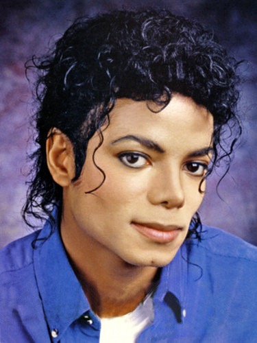
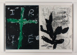
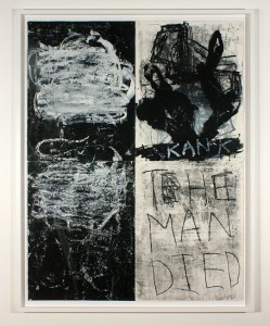
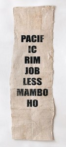
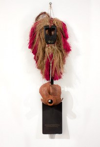
Michael-Jackson


Trinket

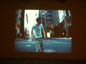
Earlier in the year I traveled to Los Angeles. Nothing major, just two weeks in and out of the city, a little bit of time in Desert Hot Springs, on the edge of Joshua Tree National Park.

Probably the most commonplace thing you can say about the city is that you spend a lot of time in a car. Even noticing this pegs you as an interloper.

It’s true though: much of what you see scrolls past your car window, lit up at night or bleached out by bright light during the day. It’s a strange feeling made more so by the cumulative effect of the thousands of LA-based films and TV shows – the fantasies that put the city centre stage.

Experience at one remove. Familiar unfamiliarity.

I spent much of my visit wondering what it would be like to live in a city mediated back to you in real time.

Even the ‘real’ aspect of the place has always struck me as heightened, familiar only in its distance. I recall OJ Simpson standing trial for murdering his wife, the roadside beating of Rodney King and the riots that followed. That city was a videotape of a hate crime. It was news footage of urban looting, of endlessly un-spooling freeways traced by spotlight. It too bled into the movies, and vice versa.

Mike Davis, the historian that people like to say LA had to have, sees the city as a vision of hell on earth. He writes like someone who loves the place, but this only means he sees it more clearly. In the brilliant coda to his otherwise unrelated essay White People Are Only a Bad Dream, he goes pretty much as far as you can, positioning it as the embodiment of a pending apocalypse.

For him LA is emblematic of an “already visible future when sprawl, garbage, addiction, violence and simulation (has) overwhelmed every vital life-space west of the Rockies”.

This too is now a commonplace observation, banal almost. The real place claims it without pause, swallows it whole and spits it out as entertainment. (See for example the ongoing spate of LA-set apocalypse movies). But surely there’s truth to it nonetheless. If I knew LA better I’d fall in line with Davis. I’d argue that somewhere within its civic borders the simultaneous horror and promise of the American frontier finds its logical contemporary expression: that part of the city’s appeal is surely the sense that even its most beautiful, ascendant moments are cut through by an undercurrent of latent disaster.

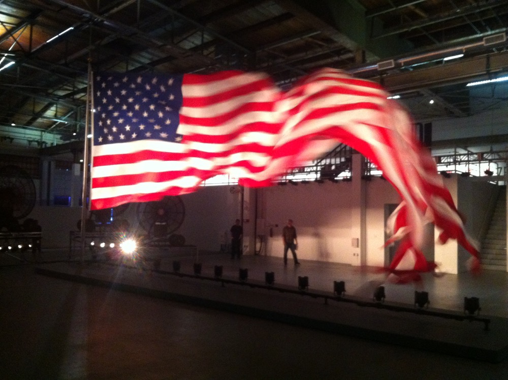
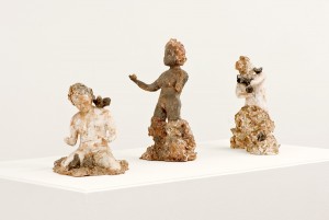
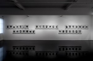
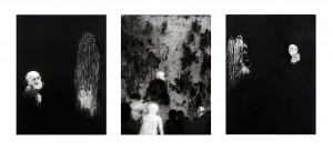
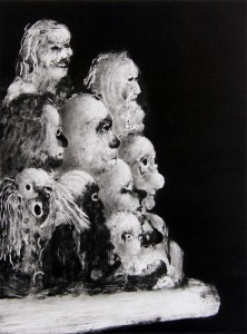
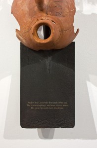
William Pope.L, Trinket, The Geffen Contemporary at MOCA, Los Angeles, 20 March – 28 June 2015.

William Pope. L, 'Trinket' exhibition view, 2008, Mixed media, Dimensions variable (approx. 12 x 5m) Courtesy of the artist and Mitchell-Innes & Nash, NY
William Pope. L, ‘Trinket’, 2008. Courtesy of the artist and Mitchell-Innes & Nash, New York, USA.


A short line between three points

“Exhibitions are texts that make their private intentions public.”

This quote is loosely paraphrased from Paul O’Neill, the English curator-artist-theorist. I won’t pretend I’m up on his work because I’m not, at least not to any great extent.

But this idea caught me. I now realise why: it’s that word, private.

The idea that an exhibition, as opposed to an artwork or practice, might have ‘private’ intentions is not something we usually think about. How we might articulate this without falling back on didacticism (as in, ‘this is what the exhibition is about’) is surely a key question.

It’s an open one, as is this, which surely follows: How is it that an exhibition might constitute something other than an idea?

That word, ‘private’, also makes sense here in another way, now I think about it.

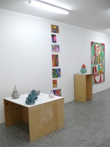
Small works are more intimate. When I curated this exhibition, ‘A Short Line Between Three Points’, I’d wanted for some time to do something that focused solely on small objects.

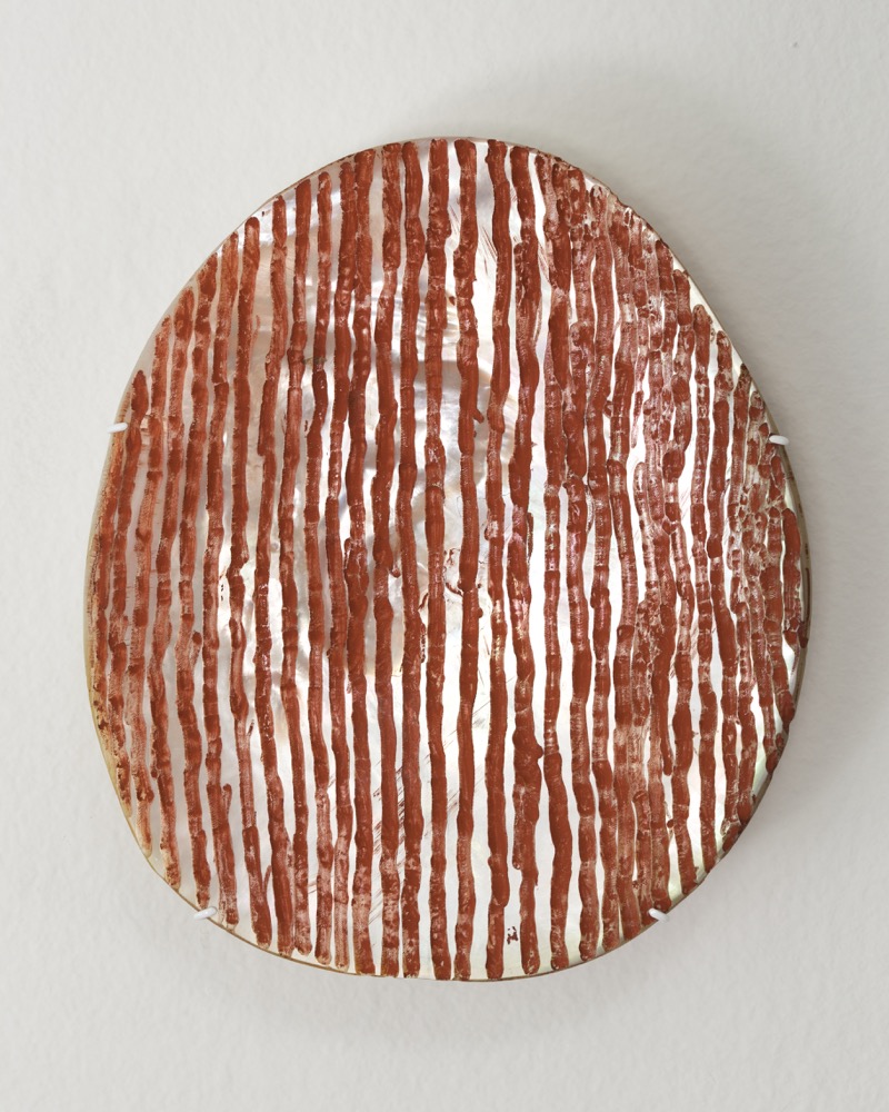
There were certain artists I was interested in, of course, and practices that traced certain lines of thought or, in the instance of Aubrey Tigan’s Honest Man Rigi, patterns of exchange.

But if I’m honest about it, it came down to intimacy: what you can hold in your hand, or thereabouts.

Small works draw you in; they limit the surrounding space. In this, you become enclosed in a fashion totally at odds with the expansiveness of large-scale practices. The bodily relation is different. It’s a very specific feeling, a kind of intensity that feels totally contingent upon size.

Process is part of this too. The three artists here – Karl Weibke and Matt Hinkley, alongside Tigan – enact processes that are intensely theirs; as different from (and similar to) each other as they are from others. This too draws you in.

We can also point to more pragmatic things when we talk about making exhibitions: that curators are bound to certain administrative, financial, and logistical realities, and that these also shape what it is they do.

It’s worth mentioning, in closing, that such parameters are almost endlessly variable. This is why there is never only one version of an exhibition, just as there isn’t a definitive edit of a text.

In this, an exhibition comes down to what’s possible in the moment. Or in this case, what you can fit in carry-on.

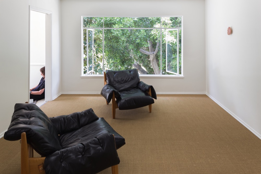
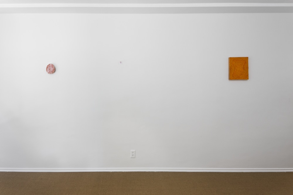
A short line between three points, (Matt Hinkley, Aubrey Tigan, Karl Weibke), Laurel Doody, Los Angeles, April 25 – May 21, 2015.

Exhibition text: A short line between three points.

Installation view, Laurel Doody, 2015
‘A Short Line Between Three Points’, Laurel Doody

Installation view, Laurel Doody, 2015
‘A Short Line Between Three Points’, Laurel Doody

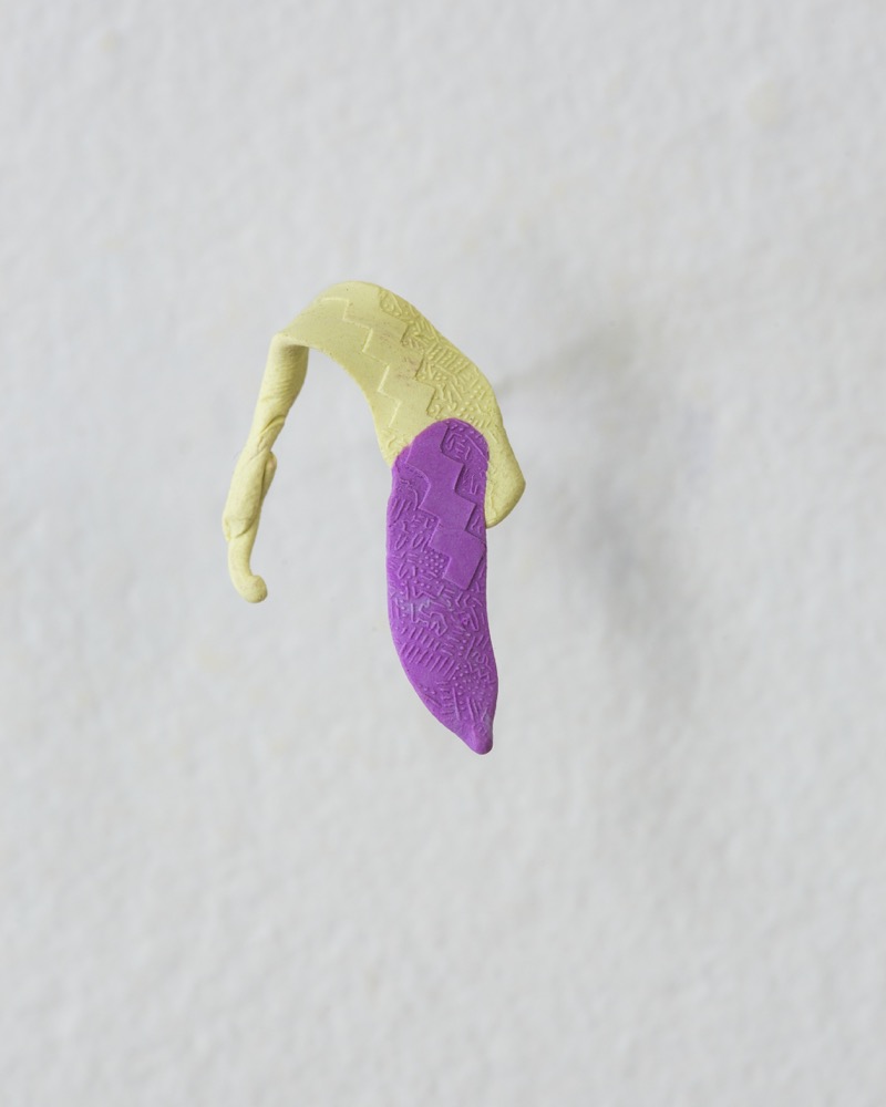
Matt Hinkley
, 'Untitled', 2014
, polymer clay, 
3.5 x 2.3 cm
Matt Hinkley
, ‘Untitled’, 2014
, polymer clay, 
3.5 x 2.3 cm

Aubrey Tigan
, 'Honest Man Rigi', 2010
, incised pearl shell and ochre, 
16.5 x 14.0 cm
Aubrey Tigan
, ‘Honest Man Rigi’, 2010
, incised pearl shell and ochre, 
16.5 x 14.0 cm

LD_06
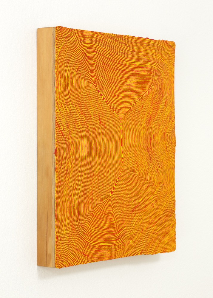
Karl Weibke
, ‘Buildings B/8’, 2004-06
, synthetic polymer paint on wood, 34.0 x 28.0 cm

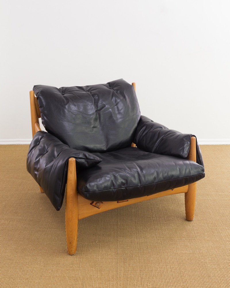
Sergio Rodrigues, 'Sheriff's chair', 1957, leather and wood
Sergio Rodrigues, ‘Sheriff’s chair’, 1957, leather and wood

NOTE: I am indebted, of course, to the brilliant and indefatigable Fiona Connor. Laurel Doody is her (ongoing) brainchild: she invited me to take part in the program, provided the chairs and made the space beautiful, among many other things. Thanks also to Emily Anne Kuriyama, who wrote a closing text for the exhibition and to whose phrasing I owe something, particularly this line: ‘Each artwork is relatively small — no bigger than the sum of my two hands, palms up, held side-by-side’


Out one spectre: Justin Trendall at Kalimanrawlins

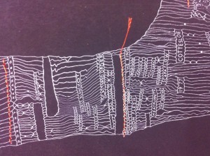
I’ve always felt that Justin Trendall’s unique state screenprints attempt to map the nature of memory; the acrobatic things it sometimes does, the mistakes it makes in the pursuit of narrative logic, that kind of thing.

He’s been making the prints for some years now. A handful of new versions are currently on display at Kalimanrawlins. Lists of names—often radically unrelated—embed in finely woven nets. There are often holes. There are also strange stoppages: bottlenecks that funnel one passage of the composition into another.

It might be me but it appears as if, over time, Trendall’s nets have become more complicated and difficult to decipher. He’s not particularly old, but I can’t help feeling that this increased complexity is somehow a graphic rendering of time passed. Existing memories remain the same when in isolation, but surely they change when jammed together with new ones; sense must be made through ever more random throws of the dice. It follows that even as connections become more diffuse and harder to explain, the pattern they trace becomes more complex, more compelling.

History is difficult. The old adage goes that it’s written by the victors. It’s equally true that it’s written by either side of whatever political divide (‘left’ or ‘right’ in Australia) holds sway. New versions only take us so far before they are pulled under by the weight of competing ideologies.

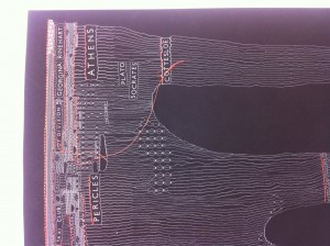
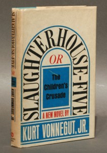
I’m not sure what this means for the kinds of personal histories individuals construct, but one thing that seems relevant here is something that has stuck with me from a teenage infatuation for Kurt Vonnegut’s books. It’s the way he described plotting his famous novel Slaughterhouse 5. He pinned a large piece of butcher’s paper to his study wall and assigned each character a different coloured pencil and then proceeded to draw horizontal lines across the paper. When they reached the bombing of Dresden, which is the novel’s penultimate event, they descended into a scribble from which only a handful emerged.

This is a simple graphic rendering of the novel’s plot. Maybe it’s far too stripped back to tell us anything much at all. But at one level that’s the only truth of things. From this perspective all lives might look something like Trendall’s prints: logic boards that have been superseded, reworked, and relaunched more effective (or defective) than ever. You make your own sense of them, that’s the point.

Justin Trendall, Out one spectre, Kalimanrawlins, Melbourne, 19 October – 9 November 2013.

Justin Trendall, 'Pilbara Block', 2013, archival digital print and cotton, 46.0 x 32.0 cm
Justin Trendall, ‘Pilbara block’, 2013, archival digital print and cotton, 46 x 32 cm

Justin Trendall, 'Pilbara Block' (detail), 2013, archival digital print and cotton, 46.0 x 32.0 cm
Justin Trendall, ‘Pilbara block’ (detail), 2013, archival digital print and cotton, 46 x 32 cm

Justin Trendall, 'Pilbara Block' (detail), 2013, archival digital print and cotton, 46.0 x 32.0 cm
Justin Trendall, ‘Pilbara block’ (detail), 2013, archival digital print and cotton, 46 x 32 cm

Kurt Vonnegut, ‘Slaughterhouse 5’


King for a day: ‘Heavenly stems’ at Neon Parc

These images are from the exhibition at Neon Parc, Heavenly stems, which has just closed. I want to draw attention to it because it echoes things I have been thinking about recently, and poses interesting questions about the nature of contemporary art and curatorship.

If anyone saw the exhibition they’ll know that it made a strange yet unavoidable kind of sense. It shouldn’t have worked, yet it did. I’d argue that this kind of feeling, at this current moment, is exactly the kind of feeling we should expect when we look at contemporary art exhibitions, big or small.

What I’ve been thinking is that not enough curators get it wrong or even risk doing so. Most exhibitions seem to be about reiterating the canon, or tracing already defined relationships in ways that echo local sentiment. But good exhibitions increasingly have a spanner in the works; some unexplainable aspect that really is just about a gut feeling. Correct me if I’m wrong, but this is how artists work too: suspend judgement, close your eyes, and perhaps that odd idea that you’ve been telling yourself is ridiculous might just be the way forward.

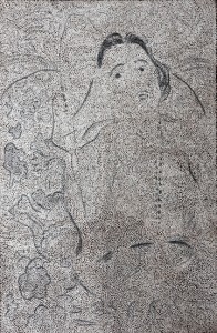
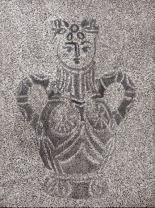
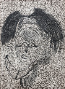
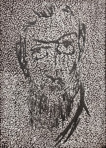
I’m not going to argue for these connections, or against them, but something in Heavenly stems was unavoidable. Put together a faux naïve modernist, an artist who would be classified, I guess, as an ‘outsider’ artist (if that is still the accepted term), and a long-out-of-favor Antipodean modernist and something happens. It’s not rocket science but it does disrupt an existing order. It points towards many more possible connections, all of which act against prevailing distinctions.

Heavenly stems, Neon Parc, Melbourne, 14–31 August 2013.

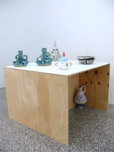
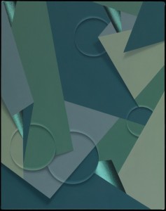
Heavenly Stems, installation view
‘Heavenly stems’

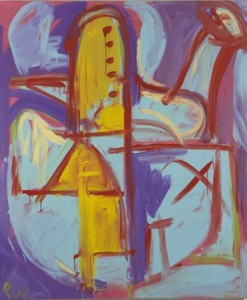
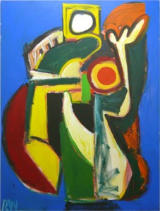
Dick Watkins, 'The Metaphysician', 2008, acrylic on canvas, 183 x 152 cm, Courtesy the artist and Liverpool Street Gallery
Dick Watkins, ‘The metaphysician’, 2008, synthetic polymer paint on canvas, 183 x 152 cm. Courtesy the artist and Liverpool Street Gallery

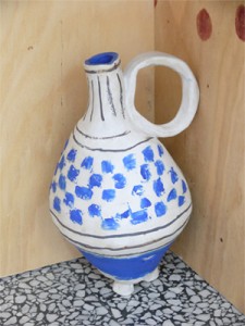
Angela Brennan, 'Jug', 2013, Stoneware, 35 x 29 x 26 cm, Courtesy the artist and Niagara Galleries
Angela Brennan, ‘Jug’, 2013, stoneware, 35 x 29 x 26 cm. Courtesy the artist and Niagara Galleries

Angela Brennan, installation view
Angela Brennan

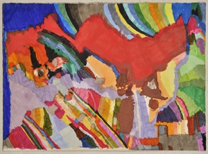
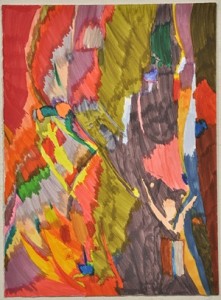
Rebecca Scibilia, 'Not titled (Red Mountain)', 2012, paint marker and marker on paper, 28 x 38 cm, Courtesy the artist and Arts Project Australia
Rebecca Scibilia, ‘Not titled (Red mountain)’, 2012, paint marker and marker on paper, 28 x 38 cm. Courtesy the artist and Arts Project Australia

Rebecca Scibilia, 'Not titled', 2010, felt pen paper, 38 x 28 cm, Courtesy the artist and Arts Project Australia
Rebecca Scibilia, ‘Not titled’, 2010, felt-tipped pen on paper, 38 x 28 cm. Courtesy the artist and Arts Project Australia

Dick Watkins, 'Sigmund Fraud', 1998, acrylic on canvas, 183 x 137 cm, Courtesy the artist and Liverpool Street Gallery
Dick Watkins, ‘Sigmund Fraud’, 1998, synthetic polymer paint on canvas, 183 x 137 cm. Courtesy the artist and Liverpool Street Gallery


Alien in the mix: Bryan Spier at Sarah Scout Presents, Justin Andrews at Block Projects

Bryan Spier makes narrative abstraction. If this sounds like a contradiction in terms, it just might be. But it’s the kind of contradiction that allows an artist to work in an impossible space and make something of it.

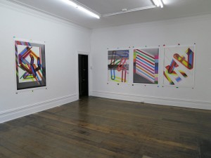
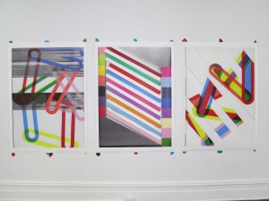
My understanding of what Spier means by narrative abstraction is relatively straightforward. Take his new exhibition of large-format giclée prints, Heavy images, currently showing at Sarah Scout Presents. In each work objects or planes are frozen yet their frame-based logic communicates a certain movement, a kind of sequential disruption that opens each composition. This is meant to be evocative; as Spier puts it: ‘past and future iterations haunt them’.

In these works form becomes a kind of character, one that the mind can’t help but attach to certain feelings or motivations. What might have been a relatively mute and coldly formal exercise instead begins to layer itself in a very human way.

A similar current runs through Justin Andrews’s exhibition at Block Projects; a linear, human logic that kicks against abstraction’s alien nature. It’s worth mentioning that both artists went through the same art school, and are part of the Canberra diaspora that includes Stamm’s own Trev Clay and me. But there’s more to it than that. If you sit in a studio on a daily basis balancing forms and adjusting colours, it’d better have some kind of feeling.

Andrews thinks about time in this new body of work, which strikes me as a similar project to Spier’s. He focuses on the idea of entropy; the disintegration of an ‘original’ as it is copied, repeated or remembered through the prism of time passed. Andrews takes this disintegration as a positive, as if the new and uncontrollable things that occur in this process hold some kind of secret meaning.

A self-authored text included in the show suggests he is thinking about his own history, trying to link up various interests and motivations across time: painting, music, the grainy reproductions held between the covers of a discarded art book. Artists can’t arrest time, but they can at least try to make sense of it. Again, it’s a matter of feeling and thinking and doing, each of these activities following and prompting the other.

There’s a pattern of making across the art world at the moment that most people involved would recognise. It’s materially driven and it relies on increasingly ‘minor’ gestures that seem guided by a kind of post-sculptural ideology. Through this kind of work artists and, by extension, audiences are required to invest more in less. If you run with it, reduction and material repeatedly reveal sequences of minor revelations. Although people rarely seem to make the connection, all this is the stuff of good painting. It echoes in the suspended moments that Spier and Andrews both render.

Bryan Spier, Heavy images, Sarah Scout Presents, Melbourne, 1–31 August 2013.
Justin Andrews, Block Projects, Melbourne, 27 July – 17 August 2013.

installation views, Heavy Images, Sarah Scout, 2013
Brian Spier

Brian Spier, installation, 'Heavy Images', Sarah Scout Presents, 2013
Brian Spier

Beyond Time 2
2013
unique print on canvas panel
39.0 x 54.0 cm
Justin Andrews, ‘Beyond time 2’, 
2013, 
unique print on canvas panel, 39 x 54 cm

Justin Andrews
Justin Andrews


Constant loss: ‘Third/Fourth: Melbourne artist-facilitated biennale’, and the 1980s at the NGV

To be honest, I thought that the NGV’s current show about the 1980s in the Melbourne art scene—Mix tape 1980s: appropriation, subculture, critical style—only transmitted the barest sense of the underlying social structure of the times. But then again, I wasn’t there. Afterwards I read Ashley Crawford’s review in The Monthly and although he notes that the energy and variety of the 1980s is ‘almost impossible to articulate comprehensively’, for him the exhibition ‘manages to embrace almost every aspect of this mayhem, and much of the vibrancy and energy of the period remains intact’.

So maybe success is in the eye of the beholder. Or—and I suspect this is more accurate—it’s easier to look back at something (a time or place etc.) if you already have first-hand memories of the subject. I assume Crawford was part of the fabric of the day, cutting his teeth as a critic and commentator alongside the artists, designers and critics whose works form the exhibition. Remove this nostalgic lens and what remains?

Of course the challenge that the curators behind Mix tape 1980s set themselves might be impossible, at least in the face of those in the audience for whom the 1980s remain a kind of mystery. I mean, how do you really communicate the meaning of a time and place retrospectively, especially when constrained by the collection policy of two decades ago?

I couldn’t help thinking about this in terms of another recent show that ‘surveyed’ a period—Christopher LG Hill’s Third/Fourth artist-facilitated biennale. Although the obvious difference between the two exhibitions is that Hill’s was embedded in a still-current moment, Third/Fourth rested under a similar nostalgic weight to Mix tape 1980s. By that I mean you felt yourself looking at this exhibition and thinking about a certain time and place. It just happened that the time was now.

If, judging by Hill’s exhibition, the best time to take the rear-view glance is just before the present merges into the past, then the best people to guide this view are those who still own the activities of making and thinking under review.

It’s not to say that Hill’s exhibition was anything but mysterious for those outside the recent pattern of art-making that it covered. But perhaps the fact it didn’t attempt to explain itself too clearly is what allowed it to accurately picture the underlying social aspect of a moment in the art world.

I couldn’t help picturing Third/Fourth at NGV as a kind of addendum to Mix tape 1980s. But then I wondered if these kinds of exhibitions fear institutions. Or is it the other way around?

Third/Fourth: Melbourne artist-facilitated biennale, Margaret Lawrence Gallery, Victorian College of the Arts, Melbourne, 31 May – 23 June 2013.

Mix tape 1980s: appropriation, subculture, critical style, NGV Australia, Melbourne, 11 April – 1 September 2013.

‘Third/Fourth: Melbourne artist-facilitated biennale’

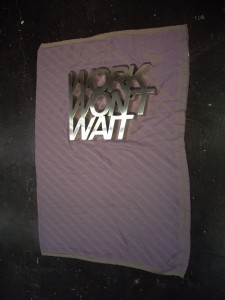
Kain Picken, ‘Work won’t wait’, 2013, stainless steel and acrylic blanket, dimensions variable

Maria Kozic, ‘Self-portrait’ from ‘The bicentennial folio: prints by twenty-five Australian artists’, 1988, photo-screenprint, 60.7 x 47.8 cm (image)


‘Kid candle’ and ‘Rocks’: Two works by Robin Rhode

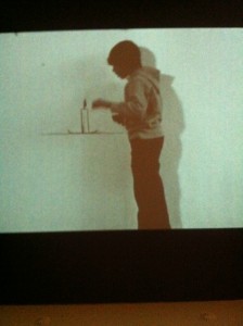
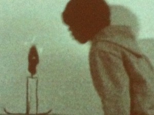
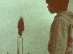
In Robin Rhode’s short black & white film, Kid candle, a young boy, dressed for the street, leans in to light a candle.

The ‘candle’ is a simple line drawing sketched on the wall, or perhaps on a paper backdrop that stands in for a wall. Either way, the flame catches and we see a flicker of fire as a black smudge begins to grow. The boy blows on it and the black smudge gets bigger. Briefly you expect the flame to overtake the image and destroy it but it doesn’t. Instead the film loops; boy leans in, lights candle, blows, flame flickers, grows etc.

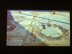
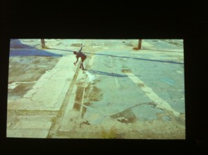
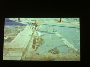
Around the corner is another work, Rocks. A man wearing ice skates and dressed in a suit skates in staggered freeze-frame over a broken concrete expanse, the entire sequence formed by still frames animated together.

It’s the kind of dilapidated public square that marks a certain kind of city teetering on the edge. Our viewpoint is back a bit and slightly above. Space is flattened—we see the surface of the square but only sense the city.

He’s a black man and although his movements are jerkily rendered, they appear carefully choreographed. Behind him ice cubes gather behind each push of his skates and mark out a scattered path. He holds a half bottle of whisky and an empty glass. Ideas and world play merge in and out of focus—rocks/on the rocks/diamonds/wealth/poverty etc. Whether or not these stick in any meaningful way seems beside the point.

The man makes one loop, crosses over, completes another and ends where he started. His trail of ‘rocks’, now melting in the sun, mark out a Möbius loop.

Robin Rhode, The call of walls, NGV International, Melbourne, 17 May – 15 September 2013.

Robin Rhode, ‘Kid candle’, 2009, black & white super 8 film transferred to HD digital betacam, silent, 1:3 mins

Robin Rhode, ‘Kid candle’, 2009, black & white super 8 film transferred to HD digital betacam, silent, 1:3 mins

Robin Rhode, ‘Kid candle’, 2009, black & white super 8 film transferred to HD digital betacam, silent, 1:3 mins

Robin Rhode, ‘Rocks’, 2011, colour HD digital betacam, sound, 2:45 mins

Robin Rhode, ‘Rocks’, 2011, colour HD digital betacam, sound, 2:45 mins

Robin Rhode, ‘Rocks’, 2011, colour HD digital betacam, sound, 2:45 mins


TV Moore’s ‘The dead zone’ at AGNSW

In New York in February I saw the exhibition NYC 1993: experimental jet set, trash and no star, which I wrote about briefly for Stamm. Perhaps the most interesting thing for someone from my generation (born 1980) was its attempt to historicise 1993—a ‘period’ from my own lifetime. There was a bank of video monitors on the upper floor that grounded the included artworks through that year’s daily news cycle and emphasised the fact they were made in time, bound by real events from the prosaic to the extraordinary.

Last week in Sydney I saw TV Moore’s The dead zone, a work from 2003—exactly a decade later. Now a decade old itself, I wondered if it too was somehow emblematic of its time. What did 2003 look like in the art world? Was it any different from 2013?

Moore’s work achieved some profile when it was first exhibited. I think it was reproduced in Art & Australia and RealTime, most likely other places too. My feeling is that at the time I only ever saw reproductions and read about it, but nonetheless the work entered into my understanding of early millenial video art in Australia and lodged there.

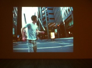
The work is lo-fi in a considered way, a quality that in hindsight feels like it speaks of the period. Three years earlier Shaun Gladwell had shot to acclaim with the balletic skateboarding of Storm sequence. As with Gladwell’s use of slow motion, Moore employs a similarly simple trick during editing; a figure running (and stumbling) through the streets of Sydney in the cold light of dawn is filmed backwards then replayed forwards.

This effect grants the slowed-down action a certain heaviness and emphasises gesture and movement in interesting ways. It’s also strikingly cinematic, but in a way that remains non-specific. By this I mean that the work recalls any number of moving-image sequences yet these are never fully articulated; if there is a narrative it remains off-screen.

This calculated ‘fuzziness’ of intent leaves The dead zone open to interpretation. Its representation of urban anxiety is undeniably bordered by the SARS crisis of 2003 and the memory of September 11’s falling towers, but all this remains non-commital. Any gravity it might touch on is instantly defused by the feeling that Moore seems equally aware (perhaps more so) that the grainy urban vista of his work is also the stuff of zombie movies and rap videos.

In fact, the film-maker Spike Jonze used a similar backwards/forwards editing trick in 1995 when he directed the video to the Pharcyde’s ‘Drop’, a direct echo that reveals how culture circulates and how artists like Moore work.

For me this reference locates The dead zone perfectly—the pathos that carried ‘Drop’ in 1995 retreats just the right distance to become inflected with the kind of nostalgia that might justify its reinterpretation in 2003. This lapse also allows its dominant motif—figures moving through urban streets—to collect other references to events both real and imagined, to in a sense become populated with transient memories of the intervening time. Popular culture merges with the real world, but in doing so the features of each blur together and are rendered hazy. Unpegged from anything specific, The dead zone just might be about anything at all.

Is that what 2003 looked like?

TV Moore, The dead zone, 2003, dual-channel DV/DVD, John Kaldor Family Collection at the Art Gallery of New South Wales, Sydney.

TV Moore, ‘The dead zone’, 2003, dual-channel DV/DVD, colour, sound, each 3:30 mins

TV Moore, ‘The dead zone’, 2003, dual-channel DV/DVD, colour, sound, each 3:30 mins

TV Moore, ‘The dead zone’, 2003, dual-channel DV/DVD, colour, sound, each 3:30 mins


The whole lot: ‘Theatre of the world’ at MONA

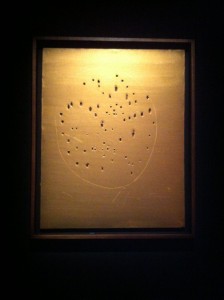
The simplest signs or gestures, like […] lines of paint or holes, whether they come from an Aboriginal woman artist, or from Papua New Guinea, or from an Italian artist, Lucio Fontana, can all become symbols of the whole of the totality, that is, the representation of immaterial life.
Jean-Hubert Martin, 2012.

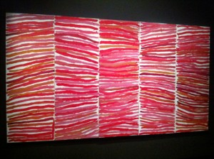
Responding to prompts to describe what she painted, the late Anmatyerre painter Emily Kame Kngwarreye famously stated, ‘(the) whole lot … that’s what I paint’.

This eliptical statement can be traced throughout the considerable literature on Kngwarreye’s work. It’s generally established that she was referring, in a holistic sense, to Alhalkere, her traditional country, and all that it embodied to a senior Anmatyerre woman of her generation.

But the provocation that her words hold for an art world inflected by the historical dominance of modernism still endures, a kind of ghost that haunts her work’s reception and points to another, more fraught possibilty.

Here ‘the whole lot’ becomes a statement of affinity, proof of art’s universal aspect.

This would go something like, ‘painting, and in particular abstraction, can heroically embody everything, even as it swings closer and closer to an apparent nothingness’.

This ‘doubling’—evident in so much work like Kngwarreye’s—is endlessly fascinating but it ultimately does your head in. The contradictions are almost immediately compounded by the historical anxieties that are still so apparent in Australia. So it’s not abstraction, but it is, or it is abstraction, but it’s not.

In his brilliant, sprawling exhibition Theatre of the world, just closed at MONA, Jean-Hubert Martin not so much ignored these difficulties as conflated them. Prevailing categories were endlessly dismantled only to be recast in new light, opening the doors to a kind of free-associative rollercoaster of sights and sensations.

He said somewhere that ‘the pleasures of a museum should be like that of a concert hall, or theatre’. I’d hazard that his exhibition was more unique than either; a dizzying experience where a kind of naïve enchantment quickly became the only common baseline.

On Martin’s stage a line is never just a line and art’s universal aspect is a given. Paintings like Kngwarreye’s become nodes within a vast network that traces new, more propositional ways of thinking through time. As an exhibition you might have hated it for its audacity if it hadn’t succeeded in such a compelling and entertaining way.

Theatre of the world, MONA, Hobart, 23 June 2012 – 8 April 2013.

‘Theatre of the world’

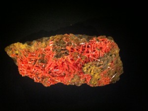
Crocoite (lead chromate), collected at Dundas, Tasmania

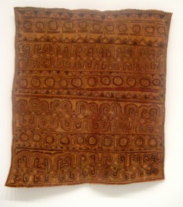
Artist unknown, Papua New Guinea, hand-painted bark cloth, dye, collected pre-1970

Emily Kame Kngwarreye, ‘Untitled (Awelye)’, 1994, synthetic polymer paint on canvas, 5 panels

Lucio Fontana, ‘Concetto spaziale’ (Spatial concept), 1964–65, metallic paint on canvas

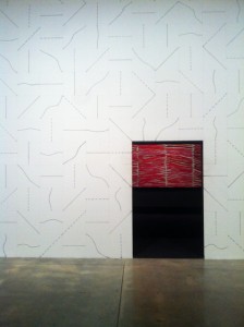
Sol LeWitt, ‘Wall drawing #394’, crayon, pencil, a 12” (30 cm) grid on painted wall

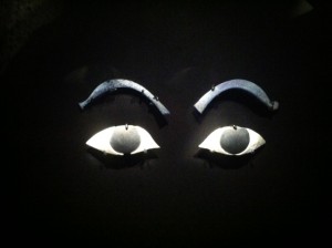
Eyes and brows, inlay fragments, c. 1550–1069 BCE, Egypt, New Kingdom, glass and glazed composition


In the hood

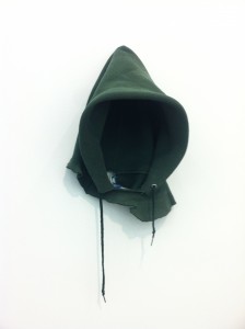
I first saw a reproduction of In the hood by David Hammons in the late 1990s, in a Phaidon publication called The art book. Still at school, my experience of art was limited to a love of Brett Whiteley, Jean-Michel Basquiat (as memorialised by Jeffrey Wright in Julian Schnabel’s then-recent film) and perhaps a few other things I can’t readily recall. In hindsight, The art book was an editorial undertaking doomed to be a selective failure: a full-page reproduction of Hammons’s work was bound together with alphabetically arranged examples from the entire history of Western art as if sense could be made from a random throw of the dice. But this contrast meant In the hood stood out simply because it echoed well beyond the canonised art history the editors had largely chosen to surround it. Its ideas arrive in sharp focus yet as a ‘work’ it is barely there. Perhaps because of this combination of difference and pitch-perfect clarity, when leafing through the book choosing ‘favourites’, In the hood would invariably fall into my late-adolescent top five.
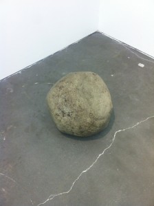
Now in a private collection, In the hood was recently installed at the New Museum in Experimental jet set, trash and no star, an exhibition that attempts to historicize the year 1993 in New York City. In a nice, if obvious, example of the art of curating, In the hood was presented alongside Gabriel Orozco’s Yielding stone, a work of similar material restraint and clarity (and another ‘favourite’ of sorts). Both works display that good ideas can be carried by the slightest of means. Like the exhibition itself, this pairing was at once deeply meaningful and frustratingly oblique.

NYC 1993: experimental jet set, trash and no star, the New Museum, New York, 13 February – 26 May 2013.

David Hammons, ‘In the hood’, 1993, athletic sweatshirt hood, wire

Gabriel Orozco, ‘Yielding stone’, 1992, plasticine ball, street debris


Eyes wide shut

In building a figure from clay we might start from the inside—the kernel of vital organs perhaps—and work our way outwards. This process would mean that each substrate, each increasing layer, would be felt into being by the fingers. Classical sculpture (or drawing, or painting) insists that any figure is first and foremost a volume that is supported by an inner structure; a musculature that defines the form of the outer surface that the eye perceives. Understanding the ‘inner’ layer thus allows the correct depiction of the ‘outer’. This is why artists of the Renaissance undertook to record the anatomy of the human body as a surgeon might; by peeling back subsequent layers and analysing the contingency of each part upon the whole.

But this kind of analytical approach only takes us so far. You might argue that even depicting something exactly as it appears to the eye is a gross distortion of how things really are, or at least how things are really perceived. So what if we followed a similar process, but one where a kind of visual feeling took precedent over analytical description? Start from the centre and work outwards again, but this time your eyes are closed and only touch guides the unwinding of material into form. The figure (or drawing, or painting) is only completed when it feels right rather than when it looks right. Limbs might distort, the geometry of space might become skewed, faces generalise, features only partially form. But at one level what we are left with might be a closer approximation of what we set out to achieve.

‘The painter recaptures and converts into visible objects what would, without him, remain closed up in the separate life of each consciousness.’

This is a quote from Maurice Merleau-Ponty writing (in 1945) on Cezanne. In the piece he tries to describe what he saw as Cezanne’s ‘doubt’—that gnawing feeling of failure, or sense of an as-yet unattained ideal which pushed him ever beyond the immediate work at hand. You might argue that Cezanne was a painter who always had his eyes wide open, that he tried to record faithfully what the eye percieved. But in doing this he moved past how the world logically appeared, attempting instead a synthesis of seeing and feeling which embedded him in his subject. Merleau-Ponty quotes him as saying: ‘The landscape thinks itself in me and I am its consciousness’.

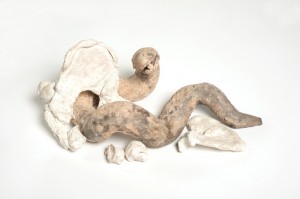
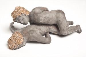
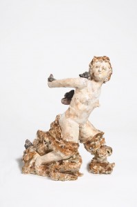
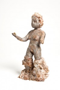
Two current exhibtions set me thinking in this direction: Naomi Eller’s ceramic works at C3 and Brent Harris’s new works at Tolarno. Both artists seem to want to achieve a synthesis between seeing and feeling, to unwind their ‘figures’ from their material ground as though discovering them for the first time. Part of me wants to call this tendency ‘re-classicism’, because in it we recognise something not only fundamental to the creative process, but also a striving to find archetypal forms that underwrite all things. Unsurprisingly both artists make reference to grand Biblical drama. For Eller, Adam and Eve and the Garden of Eden provide a meta-narrative which suggests all human struggle, big and small. For Harris it is the Stations of the Cross (and in this series the Fall in particular) which call him to ponder mortality. ‘What happens next’, he seems to be saying, ‘can’t be described, but it can be felt’. If this sounds bleak it’s not. Humour and wonder animate each exhibition. In both, the act of uncovering inner worlds is revealed as one of necessary lightness.

Naomi Eller, Nothing is set in stone, c3 contemporary art space, Melbourne, 21 November – 9 December 2012.

Brent Harris, The Fall, Tolarno Galleries, Melbourne, 21 November – 15 December 2012.

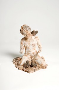
Naomi Eller, ‘The Fates: Nona’, 2012, ceramic. Photo: John Brash

Naomi Eller, ‘The remnants of Eve’, 2012, ceramic. Photo: John Brash

Naomi Eller, ‘The formation of Adam & Eve’, 2012, ceramic. Photo: John Brash

Naomi Eller, ‘The flight of man’, 2012, ceramic. Photo: John Brash

Naomi Eller, ‘The Fates: Decima’, 2012, ceramic. Photo: John Brash

Naomi Eller, c3 contemporary art space, 2012. Photo: John Brash

Brent Harris, ‘The Fall’, 2012. Photo: Andrew Curtis

Brent Harris, ‘The Fall’, 2012, monotypes. Photo: Andrew Curtis

Brent Harris, ‘#81’ from the series ‘The Fall’, 2012, Monotype. Photo: Andrew Curtis


Brent Harris, ‘#37’ from the series ‘The Fall’, 2012, monotype. Photo: Andrew Curtis


Lars and the real world

Have we all heard the story about drowning being a good way to go? It goes like this: once the body gives over, a euphoric wave washes through it, a sense of calm to belie the raw fact of death. I imagine at this moment what you see is not that whole ‘my life flashed before my eyes’ kind of thing—a sequence of poignant images carefully sequenced to sum up a life lived well, or wasted, or lived indifferently or whatever—but rather something more like shapes and colours; a synthesis of everything. And then things simply drop out. What got me thinking about this was a story on Yahoo! 7 News recently. A man died for a period of time and was resuscitated. On his return, he revealed he had been to heaven and there were no surprises. In fact it was just as one might reasonably expect: pink clouds, gates, angels with wings.

How do you make something that means something? Something that moves beyond itself to become more than the sum of its parts, something truly transcendent? I read recently that an artist’s body of work projects them beyond their own lifetime. But in doing this each single work remains linked to both its moment of inception, and to the sequence of historical moments that underlie it. Alfred Gell referred to this as ‘distributed personhood’. He was trying to makes sense of the quality embodied by a group or series of objects which, seen collectively, act as a bodily presence across space and time. Bring together a group of works and you reconstitute part of that body. You bring together an identity, however briefly or partially, and that identity speaks to whomever is around to listen. No wonder artists get nervous before a show. To make art is to enter an ongoing historical act in which your objects enter a lineage of other similar-yet-different objects—your own, other people’s—a lineage of marks and materials, an accrual of historical moments; an infinite weight of ‘then’ upon ‘now’. For any artist at any point in history this weight must at times seem unbearable. It must prompt the question: how might I make something outside history? There’s probably not an answer to this.
You might look around the art world at any given time and wonder why artists sometimes seem to be attempting to collectively recreate the ideals of a particular past moment. This is of course more than history repeating, more than simple nostalgia. Indirectly or not, this kind of translation can only highlight the unavoidable space between then and now. This is how the historical moment becomes recursive, how it reconfigures itself, how ‘innovation’ becomes contingent on ‘tradition’. Regardless of apparent similarities, things in translation always shift and change. Maybe it’s about returning to a juncture in time to imagine other possible futures; trying to picture something that could or should have been if things had turned out a little differently. In this way ‘looking back’ to move a creative project forward might be a form of hope.
Trevelyan Clay (upcoming), Neon Parc, Melbourne, 28 November – 22 December, 2012.

Trevelyan Clay, works in progress, 2012

Trevelyan Clay, works in progress, 2012

Trevelyan Clay, works in progress, 2012

Trevelyan Clay, 2012

Trevelyan Clay, works in progress, 2012


Yolngu art in the age of mechanical reproduction

When Wandjuk Marika became the first Aboriginal artist to publicly raise the issue of copyright infringement, much more was at stake that one might have initially thought. In 1974, when travelling in his capacity as inaugural chairman of the Aboriginal Arts Board, Marika had been dismayed to discover his sacred clan designs adorning cheap cotton tea-towels ‘published’ in Holland and on sale at tourist shops in Sydney. In his own words (as told to Jennifer Isaacs): ‘when I walked into that shop, and when I saw it [the design] I was shocked. My heart broke’.

By approaching the Australian government to investigate this unauthorized usage, Marika inaugurated a process that eventually, in 1985, would result in the first legal recognition of Indigenous ‘copyright’. As Fred Myers has noted, ‘Wandjuk objected not simply to commodification as a form of desacralisation, but more specifically to the display and use of designs by those lacking ritual authority to do so’. Far beyond what the word ‘design’ might denote in a Western sense, Marika’s clan designs can be visualised as an extension of his very identity, a kind of legal document that sites him within complex cultural, social and geographic networks. ‘Copyright infringement’ then, as a specific Western term, is far from adequate. Perhaps ‘identity theft’ might be more fitting. Within a Yolngu world-view the unauthorized circulation of such designs might have far-reaching and unexpected consequences; synonymous with the power of the country and ancestral narratives they depict, it follows that they too are powerful. To move into the world they need the ‘authorization’ of the artist’s hand.

In 1996, when faced with the decision to support the development of a printing workshop at their art centre, Buku-Larrnggay Mulka in Yirrkala, Eastern Arnhem Land, Yolngu leaders found themselves confronting a similar issue. Would the reproducibility of prints lead to similar misappropriation? Ceremonial leader Garrawin Gumana provided guidance for future Yolngu printmakers and their collaborators by way of a succinct satement, ‘if you’re going to paint the land, you use the land’. That is, in painting or carving the ancestral narratives and designs which usually underwrite Yolngu art, artists must use the very elements of the country they depict: ochre, bark, kapok wood and other materials which are essentially extensions of the land they come to represent. Printmaking, as a technology of reproduction utilizing foreign, industrially produced materials, would have to be directed towards different concerns, that is, beyond country. Here more than anywhere else in Yolngu art the dictates of the sacred would give way to the possibilities of the secular.

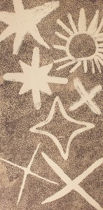
Works illustrated here include a recent linocut by Nyapanyapa Yunupingu, whose work has traced a trajectory from personal, non-sacred figuration to mayilimiriw (meaningless) mark-making. Currently celebrated for her bark paintings and recent collaborative work, Yunupingu’s practice began in the print room where she realised her earliest works as colourful screenprints.

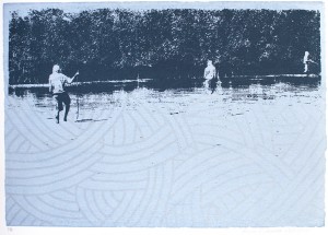
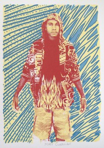
Also illustrated are outcomes of workshops undertaken with young Yolngu community members, beginning with photographs taken on their mobile phones. Here the collaborative potential of printmaking in such a context becomes readily apparent. Although relatively humble in form and vision, these works display an important move away from a period style of Yolngu art, a shift occurring at the periphery of the art market’s focus (which remains on original works by ‘star’ artists), yet firmly rooted in the lived reality of day-to-day life. As Nicolas Rothwell has written in relation to this body of work, the task of these young artists is ‘not just to keep alive the traditional designs, and make pleasing art based on them, but to transform a tiny minority society into a strong enclave, operating on an equal footing within the wider nation-state’. For Rothwell, this is a challenge ‘best shouldered by the young, the bicultural and self-confident’. It’s entirely fitting that we see this challenge beginning to be taken up through the medium of printmaking, and placed within a history of robust Yolngu engagement with the ‘outside’ world.

Many thanks to Will Stubbs and Annie Studd for generously discussing the print project during my recent visit to Yirrkala. Yirrkala Printspace enquiries: <prints@yirrkala.com>.

Nyapanyapa Yunupingu, ‘Birrka’mirri’, 2012, linocut. Printers: Annie Studd and Ruby Djikarra Alderton

Nyapanyapa Yunupingu, ‘Hunting dhuwa’, 2002, screenprint. Printer: Araluen Maymuru

Gulumbu, Nyapanyapa, Ranydjupi, Barrupu, Dhopiya, Djerrkngu, and Djakanngu Yunupingu, ‘Seven sisters’, 2012, etching. Printer: Basil Hall

Ruby Djikarra Alderton, ‘The hunter’, 2012, screenprint. Printer: Ruby Djikarra Alderton

Mikey Gurruwiwi, ‘Ngarra’, 2012, screenprint. Printers: Mikey Gurruwiwi and Sean Smith

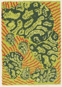
Dhalmula Burarrwanga, ‘Garrung (coral)’, 2012, screenprint. Printers: Dhalmula Burarrwanga and Annie Studd

Gadaman Gurruwiwi, ‘Rangi’, 2012, screenprint. Printers: Gadaman Gurruwiwi and Sean Smith

Gurmarrwuy Yunupingu, ‘Mantpana’, 2012, screenprint. Printers: Gurmarrwuy Yunupingu and Ruby Djikarra Alderton


Paradise

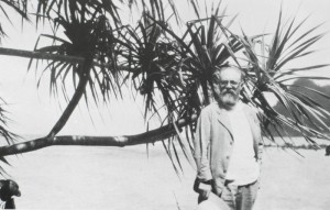
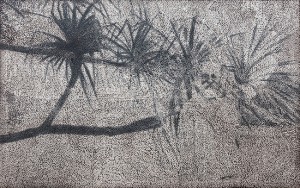
In European vision and the South Pacific, published in 1960, Bernard Smith wrote that, ‘European observers sought to come to grips with the realities of the Pacific by interpreting them in familiar forms’. That is, European vision, brought to the Pacific as it ‘opened up’ to Cook’s 1768 voyage, carried with it a familiar frame through which to experience the ‘new’ world. Paul Carter, writing in his 1994 book The lie of the land, makes the same observation in more general terms, noting that ‘the coloniser produces the country he will establish out of his own imagining’. The constituent parts of this country—the landscape, flora and fauna, even the human inhabitants—come to serve roles calibrated to the shifting ideologies of colonialism. Perhaps they might signify abject fear or endless possiblity; the dark night of a pre-enlightenment world or the bountiful paradise of an untouched arcadia. Henri Matisse, visiting Polynesia in 1930, no doubt saw a vision of the modernist avant-garde reflected back at him, exactly, one might argue, what he sought when he set sail from Europe. Sixteen years after his visit, during what he romantically termed ‘reveries’, he would call forth his version of paradise to produce works like Oceania—the sky (1946). As is well known, along with other artists like Picasso, Matisse’s engagement with the art of Africa and Oceania is popularly seen to have underwritten the gains of European modernism in the twentieth century. But, as with any colonial project, these gains can now be understood as more complex and conflicted. Theirs was a vision driven by a European mythology of the authenticity of non-European cultural forms, an authenticity which we might now recognise as contingent on the voicelessness of these forms within the world of modernity. Matisse’s ghostly figure at the centre of one of Daniel Boyd’s recent paintings seems to attest to this—it is an unsettling presence, one which looms largest only in peripheral vision. Boyd’s new paintings suggest that to visualise paradise now is to witness the ghost of colonialism. We might realise that the paradise sought beyond the familiar boundaries of empire was no paradise at all.

Daniel Boyd, Kalimanrawlins, Melbourne, 11 August – 1 September 2012.

Matisse at the Pacific island of Tahiti, 1930

Daniel Boyd, ‘Untitled’, 2012, oil and archival gel on canvas, 162 x 257 cm

Daniel Boyd, ‘Untitled’, 2012, oil and archival gel on canvas, 300 x 197 cm

Daniel Boyd, ‘Untitled’, 2012, oil and archival gel on canvas, 183 x 137 cm

Daniel Boyd, ‘Untitled’, 2012, oil and archival gel on canvas, 137 x 102 cm

Daniel Boyd, ‘Untitled’, 2012, oil and archival gel on canvas, 93 x 66 cm


(Mis)communication rules

Wikipedia tells us that Creole is a language ‘developed from the mixing of parent languages’. Like Pidgin—a necessary precursor to Creole—it is brought about through the coming together of previously incomprehensible differences. Europe’s colonial expansion brought many creoles into being by way of trade routes, colonial domination and the traumatic displacements of the slave trade. Here, old languages were bastardised to become new. The spread of cultures across the Pacific also necessitated languages of exchange. In northern Australia, the cattle industry, hot on the heels of European invasion, prompted a ‘Kriol’—a mix of Aboriginal languages, English and Chinese—which is still spoken today. At one level the development of such languages displays the need for a common ground on which social, cultural or economic transactions might be negotiated.

It’s worth considering what this space is. For example, in creating a way by which relative values can be brought into play, are cultural differences transcended? Or, in carefully plotting a space of exchange by the limitations of language, are differences beyond this space consciously maintained? In the works of Sydney-based visual artist Newell Harry we might observe that layers of difference do not necessarily settle into a coherent whole. This disjuncture points towards miscommunication. It echoes the space between languages, a gap where the necessity to communicate prompts new forms which may or may not be adequate for the task.

Newell Harry, Blue pango: musings & other anecdotes, Roslyn Oxley9 Gallery, Sydney, 26 July – 18 August 2012.

Newell Harry, ‘Untitled (Griot)’, 2012, monoprint, pastel, cowrie shells, marker on ironed Fabriano paper

Newell Harry, ‘Untitled (Wole Soyinka … is still alive)’, 2012, monoprint, pastel, cowrie shells, marker on ironed Fabriano paper

Newell Harry, ‘Untitled (More mumbo jumbo: crackpots ‘n’ poems for Ishmael Reed)’, 2010–12, 8 unique screenprints on hand-beaten Tongan ngatu (bark cloth), ink

Newell Harry, ‘Untitled (Bearded black virgin with ancestral pig)’, 2011–12, Trobriand Island women’s dance skirt, etched spade, boot polish, Japanese yen, ceramic matka (Madhya Pradeshi water vessel), glass beads, twine

Newell Harry, ‘Untitled (Bearded black virgin with ancestral pig)’ (detail), 2011–12


New tricks

Sometimes when you see a series of shows what strikes you is not so much the specific intent of each, but a more generally pervasive feeling. It can be hard to discern whether or not this speaks of your own existing preoccupations more or less than the external prompt offered by an exhibition. Often neither, at least not entirely. The ‘meaning’ of a show resides somewhere in-between.

Writing on the practice of London-based painter Tomma Abts, Jan Verwoert drew attention to Abts’s ability to imbue her paintings with a corporeal presence at odds with their apparently analytical formal construction. Although they remain just out of reach, looking at these works is to understand that real things here are mirrored, distorted. In returning from a collaboration with the unknown, Abts’s work is located within a specific lineage. As noted by Paul Klee, art like hers engages a visual language ‘abstract with memories’.

Over the last month in Melbourne it seemed that practices that unwound the mystery at the heart of projects like Abts’s were everywhere I turned. In contrast to the ahistorical quality of the German artist’s work, many of these strike me as existing within a more definite art historical trajectory. This art’s tendency to reframe the lofty aims of abstraction by locating them in the everyday was made possible by certain conditions of art after modernism.

In his essay on Abts, Verwoert goes on to note that ‘abstraction is the opposite of information’, which I take to mean that in an information-rich world, abstraction goes against the tide of instant recognition. Kind of like the art world equivalent of the slow food movement. It would seem then that locating abstraction as a readymade is a different project entirely. Undoubtedly this strategy is often smart and seductive, but it also implicates the viewer in a different way—in a sometimes frustrating double bind, you can’t help but get the joke (or the trick, or the process) whether you like it or not. By contrast, Abts’s paintings present us with a ‘dumbness’ in that their language provides imperfect means to render unknowable things—even their titles are imperfect approximations of ‘real’ language. Unlike much work on display in Melbourne recently, the fact that the viewer doesn’t ‘get it’ is exactly their point.

Elizabeth Pulie, Mixed historical, Neon Parc, Melbourne, 6–30 June 2012.
Peter Atkins, The monopoly project, Tolarno Galleries, Melbourne, 2–30 June 2012.
Alasdair McLuckie, Pink lions, Murray White Room, Melbourne, 27 April – 9 June 2012.
John Nixon, EPW: colour-music, Gertrude Contemporary, Melbourne, 1–30 June 2012.

Tomma Abts, ‘Hemko’, 2009 synthetic polymer paint and oil on canvas, 48 x 38 cm

Elizabeth Pulie, ‘Fourteen’, 1990, synthetic polymer paint on canvas, 140 x 80 cm

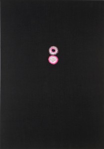
Alasdair McLuckie, ‘Untitled’, 2012, pink agate and bead thread on canvas, 153 x 107 cm. Photo: John Brash


Like seeks like

I enjoy the kinds of informal connections that you can make by simply looking at different artworks. Sometimes the brain has to catch up to the eye and try to explain away coincidences, or alternatively make a case for initial and perhaps superficial visual similarities to become more than that. It’s always positive to begin to think about the world view embodied in artworks, and for this to help you face down preconceptions about how things should or shouldn’t be. After all, what good is an artwork that simply reinforces the way you already see things?

Recently, while at the NGA in Canberra, I visited a work I like a great deal: Boxer Milner’s Milnga-Milnga, the artist’s birthplace, 1999. Someone talked to me about Milner’s work a few years ago, emphasising that once you get an understanding of his pictures they begin to work on you, but first you have to ‘get your eye in’. It’s true—before you know it you are really looking at them—thinking about where blocks of colour end, where outline becomes infill and about the multitude of decisions you can read in his pictures. They also raise broader questions about how content relates to these kinds of decisions, and where form might unhinge from an underlying framework of representation.

A number of days later I saw Nick Selenitsch’s show at Sutton Gallery. There’s a series of visual coincidences between the artists, but I would suggest that some of what the eye picks up represents more than this, and that connecting one with the other defines a mid-ground that both artists negotiate. Milner’s decision to render the winding paths of drying waterways as a striking geometry presents as a specific ‘painterly’ decision, one that’s about pattern-making and design as much as it is about representing country. Similarly, Selenitsch’s focus on the line markings that define areas of play places a geometric topography on the land’s surface and provides the crux of his work: abstraction’s signification of the real world. Each displays a tendency to adapt specific content away from literal or prosaic representation—frameworks shift and change in relation to the logic of each work.

Drawing these connections is nothing new. Comparison like this has a long (and often misguided) history, especially since Indigenous contemporary art has been established as an undeniable art-world presence. It often raises persistent and unresolved problems, both of categorisation and misrepresentation. But raising these problems makes us consider them more closely and, at an informal level at least, looking at paintings and thinking about what artists do will continue to suggest that practices can and do converge in unintended places.

Nick Selenitsch, Felt, Sutton Gallery, Melbourne, 20 April – 19 May 2012.

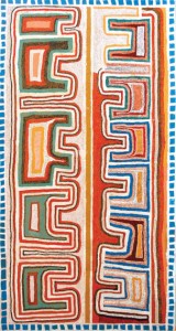
Boxer Milner, collection display, the Kimberley, Aboriginal and Torres Strait Islander art, National Gallery of Australia, Canberra.

Boxer Milner, ‘Milnga-Milnga, the artist’s birthplace’, synthetic polymer paint on canvas, 1999

Nick Selenitsch, ‘Felt’, synthetic and wool felt, glue, card, 2012


Moya McKenna: Ideas once thought and then forgotten

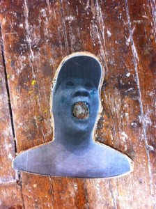
Untitled (Cosmic bust man) is a recent artwork by American Tom Friedman; a bust of a man with dark apertures in place of eyes, mouth and nostrils. In a neat spatial inversion, the viewer peers in and unexpectedly sees the night sky. It’s not an artwork that begs detailed interpretation—ideas are suggested (about infinity, about the experience of staring into space, perhaps about mortality) but are left open-ended. In this way, Friedman’s work provides perfect material for Moya McKenna’s paintings.

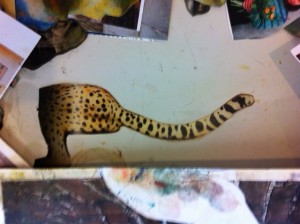
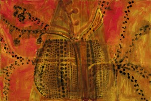
This reference is among a handful which visually repeat throughout Moya’s work, often over years. Others include a cheetah’s head licking an unseen companion, Whistler’s mother sitting in profile, and a work by Yayoi Kusama drawn from a photograph Moya took in Japan a few years ago. Each provides a different emotional and formal texture, retaining something of their original context yet providing a unique armature for each individual work. A fine control limits this selection, reflecting, as Moya noted during my recent visit, a desire to decide ‘what enters the studio’, and by extension her paintings. Pushing backwards and forwards between these images, the things they suggest and the undefined spaces they inhabit seems to provide the axis on which her new work turns.

Moya says that to paint these works she needed to first understand space in a way that her earlier paintings allowed. These earlier works drew on constructed studio tableaux and collages, and over time moved from describing the ‘literal’ space she had set up in front of her, toward that imagined, or sensed, in the paintings themselves. Her recent group of paintings can be seen to complete this trajectory—the way their spaces are constructed appears prompted by an internal dialogue no longer beholden to the logic of how things should be. Simultaneously ‘finished’ and open-ended, their revisions suggest both a future and a past: the way they could have been underlies how they are. In part they work because they hang together so tenuously; shift one or two things and they could unravel.

Moya McKenna, Ride, Kalimanrawlins, Melbourne, 5–26 May 2012.

Moya McKenna, reference material (cheetah)

Moya McKenna, ‘Hot pumpkin’, 2011, oil on canvas, 71.5 x 106.5 cm. Photo: Andrew Curtis

Moya McKenna, reference material (Tom Friedman, ‘Untitled cosmic bust man’)

Moya McKenna, reference material (artist’s drawing)


Coloured dirt

Shane Cotton’s recent paintings are dark, almost Gothic arrangements of cultural iconography floating on moody and uncertain fields. They draw on the post-colonial histories of the artist’s native New Zealand, but still carry a familiar charge for Australian audiences. In these works history is an ominous and uncertain place; ever open to revision, it haunts the present like the disembodied tattooed heads and ghostly texts Cotton repeatedly employs.

There is currently a painting by Cotton from 1997 on display in the new Art of the Pacific Gallery at NGV International. It’s quite different from recent work, but the core intent seems the same. Alongside work from regions as diverse as the Oro Province of Papua New Guinea and north Ambrym Island in Vanuatu, it suggests various possible histories.

Resonances extend from this painting throughout the exhibition: its horizontal divisions recall the contemporary Ömie bark cloths on the opposite side of the gallery, while its palette of rust browns and ochres is shared by any number of other works. Even the animated and brightly coloured Sisu dance masks echo in the graphic rendering and loosely decorative text that winds through Cotton’s painting.

Like the two works by Colin McCahon in an adjacent corner of the gallery, Cotton’s painting also links to Euro-American traditions of art making. In this sense it represents a kind of hinge point between histories, suggesting a cross-regional perspective that traverses multiple traditions and forms. Here the trajectory of art history is shown to be always relative, always open to revision.

Inaugural display, Art of the Pacific Gallery, NGV International, Melbourne, 28 May 2011 – 31 December 2012.

Shane Cotton, ‘Viewed’, 1997, oil on canvas, 182.8 x 167.8 cm

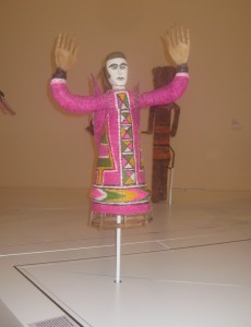
Sisu dance mask, c. 1980, natural pigments on fibre, wood, bamboo, cane, cotton

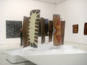
Shields from the PNG Highlands in front of Colin McCahon’s ‘I applied my mind’, 1982

Dapeni Jovenari, ‘Man’s head design and climbing vine with thorns and tendrils’, 2006, natural pigments on bark cloth


Small giants

The earliest paintings of the Western Desert art movement sparked a shift that would become a game-changer for Aboriginal art in Australia. Their appearance in the early 1970s prompted a re-evaluation of existing art world discourse; the Papunya boards, as they became known, made a convincing case for their reception as contemporary art, rather than ethnography. This shift opened the door for the many regional movements and artists that form a broad picture of Indigenous art today.

The fact that the paintings surveyed in Tjukurrtjanu represent such a watershed moment in the history of Australian art can initially be hard to imagine. They are, for the most part, strikingly humble when compared to the vast canvases which would come after them. But the scavenged offcuts of board and chalky student-grade poster paint the artists used manage to add up to far more than the sum of these parts, revealing countless possible directions for a then fledgling art movement.

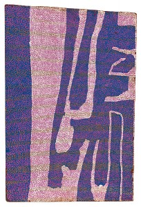
Tjukurrtjanu brings the individual achievements of the founding artists—a small group of traditional senior men who came together in the tiny community of Papunya—into sharp relief. Walls displaying an artist’s approach to specific themes, and more generally to a new medium, frame engaging moments of studio-based invention. An example of this lies in Timmy Payungka Tjapangati’s 1972 work, Sandhill country west of Wilkinkarra, Lake Mackay, where underpainted bands of hot pink and ochre yellow, all but obscured by a densely dotted overlay, add an almost imperceptible shimmer to the work’s surface. This succinct visual effect, achieved with so little, makes the innovation of the boards in general clear—they arrived at a time, and within a context, where anything was possible and the appearance of Western Desert art was essentially undefined. Despite having been painted some forty years ago, many of the boards still stand among the best of Western Desert art. Put simply: there’s nothing like them.

Tjukurrtjanu: origins of Western Desert art, Ian Potter Centre: NGV Australia, Melbourne, 30 September 2011 – 12 February 2012.


Timmy Payungka Tjapangati, Pintupi, ‘Sandhill country west of Wilkinkarra, Lake Mackay’, 1972, synthetic polymer paint on composition board, 76 x 52 cm

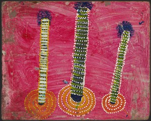
Nosepeg Tjupurrula, Pintupi, ‘Three ceremonial poles’, 1971, synthetic polymer paint on composition board, 56.2 x 70 cm

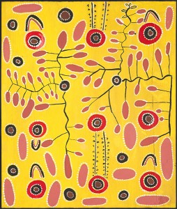
Billy Stockman Tjapaltjarri, Anmatyerr, ‘Yala (Wild Potato) Dreaming’, 1971, synthetic polymer paint on composition board, 54.5 x 46 cm