Bradd Westmoreland—wet

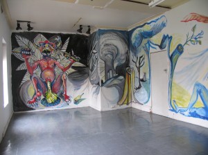
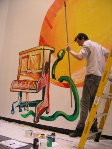
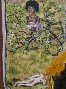
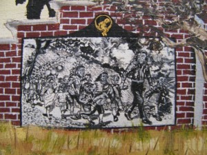
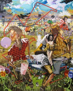
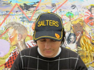
In January 2009 Bradd Westmoreland painted this crazy huge frieze titled War & peace around three walls of a small studio space I’m attached to in Fitzroy as part of a very local, very diverse, summer series of impromptu weekenders. The full catastrophe was equal part dance of life and cycle of destruction painted over a couple of days. The weekend before, Alicia Frankovich had roped and literally harnessed the entire studio building in a live performance titled Lungeing chambon. It too was a type of dance.

Too few ‘wet’ artists manage to connect with or show an interest in the main settings of contemporary art practice. They are happiest being all stoic and hog-tied to the symbolic conditions of the studio, thinking they are on a higher plane, or something like that. They don’t cheerfully fit the concrete politic contemporary art finds easiest, but also strangely don’t engage well with its impermanent and haphazard conditions. Even a word like ‘painterly’ once actually suggested a relative idea of clarity rather than an exhaustively complete one. Westmoreland’s War & peace frieze was a rare example in Melbourne of an artist ‘crossing the river’ so to speak.

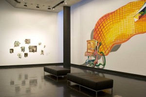
In 2010 Westmoreland painted a second wall painting at the Ian Potter Museum of Art for the exhibition There’s no time. The painting, Night’s bright song, was in a room alongside John Spiteri’s early works on glass and ‘calendar’ paintings on board. The motif Westmoreland constructed was like a gigantic snake-charming scene. He had again carefully flipped onto the gallery wall the working routines he’d established in the studio, something that provided a loosely held subjective presence in the work.

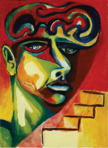
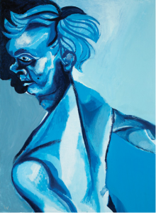
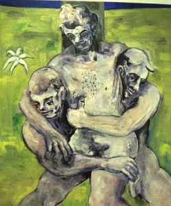
Each of these two wall paintings were curious if for no other reason than their mechanisms involved nothing of the more familiar ‘wall drawing’—architectural notation or string piece or photographic projection—de rigueur structural incursions all. Westmoreland’s art is more to do with the absence of a premeditated structure or conception or approach than just a casual, loosened or relaxed art procedure. But of course that is not completely true either. There are clearly broader codes at work and repatriations of a sort. For instance, at Westmoreland’s Niagara show earlier this year, it dawned on me (belatedly) how close his paintings are to the work of the late Peter Walsh. The precepts seem to play out in a similar way.

Bradd Westmoreland, War & peace, Beyond the Green Door, Melbourne, summer, 2009.

There’s no time: John Spiteri, Mira Gojak, Karl Wiebke, Bradd Westmoreland, the Ian Potter Museum of Art, the University of Melbourne, 17 November 2010 – 13 February 2011.

Bradd Westmoreland, In the light, Niagara Galleries, Melbourne, 7 February – 3 March 2012.
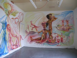
Bradd Westmoreland, ‘War & peace’, 2009

Bradd Westmoreland, ‘War & peace’, 2009

Bradd Westmoreland, ‘Night’s bright song’, 2010, synthetic polymer paint on wall

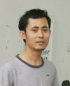
Bradd Westmoreland

Bradd Westmoreland, ‘The optimist’, 2010/11, oil on canvas, 33 x 24 cm

Bradd Westmoreland, ‘Blue boy’, 2011, oil on canvas, 55 x 40 cm

Peter Walsh, ‘Deposition’, date unknown, oil on canvas, 106.5 x 91.3 cm


New tricks

Sometimes when you see a series of shows what strikes you is not so much the specific intent of each, but a more generally pervasive feeling. It can be hard to discern whether or not this speaks of your own existing preoccupations more or less than the external prompt offered by an exhibition. Often neither, at least not entirely. The ‘meaning’ of a show resides somewhere in-between.

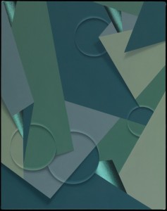
Writing on the practice of London-based painter Tomma Abts, Jan Verwoert drew attention to Abts’s ability to imbue her paintings with a corporeal presence at odds with their apparently analytical formal construction. Although they remain just out of reach, looking at these works is to understand that real things here are mirrored, distorted. In returning from a collaboration with the unknown, Abts’s work is located within a specific lineage. As noted by Paul Klee, art like hers engages a visual language ‘abstract with memories’.

Over the last month in Melbourne it seemed that practices that unwound the mystery at the heart of projects like Abts’s were everywhere I turned. In contrast to the ahistorical quality of the German artist’s work, many of these strike me as existing within a more definite art historical trajectory. This art’s tendency to reframe the lofty aims of abstraction by locating them in the everyday was made possible by certain conditions of art after modernism.

In his essay on Abts, Verwoert goes on to note that ‘abstraction is the opposite of information’, which I take to mean that in an information-rich world, abstraction goes against the tide of instant recognition. Kind of like the art world equivalent of the slow food movement. It would seem then that locating abstraction as a readymade is a different project entirely. Undoubtedly this strategy is often smart and seductive, but it also implicates the viewer in a different way—in a sometimes frustrating double bind, you can’t help but get the joke (or the trick, or the process) whether you like it or not. By contrast, Abts’s paintings present us with a ‘dumbness’ in that their language provides imperfect means to render unknowable things—even their titles are imperfect approximations of ‘real’ language. Unlike much work on display in Melbourne recently, the fact that the viewer doesn’t ‘get it’ is exactly their point.

Elizabeth Pulie, Mixed historical, Neon Parc, Melbourne, 6–30 June 2012.
Peter Atkins, The monopoly project, Tolarno Galleries, Melbourne, 2–30 June 2012.
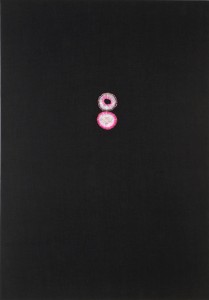
Alasdair McLuckie, Pink lions, Murray White Room, Melbourne, 27 April – 9 June 2012.
John Nixon, EPW: colour-music, Gertrude Contemporary, Melbourne, 1–30 June 2012.

Tomma Abts, ‘Hemko’, 2009 synthetic polymer paint and oil on canvas, 48 x 38 cm

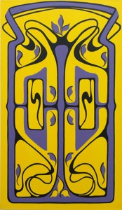
Elizabeth Pulie, ‘Fourteen’, 1990, synthetic polymer paint on canvas, 140 x 80 cm

Alasdair McLuckie, ‘Untitled’, 2012, pink agate and bead thread on canvas, 153 x 107 cm. Photo: John Brash


House and home

‘This is a country of many colourful, patterned, plastic veneers, of brick-veneer villas, and the White Australia Policy.’ Robin Boyd, The Australian ugliness.

The recent re-release by Text Publishing of The Australian ugliness by Robin Boyd, first published in 1960, provides an occasion to reflect on the prevailing views around cultural diversity. Written from the point of view of an architect and town planner, it is a hilarious read and a great work of social satire, according to which the aspirational drive for individualism and excess has been the downfall of any attempts at coming to some useful agreement on matters of progressive design in the post-colonial era. He has a point, of course, but it was and is a losing battle. I was thinking of this when viewing two recent exhibitions that dwell on the cultural life of the European expatriate.

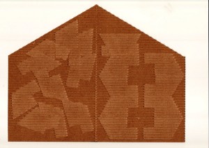
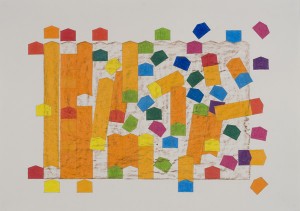
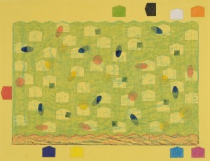
In flotsamandjetsam, at Place Gallery in Richmond, Alex Selenitsch draws on his experience of being part of the first wave of European migration after the Second World War. Here, the memory of the singularly basic accommodation provided by the Bonegilla Migrant Reception Centre in north-eastern Victoria is reduced to the simple form of the box with a triangular roof (a dormitory hut from the side view). The kaleidoscopic refraction of textures, patterns and shapes, re-arranged like Cuisenaire rods, presents what for Selenitsch was evidently a childhood memory repeated ad infinitum.

Institutionalisation can do this, of course. As I know from my mother’s experience, life at Bonegilla, as the last stop in many years of migrant camp life, was no Bauhaus experiment. Living in a bare hut under a corrugated iron roof, hot in summer, freezing in winter, with men and women segregated etc. meant that the very suburbia that Boyd mocked must have looked like heaven with curtains. In such circumstances, away from such relentless utilitarian conformity, it is no wonder that the ‘new Australian’ would conform to type by filling the house with antiques and European folk art (as my mother did).

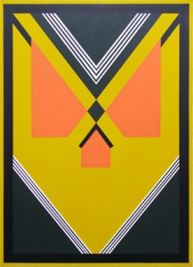
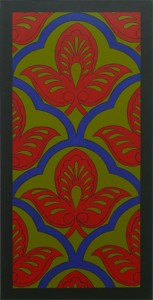
Responding in kind, the paintings of Elizabeth Pulie at Neon Parc lay claim to a northern Italian heritage and a predilection for old pattern books and what otherwise might be described as ‘Mixed Historical’. Here, Pulie brings together the exquisite flourishes of art nouveau, geometric art deco and those devolved stencilled botanicals in acculturated pastel colours and hieratic borders to signify this oddly eclectic heritage in her precisely numbered series of paintings, of which the small selection presents a representative few. Each one, in its own way, is reconfigured as a model of symmetry and harmony, lending hope to the possibility that even Boyd may have approved of the alternating template.

Alex Selenitsch, flotsamandjetsam, Place Gallery, Melbourne, 9 May – 2 June 2012.

Elizabeth Pulie, Mixed historical, Neon Parc, Melbourne, 6–30 June 2012.

Alex Selenitsch, ‘Guest: host (pseudo-trapeziods)’, 2008, indents on corrugated cardboard. Photo: Robert Colvin

Alex Selenitsch, ‘Dispersed brown slab’, 2012, aquarelle and pencil on paper. Photo: Robert Colvin

Alex Selenitsch, ‘Aggregate #2 (green)’, 2009, aquarelle and pencil on paper. Photo: Robert Colvin

Elizabeth Pulie, ‘Nineteen’, 1990, synthetic polymer paint on canvas

Elizabeth Pulie, ‘Fourteen’, 1990, synthetic polymer paint on canvas

Elizabeth Pulie, ‘Seventeen’, 1990, synthetic polymer paint on canvas


OMG

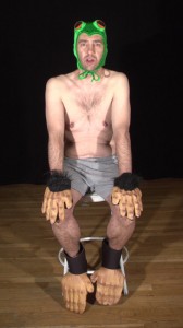
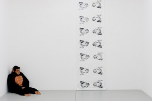
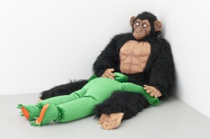
Tony Schwensen’s exhibition at Kalimanrawlins is based on a YouTube meme: a chimp, in the Honolulu Zoo, fucking a live frog that had hopped into his enclosure. Over five million hits. The YouTube video is an unshockingly blurry depiction of its title: Video what the hell another freaky monkey rapes frog orally!. One of the works in Monkey business I is a video of Schwensen sitting on a stool, po-faced and dressed in the hands and feet of a guerrilla costume and a frog hat/mask, repeating the words, ‘I’m a human being, I’m a real human being’. Monkey business I employs meme as motif, where Schwensen has submitted the chimp clip to graphic reinterpretation, to slowing down, to further repetition, and moreover he has trussed it to art history.

The meme works like an evanescent Venn diagram that locks into a cross-section of pop cultural, social and/or political situationism and holds attention for a tiny blip of time. Part of the ‘value’ of the meme is an account of exactly how much attention it holds—which is trackable on the YouTube ‘views’ counter or its visibility more broadly (as a catch-phrase or as an image printed on T-shirts). So any humanity and perhaps possible resonance in the meme subject becomes squeezed out in deference to the numbers who have ‘viewed’. A meme is an ultimate one-time-only one-liner.

In a statement (downloadable on the Kalimanrawlins website), Schwensen writes about his ‘intrigue’ in relation to the video and the further research it inspired him to undertake. This way of looking appears plainly antithetical to the meme’s function in our (collective) psyche. Schwensen also declares that he has watched the video almost daily for the past two years.

Walking through Michelle Ussher’s dense, narratively embedded and symbolically encoded psychological portraits in the larger front gallery, with Schwensen’s soundtrack undermining its logic, made for an absurd and funny reading of the obfuscatory. In some ways, where Ussher’s and Schwensen’s approaches meet is where we, as viewers, end up holding information we shouldn’t. Because we are inadvertently drawn into an information chain, where ‘intrigue’ is a congealing of the repellant and the compulsive.

I went to see a band play recently; two accompanying cage dancers moved constantly and rhythmically throughout their two-hour set. Two sets of almost identical hips, waggling centrifugally and compelling us, the audience, into hypnotic, less well-practised mirrored action. A friend I was with vaguely knew one of the dancers, and, interrupting my transfixed state, told me not the dancer’s name, but that she was in psychoanalysis. At the time I tried to calculate how many hours of dancing might equate to the cost of one session.

Tony Schwensen, Monkey business I, Kalimanrawlins, Melbourne, 2–30 June 2012.

Tony Schwensen, ‘Monkey business I’, 2012

Tony Schwensen, ‘Monkey business I’, 2012

Tony Schwensen, ‘Monkey business I’, 2012


An interview with Azam Aris

1. The duck and the moon

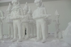
Azam Aris: They are actually trying to do this here now—send an astronaut into space. Not just for scientific experiments but because of the idea that there has to be a Malaysian in space. That is OK for me. It’s actually good. You can create this image in education, in high schools. The moon is a kind of Malaysian dream. It is costing a lot of money this astronaut. But there are many stories about the moon. In fact moonlight is a potent energy in Malay.

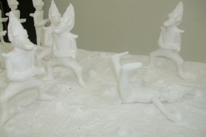
So I like to create characters and images to make a story happen. With this story there are two plots. This is the first one [image above] with the general on the lunar surface. And this is the second [image below], where the general faints after giving orders and then everybody changes into a style of duck, with splayed legs and peaks. I like the duck, but it’s not about the duck so much as I just wanted to change the scene from the military style of the first plot.

I’m not really thinking about what the duck is. I just wanted a weird thing. The casts and these sets will be the basis of final works that will be painted.

2. Cleaning

Azam Aris: This is another storyboard of the ducks for a different work. The acting is different but the characters are the same. They are throwing something, pouring something into a big pool (a sink), and the other one is turning on the tap. It’s all about making things disappear, evidence disappear, making everything clean. So the concept is cleaning, black money or whatever.

3. Aliens

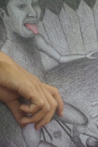
Azam Aris: My work is to make connections … so with this work it’s a mobile: this arm on the drawing is going ‘tuk tuk tuk’, moving, the hand with the axe is rotating to cut the wood. He’s burning the alien. That’s the story.

4. Wall and fence

Azam Aris: It’s like a partition for your own side. Actually it’s like going to the backyard. I’m creating the small garden that people can’t see unless they are out the back. That is where things happen.

It’s a similar kind of story in wayang kulit. Wayang is the shadow theatre and kulit is the animal skin on the puppets. In wayang kulit they understand that there is more going on backstage. It’s where the gamelan is, and the tok dalang is the puppet master: the man who controls everything. I’m trying to use this concept with this idea of the backstage, the hidden place, the secret place where the action actually happens.

There is another aspect to this image of the fence too, somehow, where I’m thinking about the wall in the Middle East: the Muslim wall in Jerusalem. I’ve used this fence image as a backdrop in a lot of work.

Azam Aris, 23 June 2012

Azam Aris is a resident artist at Rimbun Dahan, Kuang, Selangor, Malaysia, through 2012.


The what and the why: Berlinde De Bruyckere

I once ordered an exhibition catalogue from overseas. It came in a brown paper package, beautifully bound, with a 10 x 8 cm image of each represented artist’s work. I lent it and lost it. I remember only one image from that book: a distended headless horse-ness. I saw a preview for Berlinde De Bruyckere’s show at ACCA and had to go.

It was a hazy recollection of a very small image and it did not prepare me for the vastness of scale when I walked into the exhibition space. Not even the ACCA publicity shots captured it. Headless horses merged together and hung. One (hind) leg tethered, the way they do in slaughter-houses apparently, to bleed the animals, ensuring tender meat. The work awed and overwhelmed me.

I went to the show with two students of mine, Therese and Linda. At first they spoke about the what of it. What was it made of? What was the artist thinking? What did it mean? I asked them to consider the why.

Later, another student, David, a former neurophysiologist, was drawn into the conversation. Immediately it was the what of the work that outraged him, or at least directed his moral compass: ‘The work employed intentional shock value and the use of their [the horses’] dead flesh as art was disrespectful to their being’.

I do love a stoush, so I interjected: ‘How much more respect is a leather couch?’.

‘Oh, but that’s functional.’

And so it continued. The neurophysiologist related how, as a research scientist, he had used animals, ‘but their deaths were for a purpose’.

‘Is art not for a purpose?’ I continued, teasingly.

Therese interjected: ‘Could it be that [David] had not reconciled himself to particular aspects of the work [he] had undertaken as a research scientist?’.

‘Perhaps that is true’, David admitted.

Next we all went along to the ‘On flesh’ discussion, one of the public programs that accompanied the show.

Among the panel members was a meat scientist from the CSIRO. We were informed that ‘slaughter-house’ is not the correct term when referring to a slaughter-house. It is properly called a ‘processing plant’. Of course.

An embalmer offered that we should learn to embrace death. He was good-humoured and compassionate. He had made black shiny maracas with his grandparents’ ‘cremains’.

There was a professor of film, and a psychologist with expertise in disgust. The psychologist spoke of cognitive dissonance. Finally, there was a chef and meat merchant, who relished meat. He was the only one on the panel who had killed an animal (with his father at age six), to learn where meat came from.

Afterward we had dinner at Cookie. The pork belly was excellent. Inspired or inflamed, our conversation went from Victorian England—serfs and landowners—to politicians and rulers and the countless soldiers sent to wars around the world.

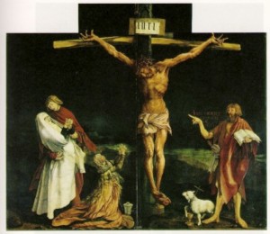
I thought of Grünewald’s depiction of the crucifixion, how an image of torture and a depiction of death and suffering becomes an image of reverence and humility.

I think I thought of the why.

Berlinde De Bruyckere, We are all flesh, ACCA, Melbourne, 2 June – 29 July 2012.
Matthias Grünewald, ‘The crucifixion’, 1510–15, oil on panel


Digesting Michael

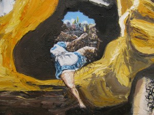
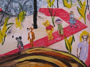
In 2010, I visited Fergus Binns quite regularly for lunch at Friends of the Earth. We’d nibble on our organic lunch plate and then head upstairs to his Smith Street studio to have a look at what he was up to. The painting taking shape for the bulk of that year was Toy painting (Alice in Neverland), a huge exploration in oil paint that calls on pop imagery and art history to unpack HIStory. I walked away from my first encounter quite flabbergasted at the sheer ambition of the work. Two years later and it’s still on my mind. The painting roams across an expanse of psychology and painting territory, crossing the gruesome power of paintings such as Goya’s Saturn devouring one of his sons with a sea of fairy-tale symbols surrounding the King of Pop’s harassment within the psychedelic Neverlandscape. Like Jackson himself, the painting is best left with this short introduction or a very long analysis.

Fergus Binns is a studio artist at Gertrude Contemporary and has a show opening at Utopian Slumps on 19 October this year.

Fergus Binns, ‘Toy painting (Alice in Neverland)’ (detail), 2010, oil on canvas, 152 x 121 cm

Fergus Binns, ‘Toy painting (Alice in Neverland)’ (detail), 2010, oil on canvas, 152 x 121 cm

Fergus Binns, ‘Toy painting (Alice in Neverland)’ (detail), 2010, oil on canvas, 152 x 121 cm

Fergus Binns, ‘Toy painting (Alice in Neverland)’ (detail), 2010, oil on canvas, 152 x 121 cm

Fergus Binns, ‘Toy painting (Alice in Neverland)’, 2010, oil on canvas, 152 x 121 cm

Fergus Binns


The green text