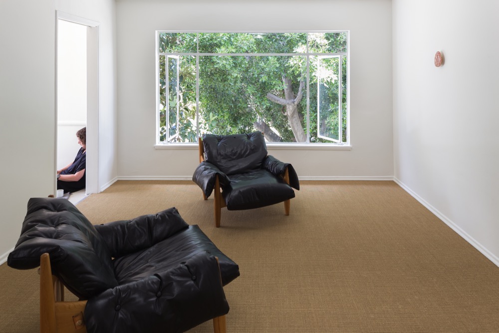
This is the archive for Stamm, an online publishing project initiated by artist Jonathan Nichols in 2012. The periodical was designed to foster fast, reactive and timely art criticism at a time when art criticism in Melbourne was limited to a few printed publications with long lead-times. ‘Stamm’ is short for ‘Stammtisch’, the German word for ‘regulars’ table’, an unstructured regular get-together between people with common interests, and also the table around which these convivial gatherings take place. The project reflects this etymology in the writers’ voluntary participation, their engagement with a peer-to-peer editing process, and various other structural interventions devised by Nichols.
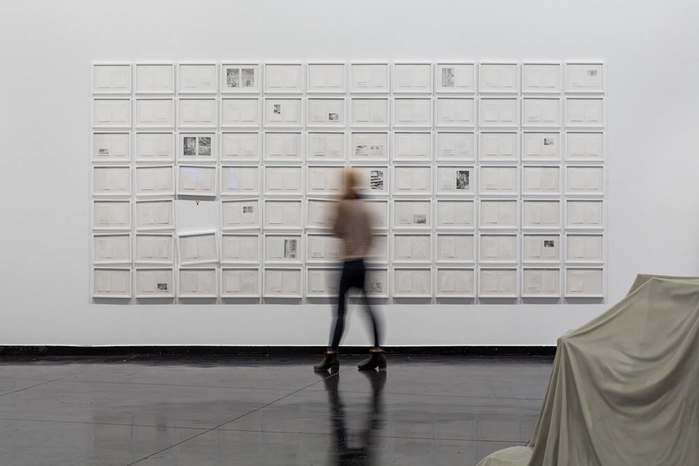
Stamm’s more-or-less monthly publishing cycle mirrored the schedule of exhibitions in commercial and artist-run spaces. The brief was to reciprocate the material practice of artists. Through conversations around editing, the writing collective tested the possibility of intimate reflection. Stamm, which circulated to a readership of more than 5,000, produced 163 individual essays on contemporary art authored by 18 writers, a cohort that expanded internationally over the course of four years. From the more academic to the poetic, humorous and digressive, individual styles coalesced to embody a spirit of independence, camaraderie and criticality. In a sense Stamm sought to forge a ‘reverse public’ where the writers themselves were the foremost readership and the subscribers were a secondary audience.
Stamm was edited by Jonathan Nichols in 2012 and 2013, and by Amita Kirpalani in 2015. It was produced by Jane Karnowski, and designed by Adrian Karnowski.
Jane Karnowski
Email: janekarnowski [at] gmail [dot] com
Amita Kirpalani
Email: amita [dot] kirpalani [at] gmail [dot] com
Jonathan Nichols
Email: jfnichols88 [at] gmail [dot] com
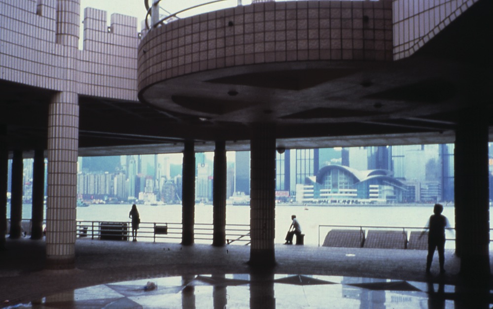
Secret art places: Part II
Cetate Arts Danube, the other art-camp I visited in August, has been situated since 2008 on the same premises as the one in Tescani, but the methods of work are somewhat different. Initiated and supported by the Joana Grevers Foundation in Bucharest, the art-camp in Cetate is hosted in a mansion built between the end of the 19th century and the beginning of the 20th century by a local landlord, Barbu Drugă. It is a beautiful Art Deco building, with Mediterranean influences.
Ştefan Creţu (RO), Simon Iurino (IT/ AT), Cristian Răduţă (RO), and Napoleon Tiron (RO) were the four artists invited to create new artworks in Cetate last summer. Over the years, all the invited artists have colonised the available spaces with their art: the old barn has taken the function of a Kunsthalle, while the vast area surrounding the buildings contains artistic interventions that surprise the viewer, especially in connection with the architecture of the place.
Napoleon Tiron, an iconic Romanian sculptor now in his eighties, placed a monumental sculpture of multiple spread wings in the garden of the mansion. For days, he cut and calculated dimensions, researching the area in order to find a position for his structure. At the time of the residence in Cetate, Napoleon had been reading about the history of landscape, van Gogh’s letters to his brother and various biographies of artists and musicians, and these writings inspired him to closely listen to nature and the sounds people were making.
Not far from Napoleon’s work, Cristian Răduţă placed a tree-shaped stand decorated with coloured plastic plates he had bought from the local market. He was calling this construction “a utility tree”, and it represented a major change in his practice, as Cristian had previously been oriented towards large-format sculptures, usually using different resins, which were bound to the studio, without exploring or interacting that much with the surroundings.
Ştefan Creţu, one of the artists that had been coming to the mansion for several years, sought inspiration for his kinetic sculptures in Darwinism. His main interest is following the evolution of humanity from amphibian to machine, stressing the limits of artificial intelligence.
Simon Iurino was focused on utilising materials from existing structures, working with the plan of the space, appropriating their context and analysing the function that these old objects had before. The series of cyanotypes he produced at Cetate were describing fragments of architectural details, combining the textile with the text and its form, in an attempt to test the expansion of linguistics.
While wondering about the local mythology in the remote village of Cetate, I unexpectedly met the British writer Selma Dabbagh who joined us for dinner one evening. She was writer-in-residence at Port Cultural Cetate, the old agricultural port by the Danube, once part of the Barbu Drugă’s estate and transformed in recent years into a cultural centre by the Romanian dissident poet Mircea Dinescu.
Selma had been talking to the local people, taking notes on mysterious situations and exploring stories told by the villagers while they were pursuing their daily errands. The night we met, during the time we were visiting the cellars of the mansion, Selma mentioned a very interesting story about a young woman turning old upon her death. The story somehow brought me closer to the intimate strata of the community, surrounded by borders – the first border being the Danube, from where one can spot the second and the third borders with Bulgaria and Serbia.
As I noted at the beginning of the text, the combination of the shock of the image, the human condition and the thin line between past, present and future define the spaces that assume a position outside the standardised art system.
And here is the story told by Selma:
The woman who serves us waves her hands around. I understand nothing of what she says. I am the only person in Port Cetate who does not speak fluent Romanian. There are many things I still don’t understand about Romania, but at least I have learnt not to mention Dracula. Port Cetate, on the Danube in the west of Romania, where I am writer-in-residence for a fortnight, has set up a sculpture park of angels to counter the Dracula park project being mooted for Transylvania, a region in the north of the country. There is indignation in the look of the woman serving us, possibly at not being deemed credible; that much I can comprehend from her challenging eyes. I like this serving woman. She bounds from table to table, talks in a flurry and has no time for anyone. She’s like an Almodovar woman without the legs, high-heels or subtitles.
What is she saying?
They’ll tell me. It’s a long story. A big story. It has been going on all week. But interpreters are fallible. If their curiosity does not match yours, you end up with holes in your tale, gaps that can only be sewn together by fictions.
First they tell me this:
There had been a death. A woman. A mother of six children in the local village, Cetate, where all the workers came from. This woman, a relative of many who worked in the kitchen, had fallen in the road, was taken to the hospital and died in childbirth. The baby was fine.
I couldn’t get this at all.
Tragic? Yes.
Deserving of the facial expressions and daily updates? No.
Could someone explain further please?
The thing, they explained, was the body. The body of the woman had aged. When they went to bury this woman in her thirties, they found an old woman. She looked at least 70 in the open coffin.
What else? Surely there was more.
They now felt she was haunting them. She had scared them. They could still see her. She never went to the hospital to give birth. She never would have been in the hospital if she had not collapsed. There had been many other children – that was the other thing – maybe as many as 22. The others were born and buried in the woods. Only a handful survived. That’s why they feared her. That’s why she couldn’t rest.
On my last Saturday I am taken to one of the workers’ houses in Cetate for a barbecue. We open the wine by pushing the cork in after banging its bottom against the rough stucco wall of the house. I eat a spicy sausage sitting on a blue plastic stool and am handed a litre of rosé in a tankard. A mobile phone is propped up in an empty beer glass to play us some music as we sit. There’s chat. Someone hands me a phone with a photograph displayed: a baby in a blue and white onesie lying on a towel. The child, it is explained, is the boy of the woman who died.
He’s being baptised the next day. Isn’t he cute? I consider the wriggling infant trapped in the tiny screen: a child known from birth as the progeny of an infanticidal witch.
Angelic, I reply, slipping the phone back into the glass for the music to continue.
The 20th century mansion at Cetate that hosts artists each summer. Photo: Ştefan Radu Creţu
Cristian Răduţă’s intervention in the shape of a tree decorated with colored plastic plates and located in the garden of the mansion. Photo: Ştefan Radu Creţu. Courtesy of the artist and Joana Grevers Foundation
The angel with multiple wings created by Napoleon Tiron. Photo: Ştefan Radu Creţu. Courtesy of the artist and Joana Grevers Foundation
Simon Iurino’s installation that questions space—emotional, physical, imagined and hidden. Photo: Ştefan Radu Creţu. Courtesy of the artist and Joana Grevers Foundation
One of Ştefan Radu Creţu’s mythical creatures is crawling on an old wall. Photo: Ştefan Radu Creţu. Courtesy of the artist and Joana Grevers Foundation
The group of artists in Cetate. Standing L-R: Ecaterina Dinulescu (the coordinator of the project) and Napoleon Tiron; Seated L-R: Cristian Răduţă, Ştefan Radu Creţu and Jacques, Simon Iurino
The old smith’s shop was transformed in a chapel by architect Alexandra Afrasinei in 2013
Franti, out!
Careof is a not-for-profit space in Milan hosted in a public architectural complex called La Fabbrica del Vapore (The Steam Factory) which, at the beginning of the 1900s, was where trams were built. The site is next to the calm beauty of Cimitero Monumentale, a tidy layout of trees and tombs of various styles and sizes. On the opposite side is the lively Chinatown, always buzzing with people, plenty of shops and more recently trendy bars serving bubble tea.
A blasting sound can be heard outside the space’s entrance, darkened for Franti, Fuori!, Diego Marcon’s solo show. Upon entering, the eyes adjust to discover a strange statue, approximately 160 cm tall, charcoal grey. In the dark it is difficult to decipher the material it is made of. It could be concrete, but it is wooden and worn out, like it had to endure the weather outdoors for some time. It depicts a bizarre creature with human features, a prominent belly and half-closed bulging eyes, somewhere between a Disney character, Paul McCarthy’s sculpture and a big garden dwarf, yet the pose of the hands with outstretched open palms, looks like Christ the Redeemer in Rio. The statue embodies a threshold, some kind of portal to other subjective dimensions, a clownish apparition like in Stephen King’s IT.
Four films play off 16mm loops sitting on metallic stands, projected directly onto the white walls at the same close focus distance. The sound of the analogue projectors is exceeded by two big speakers playing noises seemingly repeating at short intervals. After better scanning the space, the viewer becomes aware of a small screen fixed on the ground and animated through a retro-projection, showing the dwindling cartoon image of an owl on a rocking chair.
The films are studies on the recurring subject of a falling head, bending, almost collapsing. Marcon refers to them as “direct animations” and chose four for the exhibition out of the series he had been working on for months, patiently drawing and applying by hand ink, colours and scratches directly onto the film rolls. After studying cinema techniques, Marcon has been employing both digital and analogue formats in his practice, exploring the memories or documentary potential embedded in video documents. Franti, Fuori! is a hypnotic and inspired reflection on the medium of film and constitutes a turning point in the artist’s work. It’s the result of a long research in which Marcon was trying to counteract his weariness with the omnipresence of images, exhaustion with their representation and worry about their exploitation for ideological purposes, in particular as he had witnessed in Paris in the aftermath of the Charlie Hebdo attacks and when he arrived in Milan.
The partial view of a man’s face, his abstracted eyebrows and eyes, are those of the artist. These portraits, rather than an act of vanity, are a genuine attempt to go back to the source, the closest material at hand, and function as a frank questioning of one’s intentions before moving on to add further external layers. The title of the show references an old novel that used to be compulsory reading in Italian primary schools up until 60 years ago, called Cuore (Heart). Franti, the antihero, is a complex character who is first sent out of the classroom and eventually kicked out of school. In the preface to the book the writer De Amicis addresses his audience of children with the sentence: “I hope it will make you happy and bring you some good.” Within this show it is difficult to find a moral compass: on the one hand it hints at an overturning of reality, reminiscent of the dramaturgy of horror movies and introducing hidden symbols, whilst on the other it is imbued with a candor and honesty so rare to find these days. The celluloid surface is still the place where fiction thrives and a viewer can get out of oneself, and decide to follow Diego Marcon wherever he wants to go to next.
Diego Marcon, Franti, Fuori!, Careof, Milan, Italy, 22 September – 14 November 2016.
Diego Marcon, ‘Untitled (Head falling 01)’, 2015, camera-less animation, fabric ink, permanent ink and scratches on 16mm clear film leader, colour, silent, 10” looped. Frame from the film transfer. Courtesy of the artist
Diego Marcon, ‘Untitled (Head falling 02 & 05)’, 2015; ‘Untitled (All pigs must die)’, 2015 and ‘Untitled (Head falling 04)’, 2015. Photo: Edoardo Pasero. Courtesy of the artist
Diego Marcon, ‘Untitled (Head falling 02 & 05)’, 2015, camera-less animation, fabric ink, permanent ink and scratches on 16mm clear film leader, colour, silent, 10” looped. Photo: Alessandro Nassiri. Courtesy of the artist
Diego Marcon, ‘Untitled (All pigs must die)’, 2015 and ‘Untitled (Head falling 01)’, 2015, Photo: Alessandro Nassiri. Courtesy of the artist
Secret art places: Part I
The exhibition Nouvelles histoires de fantômes, prepared by Georges Didi-Huberman and Arno Gisinger and presented this year in the Palais de Tokyo, discussed the after-life of images, trying to explain how the visuality of the present is being formed after a century of art that had been politicized since WWI, and how our artistic memory is shaped by this panoply of visual information.
Aby Warburg’s Mnemosyne Atlas stood at the core of this major installation of images and archive material, first displayed at Museo Centro de Arte Reina Sofía in 2010. The beautiful publication produced for the occasion inspired me for a while in my writings and thinking about art, as it was articulate, coherent and had “a soul”. In the exhibition, apart from the strong imagery, like Harun Farocki’s videos, one could see Paul Klee’s herbarium, with his related writings and graphics, or Sol LeWitt’s photo collages.
It was exactly this relationship between contemporary visuality – the private life of an artwork operating like the mechanisms of the human condition – that has led me to explore several art-camps in Romania (tabara artistica in Romanian) this summer, with the purpose of tracking the different conditions of the artistic discourse, that are not always visible due to the accelerated rhythm of the art system. And I would like to talk about two of them: one in Tescani, a small village in the Eastern part of Romania and one in Cetate, another small village in the Southern part of the country, near the Danube. What is interesting about art-camps is that they have a structure different from that of a residency – they do have an organization behind them, but it is not that visible and it usually depends on a handful of dedicated people that make things work. In an art-camp, it is normal to have the same group of artists that meet there each year, spending from two to four weeks together, creating a connection between each other and a continuity that shapes the specific identity of the location. Even though they have interests in various media, the artists tend to explore the possibilities of traditional materials and practices, trying to stay away from the computer. The awe-inspiring landscape brings inspiration and character to the artistic process, and also a real environment for thinking and debate.
The art-camp in Tescani is housed in the mansion of an old Romanian noble family, Rosetti-Tescanu. Built at the end of the 19th century, in a pure classical style, the building is flooded by light and surrounded by a dendrologic park. The observer can easily distinguish here layers of history, stories and expectations. After the heir of the family, Maruca, married the renowned Romanian composer George Enescu, the house became the drawing-room of Enescu. In 1947, the year communism was established in Romania, the mansion was donated by the family to the Romanian state and became a cultural centre. In the 1980s it became a memorial house dedicated to the Rosetti-Enescu family.
Colonia 21 is an artistic group that was formed in 2003 around another art-camp, through the initiative of Romanian painter Teodor Moraru, and supported by The Concerts Society Bistrita. Since 2008, Colonia 21 has been convening each summer in Tescani. Apart from the main group, each year there are several invited artists, together with the recipient of the Teodor Moraru Scholarship. During my stay, there were eleven Romanian artists working in Tescani: Dan Badea, Dragos Badita, Dragos Burlacu, Claudiu Ciobanu, Marius Craita Mandra, Anca Irinciuc, Cristina Nedelea, Maria Pop Timaru, Justinian Scarlatescu, Alex Tomazatos and Zoltan Béla.
Under a pavilion, hidden behind the mansion, one would discover Zoltan Bela, Anca Irinciunc, Justinian Scarlatescu and Cristina Nedelea working on several canvases at the same time.
I have been familiar with Zoltan Bela’s practice for several years, and this July, I met him at a moment when he wanted to change his style of painting radically. Focused on the process and on the daily experience, Bela was taking notes and observing the small details of the space, staying away from photography, while positioning himself closer to nature.
In her paintings, Anca Irinciunc was combining elements she kept seeing in her walks around Tescani, like the same horse, or a plate with the message “House for Sale”, with the way light was falling on the pavilion and on the grass in certain moments of the day. Hybrid pictures, sometimes visually uncomfortable, were resulting from decomposing the real images.
Working with a large collection of original photographs that he collected from flea markets in Bucharest, Justinian Scarlatescu was transferring the images onto canvas and intervening in them, often using rudimentary equipment and expired films, without controlling the result. His purpose was to address memory and to break the chain of reproducing visual information.
Cristina Nedelea mentioned that the artists in Tescani form a nucleus, with a specific interest in landscape, drawing and the figurative. Selections of art movies and the stereotypical imagery used lucidly by film directors to express certain states of mind represented an important part of the documentary material and a basis for their discussions.
Marius Craita Mandra analyzed through his paintings the relation between the rhythm of everyday life and the standardization of the daily through the use of computers. His human models resembled cases that had been emptied of their private contents, and re-filled with information that didn’t belong to them.
Dragos Badita, the recipient of this year’s Teodor Moraru Scholarship, used his observations of the surroundings and of the people working the fields to draw with Indian ink on paper flamboyant landscapes communicating the intensity of the wind through the trees and the valleys.
A good dose of humor, mythology and contemporary living are coordinates that Maria Pop Timaru combined in her drawings and objects. The comments she was making on paper, in the form of writing or futurist drawings, would be later transformed into wooden objects that talked about childhood memories and disruptive political situations.
Dragos Burlacu was tracing the spaces of experiment, that for instance included eating together with all the artists at the same table, and introducing the presence of an invisible character or a fictitious situation that would bring criticality in the form of humorous postures or comments. I mention here the painting displaying the aerial view of a friendly dinner among artists, as if God was the beholder, but in the same time the part-taker to a conspiracy.
Studying the various eating habits of people was also one of Dan Badea’s preoccupations. Concerned with how space in general generally evolved around him – at the private, as well as the professional level – Dan Badea filled the role of commentator for the group, often using moments in the past to justify a present day situation.
After approaching local topics in his paintings, Claudiu Ciobanu chose to work on an idea he had developed before coming to Tescani. Because the mansion has many places where the guests can sleep or hide, and was meant to shelter creative minds since the beginning of the 20th century, Claudiu commented in his works upon different stances of sleep or of covering someone’s identity.
Active as a biologist specialising in the discovery of viruses, Alex Tomazatos transformed his photographic camera into a strong and pragmatic eye documenting reality (but not necessarily the truth) about a situation. Exploring areas around Tescani that were hard to access, the photographer preferred to see what was hiding underneath the bed, or in the depth of the forest, or in the ditches on the sides of the road, a method of research that resembled his study of viruses.
In my opinion, these spaces of synthesis, where several worlds collide, define a fourth temporal dimension, a transversal and innocent time, untouched by expectation or alterity.
To be continued…
‘Tescani’, Photo: Dragos Badita
The resident artists in the art-camp in Tescani. Photo: Dragos Badita
The wood-workshop of Maria Pop Timaru. Photo: Dragos Badita
Zoltan Bela paiting in plein-air. Photo: Justinian Scarlatescu
Anca Irinciuc and Justinian Scarlatescu working in the studio. Photo: Dragos Badita
The group of artists in Tescani. Upper row, from left to right: Anca Irinciuc, Justinian Scarlatescu, Dan Badea, Dragos Burlacu, Dragos Badita, Anca Verona Mihuleţ, Zoltan Bela, Alex Tomazatos and Cristina Nedelea. Lower row, from left to right: Claudiu Ciobanu, Marius Craita Mandra and Maria Pop Timaru
Dragos Burlacu, ‘Cena’, 2013, oil on stainless steel sheet, selectively sanded. Courtesy of the artist
Play your cards right (or how we never talk about money)
In the Melbourne art world, that ‘homeless’ look of a few years ago has seemingly been replaced by the gym-going-drunk-Mum and the Lumberjacktivist (part lumberjack, part Occupy bystander). I think the living-out-of-a-cardboard-box style was a bit more reflective of where artists are at – not homeless, but just surviving. Perhaps I’m wrong to look to fashion for clues of an attitudinal shift, but I’m reminded of that old adage: “Dress for the job you want, not the job you have.” Unlike any other corporatised system, you never want to look too coiffed or too tailored or expensively branded, and there is a curious silence about how to live. And by ‘how to live’, I mean how to pay for how you live.
Lots of volunteering or working for beer; lots of awkward ‘swaps’ for artwork you still aren’t sure about; lots of writing for ‘experience’, documenting shows for a pat on the back, or editing grant applications for an emoji. We are all good at not talking about money all the time. And there is a funny parity of excess – big ideas, big projects, big openings, big names, big font on big posters. We are play-acting at high-flying party mode a lot. And so when artists and curators come to visit, or when we make the move overseas, is it jealousy or plain old curiosity that makes us ask “How do you live over there?” Perhaps it’s both.
In a little known podcast well known writer Ta-Nehisi Coates who wrote this much read Atlantic piece is interviewed by his oldest (and not at all famous) friend Neil Drumming. They talk about the difference between being a snob and being boushie. Touchingly they also discuss how Coates’ money has changed the way he experiences the world, but not necessarily how he relates to it.
Mark Hilton, Half Flush, Darren Knight Gallery, Sydney, 14 November – 12 December 2015.
Mark Hilton, ‘Half Flush’, 2015, uncut printed playing cards, double-sided, edition of 10, 54.5 x 64.5 cm
Mark Hilton, ‘Half Flush’, 2015, uncut printed playing cards, double-sided, edition of 10, 54.5 x 64.5 cm
The holiday d’art
I recently returned from a few weeks in London and Venice. Was it fun? It was okay. Did you see lots of stuff? Yes. Was the art good? Yeah. Did you buy me anything? No. Did you take many pictures? HEAPS.
My intention for getting away was split evenly between some research I’ve been meaning to do for a while, and to secondly take a long overdue break.
Of course, being in London during Frieze and Venice for the Biennale meant that art significantly shaped my time away. As you’d expect with a trip filled with lots of looking, since getting back I’ve been using the photos on my phone as a reminder of what I saw and what my holiday self wanted to remember.
There was a lot of art, and like I said a lot of it was good, but nestled within these cultural spectacles were some other unintentional gems. My three favourites are below:
1. Walking around a crowded art fair like Frieze and observing gallery staff who were in clear need of a break, including a smartly dressed gallerist who, when I walked past his booth was watching a video on the Huffington Post called Koko the gorilla falls in love with a box of kittens.
2. People at the fair who coincidentally are dressed to match the artworks around them, my favourite being this visitor standing next to a Sam Gilliam work at David Kordansky Gallery. A further example was spotted near a Sol Calero pattern painting.
3. Placed ever so casually in Mika Rottenberg’s installation was this small hand-written note, asking visitors not to touch the artwork. Professional signage has never looked so good! I think I spotted five throughout the exhibition. Simply great.
56th International Art Exhibition, Venice Biennale 2015, Italy, 9 May – 22 November 2015.
Things I learned from ‘The Diplomat, the Artist and the Suit’, a documentary about architecture firm Denton Corker Marshall
1.
In the competitive field of architecture, three things are essential to success: The first is a level of diplomacy, required in the courtship and management of clients. The second is a high degree of artistry or design skill, indispensable for obvious reasons. The third is a suit. Many budding architects, in their hubris, neglect to acquire a suit. This is a mistake, for no level of artistic talent or interpersonal and management skills will compensate for deficiency of suit. The more ambitious will invest in a second suit, so as not to be without when the first is being dry-cleaned. However, when starting out, it isn’t necessary to purchase more than one suit. Seven is excessive.
2.
Barrie Marshall is the artist of the documentary’s title, a self-effacing, wiry-framed recluse with glassy brown eyes. I want to make love to him.
3.
Marshall lives in a concrete bunker resembling the HQ of a horribly disfigured cartoon villain with chainsaws for hands, sunk into a dune on the rugged Phillip Island coast. Its entrance is marked with a galvanized metal screen, its interior ruthlessly austere and as cold as the Bass Strait winds. There is a large enclosed courtyard, covered in dune grass. There are no penguins.
4.
In the history of vox pops (and probably since Neolithic times), no member of the pubic quizzed on the subject of new architecture in their city has had a single positive word to say.
5.
I bet he goes walking alone on Woolamai Beach in the driving rain, his mind harboring melancholic designs and secrets and a longing for the freedom of a sea bird.
6.
Jeff Kennett is the Lleyton Hewitt of Victorian public life. Now that our white-hot hatred has waned, the former premier’s/tennis champion’s comments are sought on the immaturity of community attitudes to public space development/Nick Kyrigos. Since retiring from office, Kennett may have done much to raise awareness of depression and anxiety but there is still a cactus where his heart should be and he still thinks we’re a bunch of lowlifes.
7.
Anyone who doesn’t like the DCM-designed cheese stick on Citylink is an idiot and should aspire to a higher level of architectural intelligence.
Across a range of factors—environmental sustainability, structural complexity, number and accessibility of public toilets—the DCM-designed Stonehenge visitor centre is, compared to the Stonehenge itself, the superior achievement.
10.
I doubt I’d actually make love to him if given the chance. His bed is probably made of zinc. What would we talk about afterwards? I‘d have to pretend to like the cheese stick.
John Denton, Barrie Marshall and Bill Corker. Photo: John Gollings. Image courtesy of the National Portrait Gallery, Canberra
Denton Corker Marshall, ‘Phillip Island House’. Photo: Richard Powers
Denton Corker Marshall, ‘Phillip Island House’. Photo: Richard Powers
‘I need you, the reader, to imagine us, for we don’t really exist if you don’t’. Vladimir Nabokov
Township Museum and Creepy Long Fingers
Getting down to writing this text has been a struggle. Battling a recent and obsessive addiction to the game Township has meant that moments between paid drone-work are filled harvesting digi-corn and carrots, feeding cattle and trying to level up to the point where I can buy a museum and a ship to sail to the other islands and collect ethnographic digi-objects for it.
That’s the dream. It will be like Pitt Rivers without the politics. I hope I can get a shrunken head.
‘Township’
However, on a completely different subject…
Having just completed an article on Rebecca Horn’s photograph Scratching Both Walls At Once (1974-5), in which the artist fabricated a pair of grossly elongated finger gloves to be able to reach, and scratch, both walls at once from the centre of a room, and also discovering the Salad Finger cartoons on YouTube, I have been mulling over the idea of creepy long fingers, and have designed the bones of an intensive seven week course involving a series of seminars, lectures and workshops on the subject of creepy long fingers. It might go something like this:
Creepy Long Fingers 1.0
Week 1.
Morning: General introduction to course
Afternoon: Lecture ‘The Mythology of the Creepy Long Finger’
We look at long-fingered figures from mythology and storytelling through history, from Tartaran half-peasant/half-monster Şüräle who tickles to death those lost into the forest, to the ape-like Moehau and the vampiric Nosferatu. How do these characters influence the monsters of popular culture today?
Evening Screening: Nosferatu (F.W. Murnau. 1922).
‘Shurale’, 1950, Kirov Theatre of Opera and Ballet, Leningrad, USSR. Image: www.balletandopera.com
Week 2.
Morning: Lecture ‘Filmic Fingers’
We examine creepy and non-creepy long fingers in film and television. Starting with Edison Studios’ Frankenstein (1910) we examine the filmic timeline of long fingers, both animated and otherwise, from extra-terrestrial long fingers within the Alien films to animated long fingers such as Jack’s Skellington’s from The Nightmare Before Christmas, the witch and bedlam from 2009’s Coraline and the horror-fied long fingers found in The Thing, The Babadook and Pan’s Labyrinth.
Afternoon: Visit/talk/Q+A with actor and contortionist Doug Jones who portrays both the pale man and faun from Pan’s Labyrinth.
Morning: Lecture ‘Lord of the Creepy Long Fingers’
This lecture will delve into the world of creepy long fingers in contemporary literature and fiction. Referring back to our mythology class we will refocus on the modern through the Gollum of Lord of the Rings, Voldemort and elves of Harry Potter and the foot long spider fingers of Roald Dahl’s The Witches. We will also look at a selection of short stories including Stephen King’s The Moving Finger.
Afternoon: Reading group and fiction writing workshop.
Evening Screening: The Witches (Nicolas Roeg. 1990).
Week 4.
Morning: Lecture ‘The Longest Finger on Earth’
We look at the life stories of those who have been, are renowned for or who hold world records for their long fingers and fingernails. Covering genetic long fingered-ness such as Robert Wadlow, who holds the Guinness World Record for the largest hands (and longest fingers) in the world, and long fingers that come about due to a disorder or disease such as Marfan Syndrome, which is sometimes characterised by very long thin fingers, or macrodactyly, a rare condition that caused Shanghai man Lui Hua’s thumb to swell to over 10.2 inches. We will also look at those who grow their fingernails to extreme lengths such as Chris Walton, who owns the current world record with combined fingernails over 20ft.
Visit: We will be visited by Lee Redmond who, with each measuring over 3ft long, previously held the record for the world’s longest fingernails, but unfortunately lost all ten in a car accident in 2009.
Evening Screening: My Strange Addiction: Rampant Rats/Extreme Fingernails (TV Episode. 2011)/At Midnight I’ll Take Your Soul (José Mojica Marins. 1963).
Lee Redmond. Image: www.guinnessworldrecords.com
Week 5.
Morning: Lecture ‘Creepy Creatures’
The aye-aye lives in the forests of Madagascar and uses its exceptionally long fingers to poke around in small holes searching for grubs. Legend has it that if the aye-aye points at you with its middle finger you are marked for impending death. This lecture will explore the creepy long fingers of the natural world from bats to tarsiers and through to the consideration of legs and tentacles as fingers in spiders, lobsters and jellyfish.
Afternoon: Visit to Bristol Zoo to see the world’s first aye-aye twins born in captivity.
Aye-aye at Bristol Zoo. Image: Bristol Zoo Gardens, UK
Week 6.
Morning: Lecture ‘Depressingly long fingers’
In this session we will explore how long fingers can be read and interpreted through the field of palmistry or hand analysis. Some people believe that having long fingers means you are more likely to be depressed, others that your finger length can predict how well you will do academically. There is a belief that the temporary elongation of your fingers can result in a rapid hypnosis effect. We will work through the different theories and research and also look at those who try to lengthen their own fingers by exercise or even surgery – why do they do this?
Afternoon: Visit to British Library where curator will give presentation on palmistry charts and finger philosophy within the print and book collections.
Evening: Optional session with palmist Gary Marwick who will give individual readings to group.
Week 7.
Afternoon: Lecture ‘Creepy Long Finger … Painting’
Looking at the use of creepy long fingers in art from the last century. Using Rebecca Horn’s performative work Scratching Both Walls at Once as a starting point, we travel through the strange gestural contemporary hand work of Nico Baixas, the paintings of Samuel Manggudja and the large-scale public works of Jose Revelino amongst many more.
Evening screening: N/A.
Closing colloquium with invited speakers TBC.
Rebecca Horn, ‘Scratching Both Walls at Once’, 1974-5. Image: Tate Liverpool
Performing relative states
“As for going along and watching people perform … There’s nobody in my experience … EVER … (who) you’d have gone to a game and could identify more rapidly than you could Buddy on the field …” 1
Buddy Franklin
The Wheeler Centre held Relative States, a series of interviews between creative couples, such as father-daughter duo, sports journalists Tim and Sam Lane. The basis of producer Amita Kirpalani’s design was to explore the intersection between the creative, professional and personal lives of these couples. Father Tim Lane and daughter Sam Lane spoke to football and care. When Tim was asked to discuss notable footballers, he spoke of Buddy Franklin and Sam Lane’s head nodded in agreement. He spoke of the physically identifying presence and swagger of a player. On a large green field I doubt I could identify Buddy’s face, but to recognize his body, movement and other player responses from such an abstract distance really struck a chord about the potential utility of every body in performance. Tim Lane’s comment appears to broach what it means to identify the micro qualities of an individual’s impact and unique movement, through the macro perspective of a field or the game.
Lawrence Weiner, ‘That which is brought to bear reducing the mass as it was & hindering passage as it is first move second move third move’, 2007
Sometimes it feels like all you may own is your movement. You may not own your body, but you often own the autonomy to cultivate how you move for best expression. When a performance artist uses their body, often they employ the rhetoric of governmentality. Does the body change when others participate? The performance I attended, as part of ACCA in the City, Public Movement’sTraining Ground, consisted of combat training through a monument walk and a final dualist performance-game-combat on a diagrammatic field in the city square. Here audience participants were invited to step into the constructed field and asked a series of polarizing in-or-out questions. Depending on what choice was made from the selection of questions, you were cordoned off and rounded into your marginalized group.
Public Movement: Training Ground, ACCA in the City, Melbourne, 2015
We know there is nothing like an injury to remind us of the material consequences of a game, combat or marginalization, but how are these principles or beliefs impacted when the audience become participants or performers in public? Do the audience’s bodies become symbolic? Are they camouflaged by the artist’s politic? Is the artist’s methodology all-enveloping as a skin for the audience to try on? How much movement can skin generate and is it resilient enough to hold the participants’ ghosts? Is there any autonomy for the body of the participatory audience?
Lawrence Weiner, ‘X Y & Z’, 2006
Like the relationships between father and daughter, it is very easy for ghosts to slip in and haunt these conversations.
Sam and Tim Lane, Relative States, The Wheeler Centre, Melbourne, 15 September 2015.
1. Tim Lane, ‘Relative States’, The Wheeler Centre, 15 September 2015.
How to quieten the mind
Lately my brain has been full of the effects of change and heat and nervous anticipation, and even in the quiet moments it is hard to find even a minute or two of contemplation from which an original thought or opinion might form itself into something worth spinning into the outside world. The last thing anyone needs is yet another mediocre observation from a brain full of scattered and racing thoughts.
When the present becomes too close to bear like this, the past comes into sharper focus. From this swirling mire of idea-less exhaustion came a memory of a first encounter with a work that really struck me as remarkable and true. Anne Noble’s The white veil of a novice“Our habit signifies complete detachment from the things of this world” is a black and white photograph from a series taken while in residence with Benedictine nuns in a London convent from 1988-90. It’s a portrait of a young nun, but also a mysterious study of light and form. The veil and its folds sit at the centre of this small work, which is barely 20 centimetres wide; a tiny sliver of the side of a face can also be seen. The drape of the folds is determined by the curve of the novice’s head, as still as marble. A dark shadow and an equally dark habit are voids against which the white veil sits. The wall is blank; a shadow settles across its left side. Its subject is thoroughly self-contained.
My memory is that I first saw this photo in a gallery in an old house on a hill in Auckland that is no longer there, but I can find no record of that now. Maybe we make memories to comfort ourselves. Either way, I would love to be sitting in front of it in that real or imagined place now.
Anne Noble, The white veil of a novice “Our habit signifies complete detachment from the things of this world”, 1992, black and white photograph, 131 x 196 mm
Against nature—Charles Lim and ‘Sea State’
We have a personal bomb shelter in our flat in Singapore; most homes do here. It’s a hard thing to reconcile. In my mind household bomb shelters are something that Hollywood invented via nuclear disaster movies such as The Road. Sure bomb shelters seem a long way from Charles Lim’s Sea State Singapore Pavilion exhibition, but then again it’s possibly a straight line.
Charles Lim’s artworks in Venice are in the main film and documentary material displaying Singapore’s endless land-reclamation activities and island geo-engineering. Singapore is highly engineered in the same way many newly emergent global cities are. Like other national pavilions though, it’s hard to get at exactly what is at stake.
The last artist I remember who confronted the triumphalism of national pavilions at Venice was Hans Haake in 1993, where he smashed up the Nazi-era German Pavilion. He lifted and broke all the stone flooring leaving it a place of disorder and latent violence, and adorned a photo of Hitler in the portico in remembrance of the visit to the building in 1938 and in the main pavilion wrote ‘GERMANIA’ over the top of it all.
So what about Sea State? Well it’s not smashing anything up. And it’s not anything like a Hans Ulrich Obrist-style ‘post-planning’ zone that is applied to other globalising Asian cities. Sea State by contrast is coherent and shaped. Its ideal is a fluid but dissipated sense of subjectivity. It is not declarative or demonstrative, quite the opposite.
It is a fact that wherever you might dig a hole in Singapore you will invariably come upon broken concrete and tiles, or kampong detritus and what was once foreign dirt. In a slightly double-schizoid way Shabbir Hussain Mustafa, the curator of Sea State, goes quite a way to dissuade intuitions that land-reclamation practices are in some way an unnatural act. In this he is aware of regional sensitivities where land possession arguments are involved but in my mind there is nothing particularly spooky about Sea State, even where Charles Lim twirls the stick a little in drawing attention to Pulau Sajahat translating as ‘Evil Island’.
The Sea State aesthetic is in large part cinematic and monumental. It is mesmerising and technologically intoxicating. Charles Lim has an intriguing knack with presentation where he strips away the black cover plastics from commercial screen equipment to leave sheer naked glass and metal.
From an international perspective what stands out with Sea State is the geo-political parallels in the South China Sea. China’s historic sea claims do in fact reach down just north of Singapore and the familial connections and social pathways and trade movement via the seas up and down these coastlines are arguably ageless in the scheme of things. Sea State entwines itself within these broader political and cultural relations. Lim’s is not however the only contemporary geographic conception of place for Singapore. Another contrast for example is Singaporean/Malaysian film-maker Sherman Ong’s recent projects, where he imagines the possibility that some day Singapore and Malaysia will become one again. Many would see this though as a rather forlorn possibility.
Charles Lim, Sea State, Singapore Pavilion, 56th International Art Exhibition, Venice Biennale 2015, Italy, 9 May – 22 November 2015.
Charles Lim, ‘Sea State’, Singapore Pavilion, Venice Biennale 2015
Regulation Singapore bomb shelter, circa 2005
Pirate – bug – museum
An unspectacular football match between Steaua Bucharest and the Norwegian team Rosenborg Ballklub which took place last week made me realise that ten years ago, almost to the day, these same two teams had met with the same result (Steaua losing to Rosenborg). The entire situation, together with the chronological coincidence, made me recall an exhibition with an unusual format, presented only for a day, on the 23rd of August 2005.
Liviana Dan is a curator whose work dates back to the ‘80s, with ‘uncomfortable’ projects in various space-formats, from basements and streets to exhibition halls in a number of Romanian cities, with a particular focus on Sibiu – a medieval city situated in central Romania. Back in 2005, Dan initiated a curatorial direction in the museum where she was working: An Artist – A Day in the Brukenthal Museum. Situated in Sibiu, the Brukenthal Museum is one of the oldest museums in Europe, opened to the public as a private institution in 1817 (although there was notable public activity in the collection long prior to that date).
An Artist – A Day in the Brukenthal Museum had a genuine laboratory structure, testing whether young artists could wield the complex structure of an old art institution and discover its soft underbelly. It was not about assailing what the museum represents, but rather about unveiling its vulnerable or unseen sides. The invited artists were supposed to make a one-day intervention in one part of the museum, without disrupting the usual display, but still questioning the history of art as a “sequence of successful transgressions”, to quote Susan Sontag.
The exhibition that day was entitled Almost Censored and it featured a site-specific installation conceived by Sebastian Moldovan. Freshly out of art school, the artist was rejecting the academic system, and the museum-as-exhibition space was too much. In this state of in-betweenness, he chose to work with that standard silence each museum encompasses, and explored the condition of closed systems or circuits that can’t support any charge. These days, when asked about the exhibition, Sebastian recalls that he could feel the museum was a serious institution and he acted like a sort of ‘pirate’.
There was one video installation installed in a former chimney ( the space where he displayed his works had functioned as a kitchen in the past) showing various animated bugs walking around the dust that had accumulated at the bottom of the structure over the years. The work was playful and earnest at the same time, being supposedly about the bugs that walk under the skin of the museum. The other elements featured in the installation were two conjoined vacuum cleaners wrapped around a pillar, two bulbs and two plugs connected to each other, and a popular metal hook destined to keep a door shut: simple statements about the state of things, without much mystification.
Teodor Graur, ‘Europia’, the basement of the Pharmacy Museum, Sibiu, 1986; a project organized by Liviana Dan, image courtesy of Teodor Graur
Sebastian Moldovan, preparatory drawing for ‘Almost Censored’, 2005, courtesy of the artist
Sebastian Moldovan, preparatory drawing for ‘Almost Censored’, 2005, courtesy of the artist
Sebastian Moldovan, preparatory drawing for ‘Almost Censored’, 2005, courtesy of the artist
‘Almost Censored’, exhibition view, the Brukenthal Museum, 2005, courtesy of the artist
Sebastian Moldovan, ‘Closed Systems – Vacuum Cleaner’, object, 2005, courtesy of the artist
Sebastian Moldovan, ‘Closed Systems – Light Bulbs’, object, 2005, courtesy of the artist
Sebastian Moldovan, ‘Closed Systems – Plugs’, object, 2005, courtesy of the artist
Sebastian Moldovan, ‘Bugs’, animation, 2005, courtesy of the artist
Orange around
Diaphanous fellow, marked by time, screening what I know so well. Heavy head, overhead, spare and barely touching as we pass. I can see your seams and your seams see me. I could also hear you, what were you thinking? I was thinking about touching you, but your guard was nearby. I used to know every corner, and now bathed in orange light, I can’t recognise you at all. Always humming you, a reminder that you are not empty, or closed. But perhaps you are closed to me.
I was in my early twenties…and at the time, of course, being a young intellectual, I wanted desperately to get away, see something different, throw myself into something practical….One day, I was on a small boat with a few people from a family of fishermen….as we were waiting for the moment to pull in the nets, an individual known as Petit-Jean…pointed out to me something floating on the surface of the waves. It was a small can, a sardine can…It glittered in the sun. And Petit-Jean said to me – You see that can? Do you see it? Well it doesn’t see you. (Lacan 1981,The Four Fundamental Concepts of Psychoanalysis, Jacques-Alain Miller (ed), Alan Sheridan (trans), New York: Norton)
Kate Newby, Always humming, Gertrude Contemporary, Melbourne, 17 July – 29 August 2015.
Kate Newby, ‘Always humming’, (installation view), 2015
Kate Newby, ‘Always humming’, (installation view), 2015
Kate Newby, ‘Always humming’, (installation view), 2015
Kate Newby, ‘Always humming’, (installation view), 2015
Scroll, scroll, double tap
This month I thought I was going to write a really long piece about art on Instagram and artists using Instagram and galleries using Instagram and Instagram #takeovers and how I personally use Instagram. I was also going to make some observations about the strange things that pop up in your ‘Discover’ page and how occasionally people notice if you haven’t liked their posts and then mention it when they see you out at an opening and you say ‘Ohhh, haven’t I? Sorry!”
But then I discovered that there’s a ‘Posts You’ve Liked’ folder that appears under your profile settings and I went looking through it and got distracted for a few hours. So instead, in no particular order, here’s twenty six chosen-at-random images (of hundreds) that I’ve double tapped during the last month.
A painting from 2010 by American artist @austinlee
Before and After, 4, 1962 by Andy Warhol at the Whitney Museum. Posted by @vasilikaliman
My favourite (well, top three at the least) Linda Marrinon sculpture, from the artist’s show at MUMA, Melbourne. Photo by @legoflamb1
Presented without comment. By one of my favourite accounts to follow, @contemporaryary
A post by @kunstsammler of this painting by Torey Thornton, who has an upcoming solo exhibition at Stuart Shave/Modern Art, London
Work by Andrew Kerr as part of The gallery is beside a church, apartments and a small park with a fountain at Rat Hole Gallery, Tokyo. Post by @themoderninstitute
@tcb_artinc’s image of a work by Josey Kidd Crowe, part of their 2015 Fundraiser.
Rebecca Warren’s Croccioni, 2000, by @maureen_paley which I saw at The Saatchi Gallery in 2011.
Brown Council by @browncouncil
From Robert Macpherson’s exhibition The Painter’s Reach at GOMA, Brisbane. Image posted by @artandaustralia
Hahahahappy painting by @pjdoublediddy
Costume by Rivane Neuenschwander for her 2015 commission at Whitechapel Gallery. Photo by @jerkscully
Maybe she’s born with it by @n40m10
Work by Ron Nagle, posted by @joseph_allen_shea
Dad Drawing, 1995-96, by Ronnie van Hout. Posted by @darrenknightgallery
This #bloodsugarchecksmagic update by @gisellestanborough
Urs Fischer at @themoderninstitute
Ceramics and hand by @emilyhuntrulesok
The genius of #JeanDubuffet by @caseykaplangallery
A new work by Ugo Rondinone to be included in the artist’s upcoming exhibition at Sadie Coles HQ, London. (Also, I like that this reminds me of Bart Simpson.) Post by @lookingatpainting
The happiest sculpture on Instagram by @rosiedeacon
I first saw Tala Madani’s work in 2011 in the Danish Pavilion at the Venice Biennale and have enjoyed following her practice since. This work, Untitled, 2015 was featured in her solo exhibition Smiley has no nose at @davidkordanskygallery earlier this month.
A post by @masonkimber of Mary MacDougall’s tile painting from the recent exhibition Casual Conversation, Verging on Harassment at Minerva, Sydney
This painting by an artist who I’m really enjoying at the moment, @stefaniabatoeva.
UK based artist Marvin Gaye Chetwynd at the Edinburgh Art Festival. Photo by @Glasgow_International
Jean Arp’s Moustaches, 1925, posted by @adamtullie
Three thousand years of people being bastards to horses
MEDIA RELEASE: The National Gallery of Victoria is delighted to present the first exhibition on the relationship between man and horse. ‘People being bastards to horses’ assembles images of this magnificent animal put by man to work and war, and subjected to extreme exercise for his amusement. Panoramic in scope, the exhibition features works from classical antiquity, the 19th Century—The Golden Age of people being bastards to horses—right through to the contemporary. Please enjoy a selection of key works from this landmark exhibition.
Lucy Kemp-Welch, ‘Horses bathing in the sea’, 1890
Nothing a horse appreciates more than being made to thrash about in the freezing cold English Channel of a morning.
Benjamin Robert Haydon, Marcus Curtius, 1842–43
Marcus Curtius: Self-sacrifice is a virtue that shall make Rome great. My horse! To that fire-eyed maiden war, and should the Gods desire it, to death. Marcus Curtius’s horse: Um, can it wait? I’ve got physio at two for the gammy knee. You know how hard it is to get an appointment with this guy!
Gericault, The Flemish farrier, 1821
Child: Do all horses have red hot iron bars nailed into their feet? Man: Only the lucky ones, kid.
Sydney Nolan, Kelly with horse, 1955
Ned Kelly: I wish to acquaint you with the occurrences present, past and future … Ned Kelly’s Horse: Sorry to interrupt your letter, mate, but something to drink would be awesome. Ned Kelly: It will pay government to give those people who are suffering, innocence … Ned Kelly’s Horse: Just a drop, mate, anything. I can’t feel my lips. Ned Kelly: … justice and liberty Ned Kelly’s Horse: My face feels like a roasted gumboot.
Schelte Bolswert, The lion hunt, c. 1628
Soldier: Attack those lions at once! Attack! Attack! Horse: I don’t mean to be a pain, but may I suggest the benefits of a qualitative risk assessment at this juncture?
Hugh Ramsay, An equestrian portrait, 1903
Man: To aid its digestive health, one must lean on one’s horse as it eats. Woman: Are you sure about that? Man: Certain. Woman: And what should horses feed on? Man: Dirt, mainly. Woman: That doesn’t sound exactly right. Man: Dirt.
Emmannuel Frémiet, Saint George and the dragon, 1891
And St George did upon the ferocious Dragon look, and call out to it that he would strike it with a lance from high up on his steed. But to St George’s surprise, his steed did resist utterly the trampling of the Dragon, bucking and whinnying and saying ‘Not my problem’ and ‘Do it yourself, hotshot.’
H.K. Browne, plate 6 from ‘How Pippins enjoyed a day with the foxhounds’, 1863
H.K. Browne, plate 4 from ‘How Pippins enjoyed a day with the foxhounds’, 1863
Pippins: Come men, let’s enjoy a grand day on horseback, hunting furry animals and shooting them in the head. Pippins’ horse: Wow let’s not instead.
Jenny Watson, Horse series No.8, grey with pink rug, 1974
Horse: How much longer? Jenny Watson: 45 minutes max. Horse: See you said that 45 minutes ago. Jenny Watson: Well maybe if you didn’t move your mouth so much.
The Horse, NGV International, Melbourne, 14 August – 8 November 2015.
Boo!
Examining some petrified Jurassic wood samples at the museum recently, the curator commented on how much they looked like little fossilised mushrooms. They seemed like rotten but still cute versions of the foam mushroom sweets I loved as a child. The concept that they were ‘petrified’ was also intriguing. I imagined them cowering and trembling, scared out of their wits at being buried within the museum store. It was easy to feel sorry for the little poppets. I considered slipping one in my pocket in rescue.
Petrified mushrooms
The petrified mushrooms have, rather tenuously, led me to think about being frightened. I am frightened of a lot of things, mostly to do with the sea and other watery situations and entities. Still bodies of water are even more sinister and unsettling – canals, for example, water tanks or even a bathtub left full overnight. Then there are the land-based things to be frightened of: nightgown-wearing Japanese girls with long black hair; the stiff legs of a BBQ-ed Tarantula poking from the mouth of a Cambodian child; as well as be-winged flying insects, cliff edges, caving, Alzheimer’s and a wealth of illnesses and diseases that I self-diagnose on WebMD.
Canals and diseases have, rather tenuously, led me to think about the last time art frightened me. Gregor Schneider’s strangely muted domestic environments complete with bodies and black, black spaces always have the capacity to jolt; Cathy Wilkes’ creepy sculpture folk are always given wide berth lest they reach out and grab my arm; Richard Wilson’s oil installations have the aforementioned Japanese teen lurking within, but perhaps also exist as a version of a Jonathan Glazer alien syrup world containing the bodies of desperate horny men lured back to a Glasgow flat by Scarlett Johannson.
Richard Wilson standing in ’20:50′. Image courtesy of Saatchi Gallery, London
A couple of works encountered during a recent visit to Dia Beacon provoked some shivers. The building itself has a grey mortuary feel. Michael Heizer’s North, South, East and West – giant black holes in the ground – have the feel of Woman in the Dunes. Once you fall in, a gallery attendant would probably come and fill the hole , burying you alive and thus completing the fly-trap artwork. This is nothing, however, compared to the giant Richard Serra spiral sheet metal mazes found on the basement floor. The mazes seemed tighter than I remembered from Guggenheim Bilbao, heavier and altogether more terrifying. This time I could only make it a few layers inside before shrinking back, careful not to touch the walls with even a fibre of clothing lest the steel decide to contract and crush my soft edible bones.
Richard Serra, ‘Torqued Ellipse’, Dia Art Foundation, Dia: Beacon, New York
About a year ago I read the collection of essays, Pulphead, by the American magazine writer John Jeremiah Sullivan. I’d seen his work here and there, and knew he was good, but a collection presents the opportunity to see where the piecemeal work of a pen-for-hire might add up to something larger.
There are brilliant essays in Pulphead, and some not so brilliant, even one or two fillers. An essay on Bunny Wailer originally published in GQ is a standout. So too is Mr Lytle, Sullivan’s memoir of his eccentric early-career benefactor. Thinking about Sullivan’s writing now, and other writing like it, I realise a lot of it comes down to the treatment of character. Because he rarely takes the expected position, the people Sullivan profiles emerge as far more complicated than they otherwise might. The terms of engagement are reset, which seems especially meaningful for those figures who would elsewhere be easily pilloried.
The old adage goes that a certain kind of writer always betrays someone. They draw close to a subject, build something resembling trust, and then disclose as they see fit. But more than that, they map the narrative points and then argue the veracity of the lines they plot between them. This is, of course, a deeply subjective undertaking: if the points are interchangeable, shifting from every perspective, then the lines too can easily shift. But if the position a writer takes is fresh enough, and their argument compelling, then it just might change the way you think. One measure of good writing, then, might be that it never quite settles. There’s always the hazy uncertainty that what you are reading is still in play. There’s a risk to it.
What we do in the art world is usually a bit different. We don’t generally do character, for one. Plus the writer’s remit – whether they be curator, critic, or historian – too often cuts the grey ground between advocacy and advertorial, with neither form well suited to big risk, or unexpected disclosure. Read a catalogue essay and you usually get what you expect; same goes for a scholarly essay, even a review.
But this isn’t always the case. The other day a friend forwarded me a recent review by the British art historian Claire Bishop. At a glance it might not seem out of the ordinary, but it pushes back against the kind of collective non-thinking that can at times seem to thread through the writing that the art world generates. Bishop argues not only for a critical reappraisal of a widely celebrated artist, but also thinks harder than most about the proliferation of artist-as-curator projects.
Neither are fashionable positions, but on both accounts her argument is timely (rather than simply of its time). It’s an example of a writer shaping the discourse, rather than simply perpetuating it.
There’s something at stake in this approach. Whether you agree with the writer’s position or not, the sense of risk pulls the reader through. All of this sounds serious, but it can be revelatory too, playful even.
Sullivan, fascinated by the human scale story (even when writing on characters whose very existence seems to buck the whole notion of human scale), plays this position well. Take the following passage from the essay Michael. Not only does it deftly restage an overly familiar figure at a key moment, it shines new light on a prejudice about its subject that we pretty much all unthinkingly hold: that his was the special order of craziness reserved for extreme celebrity, and thus unbounded by history. In a few simple paragraphs, the conversation becomes about something else entirely:
Prince Screws was an Alabama cotton plantation slave who became a tenant farmer after the civil war, likely on his former master’s land. His son, Prince Screws, Jr., bought a small farm. And that man’s son, Prince Screws III, left home for Indiana, where he found work as a Pullman porter, part of the exodus of southern blacks to the northern industrial cities.
There came a disruption in the line. This last Prince Screws, the one who went north, would have no sons. He had two daughters, Kattie and Hattie. Kattie gave birth to ten children, the eighth a boy, Michael – who would name his sons Prince, to honor his mother, whom he adored, and to signal a restoration. So the ridiculous moniker given by a white man to his black slave, the way you might name a dog, was bestowed by a black king upon his pale-skinned sons and heirs.
We took the name for an affectation and mocked it.
Matt Hinkley bumps and sprained ankles
A few months ago I sprained my ankle. I kept checking it, to see how it was swelling and discolouring. As the day wore on, I saw it grow to the size of a separate appendage, bulging out from the normal line of my ankle. The flesh became tighter, like a sausage about to burst, and as time passed the colour changed to a mottled darker pink, which then slowly flushed out a diseased looking yellow blush.
That day, I went to see my sister and her kids. They were bored and I said, “I have something to show you,”and peeled away my sock, not really expecting much, but giving it a try. My 3 year old niece, who really loves pink, peered at my sausage ankle and said, “I like it like that.” She seemed interested in the way my ankle had morphed into a recognizable but exaggerated version of its natural state. Both she and her brother kept circling around my ankle, wanting me to show it to them again and again. In its hyper state, it seemed to become bigger than life, magnetic.
In The Mechanic, at Neon Parc, Matt Hinkley was showing Untitled, a cast sculptural form. As a hanging sculpture closely attached to the wall, its bulbous expanded shape drew me in. The white surface blushed with the occasional discolouration, not of a bruise, but a topological flushing out. I kept peering closely, looking in and around it, drawn to the awkward curves and bumps. As I peered in, the surface breaks appeared low like a goose-bump, but possibly so small I downsized the scale to a freckle – so small that your fingertips might not be able to discern the raising in the flesh, so you would have to use the back of your hand to run over it for sensation, and pick up the way these indentations deckled the surface.
I feel like I sprained my ankle because I was flat-footed. My ankle didn’t hold me up: it collapsed and hugged the ground.
Maybe a collapsing ankle has greater and closer contact to another surface, and so has a friendlier relationship to its environment, like Matt Hinkley’s work. And I like it like that.
The Mechanic, Neon Parc, Melbourne, 29 April 2015 – 30 May 2015.
‘The Mechanic’, Neon Parc
‘The Mechanic’, Neon Parc
Alit on the flax
Someone posted a Colin McCahon painting on Facebook recently and I found myself feeling that familiar deep-seated response I get whenever I encounter his work, even as Facebook fodder on a phone screen. It’s a kind of nostalgia for a country you no longer live in but have unconditional love for, a feeling that is utterly lacking in critical thinking. It’s guided by the same part of my brain that makes me cry whenever I encounter tui in pohutukawa trees.
Aotearoa New Zealand is currently in the process of deciding whether to change the country’s flag. I’ve tried to think about this critically, without lurching immediately into the McCahon-response, but it’s hard. After an exciting and probably deeply misguided democratic call-out for designs, a shortlist of forty was chosen. Now it’s been whittled down to four.
Three of the four flags that will go to a referendum to then decide which will be put against the current flag are variations on a singular theme – silver ferns – with and without reference to the red and blue of the old flag, and the southern cross. But not the silver fern-on-black flag that has become a ubiquitous alternative seen on rooftops and out of the windows of utes every time we win the rugby, because too much black carries potentially unsavoury associations, apparently.
And the fourth?
Well it’s a black koru, which is a young fern, unfolding.
Suddenly that which is much loved has become politicised, branded and polemical in the most banal way. This touches my McCahon-response wellspring deeply in a way that I don’t like. What do I want from the flag? The kind of feeling I get when I read this excerpt from a poem by Toss Woollaston in McCahon’s Toss in Greymouth, 1959:
alit on the flax a tui at dusk and broke the late evening open with song.
Flag Consideration Project, Referendum One, 20 November – 11 December 2015; Referendum Two, 3 – 24 March 2016, New Zealand.
Official renderings of the final four options in the New Zealand flag referendum. Image: ONE News
Free action
A figurine of Nelson Muntz, Simpsons class bully, stands primed with a baseball bat. This was the exhibition publicity.
The installation followed suit with a new monstrous 40-metre wall diagonally bisecting the entire gallery. At the very back, on the side hidden from the entrance, a baseball bat is chained to the wall. And sure enough, when you take a swing, the sound of the hit is amplified to boom through the gallery. The wall reacts like a drum, with the volume soaking up the violence, even making it seem less.
The second Institute of Contemporary Arts Singapore work was Spectral arrows, Marco Fusinato’s 8-hour noise-guitar-splatter-concrete performance, presented with his back to the audience. The Singapore label Ujikaji Records is to release a recording of the event.
Both these works buy into the tension Fusinato creates in monumentalising and aestheticizing political gestures of ‘action’ or ideological resistance, unnerving connections between action and effect. Fusinato’s works often propose one sense or type of thinking by amping up and intensifying another. Fusinato holds open an ambiguity between the physical realisation and another thing he introduces, which comes from a different world or thinking. He pushes politics into physical expression.
So at the ICA Singapore a potentially symbolic act of inviting visitors to literally tear into a gallery wall is set against the amped-up thunder and comedy of the chain and baseball bat, and an eight-hour intensive noise-Tsunami literally collides with the audience to weed out all but a few.
The attraction in recent sound and electronic artwork is in the potential for new anonymous forms, ‘anonymous’ in the sense that these new forms are shaped in part by conditions that are not contingent upon us, or the artist for instance. Disaffection and disillusionment lead a similar conversation in discourses around contemporary painting and painterly abstraction. Noise is physical and generally unaffected by social objects. But temporal conditions of practice, such as duration or something being done too long, do force through. Situations count as well, as much for the people involved: an underground music scene for the non-workers, get-up-lates and intense types, for instance. Social conditions agitate abstract loops and feedback.
Conditions of practice lead to another sense of thinking about ‘anonymous’ forms. To read Fusinato’s works as aesthetically unassailable, or for their immersive effect alone, would be to overstate, as though ‘aesthetic’ implies a totalising procedure. The poetic in Fusinato’s work has a background and special characterisation in music and with other artists. A particular example would be Gary Wilson, et. al., whose revitalisation of Suprematist structures evolved into something of a shared usage and thinking. Fusinato’s poetic and conceptual precedents give leverage to ‘conditions of practice’ so that it is not necessary to overstate or constantly seek to lock down radical conclusion in place of an expressive moment and action.
Marco Fusinato, Constellations, Institute of Contemporary Arts Singapore, LASALLE College of the Arts, Singapore, 14 August – 29 September 2015.
Marco Fusinato, Spectral arrows, Institute of Contemporary Arts Singapore, LASALLE College of the Arts, Singapore, 30 August 2015, 4:00 pm to 12:00 midnight.
Marco Fusinato, Constellations, 2015, photo: Olivia Kwok
Marco Fusinato, Constellations, 2015, photo: Olivia Kwok
Marco Fusinato, Constellations, 2015, photo: Olivia Kwok
A tantrum in triplet
Jane Montgomery Griffiths wrote an article introducing her adaptation and its context prior to the opening night of Antigone, directed by Adena Jacobs at the Malthouse Theatre. Perhaps too optimistically, she states that: “Creon’s 5th century misogyny has a very different meaning in the 21st century.” Whilst this may be true, it is apparent that critics are all too focused on upholding the authority and structure of the patriarchal male voice, through their defense of the original text and prescription of what an adaptation should be.
The perhaps unconscious attempt to continue the myth of ‘woman who should be feared and silenced’ is not limited to the critique of the play, but extends beyond the theatre to the female playwright who might meddle with a Sophocles. The critics, namely The Age, Herald Sun and Daily Review, should act as mediators between the theatre and the audience, rather than committing such injustices to the performance and the text. It’s like reading an Amazon book review. For those wishing to read a review and not a rant, see Alison Croggon’spiece for the ABC.
Antigone, Malthouse Theatre, Melbourne, 21 August – 13 September 2015.
Antigone, Malthouse Theatre, Melbourne
Parks and roubles
It’s my first day in Moscow and I need to get roubles. The hotel I am staying at instructs me on how to find a bank. The lobby is spacious and shiny and I am not sure which facility I have entered. I ask someone if I can exchange currency and they take me to another room with two women behind a desk, who introduce me to a third door. After passing through a small waiting room with a sofa, a sliding door with a button brings me to a window counter. Two men in front of me take twenty minutes to finish: they carry suitcases and the counting machines are in constant motion. Two flat screens show me boats, luxury locations and offshore banking ads.
I am in Russia to contribute to a curatorial summer school and I am new to the country. I notice hammer and sickles everywhere: on the cuffs of the uniforms worn by flight attendants, the queue and security checks to get to Lenin’s cenotaph, Boris Nemtsov’s spontaneous memorial on the bridge by the Kremlin where he was assassinated and the golden palaces of the tzars in Saint Petersburg, all representing fragments of a layered and bloody history.
Russia feels like being in a dream. I especially enjoy the Muscovite parks: maybe it has to do with reading Dostoyevsky’s White Nights on the plane, or the nice weather attracting many people to engage in various outdoors activities. In Gorky Park I visit Garage in its new Rem Koolhaasshell. The modest size and intuitive arrangement of the museum surprises me. The shows are varied. I spend time at one in particular on the American pavilion at the Moscow international exhibition of 1959whichrepurposes literature, photographs and TV news from the time as an exercise in cultural diplomacy. It also contains reproductions of some of the original exhibits, as well as the photographic show known as The Family of Man.
On another day, making intuitive guesses about the cyrillic alphabet and paying attention to the announcements in the imposing metro stations, I make my way to VDNKh (вднх) – the Exhibition of National Economic Achievements – a huge park where signs and symbols of socialism and capitalism now coexist as public monuments: from pavilions, to Lenin statues, funfair spaceships and life-size planes.
Back home, I receive a phone call from my bank asking if I am expecting a payment. They need to verify what I have been doing, since the money has gone through the Virgin Islands and Switzerland before reaching my account. Teaching in Russia is adventurous.
Visitors stream into the American National Exhibition in Moscow in 1959
Interior of the American National Exhibition in Moscow
Scaffolding with Lenin Statue at VDNKh. Photo: Caterina Riva
Glimpse of VDNKh. Photo: Caterina Riva
What is read and what is real?
The joke is that you can’t find a television in Fitzroy. The joke is that the arts scene doesn’t know what Delta wore on The Voice last week, or who won the Masterchef finale. So it seems most amusing that we have Transmission, Ryan Trecartin and Tracey Moffat’s Art Calls showing at the moment, and that you can’t get through your pale ale without someone recounting the latest Amy Schumer interview or sketch they’ve seen. We are all watching films on our laptops, and there are laws against it.
In Olivier Assayas’ 2015 film, Clouds of Sils Maria, Juliette Binoche plays an ageing actress, and the narrative begins to fold in on itself when she is asked to play a corporate boss who has a disastrous affair with a manipulative young woman working for her. The crisis for Binoche’s character Maria is that, as a younger woman, she played the ingenue. Several stories are nested within the film, and the snakey clouds of the Maloja serve as a suffocating metaphor.
There are a series of scenes where Binoche’s character Maria reads lines with her assistant Valentine. Rehearsing scenes of seduction force a stranglehold, and the result is that Binoche is either amazing or terrible. I can’t be sure.
“I am big; it’s the pictures that got small”. In Billie Wilder’s 1950 film Sunset Boulevard, silent film star Norma Desmond (played by Gloria Swanson, herself a former Queen of the Screen) is an actress whose celebrity faded with the advent of talkies. Joe Gillis, a washed-up screenwriter, rouses Desmond from reclusivity, and for a time lives in her gigantic LA mansion, becoming absorbed in her delusional comeback through their ‘young’ romance. The film is a collage of fact and fiction, and Swanson’s ability to play a self-knowing caricature feels incredibly contemporary. These types of mise-en-abyme ricochet around women and film, perhaps because it makes for the perfect tragedy.
Art calls is made for the smallest silver screen of all – the computer screen. Originally made for the ABC website, the black and white work plays well on the wall at CCP. Moffat is warm, witty and knowingly ‘fabulous’. Billed as her ‘homecoming’, the work has her skyping with established artist Destiny Deacon, emerging artist Adul Abdullah, filmmaker Janina Harding, and designer Jenny Kee to name a few. A tone is set with the opening Dadaist sequence, these too are nested narratives and faux-intimate interplay. The interview mimics the studio visit, but we are aware both interviewer and interviewee are playing to the gallery.
Tracey Moffatt, Art calls, CCP, Melbourne, 3 July – 6 September 2015.
Tracey Moffatt, ‘Artcalls’, chapter 22, Tracey calls Abdul Abdullah
Important objects: A conversation with Lynda Draper
Tom: By any chance did you see that email I sent you at the horrendous hour of 1:30am?
Lynda: Yeah I saw it at 3am! I had a bit of a think about what you asked [laughs]. It’s quite strange having to speak about what I do, having to put it all into words. I get so uptight about it…
TP: Don’t worry, most of us do.
LD: Yeah but then you even wonder what it is you do and why… You know how sometimes people have a really specific thing they say about their work? You know, commenting on this or that, or I want to make the world a better place because I make this stuff.
TP: Yeah but I think it’s quite normal. How about we start with your process then. I really want to know how you think your process begins.
LD: I was thinking about it in relation to the Genie Bottle works [currently on show at the National Art School Gallery, Sydney]. Being invited to exhibit in TURN, TURN, TURN made me really think about working with clay over the past thirty years.
TP: In what way?
LD: Well, my work really has evolved and changed due to life circumstances and experiences. At one stage when I was undertaking my Masters, it went through a period where it became quite controlled and uptight and laboured. Thinking about that recently, I realised it was about a loss and change and a reflection of how Australia has changed during my lifetime. Lately as things have evolved, I’ve been looking back to some really early processes, to reintroduce colour and a sense of play and really push the tactile qualities of the clay.
TP: So when you talk about control, you’re speaking about the bodies of work using white porcelain [produced between 2007-2012]?
LD: Yes, the white porcelain works, with the found objects.
TP: I suppose you could attribute ideas of ‘control’ to the simplicity of the line and lack of colour in the work? Plus they’re meticulously made!
LD: Yeah, when I was making that work I was thinking about the power of them as simple objects and the way they embody all these memories and anxiety and a sense of loss and nostalgia. And even though those works look quite different to everything since, the ideas have carried through. I’ll always be interested in the relationship between the material and the spiritual world.
TP: What is it about turning an idea or a memory into an object that interests you?
LD: Well, to me, making these works is sort of just reinforcing the importance and power of inanimate objects around you, but questioning that too, questioning their value. But you know, I think as you go through your life you go through weird, changing relationships with objects and the way they track your life. They’re like markers of time and of the people around us. We’re always looking at them and we continue to absorb their qualities.
TP: Do you mind if we go back to what you said about the works reflecting what’s around you?
LD: I suppose the series of Genie Bottles are probably a good example of that, as I made those as a reaction to a friend who had concerns about their future and I wanted to find a way through with the work, even in a light-hearted way.
TP: And there’s so much symbolism of stored energy that can be associated with an object like this. So are the recent figurative works always referencing people you know? Like, if the work is called Jen, is it always based on a Jen around you?
LD: [Laughs] Kind of, because subconsciously it’ll be about who I’m thinking about at the time. But not always. I mean some of them are named after people I’ve known in the past, people who are no longer around.
TP: Finally, what do you think is next for your work?
LD: At the moment there’s quite a bit in the studio, so I want to explore some relationships between multiple works in bigger settings. For a long time I would go about making things as stand alone objects but now I’m thinking about how certain elements can be placed together in different ways, so we’ll see.
TURN TURN TURN: The Studio Ceramics Tradition at the National Art School, National Art School Gallery, Sydney, 5 June – 8 August 2015.
Lynda Draper, ‘Self Portrait with Hair Down’, 2015, earthenware, various glazes, 39 x 25 x 35 cm. Image courtesy of the artist and Gallerysmith, Melbourne.
Lynda Draper, ‘Emerald Genie Bottle’, 2014, earthenware, various glazes, 46 x 35 x 27 cm. Image courtesy of the artist and Gallerysmith, Melbourne.
Lynda Draper, ‘Home Altar’ (detail), 2010, hand built porcelain, multiple glaze firings, 50 x 150 x 60 cm. Image courtesy of the artist and Gallerysmith, Melbourne.
Lynda Draper, ‘Genie Bottle’, 2014, earthenware, various glazes, 50 x 35 x 35 cm. Image courtesy of the artist and Gallerysmith, Melbourne.
Lynda Draper, ‘Mel’, 2014, ceramic, various glazes, 30 x 50 x 20 cm. Image courtesy of the artist and Gallerysmith, Melbourne.
Art versus craft, the final word
Dear Stamm,
I graduated from the VCA’s Bachelor of Fine Arts in 2014 and I now work primarily in the field of ceramics. At the opening of my first group show, I was asked whether what I make is craft or art. I’m not sure I know what the difference is. Can you help?
Bethany
Dear Bethany,
Thanks for your enquiry.
Academics and curators agree that in this post-disciplinary age, with unprecedented lateral movement across all fields of creativity, the difference between art and craft is less clear than ever. They are, of course, wrong. The categories are distinct and immutable and determining which one your practice falls under is easy – just apply any of the following five tests.
1.
Take your wedding ring off, tie it to a piece of string, and hang it over one of your works. If it swings in a circle, it is craft. If it swings back and forth, it’s art.
2.
Did you draw on technical knowledge and a repertoire of skills to complete a work with a meticulous degree of aesthetic realisation? If you answered yes, you’re making craft. Or, does it resemble something on the reject pile at a Sophia Mundi humanities fundraiser? If so, it’s art.
3.
To which of the following statements do you most relate?
a) I think people understand me most of the time.
b) I think people understand me some of the time.
c) Monkey monkey Paddledust is hiding in my scarves.
a or b = craftsperson
c = artist
4.
In a reboot of the film adaptation of Cormac McCarthy’s The Road, what would Viggo Mortensen do with one of your works if he found it in a shelter recently abandoned by cannibals?
a) Drink tea or cordial from it.
b) Burn it for fuel. There is literally no other purpose it would serve in an apocalypse.
a = craftsperson
b = artist
5.
How do you feel after a session in your studio?
a) Happy.
b) As though I have unwittingly opened a wormhole to a universe of existential questioning. That flock of screaming lambs I wanted so much to leave behind stalk me at every turn. While I am heavy with the realisation that this path is a solitary one, I know it is the only one of any worth.
a = craftsperson
b = artist
There you go, Bethany, the difference between art and craft. Good luck with your career, whichever one it is.
Best wishes,
Suzette
More love hours, Ian Potter Museum of Art, Melbourne, 21 July – 11 October 2015.
Rhys Lee, ‘Carpet clown’, 2014, glazed earthenware, 25 x 22 x 18 cm. Courtesy the artist and Nicholas Thompson Gallery, Melbourne.
Hiromi Tango, ‘Sea Tears’, 2014, mixed media, neon, Perspex, wool, donated fabric, paper, wire. Courtesy the artist and Sullivan+Strumpf, Sydney.
Loompanics, Bik Van der Pol and how to fake an arts residency
Of course, the most important thing is to appear busy and active. Around midday, make it look like you have left the building already. Wear sunglasses to suggest you have been on a walk and not in bed watching Amy Schumer videos. Buy food and drink in advance and produce it at regular intervals to suggest you have just been to the shop rather than drinking a bottle of Chardonnay and eating instant noodles in the bath.
The artists Bik Van der Pol visited this week and spoke about their 2006 project Fly Me to the Moon in which they exhibited a moon rock in a small tower of the (then-closed) Rijksmuseum, allowing access by way of guided tours. The rock had been presented to the former Dutch prime minister during a visit by the three Apollo 11 astronauts after the 1969 moon mission. NASA had, by 1970, distributed over 100 moon rocks to countries all over the world. Three years later, in 2009, the lunar rock was subsequently exposed as a fake which was actually nothing more than a lump of petrified wood of unknown provenance. The wood is still kept in the collections, a bit of tree forever associated with the moon.
It was a treat to be reminded of Bik Van der Pol’s practice which I admire for its strong methodological research base, sense-making Dutch finish with a tabasco dash of quirk and wry smile. The first work I experienced was the 2007/9 Loompanics library at Van Abbe Museum which exhibited 140 books by the now defunct subversive US publisher: How to Disappear Completely and Never be Found, Surviving On The Streets, How to Make Driver’s Licenses/ID on Your Home Computer, How to Hide Things in Public Places…
Bik Van der Pol, Loompanics library, Plug In #28 Pay Attention, Van Abbemuseum, Eindhoven, The Netherlands, 2 June 2007 – 1 November 2009.
Bik van der Pol, ‘Loompanics’, book covers
Apollo 11 Lunar Module. Photo: NASA / Apollo 11 [Public Domain], Wikimedia Commons
Fake moon rock at Rijksmuseum. Inscription on plaque: ‘With the compliments of the Ambassador of the United States of America J. Williams Middendorf II, to commemorate the visit to the Netherlands of the Apollo-11 Astronauts Neil A. Armstrong, Michael Collins and Edwin E. Aldrin jr. RAI International Exhibition and Congress Centre Amsterdam, 9 October, 1969.’
Bik van der Pol, ‘Loompanics’, 2001/2008, installation view. Courtesy of Van Abbemuseum, Eindhoven, The Netherlands
Earlier in the year I traveled to Los Angeles. Nothing major, just two weeks in and out of the city, a little bit of time in Desert Hot Springs, on the edge of Joshua Tree National Park.
Probably the most commonplace thing you can say about the city is that you spend a lot of time in a car. Even noticing this pegs you as an interloper.
It’s true though: much of what you see scrolls past your car window, lit up at night or bleached out by bright light during the day. It’s a strange feeling made more so by the cumulative effect of the thousands of LA-based films and TV shows – the fantasies that put the city centre stage.
Experience at one remove. Familiar unfamiliarity.
I spent much of my visit wondering what it would be like to live in a city mediated back to you in real time.
Even the ‘real’ aspect of the place has always struck me as heightened, familiar only in its distance. I recall OJ Simpson standing trial for murdering his wife, the roadside beating of Rodney King and the riots that followed. That city was a videotape of a hate crime. It was news footage of urban looting, of endlessly un-spooling freeways traced by spotlight. It too bled into the movies, and vice versa.
Mike Davis, the historian that people like to say LA had to have, sees the city as a vision of hell on earth. He writes like someone who loves the place, but this only means he sees it more clearly. In the brilliant coda to his otherwise unrelated essay White People Are Only a Bad Dream, he goes pretty much as far as you can, positioning it as the embodiment of a pending apocalypse.
For him LA is emblematic of an “already visible future when sprawl, garbage, addiction, violence and simulation (has) overwhelmed every vital life-space west of the Rockies”.
This too is now a commonplace observation, banal almost. The real place claims it without pause, swallows it whole and spits it out as entertainment. (See for example the ongoing spate of LA-set apocalypse movies). But surely there’s truth to it nonetheless. If I knew LA better I’d fall in line with Davis. I’d argue that somewhere within its civic borders the simultaneous horror and promise of the American frontier finds its logical contemporary expression: that part of the city’s appeal is surely the sense that even its most beautiful, ascendant moments are cut through by an undercurrent of latent disaster.
William Pope.L, Trinket, The Geffen Contemporary at MOCA, Los Angeles, 20 March – 28 June 2015.
William Pope. L, ‘Trinket’, 2008. Courtesy of the artist and Mitchell-Innes & Nash, New York, USA.
Sarah Aiken ‘Set’: Prestidigitation or so I like to imagine
An effective architectural plan can realise through floor plans and elevations a solid three-dimensional building. We imagine it forming in our minds and in that moment qualities of abstraction occur. Once initiated in this trickery, we can carry it with us anywhere. Might we become trained in our capacity to imagine more, to handle more?
Sarah Aiken, ‘Set’, 2015. Photograph: Gregory Lorenzutti
I like to imagine that Sarah Aiken’s Set, performed at Dancehouse, built space using the tropes of Romanticism, through the use of her newly extended limbs, vignettes and spatial illusions. The performance consisted of Aiken attaching tubular limbs to her arms and legs, which not only moved with her, but also became set props within the space. In Romanticism, the introduction of the the pointe shoe as appendage led to the lifting of the length of tutus to reveal the foot, as well as an emerging focus on female dancers and the extended line of the body. In Set, Aiken extended the length and scale of the exterior limbs to new dimensions. Through these appendages the body was scaled up to set proportions, which then threw out the scale of the theatre. Too big? Too small? Not sure? Look again.
Sarah Aiken, ‘Set’, 2015. Photograph: Gregory Lorenzutti
I like to imagine these extended limbs were a bit like her hair: blunt, sharp bangs. When coupled with her red lipstick, and her languid timing as she moved into various vignettes, she threw out a kind of 1980’s Helmut Newton posturing. Strong sharp women who maybe wear blunt sharp shoulder pads for fun (or maybe a little power). Initially I found the vignettes a little trite, but actually they worked well as accents to lead us through the performance. Through their laconic timing in the piece they created a pause, drawing attention to the design and conceptual propositions of the work.
Sarah Aiken, ‘Set’, 2015. Photograph: Gregory Lorenzutti
I like to imagine the spatial illusions or trickery came through with the construction of three spaces existing simultaneously. It felt like stepping into a Frances Stark work, whilst simultaneously still being in the audience, and so challenged my sense of embodiment, but in the best way possible. Singular and multiple at the same time, moving through tenses. Could I be stretched? Could I handle more? The prestidigitation of Aiken walking between these objects, was constructed with enough material clunkiness and glitching that it revealed the illusion and effectively honed our focus between real and perception.
At times it was dense (maybe a little heavy), but like Ntone Edjabe says in the House of Truth, “Good. Sometimes this is better.” Or so I like to imagine.
Sarah Aiken, Set, Dancehouse, Melbourne, 22 – 26 July 2015.
I feel compelled to write about science fiction, which is something I really don’t know much about. Whilst recently bedridden with the flu I watched more episodes of Battlestar Galactica than I care to relate. Suffice to say that by the time wellness again washed through me, my mind was a loop of Bear McCreary and Richard Gibbs’ musical themes from the series – all taiko drums, mantras and the piercing, single note repeated in the theme for Cylon Number Six.
The reason I don’t know much about science fiction is because, despite my curiosity for most things, I used to ignorantly reject it on artistic grounds. I dismissed it as the ‘blue’ genre, just as fantasy was the ‘brown’ genre. These pervading colour-ways were indicative of limiting, banal and recurring narratives I did not want to subject myself to inhabiting, I thought.
Battlestar was indeed blue, but I pressed on and on, further into its operatic scope; its faster-than-light jumps and bleak, AI dystopia filled with flawed characters. Yet Battlestar ended very badly, in an overblown, mawkish, simplistic way. In its worst moments, it was filled with bright, life-affirming green that made me actually pine for the return of the suffocating blue genre I had always scorned.
I also realised I was quite wrong about the colour genre assignations when I finally read Ursula Le Guin’s TheLeft Hand of Darkness, which is overwhelmingly white: a swirling, overwhelming, devastating blizzard of a book which encases you in a deep, white blanket of sorrow. These misconceptions prove to me in a very humbling way that you can construct a deeply ignorant critique of complex things via visually trained excuses.
Science fiction blue
Taking notes
A little while back, Terry Smith (Discipline, no. 3, 2013) described the ‘comedy of disciplines’ that is the contemporary art scene. His hierarchy went like this:
cultural studies
art theory
———-
art history
art criticism
curating
collecting
art dealing
studio talk
art making
What’s interesting is how Smith draws a line these days between the theorising of the top two and those further down. He was actually in the process of dissing Nikos Papastergiadis for what he read as an arrogant and too-simplistic review of Smith’s own recently published books. He was saying that theory has less veracity in the art world than it once did, and that at best it communicates from the edges of the scene.
A series of seven video recordings of a symposium titled Speculations on Anonymous Materials at the Fridericianum, Kassel, in 2014 is available on YouTube. The videos introduce five speakers, mainly contemporary philosophers, discussing the trend of ‘new materialism’ thinking and the argument along the lines that the existence or non-existence of natural objects is not contingent upon us. The ‘anonymous materials’ of the title is meant as well to catch something of the way contemporary artists are more and more using strangely tangential materials in artwork.
These videos are a beautiful six hours where each speaker attempts to describe their very complex thinking to an audience comprised largely of artists and art professionals. Terry Smith writes about the potential of artists being contingent upon the worlds around them, meaning I think that there is an obvious dependency, but the stretching to connect that happens can be madly entertaining.
One of the speakers at the Kassel symposium, Iranian philosopher Reza Negarestani, proposed that artists are essentially ‘inference jumpers’, necessarily and inexplicably jumping from one inference to another. And for him the problem lies in artists ‘over-extending conceptual resources’ to the point where, he argues, artworks need objects. Conceptual practices were too often simply art by contract. For Negarestani, art is heuristic, and has nothing to do with rote learning.
In Going Public (2010), art theorist and historian Boris Groys jumps one step further to shift the politics of art by moving past ‘the spectator’s attitude’, and its associated aesthetic privileging of the audience and viewer. Groys instead proposes the viewpoint of production and writes of the necessity to build a poetics of the producer.
Groys sees the aesthetic attitude (i.e. the spectator’s) as culminating in a sociological understanding of art. He makes clear the subordinate position that the art scene allocates to production vis-à-vis consumption. Almost everyone’s interests in contemporary art tend towards collaborative, participatory practices and tactics of project-making.
Groys suggests that we are all invariably producers nowadays. The internet makes nonsense of twentieth-century aesthetic constructs to do with the demands of contemplative viewers. There are no idle viewers any more in any real sense. ‘The politics of art,’ he argues, ‘has less to do with its impact on the spectator than with the decisions that lead to its emergence in the first place.’ It is not a conversation about where art comes from and what it looks like, and art installations are not site-specific.
Terry Smith, ‘Contemporary Art and Contemporaneity: Reflections on Method, Review of Reviews (Part 1)’, Discipline, 2013, no. 3, pp. 191–200.
Speculations on Anonymous Materials, introduction by Susanne Pfeffer & Armen Avanessian, participants Maurizio Ferraris, Markus Gabriel, Iain Hamilton Grant, Robin Mackay & Reza Negarestani, Fridericianum, Kassel, January 2014, YouTube, nos 1–7, viewed June 2015.
Boris Groys, Going Public, Sternberg Press, Berlin & New York, 2010.
Mernet Larsen, ‘Taking Notes’, 2004, acrylic, tracing paper and oil on canvas, 122 x 127 cm
The impossibility of describing Trisha Brown’s ‘Scallops’ (1973) without moving the body
Five bodies stand in a large room.
Standing on blue-grey-speckled linoleum, toe, ball, heels, skin stretched not too tight, weighted.
The toe that rests next to the big toe is longer than the latter.
Equal pressure in, up, out and down
Arms hang
The smallest toe on the right foot is cuddled under its neighbour.
Standing in a line, soft pressure connects bodies along the outer arm from the shoulders to the fingers.
Arms held off the body.
Large curtains conceal most of the east-facing wall of floor-to-ceiling mirrors.
Perhaps canvas, a sort of rubbery or waxed canvas that I could wipe down?
Heavy.
Voluptuous.
Rubbery.
Heavy in the sense that if a figure stood behind it, the form of the figure would be without detail, without nuanced character; would not mould to the body like silk glides onto and over.
The focus is open and soft.
Along the north-facing wall, the figure on the far right of the line up steps right-leg-right. The left steps right across the body, pivoting on the right foot, spinning the figure around 180 degrees.
Like the inner point of a fan or the elbow of a wave, the axis shifts, and the figure on the end moves slightly, slowly.
Maintaining contact along the arm, the group move in unison, semi-circling at different speeds and variable distances to maintain the overall form.
The success of the simplest scallop is the outward awareness of the group. If the leading axis moves too quickly without taking into account the distance travelled by the flanking figures, excess energy is expended to keep up.
The scallop waves, ripples and settles. Still
Rippling, the right leg steps behind into the space, the memory of the right foot of the figure beside. Turning on the left foot, then step left-foot-right.
There is an Inside Amy Schumer sketch that I have been watching over and over: a woman bumps into a friend on a New York sidewalk, and compliments her on her looks, but in the ensuing moments the friend subverts the quality that was praised by firing off a list of negative aspects she sees in herself.
New female acquaintances pass by and join in the routine of annulling the compliment just paid by describing all the freakish faults in their own appearance. The dynamic is broken to disastrous effect when someone accepts the praise at face value.
When I receive a compliment I also can’t help but say something to my detriment. It’s almost like an out of body experience, where you observe your mouth snappily issuing either a sarcastic comeback or changing topic altogether.
What is wrong? It’s like saying sorry to someone that has elbowed you on public transport by mistake: you should not be the one apologising. It’s like when you write job applications and are rejected, the paranoia creeps in and you start thinking something must be wrong with you. I was talking to a female friend, who is also in the arts, and we were comparing notes on how undervalued we feel, in comparison to male colleagues, even after ten years of professional experience. I see women doing things at their best, with total dedication, for less money than their male counterparts, and this is exactly what the system is not only exploiting but often counting on. It’s becoming like Greece with the Troika – pretty unsustainable. Maybe we should call a referendum in the arts, too? But please let it not be run by e-flux – the EU for criticality – which ends up creating hegemony and homogeneity.
Alexis Blake, ‘Conditions of an Ideal’, Cross Performance Award (winner), Villa San Remigio, Verbania, Italy 2015
Outdoor arena, Garbatella, Rome, Italy 2015
Michelangelo Antonioni’s photos from Sicily around the filming of L’Avventura with Monica Vitti, Italy 1960
A tale of two cities
The tenderness of the Korean summer, with typhoon traces on top of a “viral” atmosphere imposed a different rhythm to the city of Seoul and its surroundings. It almost looked like it was ordained to re-discuss the paradigm of the big city, with stories that go back almost a hundred years.
The astute observer would be delighted to discover the layers that are hiding in the creation of Seoul as we know it today: utopia, visionary planning, the battle with modernity, the heaviness of the past, the spirit of the community. These states of mind transgress everyday living and impose an augmented reality where the position of the individual is constantly being evaluated.
It was in the exhibition Experiment of Architopia, organized by the National Museum of Modern and Contemporary Art Korea at the headquarters in Gwacheon that I discovered extraordinary documents about four utopian projects: Sewoon Sangga, Heyri Art Village, Paju Bookcity and Pangyo village. These controversial urban narratives were intended to launch a unique modernist view of Korean architecture, based on notions like the connecting shopping arcade, community and arts, and a symbolic social space for culture – all forming, respectively, a “landscape of desire”.
Sewoon Sangga, a 50m-wide and 1 km-long mega-structure, was supposed to connect two neighbourhoods in the central part of Seoul, rendering a totally new way of seeing and fragmenting space. It was the visionary and idealist forty-something mayor of the city, Kim Hyun Ok together with the courageous architect Kim Soo Geun, aged only 35, who had made the plan for this complex which would shelter private commercial initiatives. Unfortunately, the objectives of the space were not made clear from the beginning and the theory behind the construction was too vague to gel with Seoul’s urban planning demand. The misuse of the space affected its identity and by 2008, many of its buildings had been demolished. The recent talks and presentations around this unfinished project prompted the government to restart the discussion around Sewoon Sangga, with the clear wish to revitalize the area.
The confessions of an architect recorded on a video that was presented in the exhibition made me think more about the idea of community. The architect was talking about Paju Bookcity and how he and his collaborators were imagining it: when you walk on the street and you notice that your neighbors have left their shoes at the entrance and they are inside the house, whispering, it means that you must be silent and walk on by without disturbing them because they are making love and they shouldn’t be interrupted. As I see it now, to have an industrial city dedicated to the production of books of such sensitivity shows that the discourse around it was stronger than the real capacity of the place.
In The Unfamiliar Boundaries of Paju Bookcity (2010), architect Hyungmin Pai states: “Paju Bookcity emerges upon both the Western tradition of architecture as a symbolic art and the idea of landscape as a political and artistic instrument … As the site of such multiple intersections, it is a worthy experiment for investigating the possibility of how architecture may function in the creation and continuous transformation of identity and community in contemporary urban formation. From the inception of the idea of the book city in the late 1980s to the completion of the first phase in 2007, Paju Bookcity has been part of the changing political economy of Korea. Its particularity as a planned urban area can only be understood in the context of Korea’s recent culture of city building.”
Nowadays, many book companies once located in the centre of Seoul have moved to Paju Bookcity, although the construction has never been finished according to the masterplans and ideas of the architects that hoped to validate Korean Modernism.
Photography is one of the most valid instruments for documenting the changes around us, allowing a critical distance for the viewer to evaluate the past, present and future of a certain segment of life. City We Have Known, another exhibition produced by the National Museum of Modern and Contemporary Art, Korea and featuring the works of two renowned Korean photographers, Kang Hong Goo and Area Park, thematises the city of Seoul by focusing on the remnants and memories of the old city. While Goo (b. 1956) examines the ways in which residential landscapes are transformed by processes of urban development, Park (b. 1972) is interested in the relation between the city and the individual as social system.
In his research on cities and living, Henri Lefebvre, like Bachelard before him, theoretised the relation between people and the houses they built. He wrote about the disappearance of the “house of yore”, which served as a means of integrating thought, memory and dreams. It is through creative actions that cities attain specifity; by inventing and sculpting space, the individuals render it with rhythm and consistency, appropriating the real structure of the city.
In an attempt to appropriate the past of the port city of Incheon, Korea’s third most populous city after Seoul and Busan and also a location that has experienced many historical transformations since the Stone Age, not to mention the Japanese occupation and the strategic position it held during the Korean War, a group of ten artists (Garam & NewNew Kim, Soo Hwan Kim, Gemini Kim, Hyemin Park, Suk Kuhn Oh, Su Hyeon Woo, Oops Yang, Saem Lee, Mita Jeong and Ji Hyun Jeong ) researched and occupied abandoned houses, where they intervened in various ways, in order to raise awareness about areas that are slowly disappearing. As the broken window theory says, one empty house in a region leads to another empty house.
The project, addressed to cultural agents that have an interest in locality, individuality and site-specific work, had three parts: Punk Detective Agency, where the agency workers were detectives chasing traces of local history, memories or incidents and archiving them; Temporary Property Manager, a mobile bureau that introduced empty houses to artists for a short occupation, allowing anybody who had an interest to use them; and Temporary Tenants (11 Empty Houses Project), a title given to the artists who exhibited their art works in each of the empty houses. The houses belonged to old people who had no heirs or whose heirs lost interest in the “tired” houses. After the owners had disappeared, the houses remained empty, with vestiges of the former owner standing as inspiration for the creative minds. The local market, Yongil Jayu, played an important part in their demonstration as it was the meeting point for artists, curators, merchants and their customers, allowing art and exchange to co-exist in a natural and often unexpected way.
The micro-management of any city requires different types of economies that can’t be reduced to building or conquering space in a strategic manner. The dwellers have always kept their eyes open for possibilities, refining their condition and inscribing new behaviors for those who know how to communicate with the cities.
Experiment of Architopia, National Museum of Modern and Contemporary Art, Gwacheon, Korea, 30 June – 27 September, 2015.
Experimental project in the empty houses of Incheon City, (Garam & NewNew Kim, Soo Hwan Kim, Gemini Kim, Hyemin Park, Suk Kuhn Oh, Su Hyeon Woo, Woops Yang, Saem Lee, Mita Jeong and Ji Hyun Jeong), 139 Yonghyun-dong, Nam-gu, Incheon, Korea, 17 June – 28 June, 2015.
‘Experiment of Architopia’, 2015, Architecture Gallery, MMCA, Korea. Courtesy of MMCA Korea.
‘Experiment of Architopia’, 2015, Architecture Gallery, MMCA, Korea. Courtesy of MMCA Korea.
‘City We Have Known’, 2015, MMCA, Korea. Courtesy of MMCA Korea.
Kang Hong Goo, ‘Mickey’s House–Iron Rods’, 2005-06. Courtesy of the artist and MMCA Korea.
‘Temporary Tenants’, intervention by Woops Yang, 2015. Courtesy of the artist.
‘Temporary Tenants’, intervention by Soo Hwan Kim, 2015. Courtesy of the artist.
‘Temporary Tenants’, intervention by Gemini Kim, 2015. Courtesy of the artist.
Punk Detective Agency, 2015. Courtesy of the artists.
Doing it right: Recorded responses to ‘Art as a Verb’
On June 11, 2015 I visited Artspace in Sydney’s Woolloomooloo for the exhibition Art as a Verb. Whilst there I decide to make ‘voice notes’ on my iPhone, perhaps as a live commentary on the experience of seeing. Playing them back, I realise that I’m yet to master this technique, but in addition to a lot of heavy breathing they include:
“Ryan Gander’s The Medium [pause]. Works in prominent and unexpected points in the gallery speak to me of good ways to think about exhibition making and audiences looking.”
“Artworks are stand-ins for people … there’s real humanness on display … These works remind me of myself, people I know. Works sharing something familiar are bound to do that. [There’s] something profound about the repeated process… ”
“There’s a grouping of seminal works by artists such as Marina Abramovic and Vito Acconci … sit[ting] in the back of the gallery, displayed on monitors in a circle … it’s like a central nervous system … like a historical backbone to the show. [This grouping] … makes these works feel stronger, more important, like ‘going home’ to visit your parents. Wait, what does that mean? Note to self, be nicer to Mum and Dad.”
“I should make a list of all the verbs within the show … looking, smiling, eating, learning, clapping, [pause] singing [trails off]”
“Being surrounded by so much ‘doing’ … makes me question what I’m doing, what I SHOULD be doing. [pause] Keep going.”
“This show is like a maze, a guided tour and a labyrinth. I like it.”
“It’s like I am the final work in the show; it’s like I am a verb!” (Embarrassingly, I am not alone in the gallery when I say this out loud.)
At the end of my visit and when I feel like I’m done, I linger in the foyer to enjoy Ceal Floyer’s Til I get it right, a sound work that’s followed me around my whole visit. It’s on repeat both in the gallery and, happily, in my head long after I leave.
So I’ll just keep on/ ‘til I get it right… So I’ll just keep on/ ‘til I get it right… So I’ll just keep on/ ‘til I get it right…
Art as a Verb, Artspace, Sydney, 4 June – 26 July 2015.
‘Art as a Verb’, Artspace. Photo: Zan Wimberley
‘Art as a Verb’, Artspace. Photo: Zan Wimberley
‘Art as a Verb’, Artspace. Photo: Zan Wimberley
‘Art as a Verb’, Artspace. Photo: Zan Wimberley
If I was curator: An imagined conversation
Fiona Hall: Suzette.
Suzette: Ms Hall?
F: Sorry to call late.
S: What time is it?
F: It’s Wrong Way Time. Hahaha!
S: …
F: It’s 3am.
S: Jesus. Don’t you sleep?
F: I’ll sleep when I’m dead. Hey. Just finished another sculpture for the Biennale. Shall I text you a pic?
S: Oh. Sure.
F: K. It’s called All the King’s men.
S: I just got it.
F: It articulates the inexorable currents of capitalism, neo-colonialism and civil war with reference to the concentration of media ownership, deforestation and corporate greed.
S: It’s a khaki skull with a glass eye and a bullock mandible for teeth.
F: Don’t you like it?
S: It’s very nightmares—I mean interesting. It’s very interesting.
F: Great. When the exhibition closes, I’d like you to keep it.
S: No no, that’s okay, I couldn’t possibly—
F: I insist.
S: Oh. Thanks. I’ll, um, put it in a prominent place and look at it often.
F: There are 20 more of them for the show.
S: 20?! There are 783 works already.
F: I know right. It will be as though Denton Corker Marshall and Kurtz from Apocalypse now opened a canal-front wunderkammer.
S: What’s that noise? Is that an electric knife?
F: I’m working on a new sculpture: A 1:30 scale replica of an AK-47. Guess what it’s made of.
S: Soap?
F: Cold.
S: Sardine tins?
F: Colder.
S: American currency?
F: Colder.
S: I feel like you’ve asked me to guess the medium as though it’s a normal medium when in fact it is really unconventional which no-one would ever guess—
F: Bread!
S: Okay.
F: I think I’ll make a baker’s dozen. What do you think?
S: I think that’s a lot.
F: Do you think any of the other pavilions will be doing bread?
S: I don’t know. Guns maybe, but probably not in wheat. I think the other pavilions are going paleo. And minimal.
F: You’re anxious about the quantity of works, Boss. I feel you. Relax. Every sculpture is an integral part of the glorious, nihilistic whole. Including each cuckoo clock.
S: Each what?
F: I’ve knocked up a few dozen grandfather and cuckoo clocks for the show.
S: A few dozen.
F: To balance out the 40-odd sculptures from the Tjanpi Desert Weavers collab.
S: I think I’ll start a new spread sheet.
F: Don’t forget to add the bank-note nests from GOMA—
S: Wow.
F: —a heap of new sardine tins, and a tapa cloth. Maybe two.
S: I’m going back to sleep. Can we talk about this tomorrow?
F: Tomorrow’s tight. I’m packing a shipping container of Whanganui River driftwood for freight to Venice.
S: Amazing.
F: Great. Nighty night.
S: Night.
Fiona Hall, Wrong Way Time, 56th International Art Exhibition, Venice Biennale 2015, Italy, 9 May – 22 November 2015.
Fiona Hall, ‘All the King’s Men’, 2014–15 (detail), knitted military uniforms, wire, animal bone, horns and teeth, dice, glass, leather boxing gloves, pool ball, dimensions variable (20 parts), image courtesy of the artist and Roslyn Oxley Gallery
Fiona Hall, ‘Wrong Way Time’, image courtesy of the artist and Roslyn Oxley Gallery
Fiona Hall, ‘Wrong Way Time’, image courtesy of the artist and Roslyn Oxley Gallery
Fiona Hall, ‘Wrong Way Time’, image courtesy of the artist and Roslyn Oxley Gallery
Fiona Hall, ‘Wrong Way Time’, image courtesy of the artist and Roslyn Oxley Gallery
Fiona Hall, ‘Wrong Way Time’, image courtesy of the artist and Roslyn Oxley Gallery
Asbestos
Certain objects in museum collections can never be taken out of storage and exhibited. Buried in the mineralogical stores of the Hunterian Museum, Glasgow, is a collection that poses a particular risk – Asbestos. The numerous samples are either in solid rock form or the more interesting and dangerous fibrous types which look like beautiful lush hair or candy floss.
Crocidolite, blue in colour, is the most dangerous form of asbestos. Most Crocidolite mines have now been closed and, as is the case with Western Australia’s Wittenoom, have also been erased from maps and road signs. There was an abc news story a couple of years ago about a love affair between two of the last eight residents: an Austrian who moved there to herd cattle and the lady that ran the gift shop that sold bumper stickers reading ‘I survived Wittenoom’. You can get these sometimes on eBay. The mineralogical curator told me that extended exposure to Asbestos, like radioactivity, can sometimes be better than a shorter exposure, followed by withdrawal.
You can just about handle the Hunterian Museum asbestos samples as they are sealed in plastic bags, but their packaging poses another unexpected risk: mice are very partial to nibbling the bags. Mice will not live long enough to die from asbestosis, but the more the fibrous sample bags are compromised and handled, the more likely they are to shed their fibres and ‘puff up’, meaning potential inhalation by staff.
There are several towns and cities called Asbestos (none in Australia) – towns that are named after or celebrate certain industries or products: Port Sulphur, Louisiana; Sodium, Wyoming; Neon, Colorado; Toyota City, Japan; Bournville, UK; and Woodfibre, British Columbia.
Former Wittenoom Road Sign. Photo: Five Years at en.wikipedia [CC BY-SA 3.0 (sa/3.0], Wikimedia Commons
Hunterian Asbestos Collections. Photo: Sacha Waldron and John Faithfull
Port Sulphur. Photo: Dr Warner (Flickr: IMG_4276.JPG) [CC BY 2.0], Wikimedia CommonsFood & Drink Notes: Left over cold crispy chicken from bedside drawer/Tea cup of Cointreau/S.Water. Wirral, North West England. 12.44.
A short line between three points
“Exhibitions are texts that make their private intentions public.”
This quote is loosely paraphrased from Paul O’Neill, the English curator-artist-theorist. I won’t pretend I’m up on his work because I’m not, at least not to any great extent.
But this idea caught me. I now realise why: it’s that word, private.
The idea that an exhibition, as opposed to an artwork or practice, might have ‘private’ intentions is not something we usually think about. How we might articulate this without falling back on didacticism (as in, ‘this is what the exhibition is about’) is surely a key question.
It’s an open one, as is this, which surely follows: How is it that an exhibition might constitute something other than an idea?
That word, ‘private’, also makes sense here in another way, now I think about it.
Small works are more intimate. When I curated this exhibition, ‘A Short Line Between Three Points’, I’d wanted for some time to do something that focused solely on small objects.
There were certain artists I was interested in, of course, and practices that traced certain lines of thought or, in the instance of Aubrey Tigan’s Honest Man Rigi, patterns of exchange.
But if I’m honest about it, it came down to intimacy: what you can hold in your hand, or thereabouts.
Small works draw you in; they limit the surrounding space. In this, you become enclosed in a fashion totally at odds with the expansiveness of large-scale practices. The bodily relation is different. It’s a very specific feeling, a kind of intensity that feels totally contingent upon size.
Process is part of this too. The three artists here – Karl Weibke and Matt Hinkley, alongside Tigan – enact processes that are intensely theirs; as different from (and similar to) each other as they are from others. This too draws you in.
We can also point to more pragmatic things when we talk about making exhibitions: that curators are bound to certain administrative, financial, and logistical realities, and that these also shape what it is they do.
It’s worth mentioning, in closing, that such parameters are almost endlessly variable. This is why there is never only one version of an exhibition, just as there isn’t a definitive edit of a text.
In this, an exhibition comes down to what’s possible in the moment. Or in this case, what you can fit in carry-on.
Matt Hinkley , ‘Untitled’, 2014 , polymer clay, 3.5 x 2.3 cm
Aubrey Tigan , ‘Honest Man Rigi’, 2010 , incised pearl shell and ochre, 16.5 x 14.0 cm
Karl Weibke , ‘Buildings B/8’, 2004-06 , synthetic polymer paint on wood, 34.0 x 28.0 cm
Sergio Rodrigues, ‘Sheriff’s chair’, 1957, leather and wood
NOTE: I am indebted, of course, to the brilliant and indefatigable Fiona Connor. Laurel Doody is her (ongoing) brainchild: she invited me to take part in the program, provided the chairs and made the space beautiful, among many other things. Thanks also to Emily Anne Kuriyama, who wrote a closing text for the exhibition and to whose phrasing I owe something, particularly this line: ‘Each artwork is relatively small — no bigger than the sum of my two hands, palms up, held side-by-side’
Athens ‘House of Truth’ and ‘Hang ‘Em High #1’
At Documenta 12, 2007 as part of the living newspaper Chimurenga(Cape Town), editor Ntone Edjabe created DJ sets as performances called a House of Truth. Borrowed from a drinking pit in the old Kofifi, where the makers of the infamous Drum magazine gathered nightly for informal seminars with Can Themba as resident deconstructor, at the House of Truth, fluids, bodies and burning minds mix freely.
Whereas Edjabe’s first German House of Truth was free-wheeling and body pumping, the second was pretty hostile. All groups standing on the periphery of the dance floor, biding time, but present and waiting, radiating an awkward intensity. Edjabe looked around and said, ‘Good. Sometimes this is better.’
Edjabe has spoken of the Chimurenga Chronicle as a newspaper which looks at everything from an analytical place, an ideological place and a philosophical place – not a physical place. This is in itself contradictory, because newspapers are in their foundation made to mark time, whilst being material in their logic to the street. They are an access point. They make contact. In Chimurenga, they have embraced complexity in a logic of emergency. He discusses how they have embraced opacity, to liberate them from this shut hole of relevance.
Hang ‘Em High #1 was a show and performance at the Velvet Room, in January 2015, Athens, Greece. Like a reverse-install, it consisted of a series of artworks hung high in the space, and a level stage for the performers. It was packed, like a scene out of the Seaview Ballroom circa 1970’s. Lakis Ionas of The Callas spoke of how ‘we are trying to combine the excitement and the physical impact of music…with art. So…in this way (of having all artworks as high as we can in the Velvet Room), we are able to have a packed room full of sweating bodies dancing and drinking… We believe that our main point of curating these shows is to create a big installation including artworks, bands, lights, smoke, booze, chit chat, lust….
Both Edjabe’s House of Truth and the Velvet Room’s Hang ‘Em High #1 have a physicality to them. You feel things, you touch things, and bodies touch you. Within these instances they generate a kind of timeliness that seems to be highly designed to purpose a heightened firstness, as a here and now with talons to the past and opacity for the future.
In Hang ‘Em High #1, through the high install, people could lean against the walls and lean into each other. Through the high works, you looked up, noticed the smoke-laden air, the abstracted tapestries and the perspective of a higher view. The physical curation ideologically directed a sideline sensation of noticing you were looking, a bit like being reminded that a painting is constructed on a two dimensional surface, when you can see the untreated linen coming through. And through this opacity, what comes? Look hard, feel well. In truth, not something I always do.
Hang ‘Em High #1 (Antonakis Christodoulou, Dora Economou, Extra- Conjugale, Lakis & Aris Ionas / The Callas, Andreas Kasapis, Eleni Bagaki, Leonidas Papadopoulos, Panos Papadopoulos), Velvet Room, 17 January 2015, Athens, Greece.
‘Hang ‘Em High #1’, Velvet Room
‘Hang ‘Em High #1’, Velvet Room
‘Hang ‘Em High #1’, Velvet Room
‘Hang ‘Em High #1’, Velvet Room
‘Hang ‘Em High #1’, Velvet Room
Bright light wakes you early in the tropics, which may reduce anxiety
I escaped a tropical downpour into Hito Steyerl’s Too Much World. The rain came straight down like a wide curtain, heavy and loud. Inside, the overriding mood was Scepticism Inc., a meta-melange of corporate training video, hotel room cable TV, real estate fly-through, political message, financial collapse, weather report, biography and probably even more than this.
Until the last room, where I sat in a grey-walled space, watching conservators picking and scratching at a wall in a room in a Frankfurt university, in search of the myth or reality of Adorno’s Grey. Their slow, white-coated labour of incremental excavation half a world away was projected onto a screen split into four vertical boards propped against the wall, as if ready for removal at any time. A provisional idea expressed in material form.
A few weeks later, Ross Manning’s mechanical mobile, Memory Matrix and Antiquity (for synchronized multichannel video) 2015 reached down into the same gallery space from the ceiling, projecting colour calibration screens on the floor from decommissioned projectors. These slowly colliding and intersecting readymade test-patterns of light were without subject matter, beyond themselves.
Melbourne in late autumn was all of its clichés: crisp, cool and dark and full of everything. In the final room of Kaleidoscopic Turn at NGVA, the magnetic video tape floating between two whirring fans in Zilvinas Kempinas’s Double O 2008 drew a hovering frame around Elizabeth Newman’s Untitled 2013 on an adjacent wall. Newman’s minimal work featured a section of slumped and sagging fabric – the result of a simple, three-sided, rectangular cut – which seemed to resist the tenuous optimism of this constantly suspended drawing in space. The gesture delivered a material scepticism, quietly yet insistently spoken.
Hito Steyerl, Too Much World, Institute of Modern Art, Brisbane, 13 December 2014 – 22 March 2015.
Imaginary Accord (Agency, Vernon Ah Kee, Gerry Bibby with Janet Burchill and Jennifer McCamley, Zach Blas, Ruth Buchanan, Céline Condorelli, Peter Cripps, Sean Dockray, Goldin+Senneby, Raqs Media Collective, Ross Manning, Marysia Lewandowska and Hito Steyerl), Institute of Modern Art, Brisbane, 11 April – 11 July 2015.
The Kaleidoscopic Turn, National Gallery of Victoria (Australia), Melbourne, 20 March – 23 August 2015.
‘Too Much World’, IMA. Image: Kyla McFarlane, Instagram
‘Imaginary Accord’, IMA. Image: Kyla McFarlane, Instagram
‘The Kaleidoscopic Turn’, NGVA. Image: Kyla McFarlane, Instagram
Modern zombies
What is it about zombie paint? Or this show at Arndt in particular? Sure, it’s the cool, distanced abstraction that has come to epitomise New York influences, especially the way they’ve revived the big 9’x6’ format canvas. Most artists’ work, too, hones down a single, sometimes beautiful, line of thinking.
There is a temporal necessity I respond to. These zombie painters feel like they waste plenty of time, or have plenty of time on their hands. Or maybe it’s that they spend more time talking and thinking about what they might be doing than actually doing what they do. I don’t mind this. There is something healthy and satisfying in environments where there is always a lot of talk.
Zombies are thankfully not team productions either it seems, and by working alone at the end this adds something ‘felt’ and affirming and implies something existent and in the world with you. These artists propose material physical weight, even as this accentuates the thinner repetitive history of what they are doing, so the double effect carries a sense of pointedness and willingness but is still actually an open breath.
Yet some of the propositions (paintings) were so slim as to be simply daft. It kills me they can get away with it.
Needless this revival of ‘the big 9’x6’format’ has another correlation of sorts in an exhibition down the road at the NTU CCA Singapore.
Simryn Gill’s installation of grids of square photographs along monolithic walls draws a straight line with conceptual/minimal tactics of the 60s and 70s. There are no interferences, or spatial slang or wandering at all. Photographs of Malaysian living-room interiors, decaying unfinished building sites and dissected tropical leaves are presented in serried mono-pattern.
It’s a strange installation: a confluence of authority and critique that comes across as slightly acerbic, or astringent. The actual spaces and experience that Gill reads colloquially via the photographs are attenuated up against the ambivalent effect of hard grid formations and monumental walls — possibly here is a point, I can’t be sure.
The sense of existent emptiness and distance comes with an awareness of the contemporary art gallery. Gill’s practice looks to a certain feasibility in this. The exhibition is a collision of place and space. Gill fends off any suggestion of seeking solace or further clarity in specific pictures, or thinking one might inevitably ‘get closer’. Like she says, it might be a matter of hugging the shoreline.
Simryn Gill, Hugging the Shore, NTU Centre for Contemporary Art Singapore, 27 March – 21 June.
I Know You Got Soul (Phoebe Collins-James, Liam Everett, Amy Feldman, JPW3, Kika Karadi, Hugo McCloud, Joshua Nathanson, Alex Ruthner, Diego Singh, Marianne Vitale and Jeff Zilm), Arndt, Singapore, 19 April — 21 June.
‘I Know You Got Soul’ (foreground Amy Feldman). Image courtesy of Arndt Singapore
‘I Know You Got Soul’ (foreground Kika Karadi). Image courtesy of Arndt Singapore.
‘I Know You Got Soul’ (middle-ground Jeff Zilm). Image courtesy of Arndt Singapore
Simryn Gill, ‘Dalam’, 2001. Image courtesy of NTU CCA, Singapore
I credit you with getting me to do one
You were strategic about it
I wasn’t I was just trying to do it all at once and failing because of that
Usual practice
Ha! Yes but you would have figured it out at some point
Or gone to some training facility
?
Eventually hopefully
I was at the stage filming myself standing upright but pretending I was upside down
That’s incredible
I was trying to invent some sort of clothes pulley system that would flip my skirt over my head at the right moment
How did you go?
There’s some pretty ridiculous footage
I don’t think its clear WHAT I was trying to do
That’s amazing
But it’s a good example of my desire to improv with the immediate rather than solve the problems
Problem-solving as inefficiency is something I often fall into
Oh right!
It is? Tell me more
Tell me I’m not alone
Definitely – this kind of circumnavigating, working with what you’ve got. I often make the problem bigger than is necessary
You’re not alone and it’s fun
And do you think the solution to chasing your tail down a rabbit hole is conversation and sharing with others to break the ever-expanding problem?
It’s so fun
I think it’s an act of defiance
I think both are important, knowing when to have a conversation
Yes and free will
Exactly
Exercising free will in a probably ineffective way
So liberating
A quiet fuck you
Glorious
It’s a really great exercise or practice. I often feel hopeless though when I feel like I’ve failed
I just did a pivot
And then your boss asks “What sort of art do you make?” and quietly under your breath you say “Fuck you.”
We have entered a period of barbarism, she says. (S. Sontag)
Did I tell you I have been in living in Rome since the beginning of the year? Rome is beautiful but full of tourists, and shits. I mean real dog poo on the pavement. It’s really dirty, as my parents kept saying when they came to visit. They live in the North of the Country, you see, close to Switzerland.
Here, despite the fact it is Italy’s capital, as the black cars of MPs and foreign ambassadors constantly remind us, the Public is a woolly notion. Tourists in their improbable outfits eat gelato and pizza from improbable places and play with their recently acquired selfie sticks. Here is my two cents: the selfie stick will become a thing in post post-internet art.
I recently watched on YouTube a 1987 Marcello Mastroianni interview on Letterman, and I thought the Italian actor was great at making the presenter uncomfortable and mastering the duplicitous game of pretending his English wasn’t that good. He was talking about cities and shit, too.
I have been doing production work for different artists within an institutional context lately and have been thinking quite a bit about the profession I am in, and how art making is changing, which, I know, is so art historian of me, but maybe worth casting some thought upon.
I have been struggling with given formats and the difficulty of breaking the mould on how accustomed we are to them, and is proven perhaps by the failure of communicating to other people the possibility of other ways. And this isn’t about the shaky English we employ in the art world…
“Is there a dinner?” was what was asked of me a few times at the opening of the last exhibition I have organised. I am increasingly shocked by the rudeness of some “professionals” of the art world, their ruthlessness and utilitarianism. I was also debating in my head about the lack of material awareness: this constant outsourcing of work that makes them forget the dynamics, complexities and ultimately the real consequences of their requests, or their last minute changes of heart. “Pressing enter is not all it takes!” I feel like shouting at times.
I am more and more wary of the tendency in the arts to debate about immaterial labour, while exploiting the goodwill of people with no remuneration, or justify through theoretical means what often comes from pretty mercenary considerations about how to progress a work, or parasite an institution to get to the next. Is this way of thinking sustainable? Is there a day when someone will muster the guts to say: “Hey wait a minute. NO. I am not behind this. I am not doing it.” Can we stop employing double standards? And preach one thing only to then deny it with actions and the conditions in which the work occurs?
I speak from the perspective of someone that chose willingly to be a curator, with all the implications of the definition and considering I do a different job (or more than one) every day, depending who I am working with. It also means thinking beyond any selfish goals (again speaking for myself) and creating a context for the audience, but also with the artist, and building up something that hopefully doesn’t start and end with an exhibition or an event but whose effects (no I am not talking about money) continue to be in the world.
Rehearsal, ‘Performance Proletarians’, 2015, TV streaming marathon (15 hours) with live performance and dedicated internet channel, Rome. Image: Galaxïa Roijade Konungur
Rehearsal, ‘Performance Proletarians’, 2015
Moving images
In a busy and eclectic area of Hong Kong, on the 17th floor of a commercial building, a not-for-profit space for art and performance was opened in 2014: Midtown Pop. For the conservative mind, the association of different forms of business or living with art can seem uncanny. But within the expanding space production in Hong Kong, such a place punctuates the provisions for the future.
Just a few days before the commencement of Art Basel Hong Kong, M+ Museum opened an exhibition that translates an important principle of how our society functions today – MOVING – acknowledging key aspects of borders, mobility, migration and transition. The mobile aspect of this conceptual enterprise is immediate, as the building of M+ Museum is under construction, and a series of nomadic projects have been developed in the last four years, aiming to test and slowly introduce the museum into the daily economy of Hong Kong. It all comes together in a logical association regarding the functionality of the institution and its scope – the mobile museum and the moving image. Cinematography played an important part in the curatorial demonstration, referencing the highly acclaimed film production set in Hong Kong and its special aesthetics. It was a vulnerable opening scene taking place in and outside a noodle shop from the film Floating Life, directed by Clara Law and released in 1996, that the curator had used as a “Madeleine” to discuss the mixture of feelings in a migrant’s life: nostalgia, fear of displacement and the uncontrolled switch between public and private.
By connecting all these elements, the exhibition Moving Images transposed the beholder in a complex visual experience. The setting of the video works was molecular – not too many extra walls, not too much darkness or unwanted headphones – and each art work had a well-defined position in the space, building the context for the next work the viewer would discover. Because of this rhythm, that was almost like a musical score, the visitor was naturally moving in the space of the exhibition. It is quite hard to find an exhibition where one can freely move and compose a specific relation with the space. Maximum attention was given to the labels, which were actually tiny light-boxes generating small doses of light.
Several of the works in the exhibition were discussing “the right to the city” (concept introduced by Henri Lefevre in his book Le Droit à la ville (1968), meaning the initiative of the individual to change and improve urban life, and shape it in a way that it serves the common welfare) together with the transformations Hong Kong has experienced in its modern history. The relationship with the water and the transient population was accurately constructed in Dominique Gonzales-Foerster’s video piece, Central (2001), filmed on super 8 and 35 mm film. Central is a melancholic filmic portrait of Hong Kong, focused on the people passing by Victoria Harbour, carrying their memories and expectations in a silent tour. The narrator mediated the sensitive actions in the film, inviting the observer to compare Hong Kong in 2001 with Hong Kong in 2015.
The photographs depicting spectacular botanical formations, part of a series realized by Simryn Gill and entitled Forest (1996 – 1998) pointed out the colonial history of South East Asia, bringing out questions of memory and oblivion, of seeing and not being seen. The quality of the silver gelatin print was deepened by the artist through the use of strips of text that were attached to the photograph, codifying the image.
The intensity of a re-imagined dancing scene from a night on the streets of Cairo re-edited by the artist Hassan Khan in the video Jewel (2010) combined with the placid movement in Chen Chieh-jen’s piece Empire’s Borders I (2008 – 2009), which discussed the discriminatory treatment encountered by Taiwanese and Chinese migrants triggered various visual diagrams revolving around the critical phenomenology of migration and identitary transformation.
The project unfolded as a room in a room in a room, in a way celebrating the infinite possibilities of video art and film, and on the other side creating a blueprint of an exhibition that has kept on creating itself and becoming independent. Starry Starry Room (2012), the painting of the young Hong Kong artist Firenze Lai, can serve as a synthesis of this “moving visuality”.
Chen Chieh-jen, ‘Empire’s Borders I’, 2008 – 2009, 35mm transferred to DVD, colour & black and white, sound, single-channel video, 26 min 50 sec
Simryn Gill, ‘Forest #6’, 1996 – 1998, silver gelatin print, 147 x 121 cm. Photo courtesy of the artist and Tracy Williams Ltd, New York
Dominique Gonzalez-Foerster, ‘Central’, 2001, super 8 and 35mm on DVD, 10 min 30 sec. Photo courtesy of the artist and 303 Gallery, New York
Hassan Khan, ‘Jewel’, 2010, 35mm film transferred to full HD video, 6 min 30 sec. Photo courtesy of the artist and Galerie Chantal Crousel, Paris
Firenze Lai, ‘Starry Starry Room’, 2012, acrylic on paper, 40.5 x 30.5 cm. Photo courtesy of the artist
Ryan Gander looks like Karl Pilkington and they are both misanthropic northerners
“What move?” “Which restaurant?” “Whose bunion?”
Perhaps it is inadvertent rudeness via inattention until the conversation hits a note I want to hear. Or maybe I’m undertaking less than expert multi-tasking (trolling and hand-washing or sauteeing and waxing). But lately, I’m in the habit of asking the wrong questions at the wrong time.
Picking up the thread mid-conversation when the chat is in full swing, and where those in the circle are with heads thrown back, all pre-big-laugh laughs. The storyteller is stalking attention and why would they stop to answer me?
Like his 2011 site-specific Artangel commission, Locked Room Scenario, (a ‘para-possible’ group show of invented artists the visitor was denied access to), Read Only lets you in, but only a little bit. No emotional shapes but apparent connective tissue, like a father who finds it difficult to say he loves you Gander doesn’t do feelings. Soooo needy, but I’m left wanting. Conceptualism doesn’t deal in hugs though, never has.
I’m not convinced it’s compelling storytelling, is it? Reaching towards so many Modernist signifiers in his work, we are denied the transformative. But this is prankstraction, and I can’t help thinking about the video interview I saw where it’s possible to see him working on hundreds of groups of index cards, containing images, jokes, scenarios, propositions, patterns, all lined up, just so, ready to be executed with a virtuosic command of materiality.
Most reviewers, critics and curators refute the title of ‘Conceptual artist’. Gander jokes about it, and all prefer ‘ideas artist’ or ‘inspiration-from-everything artist’. I prefer Ideas Man-boy. He comes from a long art historical genealogy of Ideas Men, each following the leader. And here in Melbourne, where public lectures, visiting artists and touring exhibitions can set off flurries of investigations into spirituality, choreography, the economy etc, will this set us off back into the bad old days of tricksy sk8er Unmonumental-ism? And while I’m asking, why is everyone wearing these? Are they really that comfortable?
Ryan Gander, Read Only, ACCA, Melbourne, 4 June – 2 August 2015.
Nike Flex Run
Ryan Gander, ACCA
Ryan Gander, ACCA
Ryan Gander, ACCA
Ryan Gander, ACCA
Ryan Gander, ACCA
Ryan Gander, ACCA
Ryan Gander, ACCA
Out one spectre: Justin Trendall at Kalimanrawlins
I’ve always felt that Justin Trendall’s unique state screenprints attempt to map the nature of memory; the acrobatic things it sometimes does, the mistakes it makes in the pursuit of narrative logic, that kind of thing.
He’s been making the prints for some years now. A handful of new versions are currently on display at Kalimanrawlins. Lists of names—often radically unrelated—embed in finely woven nets. There are often holes. There are also strange stoppages: bottlenecks that funnel one passage of the composition into another.
It might be me but it appears as if, over time, Trendall’s nets have become more complicated and difficult to decipher. He’s not particularly old, but I can’t help feeling that this increased complexity is somehow a graphic rendering of time passed. Existing memories remain the same when in isolation, but surely they change when jammed together with new ones; sense must be made through ever more random throws of the dice. It follows that even as connections become more diffuse and harder to explain, the pattern they trace becomes more complex, more compelling.
History is difficult. The old adage goes that it’s written by the victors. It’s equally true that it’s written by either side of whatever political divide (‘left’ or ‘right’ in Australia) holds sway. New versions only take us so far before they are pulled under by the weight of competing ideologies.
I’m not sure what this means for the kinds of personal histories individuals construct, but one thing that seems relevant here is something that has stuck with me from a teenage infatuation for Kurt Vonnegut’s books. It’s the way he described plotting his famous novel Slaughterhouse 5. He pinned a large piece of butcher’s paper to his study wall and assigned each character a different coloured pencil and then proceeded to draw horizontal lines across the paper. When they reached the bombing of Dresden, which is the novel’s penultimate event, they descended into a scribble from which only a handful emerged.
This is a simple graphic rendering of the novel’s plot. Maybe it’s far too stripped back to tell us anything much at all. But at one level that’s the only truth of things. From this perspective all lives might look something like Trendall’s prints: logic boards that have been superseded, reworked, and relaunched more effective (or defective) than ever. You make your own sense of them, that’s the point.
Justin Trendall, Out one spectre, Kalimanrawlins, Melbourne, 19 October – 9 November 2013.
Justin Trendall, ‘Pilbara block’, 2013, archival digital print and cotton, 46 x 32 cm
Justin Trendall, ‘Pilbara block’ (detail), 2013, archival digital print and cotton, 46 x 32 cm
Justin Trendall, ‘Pilbara block’ (detail), 2013, archival digital print and cotton, 46 x 32 cm
Kurt Vonnegut, ‘Slaughterhouse 5’
Jonathan Nichols plays David Morse and Viggo Mortensen
In 1991 Sean Penn directed his first film, The Indian runner. It is a story about two brothers. Viggo Mortensen plays the charismatic violent younger brother and David Morse plays the stoic gentle older brother. The film was set in the 1960s, but its sibling themes are timeless, timed well and present a time that has already passed before it even really existed. It is the film where I fell in love with Viggo Mortensen, taking photos off the TV screen to capture his lazy drawling stance, but here his charismatic qualities are a fast fix. ln the film Mortensen’s charisma is finite, as it always eventually blows out into cruel violence. More striking is my memory of David Morse’s performance. It is the quality of his manner I always remember to look out for—the small gestures, the slow pace, and the efficacy of his character (I’ve experienced and sought out these reticent moments wherever I can find them, hearing such a moment in Elliot Smith’s exhalation in Condor Ave, experiencing one in Rosalind Crisp’s awkwardly precise Danse (3) Sans spectacle, and seeing another in Carey Mulligan’s vulnerability in Never let me go). Small things that hold, last, move with you, alongside you. Morse’s performance plays out in extended time through his interactions, small smiles and tolerance of the eccentricities of others, all the while revealing or revelling in his smoothness, as a contrast to the rigidity of his younger brother.
Jonathan Nichols’s recent exhibition Frank Gardner at Lovers plays out like this self-portrait by Sean Penn. The show comprises a video propped on the floor and four paintings. The video resonates with the jarring qualities of Viggo Mortensen, while the paintings play out like David Morse. The video agitates as it captures the Asperger-like hyper qualities of a monkey, a monkey that is absolutely aware of the camera, yet will not meet the lens with a direct gaze. In contrast, the paintings capture a more subtle interaction between the way they each play out as a slow release of experience of time in art and their painted surface.
I have often felt the resonance of a work by Jonathan Nichols after stepping away, when its haunting presence follows me into my everyday existence. These new paintings reference paradoxically fleeting and iconic characteristics in people and implicate a sense of time. The works seem to hover between a kind of sculptural composition of the figure, where the spaces between two arms and legs, or the interplay between two women, or the contrapposto of an ancient and modern figure all throw out propositions about how I might gaze over the artworks, which is then layered up with a fragile construction of colour. Initially the effect is muted, like David Morse smiling and exhaling as he stands with his wife looking at his young son. And just as I have often asked how David Morse as a tall man could convey such sensitivity and repose as the older brother, I question Nichols’s use of colour to draw me in and hold me in the experience of his painting.
Nichols creates this muted or filtered experience in his paintings by exposing the untreated canvas—a dull taupe—and, similar to Bonnard, frugal use of paint. The colours have been created through a careful underlay of paint, which provides a Rothko-like intensity to the hue, but here it is not a repeated build-up of the same colour or tone, but an underlying carrier, whose purpose is to establish and hold the palette on the surface. This slows down the experience of the work and creates shifts and anomalies in the way it plays out during the experience of looking.
David Morse’s performance in The Indian runner is edged with sorrow. The performance has brevity; meaning is conveyed through the character’s existence alone. It is in being itself that Morse relegates space for these qualities. Jonathan Nichols’s work pervades its space. It is work that doggedly commits to these modest yet compelling qualities and through the subtlety of its application generates a complexity that sighs and holds.
Jonathan Nichols, Frank Gardner, Lovers, Melbourne, 17–18 October 2013.
Jonathan Nichols
Jonathan Nichols, ‘Elaine de Kooning’, 2013
Jonathan Nichols
Jonathan Nichols, ‘Mannequin’, 2013
Like a prayer: Kate Murphy ‘Probable portraits’
Earlier this year, a gallery at Federation Square presented a large exhibition of work by a well-known international film artist. Throughout the week, school kids shoved and tumbled like wildebeest, iPhones flashed, gallery attendants stalked and on weekends mums steered prams into the legs of skinny, beardy dilettantes, young couples drifted, older ones concentrated, toddlers squealed. It was a blockbustery, people-pleaser of a show. Critics used the words ‘clever’ and ‘inventive’ to describe the artist’s ‘astute investigations’ into identity, individuality, performance and stereotypes. Maybe clever editing and montage doesn’t get my blood pumping like it used to, because in the low-budget arts program in my mind, I gave the exhibition two (out of five) stars. I couldn’t shake a sense of the artist’s haughty attitude toward her subjects—the actors and interviewees upon whom she has relied for her own art-world celebrity.
Success in the arts is largely based on ambition. (You’ll be disappointed to learn I’m not presenting the keynote on ‘Success in the arts’ at the AAANZ conference next month. The interview was really hard and I flunked the part when they ask you to list a solitary creative achievement from that fellow with the wacky glasses on The X factor. Please write in if you know the answer.) This is not to say that careerism leads to great work, which often happens at the hands of people who are good at wasting huge amounts of time.
Probable portraits, an exhibition of six video works by Australian artist Kate Murphy is part of Shepparton Art Museum’s focused contemporary art program. The exhibition is in some ways a portrait of a serious and perceptive artist, exploring the capacity of documentary and video portraiture to reveal the latent parts of her subjects, her audience and herself.
Prayers of a mother (1999), and Yia Yia’s song (2010)—the exhibition’s earliest and most recent works, respectively—are multi-channel family portraits. Murphy brings her own immediate family together in Prayers of a mother, a piece that describes ideas no less grand than Catholic faith, doubt, and intergenerational dependency. Yia Yia’s song unites a family of first-generation Greek migrants in their heart-rending responses to the 1976 tape-recorded elegy of a mother left behind in Greece. The song itself, presented on loop in a spacious, darkened gallery at SAM, is stunning. The range of voices in this work, and the confluence of concentration, pathos, distress and amusement reflected in the faces of the participants, captures the effects of migration on individuals and communities.
Each of these two works uses the visual language of the YouTube selfie, or reality TV confessional, but, crucially, without the sense of voyeurism or imposition. In her investigations into family, God, trauma and truth, Kate Murphy deploys what I call the ‘David Attenborough approach’—one of humility and wonder.
Kate Murphy, Probable portraits, Shepparton Art Museum, Victoria, 13 September – 24 November 2013.
Kate Murphy with Basil Hagios, ‘Yia Yia’s song’ (still), 2010, 8-channel HD video installation. Courtesy the artist and BREENSPACE, Sydney
Kate Murphy with Basil Hagios, ‘Yia Yia’s song’ (still), 2010, 8- channel HD video installation. Courtesy the artist and BREENSPACE, Sydney
Kate Murphy, ‘Prayers of a mother’ (still), 1999, 5-channel digital video installation. Courtesy the artist and BREENSPACE, Sydney
Kate Murphy, ‘Prayers of a mother’ (still), 1999, 5-channel digital video installation. Courtesy the artist and BREENSPACE, Sydney
Huh
Last year in September, JJ Charlesworth wrote a relatively short opinion piece for Art Review titled ‘At what point does nothing become too much of a good thing?‘—a pointed meandering that refers to Object Oriented Ontology (OOO hype) whilst questioning the ‘dematerialised, postindustrial rhetoric’ of Tino Seghal.
In between all this questioning of material-based culture, the market and overproduction what about the ‘thingness’ of words, verbal exchange and speech; of daily exchanges and their value; what is shared and how it becomes action—the materiality of language.
Samuel Beckett spoke about the limitations of this and language. In his famous 1986 made-for-TV teleplay ‘Quad I & II’ we have the visual boundary of these ideas played out. Quad’s script could be read as a mathematical pattern or a diagram—a thing—the material manifestation of something unspoken played out on a stage and presented en mass via television. Ungendered cloaked mimes rhythmically stepping-out a preprogrammed loop, leaders alternating, order defined by the boundaries of a square stage, this in turn echoing that of the square box of televisions from that time. The centre only ever circled (so too speak), as if to arrive or acquire desire, would only serve to make visible what we the viewer and unnamed collective might already know. Beckett’s stage play is as such, a kind of gesture towards us—a pattern we can interpret, a rhythm we might recognize—potentially boring the arrangement becomes a narrative without words and somehow contains shared meaning.
Life and times begins with about a five-minute musical prelude—somewhat Sufjan-Stevens-Illinoise in its arrangement and then …
um
is sung.
I’m not sure many musical theatre scripts begin with um, a pause filler dependent on place and perhaps time. (Americans use um and uh, whilst the British might use er and erm. I think we use a combo. I’m fond of the Japanese ano and eto.)
Life and times episodes 1–4 was performed on sequential nights and in its entirety during a ten-hour-day long marathon performance which included a BBQ and brownies cooked and served by members of Nature Theatre of Oklahoma (NY) during the 2013 Melbourne Festival.
The duration of the performance eventually reveals a narrative, but one that involves repetition, boredom, and choreographed and melodic improvisation. Simultaneously theatre and not-theatre, Episode 1 opens with three female cast members each singing a different part of a recored narrative. References to first person and third person pronouns move with each character. When the female cast members are replaced by their male counterparts, so too do the gendered pronouns—one person’s story becomes many. As you wonder if anything will happen, and boredom sets in, it is ruptured by the semi-fascist grey uniforms worn by the cast, the occasional glance they throw you, or the rigid mass-spectacle-type-semi-democratic-choreographed moves.
Fatigue and boredom are shared by both the actors and the audience, perhaps too by those playing the live score …
Oh my god …
um … I’m like a very serious baby.
um and ah um.
ha ha ha
It’s a kind of a lol IRL YOLO performance that reflects on someone’s (anyone’s) life story from birth, mostly sung by a cast that somehow maintains momentum and stamina without the usual verse-chorus-verse-structure. Unlike Quad, the repetition is inconsistent, or less obvious from afar—more differential calculus than linear equation and more sculptural painting performance gig than theatre—the formal space of the Playhouse transformed.
Come on Julie, come on—is chanted semi-Appalachian—think ‘Down in the river to pray’.
It was like so beautiful—returns intermittently throughout the performance like an off-beat refrain.
Day-dreaming seems like an OK thing to do during the performance—the OK singing, the OK dancing and the OK script kind of merging to form a kind of familiar soundtrack, albeit new. By the 3rd and 4th episode—more ‘Days of our lives’ or ‘Bold and beautiful’ in its aesthetic (rather than the minimal post-Soviet uniforms of episode one, and RUN-DMC-multicolour-tracksuits of disco-backing-tracked episode 2), you might be looking at the audience around you. Watching them, instead of the stage, as they laugh, cry, walk out, fall asleep and/or sigh in response to the almost-acapella-absurdist-and-readymade-script (the (soon to be 16) episodes are derived from a phone conversation between an unknown to us story-teller and the OK Theatre directors Pavol Liska and Kelly Copper).
As with Beckett’s Quad, story is rendered irrelevant whilst language is stretched—formal foredom—like Baldessari throwing balls in the air to make a perfect square, or Taree and Ronen’s coloured Venetian blinds and Sam George’s Sony Bravia painting of every letter of the alphabet overlaid.
One half of the Life and times director-duo, Pavol Liska, originated from Slovakia and was trained in the mass spectacle performances of the Soviet-run state. It was the theatre companies that led the strikes leading to the 1989 Velvet Revolution.
In Ranciere’s text The aesthetic unconscious, he attempts to position his idea of the aesthetic regime in the context of the emergence of psychoanalysis and the order of representation. It is described as being the relations between what is said and what can be seen, and the set of relations between knowledge and action.
Amidst a plethora of representations our shared ‘trying to say everything at once’ is perhaps very similar to a potentially never-ending almost melodic and almost performed opus, huh.
History is our audience (Craig Burgess, Marcia Jane, Taree Mackenzie and Ronen Becker, David Chesworth, Dirk de Bruyn and John Nixon), curated by Kelly Fliedner, WESTSPACE, Melbourne, 22 November – 14 December 2013.
Sam George, just for now, TCB art inc, Melbourne, 30 October – 2 November 2013.
Life and times: episodes 1–4, Nature Theatre of Oaklahoma (US), Melbourne Festival, Arts Centre Melbourne (Playhouse), Melbourne, 22 – 26 October 2013.
Taree Mackenzie and Ronen Becker, ‘Glow’, 2013
Sam George, ‘trying to say everything’, 2013
Sam George, ‘trying to say everything’ (detail), 2013
Trev goes to Frieze London and Chelsea in New York. Enjoys it, but still …
Facebook, The Age. Facebook, The Age. When will I ever ‘Facebook’ The Age? Status imminent to ‘Facebook’ The Age … (The newspaper I mean). You see I’m at Frieze Art Fair in London. I see a Rob Pruitt he’s doing well. The huge portrait of Sasha Grey the porn star is doing well, Koons is doing REAL well, bit of funs never hurt anybody is doing well. I’m implicit dreaming I’m an old money collector. Fantasy is along for the ride. Facebook, The Age, Facebook, The Age. Instagram. Scroll, scroll, scroll away. Saltz on ‘The new uncanny’, blah. Facebook, The Age. Facebook, The Age. Now I’m in a Lear Jet two-seater with Drake checking out what he’s gonna buy from that poor show of Matthew Day Jackson at Hauser & Wirth, those post-Damian Hirst tiddly bits. Facebook, The Age, Facebook, The Age. Now Instagram. Scroll, scroll, scroll, scroll, scroll, scroll, scroll, keeping on scrollin now ‘Facebook’ The Age. Facebook, The Age. Media is a medium, damn the creator. Facebook, The Age. Soulful Soldier this Oscar Murillo but he’s just like a cashed up Basquiat getting Tupac money twice over. I suppose it’s not his fault. Schnabel’s heaving ho heave ho. Get out of Drake’s jet in NY to go MoMA PS1 and see why Mike Kelley killed himself. Facebook The Age Facebook ‘The Age’. Kanye’s New Video ‘Bound 2’ Kim Kardashian’s assets. Final Facebook + The Age. In the words of Kelley ‘When SPERLUNKING sometimes you have to stoop … sometimes you have to go on ALL FOURS … SOMETIMES EVEN CRAWL … CRAWL WORM’
Gavin Brown’s Enterprise, Gagosian Gallery and Galerie Max Hetzler, Frieze London, Regents Park, 17–20 October 2013.
Mike Kelley, MoMa PS1, New York, 13 October 2013 – 2 February 2014.
Rob Pruitt and Alex Katz, Gavin Brown’s Enterprise, Frieze London
Richard Phillips, Galerie Max Hetzler, Frieze London
Jeff Koons, Gagosian Gallery, Frieze London
Mike Kelley, MoMa PS1
Mike Kelley, MoMA PS1
Right thurr
In the corner of the exhibition Unsettled sculpture is the larger of Carolyn Eskdale’s two untitled works and it has been on my mind.
The exhibition provides tactility at a distance and relief from the expectation of audience performance. ‘Tis the season of the more didactic and the make-your-own about town, but to paraphrase Chingy, sometimes, I love it when you just put it right thurr.
Eskdale has worked one of the Sarah Scout gallery walls into a lather. An off-white, fingerprinted and hand-pressed patina of plasticine with squared-off edges has been squidged into and over the cornice. The largest work in the show is almost imperceptible upon entering the space … which is a kind of a writing-lie. Not much is beyond or beneath seeing in the gallery space, since the specifics of context set eyes to alert, so scratch that. Rather the work ghosts and apes the fabric of the gallery space, its woolly quality toying with focus.
Eskdale has worked ash into the centre-ish of the plasticine so the domestic gallery space is forced to carry a grubby schmear, like sex on sheets. Eskdale’s work unsettles best where wonk has an important and appealing place in this show. Off-white and grey/black make it appear like the room couldn’t handle the heat or handle the pressure and works around the jostling patrons and the abrasion of white walls, with inattention and excuse-mes.
I recently heard Stuart Geddes speak about ‘desire lines’ as part of a CCP lecture series—reminding us of British artist Ryan Gander’s project which takes the form of a lecture. Desire lines concern little acts of rebellion in urban spaces, in the form of man-made pathways, that Gander describes ‘have been worn away by people who cut across the middle. They’re always the most direct route people want to take, which is why they are called desire lines’. The equal opposite paths are trauma lines, which he has also documented, of well-worn pathways through hospital emergency rooms. A related examination of artistic practices where alchemy and unruliness combine with a kind of necessity or desire were at play in this thoughtful and complex exhibition (noted objectively and without bias). There is an unbounded and don’t-fence-me-in character at play in both projects, which is common to Eskdale’s installation, appearing timely and comforting.
Unsettled sculpture, Sarah Scout Presents, Melbourne, 14 November to 14 December 2013.
Carolyn Eskdale. Photo: Phoebe Schmidt
Chua Mia Tee’s Singapore
Singaporean artist Chua Mia Tee’s Epic poem of Malaya (1955) is a history painting of the sort we rarely see anymore—so many aspirations and doubts in the same frame. The image is of students sitting on the ground outside, under a tropical sky, listening and watching a young man speak—a teacher perhaps. It’s a scene that at its surface feels very contemporary. There is a currency today of artists imagining everyday group scenes—in a classroom or kitchen or at a tea party where people interact or just coexist —to describe or interrogate or enact what we share between us. In the context of 1955 the proposition of these students was the design of a state and the possibility of building nations. Or at least Chua Mia Tee was thinking through these propositions with this painting.
What’s unusual in Chua’s work is that there is complexity in the relations displayed between the students listening. There may be shared aspirations but these are not anxiety-free or uniform. There are different reactions and Chua is anticipating these differences collectively. The faces are not evenly focused; it’s a classroom after all. The fly on the man’s shoulder in the foreground anticipates another unmanageable spirit inconsistent with civic schemes. (On the same arm there is also what looks like an inoculation scar.) These qualities subtly distinguish the painting from more recent examples.
National language class (1959), Chua’s second work in the exhibition A changed world, could almost be a Mamma Andersson painting. The work describes an idea or proposal at a point that predated its actual adoption. National language class is painted ten to fifteen years before a new Singapore adopted two foreign languages as national languages although it wasn’t to be Malay by then, but Mandarin and English. Chua’s painting propagated the view that a new state needed room for the future and so too it needed the strength to make that room and change and so sometimes actively discard certain vernaculars and popular ways.
Equivalent contemporary pictures like, say, Mamma Andersson’s (with titles such as Ramble on or We are much closer than we ever thought), or Helen Johnson’s, with realist titles like History problem, are perhaps by contrast calculated to underwhelm slightly. Contemporary group pictures can resort to a kind of melancholic ‘the way “we” are’. As often there can be a backdrop of inaction, or boredom, or worse, a kind of fateful positivity which just makes me cringe. Chua Mia Tee’s group interplay is more demanding and comes from an environment that obviously was too. Among the deep aspiration there is still a level of uncertainty or irritation that is potentially dangerous and inciting—it’s an image of survival with a face and pressure.
Chua Mia Tee, ‘Epic poem of Malaya’, 1955. Image courtesy National Collection, Singapore
Chua Mia Tee, ‘Epic poem of Malaya’ (detail), 1955. Image courtesy National Collection, Singapore
Chua Mia Tee, National language class, 1959. Image courtesy National Collection, Singapore
Mamma Andersson, title unknown, 2005
Helen Johnson, ‘History problem’, 2013
Sand brah
George Peeps a dude in a bazza down Bells Beach. A dog acknowledges George albeit insignificantly. Doggedly dog takes in terrain to the refrain:
‘Now it’s the last week of summer! Let’s focus, let’s take care of business! You know the rules, wake up, drink, eat, drink, work, drink etc. Let’s take care of business!’
Meanwhile George gets stuck into the sand brah, feels it between his fingers, between his toes. Hand as spade, here is gesture, here is form. If there is a God he is surely watching now.
It’s alchemy time: the sea, moon and paraplegic shore break are to be the only witnesses of this act. George gets down close to the wet sand and penetrates it with spaded hand. His visions are embedded in the landscape, not happy to let them die he resorts to filling the reliefs with plaster in the tip of the high tide.
Using the high tide as a medium this way ensures they will not be fully obliterated by the force of nature.
Instead of fading away peacefully, the million or so grains of sand traverse the highways of south-western Melbourne until they become grandiose and puffy under the critical gaze of Gertrude Contemporary.
George Egerton-Warburton, Dog, Gertrude Contemporary, Melbourne, studios 11 and 12, 7 September – 28 October 2013.
Back and forth
Do you like this quote or not?
I love the Plath quote.
‘If a neurotic is wanting two mutually exclusive things at one and the same time, then I’m neurotic as hell. I’ll be flying back and forth between one mutually exclusive thing and another for the rest of my days.’ Sylvia Plath, The bell jar.
Tell me why it’s on topic?
OK maybe it’s not on topic I just liked it because I was thinking about us writing this and the voices and the perceived judgment and the ‘tone’ of the writing that has its own little neurotic struggle going on within it as part of its own trauma … just thought it was a funny tangle of crisis. OK I understand. Perceived judgment and perceived objectivity. Words can’t be, should never be, props for work—they are as structurally unsound as any other mark, object. Words can seem like such contained concrete markers but I reject that! In that case, here are some words. They’re just words.
Soft eyes huh? Are these uncritical eyes or are these intoxicated eyes?
I was thinking that I hope it’s both, maybe uncritical is too loaded a term … ‘loose eyes’? Loose eyes so one doesn’t edit everything out and open enough to offer things up. They’re open eyes, sure. In season 4 episode 4 of The wire one investigator tells the other, you need ‘soft eyes’ on a crime scene. This is something Sarah Crowest talks about. I think it’s a willingness or ability to see with openness what is previously unseen. You make a decision to see with soft eyes. It’s not about a default—it’s more concerned with working against the default. Determinedly going towards an unknown. Making as looking, seeking.
I know I sound like a sap (how could you sound like a sap in comparison to the romance I just spewed up?) but it’s the same way you love or befriend another person—so you are searching for more things to love, you’re kind of hungry for that and then at the same time you’re trying to block out the bad bits: weird noisy eating, bad performance in the sack … etc.
Hungry eyes.
This made me think about soft ears, which is getting off topic too … soft ears for sound art … ? Ha. Isn’t that what any practice is doing? Art-making is a research. Editing has a place here definitely, but I’m more interested in the speculative process which precedes it. We have talked a lot about the importance of editing but then we’re both pretty neurotic—editing is a form of neurosis right? right?!—and maybe that’s why I’m interested in the more investigative—it could be a propositional squint ahead as opposed to the editor’s assessing squint. (Maybe this metaphor isn’t working very hard.) Then again, these happen together rather than sequentially. Tomma Abts said in an interview that ‘it’s just decision after decision—an ongoing process of editing … The making itself leads the way.’ (1) And maybe this is my question—if the process is so accumulative and kinetic then it seems frustrating for reception to be reductive and static—a dead end. By frustrating I mean stingy.
But then going way too far with this—we squint to make not only the edges fuzzy but to squeeze everything together—to Vaseline our lenses and allow ourselves the fantasy of the indeterminate better something-or-other …
Maybe.
My Mother used to say if you squint when driving down the main street of Seymour at night you can pretend you’re in New York. The wishful squint. But to go back, I’m not willing to let go of the value of proceeding without a predetermined outcome—the hungry eyes. If we’re not looking for something new what are we doing—confirming, affirming. My thinking about this way of working—process-based practice if we want to call it that—came from a conversation you and I kept returning to because of a healthy distrust maybe. Is trust a problem, are we at the old knowledge vs. faith crossroads?
OK here is an ugly question to avoid answering your ugly question: where does intuition sit? And how much value are we ascribing it? And how does training and how does theory hold hands with intuition? Oh so yukky.
OK this is good, look the ugly right in the face. I’ve been thinking about this idea of training and intuition holding hands a lot. To go back to Sarah Crowest, she writes about a very focused and determined way of using intuition as a method, a tool, to avoid affirming already-knowns. Perhaps, because maybe what we’re dancing around here is laziness (bad word? Flippancy?), it’s worth distinguishing intuition used in this way, from intuition used as a prop for style (am I going too deep into yuk here?).
To talk about this in relation to training—in Sarah’s great interview with Lizzy Newman, Lizzy talks about artists needing to address (I think she calls it an ethical requirement actually) the zone of unknown knowledge which she pitches against an overly prescriptive, didactic training at art school. Is this the right time to talk about the unconscious (gasp)? Which I’ve been wanting to bring up given your recent studies … Hmmm maybe I really like the idea of the subconscious doing the work.
This is a necessary part of psychoanalytic practice, everyone is taking mental notes in those sessions and the mark is made way down deep. I guess what I’m wondering is, when that ‘deep-down’ surfaces. And how much therapy/scrutiny is too much? And is this the question you are asking in the show?
I think process practices, or intuitive practices, are sometimes perceived as, and sometimes are stylistic, but I wanted to distinguish those that make a very contentious push for new logics, for research—which you can only push for by proceeding with undetermined outcomes. I wanted to think about abstraction as a means posing structural questions about our thinking and making. That is the first proposition, the first part. The second part is about intuitive practice, not through material investigation, but through associative thinking. But that is another conversation …
(1) Tomma Abts interviewed by Christopher Bedford, ‘Dear painter … ’, Frieze, no. 145, 2012.
Typesetting
When something new is coming through, I click my fingers. My thumb holds straight as my middle finger bends curving off and against it. Pressing to connect—straight lines and curves. The sound doesn’t really matter. It is to create tactility, to physically remind myself that the timing has changed, bringing forward a syncopated new speed (a short line translation between two creative processes). My fingers as these bodily outliers materialise the emergent asymmetry of a tipping point, where in close proximity they catch like tinder.
T consists of straight lines, Y consists of straight lines, P consists of straight lines and curves, O consists of curves, G consists of straight lines and curves, R consists of straight lines and curves, A consists of straight lines, P consists of straight lines and curves, H consists of straight lines, Y consists of straight lines.
Setting type is a reminder of the potential of a physical process to imbed and implicate the content. As a structure it has the capacity to release the other qualities so they are open to explore, to be creative. As a process the structure is explicit (you feel the raised indentation of ink sitting on a surface and distinguish that it is not digital). This support enables decisions surrounding the form to be implicit as the smaller delights waiting to unfurl over time. The font style and point size establish the scale/ambition, tone and context. The ragging establishes a horizontal and vertical aesthetic and read; a key access point. The furniture locks the text in place to print well, a stabiliser that digital printing has abstracted (almost like the disappearing editor in journalism).
Setting type is a timely (costly?) process. The Melbourne Museum of Printing holds a collection of print presses, which have been left behind, often discarded. Thankfully director Michael Isaachsen has caringly held on and saved as many as he can. He has collected a group of Linotype presses in the back room, with the dream of one day re-establishing a typeset newspaper. Why set type when digital printing is so much faster, cheaper? Holding type in your hand you can feel its straight lines and curves. The process has the capacity to materially bring into focus the distinction between text and reading. Good typesetting encourages a good read. It is built.
Thanks to Will Holder, David Reinfurt, Abra Ancliffe and the Banff Centre for typesetting workshops and information during ALWAYS LIFT INKING ROLLERS WHEN PRESS IS NOT IN OPERATION. IF ROLLERS ARE LEFT TURNING ON THE DRUM THE INK WILL DRY FASTER AND THE ROLLERS WILL BE SUBJECT TO NEEDLESS WEAR residency.
Melbourne Museum of Printing
Melbourne Museum of Printing
Melbourne Museum of Printing
Xmas: Jordan Marani
Jordan Marani has piled five old TVs flickering afternoon programs to represent five brothers, including the ‘new’ one he’d discovered late. Black and white ‘Mr Ed’ is playing on the top screen so my guess is that must be an older brother. The little screen represents Jordy, because he is the youngest and it is at the very bottom, I suppose—according to the catalogue it’s showing the bulldog from Looney Tunes’s Chow Hound.
Xmas is a four-letter word is split in two halves with text works and recent portrait paintings on one side and at left/centre sixty or so small-scale works from as early as 1986 but mostly completed through the early and middle 1990s. These earlier works feel slightly strange now, marked as they are by time and a different regime of language, but I’m thinking too that the wider account Jordan plays out here—the exhibition and his act of self-historicising—is stirred by how long memories are so often missing in action these days. Only a few viewers or art professionals would have any recollection of these works I would guess. Jordan’s art is at one level contained within personal idioms and affections, but he is in fact an insider and ‘survey’-making says as much. In this sense making history on his own terms is purposefully set in the exhibition against today’s wider context of impossibly stacked attentions devoted to contemporary revisions.
The actual stories Jordan ascribes to these early works, the first-person contacts they make and the abrupt, demonstrably close viewpoints, are calibrated as a glue or a binder from one to another. Jordy uses materials as binders. His blunt face-down of attitudes and upbringing isn’t just an invocation of family, brothers and absent parents, but creates a kind of physical blur or shorthand that flows across the exhibition. Cardboard cartons, tin can lids and artworks with words like ‘wogs’, ‘shit’ and ‘arse’ collapse into a very confined, pushed-together space so they touch. Greasy paint circa 1991 therefore equals honest: bereft but willing. Four letters equals foul but sincerely yours. You would have to close your eyes first but maybe there is an art stack too, another pile. Is this OK? The glue extends as a male sauce thing that is a point of fact more than right of exclusion and connects Jordan with a community of artists that would include Ralph Balson, Robert Rooney, Mike Nichols and Raafat Ishak.
The male thing actively looks to women too, for instance in a work such as Mother, 1991, that puts ‘habit’ in the same frame as ‘tenderness’. I like the poetics of these works. They are studied and reserved.
Jordan Marani, installation of stacked TV monitors
Jordan Marani, ‘Mother’, 1991
Jordan Marani, ‘Cunt’, 1990
Jordan Marani, ‘SHIT’, 1992
Jordan Marani, ‘Vinnipanni (Flowers for Cartoggio)’, 1993
King for a day: ‘Heavenly stems’ at Neon Parc
These images are from the exhibition at Neon Parc, Heavenly stems, which has just closed. I want to draw attention to it because it echoes things I have been thinking about recently, and poses interesting questions about the nature of contemporary art and curatorship.
If anyone saw the exhibition they’ll know that it made a strange yet unavoidable kind of sense. It shouldn’t have worked, yet it did. I’d argue that this kind of feeling, at this current moment, is exactly the kind of feeling we should expect when we look at contemporary art exhibitions, big or small.
What I’ve been thinking is that not enough curators get it wrong or even risk doing so. Most exhibitions seem to be about reiterating the canon, or tracing already defined relationships in ways that echo local sentiment. But good exhibitions increasingly have a spanner in the works; some unexplainable aspect that really is just about a gut feeling. Correct me if I’m wrong, but this is how artists work too: suspend judgement, close your eyes, and perhaps that odd idea that you’ve been telling yourself is ridiculous might just be the way forward.
I’m not going to argue for these connections, or against them, but something in Heavenly stems was unavoidable. Put together a faux naïve modernist, an artist who would be classified, I guess, as an ‘outsider’ artist (if that is still the accepted term), and a long-out-of-favor Antipodean modernist and something happens. It’s not rocket science but it does disrupt an existing order. It points towards many more possible connections, all of which act against prevailing distinctions.
Heavenly stems, Neon Parc, Melbourne, 14–31 August 2013.
‘Heavenly stems’
Dick Watkins, ‘The metaphysician’, 2008, synthetic polymer paint on canvas, 183 x 152 cm. Courtesy the artist and Liverpool Street Gallery
Angela Brennan, ‘Jug’, 2013, stoneware, 35 x 29 x 26 cm. Courtesy the artist and Niagara Galleries
Angela Brennan
Rebecca Scibilia, ‘Not titled (Red mountain)’, 2012, paint marker and marker on paper, 28 x 38 cm. Courtesy the artist and Arts Project Australia
Rebecca Scibilia, ‘Not titled’, 2010, felt-tipped pen on paper, 38 x 28 cm. Courtesy the artist and Arts Project Australia
Dick Watkins, ‘Sigmund Fraud’, 1998, synthetic polymer paint on canvas, 183 x 137 cm. Courtesy the artist and Liverpool Street Gallery
Under-performance
Jan Verwoert’s Exhaustion and exuberance is one of the great pieces of writing on contemporary creative culture, and not only because it is the first to bring together the ideologies of the Sex Pistols, Edgar Allan Poe and Spongebob Squarepants. It is the love-child of critical theory and self-help, and this writer returned to it after a recent visit from her villainous inner critic.
Though Verwoert is writing for and about our high-performance culture, there’s plenty in there for those just doing their thing. There’s something for anyone whose ‘I can’t’ is louder than their ‘I can’, or anyone questioning the legitimacy and ethics of their writing/curating/sculpture/photography/performance/lack of performance/opinion/preferred brand of laundry detergent/collection of sunglasses/badminton swing.
These photos were taken this month on the single dirt road that connects the Aboriginal community of Peppimenarti in the Daly River region, and the Stuart Highway, in the Northern Territory.
Public art = social space: A review of Sean Peoples’s ‘Channel G’
‘The Internet is by its essence a machine of surveillance. It divides the flow of data into small, traceable, and reversible operations, thus exposing every user to surveillance—real or possible.’ Boris Groys
Throughout June, West Space became a live-to-air studio for Sean Peoples’s social experiment Channel G TV. Over a period of nine days performances and pre-taped mayhem were broadcast via U-Stream accompanied by schedules, nightly updates and content appearing randomly on Facebook. Peoples and his collaborators created a multidisciplinary social arts experiment exposing the strengths and weaknesses of online platforms for artistic engagement. Interestingly Channel G was based at a public gallery but viewed primarily online. In this way Peoples challenged established arts audience codes by proposing the public realm of social media as a platform for public art. His open invitation to friends, associates and relatives resulted in the production of live content that included over 100 participants.
Groys’s theories of Arts Worker and Bertolt Brecht’s theories of Epic Theatre highlight themes that are marked in Peoples’s project. Groys writes: ‘the artistic project becomes a revolutionary project that aims at the total transformation of society’. One of Peoples’s mantras ‘no EGO, no PROBLEM’ acknowledges a similar desire to revolt against polemic definitions under the gaze of public scrutiny.
I wonder does the G experience improve upon our desire to scrutinize or question; does it address the percieved non-criticality of the net while also promoting the sprawling platform for engagement?
As an act, Channel G expresses a desire for research in an area arts practitioners often leave dormant or ignore. I wonder how Peoples’s social experiment fares with Groys’s thoughts: Can egos, faults and relationships (and their intermixing) become sources for engagement and gathering?
During its nine-day life span, Channel G became a site for reality (in which there were many broadcast moments of casual socialising) and questionable privacy expressed in the plurality of practice. In gallery form, the absconded studio played its greatest hits: 60 hours of demo footage looped on screen. Facebook uploads and TV playback showed participants playing, be it in a band or in a game; chatting, on a talk show or to the director or a friend. Formal moments were juxtaposed with personal acts—searches on computer, camera set up, dress up, clean up, measuring, adjusting, feeding (a pet or themselves), drinking, kissing and dancing: functioning topics.
I asked Sean a few questions via email and over the phone.
KM: How did you approach managing the show?
SP: I really took a non-arts focus when putting it together. Most of the decisions were technical in production. My job was making people feel at ease with what they were going to do. It was apparent there were complications associated with the format months before it became a reality. The idea of participants juggling set construction, dialogue, costumes and scene changes in tandem with others was inescapable. The mantra soon became ‘How do I do my best in this impossible situation?’
Perhaps it is brave to comment ‘I took a non-arts focus’ when presenting organisation as art, but this is the new way, to gather being the statement. Which encapsulates a direction we are heading, switching towards social interdisciplinary art that is process-driven, differentiated by communicative ‘non-art’ perspectives (enabled by a renewed appreciation of a range of media sources).
I’ll admit, I got hooked on the experience of Channel G. Watching the phenomenon develop and Peoples’s craft improve was a real pleasure. I took part, then asked Sean not to republish it. As an audience member, I enjoyed observing participants in the act of posing before an unquantifiable gaze.
Theories of audience distancing itself from the actor’s identity is exemplified in Brecht’s Epic Theatre approach, or ‘Verfrumdungseffekt/Alienation Technique’. Brecht believed emotional distance should be maintained in order to ‘effectively critique and evaluate the struggle between characters and so as to understand the social realities of narrative’. Unlike Brecht, Peoples’s audience chose to interact via social media (Facebook), enabling comments, messages or phone calls from the audience to foster response from performers. Unlike Brecht’s, Peoples’s suppositions did not seek to be moral. Rather, Peoples attempted to create a celebration for us, of ourselves and comment on the power of community to embrace difference.
Brecht wanted to break the notion of disbelief employed in theatre, with the audience able to acknowledge that they were witnessing performative fiction (entertainment) and as such were able to interact, communicate and alter performances accordingly—a feature of the Channel G transmission.
A critical performance with little preparation, an open journal without need for an editor, Channel G consciousness oscillated between: ‘who could be watching?’ and ‘what if people are watching?’ A few artists chose to share influences and to meta-perform: Anastasia Klose faced the camera staring passed it watching archive footage of Andy Kaufman (interviewing his ex) on screen while smoking. The green screen trick meant Klose met Kauffman with the YouTube clip screened behind her; Simon Zoric played Simon and Simon while Matthew Linde, Holly Childs and Christopher LG Hill created unsubtle text/sound performances that challenged poetics. Nathan Gray, Moontubers and Sarah CrowEST initiated live performances; Gray’s Ancient memories was an improvisational 8-piece scratch ensemble and CrowEST’s Mount activity utilised Arthur the cat searching for an object under a sheet. Masato Takasaka used computer-generated sound distortions to describe theories of the ready-made.
KM: I noticed the green scene was popular.
SP: Everyone loved the green screen! They were obsessed with watching a preview of themselves onscreen. They saw themselves in those spaces and acted as if in those spaces they weren’t present in the actual space. This caused an unconscious type of other’. I had a particular persona when people were asked to participate, come in and do their part—I was interested in what they were going to do, who with, the amount of time and what they needed. Most people wanted to explain why but I wasn’t interested in that. It didn’t matter if they were bad or awesome, if it was embarrassing that was fine. I suspected it would be in some ways, that’s why I created the wall from the front gallery to create privacy, for a sense of security. We created a few spaces, the green screen and a living room. It made the room (gallery) feel homely. Some people were really rehearsed and brought in their expectations about the camera angles and how the show would look, others would walk in and walk out and leave it up to me. The camera being there made some people feel embarrassed.
KM: How did the ideas for presentation come about?
SP: The concept of an unknown audience and the distortion of their usual practice and prepared art object as opposed to a spontaneous act was obviously challenging for some artists.
KM: What is your definition of ‘collaboration’ for the purpose of this work? Was it creating opportunities for presentation?
SP: I took a deliberate approach for the project to be seen as a collaborative effort. Channel G’s success was reflected by those participating and the programs they created. I didn’t want everybody’s hard work being solely a reflection of what I had done. I wanted to acknowledge that they had generated the work.
KM: Groys writes that ‘Jean-Paul Satre said hell is other people—life under the gaze of others’. What do you think this means in regards to Channel G?
SP: I feel like the project’s experience of ‘the eye’ was the reverse. It was supportive, the emphasis was to embrace all those mistakes.
Channel G, West Space, Melbourne, 21 June – 13 July 2013.
Anastasia Klose, ’13 minutes with YouTube video and a smoke’
Christopher LG Hill and his Poetry TV, ‘Performance as poetry’
Elevator, Michael John Joseph and Hannah Smith
Moontubers: Rebecca Jensen, Sarah Aiken, Natalie Abbott, Janine Proost
Matthew Linde ‘A rose by any other name’
Screen shot
de for
In the last month or so, we have seen leaders change, policies align and disgusting decisions imposed on the most vulnerable. Decline seems to be our modus operandi. If an empire is failing, how does it fall with the least possible pain?
Harriet Morgan’s exhibition with the same name, Decline at Top Shelf above Deans Art in La Trobe Street might have been asking the same thing—an omnipresent apocalypse with a glass of champagne. Nick Austin’s paintings of flying envelopes and Kate Smith’s three-part painting Art school point to a past, a kind of neo-nostalgia: one more melancholy than the other—a nuanced picture and unrecognisable painted forms in spaceless-languid-yellow. Alex Vivian’s Dirt swatch is a sliced soccer shirt flicked with filth and fixed with hairspray skinned over a neo-faux-doric-columned-new-bone-china-serving-dish registers painting in its past-particle-present—the ambiguity of polity evident in an array of decadence.
New improved qualities …
… reads the text on Janet Burchill and Jenifer McCamley’s painting accompanied by a chair.
Helen Johnson’s video as long as a pop song has a group of nameless voices discussing Badiou and Brecht in a context that’s not ours to be privy to. We see, not hear, violins played and a cat looks back at me spliced after footage of Karl Marx’s grave. I look down to my phone, a ‘fact’ reads: other than humans, cats are the only other species which likes getting things for free. While wondering what this might mean, the analytical screen and self-conscious spoken words remain synced, ‘I keep making the same point, fine, but … I don’t understand what an individual is. I don’t know what it is … ‘ But it is in the opening lines, ‘But aren’t the militants here precisely trying to prevent the young militant from taking this path’, that we find the dissension and the doubling in Decline.
To depose is to get rid of, dismiss or displace. De-pose on the other hand, might infer a colloquial reference to the stance of someone captured on The Satorialist blog. In either form, power is undermined—that of the leader by an action or that of the image (and beauty itself) by language.
Caligynephobia is an irrational fear of beautiful women, callophobia is an irrational fear of beauty and scopophillia is the ‘love of looking’.
The first may be evidenced in cinema, and the latter perhaps found in art: Abicare’s objects declare a different type of decadence than that which is found in Decline.
Decadence (Medieval Latin for ‘decay’) in Abicare’s work appears in the subtle arrangement of objects that point to one another and us, creating a space of suspicion between. A chair in the corner of the room. A cast of clay the size of a table-top, perforated by studio-based archery lessons framed on three sides with stainless steel and the other with bronze. Looking back at it, on the mantle above the disused fire-place rests a small framed photo of a woman wearing a beautifully made coat—the sartorial sign—that also hangs on a coat-hanger as you enter the space. In the photographic image, behind the woman modeling, hangs the perforated clay, exactly as it does now, as I the viewer stand, minus the coat, the build and the photogenic smile. The aforementioned frame is mirrored, but to scale. Before the mantle, in front of an unused fire-place, the stainless steal and bronze are echoed again but inverted. A silk wool scarf that depicts a golden retriever and her double is placed, not thrown—its material more vulnerable and volatile than the metal one usually expects to be used for a screen. From the vantage point of the chair, one sees all and all sees one.
Go-see is the models’ audition, success is not predetermined. A trophy-pose is held by the winner, failure is for another time.
Attention to detail, these fragments from a narrative, un-timed objects re-appearing and re-occurring. Power. Desire. Target. Capture. Game in all its forms. Fair and unfair.
Fiona Abicare, De-pose, Sarah Scout Presents, Melbourne, 27 June – 27 July 2013.
Fiona Abicare, ‘De-pose’, 2013
Fiona Abicare, ‘De-pose’, 2013
Fiona Abicare, ‘De-pose’, 2013
Fiona Abicare, ‘De-pose’, 2013
Fiona Abicare, ‘De-pose’, 2013
Fiona Abicare, ‘De-pose’, 2013
Alex Vivian, ‘Dirt swatch’, 2013
Alex Vivian, ‘Dirt swatch’, 2013
Kate Smith, ‘Art school’, 2013
Helen Johnson, ‘Er Brecht, wir Brechen’, 2008
Helen Johnson, ‘Er Brecht, wir Brechen’, 2008
Helen Johnson, ‘Er Brecht, wir Brechen’, 2008
Nick Austin, ‘Travelling envelope #10’, 2012
Ro Noonan’s parents’ fire-place guard
A Con Temporary image post on the book of face
Decline: Jennifer McCamley, ‘Homage to Thierry de Cordier (I have absolutely nothing to do with the 20th century)’, 1989; Luke Holland, ‘Warning’, 2013; Joshua Petherick, ‘Gutter’, 2013; Janet Burchill and Jennifer McCamley, ‘New improved, qualities’, 2007
Decline: Dan Arps, ‘Untitled (Green ambivalent up)’, 2012; Dan Arps, ‘Not titled atm’, 2011; Kate Smith, ‘Art school’, 2013; Nick Austin, ‘Travelling envelope #10’, 2012
Don Celender and The Kitchen
Portraiture study
If you could have your portrait painted by a famous artist of the past, or present, whom would you select? Why?
Don Celender
Picasso. Because my eyes are on one side of my nose.
Herb Caen
Don Celender surveyed part 2 comprises series of mail-out art, where Don Celender mailed out questionnaires to various communities (general and professional) asking them to respond to a series of questions about life, work, art and death. This survey presents Portraiture study;Art dealers’ selection of artists survey, Artists survey, Ignored and neglected artist survey part 2, Aesthetic experiences survey, Art movements, Critics’ choice, Organisational art movement, Corporate art movement, and Mass media art movement. Consisting of a trail of white A4-size pages nailed onto white walls, the exhibition has a monastic sparseness. The gallery’s monochromatic walls offer numerous threads of the individual responses and non-responses to Celender’s questions and their context in time and the art profession. Unrestrained by linguistic gymnastics, the ideas come through the text directly.
In 2011, for its 40th anniversary, The Kitchen presented an exhibition, The view from a volcano: The Kitchen’s Soho years, 1971–85, showing the programming history of The Kitchen over more than ten years. The show consisted of single-channel videos and other artworks presented alongside audio and print documentation such as press releases, photographs of performances and posters from the shows. Artists included Vito Acconci, Nam June Paik, Robert Ashley and Carolee Schneeman, along with the Beastie Boys (as a group of four, including drummer Kate Schellenbach) and many more. Memorable threads were early Tony Oursler—a video of Oursler interviewing a woman about alien abductions; Bill Viola figuring out what a camera does; and discovering the neurotic Spalding Gray. Once again, the qualities of the work and their context emerged succinctly, through language that was accessible. The press releases revealed the artists’ desire to lay out an idea they appeared to be grappling with and, like Don Celender’s surveys,The view from a volcano as an exhibition managed to retain its content through time (past and present) as an archive and as individual works of art.
Often with a survey or an archive, language can become a turbulent terrain where the desire to express is lost to stylisation, perhaps as a result of self-consciousness, or a perception that this type of work needs to be propped up. The Don Celender and The Kitchen exhibitions are reminders of the value, pleasure and poetics that can be gained by having work just stand—through language.
‘The view from a volcano: The Kitchen’s Soho years, 1971-85’
Jim Burton, ‘John Cage event’, 1973, performance. Photo: Kathy Landman
Poster
Poster
Press release
Alien in the mix: Bryan Spier at Sarah Scout Presents, Justin Andrews at Block Projects
Bryan Spier makes narrative abstraction. If this sounds like a contradiction in terms, it just might be. But it’s the kind of contradiction that allows an artist to work in an impossible space and make something of it.
My understanding of what Spier means by narrative abstraction is relatively straightforward. Take his new exhibition of large-format giclée prints, Heavy images, currently showing at Sarah Scout Presents. In each work objects or planes are frozen yet their frame-based logic communicates a certain movement, a kind of sequential disruption that opens each composition. This is meant to be evocative; as Spier puts it: ‘past and future iterations haunt them’.
In these works form becomes a kind of character, one that the mind can’t help but attach to certain feelings or motivations. What might have been a relatively mute and coldly formal exercise instead begins to layer itself in a very human way.
A similar current runs through Justin Andrews’s exhibition at Block Projects; a linear, human logic that kicks against abstraction’s alien nature. It’s worth mentioning that both artists went through the same art school, and are part of the Canberra diaspora that includes Stamm’s own Trev Clay and me. But there’s more to it than that. If you sit in a studio on a daily basis balancing forms and adjusting colours, it’d better have some kind of feeling.
Andrews thinks about time in this new body of work, which strikes me as a similar project to Spier’s. He focuses on the idea of entropy; the disintegration of an ‘original’ as it is copied, repeated or remembered through the prism of time passed. Andrews takes this disintegration as a positive, as if the new and uncontrollable things that occur in this process hold some kind of secret meaning.
A self-authored text included in the show suggests he is thinking about his own history, trying to link up various interests and motivations across time: painting, music, the grainy reproductions held between the covers of a discarded art book. Artists can’t arrest time, but they can at least try to make sense of it. Again, it’s a matter of feeling and thinking and doing, each of these activities following and prompting the other.
There’s a pattern of making across the art world at the moment that most people involved would recognise. It’s materially driven and it relies on increasingly ‘minor’ gestures that seem guided by a kind of post-sculptural ideology. Through this kind of work artists and, by extension, audiences are required to invest more in less. If you run with it, reduction and material repeatedly reveal sequences of minor revelations. Although people rarely seem to make the connection, all this is the stuff of good painting. It echoes in the suspended moments that Spier and Andrews both render.
Bryan Spier, Heavy images, Sarah Scout Presents, Melbourne, 1–31 August 2013.
Justin Andrews, Block Projects, Melbourne, 27 July – 17 August 2013.
Brian Spier
Brian Spier
Justin Andrews, ‘Beyond time 2’, 2013, unique print on canvas panel, 39 x 54 cm
Justin Andrews
Arthur Boyd: An active witness
Lonsdale Street Roasters Saturday 13 July, 11.05 am
Brother: What do you want to do after breakfast?
Sister: I’m happy. Whatevs.
B: Good, because I’ve prepared an itinerary.
S: Let’s have it.
B: We start with a midday tour of Old Parliament House.
S: Who are you? Clark Griswold?
B: Don’t be like that. This is your first trip to Canberra. You should take the opportunity to explore the nation’s political heritage, beginning with the architectural bedrock of power and—
S: No way, man. I didn’t drive eight hours from Melbourne to visit parliamentary Sovereign Hill.
B: OK. How about Capital Hill? The nerve centre, the heart and soul of current policy and debate. The seat of our thriving democracy. There’s an exhibition of touch-screen kiosks where you can interact with senators!
S: You’ll find more heart and soul in a Nauruan mine shaft. Best minimise my interaction with senators and their seats.
B: We could do the 16 km lap of Lake Burley Griffin.
S: Old Parliament House it is.
—
Museum of Australian Democracy, Old Parliament House Saturday 13 July, 1.05 pm
Brother: Oi. You’ve been in Arthur Boyd over an hour. Don’t you want to see the Magna Carta?Or Malcolm Fraser’s favourite biro?
Sister: Not really. Listen, thanks for bringing me here. I really, really like this exhibition.
B: What’s so good about it?
S: Well. The curatorial premise is uncomplicated but engaging: ‘an active witness’. Boyd is an exemplar of the empathetic, affected artist. Dissatisfaction with the inhumanity of the world is common, sure, but how many of us possess the determination and fortitude to respond meaningfully to that frustration, to shine light in areas of darkness, throughout our entire lives.
B: How’s about that picture in the next room, the one of the guy with his dick out, pissing at the firing squad. Is that an empathetic response to the inhumanity of the world?
S: It’s satirical. It’s one illustration within the artist’s career-long commitment to exposing the debauchery and grotesqueness of war.
B: Hmmm.
S: See this work, Nebuchadnezzar being struck by lightning. Nebuchadnezzar is a figure from the Old Testament. Boyd frequently drew on myth for inspiration. But here, in this painting, the latent subject matter is grander even than the biblical content.
B: Do you think he’s pissing, or … you know … ejaculating?
S: Who?
B: The guy in the picture, in front of the firing squad.
S: Why would he be ejaculating?
B: Why would he be pissing?
S: War is absurd. There’s no place in it for your sophisticated brand of Socratic questioning. Now, pay attention. He painted the work in front of you after witnessing a Vietnam war protester set fire to himself in London.
B: Jesus.
S: This is Boyd’s timeless exploration of political and human folly. It is as powerful an evocation of hubris, anguish and guilt as you will see in a painting. Take another look, before we go.
B: The work is a powerful symbol of humanity’s vanity and failure during a time of crisis.
S: That’s very good!
B: I’m just reading from the brochure.
S: Right.
B: Says here that Bob Hawke chose Boyd’s Interior with an open door, Shoalhaven to decorate his office. He thought it was ‘well suited to moments of inner calculation’.
S: I bet an advisor chose the work, and wrote that response for him.
B: Would you take that gig? Senior Cabinet art consultant?
Arthur Boyd, ‘Nebuchadnezzar being struck by lightning’, 1968-69, oil on canvas
Installation view of ‘Arthur Boyd: An active witness’, showing two illustrations from his series ‘Spare the face, gentlemen, please’, 1993
To be outside, to be inside, to be free, to be bound, to be
Walking up to Kate Newby’s ceramic wind chimes at Between being and doing, a group show at Utopian Slumps, I was aware that I wouldn’t be able to hear them clink in the wind from inside the gallery. I was talking to the curator about another piece of Newby’s in which she traced two outdoor desire paths to where they each met and then filled the worn cross-path puddle with concrete. I thought it was an interesting action. The way Newby’s art works for me is its play on landscape; it wants to be outside and doesn’t really seem to need the gallery. Don’t get me wrong; it looks good in the gallery and brings the outside in, but it’s transient, ready to roam.
Last Wednesday night, Melbourne Nite Art happened and roam it did—a bunch of drunk women broke one of the chimes by using their hands to emulate a devastating wind. As the gallerist came to the rescue they fled with the broken chime. Out it went. I thought it was poetic in a weird way as Newby’s romance is elsewhere already. Off the grid.
Free feudal barter store, Christopher LG Hill’s Studio 12 show at Gertrude Contemporary, has Hill filling the space with his own work; publications, paintings, sculptures, records, toys, collages, Asian milk drinks. The wooden lattice that covers the floor is like a tilled field from which the objects shoot upwards. Some things are more mulched down than others but these parts give nutrients to the work as a whole and there are some juicy fruits to be taken. Everything in the show is up for grabs and free. I took a mirror-tiled bust of an adolescent home.
And then there’s new work by Melinda Harper at Block Projects. Her paintings strike me as rich, like she needs what she paints. Each feels executed as though the finest things in life cost a bit but not heaps; cadmium red and yellow, cerulean blue, studio rent.
Harper’s painting style is nonchalant and frank. The aesthetic action versus its perceived monetary value; greasy tendrils of oil paint that crisp up where the masking tape hasn’t sealed thoroughly; the coolness of her one coat of oil paint. The work is not over-prepared like a lot of bad flat designer painting of the moment, it has soul. It’s done as it needs to be.
Between being and doing (Kate Newby, Joshua Petherick, Sriwhana Spong, Alex Vivian), curated by Brooke Babington and Melissa Loughnan, Utopian Slumps, Melbourne, 27 July – 17 August 2013. Free feudal barter, Christopher LG Hill, Studio 12, Gertrude Contemporary, Melbourne, 25 July – 23 August 2013. Melinda Harper, Block Projects, Melbourne, 23 July – 17 August 2013.
Kate Newby
Kate Newby
Christopher LG Hill
Christopher LG Hill
Melinda Harper
Melinda Harper
John Aslanidis—New York noise
JN: By 2003 you’d established the premise that you apply now, where you effectively paint intervals of sound or noise, right? Your paintings are non-objective in a way that correlates with artists such as Stephen Bram and Michael Graeve and reminds me in some senses too of Karl Wiebke. Though you’ve not exhibited in a focused way with any of these artists, have you?
John Aslanidis: I use sonic intervals. Bram uses a different methodology with a series of perspective points to orientate the surface. The connections with Wiebke would be in the paint surfaces and the material ways these unfold. By 2003 I felt I’d gone as far as I could in Australia. I’d studied in Sydney before moving to Melbourne, but the 1990s were a pretty lean time. Don’t get me wrong, there were a lot of good times, but artists emerging didn’t really get to consolidate (professionally and historically) back then. In terms of institutions I just had to go somewhere else.
JN: Your first solo exhibition in New York was in 2003 although you were already being regularly included in group shows.
JA: I’d been making trips as often as I could since 1999. In New York things were different—contemporary art plays out there in a different way. Exhibiting remains very important and of course there are just so many more galleries that the scene has scale and ebbs and flows in a way you notice. In New York too I feel there has always been a basic respect for the potential of studio practice and that hasn’t changed.
JN: The early exhibitions in New York and particularly your recent collaborations with Brian May led to new shows in Berlin? In the Berlin work, the wall of noise Brian May composed is played aloud in the space along with your painting. How did the collaboration work exactly?
JA: The sound is generative. Brian works with different software and calibrates the sound to colours and intervals in the painting. He measures the colour frequency in sound. The premise seems very simple but the outcome becomes quite complex where the sound warps against itself and across the painting. The sound recreates, it regenerates in an expanding loop, and the painting resonates in a similar way—visually or conceptually. The paintings have no edges in this sense or exist as a contingent proposition; every work is a cast of the same proposition.
JN: The system you use persists from painting to painting.
JA: The original idea was to achieve structure and consistency in terms of thickness and density and viscosity etc. Because I was working with these intervals I didn’t have to think about the painting as a whole, it composed itself or simply unfolded. Earlier on I didn’t correlate it explicitly to sound although it is a parallel that is very close now. I still use the same piece of scrap paper from years ago where I first plotted the system design and compositional intervals.
JN: It’s not so easy to account for the cross-over between sound effects and the abstraction of the painting. For me they are different types of thinking or sense that are converging. You were a resident at Location One in New York for a while too in 2011. How did this go?
JA: That year at Location One there were a number of us using sound which culminated in the end-of-the-residency exhibition curated by Claudia Calirman. A little while later I was included in Sound and vision at McKenzie Fine Art in Chelsea—that was with Gilbert Hsiao, Daniel Hill and Laura Watt. The great thing about that exhibition was the opportunity to meet with Daniel Hill. He is a musician and we were both interested in the movement between conceptual and perceptual thinking. This is the cross-over you are speaking about I think. The next year Daniel included me in an exhibition he co-curated with Ron Janovich called Emergence and structure, dealing with emergence theory. It toured through university museums in southern states.
JN: The Berlin shows were different initiatives?
JA: While I was at Location One there was a lot of interest in the Berlin work, which had gone ahead before I’d arrived there. Gilbert Hsiao had introduced me to Matthias Seidel and we organised to show the sound/painting collaboration with Brian May at Matthias’s gallery dr. julius in April 2012. Matthias Seidel later included me in FutureShock OneTwo: Internationale neue Konkrete as well.
After dr. julius I went back to New York and was talking to Juan Puentes at White Box. I wasn’t even sure I would end up showing there but through the gallery was meeting a lot of nice people. Eventually I had to fly back to Australia but just on my way out Juan offered that we actually show. So we came back later the same year and set up with just the one painting and Brian’s generative sound piece. I’d always wanted to have this show in New York and just put one painting into this big space and I think we did pretty well.
This is an edited version of a conversation in John Aslanidis‘s studio, August 2013.
Sonic network no. 9, White Box, New York, April 2012, and dr. julius, Berlin, October 2011
At the opening for Simon Zoric’s exhibition What I can and can’t do and what I will and won’t do, after being kind of startled by his carved wooden effigy, I was walking away from one of his works where Zoric had basically cut out the wall from his teenage bedroom because it contained the beloved Nirvana poster that needed to be shown. I was walking and thinking, ‘is it really from his bedroom?’, ‘how’s that ’70s blue paint’, ‘what’s with Nirvana?’, ‘it’s the ’90s again’, ‘Fuck, Kurt committed suicide’, ‘shit, I hope Zoric doesn’t die’.
At the precise moment of that last thought, I kicked the silicone cast of his Cock & balls. Zoric’s self-depreciating humor, quite obviously contagious.
On Saturday just past, I went to see Christos Tsiolkas talk about Class and Culture at Trades Hall in Carlton. I guess, other than being called a hipster, my question about class and its invisibility or slipperiness re-emerged—does the approach to definition un-render representation?
Kiron Robinson’s 8-minute video When I write I write for you begins with a sniff and ends with awkward laughter. It’s an 8-minute close-up of a tightly framed face. Reminiscent of John Cassavetes’s 1968 film Faces.
The Le Tigre song ‘What’s your take on Cassavetes’ begins with a kind of drawling voice:
we’ve talked about it in letters and we’ve talked about it on the phone,
but how you really feel about it, I don’t really know.
Which, however obtuse, seems relevant here.
Robinson’s short film, mini-doc, foray into a kind of cinéma vérité aesthetic straddles a monologue about family relations, siblings, age gaps and role models, footy, responsibilities, time and scale issues, pornography, masculinity, hierarchies and the need for an inability to take sides.
Robinson exhibited the work in an exhibition he organised called The big east, which involved seven artists exhibiting in two Scout halls in Heathmont on Sunday June 9 between 10 am and 5 pm.
I asked Kiron some questions, the first being, could I ask him some questions:
LR: OK. I’m gonna start really simply. How did the idea for the show come about?
KR: About eighteen months ago I moved out here (outer eastern Melbourne). It is not my ideal location and resulted in odd sorts of pressures in my life. As a result, I decided to make some work out of being in the middle/outer suburbs. When I started looking around I noticed there were lots of psychologically interesting spaces in the suburbs that I had not noticed before. The Scout halls I used, are two that I pass by on a run. Over about eight months of running by them, an idea emerged of what I could do, so I decided to see if they were open to being used and it turned out they were. The rest just grew from there.
LR: What I found interesting about the project was the way in which it forced us out of the safety of the CBD. There is an inherent irony in this, especially if we consider all the ‘danger, drunk’ talk of the media, ‘mayhem on the weekends’ blah blah. You turned us into Sunday drivers without cars or something. All the obvious, by-chance visitors are kind of amazing as well. Having worked out there at one stage, I liked catching up with my old boss again and hanging out with his kids in his hood.
The Scout halls were these interesting spaces where ‘contemporary’ seemed irrelevant. I know we talked about the upturned coloured plastic cups; Daniel Belfield’s Map easily blending in with the in-situ pin board; your film projected on a stand (can’t remember the word for this thing!) as if ready for rope-knotting demonstration; Eliza Dyball’s performance which could have been a team-building exercise; the Ryan sisters hiding from the world double-self-portrait-sculpture could have been real-kids playing real-games (albeit slightly sinister) and Cormick’s dirt-bike dinks slip easily into hoon territory. How did you choose the artists for the exhibition? And did you specifically choose the Scout sites for these artists?
KR: Yes, it is nice to be out of the CBD. It changes things in terms of whatever our expectations or preconceptions of the suburbs are and alerts us to our conceptions of art. I am alerted to this every time I go home (as I live down the road from the Scout halls.)
I was really stunned when the first visitors came by. I think up until the point of someone arriving I had been unable to marry up these two parts of my life, art and where I live, and having people turn up acted as a catalyst or a clash which alerted me to my own awkwardness in relation to how I see my life.
The Scout halls came first. I chose them really thinking about my own works (selfish yes), but then invited the other artists because of a psychological aspect to their works which resonated with the sites. I knew of all their practices obviously and like them as people and so thought it would be a good combo.
LR: I am going to latch on to something there about ‘liking the artists as people’. It is something I am interested in in terms of momentum and criticality. In some ways, it is traditionally opposed to the very notion of critical because its first encounter is recognising subjectivity and in some ways, the sentimental.
When you said ‘I knew of all their practices obviously and like them as people and thought it would be a good combo’, what is it about the combination of artists? I know there is a space of not-knowing that we are working in, or aim to work in, but what were you hoping to achieve though the exhibition and the relationship between the works?
KR: Mmm.
I have curated/organised a number of exhibitions. Basically it is about working with people I am interested in. I see it as an extension of my practice in that I do things and make work about things that I am interested in. I am not really into curating for the sake of curating. As such i feel no obligation to criticality. Rather, like my own work I just want to do something that interests me first and hope that others can also connect in their own way. It is the way most artists work I think. It is nice, as you kind of just put your subjectivity front and centre.
It is the psychological aspect of the Scout halls, which I think reflects a deeper psychology of the suburbs, what lies beneath, that I was really interested in and that I was hoping to draw out. There is an intrinsic anxiety within the suburban, the anxiety of the aspirational and it leaks out in all sorts of ways. I think partly I recognise this within myself and moving back to the suburbs has really heightened it in me. Maybe for me it is not so much the aspirational but the settling. The giving up that I associate with a regression of returning to a suburban setting. I wanted to work with that. There is a romantic aspect to the suburban that I was interested in as well. The Sunday drive, the ideal that it sells. I just find them a very tense place.
The big east, 3rd Heathmont Scout Hall, Melbourne, 9 June 2013.
Screen shot, Google search for Cassevetes faces
Screen shot, YouTube, Le Tigre, ‘What’s your take on Cassevetes’
Simon Zoric, ‘Nirvana’, 2013, poster, Blu-tac, bedroom wall
Simon Zoric, ‘Cock & balls’, 2013, silicone and crepe hair
Lane Cormick, ‘Only one way out of here’, 2007–13
Eliza Dyball, ‘Conformation in three parts’, 2013
Eliza Dyball, ‘Conformation in three parts’, 2013
Eliza Dyball, ‘Conformation in three parts’, 2013
Daniel Belfield, ‘A blanket woven from the laughter of my friends’, 2012, cotton
Daniel Bellfield, ‘Map’, 2013
Kiron Robinson, ‘When I write I write for you’, 2013, DVD
The cups in the 3rd Heathmont Scout Hall cabinets
‘Our Joey Scout Huturn Tree’ on the Scout Hall pinboard
Constant loss: ‘Third/Fourth: Melbourne artist-facilitated biennale’, and the 1980s at the NGV
To be honest, I thought that the NGV’s current show about the 1980s in the Melbourne art scene—Mix tape 1980s: appropriation, subculture, critical style—only transmitted the barest sense of the underlying social structure of the times. But then again, I wasn’t there. Afterwards I read Ashley Crawford’s review in The Monthly and although he notes that the energy and variety of the 1980s is ‘almost impossible to articulate comprehensively’, for him the exhibition ‘manages to embrace almost every aspect of this mayhem, and much of the vibrancy and energy of the period remains intact’.
So maybe success is in the eye of the beholder. Or—and I suspect this is more accurate—it’s easier to look back at something (a time or place etc.) if you already have first-hand memories of the subject. I assume Crawford was part of the fabric of the day, cutting his teeth as a critic and commentator alongside the artists, designers and critics whose works form the exhibition. Remove this nostalgic lens and what remains?
Of course the challenge that the curators behind Mix tape 1980s set themselves might be impossible, at least in the face of those in the audience for whom the 1980s remain a kind of mystery. I mean, how do you really communicate the meaning of a time and place retrospectively, especially when constrained by the collection policy of two decades ago?
I couldn’t help thinking about this in terms of another recent show that ‘surveyed’ a period—Christopher LG Hill’s Third/Fourth artist-facilitated biennale. Although the obvious difference between the two exhibitions is that Hill’s was embedded in a still-current moment, Third/Fourth rested under a similar nostalgic weight to Mix tape 1980s. By that I mean you felt yourself looking at this exhibition and thinking about a certain time and place. It just happened that the time was now.
If, judging by Hill’s exhibition, the best time to take the rear-view glance is just before the present merges into the past, then the best people to guide this view are those who still own the activities of making and thinking under review.
It’s not to say that Hill’s exhibition was anything but mysterious for those outside the recent pattern of art-making that it covered. But perhaps the fact it didn’t attempt to explain itself too clearly is what allowed it to accurately picture the underlying social aspect of a moment in the art world.
I couldn’t help picturing Third/Fourth at NGV as a kind of addendum to Mix tape 1980s. But then I wondered if these kinds of exhibitions fear institutions. Or is it the other way around?
Maria Kozic, ‘Self-portrait’ from ‘The bicentennial folio: prints by twenty-five Australian artists’, 1988, photo-screenprint, 60.7 x 47.8 cm (image)
Cool car park in Freo: Australian Centre for Concrete Art
The Australian Centre for Concrete Art is mostly 2D paintings on walls and not sculpted concrete as the name may suggest—big formal paintings on the sides of houses and shops in the CBD of Fremantle, WA. The original aim of the participating artists was to create a clique and define a distinction between their painting and that of their perceived copycats. As the project got underway, they transcended their chummy elitism and focused instead on rewarding the everyday viewer’s glance—the public person who opens their car door and peers up to see a 16 x 16 metre painting. In a way, it started as slightly pervasive, but the actually paintings hold a dignified respectful presence.
The AC4CA is like an open hive of living paintings. They get painted over in time, but during their lives within the grid-like streets of downtown Freo the paintings pop out into the pedestrians’ view, resembling characters due to their serial similarity. There is the mothership, a colossal painting commissioned by Alex Spremberg in the form of a 6-storey car park with conceptually painted ceilings, floors, columns and walls. A painting that has to be driven to be believed. There is a topographical offset to the landscape that surrounds it, the commercial zone, the horizon of the Indian Ocean and the massive cargo ships with their huge paint jobs. This urban beautification is feel-good and surreal in that the entire district of Fremantle feels oddly activated by painters engaging the high with low.
Artists involved in the project are Pam Aitken, John Nixon, Trevor Richards, Alex Spremberg, Julian Goddard, Andrew Leslie, Jurek Wybraniec, Helen Smith, Jan van der Ploeg and Daniel Gottin.
AC4CA project 16, David Tremlett, Cantonment St, Fremantle
AC4CA project 15, Jan van der Ploeg, Henry St, Fremantle
AC4CA project 7, commisioned by Alex Spremberg, Queensgate car park, Fremantle
AC4CA project 7, commisioned by Alex Spremberg, Queensgate car park, Fremantle
Funny games
The lingering stench of propriety and duty at the Heathmont Scout Hall was nearly as strong as the snags Kiron Robinson was cooking out the front. The framed colour photo of the Queen, the pine-panelled hall with honour boards, the texta instructions for the urn in the kitchenette, it was all there. Pip and Nat Ryan’s work in The big east, curated by Robinson, was like an amulet; both made of, and antidote to, the spirit of the Scout.
The sculpture sat in some dark place between the cultish initiation in the rec reserve car park, the smirking gags in the back row and the repressed angst of Scoutmaster. Speaking of grown-ups playing in a kids’ world, these adult figures in jammies and sleeping bags are about as cute as a double-dare suicide pact after lights out. A sculptural sardonic laugh, the work was an antidote to the dutiful and its absurdity soothed the pragmatic self-betterment that haunts the building. Flippancy keeps self-seriousness on the back foot.
The charts, codes, uniforms in the hall at Heathmont look a lot like all the other frameworks we build to face the terror of infinite choice. Laminated and framed on the wall, the Pathway to the Grey Wolf Award (tasks, skills, badges, rules for living) is the most basic of survival mechanisms; a self-imposed cell. We’re all agoraphobes. And handrails and cell bars are made of the same stuff. Painter Charline von Heyl describes ‘breaking the rules where there are none’ as a way of grappling with abstraction. Like a Scout gone rebel, the greatest freedom comes from having a rule to break, which is why the institution makes the best house of horrors.
The big east, 3rd Heathmont Scout Hall, Melbourne, 9 June 2013.
Pip and Nat Ryan, ‘slump’, 2013. Photo: Christo Crocker
Cub Scout Award Scheme Chart, the Pathway to the Grey Wolf Award, 3rd Heathmont Scout Hall
Ryoji Ikeda
I was reading about Ryoji Ikeda’s test pattern (No 5) as being perfect for iPhone documentation. How depressing. But it’s true, see my snapshots below.
Described as ‘a system that converts any type of data (text, sounds, photos and movies) into barcode patterns and binary patterns of 0s and 1s. Through its application, the project aims to examine the relationship between critical points of device performance and the threshold of human perception’. I’m not one for maths, but I am one for geometric abstraction. And critical points are, well, critical. But with such an undelineated and expansive data set, maybe the mesmeric power of this installation isn’t easily remembered now that I’m trying to do the work. And I’m reminded it’s important to do the work. Perhaps where the description above is actually ‘felt’ is in the midst of this installation where this giant barcode has a velocity beneath you; further encoding as well as encompassing your body within it.
I wonder about transmission of unspecified data being a valid or, worse, compelling starting point. Deconstructing of the ever apparent. (The experience and the press release needn’t correspond of course, but I went to thinking around Ikeda and suspect it’s important to put music brain on this rather than art brain. And I wonder if the difference between the two brains is an allowance for abstraction. Perhaps the experience of music is a more pure unfettered enjoyment in pattern-making, hinged more directly to its own form, rather than a historical world beyond the form. Of course so much has been written on this. But it did make me think how listening can be quick and repetitive, and looking can be a slower unfurling.
…Sometimes a blog link is as good a gift as you can get. I’m enjoying Love dog, even when it’s a bit maudlin:
The internet is so nerve-racking for me. I’m still not used to it. It’s like looking at an X-ray all day long—of yourself, of others, of a culture. Nothing feels safe. In an email, I ask my mother why even success (reblogs, retweets, viral attention) feels shitty on the internet. How I always feel sullied afterwards for some reason. How even when the response is good, it feels bad, and makes me want to hide even more than I already do. She writes: ‘But this is the disadvantage of publishing on line. With it comes instant gratification andinstant humiliation’. The internet doesn’t require you to have thicker skin. It requires you to have no skin. Which makes everything feel painful unless you learn to feel no pain at all.
…There is a (crowd-sourced) project called Printing Out the Entire Internet. MOMA’s first poet laureate, Kenneth Goldsmith has rented a 500 square metre gallery space in Mexico City, with 6 metre high ceilings to be filled with sheets of A4 paper. An homage to Aaron Swartz, the co-founder of Reddit. Of course the project is being slammed by organisations such as Change.org as a maximalist monument to unnecessary waste. But that’s Goldsmith’s argument, unnecessary waste to somehow quantify and monumentalise unnecessary waste.
Ryoji Ikeda, test pattern (No 5), 8 June – 1 July 2013, Carriageworks, Sydney.
Ryoji Ikeda, ‘test pattern (No 5)’
Ryoji Ikeda, ‘test pattern (No 5)’
Ryoji Ikeda, ‘test pattern (No 5)’
If you can’t say something nice
‘All that is necessary for the triumph of evil is that good men do nothing’, said Edmund Burke. Recently it occurred to me that this famous aphorism might have come to Burke on a visit to an exhibition of particularly dreadful paintings. Perhaps he scrawled ‘bad art happens when good people don’t point out that it’s bad’ on the toilet door of an eighteenth-century ARI and the whole ‘triumph of evil’ thing developed from there. Perhaps.
In the current issue of Artlink, Vernon Ah Kee decries the supposed proliferation of mediocre art from Aboriginal remote communities, and addresses the paucity of criticism that enables and sustains it.
Erudite and acid-tongued, Ah Kee has made a career out of inflammatory statements. But there isn’t much controversy here. It’s widely agreed that there aren’t enough people making the call on Aboriginal art. Many recognise too, that acclaim is often ‘well-intentioned’, incommensurate with the complexity or quality of the artist’s work. And the critical vacuum is not exclusive to Aboriginal art produced in remote areas. Not listed under ‘favourites’ in Ah Kee’s iPhone are those who argue that urban-based Aboriginal artists are over-represented in major exhibitions, and public collections.
Frequently the meaning and significance of work from remote art centres exists in language that is foreign and inaccessible to curators, critics, and audiences. When the work penetrates, it penetrates on Eurocentric terms. For instance, I’m an obnoxious American collector lamenting that ‘one sometimes confuses one’s Rover with one’s Rothko’. Or, I’m director of the Musée du Quai Branly, writing to Warmun Arts requesting that Lena Nyadbi lend her aesthetically pleasing designs to the tiles of my magnificently positioned roof. I disagree with Ah Kee when he suggests that these kinds of things mitigate the agency of Rover Thomas and Lena Nyadbi, as artists and people. Ah Kee has said ‘the only authentic Aboriginal people in this country are the urban Aboriginal people. They’re the only ones that behave autonomously’.
It’s been around forty years since a group of desert men were introduced to the contemporary medium of acrylic painting, in the settlement of Papunya, west of Alice Springs. Thought-provoking, inventive and genuinely compelling art is today produced by urban-based Aboriginal artists, and by artists working at Aboriginal-owned and operated (actually, not just notionally) art centres in remote communities. There’s mounting frustration with the preciousness and culture of entitlement that stymies discourse on all sides. Provocative quips about authenticity are tedious and obstructive, whether they slip from backward minds, or whether espoused by proponents of change.
A photograph I found on the internet of someone staring at the gap between two Mark Rothko paintings
A photograph I found on the internet of an eye-catching silhouette inexplicably wielding two paint-brushes in front of a Rover Thomas painting
Default: ‘Everyday rebellions’ and Frances Stark
Two good shows. Frances Stark’s My best thing and Everyday rebellions, the latter curated by Emily Cormack, are both like Kunstvereine exhibitions—spare and intelligent. Kitty Kraus in Cormack’s exhibition is very cool. A new pale white flooring. A heat bomb slowly unloading. The power left on. Degradation, gloom, linearity—the movement in the work is atomic or sub-atomic. The arrow of time moves in only one direction. Material resistance (‘rebellion’, writes Cormack) is a default setting.
Throwing salt onto metal, Virginia Overell speeds things up just for a little while, turning up the ‘more entropy/greater order’ dial so to speak. In the second room, Dane Mitchell waits for nonsense between systems. Substituting ‘the smell of an empty room’ for fixing chemicals, Mitchell alters our perception of the documentary mechanism of photographic paper from image to three-dimensional solid.
Frances Stark’s My best thing, 2011, at the Potter is close to Joan Jonas’s video Vertical roll, 1972, at Gertrude. During her chat-dialogue with an anonymous undies-wearing Italian, Stark interrupts to explain an art point, saying ‘… you have to do more that just use the tools’. It’s a cliché, she knows, especially when spoken out loud—too much the professor—but Stark for that moment is unsettled by her young cam-sex friend.
Joan Jonas’s 1972 classic manipulates not so much video but television technology. She makes the TV format her own, in much the same way that Stark uses online chat platforms. Jonas takes the tension found in a buggered TV’s rolling black bars, and visually imprisons the women pictured on the screen. Both Jonas and Stark use the energy of language expressively, but not as proof.
Malfunctioning screens like a Jonas-day TV are gone now anyway. Finished.
Everyday rebellions, Gertrude Contemporary, Melbourne, 11 May – 8 June 2013.
Francis Stark: My best thing, the Ian Potter Museum of Art, the University of Melbourne, 20 March – 2 June 2013.
Joan Jonas, ‘Vertical roll’, 1972, black & white, sound, 9:38 mins. Courtesy Video Data Bank, Chicago
Frances Stark, ‘My best thing’, 2011, single-channel SD video, sound, 99 mins
Naval gazing: The busy beaver Turing machine and Justene Williams
In computability theory, a busy beaver is a Turing machine that attains the maximum ‘operational busyness’ (such as measured by the number of steps performed, or the number of nonblank symbols finally on the tape) among all the Turing machines in a certain class. (Wikipedia)
With a beaver-like ethic, Justene Williams’s seven small monitors in the group show FX at CCP generate a machine-like image and sound of whirling activity. There is a lot of action, as the not-quite-stuck-down papier-mâché sets, figures, costumes and world heave with Germanesque robustness. The dancing figures look and move like Vikings, their strength generated from the hips with a slow metronomic measure. The tone never sets because every time you think you have it figured out, you realise it’s not quite right. It doesn’t quite work.
The monitors are packed with detail, as the videos construct the illusion of a work ethic, but don’t compute towards efficiency. You feel art—Monet, Seurat, Berlin—but the rhythm takes you somewhere else. If you stay long enough, you might stay forever, waiting and hoping it’ll get somewhere, that the cake will be baked and come out of the oven. It never does. Williams’s work hits off lo fi not as an apathetic romantic hipster naval gaze, but as a kind of despair, like when you beaver away in the studio with anything and everything that is around you and then realise in fright that what you have created is something like a black hole.
Williams seems at one level to invert the Protestant work ethic. But if the Protestant work ethic emphasizes hard work, frugality and prosperity as a display of a person’s salvation, when Williams’s works go a little bonkers, it feels like a Mercedes spinning out of control. How could this happen? Failed Fordism through troubling German (in)efficiency? It wasn’t supposed to be this way. And, in true Williams style, just as you register a bad feeling that it won’t work out, a figure will dance, have a light foot and you’ll laugh. Busy, busy, busy.
Justene Williams, ‘Berlin, burghers, microwave, Monet’, 2010, 7-channel digital video
Justene Williams, ‘Berlin, burghers, microwave, Monet’, 2010, 7-channel digital video
Justene Williams, ‘Berlin, burghers, microwave, Monet’, 2010, 7-channel digital video
Justene Williams, ‘Berlin, burghers, microwave, Monet’, 2010, 7-channel digital video
It’s not even a painting: ‘Like Mike’
Lob a rock into a well-attended contemporary art opening and you will not only become my hero instantly, you will hit at least one artist influenced by Mike Brown. Yet many have never heard of him and, of those who have, several would mistakenly consider him only a minor character in the narrative of twentieth-century Australian art.
Brown (1938–97) was Australia’s first major proponent of Dadaism and, later, graffiti art. He advocated spontaneous, collaborative art-making, long before it became a common part of so many artists’ lives. Ditto assemblage, appropriation and installation. Brown dragged modernism into the backyard of his Fitzroy terrace and thrashed it with a star picket, in the hope that no artist after him would have to question their right to make art. Outraged by the elite and commercialised art establishment, he was a man of absolute moral integrity, passionate about the accessibility of art and about creative freedom.
So what’s with the historical blind-spot? Richard Haese addresses this in his book Permanent revolution: Mike Brown and the Australian avant-garde 1953–97. After interviewing every Australian artist and art dealer born after 1920, all public gallery directors past and present, 218 curators, three-quarters of the living residents of Annandale and anyone who ever sold the artist pot, Haese concludes that Brown was an unwelcome guest at the dinner party of Antipodean art because of his indomitable rebelliousness against it. Had he made it past security, Brown would have spent the evening swearing at Nolan, Olsen, Drysdale and Whiteley, espousing the virtue of Dulux Quick Dry and ‘accidentally’ breaking Robert Hughes’s crystal ware.
What is remembered about Brown is that he is the only artist ever to have been successfully prosecuted for the crime of obscenity in Australia. In 1967, four years after Mary-Lou as Miss Universe was exhibited at the Art Gallery of New South Wales, he was convicted and sentenced to three months’ hard labour, which was eventually reduced to a $20 fine. Brown may have been unsurprised by the randomness and idiocy of the objection ‘on moral grounds’ that led to his conviction—‘It’s not even a painting!’ one AGNSW trustee is recorded to have said—but still, the response of his peers to the affair, and the coverage of the conservative press, damaged him irrevocably. He suffered a nervous breakdown, and never exhibited in a Sydney gallery again.
Like Mike is an adjunct curatorial project running in tandem with the current Mike Brown survey at Heide, and a playful intervention into the story of Australian art. While not suggesting that Brown was the messiah, curator Geoff Newton demonstrates that he was far more than just a very naughty boy. In this and other respects, Like Mike the project is like Mike the man—more significant than the farcical sideshow for which it will be remembered.
Newspaper clipping, ‘Sunday Mirror’, 1 December 1963, ‘The sometimes chaotic world of Mike Brown’
How the rich recycle their pleasures
I was a mind-wandering art installer working at Heide in 2007 when I discovered Mike Brown. His work made me wonder if he was exhausted all the time, exhausted from the hyper nature of his art-making, from the unhinged wrist spasms of his gestural painting, and the complex assemblages. His work gave off a warm afterglow of radiant energy from the hot act of making, remaining potent and ready to engage the viewer forty years on. Brown’s style is steeped in that 1960s through to 1990s pop-hippie-Oz-magazine thing. But Mike Brown’s work also transcends that time bracket and shares similarities with the art-making of today: the cool attitude, the material nature, the ‘hyper’ aesthetic, and the irreverence.
I remember installing Brown’s Kite. Once it was up on the wall everyone took a step back, the curators came in to see it. It was still controversial, still a big deal. Kite, consisting of an octagonal frame covered with collage and brush-and-ink writing, presents a charged yet eloquent dressing down of the mid-’60s Sydney art establishment and its stars. Mike went knives-out for everyone: Hughes, Klippel, Olsen, you name them. Brown declared the critics lame and the artists stagnant, and called on his peers to make progressive art.
How could you do that and survive in the Australian art world? As small as it is now and was back then? Those artists, critics and galleries he ran down in response to the Hungry Horse calendar of ’63 would surely have seen red and returned fire in career-stymieing ways. LOL.
Mike Brown the dude lived hard. He made beautiful work but was always poor. He fell in love, fell out of it; and celebrated the positive aspects of life, bringing to the fore slogans like ‘Power to the People’ and ‘the Miracle of Love’.
Mike Brown lived the artist’s life at the lofty heights that some freak out about. But his life seemed charmed if his work is anything to go by.
On Saturday 1 June Victoria Police removed parts of a larger installation by Paul Yore titled EVERYTHING IS FUCKED exhibited in the Like Mike exhibition at Linden Centre for Contemporary Arts. The action followed a complaint made to police. Paul was questioned by Victoria Police on Monday 3 June and subsequently released without charge on summons. The exhibition at Linden Centre for Contemporary Arts remains closed; a decision made by the Linden board of directors.
We sought the following comments:
Tamara Winikoff, executive director, National Association for the Visual Arts: As a long-standing defender of artists’ freedom of expression, the National Association for the Visual Arts (NAVA) has been vociferous in its condemnation of the latest raid by police, who seized the work of young artist Paul Yore from his exhibition at the Linden Centre for Contemporary Arts in Melbourne. NAVA asserts that within the law, Australian citizens have the democratic right to make judgements about what they want to see and respond to according to their own understandings and value systems.
In my forthcoming artsHub article I comment that, ‘Art pyromaniacs are people who ignite a cultural controversy and hide on the margins watching it burn. Pillorying artists is an irresistible sport for people with political motives or who are seeking the opportunity to stamp their brand on public morality. But human imagination is the fluid that leaks through the cracks in tired rules and outmoded ideas. It is not easy to quell the subversive power of parody and interrogative probing’.
In a series of forums around the country in 2013, NAVA will be asserting that Australian cultural expression must be protected against the personal ideological crusades and political point-scoring exercises of particular interest groups.
Mikala Dwyer, artist: The work Paul has created is from images and objects readily available everywhere. They are complex two-dimensional and three-dimensional collages that are made from many many hours, days and years of thoughtful intelligent speculation on the nature of the world we live in. They are in no way pornographic any more than the world is.
It is sad that the Linden Gallery shows so little faith in what it exhibits but even sadder and more perplexing that the police are called in to waste their time following bogus complaints and were even compelled to vandalise these extraordinary and beautiful artworks. Police time could be much better used following real dangers to the community.
But perhaps even more unbelievable is the extent this farce has travelled. It’s time it just simply stopped.
Robert Nelson, Monash University and The Age: Antiscandal. At first, I was angry. The persecution of Paul Yore is another regrettable episode that confirms the widespread backwardness of recent cultural history. The police may be obliged to investigate allegations but seizing artworks from an exhibition—which is clearly trying to hide nothing—is an absurdity that could only be justified on the basis that the exhibition puts somebody at risk. With what evidence did they make that judgement?
But have we as an art community done everything that we can to dispel the misconceptions held by the authorities and so many members of the public who abhor our liberality. When these perturbations arise, they are messy and invite unsympathetic and undesirable reactions. We prefer not to attract attention and hope for it all to blow over. We communicate poorly and take few steps to prevent another episode.
My own efforts on the topic propose a checklist of necessary criteria for invoking censorship. Further, I have made a submission (CI 235) to the Australian Law Reform Commission, where I detail the basis on which scholars and artists may legitimately consult material that might otherwise be incriminating.
Geoff Newton, director, Neon Parc, and curator, LikeMike: Galleries work in collaboration with artists not unilaterally. The conduct of Linden reflects poorly on that organisation as an artistic institution and in my view it will ultimately affect their ability to attract the sort of artist necessary to sustain a vibrant audience base.
Until this time we have trusted and been patient with the board but its continued lack of support and non-communication leave us no alternative but to take the following action. We will stage a peaceful protest tomorrow, Saturday 8 June at 10 am, at Linden Gallery against censorship in the arts.
Alexie Glass-Kantor, director, Gertrude Contemporary: Paul Yore is an early career artist dealing with images that emerge from a media environment that daily produces a deluge of mixed messages. The work is about the artist’s own identity and the work is intensely personal, it is not about pornography nor is it pornography. Often an image circulates but it can easily be taken out of context. Yore’s images have been circulating now for a few years, they are sexual and political but not about exploitation or pornography. They instead rely on the amplification of sexuality, chaos, and neuroses, underscored by complicated personal boundaries and trespass.
Historically the work can be read or perceived in relation to the contemporary practices of artists such as Juan Davila, Richard Larter, Del Kathryn Barton, Jean Michel Basquiat and Paul McCarthy. Exhibited in dialogue with the early works of Mike Brown it is important to acknowledge that that generation of artists was hugely influential locally. The sub/pop/cultural images that were key in Brown’s work are absolutely present in Yore’s works.
It is important that artwork is seen in context and I do not believe that the artist’s intention is to vilify or exploit children. There are situations where children have to be protected and as institutions we have an ethical imperative to do due diligence and act responsibility. I think that sensationalism, vilification and kneejerk reactions are counter-productive to intelligent discussion and create the kind of distraction where the artist and artwork become fodder for another agenda.
Charles Nodrum, director, Charles Nodrum Gallery: Quote: ‘the work contained collages such as a cardboard cut-out of a child with Justin Bieber’s head stuck on, urinating from a dildo into a sink’ (Pia Akerman, The Australian, 4 June 2013).
Questions: For the sexologist: 1) Since when has urination been classified as sexual? 2) How can anyone urinate from a dildo?(!)
For the judiciary, the legislators (and by extension, all of us citizens): a collage as described above can get the artist up to 10 years, yet paedophiles found guilty of multiple rape get less than that. Have we gone mad? And as for the above constituting child pornography, even the most pedantic logic-chopper would surely balk at that?
For the board of Linden: out of a large group show, small parts of one work were deemed to have possibly infringed the law—and were removed. Why close the whole exhibition? Why instruct staff to make no statements? Since when has locking up the venue and locking down debate ever resolved any issue? Since the offending material has gone, why not open the doors and let the public in?
Natalie Thomas, artist: We don’t want any trouble mate, but they started it! These bloody artists! I don’t know who they think they are and that pile of rubbish is taxpayer funded too! The bloody nerve of them! It’s not even a painting!
Are Australian artists allowed to comment on celebrity these days? Treating Pop stars like Justin Bieber or Sports stars like Thorpie satirically, irreverently or with contempt, will get big media backlash and inflame Public Opinion. You can have ‘Your Say’ and write in that artists are a bunch of freeloading wankers. Few make the link that most Industries are Government subsidized in one form or another.
Paul Yore recently had his work confiscated, taken by Police from Linden Gallery (in sleazy St Kilda). His work is not pornographic. I think ‘playfully visceral’ is a more fitting description. The work makes a statement and with the artworks’ removal, I reckon Paul has had his Human Rights violated.
After talking to a friend about the unfolding drama, we discussed the UN’s Universal Declaration of Human Rights (UDHR). Australia signed up to it in 1948:
Article 27
1. Everyone has the right freely to participate in the cultural life of the community, to enjoy the arts and to share in scientific advancement and its benefits.
2. Everyone has the right to the protection of the moral and material interests resulting from any scientific, literary or artistic production of which he is the author.
Jon banged on about Article 27: how it’s not ideal, but how it says just enough to dam this tide of reactionary hysterical censorship. This is Australian 21st Century Censorship. And the election will deliver what we expect. A Conservative, fiscally fixated landscape of church-goers with which to play.
Paul Yore, ‘Everything is fucked’, 2011, tapestry. Photo: Devon Ackerman
‘Kid candle’ and ‘Rocks’: Two works by Robin Rhode
In Robin Rhode’s short black & white film, Kid candle, a young boy, dressed for the street, leans in to light a candle.
The ‘candle’ is a simple line drawing sketched on the wall, or perhaps on a paper backdrop that stands in for a wall. Either way, the flame catches and we see a flicker of fire as a black smudge begins to grow. The boy blows on it and the black smudge gets bigger. Briefly you expect the flame to overtake the image and destroy it but it doesn’t. Instead the film loops; boy leans in, lights candle, blows, flame flickers, grows etc.
—
Around the corner is another work, Rocks. A man wearing ice skates and dressed in a suit skates in staggered freeze-frame over a broken concrete expanse, the entire sequence formed by still frames animated together.
It’s the kind of dilapidated public square that marks a certain kind of city teetering on the edge. Our viewpoint is back a bit and slightly above. Space is flattened—we see the surface of the square but only sense the city.
He’s a black man and although his movements are jerkily rendered, they appear carefully choreographed. Behind him ice cubes gather behind each push of his skates and mark out a scattered path. He holds a half bottle of whisky and an empty glass. Ideas and world play merge in and out of focus—rocks/on the rocks/diamonds/wealth/poverty etc. Whether or not these stick in any meaningful way seems beside the point.
The man makes one loop, crosses over, completes another and ends where he started. His trail of ‘rocks’, now melting in the sun, mark out a Möbius loop.
Robin Rhode, The call of walls, NGV International, Melbourne, 17 May – 15 September 2013.
Robin Rhode, ‘Kid candle’, 2009, black & white super 8 film transferred to HD digital betacam, silent, 1:3 mins
Robin Rhode, ‘Kid candle’, 2009, black & white super 8 film transferred to HD digital betacam, silent, 1:3 mins
Robin Rhode, ‘Kid candle’, 2009, black & white super 8 film transferred to HD digital betacam, silent, 1:3 mins
Robin Rhode, ‘Rocks’, 2011, colour HD digital betacam, sound, 2:45 mins
Robin Rhode, ‘Rocks’, 2011, colour HD digital betacam, sound, 2:45 mins
Robin Rhode, ‘Rocks’, 2011, colour HD digital betacam, sound, 2:45 mins
Hi mail, love Lisa
I think it was in 2006 that we at TCB art inc. decided to invite Rebecca Ann Hobbs, based in Auckland at the time, to curate a show at the gallery. We were keen to mix up the programming and eager to see things we might not otherwise see.
I
How to look
well, feel well:
First, you need
to find a
routine.
The exhibition One for the ‘other’ ended up being like a convoluted gift. Rebecca, herself invited, in turn invited fourteen of her favourite men to exhibit alongside her. Among them were Melbourne-based artists, friends and colleagues of ours and hers: Nick Selenitsch, Paul Knight, Christopher Koller, Brendan Lee and Kiron Robinson. The others were artists based elsewhere, mostly New Zealand, perhaps one in LA (1).
Three Nicks in one show.
Nick Selenitsch, whom I didn’t really know well at the time, assisted installing the works— quiet logic and confident ease.
I remember opening a homemade foam core box from Michael Lett as if it were a present, a gift. Upon opening I found a set of instructions, a woollen blanket and a $2 shop-esque thin plastic decorated tablecloth.
1. Rub blanket on wall
2. Spread tablecloth on wall.
Simple instructions, alongside a simple diagram, Untitled, by Simon Denny.
3. Fall in love with static electricity.
I lie. The third instruction does not exist. Perhaps saying it, overstates it.
If my memory serves me correctly, Nick Austin’s work arrived in a tube. Unrolling a carefully wrapped and painted tabloid double-page spread has a particular material quality to it: the newspaper and paint somehow merge to become another material—softer, more fragile, more plastic.
Note: Fall in love again.
The scumbled surface of Austin’s painting left only remnants of the daily dealings below its surface. Eliciting a kind of banal-melancholic humour, Austin’s painting A rhizome (2006) depicted a small piece of ginger (or was it tumeric?) contained by an almost-sloppy-peachily-painted round-edged-rectangle.
Quotidian beauty.
Jon Bywater might say, ‘As if to say: if that’s what you’re looking for, don’t look for it in the canvas. It highlights instead their simplifications, the analytical, human character of the act of painting’.
A couple of weeks ago, someone asked me who my favorite artist was. A strange question to which I am usually hesitant to respond—the answer can seem to be transient and allusive to both the questioner and questionee. Deciding to commit. If only allowed one, the parameters were set, I would say Nick Austin.
I said, ‘Nick Austin’.
Across the Tasman Sea, aided by intermittent internet searches and the occasional exhibition in Melbourne, I can be a fan. Electing Austin as a favorite, not the Firefox kind, means I might get to share some of his historical friends—Morandi, Cezanne, Giotto, Piero della Francesca—and wonder, would he share mine? Tony Clark, Vermeer or Sophie Tauber-Arp. What of Bonnard? De Stael? John Brack? What does he think of wacky Magritte paintings such as The ellipsis (1948)? Does he like Patrick Lundberg’s shoelaces?
Funny formalism for lovers. Empty absurdity for wanna-be vagabonds.
Hey Lane! Hey Col! Hey Moo! Who was that Mannerist that lived in the tree?
About a month ago, after some brief email conversations with Helen from Parsons’ Library Supply, credit card numbers and expiry dates, I received in the mail The liquid dossier.
Handwritten 45/200.
No expectations.
A humble-but-eluding-to-order Eastlight. Slimpick. Wallet. Foolscap in fact, Manila folder yellow in colour. Contained within it, an unbound book. A package. Some loose thoughts. Some points to, some points from—trajectories. Personal paraphernalia. Personable.
A list of items contained within—a room-sheet for a folder. A poster, a laser print, a risograph, photographs printed and enveloped in the equivalent of an Officeworks envelope. A very short PowerPoint film called Dentists on holiday with an improvised-jazz–accompanied-by-an-engine soundtrack on a DVD in a crystal case. A small sachet of coffee the size of a photo depicting a coffee cup the size of a small car. A postcard of a painting of an envelope flying.
Envelopes inside envelopes. Unread … no … wait … cannot be opened mail.
The green notebook was a gift, Jon Bywater writes.
He goes on: I find ways to use it as well as the laptop on which I usually write; sometimes, of course, just because it’s easier to carry and the only thing to hand, but it also creates a loose genre of notes.
The package is im or I’m perfect. And quirky in its everyday-ness, in its dossier-ness, rather than its archive-ness. This is like Christopher LG Hill’s Endless lonely planet or Jon Nixon’s Mike Brown research volumes 1 and 2.
But also not.
A very short letter to Bonnard dated 13 August 1925 reads:
Long Live
Painting!!!
In Friendship
Likened to what Patrick said, maybe our interest can lie in ‘a more social painting. A painting with a keener sense of duration. A painting which one day may no longer beg to be called by that name’.
A book with a keener sense of time, a book which one day may no longer beg to be called by that name.
(1) One for the ‘other’ was curated by Rebecca Hobbs. The artists included in the exhibition were: Rebecca Hobbs, Peter Volich, Phillip Maysels, Nick Selenitsch, Josh Stone, Dan Arps, Christopher Koller, Jon Bywater, Brendan Lee, Nick Austin, Paul Knight, Simon Denny, Kiron Robinson, Mario Garcia Torres and Nick Spratt.
(2) Jon Bywater, ‘Power nap’, in Nick Austin, The liquid dossier, designed by Nick Austin, Gilbert May & Duncan Munro, Lucky Stairs Studio, edn 45/200, published by Nick Austin & Hocken Collections, University of Otago, on the occasion of the exhibition The liquid dossier, Feb. 2013.
Simon Denny, ‘Untitled’, 2006, static electricity, woollen blanket, plastic sheet
Nick Austin, ‘A rhizome’, 2006, synthetic polymer paint on newspaper
Rene Magritte, ‘The ellipsis’, 1948, oil on canvas, Royal Museum of Fine Art Brussels
Nick Austin, ‘The liquid dossier’, 2013, at my house, on my coffee table with my new copy of Elizabeth Newman’s book, ‘More than what there is’ (published by 3-ply in 2013) underneath
Nick Austin, ‘The liquid dossier’, 2013
Nick Austin, ‘The liquid dossier’, 2013
Obiter dickta
The camera transforms its operator into a creep. The eye not pressed to the viewfinder holds a wrinkly squint. So the camera operator always appears as if she or he is semi-disgusted with what has been found in or orchestrated especially for the viewfinder. Long hours, for some, are spent like this. The squinting eye is only partially idle, guiding … seeing and not seeing … idling. And so it’s with this eye that we also witness Lane Cormick’s performance, within a busy exhibition opening, via which we are party to many other acts of observation, there is so much looking.
Nina Simone begins her performance at the 1978 Montreux Jazz Festival by adopting a graceful deep bend in a long black dress, her hands held in supplication for a few moments, while the audience applauds. Once upright she distractedly begins singing to herself or perhaps just mouthing the first phrase before she takes the microphone to begin performing. Be my husband and I’ll be your wife. There aren’t many shots of the crowd, most of the footage is a close-up of Simone’s face and there is one lingering shot of a cameraman hovering in the background, behind her grand piano. Be my husband and I’ll be your wife. Cormick holds a projector, displaying this footage of Simone now rendered orangey black, and he aims it at a woman I’ve never seen before. The woman wears a black singlet tucked up into her bra, so that her stomach and her lower back are bare, and available for projection, sorry the projection. Simone singing. Love and honor you the rest of your life. If you’ll promise me you’ll be my man. Simone’s eyes are wide open and wild. The woman holding and not holding this footage on her body as she moves across the space, she looks somewhere, but not at us, and not around the gallery and not at Cormick. If you’ll promise me you’ll be my man/I’m gonna love you the best I can.
The exhibition space, during the performance, compressed the viewing experience, more so than usual: in addition to the audience of bodies who lined the walls and occasionally shuffled past Cormick and his performer, the repeated xeroxed portrait of ‘lost’ soul musician Lee Moses served as a kind of compacted, coded and symbolic scenography. The floor was also recovered in a collage of cut-up Adidas tracksuits, black with white triple stripes, perhaps a reference to Jesse Owens, or perhaps not. Repetition and doubling served to draw the sculptural and the performative elements together in a loose twirl.
Cormick’s projection was a careful and relentless shuffle, to his subject’s eurhythmy or, even, whim. Over the 40 or so minutes’ duration, a twisting and turning to the comparative stillness of our spectatorship didn’t serve to fully communicate the connections between all these portraits: Cormick’s self-portrait as projectionist, the woman as dancer and as projection screen, Nina Simone, Lee Moses and even we, the audience, caught in the viewfinder of the guy documenting the performance.
Last month many of us experienced Yvonne Rainer’s ‘Trio A’ ‘transmission’ sessions in Perth, Melbourne and Sydney, as well as Kaldor’s 13 Rooms, where the celebration, reinterpretation and recontextualisation of 1960s performance practices and aesthetics (rather than politics) have been given an overwhelming cross-institutional tick. By contrast, Cormick’s performance is a refreshing turn about the room because there is sex in here, even if it’s not good sex. The performer is hunted down each time, while successfully falsifying relaxed and languid movement, playfully and seductively enacting pose and repose. But maybe that’s just your writer inferring seduction, based on at least one instance of slow motion tousling of her own hair, her exposed midriff and her disinterested gaze loosely focussed on the middle distance, that even regular opening-goers are never easily able to fake.
Lane Cormick, Janis, TCB, Melbourne, 27 March – 13 April 2013.
Exhibition and performance by Lane Cormick, 27 March 2013, TCB
Exhibition and performance by Lane Cormick, 27 March 2013, TCB
Exhibition and performance by Lane Cormick, 27 March 2013, TCB
Exhibition and performance by Lane Cormick, 27 March 2013, TCB
Exhibition and performance by Lane Cormick, 27 March 2013, TCB
Gotta dance
Tarantism by Joachim Koester is a film prefaced on letting go. Bodies writhe and lash around the screen in attempts to release themselves. Watching these photogenic bodies move around, we are hypnotised by the rhythmic metronomic projector throwing up the images. Hypnotic trances, when working well, open up sideline spaces, enabling the focal point to shift from the centre to the edge.
I Participate Wisps of hair flick through space, hitting the edges of the frame, cutting, yet always seductive. In these moments, intensity is not generated from within the torso, but instead expands beyond boundaries towards unknown trajectories: the rapture of letting go when you can’t see the function of the body, its extension into an abstract ideal, the whiplash of hair from a spasmodic head reaching beyond its line. An image hits off the body, off its form, and transmutes, to scratch the edges of a screen.
II Watch
A body is writhing on the floor while the other performers stand around and watch in a circle-like shape, a roda. Robert Hinton, writing in ‘Black dance in American history’, for the 1988 American Dance Festival Program booklet, distinguishes between dual audiences where, a) the dance can be created for the benefit of the dancers, where the experience for the audience is secondary, and b) the dance can be created for the pleasure of the audience, where the experience of the performer is secondary.
Here, in its rigidness, the polarity between the writhing dancer and viewing/inactive performers situates the space and the incongruity of this moment in Tarantism so that it feels like the edge of the peak. As the performers bandy together they cleave energy off one another to gather momentum for their tarantism. In the circle the inactive performers watch the active dancer’s seizure-like rapture as a precedent to perform, to dance. In this sideline, the investment, the articulation and the relationships shift. This is not to define the gestures, but to create a lineage and use it as a vessel for focus, to delve further, go deeper, get lost.
III Release
The dancers stop. Puffed out, breathing heavily, showing the exertion of their sustained performance. The panting completes the dance. Without it we can’t expel our own breath or even recognise we’ve been holding it.
Without it we can’t recognise what we’ve gotta do.
Joachim Koester, ‘Tarantism’, 2007, 16 mm black & white film installation, 6:31 mins
Joachim Koester, ‘Tarantism’, 2007, 16 mm black & white film installation, 6:31 mins
How to explain YouTube to a dead hare
You may not know this, but late in 2012, Anish Kapoor released a version of Psy’s ‘Gangnam style’ in support of the plight of Ai Weiwei. (Ai’s freedom from incarceration by the Chinese state is a pet crusade of click-happy slactivists the world over. You really must do your research before coming to my Stamm; I can’t spoon-feed you forever.) And not since 1984, when a Republican advisor said to Ronald Reagan, ‘Let’s put some heartland rock into this campaign—try talking about that patriotic Bruce Springsteen number with the cheerful birthplace affirmation’—has such embarrassment resulted from one man’s attempt to rouse the masses through song.
If a lesson can be drawn from these disparate musical forays, it is this: the appropriation of a pop culture phenomenon is fraught with risk, particularly for those who don’t know how to dance.
Joseph Beuys couldn’t dance but at least the man wrote his own material. In 1982, he produced ‘Sonne statt Reagan’, three minutes of anti-nuclear, anti-Reagan Euro pop featuring Jesus Christ on drums.
With little attention to the mainstream appeal of her work, Laurie Anderson has been exploring the relationship between technology and communication for over thirty years. An artist, musician and ceaseless innovator, her curriculum vitae reads like one written by an ambitious yet troubled adolescent avoiding their geography homework. To wit: Anderson invented a voice filter enabling her to speak in a masculine register; she invented a vegan fiddle bow; she was the first and only artist-in-residence at NASA; in 2007, she received an award for her ‘outstanding contribution to the beauty of the world and to mankind’s enjoyment and understanding of life’; and in 2010 she collaborated with husband Lou Reed to perform a concert at the Sydney Opera House—for dogs.
Anderson is a renowned raconteur. Fitting then, that the Anne & Gordon Samstag Museum of Art’s survey exhibition The language of the future was selective, intelligent, engrossing and affecting—testament to the power of expert storytelling. At the opening, Anderson spoke of the death of her grandmother while playing an altered violin and balancing in skates atop two blocks of melting ice. I’m told that she was reluctant to have the performance filmed, most likely to privilege the experience of her attentive audience. Or maybe she’s seen enough crappy video on the internet, and suspects that YouTube is where avant-gardism goes to die.
Laurie Anderson, The language of the future, the Anne & Gordon Samstag Museum of Art, University of South Australia, Adelaide, 1 March – 19 April 2013.
Laurie Anderson, ‘A story about a story’, 2012, artist book, hard cover. Photo: Sam Noonan, courtesy Samstag Museum of Art, University of South Australia
Laurie Anderson, ‘A story about a story’, 2012, artist book, hard cover. Photo: Sam Noonan, courtesy Samstag Museum of Art, University of South Australia
Laurie Anderson, ‘From the air’, 2008, single-channel video projection, clay figure, dimensions variable. Photo: Sam Noonan, courtesy Samstag Museum of Art, University of South Australia
Totally none of my business
I wanted to make work that looked synthetic and graphic in its depiction of space, being heavy on the ‘Modern Painting’ trip (dominantly hard-edge abstraction) and also looking as if the compositions have been constructed in real space, sculptural and landscape. A melding of paradoxical spaces. The works have a play on a light source which reveals a certain sense of depth by the fall of the shadow, while the shadows themselves in some cases are wrong and allude to some fakery or bad coding on a video game or CGI. The paint is treated thickly and stresses to retain and exaggerate the coarseness of the bristle.
Trevelyan Clay, For the shadows fall, OK Gallery, Perth, 13 June – 14 July 2013.
Trevelyan Clay, studio, 2013
Trevelyan Clay, not yet titled, 2013, oil on linen, 56 x 75 cm
Trevelyan Clay, not yet titled, 2013, oil on linen, each 56 x 75 cm
Trevelyan Clay, not yet titled, 2013, oil on linen, 56 x 75 cm
Trevelyan Clay, not yet titled, 2013, oil on linen, 56 x 75 cm
Talk it out
The performance show I should’ve stayed in Sydney for was Work out at the MCA. What I stayed in the MCA for was William Eggleston’s video work Stranded in Canton, 1974—documentary photography turns absurd trip that held me far longer than 13 Rooms. I shouldn’t have been surprised that a packaged blockbuster of performance work was upsetting.
The 13 Rooms problem that really stuck was substitution (there were a few others—see below). Substitution of the artist for another performer is problematic when the hinge of the original work was the artist’s reclamation of agency over her own body. This hinge is almost completely reversed in the re-objectification of women’s bodies through the replacement of a very particular body (subject) with any other hired female body (object).
When Abramovic pins herself to the wall, nude in a spot light, for indefinite periods of time she exerts agency. When a number of anonymous women are paid to do the job for her they become objects of a higher authority. About turn. It’s just not the same thing to watch someone paid to suffer, as it is to watch someone who chooses to suffer.
Repeat re Joan Jonas’s work.
The substitution problem isn’t specific to 13 Rooms, but put it in the mix with the contextless mist of that exhibition and the crux of the work is hard to find.
So, re-presentation of performance over time.
Tino Sehgal’s This is new, 2013, was the only work that shirked the curatorial heavy hand. The invigilator who said ‘O’Farrell comes out for gay marriage’ was the single performer in the show not choked by the shuffling factory line.
I’ve been waiting a long time to be Sehgaled, so there was that too.
Sehgal, who doesn’t allow documentation of his works and only verbal sales agreements, has got something in this no paperwork no photos please policy. Radical immaterialism. Radically visible evasiveness too.
Re-performance and controlled transmission were also rolled out at the Trio A workshop held recently at VCA. Yvonne Rainer has a very particular way of facilitating the ongoing life of her iconic 1966 dance work. I sat down with Ash Kilmartin and Eliza Dyball to talk about their involvement in a workshop run by one of Rainer’s ‘transmitters’, Sarah Wookey. Eliza and Ash spoke of, and in, the language of Yvonne and Sarah—check in, tune up, take away.
Speech and the body. We talked about trying to close that gap—a gap that is wider for most of us than it is for a dancer. Eliza recalled an exercise where they each notated the dance and another participant then performed those instructions. The result was apparently often miles from the intention, which speaks of shift through the subjectivity of language.
Ash perceives in dance culture an acknowledgment that over time a work will change since it is passed down through the body and every body is different every day: ‘you’re not the same body two days in a row’. Sehgal and Rainer both transmit their work primarily through speech and both use the body and voice to either allow for or resist a shift in the work over time. Choreography expects another body to perform the work. And choreography acknowledges time. For those reasons Rainer’s and Sehgal’s works have a built-in protection against misrepresentation over time. Choreography not as a means (of instruction) but as a method (of making).
Sehgal controls the form, as Ash pointed out, and the content of the work is allowed to re-form each time it is performed. If the form of the other works in 13 Rooms were preserved, the content was all talk.
Postscript
My rant about 13 Rooms includes, and this is an architectural as well as communication hitch, that the lack of context given about the works meant we became voyeurs popping in and out of the 13 white boxes like it was a freak show. The poetic and political was lost to the spectacle.
Also, the ‘coincidence’ that when I visited the exhibition each of the works involving women had the performers passive—often nude—and in those involving men, the performers were active. I went to the catalogue—the last hope—to find essays by four men and no women’s voices. But that was just a coincidence too so it’s cool. Lazy curatorial non-decisions left a bad aftertaste.
And (last one, I promise) what a slap in the face that the opportunity to contextualise Australian performance practice in this canon of significant international works from the last thirty years was used to show work by the very early career Clark Beaumont duo (not that their work isn’t strong and interesting—which is beside the point) rather than acknowledge the key works of this mode from recent Australian art history—Rrap, Parr, Stelarc …
13 Rooms, Kaldor Public Art Projects, Pier 2/3, Sydney, 11–21 April 2013.
William Eggleston, ‘Stranded in Canton’, 1973, video, 77 mins
Marina Abramovic, ‘Luminosity’, 1997, re-performed for Kaldor Public Art Project 27: 13 Rooms, 11–21 April 2013
Sarah Wookey performing Yvonne Rainer’s ‘Trio A’ at Viva! Art Action, Quebec, 2011
TV Moore’s ‘The dead zone’ at AGNSW
In New York in February I saw the exhibition NYC 1993: experimental jet set, trash and no star, which I wrote about briefly for Stamm. Perhaps the most interesting thing for someone from my generation (born 1980) was its attempt to historicise 1993—a ‘period’ from my own lifetime. There was a bank of video monitors on the upper floor that grounded the included artworks through that year’s daily news cycle and emphasised the fact they were made in time, bound by real events from the prosaic to the extraordinary.
Last week in Sydney I saw TV Moore’s The dead zone, a work from 2003—exactly a decade later. Now a decade old itself, I wondered if it too was somehow emblematic of its time. What did 2003 look like in the art world? Was it any different from 2013?
Moore’s work achieved some profile when it was first exhibited. I think it was reproduced in Art & Australia and RealTime, most likely other places too. My feeling is that at the time I only ever saw reproductions and read about it, but nonetheless the work entered into my understanding of early millenial video art in Australia and lodged there.
The work is lo-fi in a considered way, a quality that in hindsight feels like it speaks of the period. Three years earlier Shaun Gladwell had shot to acclaim with the balletic skateboarding of Storm sequence. As with Gladwell’s use of slow motion, Moore employs a similarly simple trick during editing; a figure running (and stumbling) through the streets of Sydney in the cold light of dawn is filmed backwards then replayed forwards.
This effect grants the slowed-down action a certain heaviness and emphasises gesture and movement in interesting ways. It’s also strikingly cinematic, but in a way that remains non-specific. By this I mean that the work recalls any number of moving-image sequences yet these are never fully articulated; if there is a narrative it remains off-screen.
This calculated ‘fuzziness’ of intent leaves The dead zone open to interpretation. Its representation of urban anxiety is undeniably bordered by the SARS crisis of 2003 and the memory of September 11’s falling towers, but all this remains non-commital. Any gravity it might touch on is instantly defused by the feeling that Moore seems equally aware (perhaps more so) that the grainy urban vista of his work is also the stuff of zombie movies and rap videos.
In fact, the film-maker Spike Jonze used a similar backwards/forwards editing trick in 1995 when he directed the video to the Pharcyde’s ‘Drop’, a direct echo that reveals how culture circulates and how artists like Moore work.
For me this reference locates The dead zone perfectly—the pathos that carried ‘Drop’ in 1995 retreats just the right distance to become inflected with the kind of nostalgia that might justify its reinterpretation in 2003. This lapse also allows its dominant motif—figures moving through urban streets—to collect other references to events both real and imagined, to in a sense become populated with transient memories of the intervening time. Popular culture merges with the real world, but in doing so the features of each blur together and are rendered hazy. Unpegged from anything specific, The dead zone just might be about anything at all.
Is that what 2003 looked like?
TV Moore, The dead zone, 2003, dual-channel DV/DVD, John Kaldor Family Collection at the Art Gallery of New South Wales, Sydney.
TV Moore, ‘The dead zone’, 2003, dual-channel DV/DVD, colour, sound, each 3:30 mins
TV Moore, ‘The dead zone’, 2003, dual-channel DV/DVD, colour, sound, each 3:30 mins
TV Moore, ‘The dead zone’, 2003, dual-channel DV/DVD, colour, sound, each 3:30 mins
Paddle-pop populous and farcical femme-fatales
Mario Armando Lavandeira, Jr, aka Perez Hilton, had his first child on 16 February this year, appropriately named Mario Armando Lavandeira III—the mother a surrogate, the conception facilitated with a donor egg.
Cloning, copying, reproduction, redemption.
Gossip, someone says, is the production of something from nothing. A kind of Warhol-infused neo-Faustian bargain. A dialogue with the devil—aesthetics ‘n’ ethics. A schematic backdrop to mundanity.
Sue Dodd’s Best of: a survey of Gossip Pop, presented ever so briefly at Techno Park Studios, was a Mike Kelley-Day-is-Done-esque (minus the absurd narrative) immersive installation, which transformed the once kindergarden into a kind of lo-fi-sci-fi video-file den. Seductive and silly, the ambitious three-room installation presented several new satirical video works alongside a Gossip Pop compilation. At times droll and occasionally sardonic, Dodd’s performed and animated New Weekly (or is it Women’s Weekly?) chants an absurdist yes or no response to a series of speculative rumors—the slippery pages of the gossip mag become Beckettesque in a Quad kind of repetitive way—the outcome unimportant while the pattern is prolific, the irrelevancy of the question Is it true? existentially revealed.
Amongst the humorous and self-reflective multi-channel-but-on-a-telly-not-projected installation, backdropped and furnished with faux-silver-forms-cum-stage-props, a kind of melancholic void pervades—Gossip Pop may perform on the empty stage surrounded by her looped-video ghosts. Dave Hickey suggests Warhol wants us to be redeemed by representation. Dodd repurposes the voices of digital deities whom we consume, digest, passively accept and occasionally ignore. Twelve dead musicians: Kurt, Janis, Jimmy Hendrix, Morrison, Michael Hutchence, Winehouse, Nico, Karen Carpenter, Bon Scott, Freddy Mercury, Sid Vicious and Brian Jones, resuscitated, re-animated, brought back to life on a vertical flat screen, just managing to declare in a catechistic whisper—
Sue Dodd, ’12 Most wanted’, 2012, single-channel video with stereo sound
Sue Dodd, ’12 Most wanted’, 2012, single-channel video with stereo sound
Sue Dodd, ‘Fame puppet’, 2010, single-channel video projection with stereo sound
Sue Dodd, ‘Gossip Pop may perform’, 2013, microphone, mike stand, NW magazines (2004–13), portable PA, laptop with iTunes visualiser playing selected Gossip Pop songs play-list on shuffle playback, duration: 58 mins, headphones, cardboard, silver tape, 240 x 250 x 250 cm
Sue Dodd, ‘Encyclopedia of Gossip Pop’, 2013, 8 single-channel videos with stereo sound, looped playback, headphones, cardboard, silver tape, 378 x 197 x 262 cm
Sue Dodd, ‘Gossip Pop may perform’, 2013, microphone, mike stand, NW magazines (2004–13), portable PA, laptop with iTunes visualiser playing selected Gossip Pop songs play-list on shuffle playback, duration: 58 mins, headphones, cardboard, silver tape, 240 x 250 x 250 cm
The cultivator: Hou Hanru
Two images from Hou Hanru’s Melbourne lecture last month stayed with me. Hou is the curator of this year’s 5th Auckland Triennial,If you were to live here …
The first was an early black & white image from his student days in Beijing through the 1980s. The image he projected showed students standing on ladders pasting handwritten bill-posters all over a building—all over its façade. Hou used the image in the same way an artist might show early formative work. The picture was equal-parts building, student crowd and big-character text climbing the walls. Hou said it was the sort of activity he was involved in all the time in Beijing in the years before the events of Tiananmen Square. As a precursor it gives some practical reason for his preferences for display and process, which typically involve a melange of institutional partnerships, public excursions, interdisciplinary workshops, residencies and collaborations.
In the same week that Hou spoke at Asialink, I found myself in front of Stephen Bush’s painting Cultivator, of the same era as Hou’s student days. It’s a terrible gesture to draw equivalences too quickly, but I imagined Hou’s project and the Bush running in conceptual parallel, as method or critique of culture or civic progress. The painting has a faintly suspicious feel about it—hard to place, but an aspect that might in the 1980s have been called ‘postmodern irony’.
The second of Hou’s images that took my interest followed discussion that in contemporary China there are now something like 12,000 new museums under construction or almost completed.
This image was a diagram of how Dutch architect Rem Koolhaas planned to implant a museum in a new residential development in Guangzhou. Koolhaas and Hou had negotiated with a local developer to reposition an initial idea for a museum space, shifting it from a sequestered interior forecourt to an accessible rooftop position. Koolhaas had come up with a design that linked the rooftop museum via lifts to a street-front foyer with project spaces and studios inserted at middle height in the building. To me it is interesting too that this museum, like most new cultural initiatives in Asia, was a private initiative. From the developer’s viewpoint, the art museum helped brand the complex through the design and construction phases of the building in a way that was attractive to new residential buyers. Once well-established, I am guessing that the museum would be given over to the future collective residential ownership.
‘If you were to live here … a conversation with internationally renowned biennial curator Hou Hanru’, with Natalie King, Utopia@Asialink, Sydney Myer Asia Centre, Melbourne, 15 April 2013.
Big-character posters, China
Stephen Bush, ‘Cultivator’, 1987, oil on canvas, 132 x 198.2 cm, National Gallery of Victoria, Melbourne
Rem Koolhaas’s design for Times Museum, Guangzhou, China, 2005
Winners and grinners
It’s Archibald season, so if this issue lacks its usual rigour, be mindful of our distraction. Your Stammers have just emerged from two weeks huddled around a transistor radio, listening for any forecast of what excellence and sheer invention we might expect from the nation’s most prescient art prize, and awaiting the announcement of which artist is painting at the very vanguard of contemporary art. We took turns holding the aerial to the sky, and slept in shifts. The unbearable apprehension and hope of those days dissolved our differences and bonded us for life, in a way that recalled the lead-up to last year’s US presidential election—we prayed for reward of equivalent magnitude.
All right, yes, I’m joking. I’ll write nothing more on the reliably uninspiring Archibald because a) one should regard with suspicion those opinions one shares with Christopher Allen, and b) as a target for invective, it’s pretty low-hanging fruit.
When it comes to taking the piss out of the art world, no one boasts so comprehensive an arsenal as Richard Bell. Following are just three of his weapons, on show at MUMA’s Richard Bell: Lessons on etiquette and manners:
1. The cheap shot
Playing a Freudian therapist in Scratch an Aussie (2008), Bell is asked by his own therapist why he became a psychiatrist. His reply? To offset expenses he incurred producing work for the (notoriously mean) Biennale of Sydney.
2. The Louis Theroux
In Broken English (2009), Bell weaves through the crowd at a lavish GoMA opening wielding a microphone and all the propriety of an unhooked grenade. From the art world’s who’s who—happy to momentarily indulge a famous black artist—Bell solicits insights on the idea of an Aboriginal treaty. Stunned interviewees leak their inner dickheads.
3. The sting in the tail
Into the neat, accordion-style folder that I imagine he owned, Freud would have filed the ironic re-appropriation of Bell’s theorem (Trikky Dikky and friends) (2005) and the famously unsettling idiom ‘Aboriginal art—it’s a white thing’ of his Scientia e metaphysica (2003) under ‘tendentious humour’ for the weight and seriousness of their content. Bell’s acerbic, penetrating indictment of the categories which underpin Australian art production and reception is one of the great contributions to our nation’s critical discourse.
That Bell’s art is his passion, his medium for anarchic expression and his bread and butter adds a rich ambivalence to its humour. It was largely because he had been a finalist in several Australian art prizes that we were left aghast by the somewhat unorthodox method he employed to determine the winner of the Sulman—Archibald’s awkward cousin—two years ago. Suffice that Bell is as likely to be named on a future judging panel as Kanye West is to be encouraged to speak without autocue on a live-to-air telethon for survivors of a natural disaster. To his delight.
Richard Bell, ‘Bell’s theorem (Trikky Dikky and friends)’, 2005, synthetic polymer paint on canvas, 180 x 480 cm
Washing machine
Alex Vivian has been making work at home. Watching the TV, in front of the fan, making things he’s collected go through processes. He conditions things. The works in this show are four small collages on ‘snack plates’ atop $2-shop canvas stretchers and a hat on a pedestal. The collages use a lot of materials to build up their presence. At first view from across the room they read like paint, deep, murky and worn. There is no paint, but Vaseline over square patches of coloured fabric gives a similar impression. Op shop jumpers, polar fleece and the nose of Goofy (which appears like the coarsest Band-Aid ever) are treated with Vaseline, dirt and toilet paper. The hat too has been thrown in the washing machine with a handful of toilet paper, making it wilt and abstract.
The process is one of public sublimation for Vivian. The snack plates he collects in Melbourne second-hand shops have a hypnotic bodily formality to them and a serial nature, alluding to masses of eaters. The toys and jumpers are like skins. Collectively, the rubbed-in dirt, Vaseline and toilet paper are the grubbiness of shared pasts. These abandoned and collected things feel frozen in time, ready for hell. Through his processes Vivian extends and amplifies the decay of their ‘lives’ within the gallery’s white walls.
Alex Vivian, Dirt season lookbook, Sutton Gallery Project Space, Melbourne, 7 March – 6 April 2013.
Alex Vivian, ‘Shrug #1’, 2013, dirt, PVA glue, tissues, ceramic plate, stretched canvas, men’s jumpers, polar fleece, fixative, 19 x 20 cm
Alex Vivian, ‘Unisex pullover #1’, 2013, dirt, PVA glue, tissues, ceramic plate, stretched canvas, men’s jumpers, fixative, 19 x 20 cm
Alex Vivian, ‘Unisex pullover #2’, 2013, dirt, PVA glue, tissues, ceramic plate, stretched canvas, men’s jumpers, fixative, 19 x 20 cm
Alex Vivian, ‘Shrug #2′, 2013, dirt, PVA glue, tissues, ceramic plate, stretched canvas, men’s jumpers, polar fleece, fixative, 19 x 20 cm
Alex Vivian, ‘Hat’, 2013, tissues, peak hat, metal stand, 112 x 20 x 20 cm
Voice-over
In May 1985 an Australian woman and her husband working for the UN were kidnapped in Pakistan and held hostage. At some point during the months of search and negotiation the Australian Government flew the woman’s parents to the Afghan border and an area they believed the hostages to be. The helicopter touched down and the woman’s father stood looking out at the mountains. After a while he called, ‘Hello’.
I thought about this call out into space after seeing Danae Valenza’s call-and-response work in North Melbourne. Valenza’s operetta reinterpreted Kyu Sakamoto’s 1961 pop hit ‘Ue o muite arukō‘. Also in 1985, the Japanese crooner was killed in the Japan Airlines Flight 123 crash, the largest ever single aircraft crash. It lends a cruel irony to the title of his hit single, translated as ‘I will walk looking up’ (and continuing, ‘so that the tears won’t fall’).
Two sopranos sung Valenza’s work to each other across Errol Street, one standing on the balcony of the Town Hall Hotel above regulars in the bar, and the other in an upstairs window of the opposite building. A cappella singing is hard to beat for a spine tingle. The unmediated medium—straight from the heart or at least the sternum. The simplicity of two people singing to each other went down easy in the quiet Saturday afternoon when most people in earshot were picking up some milk or putting on a load of washing at the laundromat.
It might have been a background accompaniment to your steak Diane at the Town Hall or the reason for your visit to Errol Street. Valenza’s work was without presumption that it had something to teach or that you might be better off having heard it (‘benevolent’ public art is my pet hate). The inconsequentiality of a tune sung and the deep lightness of a pop song made this bit of public art poetic not pushy. This was the anti-declaration voice.
—
The public intimacy of the voice was also in the reading of Fayen d’Evie’s text work ESSENTIAL MAKE-UP REPAIRS/I asked her if she had a favourite perfume and she replied ‘Chances, by Chanel’. An actress read the narrative to a packed front gallery at the opening of Can’t quite pin it down at TCB earlier in the month. The text recounts in third person the experiences of a transsexual woman over the course of many years and relationships while she becomes herself.
In the context of an abstraction show, and one of all women, this narrative helped refocus what was happening on the TCB gallery walls—abstraction working hard to get out beyond the break of the easily known and the clearly defined. d’Evie’s text work spun gender and abstraction outward into wider fields.
Danae Valenza, Operetta after Sakamoto, performed as part of Action/response: Falling, Dance Massive, 23 March 2013.
Can’t quite pin it down (Fayen d’Evie, Suzie Idiens, Mia Kenway, Heidi Kozar, Fiona Morgan, Renne Jaeger), TCB, Melbourne, 6 – 24 March 2013.
Dane Valenza, ‘Operetta after Sakamoto’, 2013
Fayen d’Evie, ‘ESSENTIAL MAKE-UP REPAIRS/I asked her if she had a favourite perfume and she replied ‘Chances, by Chanel’, 2013, text and reading. Photo: Ross Coulter
The whole lot: ‘Theatre of the world’ at MONA
The simplest signs or gestures, like […] lines of paint or holes, whether they come from an Aboriginal woman artist, or from Papua New Guinea, or from an Italian artist, Lucio Fontana, can all become symbols of the whole of the totality, that is, the representation of immaterial life.
Jean-Hubert Martin, 2012.
Responding to prompts to describe what she painted, the late Anmatyerre painter Emily Kame Kngwarreye famously stated, ‘(the) whole lot … that’s what I paint’.
This eliptical statement can be traced throughout the considerable literature on Kngwarreye’s work. It’s generally established that she was referring, in a holistic sense, to Alhalkere, her traditional country, and all that it embodied to a senior Anmatyerre woman of her generation.
But the provocation that her words hold for an art world inflected by the historical dominance of modernism still endures, a kind of ghost that haunts her work’s reception and points to another, more fraught possibilty.
Here ‘the whole lot’ becomes a statement of affinity, proof of art’s universal aspect.
This would go something like, ‘painting, and in particular abstraction, can heroically embody everything, even as it swings closer and closer to an apparent nothingness’.
This ‘doubling’—evident in so much work like Kngwarreye’s—is endlessly fascinating but it ultimately does your head in. The contradictions are almost immediately compounded by the historical anxieties that are still so apparent in Australia. So it’s not abstraction, but it is, or it is abstraction, but it’s not.
—
In his brilliant, sprawling exhibition Theatre of the world, just closed at MONA, Jean-Hubert Martin not so much ignored these difficulties as conflated them. Prevailing categories were endlessly dismantled only to be recast in new light, opening the doors to a kind of free-associative rollercoaster of sights and sensations.
He said somewhere that ‘the pleasures of a museum should be like that of a concert hall, or theatre’. I’d hazard that his exhibition was more unique than either; a dizzying experience where a kind of naïve enchantment quickly became the only common baseline.
On Martin’s stage a line is never just a line and art’s universal aspect is a given. Paintings like Kngwarreye’s become nodes within a vast network that traces new, more propositional ways of thinking through time. As an exhibition you might have hated it for its audacity if it hadn’t succeeded in such a compelling and entertaining way.
Steve McQueen crossed over in 2008 with Hunger. Gillian Wearing did it in 2010 with her doco/art film Self made, which got neither a major release or a spot in a film festival in Melbourne. On 17 March, at LongPlay in North Fitzroy, Doc(c)o Club returned with a screening of Wearing’s film.
A couple of friends-slash-film-making-colleagues have recently started this film club. Modeled on the reading-group-cum-book-club phenomenon, Kim Munro and Amanda Kerley began Doc(c)o Club with the idea of screening seminal, rare and innovative films that could generate discussion and dialogue. While Doc(c)o Club centres around screening and discussion, Amanda and Kim’s other project, Camera Buff Movie Makers, brings together makers interested in the production of short, essayistic films that question the limitations of documentary making. With funding for documentary film-making becoming harder to get, these projects have provided a way for Amanda and Kim to focus attention and help grow divergent ways of thinking about and telling non-fiction stories.
Amanda and Kim have both engaged in documentary practice. Kim began her foray into the field with the short musical documentary, The rise of Leatherman (2008), following this with Nerve (2011), a made-for-television (in particular the ABC) documentary about the London-based Australian artist, Paul Knight, and his project to find two strangers interested in having sex upon meeting. Together, Amanda and Kim have worked on the short campaign documentary Save the Hope Street bus (Keep our hope alive), made last year following State Government funding cuts which saw the axing of the shortest bus route in Melbourne. The ‘economically irrational’ cuts to the service meant some 150 elderly citizens could no longer be self-sufficient.
Gillian Wearing’s Self made is a cross-over film. By utilizing processes and approaches not unlike her previous works, Wearing made a documentary film that not only traverses a kind of self-help, cathartic-reality TV genre but also a film that, in the end, tends to the dramatic theatrical. Wearing’s doco becomes drama as she weaves together scenarios determined by the film’s own participants and the workshops they have participated in with Sam Rumbelow, a method acting teacher. Scenarios involve a man who has planned his own death and identifies with Mussolini as his on-screen alter ego, a depressed and repressed middle-aged woman who becomes the heroine of a 1940s love story (this reminded me somewhat of Claude Chabrol’s 1970 film Le boucher), and the complicated relationship between a daughter and father, which is replayed via the restaging of Shakespeare’s King Lear. The process of fictionizing self-emanated facts highlights the difficulty of representation—in particular, Wearing’s participants’ complex relationships with themselves and the world.
The participants’ privilege of being able to cathartically engage with their past or present internal conflicts and then reshape that conflict via method acting reminded me of Salvoj Zizek’s 2011 article ‘Shoplifters of the world unite‘, published in the LondonReview of Books. The text examines the sloganless actions of the London rioters reacting to the shooting of Mark Duggan and their relationship to the European debt crisis through Zizek’s typical Marxist-Hegelian lens—those outside organized social space express discontent through ‘irrational’ outbursts of destructive violence. The rioters’ unspeakable and unrepresentable conflict with the present eventuated in several days of violence and looting; this was a space between rational and irrational, the representable and the unrepresentable, tentative and potentially volatile.
Unrepresentable.
If Wearing’s film can be considered a fictional cinematic portrait of the lives of seven Londoners, I see a parallel with Colleen Ahern’s exhibition Cortez the Killer at Neon Parc this month (previously written about by Hannah Mathews for Stamm). This two-year project has seen the production of more than thirty portraits of a man based on the Neil Young song of the same name, a man Colleen can only imagine. The song references Hernán Cortez, a spanish conquistador who conquered Mexico for Spain in the sixteenth century. The song utilizes a historical narrative and then shifts to what seems like a personal first-person narrative. Colleen has painted the image of this man she cannot see and of whom there is no photographic portrait in existence.
Oil paint can be a slippery, manipulative medium. Sometimes the portrait is a collaged mash-up of faces, another is clearly a painting of someone (whom I am privileged enough to know is Colleen’s daughter) masked with a taped-on moustache and goatee. In the exhibition, we are presented with thirty questions of what a portrait is, what it can and what it can’t be, whether finely glazed and reminiscent of a Velásquez or loosely painted, facial features rendered awkward. I can’t help but think of the Shroud of Turin, or Robin Williams’s character Harry in Woody Allen’s Deconstructing Harry, a man who literally slips out of focus: portraits, pictures and leaps of faith.
In the end, through these works Colleen forces us to make our own assumptions as to who is being depicted and we name them accordingly: the Dave Grohl one, the Alex Vivian one, the Tony Abbott one. What we are left with, perhaps, is the melancholic loss embedded within an endless project. Painting a portrait is difficult at the best of times, but painting the portrait of someone whom one has to imagine, building the face, the structure, the tonality, the touch, is surely near impossible. Colleen gives us thirty paintings about the impossibility of portraiture and representation and the challenge of historical memorialization. Her serialized, fictional portrait of one person becomes a collection of individual portraits of a faceless many.
Note: Kim and Colleen are both very good friends of the writer. Gillian is not.
Colleen Ahern, Cortez the Killer, Neon Parc, Melbourne, 13 March – 6 April 2013.
(1) Something something video something was an exhibition curated by Blair Trethowan and Jarrod Rawlins and presented at Artspace, Sydney, in 2003 and Uplands Gallery, Melbourne, in 2002.
Screen shot of online image search results for ‘Gillian Wearing “Self made”‘.
Amanda Kerley and Kim Munro, ‘Save the Hope Street bus (Keep our hope alive)’, 2012, production still
Amanda Kerley and Kim Munro, ‘Save the Hope Street bus (Keep our hope alive)’, 2012, production still
Colleen Ahern, ‘Cortez the Killer’, 2012
Colleen Ahern, ‘Cortez the Killer’, 2012
Colleen Ahern, ‘Cortez the Killer’, 2012
New ACCA
‘Exhibitions that don’t have an inventive display feature are doomed to oblivion’, says Hans Ulrich Obrist. ACCA rebuilds its exhibition formats all the time, every time. There’s never been a baseline for its architecture or ambition, no opportunity for being nil, no bare bones—although ‘tin shed’ might suggest otherwise. Martin Creed’s The lights off (2005), was perhaps the nearest this gallery came to bare bones, but even then the lights were only turned off down the back in the art spaces.
New13 suffers from this lack of emptiness. Do architects design for emptiness? Can exhibition designers empty a space? Surely artists are concerned with gaps and disparities—slow lanes, fast lanes, material dexterity. The always-on hum of production-jazz adds a fog to any space. The artists in New13 seemed caught in the ACCA format, rather than any chance of the other way round.
ACCA was running a radio advertisement for New13 that I heard on 3RRR and the voice-over went something like, ‘come and see the art stars of tomorrow’. You have to be kidding?
From an artist’s perspective it’s worth asking, what is the point with New13? What is being learned or invigilated? Alex Martinis Roe, for example, might be better served by being included in the more conceptually defined Gertrude Contemporary exhibition Loosely speaking. Conversely, any of the Gertrude exhibiting artists might have been commissioned for New13. As an event, it could have paralleled something like Action/response in North Melbourne last month. Shock-horror, New13 could have comprised women exclusively, whereupon this impertinence might finally have had a serious structural airing (celebrations aside).
Melbourne’s fifteen years of boom-time museum building must surely be over. There are now so many larger scale art institutions: RMIT, Ian Potter Museum of Art, ACMI, NGV Australia and International, ACCA, TarraWarra, Heide and MUMA (I think that was the chronology), all of them entirely capable of affecting and nurturing content. So now, or soon, there is a chance again at an old phase, where priorities go back to content.
New13 (Benjamin Forster, Jess MacNeil, Alex Martinis Roe, Sanne Mestrom, Scott Mitchell, Joshua Petherick and Linda Tegg), Australian Centre for Contemporary Art, 16 March – 12 May 2013.
Linda Tegg, ‘Tortoise’, 2013
From left: Sanne Mestrom, ‘Still life with nine objects, 1954’, 2013; ‘Still life with small white cup on the left, 1931’, 2013; ‘Weeping woman’, 2013
You need a bad operation
As Dr Octagon (aka Kool Keith/Dr Dooom—all personas fabricated by American rapper Keith Matthew Thornton) said, ‘you need a bad operation’. This was just before he gruesomely cut the body open, with ensuing sounds of screams, blood spurts, farts and confusion.
Robin Hungerford’s video, The fix, showing at Bus Projects in the exhibition Thank you very much, is a reminder of how over time artists have pursued the ritualised and bloody ‘bad operation’ genre as a rite of passage. Hungerford’s crude self-operation locates him in this motley crew, which includes Dr Octagon/Dr Dooom, Dana Schutz and the quintessential John Bock. At its most Bockish, The fix is agitatedly funny, especially when Hungerford sneers at the catching rips of his stockinged flesh (the Stanley knife just isn’t sharp enough). Once all his original organs have been removed, Hungerford’s hand rests in a pool of his own blood, finding comfort there. But the most insightful and amusing moment comes when Hungerford attempts to piece himself back together again. Because his flesh can’t quite hold the new organs, his symmetrical crucifix-like self-portrait is seismically pushed and pulled in and out of form.
In Thank you very much, curator Channon Goodwin has first and foremost presented the artists. So while this is an eclectic show, the presence of the artist is evident in all works. The show’s tension is created out of the way these artists manoeuvre us around the space, from the gentle nudging of Tim Woodward and Ms & Mr, to the jarring shoves of Erika Scott and Hungerford. The space we have for consideration is negotiated via fluctuations in pressure applied in this way.
I was shoved into Hungerford’s space, where I found the image of the operation compelling, but I left feeling as though I had been exposed to more. Through the operation I had glimpses of Hungerford himself as his expression responded abjectly to the conceptual gestures self-inflicted on his body. I was reminded that we are never merely looking at works of art, but also at the artists, and shouldn’t forget their influence over our perception of what is going on.
Like all good bad operations, the performance had to be crude, and I chuckled and snickered at all that had been exposed. But while I also had the feeling that it had been done to me—that I’d been cut somehow—I didn’t really know how I had been marked. Who was I in this farcical act? Why did I love the bad operation so much? Then a tune wafted through my memory …
‘Milton the monster’, 1965–68, produced and directed by Hal Seeger
I realized that, if in luck, with this kind of work we might feel as though we have seen and been Professor Weirdo … and Count Kook … and Milton … (all and none).
Thank you very much(Adam Cruickshank, Robin Hungerford, Katie Lee, Ms & Mr, Dell Stewart, Erika Scott and Tim Woodward), Bus Projects, Melbourne, 26 February – 16 March 2013.
Robin Hungerford, ‘The fix’, 2011, video
Dr Octagon, ‘General Hospital’, 1996
Dr Dooom, ‘R.I.P. Dr Octagon’, 2008
Dana Schutz, ‘Face eater’, 2004
John Bock, ‘Im Schatten der Made (In the shadow of the maggot)’, 2010
John Bock, ‘Im Schatten der Made (In the shadow of the maggot)’, 2010
Group portrait
Atul Dodiya’s Kochi–Muziris Biennale installation in a disused laboratory comprised upwards of 200 framed photo-portraits standing on half-size partitions and benches, and hanging on walls. Snapshots taken with a digital camera showed mainly artists and other participants in the Indian art scene, all the individuals in ones and twos and threes, interspersed with the odd art-historical figure and a few David Attenborough-style wildlife pictures.
As a giant, glorious collective portrait of a community, Celebration in the laboratory was multidimensional but reminiscent too of all those many earlier group portraits of artists. Dodiya’s installation was hugely inclusive and at a point intimate, but struck me as capturing a pathos now bypassed elsewhere. The Indian scene (this scene described by Dodiya) is I guess roughly an equivalent size to the Melbourne scene, all up, but I couldn’t think of such a project being conceived, let alone staged, in Australia.
Celebration in the laboratory communicated something of the purpose and confidence of the Indian contemporary art scene in its current state. People seem to know one another. Infrastructure, like the architecture, is generally very low to the ground. Cross-generational networks are visible. Shared knowledge and enthusiasms between artists matter.
International art events are like international airports. If you have one, people come. If you don’t, they won’t. It’s the event design that needs to be right. The Kochi–Muziris Biennale was the inaugural Indian biennale, and it was also the first opportunity I know where you could get to see serious volumes of contemporary Indian practice and come to some awareness of its details yourself.
Atul Dodiya, ‘Celebration in the laboratory’ (detail), 2012
Atul Dodiya, ‘Celebration in the laboratory’ (detail), 2012
Atul Dodiya, ‘Celebration in the laboratory’ (detail), 2012
Atul Dodiya, ‘Celebration in the laboratory’ (detail), 2012
Atul Dodiya, ‘Celebration in the laboratory’ (detail), 2012
Falling into a hangover. Don’t show images fast
So I’m wondering …
I was in Greece recently talking to two brothers about the situation there, and they presented Sweden as a utopia. Social democracy. It worked. Did it work? Could it work over a sustained period of time? How might you get some?
One month later I was in Klaipėda, Lithuania, at Falling from grace, a contemporary Swedish art group show based on the hangover of post-social democracy. An exhibition expressing the fall towards a lower economic standard of living in Sweden. A fall from grace for whom? For the rest of us who wish we were there, symbolically if not in reality?
Magnus Petersson’s series Sealed comprises photographs of scaled views of the Swedish family countryside home, a disappearing tradition. As models they present an ideal to aspire to. The rooms reflect a warm, soft, all-enveloping glow, which Petersson has referred to as ‘a soft Hammershoi or Tarkovsky-like afternoon glow’. Coming from the other side of the world, it felt like Vermeer—a glow from inside a house, warm and suggestive of a robust life unburdened by a harsh sun or thongs. Like all models, the images have a stillness to them, and this renders their time fixed, dead, historical. While I was drawn in by the glow and symmetry, I couldn’t help but feel like I missed the party. That I had come too late.
Ninia Sverdrup’s videos Urban scene XII: petrol station andUrban scene XIV: corner store, felt like an antidote to being too late. The work was slow. A fixed camera captured the happenings at a petrol station at night, a corner store during the day. The videos were based around ‘to have time for’, a luxury. The images had the slow plod of a moving Philip-Lorca diCorcia urban/suburban environment: nice light, easy life, boring possibly. So, while beautifully rendered, without the sound they seemed common and easy to pass by and dismiss, but once I put on the ear-phones, the sounds of these scenes began unfolding. I felt the push-pull of the tension of nothing but life happening. Certain sounds were heightened, not of conversations, but of the space, the creaks and moans of these urban environments. These scenes began to suggest that to have time (which is always a luxury), is to enable better hearing, better light and easier daily rituals.
Kalle Brolin’s Images of debt, in contrast, was fast. So fast that the microfiche whirled in a blurred Citizen Kane-like flurry. Brolin presented a video-portrait of a child (Mattias Abrahamsson) who had been portrayed in a Swedish newspaper throughout his life up to adulthood as a metaphor for changing levels of national debt in Swedish society. In the style of Seven Up!, the video showed how each year the newspaper would show an image of Abrahamsson growing and a note showing the corresponding size of the national debt. Brolin contacted Abrahamsson and his video was interspersed with a running commentary of Abrahamsson’s experiences and present life. As each year rolled through, the microfiche whirled forward and you felt analogue time passing, a historical medium showing a lost time. Images of debt managed to capture the discomforting way in which economic circumstances can make us feel we are more statistical data than human beings. Seeing a young man discuss how at times he didn’t really want to have his photo taken, and how ‘they’ came into his home, I began to feel that I was seeing the crevices in a symbolic ideal. The fall.
So, coming from Australia and knowing how I/we like things slow, I couldn’t help but wonder who we are. Are we Sweden, with a good social-democratic life and economic fortitude, or will we always aspire towards contemporary Europe and its diminishing middle class? In 2013, will we be the party or the hangover? And at what speed and in what light will we show our images?
Falling from grace, Klaipėda Culture Communication Centre (KCCC), Lithuania, 18 January – 21 February 2013.
Magnus Petersson, ‘Sealed’, 2005
Ninia Sverdrup, ‘Urban scene XII: petrol station’, 2011, HD video, 8:30 mins
Kalle Brolin, ‘Images of debt’
Beam me up Scotty (1): eulogy for a leader
So, my favourite tweet from the evening of 23 February came from @FakePremierTed a couple of hours before the official 7 pm kick-off for the 24-hour White Night event. Premier Ted Baillieu (albeit Fake) dutifully declared: ‘White Night Melbourne tonight. As Arts Minister, I have to smile at the hippies and pretend I like them. The things I do for opera tickets’.
Which got me thinking, as I periodically do, about the idea of culture by osmosis and the probability of this event acting as a blanket-cum-diversion-strategy for a neo-liberal cost-cutting agenda. Why? Because surely it’s cheaper to put a whole heap of cash into a one-night affair than invest in quality art education and its long-term effects. There does seem to be an inherent irony in a situation that elevates Ted (the real one) as our culture-loving leader when he is also the head of a party that has slashed funding and, as such, access to TAFE education, resulting in the closure of visual arts courses that don’t appear to make money or result only in vocational activities that make the one-eyed economics-focussed establishment happy (2).
This is why there is something about Liang Luscombe’s complex social-functional-design-object artworks (3) that rings true. A shelf to use, coins to steal food with and some things that just need to be said. Yes Our TAFE does need to be saved because if funding to TAFE is not returned, if we don’t consider the type of arts education we are providing (and receiving) at all levels, then the next generation of artists may be spawned entirely from the upper-middle classes who make fake coins from mining and reside and eat wherever and whatever they like. Actually, why would these people even bother becoming artists? Regardless, you know where I am going. We live in a complex space of masked stealing and failed state obligations: file-sharing, crowd-funding, health and education cuts.
I know you like the arts, Ted, and were moved to ‘sing’, but you were watching opera while ‘the people’ were doing a Zumba class.
Not that I am averse to Zumba. Heck, I spent a good six months taking a class twice a week in a temporary gym/stink-box at the Carlton flats—and loved it. I’m happy to dancercise to tracks-that-you-only-hear-in-supermarkets-but-somehow-know-all-the-words-to for two hours a week. Perhaps I’m too cynical. I love crowds and I like art, I’m just suspicious of Ted’s motives and pissed off about the TAFE cuts. To be frank, rather than shuffle through the laneways of Melbourne ‘looking for culture ’cause I’m told to’, I’d much prefer to meander through the Edinburgh Gardens and come across an absurd shrine to Mick Edwards (or Swami Deva Pramada as he was also known), contributor to the first four or so albums by ELO who was killed when a 600 kg hay-bale rolled onto his van in 2010.
A folly such as this (the shrine, not Edwards’s death!) is perhaps harder to contextualise. Sure, I might know when to pop over to the picnic-cum-opening for cheap beer and a chat with friends. Even more so, I like knowing that Aunty Joan, who has lived in North Fitzroy since day dot, might chance upon Oscar Perry’s hay-bale atop a previously sculpture-less plinth (4) that she has walked past umpteen times and ponder the recently deceased Edwards, rekindle her love of ELO, go home and put on her copy of Eldorado, play air-trombone to the fanfare at the beginning of Boy Blue, and then sit and reminisce to the title track while drinking a portagaff and googling art and contemporary prog. Aunty Joan may of course prefer Woody Guthrie and Russian Caravan tea, and might instead google the why, what and where of hay-bales spontaneously combusting.
1. From a bumper sticker reading ‘Beam me up Scotty, there is no intelligent life form on this planet’, which spawned our abridged and shared evacuation chant. The phrase was apparently never actually uttered in the Star Trek series, but we all know it and as such it’s perhaps an example of cultural osmosis.
2. See Ann Stephen’s address to the AAANZ conference in November last year about the importance of TAFE in fostering an inclusive and rich culture.
3. Liang Luscombe’s Jonas Bohlin (from Spring Street, the office and the vending machine), 2013, was exhibited in Navel-gazing, curated by Brooke Babington and Melissa Loughan at Utopian Slumps early this year.
4. Plinth Projects is a new artist-run public-art venture codirected by Daniel Stephen-Miller and Jeremy Pryles assisted by a gang of other artists including Sam George, Carla McKee, Ben Ryan and Isabelle Sully. The project, launched on 3 March, is funded by the City of Yarra. The committee isn’t paid but the artists exhibiting get a fee.
White Night Melbourne documentation courtesy Piero and a conversation we shared on the night of 27 February 2013, Meyers Place, Melbourne
Liang Luscombe, ‘After Jonas Bohlin (from Spring Street, the office and the vending machine)’, 2013, mixed media, 40 x 45 x 180 cm. Photo: Christo Crocker
Liang Luscombe, ‘After Jonas Bohlin (from Spring Street, the office and the vending machine)’, 2013, mixed media, 40 x 45 x 180 cm. Photo: Christo Crocker
Oscar Perry poses with Yarra Mayor, Cr Jackie Fristacky, Plinth Projects opening picnic. Photo: Kobie Nel
Oscar Perry, ‘Harvest showdown/Early classics, hits and rarities’, 2013, Plinth Projects opening picnic. Photo: Kobie Nel
Oscar Perry, ‘Harvest showdown/Early classics, hits and rarities’ (detail), 2013. Photo: Kobie Nel
In the hood
I first saw a reproduction of In the hood by David Hammons in the late 1990s, in a Phaidon publication called The art book. Still at school, my experience of art was limited to a love of Brett Whiteley, Jean-Michel Basquiat (as memorialised by Jeffrey Wright in Julian Schnabel’s then-recent film) and perhaps a few other things I can’t readily recall. In hindsight, The art book was an editorial undertaking doomed to be a selective failure: a full-page reproduction of Hammons’s work was bound together with alphabetically arranged examples from the entire history of Western art as if sense could be made from a random throw of the dice. But this contrast meant In the hood stood out simply because it echoed well beyond the canonised art history the editors had largely chosen to surround it. Its ideas arrive in sharp focus yet as a ‘work’ it is barely there. Perhaps because of this combination of difference and pitch-perfect clarity, when leafing through the book choosing ‘favourites’, In the hood would invariably fall into my late-adolescent top five.
Now in a private collection, In the hood was recently installed at the New Museum in Experimental jet set, trash and no star, an exhibition that attempts to historicize the year 1993 in New York City. In a nice, if obvious, example of the art of curating, In the hood was presented alongside Gabriel Orozco’s Yielding stone, a work of similar material restraint and clarity (and another ‘favourite’ of sorts). Both works display that good ideas can be carried by the slightest of means. Like the exhibition itself, this pairing was at once deeply meaningful and frustratingly oblique.
David Hammons, ‘In the hood’, 1993, athletic sweatshirt hood, wire
Gabriel Orozco, ‘Yielding stone’, 1992, plasticine ball, street debris
Backyard shed jams
The centre-piece of Tim Price’s painting show in the back room at Utopian Slumps appears to be Backyard open city, which is the idyll, a utopian idea of a painted backyard. Happy painter, crafty as he is, all-consumed by his perspective of the scene. There, deep in middle-class contemplation, a responsibility to be cynical seems to arise.
The other three paintings will take you further afield of the pastoral. We’ll never be any good gives us a big old shit on an aeroplane apparently pushing aside a Francis Bacon self-portrait while Gina’s Dad surveys the Pilbara. More topical oddities occur in Bonus points, which shows a politician or miner with armed guards chilling with Aboriginal elders. Lastly, 500 ml mother brings us all home to the domestic lounge room where a deflated figure passes out as another figure sets up in front of a mirror/tablet to ponder their own worth. These are contemporary happenings rendered introspectively, caught in frame, making for a wholesome image for the artist. The paintings’ characters and situations suggest there is political observation without a pronounced message—perhaps it’s hidden in code. This could be frustrating to some, as if not quite enough: ‘Why go there and not go all the way?’ But within the ideal of Prices’s painting, the actual painting comes first and the political subtext later in a way that might prompt further enquiry and conversation.
While these paintings are deep, luminous and virtuosic, they are not conventionally fine. The aesthetic has a strewn-all-overness. They look quick, spilt, but equally can be considered slowly. The space is either beautifully defined or obliterated. The thin layers of cheap acrylic retain the texture of the canvas and allow Price to play with notions of painting as luxury.
Here, painting is backyard shed jams where the artist embeds himself within the world and keeps outside conversations rolling. In the tone of the late Robert Hughes, I conclude: Luxury goods as they are, there is a luxury they are not afforded.
Timothy Price, Nice painting, nice price, Utopian Slumps, Melbourne, 9 February – 2 March 2013.
Tim Price, ‘Backyard open city’, 2013, synthetic polymer paint on canvas, 70 x 90 cm
Tim Price, ‘We’ll never be any good’, 2012, synthetic polymer paint on canvas, 76 x 102 cm
Tim Price, ‘Bonus points’, 2012, synthetic polymer paint on canvas, 61 x 80 cm
Tim Price, ‘500 ml mother’, 2012, synthetic polymer paint on canvas, 65 x 90 cm
Comfort grunge
Despite appearances, grunge is deeply optimistic; it knows that the sacred and the profane cohabit (what a relief) and that if there’s enlightenment to be found in this world, it’ll be found at the bottom of a pizza box.
Woodstock cans were the currency of choice at teenage paddock parties. As funny and cringe-inducing are Stuart Ringholt’s crushed alcho-cans, Aerosol Woodstock, aerosol Heineken, 2009. With their drinking end replaced by a spray nozzle, these cans are some of my favourite works by Ringholt for both their succinctness and absurdity—the fuel and the medium of vandalism is one and the same. Delinquency one stop shop. The heavy-handedness consumer goods often bring to the art party is shirked off by the agility of Ringholt’s economic material poetry.
Hany Armanious’s Pizza box, 1989, records the ruminations of someone, probably the eater of the pizza (was this a shared or a solo meal?), in red texta punctuated by cheesy oil spots. The photographic print, edition of a trillion trillion, is the map of a mind gone off-road. The nonsensical notes are names, places, dates or addresses, references to the Bible and an Australian media mogul, the Star of David and a swastika. ‘Stolen ritual’ is underlined and given a tick. Inebriation and enlightenment aren’t such strangers and this is transcendence any cheap way you can get it. Does that make art, religion and a high the holy trinity? Whether the diner was stoner or shaman makes no difference because we’re used to joining the dots or allowing them to go unjoined. The scribblings finish with ‘you understood’, and yes I do, I really get you right now.
Stuart Ringholt, ‘Aerosol Heineken, aerosol Woodstock’, 2009, aluminum, plastic, each 15 x 8 x 8 cm
Hany Armanious, ‘Pizza box’, 1989, inkjet print on paper, edn of a trillion trillion, 50 × 50.5 cm
Period piece
I am afraid of silence I am afraid of the dark I am afraid to fall down I am afraid of insomnia I am afraid of emptiness
Is something missing? Yes, something is missing and always will be missing The experience of emptiness
To miss What are you missing? Nothing I am imperfect but I’m lacking nothing Maybe something is missing but I do not know and therefore do not suffer
Empty stomach empty house empty bottle The falling into a vacuum signals the abandonment of the mother
This text is faint, it’s also behind glass—so it’s glary—and despite its oversized type face it requires pause. Occupying the same room is a collection of blunt, padded bodies suspended from a wire frame. Bourgeois’s overstuffed fabric forms are the opposite of the gallery’s hard architecture.
This confessional mode, in its restraint and control, and its sporadic, embarrassing release, acts like a kind of Butoh. Simultaneous channelling and restraint demands either great concentration or great drunkenness.
In an interview recently, Lena Dunham summed up the flawed character she has written for herself in the television series, Girls, as ‘a few years younger’ than herself. What exists in the lag between day one and the time when we start to form words in order to communicate haunts our speech and writing, to our advantage and disadvantage. Unfortunately, we can’t control who looks on. Fortunately, this gap gives us a mode of truth and freedom.
So let’s just say we’re making artworks that are barely disguised objects or tools for self-analysis. Let’s say we’re curating our biographies and hang-ups in an attempt to work them out a little. Let’s say that as writers we’re struggling not just to describe the material we are commissioned to, but rather struggling to describe ourselves. I guess this is all more compelling via a knotty, unresolved, self-questioning.
Louise Bourgeois, ‘Blue days’, 1996, cloth, steel, glass
Survival stories
Remote Aboriginal communities are sites of polarity. Yirritja and Dhuwa, Garth Brooks and Azealia Banks, boundless flood-plains and land permits, transcendent beauty and Third World squalor. Were you a privileged white girl with an art-history degree you might find a two-year stint at one of the epicentres of this opposition—a community art centre—divergently exhausting and exhilarating. You might feel your education building moment-to-moment, in tandem with new awareness of your ignorance. You might return to Melbourne feeling inadequate, barking at anyone who dares ask for your opinion on the intervention, thawing out in a puddle of tears.
Warwick Thornton’s 14-minute film installation, now showing at ACMI after premiering at dOCUMENTA, is based on Bertolt Brecht’s Mother Courage and her children. Set against the carnage of the Thirty Years’ War (ask me why they call it that—it’s the only piece of war-related trivia I ever remember), the play follows a morally bankrupt canteen-lady whose decisions lead to the deaths of her three children. Brecht’s text illustrates the mercantile nature of war. It asks reader and audience to contemplate what price Mother Courage pays for her survival.
Believe it or not, Brecht’s apocalyptic, ideologically complex play is also seriously funny. After an attack leaves her daughter permanently disfigured, Mother Courage consoles her by pointing out that she won’t be the first girl raped by soldiers. Later, rumours of peace send Mother Courage into a funk, representing nothing more than her own financial ruin. Presumably Brecht was having too much fun writing the awfulness of the title character to provide a satisfactory explanation for his naming another one ‘Swiss Cheese’.
Thornton’s Mother Courage sits cross-legged on a mattress in the back of a dilapidated camper-van somewhere on the outskirts of Alice Springs, slowly filling a canvas on her lap with coloured dots. Her stoicism cuts against the fidgeting of her young grandson, squashed in beside her—polishing off Cheezles, drinking no-name cola, twiddling the volume knob of his ghetto blaster. A DJ dedicates his broadcast to Aboriginal prisoners.
Thornton sees his matriarch as ‘an empowered, resourceful sort who is reinventing herself and her culture’. I’m inclined to see her more as a victim of the worsening social reality of remote communities than an agent of cultural prosperity. In any case, Mother Courage captures the compromises made by those whose survival is at stake, and the disconnect between the conditions under which ‘tradition-based’ Aboriginal art is made, and the art market that consumes it. If none of that interests you, be seduced by one Central Desert boy’s aspirations to air guitar virtuosity.
Warwick Thornton, Mother Courage, ACMI, Melbourne, 5 February – 23 June 2013.
Warwick Thornton, ‘Mother Courage’, 2012, film installation
Warwick Thornton, ‘Mother Courage’, 2012, film installation
Warwick Thornton, ‘Mother Courage’, 2012, film installation
Warwick Thornton, ‘Mother Courage’, 2012, film installation
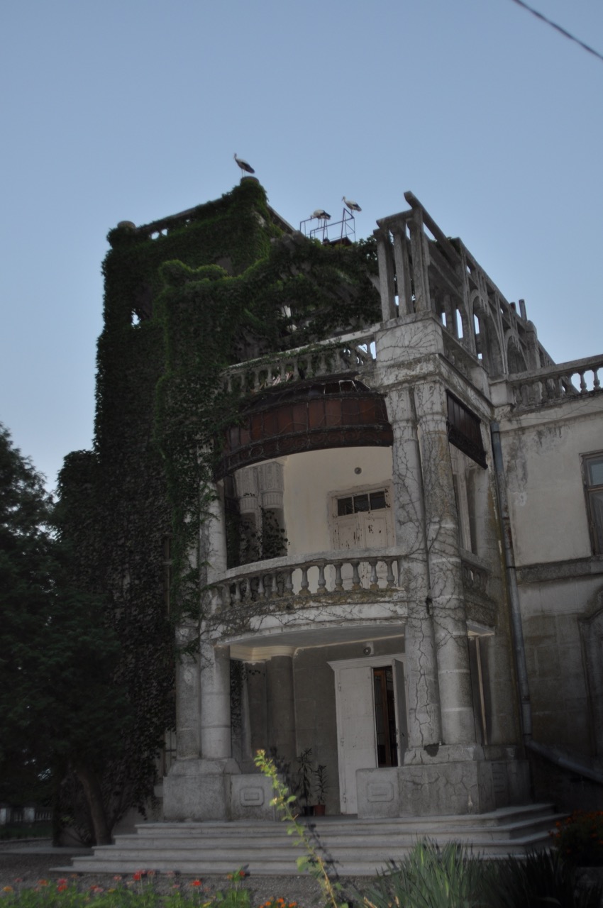
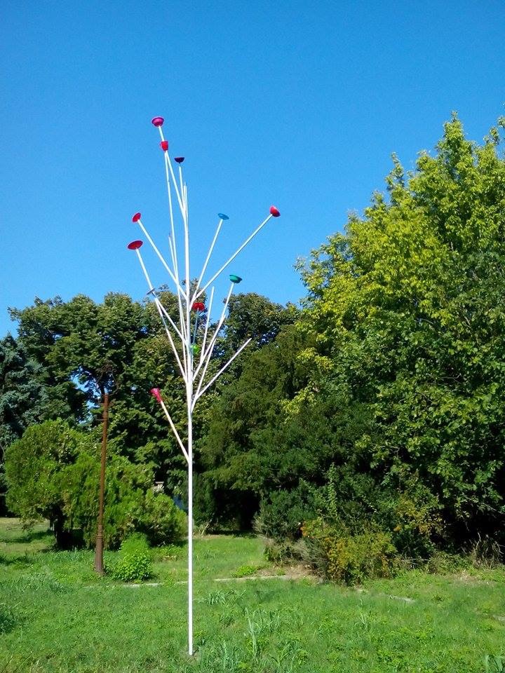
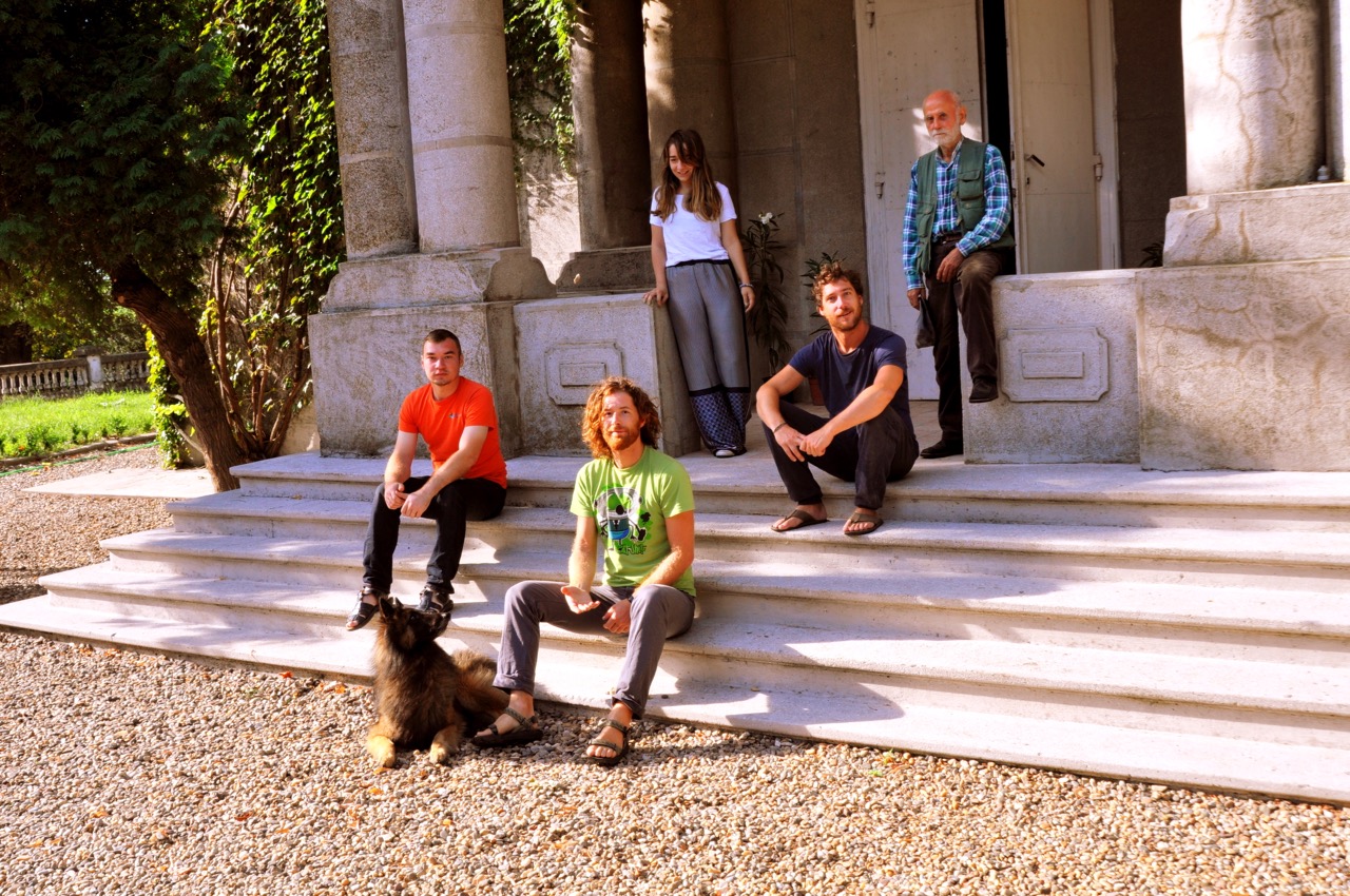
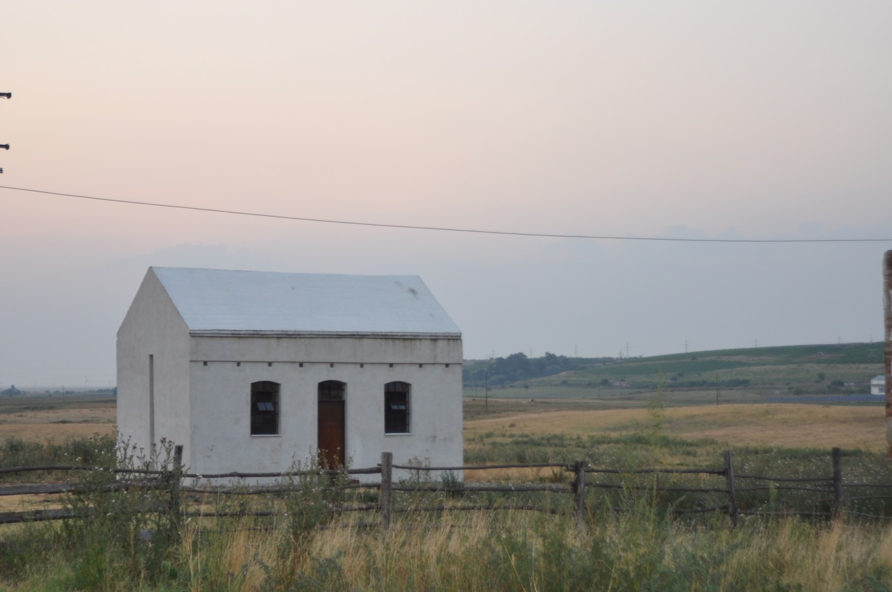
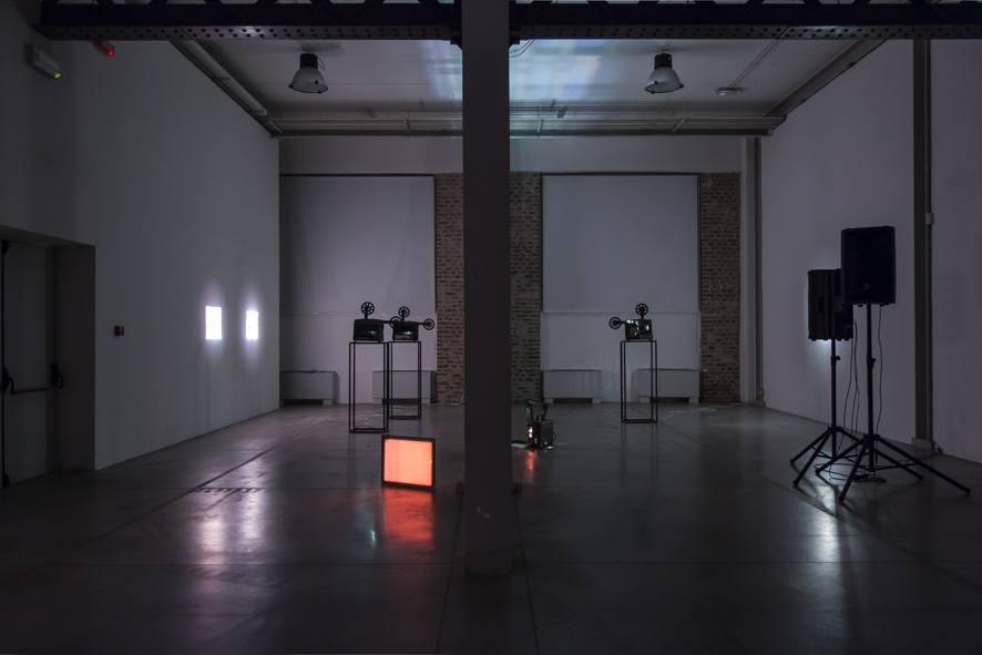
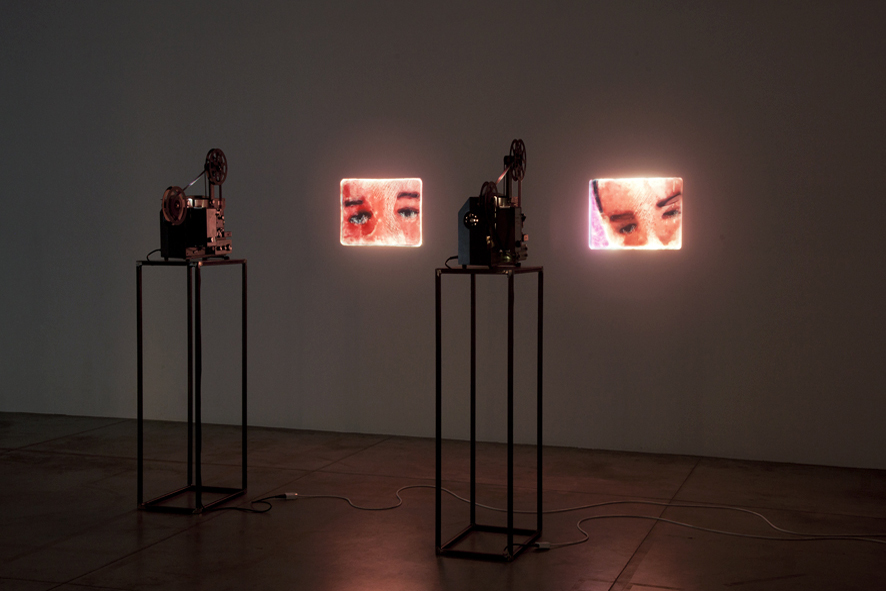
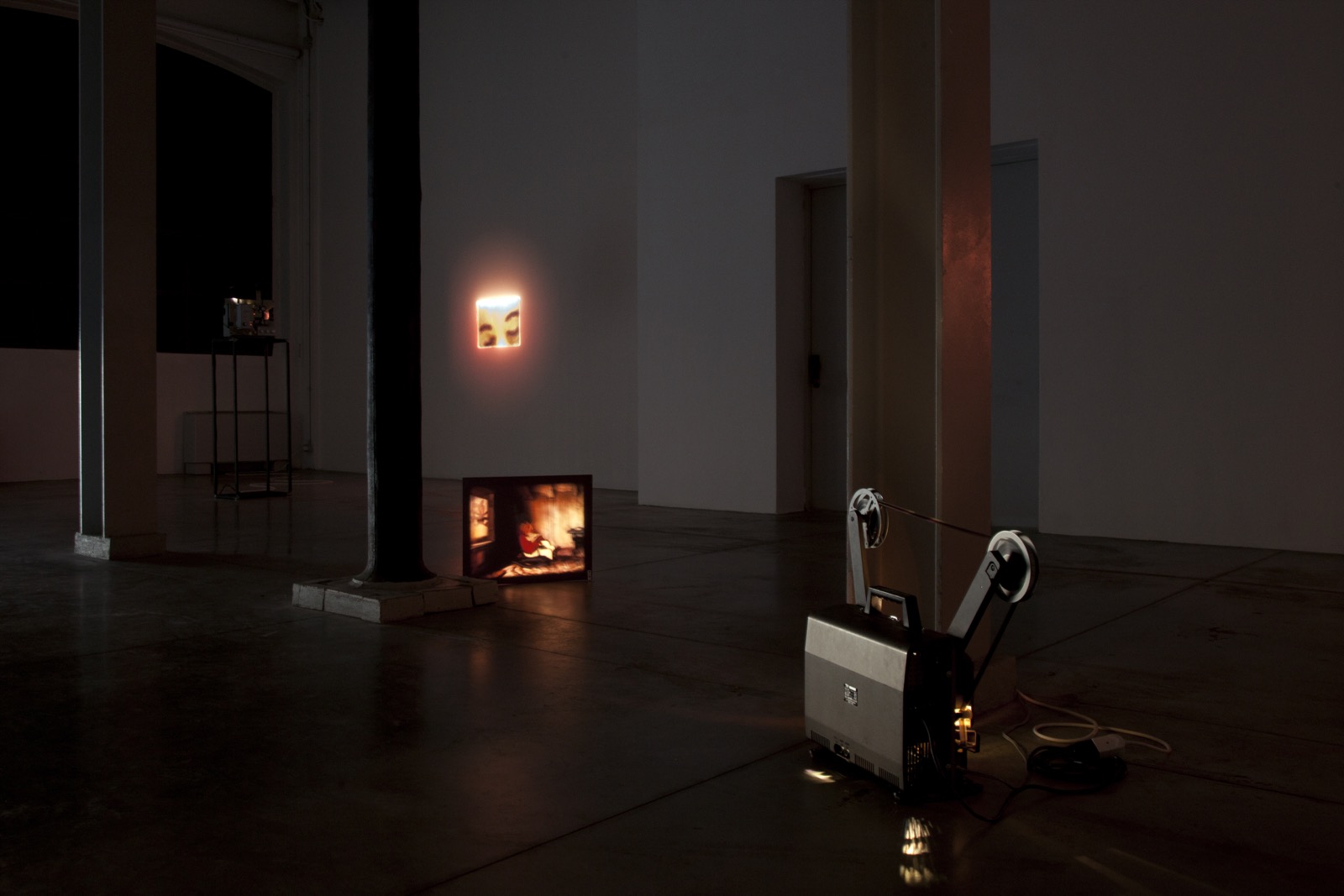
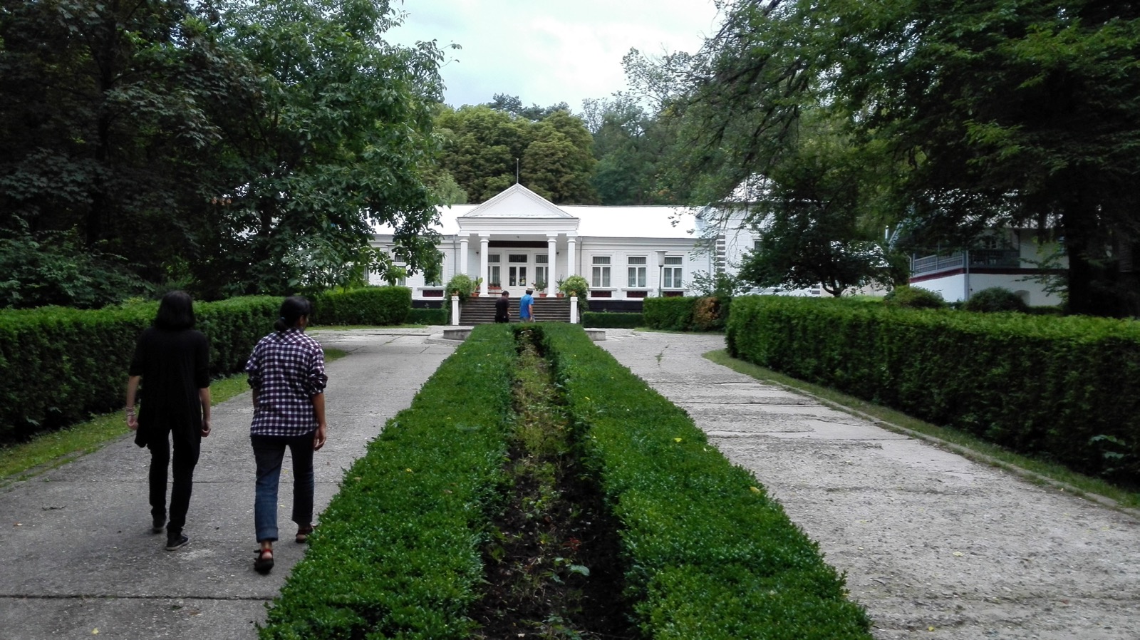
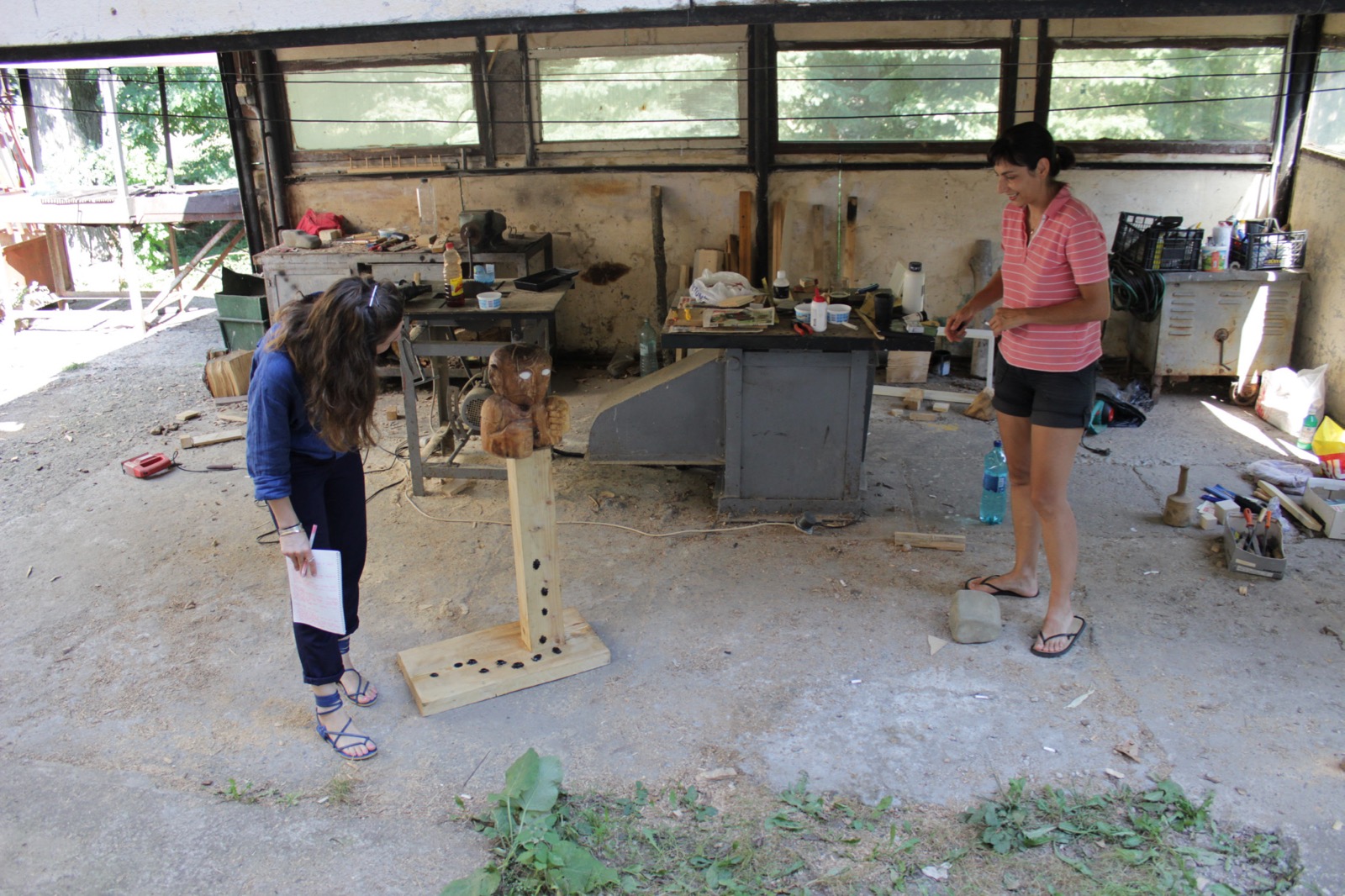
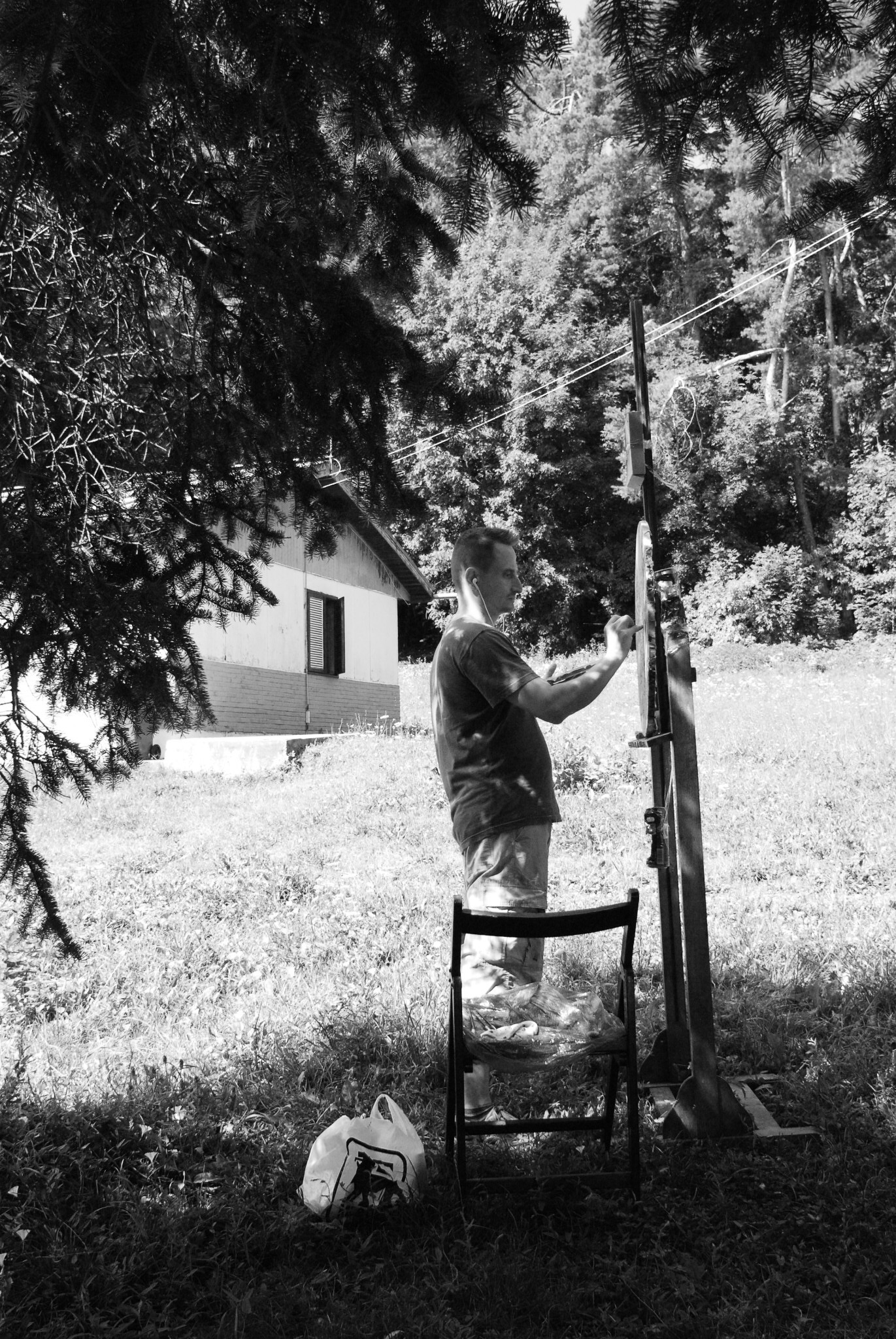
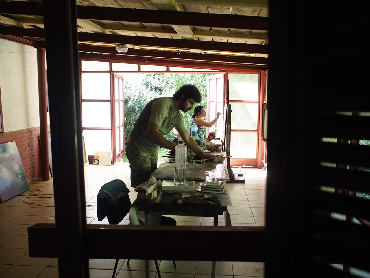
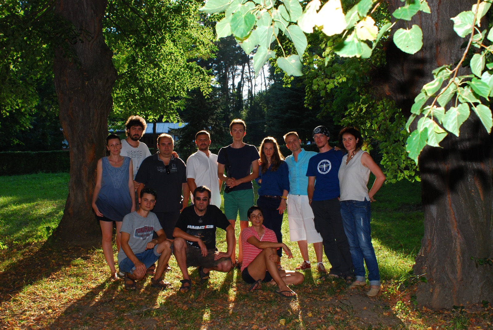
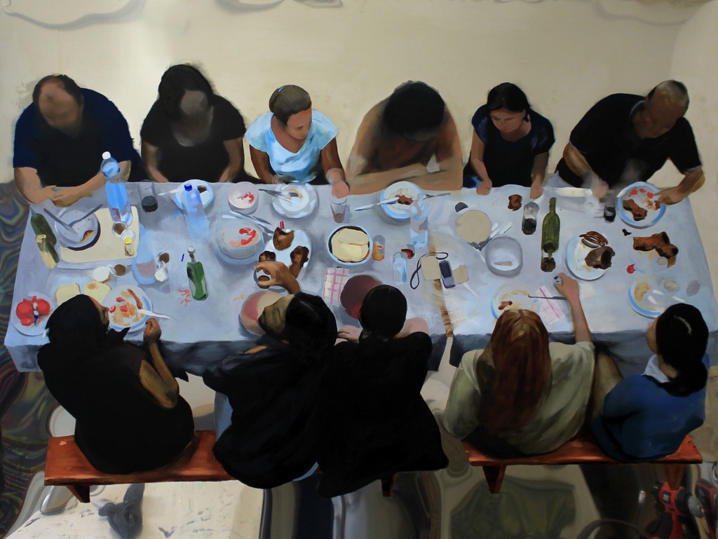
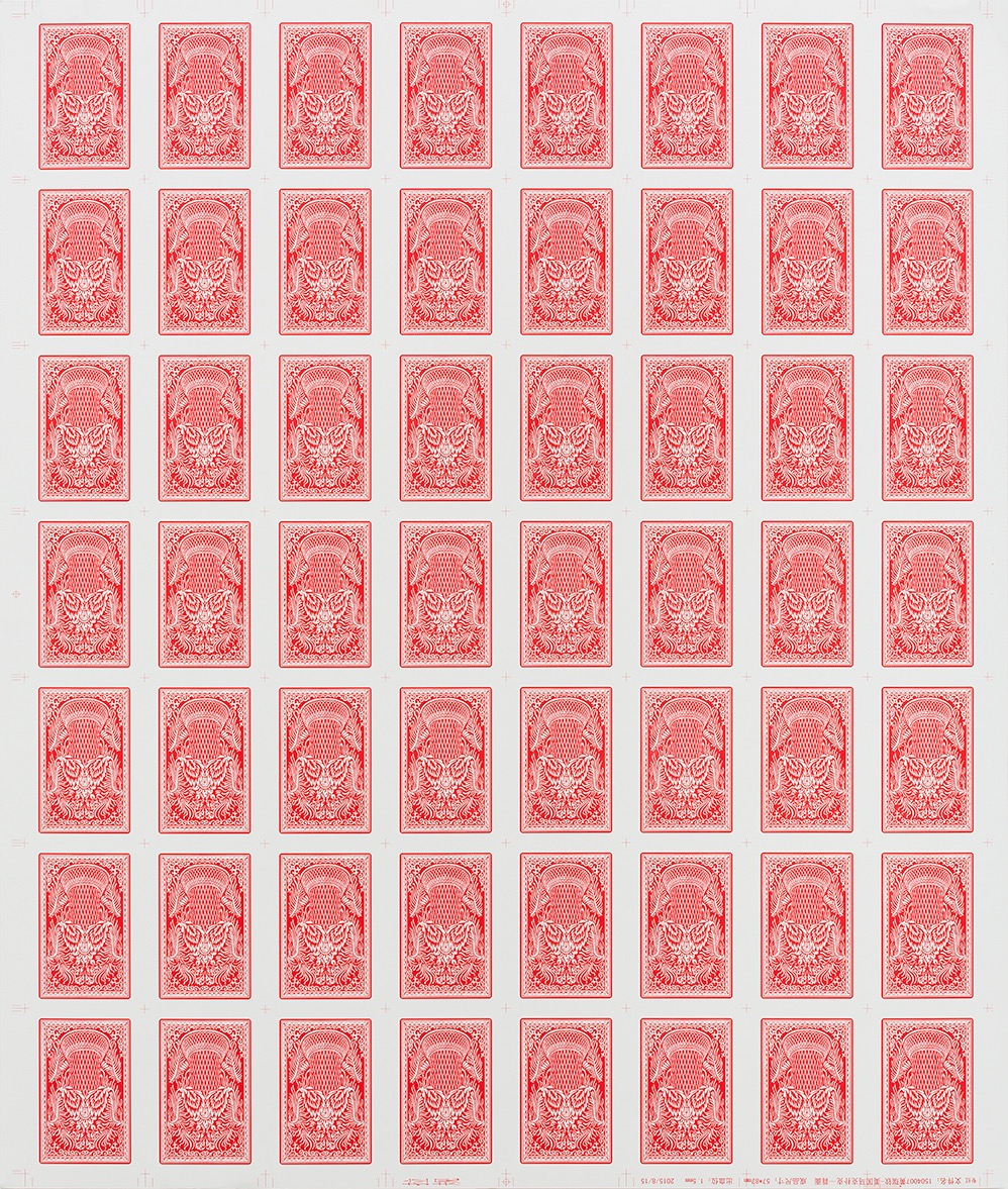
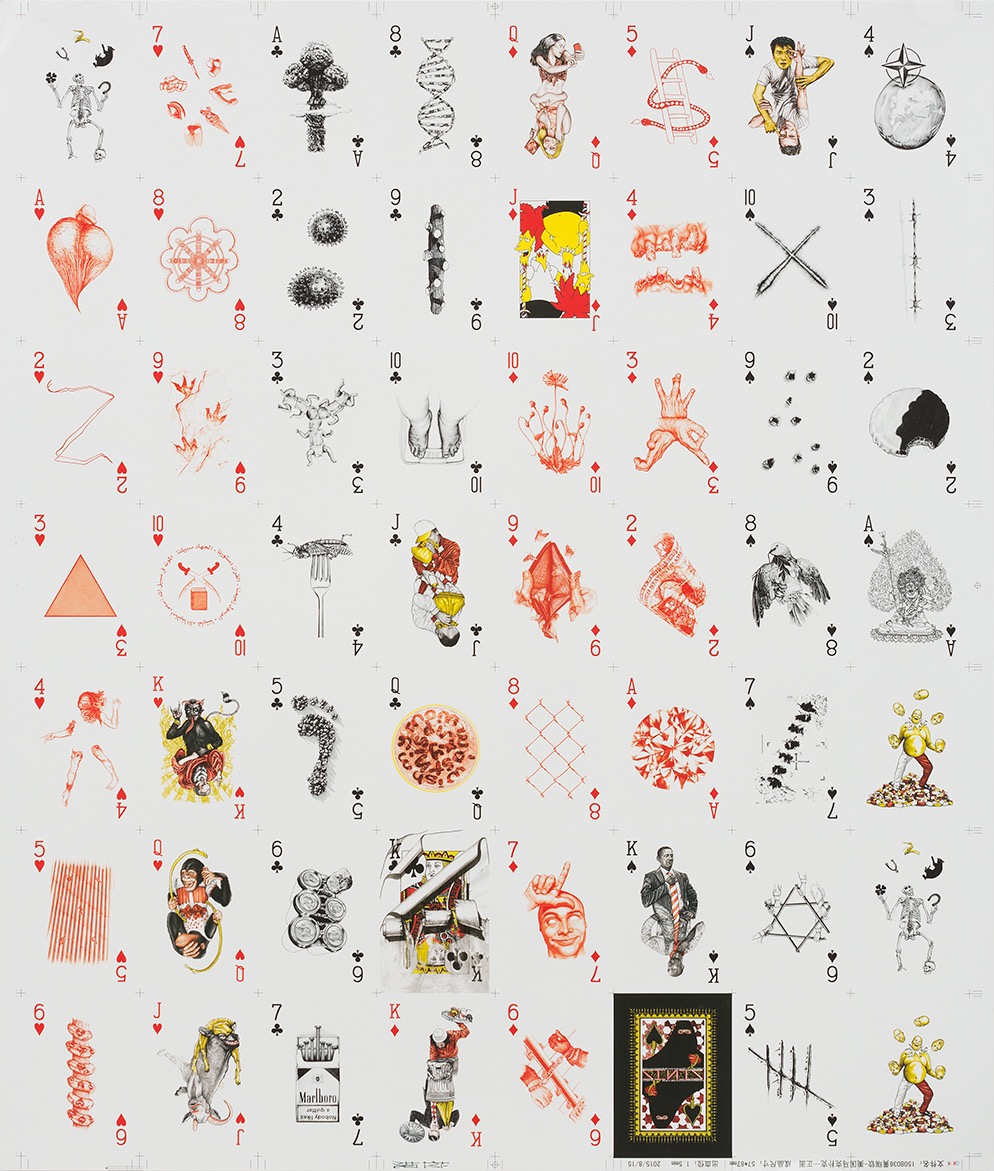
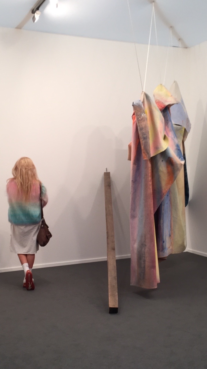
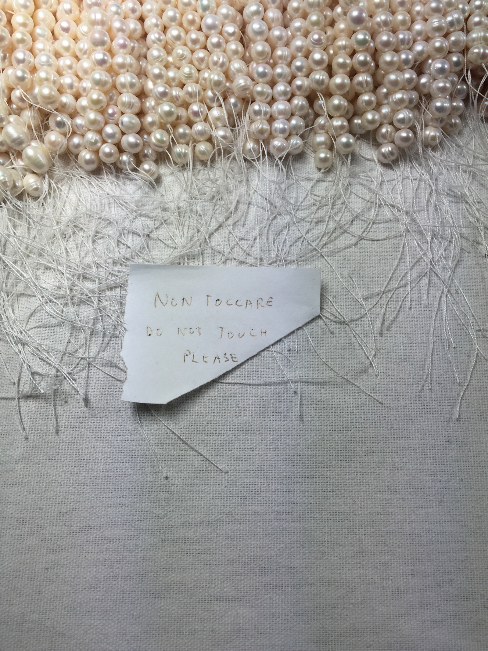
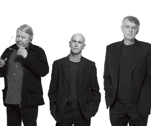
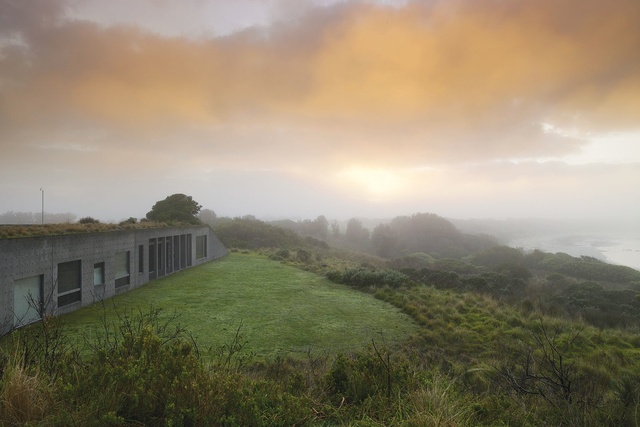
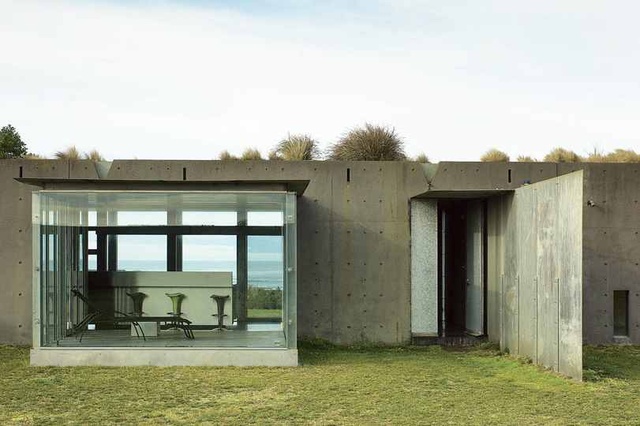


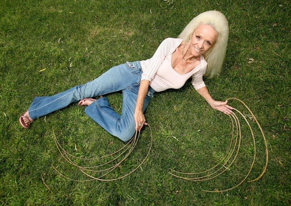

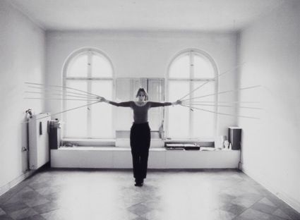
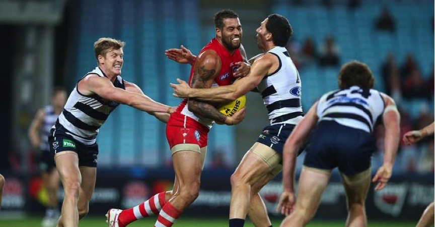
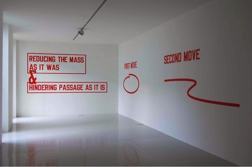
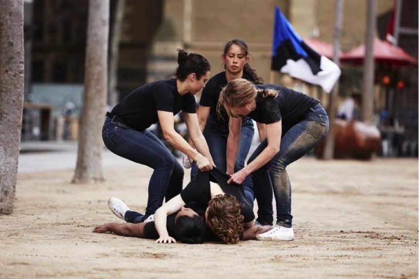
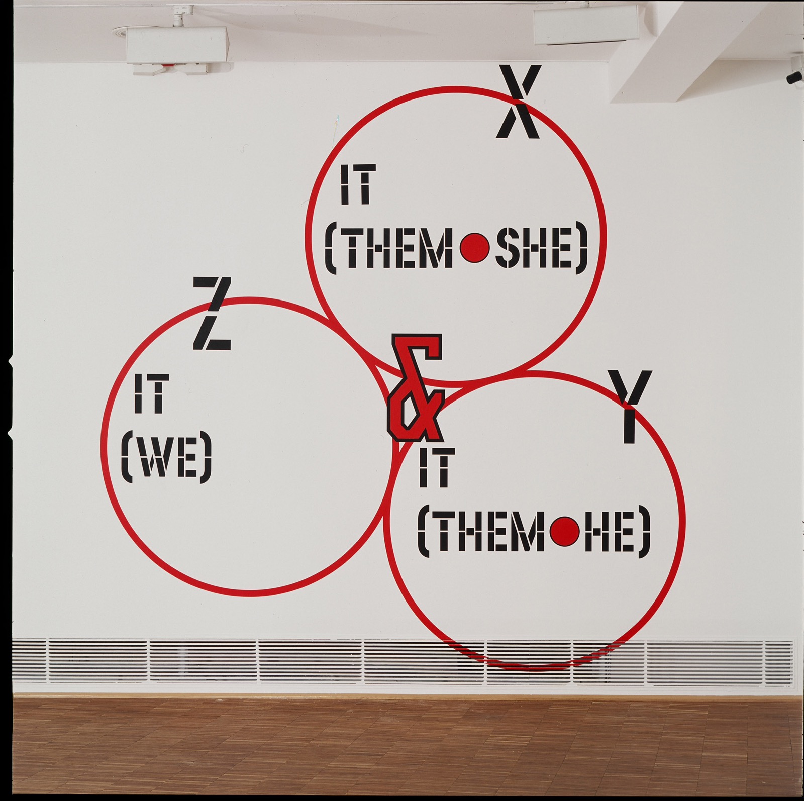
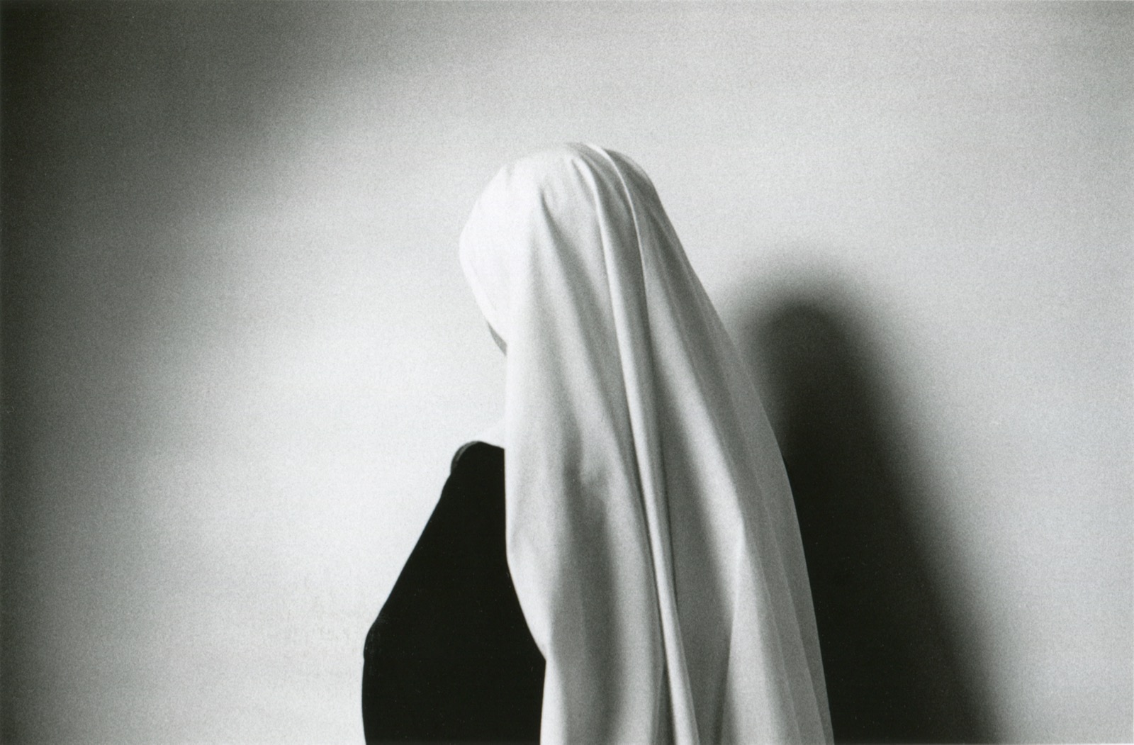
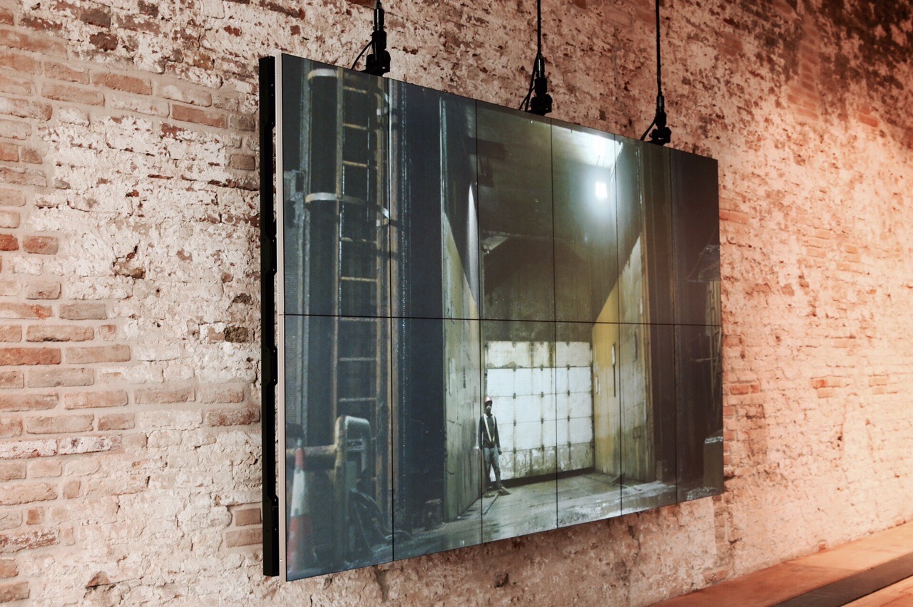
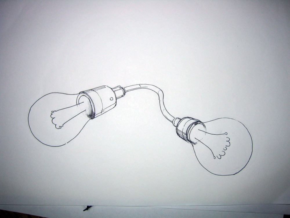
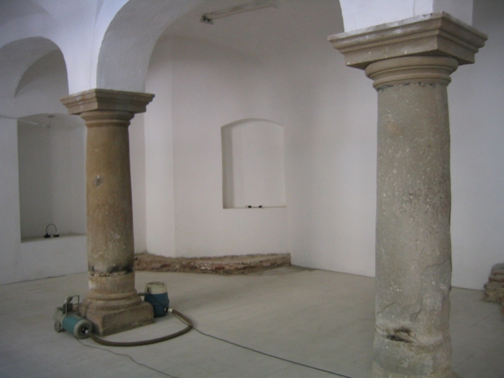
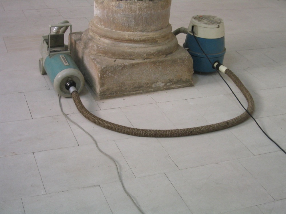
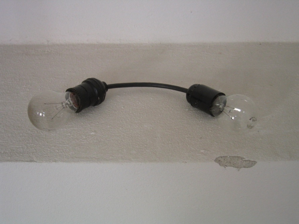

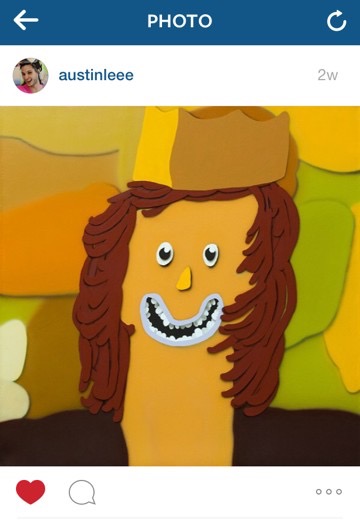
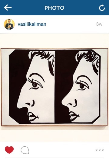
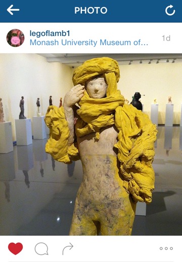
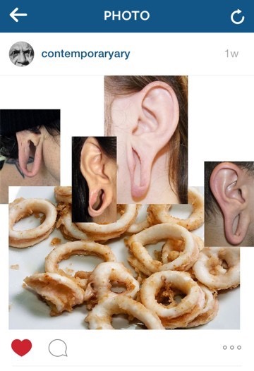
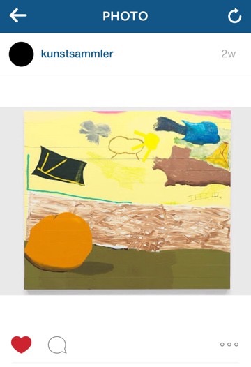
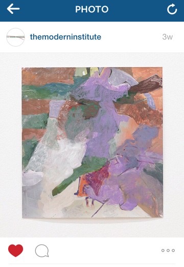
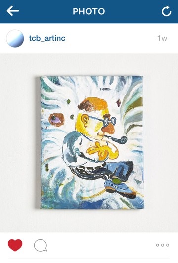
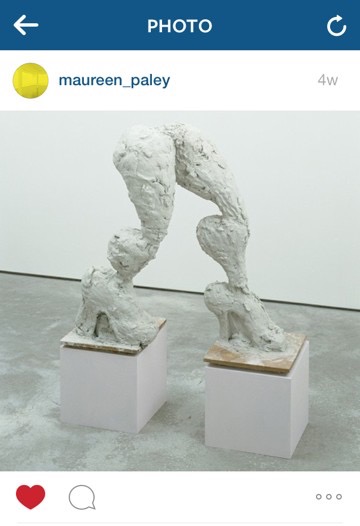
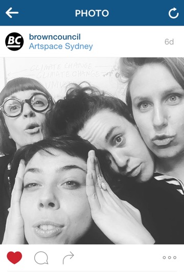
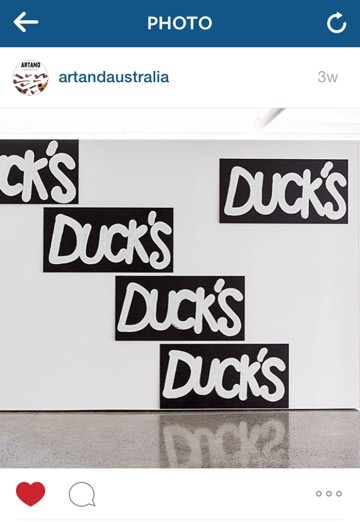
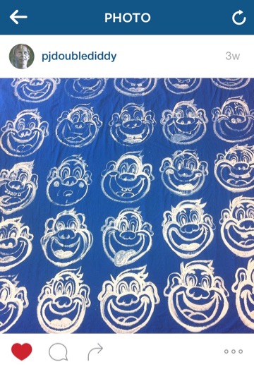
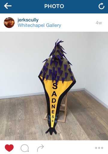

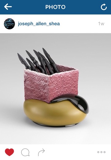
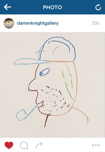
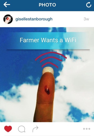
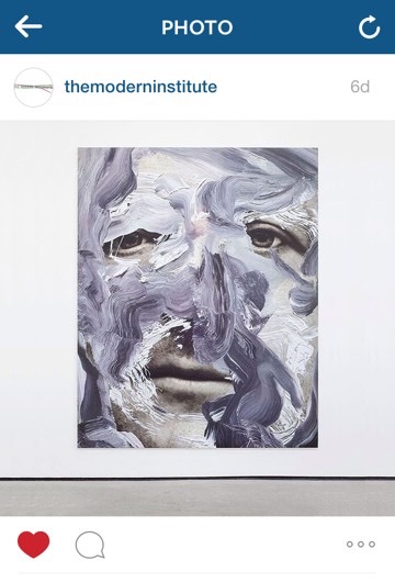
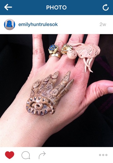
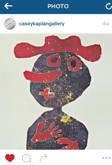
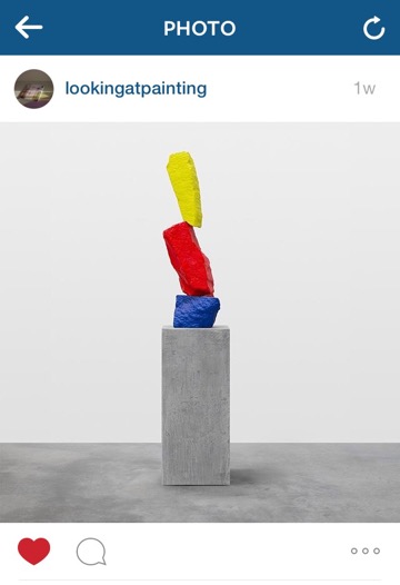
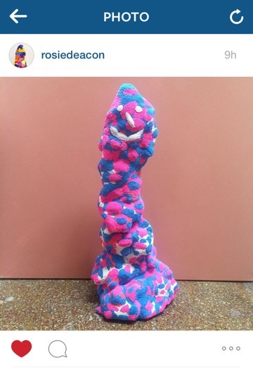
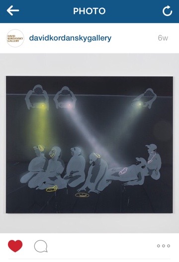
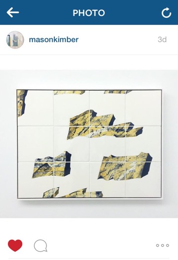
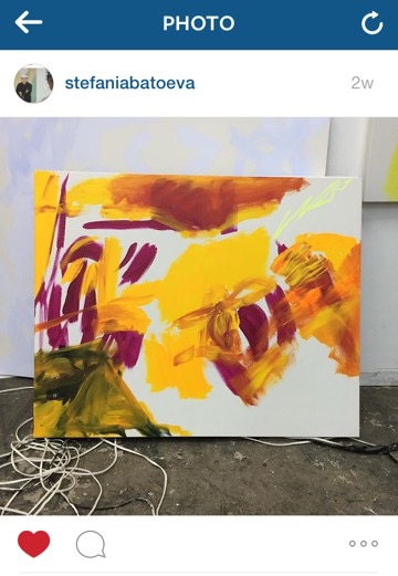
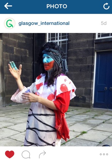
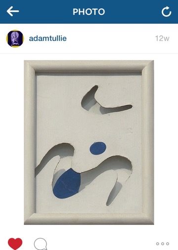
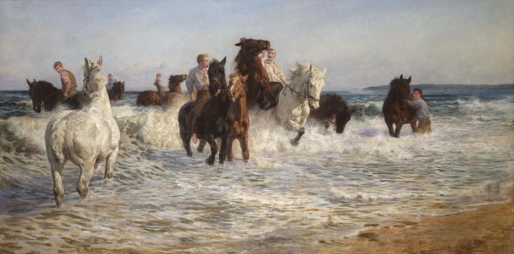
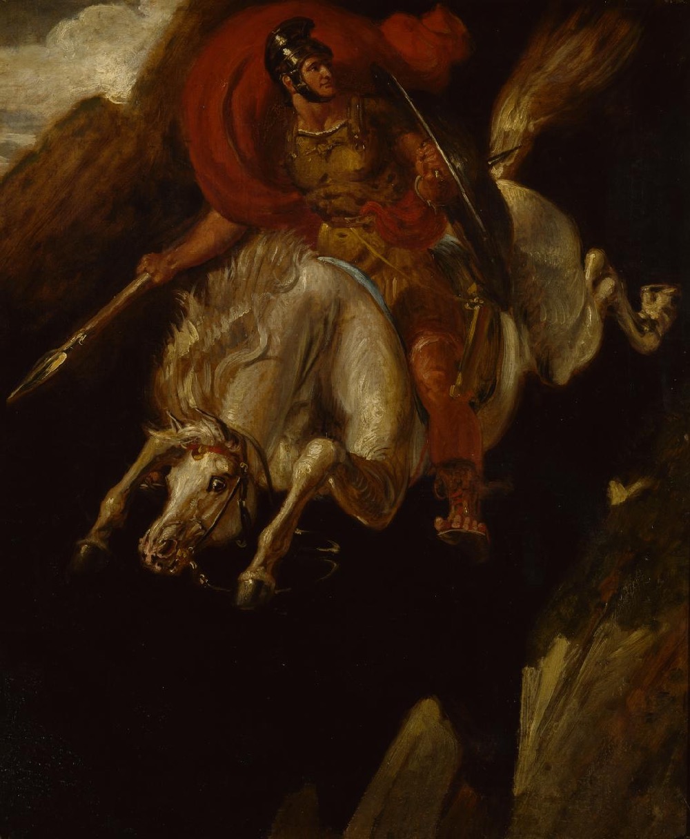
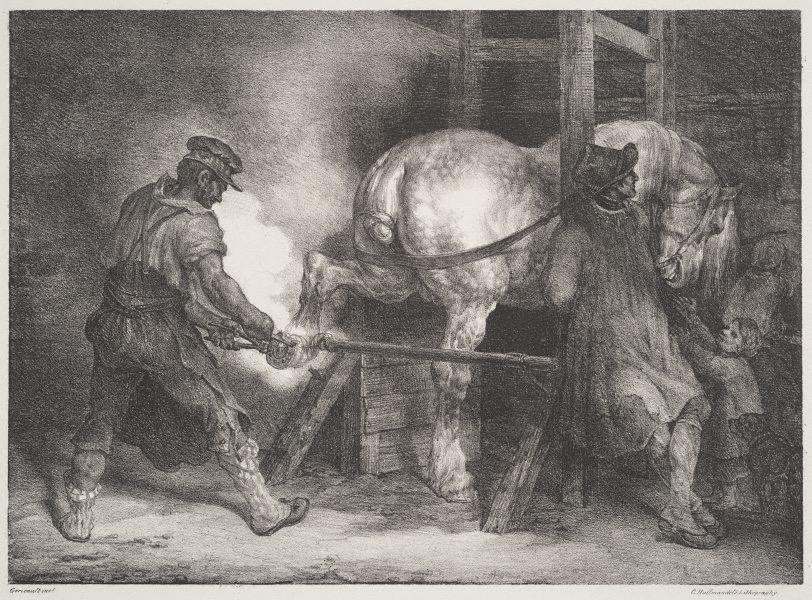
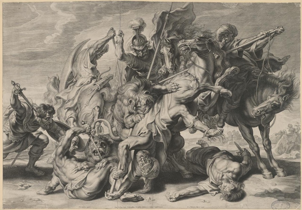
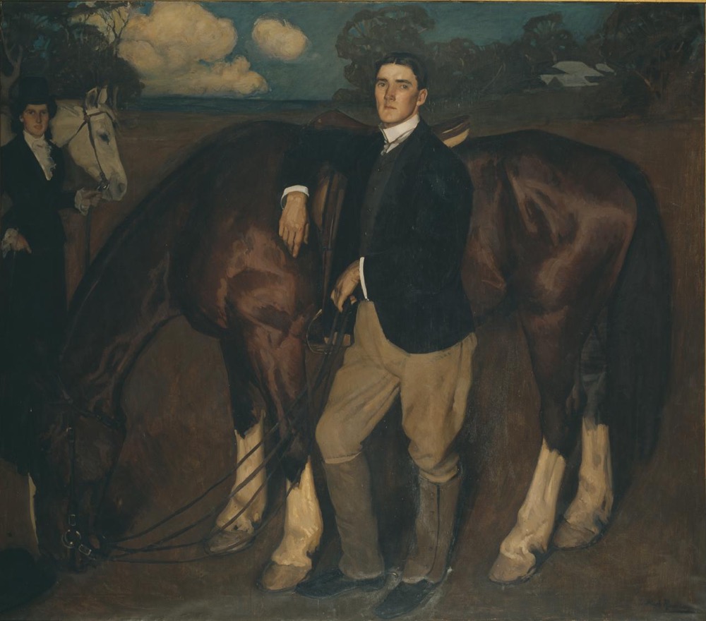
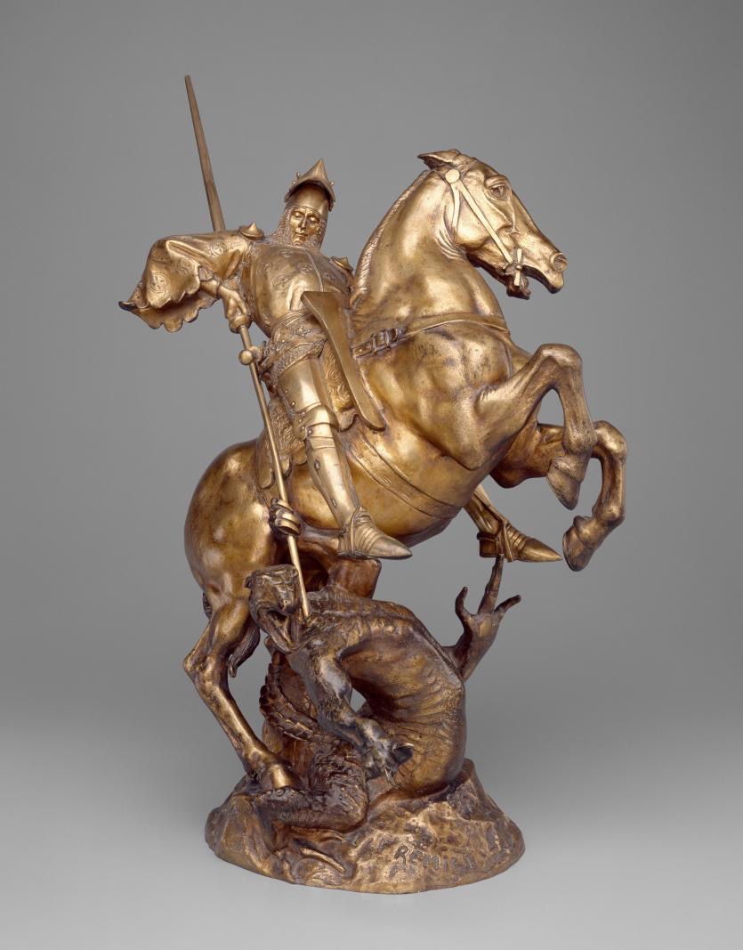
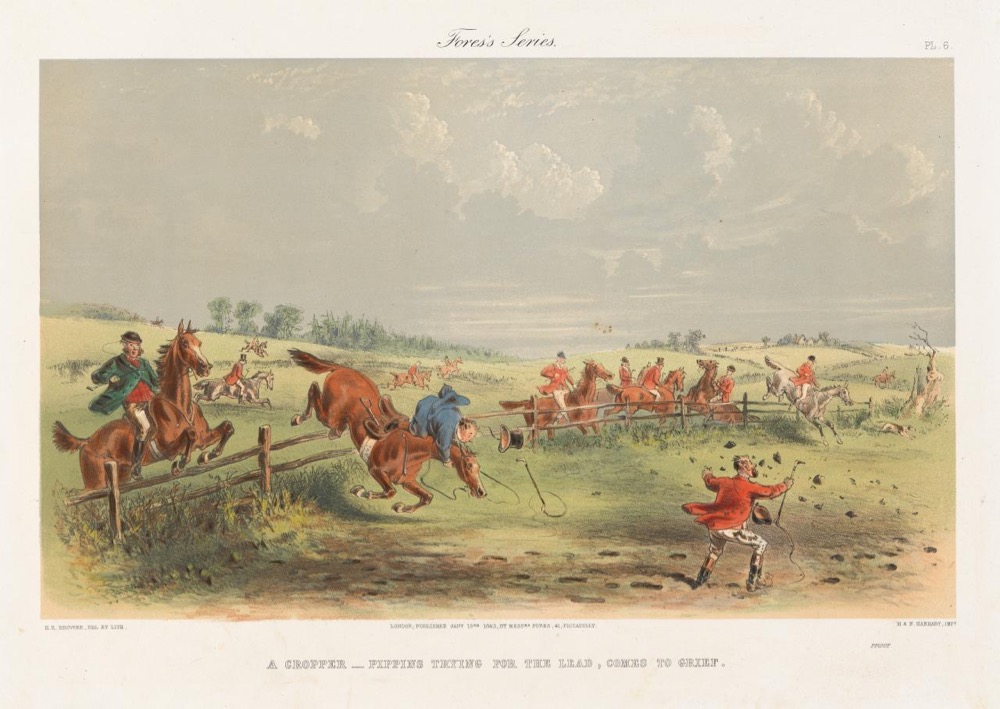
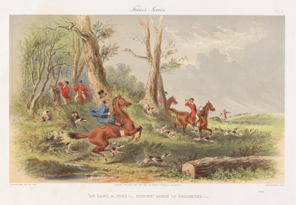
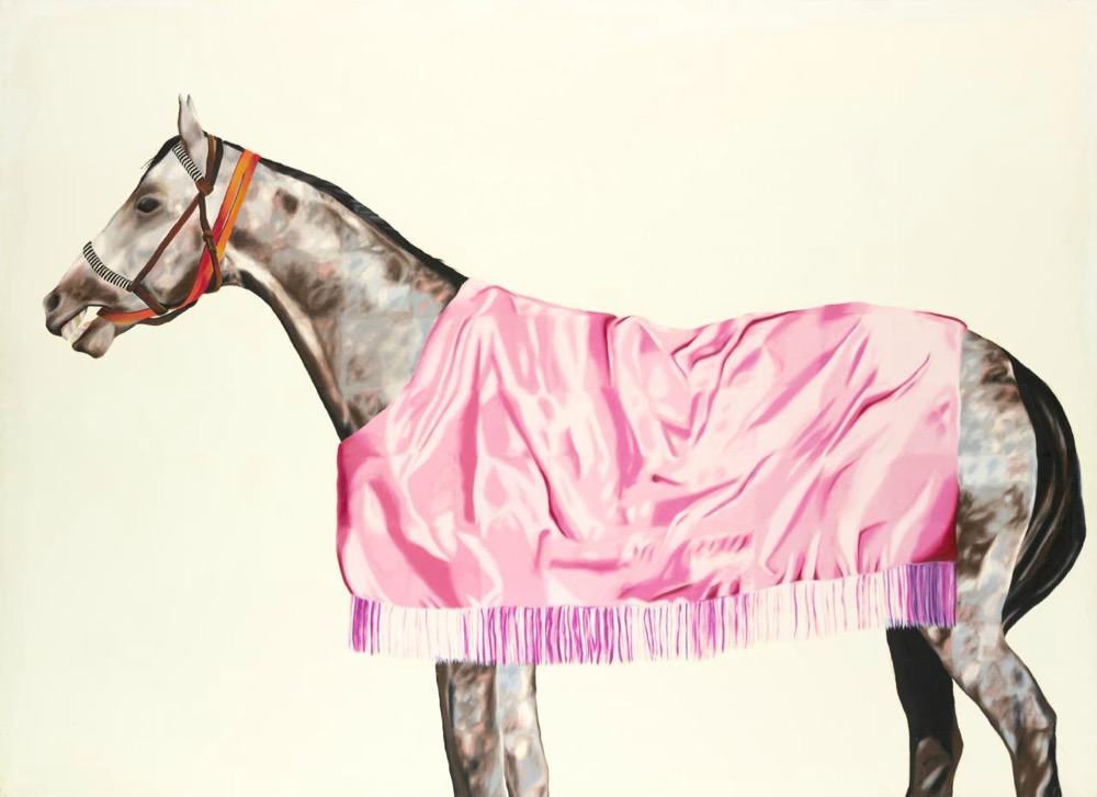


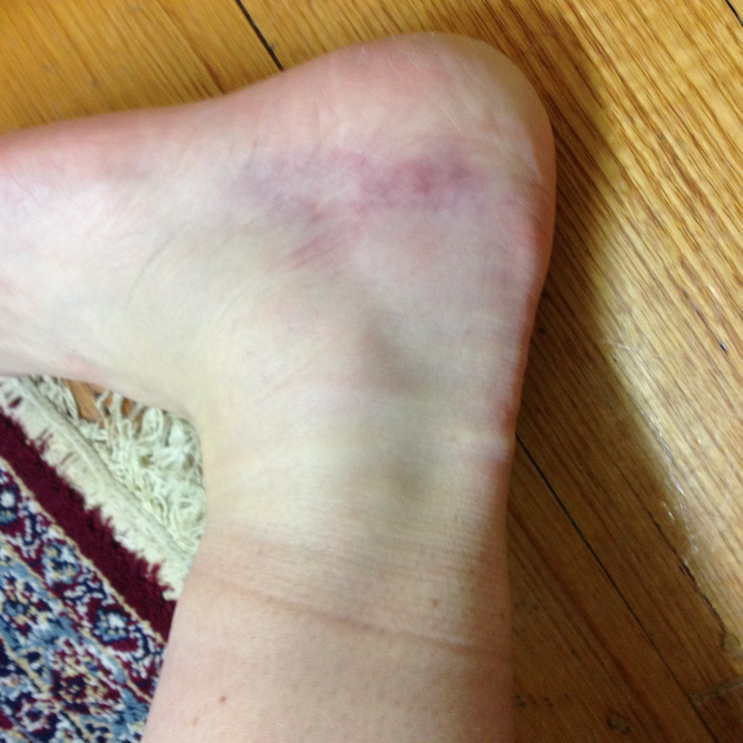
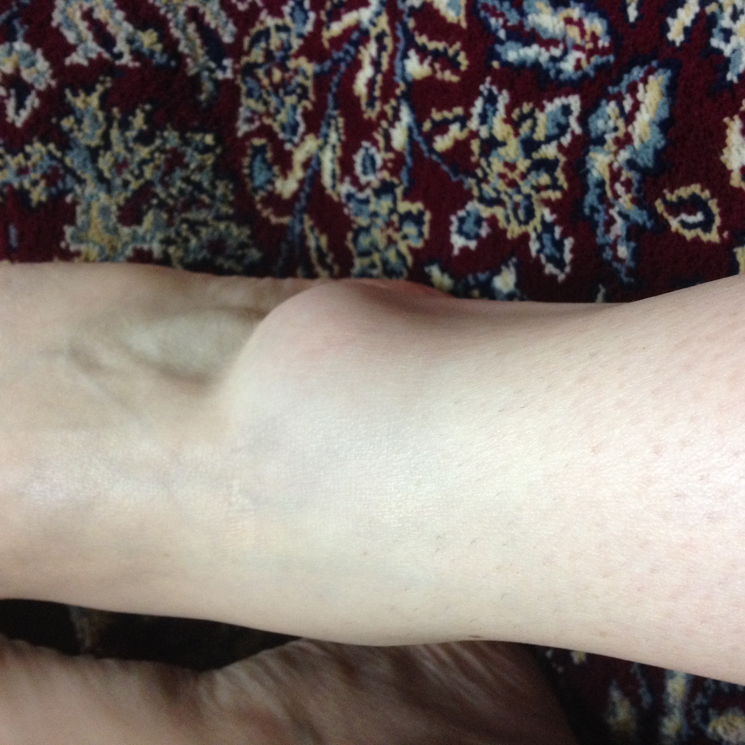
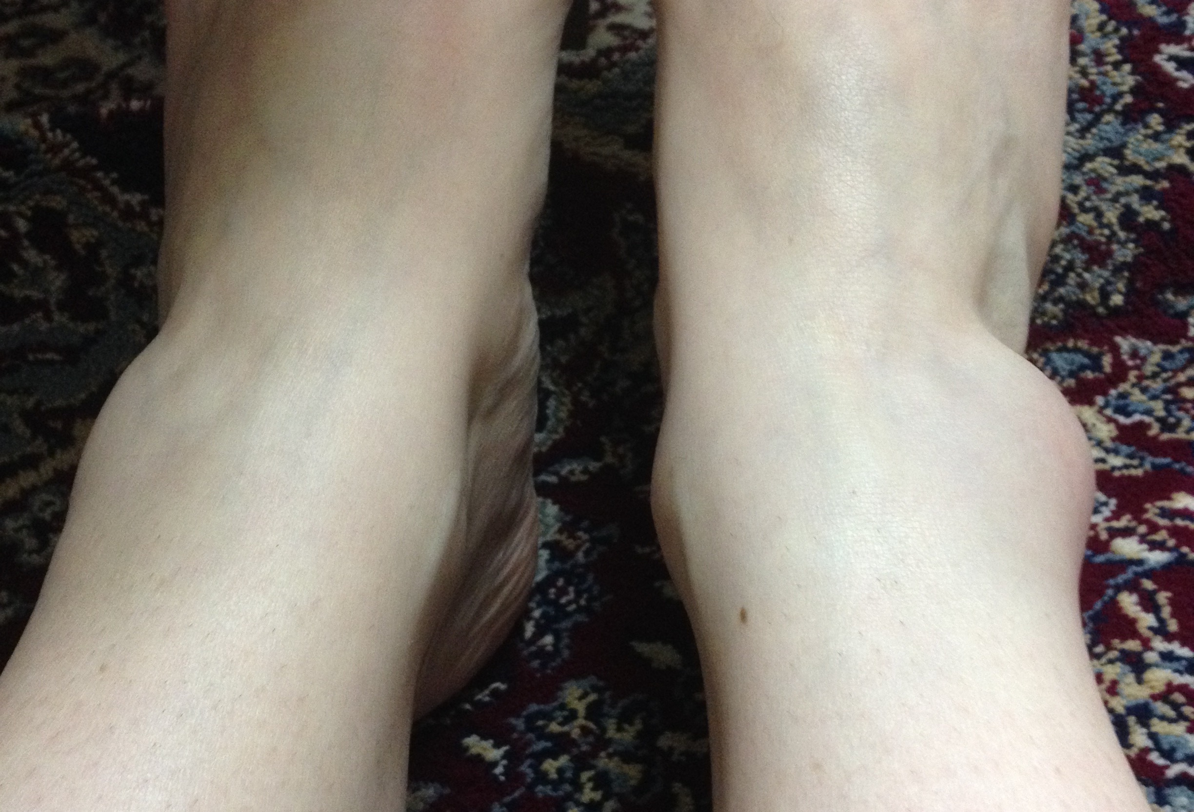
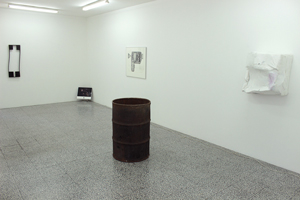
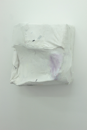

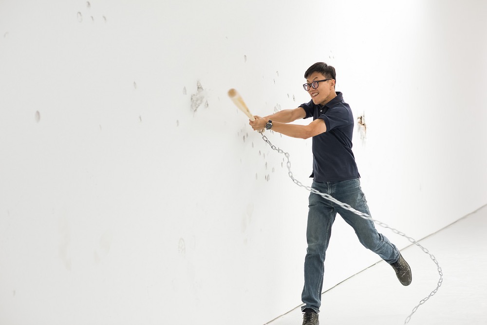
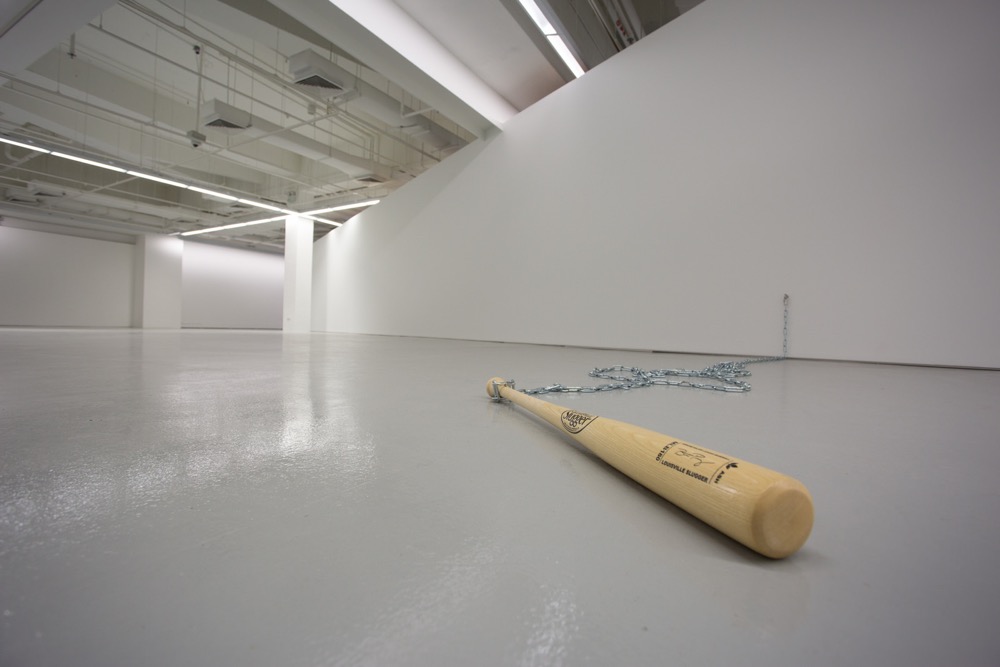
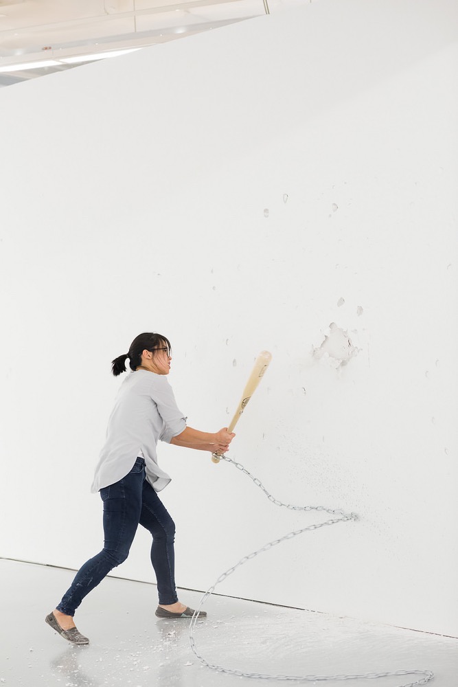
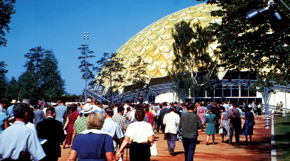
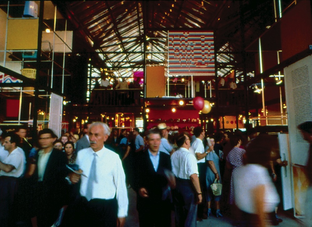
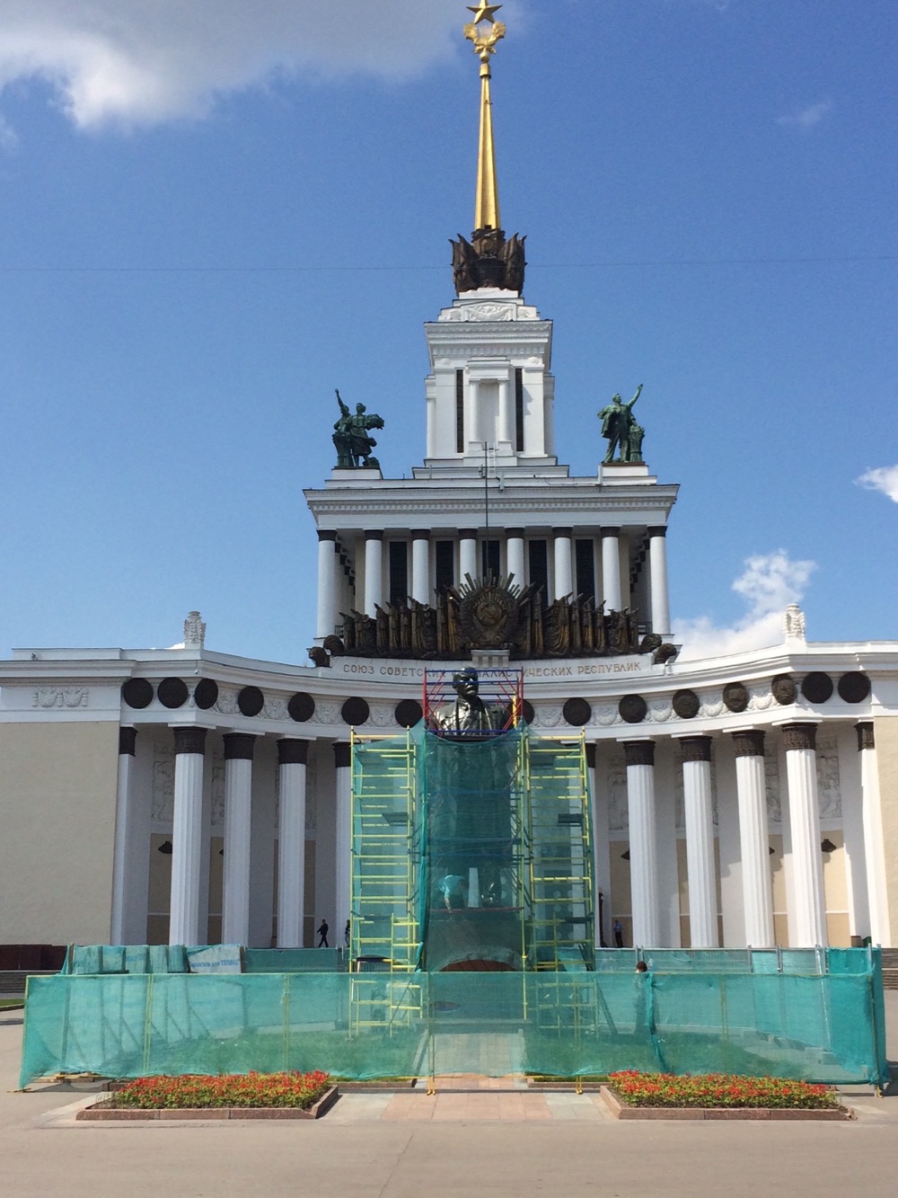
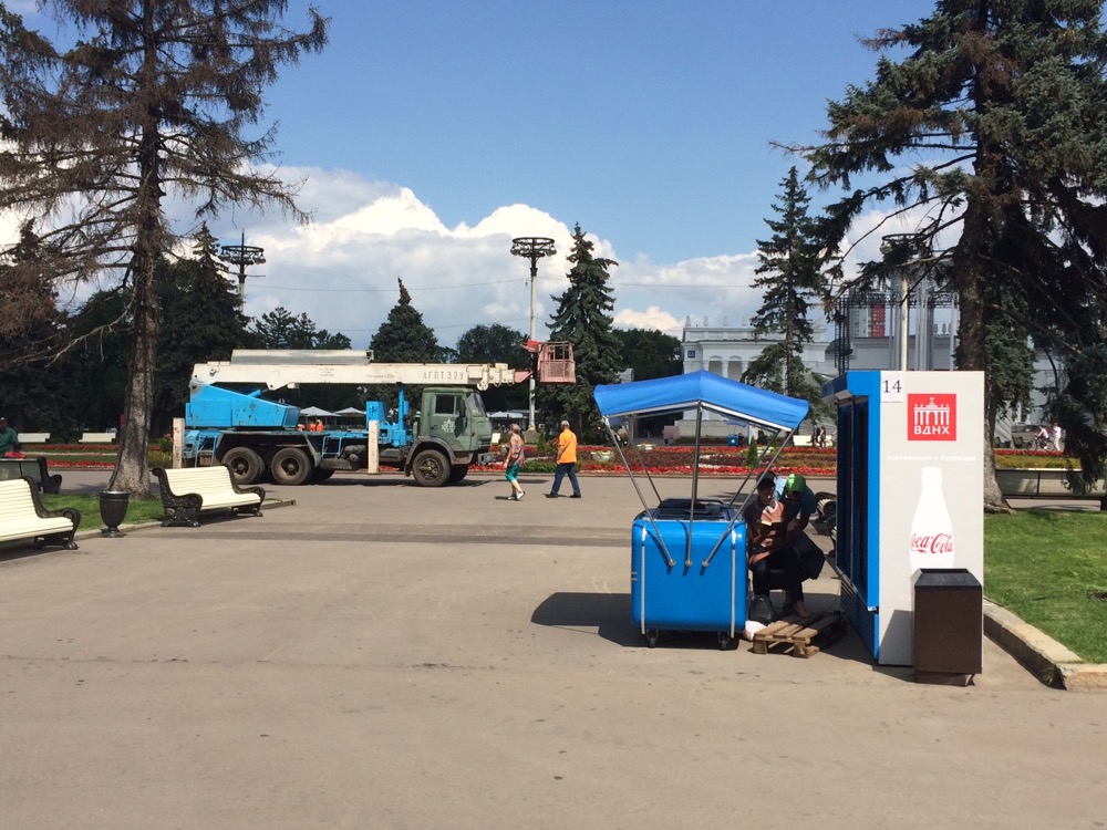
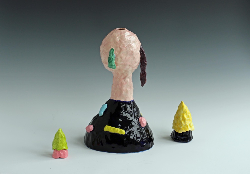
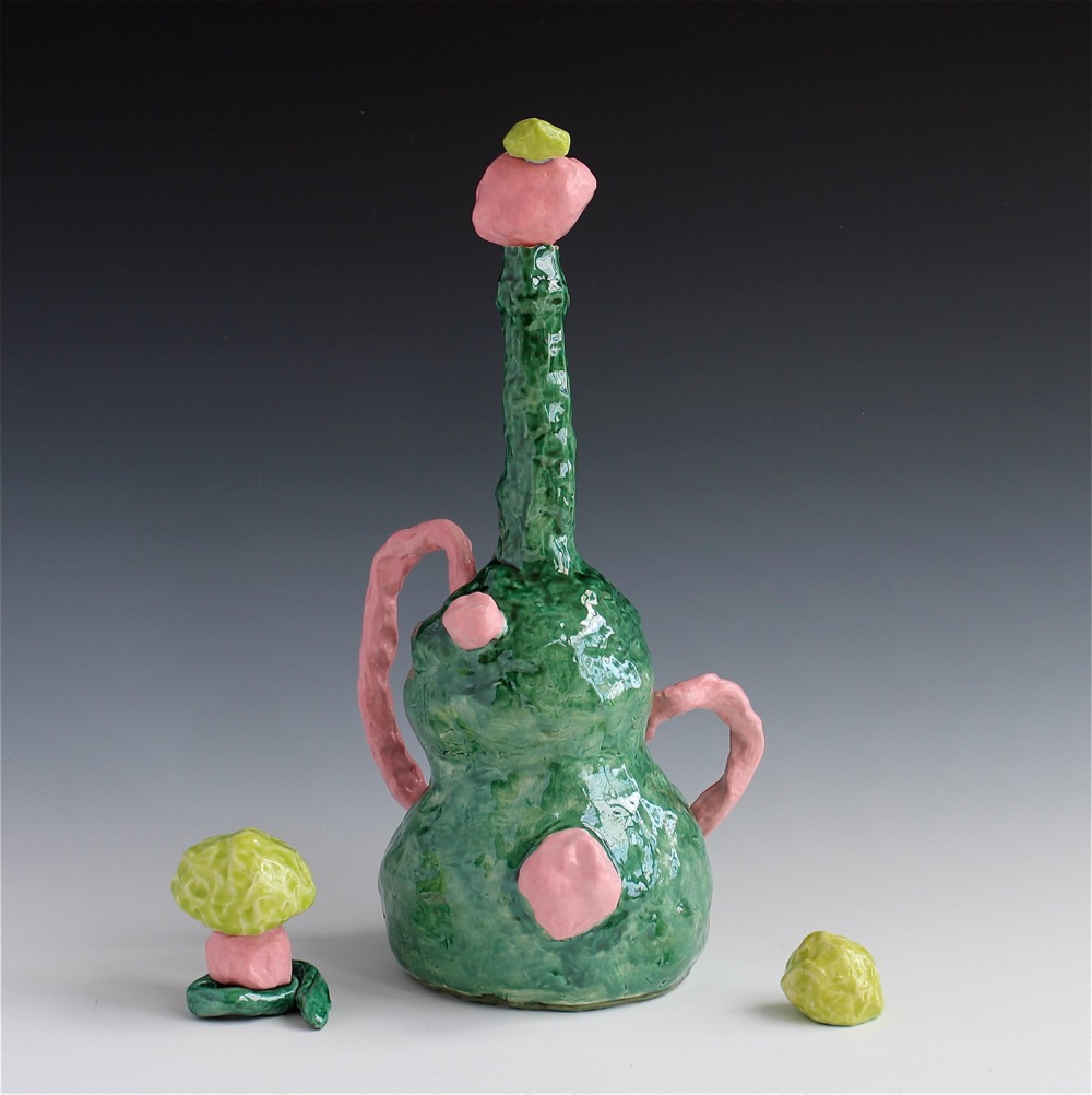
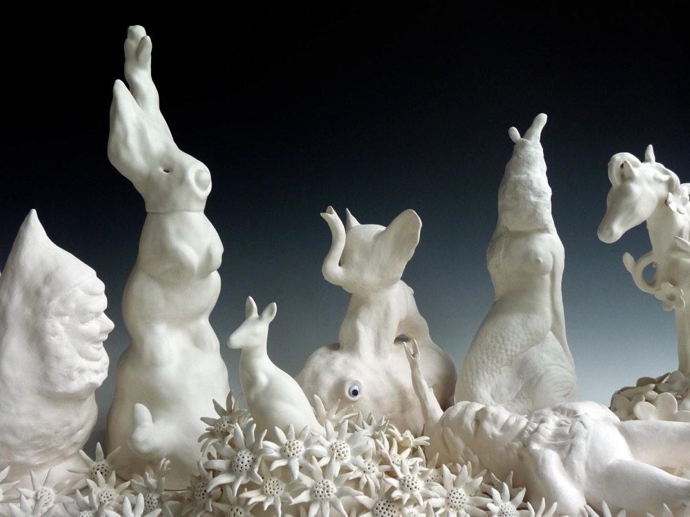
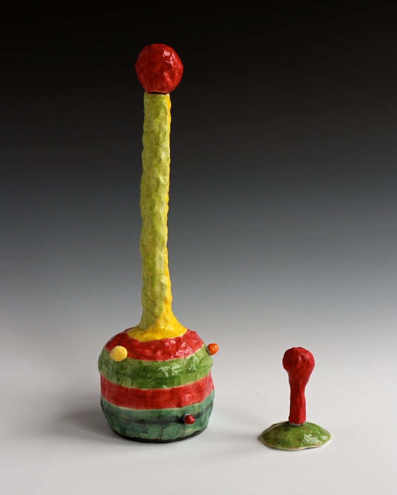
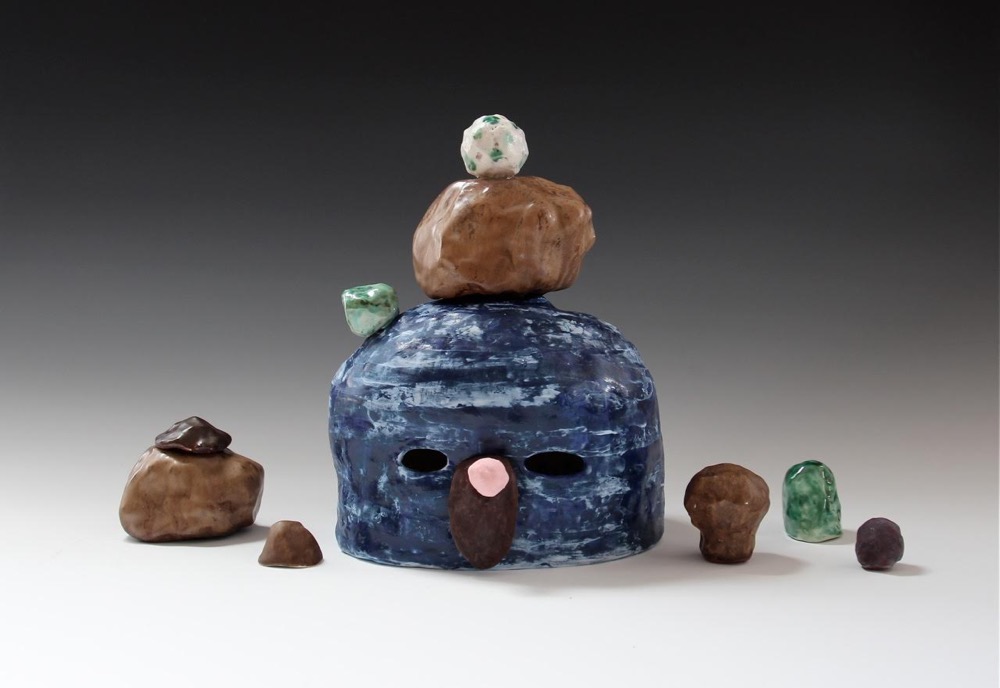
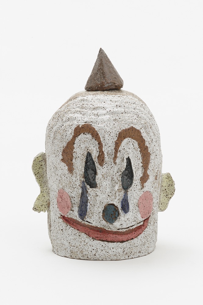
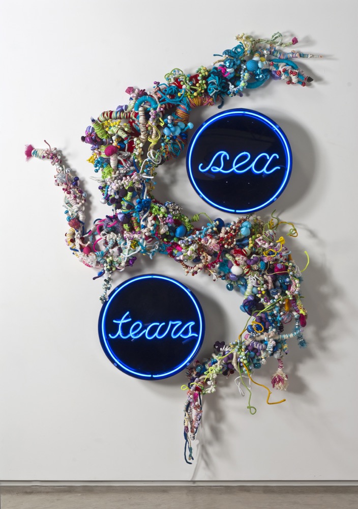
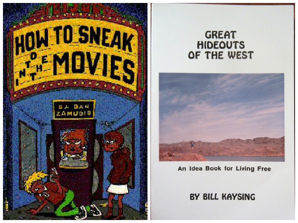
![Apollo 11 Lunar Module. By NASA / Apollo 11 [Public domain], via Wikimedia Commons](https://stamm.com.au/wp-content/uploads/2015/08/SaW_Apollo-11-Lunar-Module.jpg)
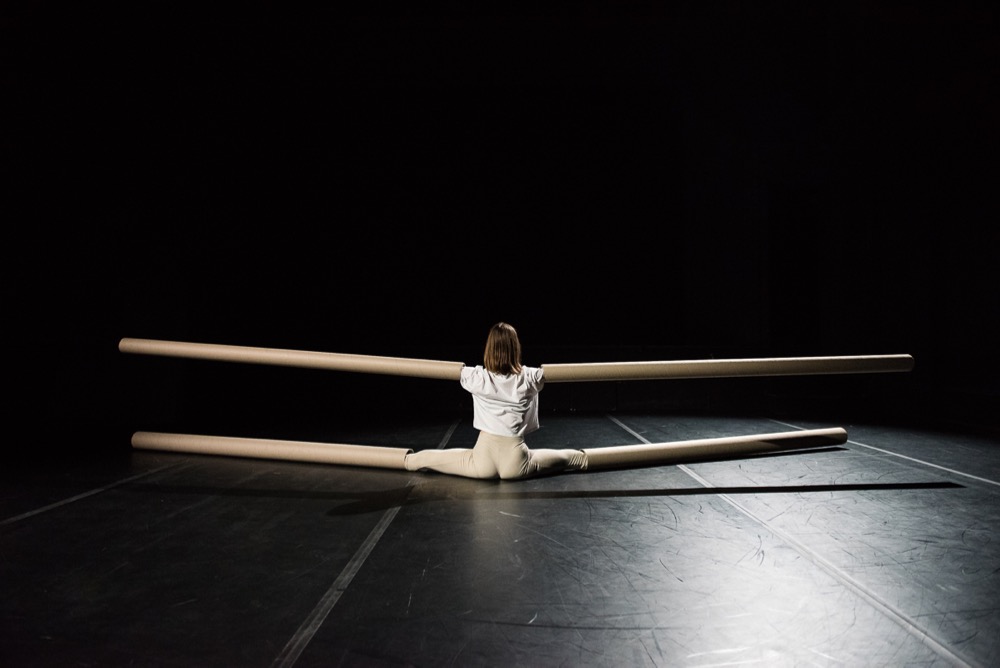
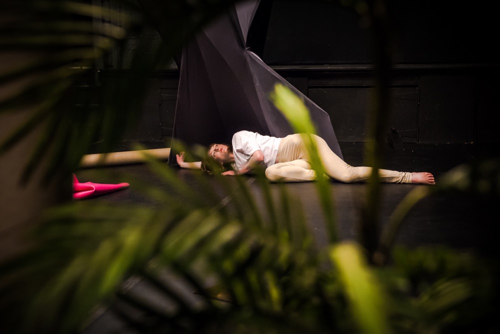
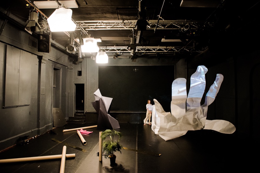

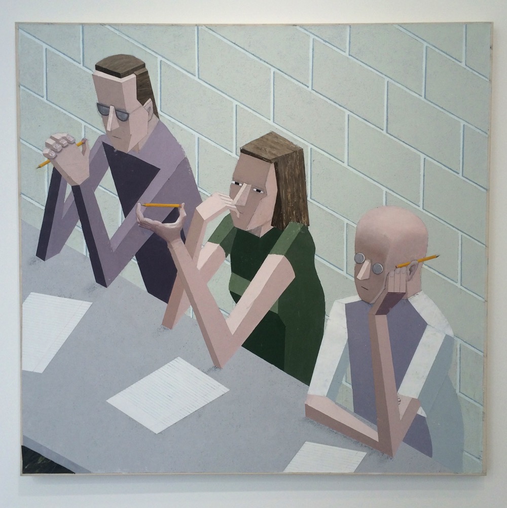

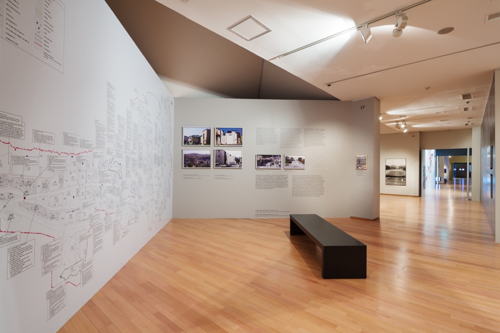
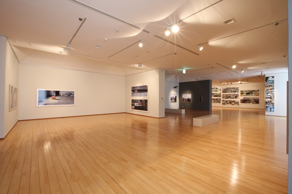
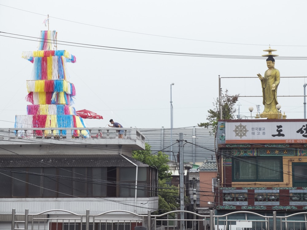
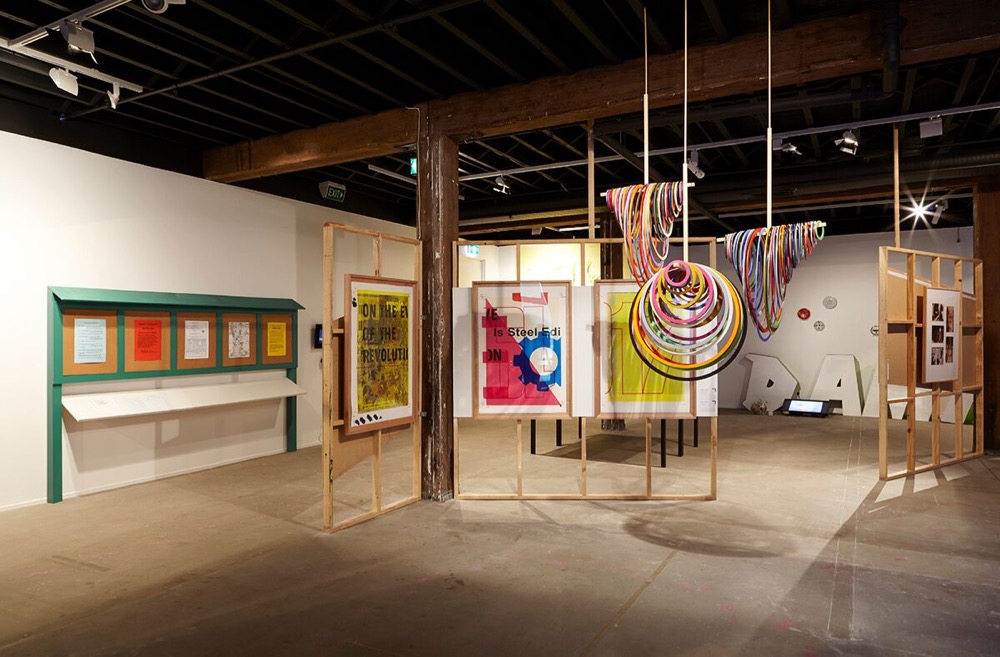
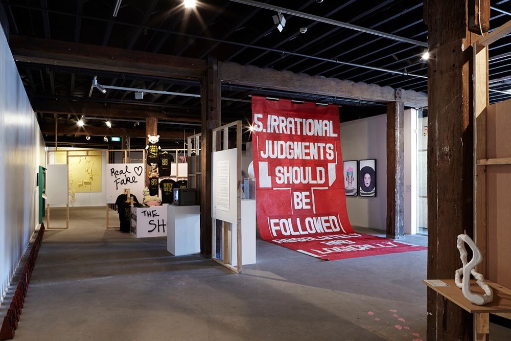
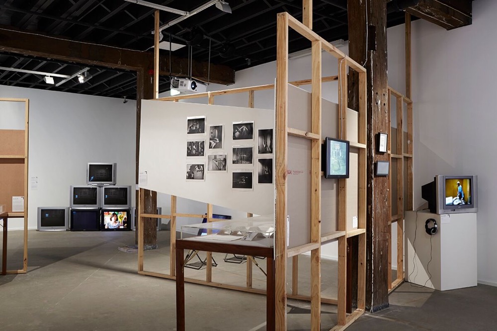
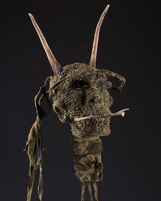
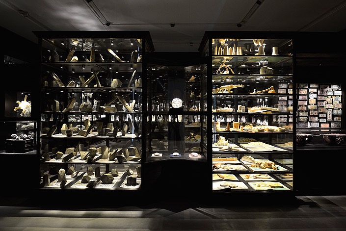
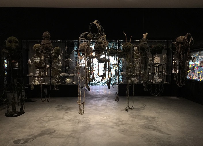
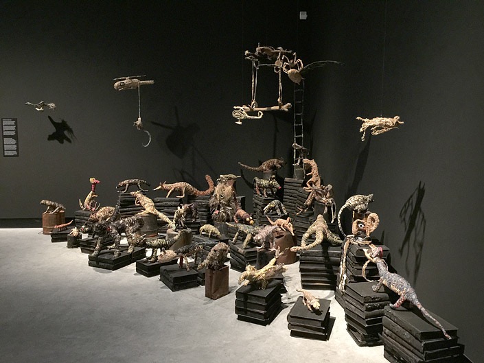
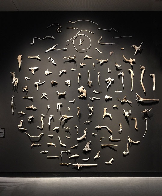
![Former Wittenoom Road Sign. Photo: Five Years at en.wikipedia [CC BY-SA 3.0 (sa/3.0], Wikimedia Commons](https://stamm.com.au/wp-content/uploads/2015/06/2_SW.jpg)
![Port Sulphur. Photo: Dr Warner (Flickr: IMG_4276.JPG) [CC BY 2.0], via Wikimedia Commons](https://stamm.com.au/wp-content/uploads/2015/06/3_SW.jpg)