Matt Hinkley bumps and sprained ankles

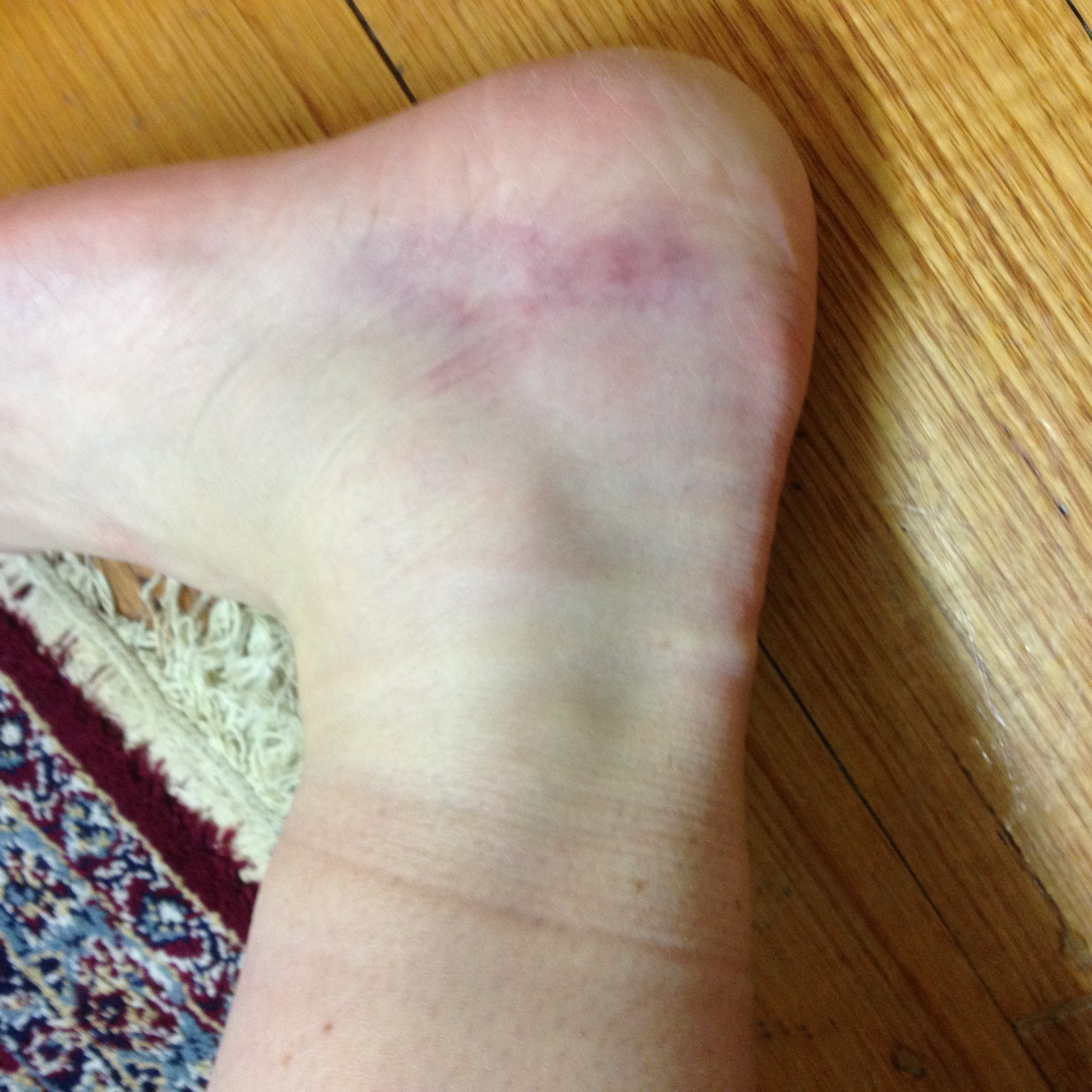
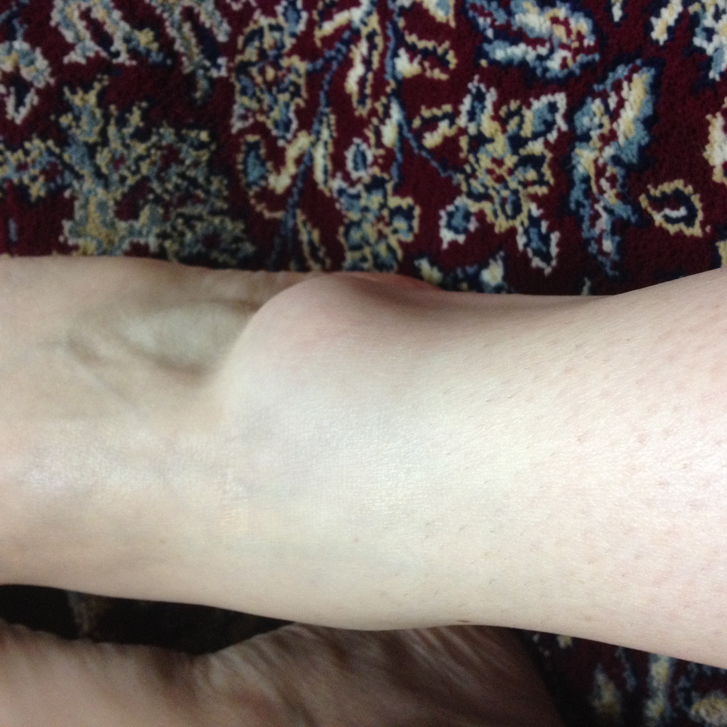
A few months ago I sprained my ankle. I kept checking it, to see how it was swelling and discolouring. As the day wore on, I saw it grow to the size of a separate appendage, bulging out from  the normal line of my ankle. The flesh became tighter, like a sausage about to burst, and as time passed the colour changed to a mottled darker pink, which then slowly flushed out a diseased looking yellow blush.

That day, I went to see my sister and her kids. They were bored and I said, “I have something to show you,” and peeled away my sock, not really expecting much, but giving it a try. My 3 year old niece, who really loves pink, peered at my sausage ankle and said, “I like it like that.” She seemed interested in the way my ankle had morphed into a recognizable but exaggerated version of its natural state. Both she and her brother kept circling around my ankle, wanting me to show it to them again and again. In its hyper state, it seemed to become bigger than life, magnetic.

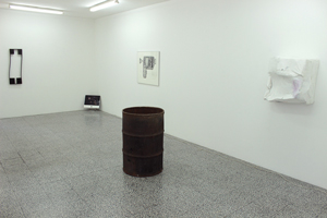
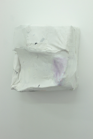
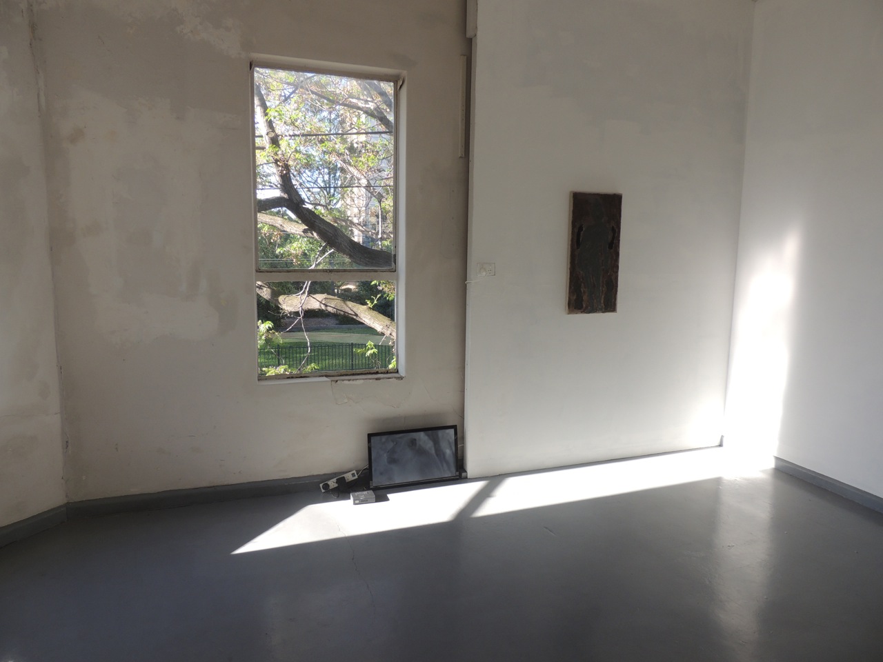
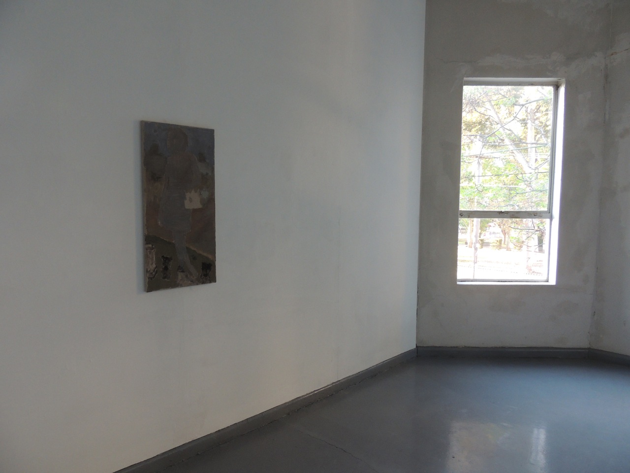
In The Mechanic, at Neon Parc, Matt Hinkley was showing Untitled, a cast sculptural form. As a hanging sculpture closely attached to the wall, its bulbous expanded shape drew me in. The white surface blushed with the occasional discolouration, not of a bruise, but a topological flushing out. I kept peering closely, looking in and around it, drawn to the awkward curves and bumps. As I peered in, the surface breaks appeared low like a goose-bump, but possibly so small I downsized the scale to a freckle – so small that your fingertips might not be able to discern the raising in the flesh, so you would have to use the back of your hand to run over it for sensation, and pick up the way these indentations deckled the surface.

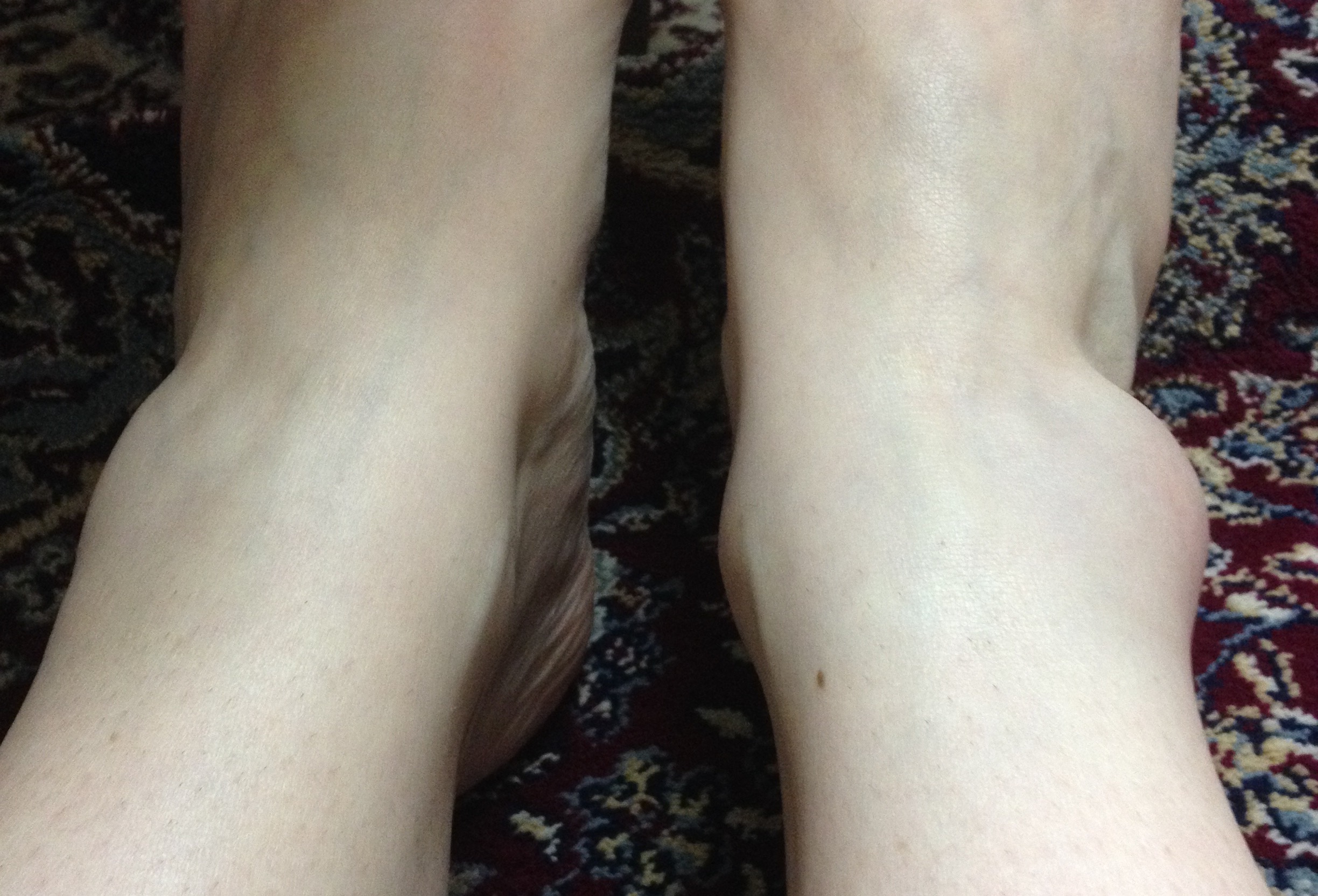
I feel like I sprained my ankle because I was flat-footed. My ankle didn’t hold me up: it collapsed and hugged the ground.

Maybe a collapsing ankle has greater and closer contact to another surface, and so has a friendlier relationship to its environment, like Matt Hinkley’s work. And I like it like that.

The Mechanic, Neon Parc, Melbourne, 29 April 2015 – 30 May 2015.

IMG_3571

IMG_3568

FullSizeRender

'The Mechanic', Neon Parc
‘The Mechanic’, Neon Parc

'The Mechanic', Neon Parc
‘The Mechanic’, Neon Parc


Sarah Aiken ‘Set’: Prestidigitation or so I like to imagine

An effective architectural plan can realise through floor plans and elevations a solid three-dimensional building. We imagine it forming in our minds and in that moment qualities of abstraction occur. Once initiated in this trickery, we can carry it with us anywhere. Might we become trained in our capacity to imagine more, to handle more?

Extended limbs
Sarah Aiken, ‘Set’, 2015. Photograph: Gregory Lorenzutti

I like to imagine that Sarah Aiken’s Set, performed at Dancehouse, built space using the tropes of Romanticism, through the use of her newly extended limbs, vignettes and spatial illusions. The performance consisted of Aiken attaching tubular limbs to her arms and legs, which not only moved with her, but also became set props within the space. In Romanticism, the introduction of the the pointe shoe as appendage led to the lifting of the length of tutus to reveal the foot, as well as an emerging focus on female dancers and the extended line of the body. In Set, Aiken extended the length and scale of the exterior limbs to new dimensions. Through these appendages the body was scaled up to set proportions, which then threw out the scale of the theatre. Too big? Too small? Not sure? Look again.

Vignette
Sarah Aiken, ‘Set’, 2015. Photograph: Gregory Lorenzutti

I like to imagine these extended limbs were a bit like her hair: blunt, sharp bangs. When coupled with her red lipstick, and her languid timing as she moved into various vignettes, she threw out a kind of 1980’s Helmut Newton posturing. Strong sharp women who maybe wear blunt sharp shoulder pads for fun (or maybe a little power). Initially I found the vignettes a little trite, but actually they worked well as accents to lead us through the performance. Through their laconic timing in the piece they created a pause, drawing attention to the design and conceptual propositions of the work.

Spatial Illusion, Photograph: Gregory Lorenzutti
Sarah Aiken, ‘Set’, 2015. Photograph: Gregory Lorenzutti

I like to imagine the spatial illusions or trickery came through with the construction of three spaces existing simultaneously. It felt like stepping into a Frances Stark work, whilst  simultaneously still being in the audience, and so challenged my sense of embodiment, but in the best way possible. Singular and multiple at the same time, moving through tenses. Could I be stretched? Could I handle more? The prestidigitation of Aiken walking between these objects, was constructed with enough material clunkiness and glitching that it revealed the illusion and effectively honed our focus between real and perception.

At times it was dense (maybe a little heavy), but like Ntone Edjabe says in the House of Truth, “Good. Sometimes this is better.” Or so I like to imagine.

Sarah Aiken, Set, Dancehouse, Melbourne, 22 – 26 July 2015.

Bec J and Sarah J, Rebecca Jensen and Sarah Aiken Tumblr.


Athens ‘House of Truth’ and ‘Hang ‘Em High #1’

At Documenta 12, 2007 as part of the living newspaper Chimurenga (Cape Town), editor Ntone Edjabe created DJ sets as performances called a House of Truth. Borrowed from a drinking pit in the old Kofifi, where the makers of the infamous Drum magazine gathered nightly for informal seminars with Can Themba as resident deconstructor, at the House of Truth, fluids, bodies and burning minds mix freely.

Whereas Edjabe’s first German House of Truth was free-wheeling and body pumping, the second was pretty hostile. All groups standing on the periphery of the dance floor, biding time, but present and waiting, radiating an awkward intensity. Edjabe looked around and said, ‘Good. Sometimes this is better.’

Edjabe has spoken of the Chimurenga Chronicle as a newspaper which looks at everything from an analytical place, an ideological place and a philosophical place – not a physical place. This is in itself contradictory, because newspapers are in their foundation made to mark time, whilst being material in their logic to the street. They are an access point. They make contact. In Chimurenga, they have embraced complexity in a logic of emergency. He discusses how they have embraced opacity, to liberate them from this shut hole of relevance.

Hang ‘Em High #1 was a show and performance at the Velvet Room, in January 2015, Athens, Greece. Like a reverse-install, it consisted of a series of artworks hung high in the space, and a level stage for the performers. It was packed, like a scene out of the Seaview Ballroom circa 1970’s. Lakis Ionas of The Callas spoke of how ‘we are trying to combine the excitement and the physical impact of music…with art. So…in this way (of having all artworks as high as we can in the Velvet Room), we are able to have a packed room full of sweating bodies dancing and drinking… We believe that our main point of curating these shows is to create a big installation including artworks, bands, lights, smoke, booze, chit chat, lust….

Both Edjabe’s House of Truth and the Velvet Room’s Hang ‘Em High #1 have a physicality to them. You feel things, you touch things, and bodies touch you. Within these instances they generate a kind of timeliness that seems to be highly designed to purpose a heightened firstness, as a here and now with talons to the past and opacity for the future.

In Hang ‘Em High #1, through the high install, people could lean against the walls and lean into each other. Through the high works, you looked up, noticed the smoke-laden air, the abstracted tapestries and the perspective of a higher view. The physical curation ideologically directed a sideline sensation of noticing you were looking, a bit like being reminded that a painting is constructed on a two dimensional surface, when you can see the untreated linen coming through. And through this opacity, what comes? Look hard, feel well. In truth, not something I always do.

Hang ‘Em High #1 (Antonakis Christodoulou, Dora Economou, Extra- Conjugale, Lakis & Aris Ionas / The Callas, Andreas Kasapis, Eleni Bagaki, Leonidas Papadopoulos, Panos Papadopoulos), Velvet Room, 17 January 2015, Athens, Greece.

Image 1
‘Hang ‘Em High #1’, Velvet Room

‘Hang ‘Em High #1’, installation view, Velvet Room, Athens, 17 January 2015
‘Hang ‘Em High #1’, Velvet Room

‘Hang ‘Em High #1’, installation view, Velvet Room, Athens, 17 January 2015
‘Hang ‘Em High #1’, Velvet Room

‘Hang ‘Em High #1’, installation view, Velvet Room, Athens, 17 January 2015
‘Hang ‘Em High #1’, Velvet Room

‘Hang ‘Em High #1’, installation view, Velvet Room, Athens, 17 January 2015
‘Hang ‘Em High #1’, Velvet Room


Jonathan Nichols plays David Morse and Viggo Mortensen

In 1991 Sean Penn directed his first film, The Indian runner. It is a story about two brothers. Viggo Mortensen plays the charismatic violent younger brother and David Morse plays the stoic gentle older brother. The film was set in the 1960s, but its sibling themes are timeless, timed well and present a time that has already passed before it even really existed. It is the film where I fell in love with Viggo Mortensen, taking photos off the TV screen to capture his lazy drawling stance, but here his charismatic qualities are a fast fix. ln the film Mortensen’s charisma is finite, as it always eventually blows out into cruel violence. More striking is my memory of David Morse’s performance. It is the quality of his manner I always remember to look out for—the small gestures, the slow pace, and the efficacy of his character (I’ve experienced and sought out these reticent moments wherever I can find them, hearing such a moment in Elliot Smith’s exhalation in Condor Ave, experiencing one in Rosalind Crisp’s awkwardly precise Danse (3) Sans spectacle, and seeing another in Carey Mulligan’s vulnerability in Never let me go). Small things that hold, last, move with you, alongside you. Morse’s performance plays out in extended time through his interactions, small smiles and tolerance of the eccentricities of others, all the while revealing or revelling in his smoothness, as a contrast to the rigidity of his younger brother.

Jonathan Nichols’s recent exhibition Frank Gardner at Lovers plays out like this self-portrait by Sean Penn. The show comprises a video propped on the floor and four paintings. The video resonates with the jarring qualities of Viggo Mortensen, while the paintings play out like David Morse. The video agitates as it captures the Asperger-like hyper qualities of a monkey, a monkey that is absolutely aware of the camera, yet will not meet the lens with a direct gaze. In contrast, the paintings capture a more subtle interaction between the way they each play out as a slow release of experience of time in art and their painted surface.

I have often felt the resonance of a work by Jonathan Nichols after stepping away, when its haunting presence follows me into my everyday existence. These new paintings reference paradoxically fleeting and iconic characteristics in people and implicate a sense of time. The works seem to hover between a kind of sculptural composition of the figure, where the spaces between two arms and legs, or the interplay between two women, or the contrapposto of an ancient and modern figure all throw out propositions about how I might gaze over the artworks, which is then layered up with a fragile construction of colour. Initially the effect is muted, like David Morse smiling and exhaling as he stands with his wife looking at his young son. And just as I have often asked how David Morse as a tall man could convey such sensitivity and repose as the older brother, I question Nichols’s use of colour to draw me in and hold me in the experience of his painting.

Nichols creates this muted or filtered experience in his paintings by exposing the untreated canvas—a dull taupe—and, similar to Bonnard, frugal use of paint. The colours have been created through a careful underlay of paint, which provides a Rothko-like intensity to the hue, but here it is not a repeated build-up of the same colour or tone, but an underlying carrier, whose purpose is to establish and hold the palette on the surface. This slows down the experience of the work and creates shifts and anomalies in the way it plays out during the experience of looking.

David Morse’s performance in The Indian runner is edged with sorrow. The performance has brevity; meaning is conveyed through the character’s existence alone. It is in being itself that Morse relegates space for these qualities. Jonathan Nichols’s work pervades its space. It is work that doggedly commits to these modest yet compelling qualities and through the subtlety of its application generates a complexity that sighs and holds.

Jonathan Nichols, Frank Gardner, Lovers, Melbourne, 17–18 October 2013.

Jonathan Nichols, Frank Gardner at Lovers, 2013
Jonathan Nichols

Jonathan Nichols, Frank Gardner at Lovers, 2013
Jonathan Nichols, ‘Elaine de Kooning’, 2013

Jonathan Nichols, Frank Gardner at Lovers, 2013
Jonathan Nichols

Jonathan Nichols, installation view 'Frank Gardner', 2013
Jonathan Nichols, ‘Mannequin’, 2013


Typesetting

When something new is coming through, I click my fingers. My thumb holds straight as my middle finger bends curving off and against it. Pressing to connect—straight lines and curves. The sound doesn’t really matter. It is to create tactility, to physically remind myself that the timing has changed, bringing forward a syncopated new speed (a short line translation between two creative processes). My fingers as these bodily outliers materialise the emergent asymmetry of a tipping point, where in close proximity they catch like tinder.

T consists of straight lines, Y consists of straight lines, P consists of straight lines and curves, O consists of curves, G consists of straight lines and curves, R consists of straight lines and curves, A consists of straight lines, P consists of straight lines and curves, H consists of straight lines, Y consists of straight lines.

Setting type is a reminder of the potential of a physical process to imbed and implicate the content. As a structure it has the capacity to release the other qualities so they are open to explore, to be creative. As a process the structure is explicit (you feel the raised indentation of ink sitting on a surface and distinguish that it is not digital). This support enables decisions surrounding the form to be implicit as the smaller delights waiting to unfurl over time. The font style and point size establish the scale/ambition, tone and context. The ragging establishes a horizontal and vertical aesthetic and read; a key access point. The furniture locks the text in place to print well, a stabiliser that digital printing has abstracted (almost like the disappearing editor in journalism).

Setting type is a timely (costly?) process. The Melbourne Museum of Printing holds a collection of print presses, which have been left behind, often discarded. Thankfully director Michael Isaachsen has caringly held on and saved as many as he can. He has collected a group of Linotype presses in the back room, with the dream of one day re-establishing a typeset newspaper. Why set type when digital printing is so much faster, cheaper? Holding type in your hand you can feel its straight lines and curves. The process has the capacity to materially bring into focus the distinction between text and reading. Good typesetting encourages a good read. It is built.

Thanks to Will Holder, David Reinfurt, Abra Ancliffe and the Banff Centre for typesetting workshops and information during ALWAYS LIFT INKING ROLLERS WHEN PRESS IS NOT IN OPERATION. IF ROLLERS ARE LEFT TURNING ON THE DRUM THE INK WILL DRY FASTER AND THE ROLLERS WILL BE SUBJECT TO NEEDLESS WEAR residency.

Melbourne Museum of Printing

Melbourne Museum of Printing

Melbourne Museum of Printing


Don Celender and The Kitchen

Portraiture study

If you could have your portrait painted by a famous artist of the past, or present, whom would you select? Why?
Don Celender

Picasso.
Because my eyes are on one side of my nose.
Herb Caen

Don Celender surveyed part 2 comprises series of mail-out art, where Don Celender mailed out questionnaires to various communities (general and professional) asking them to respond to a series of questions about life, work, art and death. This survey presents Portraiture study; Art dealers’ selection of artists survey, Artists survey, Ignored and neglected artist survey part 2, Aesthetic experiences survey, Art movements, Critics’ choice, Organisational art movement, Corporate art movement, and Mass media art movement. Consisting of a trail of white A4-size pages nailed onto white walls, the exhibition has a monastic sparseness. The gallery’s monochromatic walls offer numerous threads of the individual responses and non-responses to Celender’s questions and their context in time and the art profession. Unrestrained by linguistic gymnastics, the ideas come through the text directly.

In 2011, for its 40th anniversary, The Kitchen presented an exhibition, The view from a volcano: The Kitchen’s Soho years, 1971–85, showing the programming history of The Kitchen over more than ten years. The show consisted of single-channel videos and other artworks presented alongside audio and print documentation such as press releases, photographs of performances and posters from the shows. Artists included Vito Acconci, Nam June Paik, Robert Ashley and Carolee Schneeman, along with the Beastie Boys (as a group of four, including drummer Kate Schellenbach) and many more. Memorable threads were early Tony Oursler—a video of Oursler interviewing a woman about alien abductions; Bill Viola figuring out what a camera does; and discovering the neurotic Spalding Gray. Once again, the qualities of the work and their context emerged succinctly, through language that was accessible. The press releases revealed the artists’ desire to lay out an idea they appeared to be grappling with and, like Don Celender’s surveys, The view from a volcano as an exhibition managed to retain its content through time (past and present) as an archive and as individual works of art.

Often with a survey or an archive, language can become a turbulent terrain where the desire to express is lost to stylisation, perhaps as a result of self-consciousness, or a perception that this type of work needs to be propped up. The Don Celender and The Kitchen exhibitions are reminders of the value, pleasure and poetics that can be gained by having work just stand—through language.

Don Celender surveyed part 2, Crate Studio and Project Space, Margate, UK, curated by Sacha Waldron, 21 June – 11 August 2013.
The view from a volcano: The Kitchen’s Soho years, 1971–85, The Kitchen, New York, curated by Debra Singer, Matthew Lyons, and Lumi Tan, 30 June – 27 August 2011.

Don Celender, installation,
Don Celender, Crate, 2013

Don Celender, installation, Crate, 2013
Don Celender, ‘Corporate art movement’

Don Celender
Don Celender, ‘Portraiture survey’

The Kitchen, New York
‘The view from a volcano: The Kitchen’s Soho years, 1971-85’

The Kitchen, New York
Jim Burton, ‘John Cage event’, 1973, performance. Photo: Kathy Landman

The Kitchen, New York
Poster

Poster
Poster

The Kitchen, New York
Press release


Naval gazing: The busy beaver Turing machine and Justene Williams

In computability theory, a busy beaver is a Turing machine that attains the maximum ‘operational busyness’ (such as measured by the number of steps performed, or the number of nonblank symbols finally on the tape) among all the Turing machines in a certain class. (Wikipedia)

With a beaver-like ethic, Justene Williams’s seven small monitors in the group show FX at CCP generate a machine-like image and sound of whirling activity. There is a lot of action, as the not-quite-stuck-down papier-mâché sets, figures, costumes and world heave with Germanesque robustness. The dancing figures look and move like Vikings, their strength generated from the hips with a slow metronomic measure. The tone never sets because every time you think you have it figured out, you realise it’s not quite right. It doesn’t quite work.

The monitors are packed with detail, as the videos construct the illusion of a work ethic, but don’t compute towards efficiency. You feel art—Monet, Seurat, Berlin—but the rhythm takes you somewhere else. If you stay long enough, you might stay forever, waiting and hoping it’ll get somewhere, that the cake will be baked and come out of the oven. It never does. Williams’s work hits off lo fi not as an apathetic romantic hipster naval gaze, but as a kind of despair, like when you beaver away in the studio with anything and everything that is around you and then realise in fright that what you have created is something like a black hole.

Williams seems at one level to invert the Protestant work ethic. But if the Protestant work ethic emphasizes hard work, frugality and prosperity as a display of a person’s salvation, when Williams’s works go a little bonkers, it feels like a Mercedes spinning out of control. How could this happen? Failed Fordism through troubling German (in)efficiency? It wasn’t supposed to be this way. And, in true Williams style, just as you register a bad feeling that it won’t work out, a figure will dance, have a light foot and you’ll laugh. Busy, busy, busy.

FX (Steve Carr, Greatest Hits, Lou Hubbard, Taree Mackenzie and Justene Williams), Centre for Contemporary Photography, Melbourne, 3 April – 19 May 2013.

Justene Williams, ‘Berlin, burghers, microwave, Monet’, 2010, 7-channel digital video

Justene Williams, ‘Berlin, burghers, microwave, Monet’, 2010, 7-channel digital video

Justene Williams, ‘Berlin, burghers, microwave, Monet’, 2010, 7-channel digital video

Justene Williams, ‘Berlin, burghers, microwave, Monet’, 2010, 7-channel digital video


Gotta dance

Tarantism by Joachim Koester is a film prefaced on letting go. Bodies writhe and lash around the screen in attempts to release themselves. Watching these photogenic bodies move around, we are hypnotised by the rhythmic metronomic projector throwing up the images. Hypnotic trances, when working well, open up sideline spaces, enabling the focal point to shift from the centre to the edge.

I Participate
Wisps of hair flick through space, hitting the edges of the frame, cutting, yet always seductive. In these moments, intensity is not generated from within the torso, but instead expands beyond boundaries towards unknown trajectories: the rapture of letting go when you can’t see the function of the body, its extension into an abstract ideal, the whiplash of hair from a spasmodic head reaching beyond its line. An image hits off the body, off its form, and transmutes, to scratch the edges of a screen.

II Watch
A body is writhing on the floor while the other performers stand around and watch in a circle-like shape, a roda. Robert Hinton, writing in ‘Black dance in American history’, for the 1988 American Dance Festival Program booklet, distinguishes between dual audiences where, a) the dance can be created for the benefit of the dancers, where the experience for the audience is secondary, and b) the dance can be created for the pleasure of the audience, where the experience of the performer is secondary.

Here, in its rigidness, the polarity between the writhing dancer and viewing/inactive performers situates the space and the incongruity of this moment in Tarantism so that it feels like the edge of the peak. As the performers bandy together they cleave energy off one another to gather momentum for their tarantism. In the circle the inactive performers watch the active dancer’s seizure-like rapture as a precedent to perform, to dance. In this sideline, the investment, the articulation and the relationships shift. This is not to define the gestures, but to create a lineage and use it as a vessel for focus, to delve further, go deeper, get lost.

III Release
The dancers stop. Puffed out, breathing heavily, showing the exertion of their sustained performance. The panting completes the dance. Without it we can’t expel our own breath or even recognise we’ve been holding it.

Without it we can’t recognise what we’ve gotta do.

Gotta dance.

Joachim Koester: Tarantism, Ian Potter Museum of Art, University of Melbourne, 20 March – 2 June 2013.

Joachim Koester, ‘Tarantism’, 2007, 16 mm black & white film installation, 6:31 mins

Joachim Koester, ‘Tarantism’, 2007, 16 mm black & white film installation, 6:31 mins


You need a bad operation

As Dr Octagon (aka Kool Keith/Dr Dooom—all personas fabricated by American rapper Keith Matthew Thornton) said, ‘you need a bad operation’. This was just before he gruesomely cut the body open, with ensuing sounds of screams, blood spurts, farts and confusion.

Robin Hungerford’s video, The fix, showing at Bus Projects in the exhibition Thank you very much, is a reminder of how over time artists have pursued the ritualised and bloody ‘bad operation’ genre as a rite of passage. Hungerford’s crude self-operation locates him in this motley crew, which includes Dr Octagon/Dr Dooom, Dana Schutz and the quintessential John Bock. At its most Bockish, The fix is agitatedly funny, especially when Hungerford sneers at the catching rips of his stockinged flesh (the Stanley knife just isn’t sharp enough). Once all his original organs have been removed, Hungerford’s hand rests in a pool of his own blood, finding comfort there. But the most insightful and amusing moment comes when Hungerford attempts to piece himself back together again. Because his flesh can’t quite hold the new organs, his symmetrical crucifix-like self-portrait is seismically pushed and pulled in and out of form.

In Thank you very much, curator Channon Goodwin has first and foremost presented the artists. So while this is an eclectic show, the presence of the artist is evident in all works. The show’s tension is created out of the way these artists manoeuvre us around the space, from the gentle nudging of Tim Woodward and Ms & Mr, to the jarring shoves of Erika Scott and Hungerford. The space we have for consideration is negotiated via fluctuations in pressure applied in this way.

I was shoved into Hungerford’s space, where I found the image of the operation compelling, but I left feeling as though I had been exposed to more. Through the operation I had glimpses of Hungerford himself as his expression responded abjectly to the conceptual gestures self-inflicted on his body. I was reminded that we are never merely looking at works of art, but also at the artists, and shouldn’t forget their influence over our perception of what is going on.

Like all good bad operations, the performance had to be crude, and I chuckled and snickered at all that had been exposed. But while I also had the feeling that it had been done to me—that I’d been cut somehow—I didn’t really know how I had been marked. Who was I in this farcical act? Why did I love the bad operation so much? Then a tune wafted through my memory …


‘Milton the monster’, 1965–68, produced and directed by Hal Seeger

I realized that, if in luck, with this kind of work we might feel as though we have seen and been Professor Weirdo … and Count Kook … and Milton … (all and none).

Thank you very much (Adam Cruickshank, Robin Hungerford, Katie Lee, Ms & Mr, Dell Stewart, Erika Scott and Tim Woodward), Bus Projects, Melbourne, 26 February – 16 March 2013.

Robin Hungerford, ‘The fix’, 2011, video

Dr Octagon, ‘General Hospital’, 1996

Dr Dooom, ‘R.I.P. Dr Octagon’, 2008

Dana Schutz, ‘Face eater’, 2004

John Bock, ‘Im Schatten der Made (In the shadow of the maggot)’, 2010

John Bock, ‘Im Schatten der Made (In the shadow of the maggot)’, 2010


Falling into a hangover. Don’t show images fast

So I’m wondering …

I was in Greece recently talking to two brothers about the situation there, and they presented Sweden as a utopia. Social democracy. It worked. Did it work? Could it work over a sustained period of time? How might you get some?

One month later I was in Klaipėda, Lithuania, at Falling from grace, a contemporary Swedish art group show based on the hangover of post-social democracy. An exhibition expressing the fall towards a lower economic standard of living in Sweden. A fall from grace for whom? For the rest of us who wish we were there, symbolically if not in reality?

Magnus Petersson’s series Sealed comprises photographs of scaled views of the Swedish family countryside home, a disappearing tradition. As models they present an ideal to aspire to. The rooms reflect a warm, soft, all-enveloping glow, which Petersson has referred to as ‘a soft Hammershoi or Tarkovsky-like afternoon glow’. Coming from the other side of the world, it felt like Vermeer—a glow from inside a house, warm and suggestive of a robust life unburdened by a harsh sun or thongs. Like all models, the images have a stillness to them, and this renders their time fixed, dead, historical. While I was drawn in by the glow and symmetry, I couldn’t help but feel like I missed the party. That I had come too late.

Ninia Sverdrup’s videos Urban scene XII: petrol station and Urban scene XIV: corner store, felt like an antidote to being too late. The work was slow. A fixed camera captured the happenings at a petrol station at night, a corner store during the day. The videos were based around ‘to have time for’, a luxury. The images had the slow plod of a moving Philip-Lorca diCorcia urban/suburban environment: nice light, easy life, boring possibly. So, while beautifully rendered, without the sound they seemed common and easy to pass by and dismiss, but once I put on the ear-phones, the sounds of these scenes began unfolding. I felt the push-pull of the tension of nothing but life happening. Certain sounds were heightened, not of conversations, but of the space, the creaks and moans of these urban environments. These scenes began to suggest that to have time (which is always a luxury), is to enable better hearing, better light and easier daily rituals.

Kalle Brolin’s Images of debt, in contrast, was fast. So fast that the microfiche whirled in a blurred Citizen Kane-like flurry. Brolin presented a video-portrait of a child (Mattias Abrahamsson) who had been portrayed in a Swedish newspaper throughout his life up to adulthood as a metaphor for changing levels of national debt in Swedish society. In the style of Seven Up!, the video showed how each year the newspaper would show an image of Abrahamsson growing and a note showing the corresponding size of the national debt. Brolin contacted Abrahamsson and his video was interspersed with a running commentary of Abrahamsson’s experiences and present life. As each year rolled through, the microfiche whirled forward and you felt analogue time passing, a historical medium showing a lost time. Images of debt managed to capture the discomforting way in which economic circumstances can make us feel we are more statistical data than human beings. Seeing a young man discuss how at times he didn’t really want to have his photo taken, and how ‘they’ came into his home, I began to feel that I was seeing the crevices in a symbolic ideal. The fall.

So, coming from Australia and knowing how I/we like things slow, I couldn’t help but wonder who we are. Are we Sweden, with a good social-democratic life and economic fortitude, or will we always aspire towards contemporary Europe and its diminishing middle class? In 2013, will we be the party or the hangover? And at what speed and in what light will we show our images?

Falling from grace, Klaipėda Culture Communication Centre (KCCC), Lithuania, 18 January – 21 February 2013.

Magnus Petersson, ‘Sealed’, 2005

Ninia Sverdrup, ‘Urban scene XII: petrol station’, 2011, HD video, 8:30 mins

Kalle Brolin, ‘Images of debt’