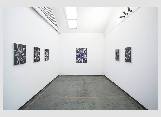
Out one spectre: Justin Trendall at Kalimanrawlins
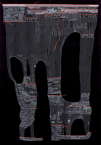
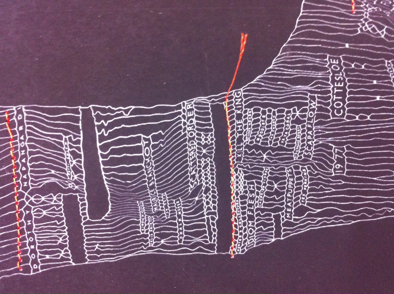
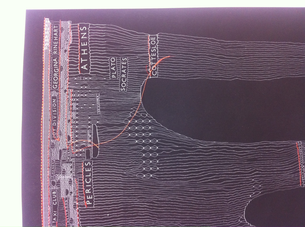
I’ve always felt that Justin Trendall’s unique state screenprints attempt to map the nature of memory; the acrobatic things it sometimes does, the mistakes it makes in the pursuit of narrative logic, that kind of thing.
He’s been making the prints for some years now. A handful of new versions are currently on display at Kalimanrawlins. Lists of names—often radically unrelated—embed in finely woven nets. There are often holes. There are also strange stoppages: bottlenecks that funnel one passage of the composition into another.
It might be me but it appears as if, over time, Trendall’s nets have become more complicated and difficult to decipher. He’s not particularly old, but I can’t help feeling that this increased complexity is somehow a graphic rendering of time passed. Existing memories remain the same when in isolation, but surely they change when jammed together with new ones; sense must be made through ever more random throws of the dice. It follows that even as connections become more diffuse and harder to explain, the pattern they trace becomes more complex, more compelling.
History is difficult. The old adage goes that it’s written by the victors. It’s equally true that it’s written by either side of whatever political divide (‘left’ or ‘right’ in Australia) holds sway. New versions only take us so far before they are pulled under by the weight of competing ideologies.
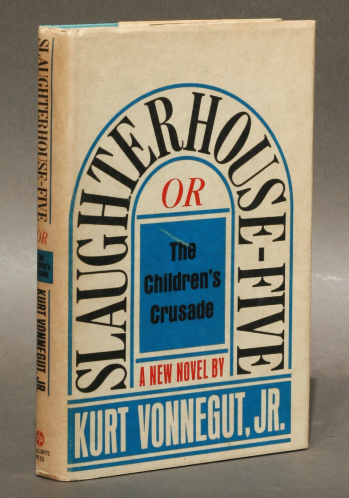
I’m not sure what this means for the kinds of personal histories individuals construct, but one thing that seems relevant here is something that has stuck with me from a teenage infatuation for Kurt Vonnegut’s books. It’s the way he described plotting his famous novel Slaughterhouse 5. He pinned a large piece of butcher’s paper to his study wall and assigned each character a different coloured pencil and then proceeded to draw horizontal lines across the paper. When they reached the bombing of Dresden, which is the novel’s penultimate event, they descended into a scribble from which only a handful emerged.
This is a simple graphic rendering of the novel’s plot. Maybe it’s far too stripped back to tell us anything much at all. But at one level that’s the only truth of things. From this perspective all lives might look something like Trendall’s prints: logic boards that have been superseded, reworked, and relaunched more effective (or defective) than ever. You make your own sense of them, that’s the point.
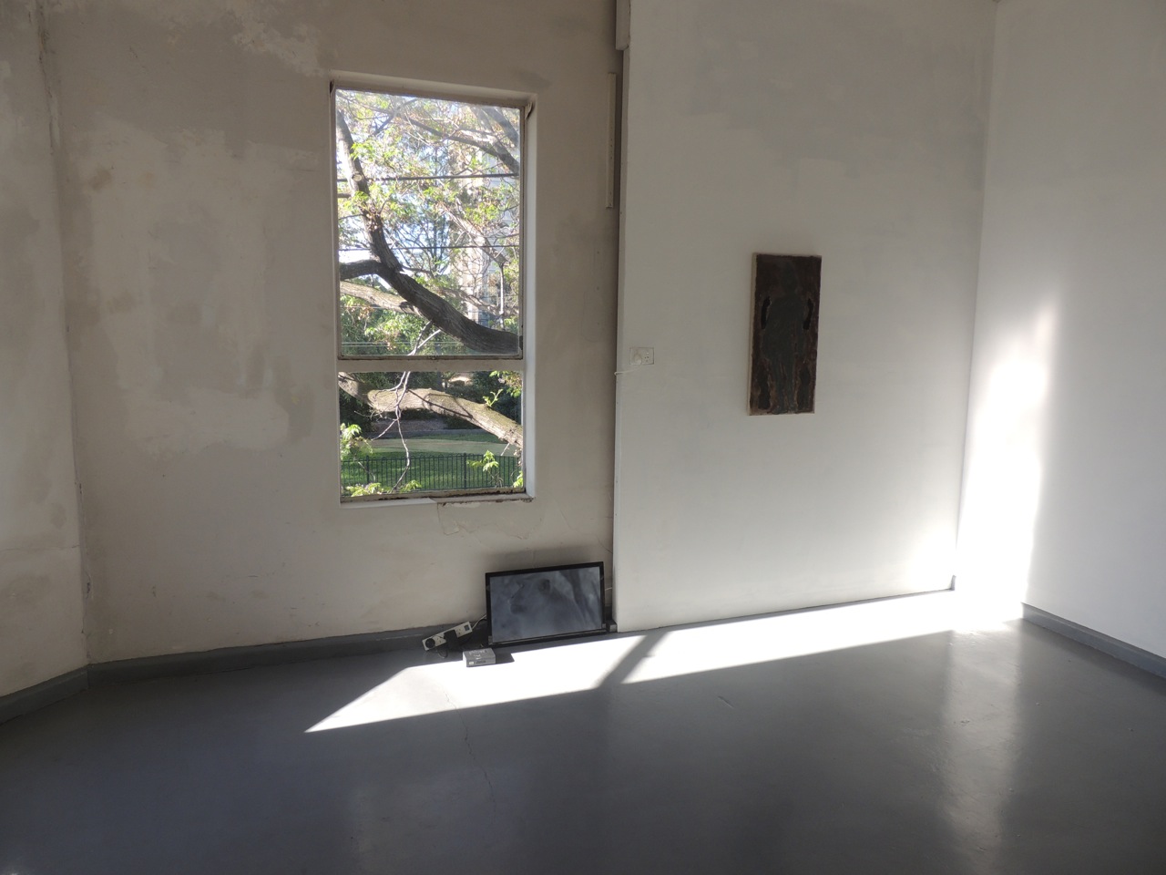
Justin Trendall, Out one spectre, Kalimanrawlins, Melbourne, 19 October – 9 November 2013.
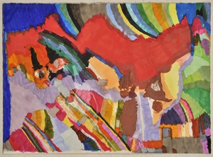
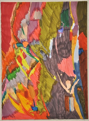
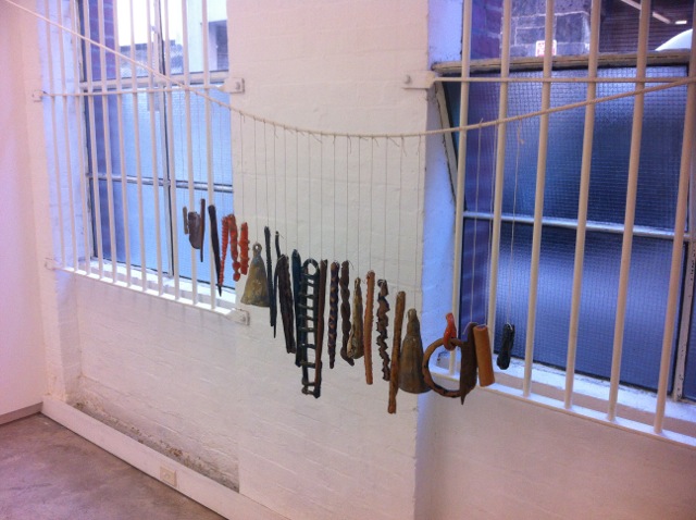
Justin Trendall, ‘Pilbara block’, 2013, archival digital print and cotton, 46 x 32 cm
Justin Trendall, ‘Pilbara block’ (detail), 2013, archival digital print and cotton, 46 x 32 cm
Justin Trendall, ‘Pilbara block’ (detail), 2013, archival digital print and cotton, 46 x 32 cm
Kurt Vonnegut, ‘Slaughterhouse 5’
Jonathan Nichols plays David Morse and Viggo Mortensen
In 1991 Sean Penn directed his first film, The Indian runner. It is a story about two brothers. Viggo Mortensen plays the charismatic violent younger brother and David Morse plays the stoic gentle older brother. The film was set in the 1960s, but its sibling themes are timeless, timed well and present a time that has already passed before it even really existed. It is the film where I fell in love with Viggo Mortensen, taking photos off the TV screen to capture his lazy drawling stance, but here his charismatic qualities are a fast fix. ln the film Mortensen’s charisma is finite, as it always eventually blows out into cruel violence. More striking is my memory of David Morse’s performance. It is the quality of his manner I always remember to look out for—the small gestures, the slow pace, and the efficacy of his character (I’ve experienced and sought out these reticent moments wherever I can find them, hearing such a moment in Elliot Smith’s exhalation in Condor Ave, experiencing one in Rosalind Crisp’s awkwardly precise Danse (3) Sans spectacle, and seeing another in Carey Mulligan’s vulnerability in Never let me go). Small things that hold, last, move with you, alongside you. Morse’s performance plays out in extended time through his interactions, small smiles and tolerance of the eccentricities of others, all the while revealing or revelling in his smoothness, as a contrast to the rigidity of his younger brother.
Jonathan Nichols’s recent exhibition Frank Gardner at Lovers plays out like this self-portrait by Sean Penn. The show comprises a video propped on the floor and four paintings. The video resonates with the jarring qualities of Viggo Mortensen, while the paintings play out like David Morse. The video agitates as it captures the Asperger-like hyper qualities of a monkey, a monkey that is absolutely aware of the camera, yet will not meet the lens with a direct gaze. In contrast, the paintings capture a more subtle interaction between the way they each play out as a slow release of experience of time in art and their painted surface.
I have often felt the resonance of a work by Jonathan Nichols after stepping away, when its haunting presence follows me into my everyday existence. These new paintings reference paradoxically fleeting and iconic characteristics in people and implicate a sense of time. The works seem to hover between a kind of sculptural composition of the figure, where the spaces between two arms and legs, or the interplay between two women, or the contrapposto of an ancient and modern figure all throw out propositions about how I might gaze over the artworks, which is then layered up with a fragile construction of colour. Initially the effect is muted, like David Morse smiling and exhaling as he stands with his wife looking at his young son. And just as I have often asked how David Morse as a tall man could convey such sensitivity and repose as the older brother, I question Nichols’s use of colour to draw me in and hold me in the experience of his painting.
Nichols creates this muted or filtered experience in his paintings by exposing the untreated canvas—a dull taupe—and, similar to Bonnard, frugal use of paint. The colours have been created through a careful underlay of paint, which provides a Rothko-like intensity to the hue, but here it is not a repeated build-up of the same colour or tone, but an underlying carrier, whose purpose is to establish and hold the palette on the surface. This slows down the experience of the work and creates shifts and anomalies in the way it plays out during the experience of looking.
David Morse’s performance in The Indian runner is edged with sorrow. The performance has brevity; meaning is conveyed through the character’s existence alone. It is in being itself that Morse relegates space for these qualities. Jonathan Nichols’s work pervades its space. It is work that doggedly commits to these modest yet compelling qualities and through the subtlety of its application generates a complexity that sighs and holds.
Jonathan Nichols, Frank Gardner, Lovers, Melbourne, 17–18 October 2013.
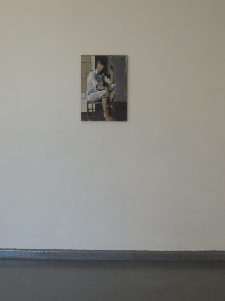
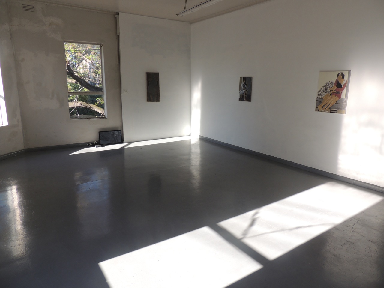
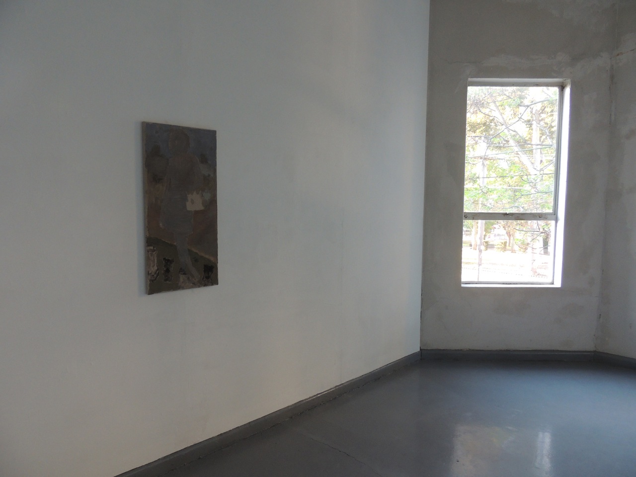
Jonathan Nichols
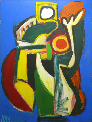
Jonathan Nichols, ‘Elaine de Kooning’, 2013
Jonathan Nichols
Jonathan Nichols, ‘Mannequin’, 2013
Like a prayer: Kate Murphy ‘Probable portraits’
Earlier this year, a gallery at Federation Square presented a large exhibition of work by a well-known international film artist. Throughout the week, school kids shoved and tumbled like wildebeest, iPhones flashed, gallery attendants stalked and on weekends mums steered prams into the legs of skinny, beardy dilettantes, young couples drifted, older ones concentrated, toddlers squealed. It was a blockbustery, people-pleaser of a show. Critics used the words ‘clever’ and ‘inventive’ to describe the artist’s ‘astute investigations’ into identity, individuality, performance and stereotypes. Maybe clever editing and montage doesn’t get my blood pumping like it used to, because in the low-budget arts program in my mind, I gave the exhibition two (out of five) stars. I couldn’t shake a sense of the artist’s haughty attitude toward her subjects—the actors and interviewees upon whom she has relied for her own art-world celebrity.
Success in the arts is largely based on ambition. (You’ll be disappointed to learn I’m not presenting the keynote on ‘Success in the arts’ at the AAANZ conference next month. The interview was really hard and I flunked the part when they ask you to list a solitary creative achievement from that fellow with the wacky glasses on The X factor. Please write in if you know the answer.) This is not to say that careerism leads to great work, which often happens at the hands of people who are good at wasting huge amounts of time.
Probable portraits, an exhibition of six video works by Australian artist Kate Murphy is part of Shepparton Art Museum’s focused contemporary art program. The exhibition is in some ways a portrait of a serious and perceptive artist, exploring the capacity of documentary and video portraiture to reveal the latent parts of her subjects, her audience and herself.
Prayers of a mother (1999), and Yia Yia’s song (2010)—the exhibition’s earliest and most recent works, respectively—are multi-channel family portraits. Murphy brings her own immediate family together in Prayers of a mother, a piece that describes ideas no less grand than Catholic faith, doubt, and intergenerational dependency. Yia Yia’s song unites a family of first-generation Greek migrants in their heart-rending responses to the 1976 tape-recorded elegy of a mother left behind in Greece. The song itself, presented on loop in a spacious, darkened gallery at SAM, is stunning. The range of voices in this work, and the confluence of concentration, pathos, distress and amusement reflected in the faces of the participants, captures the effects of migration on individuals and communities.
Each of these two works uses the visual language of the YouTube selfie, or reality TV confessional, but, crucially, without the sense of voyeurism or imposition. In her investigations into family, God, trauma and truth, Kate Murphy deploys what I call the ‘David Attenborough approach’—one of humility and wonder.
Kate Murphy, Probable portraits, Shepparton Art Museum, Victoria, 13 September – 24 November 2013.
Kate Murphy with Basil Hagios, ‘Yia Yia’s song’ (still), 2010, 8-channel HD video installation. Courtesy the artist and BREENSPACE, Sydney
Kate Murphy with Basil Hagios, ‘Yia Yia’s song’ (still), 2010, 8- channel HD video installation. Courtesy the artist and BREENSPACE, Sydney
Kate Murphy, ‘Prayers of a mother’ (still), 1999, 5-channel digital video installation. Courtesy the artist and BREENSPACE, Sydney
Kate Murphy, ‘Prayers of a mother’ (still), 1999, 5-channel digital video installation. Courtesy the artist and BREENSPACE, Sydney
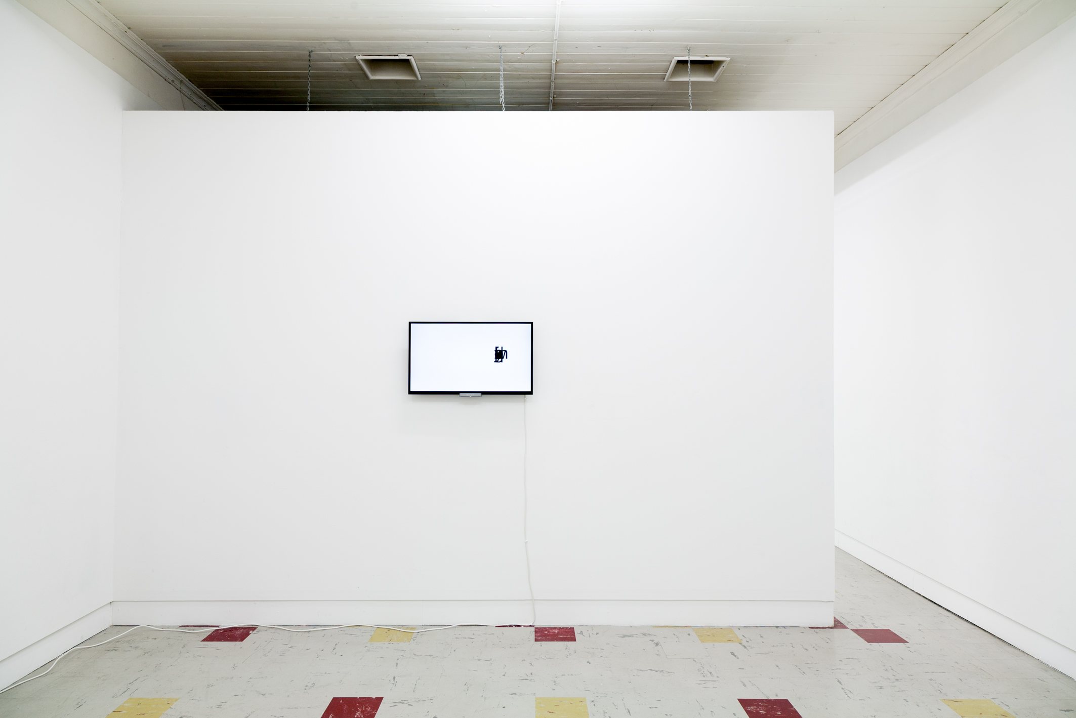
Huh
Last year in September, JJ Charlesworth wrote a relatively short opinion piece for Art Review titled ‘At what point does nothing become too much of a good thing?‘—a pointed meandering that refers to Object Oriented Ontology (OOO hype) whilst questioning the ‘dematerialised, postindustrial rhetoric’ of Tino Seghal.
In between all this questioning of material-based culture, the market and overproduction what about the ‘thingness’ of words, verbal exchange and speech; of daily exchanges and their value; what is shared and how it becomes action—the materiality of language.
Samuel Beckett spoke about the limitations of this and language. In his famous 1986 made-for-TV teleplay ‘Quad I & II’ we have the visual boundary of these ideas played out. Quad’s script could be read as a mathematical pattern or a diagram—a thing—the material manifestation of something unspoken played out on a stage and presented en mass via television. Ungendered cloaked mimes rhythmically stepping-out a preprogrammed loop, leaders alternating, order defined by the boundaries of a square stage, this in turn echoing that of the square box of televisions from that time. The centre only ever circled (so too speak), as if to arrive or acquire desire, would only serve to make visible what we the viewer and unnamed collective might already know. Beckett’s stage play is as such, a kind of gesture towards us—a pattern we can interpret, a rhythm we might recognize—potentially boring the arrangement becomes a narrative without words and somehow contains shared meaning.
Life and times begins with about a five-minute musical prelude—somewhat Sufjan-Stevens-Illinoise in its arrangement and then …
um
is sung.
I’m not sure many musical theatre scripts begin with um, a pause filler dependent on place and perhaps time. (Americans use um and uh, whilst the British might use er and erm. I think we use a combo. I’m fond of the Japanese ano and eto.)
Life and times episodes 1–4 was performed on sequential nights and in its entirety during a ten-hour-day long marathon performance which included a BBQ and brownies cooked and served by members of Nature Theatre of Oklahoma (NY) during the 2013 Melbourne Festival.
The duration of the performance eventually reveals a narrative, but one that involves repetition, boredom, and choreographed and melodic improvisation. Simultaneously theatre and not-theatre, Episode 1 opens with three female cast members each singing a different part of a recored narrative. References to first person and third person pronouns move with each character. When the female cast members are replaced by their male counterparts, so too do the gendered pronouns—one person’s story becomes many. As you wonder if anything will happen, and boredom sets in, it is ruptured by the semi-fascist grey uniforms worn by the cast, the occasional glance they throw you, or the rigid mass-spectacle-type-semi-democratic-choreographed moves.
Fatigue and boredom are shared by both the actors and the audience, perhaps too by those playing the live score …
Oh my god …
um … I’m like a very serious baby.
um and ah um.
ha ha ha
It’s a kind of a lol IRL YOLO performance that reflects on someone’s (anyone’s) life story from birth, mostly sung by a cast that somehow maintains momentum and stamina without the usual verse-chorus-verse-structure. Unlike Quad, the repetition is inconsistent, or less obvious from afar—more differential calculus than linear equation and more sculptural painting performance gig than theatre—the formal space of the Playhouse transformed.
Come on Julie, come on—is chanted semi-Appalachian—think ‘Down in the river to pray’.
It was like so beautiful—returns intermittently throughout the performance like an off-beat refrain.
Day-dreaming seems like an OK thing to do during the performance—the OK singing, the OK dancing and the OK script kind of merging to form a kind of familiar soundtrack, albeit new. By the 3rd and 4th episode—more ‘Days of our lives’ or ‘Bold and beautiful’ in its aesthetic (rather than the minimal post-Soviet uniforms of episode one, and RUN-DMC-multicolour-tracksuits of disco-backing-tracked episode 2), you might be looking at the audience around you. Watching them, instead of the stage, as they laugh, cry, walk out, fall asleep and/or sigh in response to the almost-acapella-absurdist-and-readymade-script (the (soon to be 16) episodes are derived from a phone conversation between an unknown to us story-teller and the OK Theatre directors Pavol Liska and Kelly Copper).
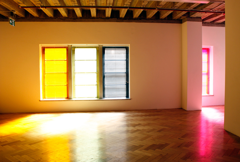
As with Beckett’s Quad, story is rendered irrelevant whilst language is stretched—formal foredom—like Baldessari throwing balls in the air to make a perfect square, or Taree and Ronen’s coloured Venetian blinds and Sam George’s Sony Bravia painting of every letter of the alphabet overlaid.
One half of the Life and times director-duo, Pavol Liska, originated from Slovakia and was trained in the mass spectacle performances of the Soviet-run state. It was the theatre companies that led the strikes leading to the 1989 Velvet Revolution.
In Ranciere’s text The aesthetic unconscious, he attempts to position his idea of the aesthetic regime in the context of the emergence of psychoanalysis and the order of representation. It is described as being the relations between what is said and what can be seen, and the set of relations between knowledge and action.
Amidst a plethora of representations our shared ‘trying to say everything at once’ is perhaps very similar to a potentially never-ending almost melodic and almost performed opus, huh.
History is our audience (Craig Burgess, Marcia Jane, Taree Mackenzie and Ronen Becker, David Chesworth, Dirk de Bruyn and John Nixon), curated by Kelly Fliedner, WESTSPACE, Melbourne, 22 November – 14 December 2013.
Sam George, just for now, TCB art inc, Melbourne, 30 October – 2 November 2013.
Life and times: episodes 1–4, Nature Theatre of Oaklahoma (US), Melbourne Festival, Arts Centre Melbourne (Playhouse), Melbourne, 22 – 26 October 2013.
Taree Mackenzie and Ronen Becker, ‘Glow’, 2013
Sam George, ‘trying to say everything’, 2013
Sam George, ‘trying to say everything’ (detail), 2013
Trev goes to Frieze London and Chelsea in New York. Enjoys it, but still …
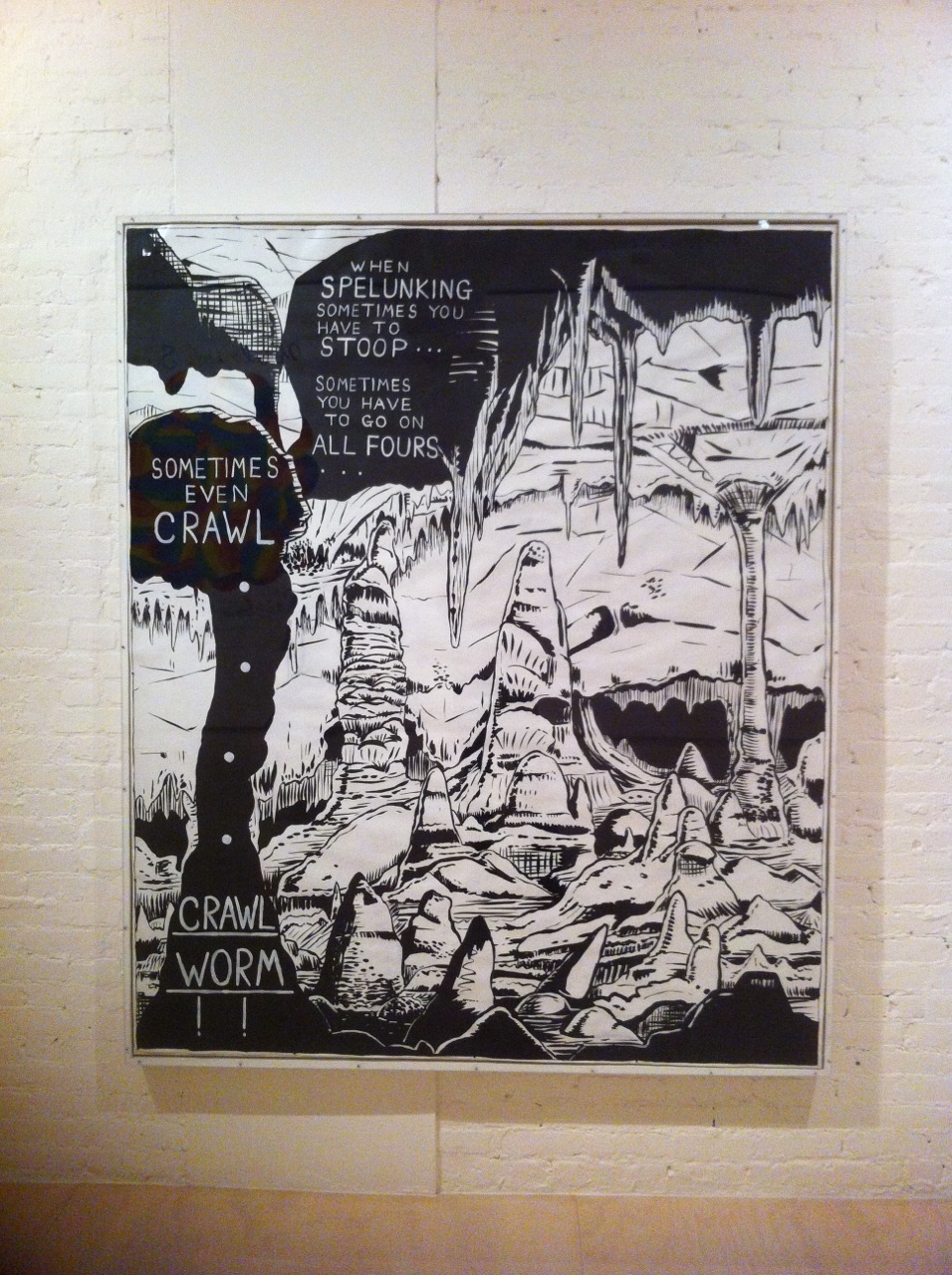
Facebook, The Age. Facebook, The Age. When will I ever ‘Facebook’ The Age? Status imminent to ‘Facebook’ The Age … (The newspaper I mean). You see I’m at Frieze Art Fair in London. I see a Rob Pruitt he’s doing well. The huge portrait of Sasha Grey the porn star is doing well, Koons is doing REAL well, bit of funs never hurt anybody is doing well. I’m implicit dreaming I’m an old money collector. Fantasy is along for the ride. Facebook, The Age, Facebook, The Age. Instagram. Scroll, scroll, scroll away. Saltz on ‘The new uncanny’, blah. Facebook, The Age. Facebook, The Age. Now I’m in a Lear Jet two-seater with Drake checking out what he’s gonna buy from that poor show of Matthew Day Jackson at Hauser & Wirth, those post-Damian Hirst tiddly bits. Facebook, The Age, Facebook, The Age. Now Instagram. Scroll, scroll, scroll, scroll, scroll, scroll, scroll, keeping on scrollin now ‘Facebook’ The Age. Facebook, The Age. Media is a medium, damn the creator. Facebook, The Age. Soulful Soldier this Oscar Murillo but he’s just like a cashed up Basquiat getting Tupac money twice over. I suppose it’s not his fault. Schnabel’s heaving ho heave ho. Get out of Drake’s jet in NY to go MoMA PS1 and see why Mike Kelley killed himself. Facebook The Age Facebook ‘The Age’. Kanye’s New Video ‘Bound 2’ Kim Kardashian’s assets. Final Facebook + The Age. In the words of Kelley ‘When SPERLUNKING sometimes you have to stoop … sometimes you have to go on ALL FOURS … SOMETIMES EVEN CRAWL … CRAWL WORM’
Gavin Brown’s Enterprise, Gagosian Gallery and Galerie Max Hetzler, Frieze London, Regents Park, 17–20 October 2013.
Mike Kelley, MoMa PS1, New York, 13 October 2013 – 2 February 2014.
Rob Pruitt and Alex Katz, Gavin Brown’s Enterprise, Frieze London
Richard Phillips, Galerie Max Hetzler, Frieze London
Jeff Koons, Gagosian Gallery, Frieze London
Mike Kelley, MoMa PS1
Mike Kelley, MoMA PS1
Right thurr
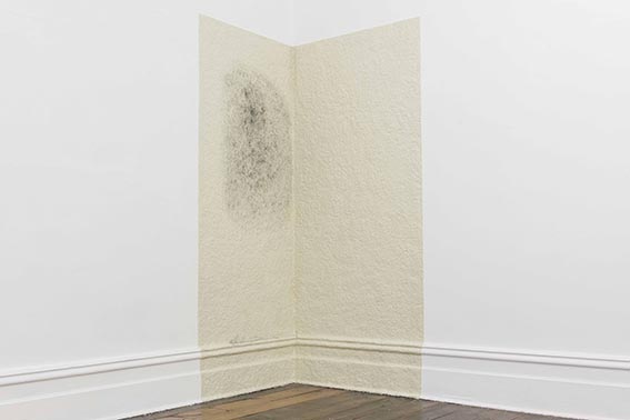
In the corner of the exhibition Unsettled sculpture is the larger of Carolyn Eskdale’s two untitled works and it has been on my mind.
The exhibition provides tactility at a distance and relief from the expectation of audience performance. ‘Tis the season of the more didactic and the make-your-own about town, but to paraphrase Chingy, sometimes, I love it when you just put it right thurr.
Eskdale has worked one of the Sarah Scout gallery walls into a lather. An off-white, fingerprinted and hand-pressed patina of plasticine with squared-off edges has been squidged into and over the cornice. The largest work in the show is almost imperceptible upon entering the space … which is a kind of a writing-lie. Not much is beyond or beneath seeing in the gallery space, since the specifics of context set eyes to alert, so scratch that. Rather the work ghosts and apes the fabric of the gallery space, its woolly quality toying with focus.
Eskdale has worked ash into the centre-ish of the plasticine so the domestic gallery space is forced to carry a grubby schmear, like sex on sheets. Eskdale’s work unsettles best where wonk has an important and appealing place in this show. Off-white and grey/black make it appear like the room couldn’t handle the heat or handle the pressure and works around the jostling patrons and the abrasion of white walls, with inattention and excuse-mes.
I recently heard Stuart Geddes speak about ‘desire lines’ as part of a CCP lecture series—reminding us of British artist Ryan Gander’s project which takes the form of a lecture. Desire lines concern little acts of rebellion in urban spaces, in the form of man-made pathways, that Gander describes ‘have been worn away by people who cut across the middle. They’re always the most direct route people want to take, which is why they are called desire lines’. The equal opposite paths are trauma lines, which he has also documented, of well-worn pathways through hospital emergency rooms. A related examination of artistic practices where alchemy and unruliness combine with a kind of necessity or desire were at play in this thoughtful and complex exhibition (noted objectively and without bias). There is an unbounded and don’t-fence-me-in character at play in both projects, which is common to Eskdale’s installation, appearing timely and comforting.
Unsettled sculpture, Sarah Scout Presents, Melbourne, 14 November to 14 December 2013.
Carolyn Eskdale. Photo: Phoebe Schmidt
Chua Mia Tee’s Singapore
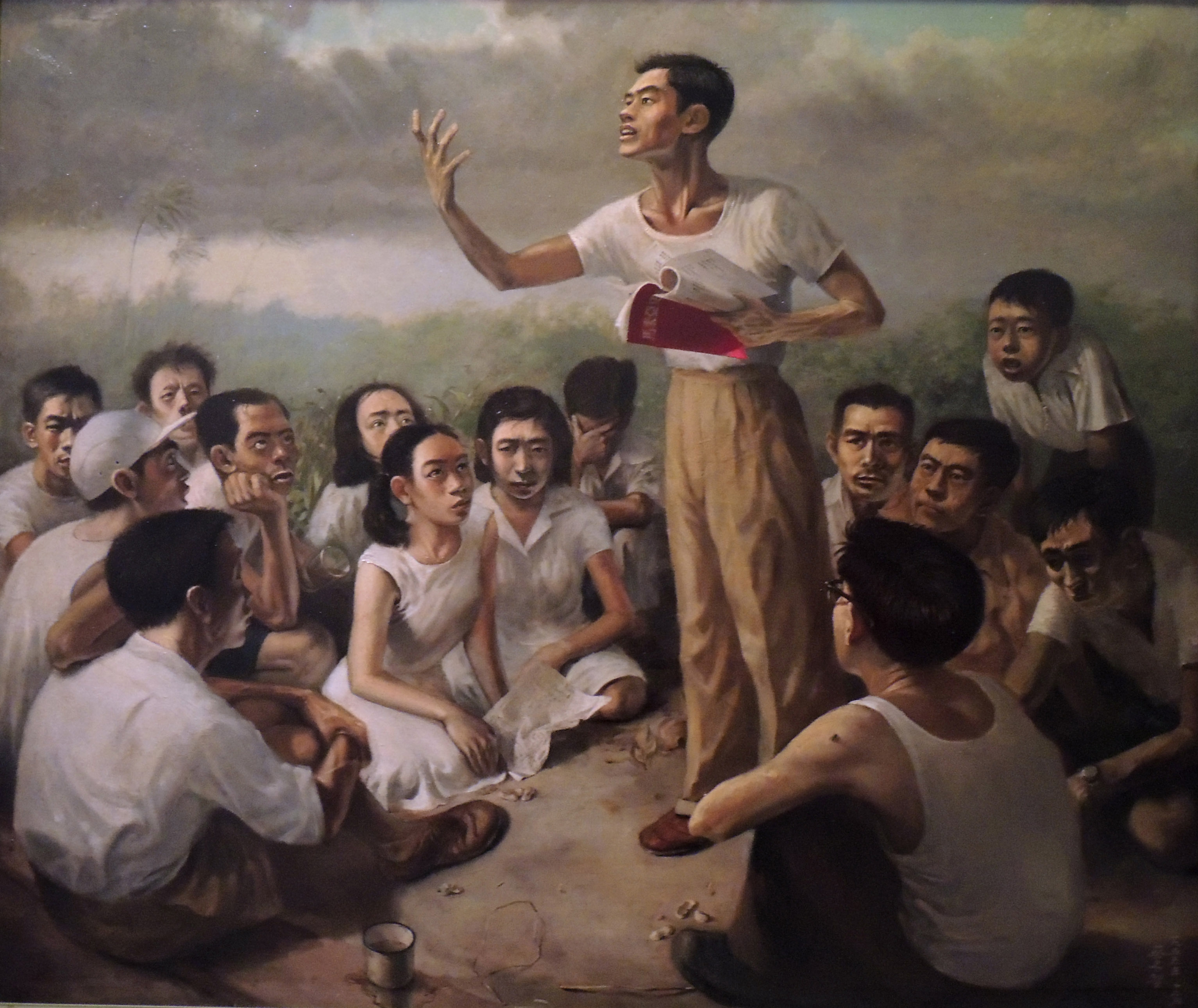
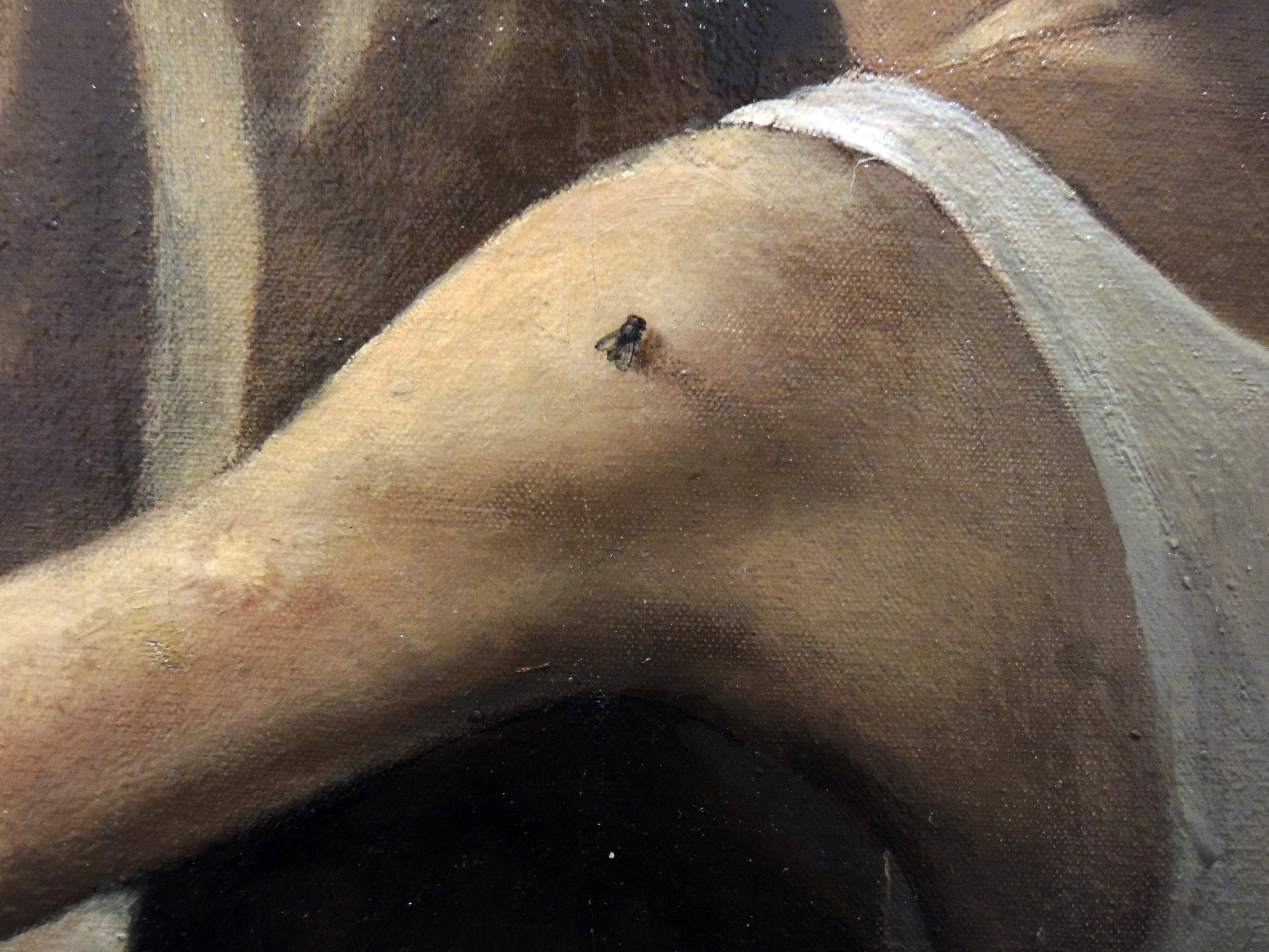
Singaporean artist Chua Mia Tee’s Epic poem of Malaya (1955) is a history painting of the sort we rarely see anymore—so many aspirations and doubts in the same frame. The image is of students sitting on the ground outside, under a tropical sky, listening and watching a young man speak—a teacher perhaps. It’s a scene that at its surface feels very contemporary. There is a currency today of artists imagining everyday group scenes—in a classroom or kitchen or at a tea party where people interact or just coexist —to describe or interrogate or enact what we share between us. In the context of 1955 the proposition of these students was the design of a state and the possibility of building nations. Or at least Chua Mia Tee was thinking through these propositions with this painting.
What’s unusual in Chua’s work is that there is complexity in the relations displayed between the students listening. There may be shared aspirations but these are not anxiety-free or uniform. There are different reactions and Chua is anticipating these differences collectively. The faces are not evenly focused; it’s a classroom after all. The fly on the man’s shoulder in the foreground anticipates another unmanageable spirit inconsistent with civic schemes. (On the same arm there is also what looks like an inoculation scar.) These qualities subtly distinguish the painting from more recent examples.
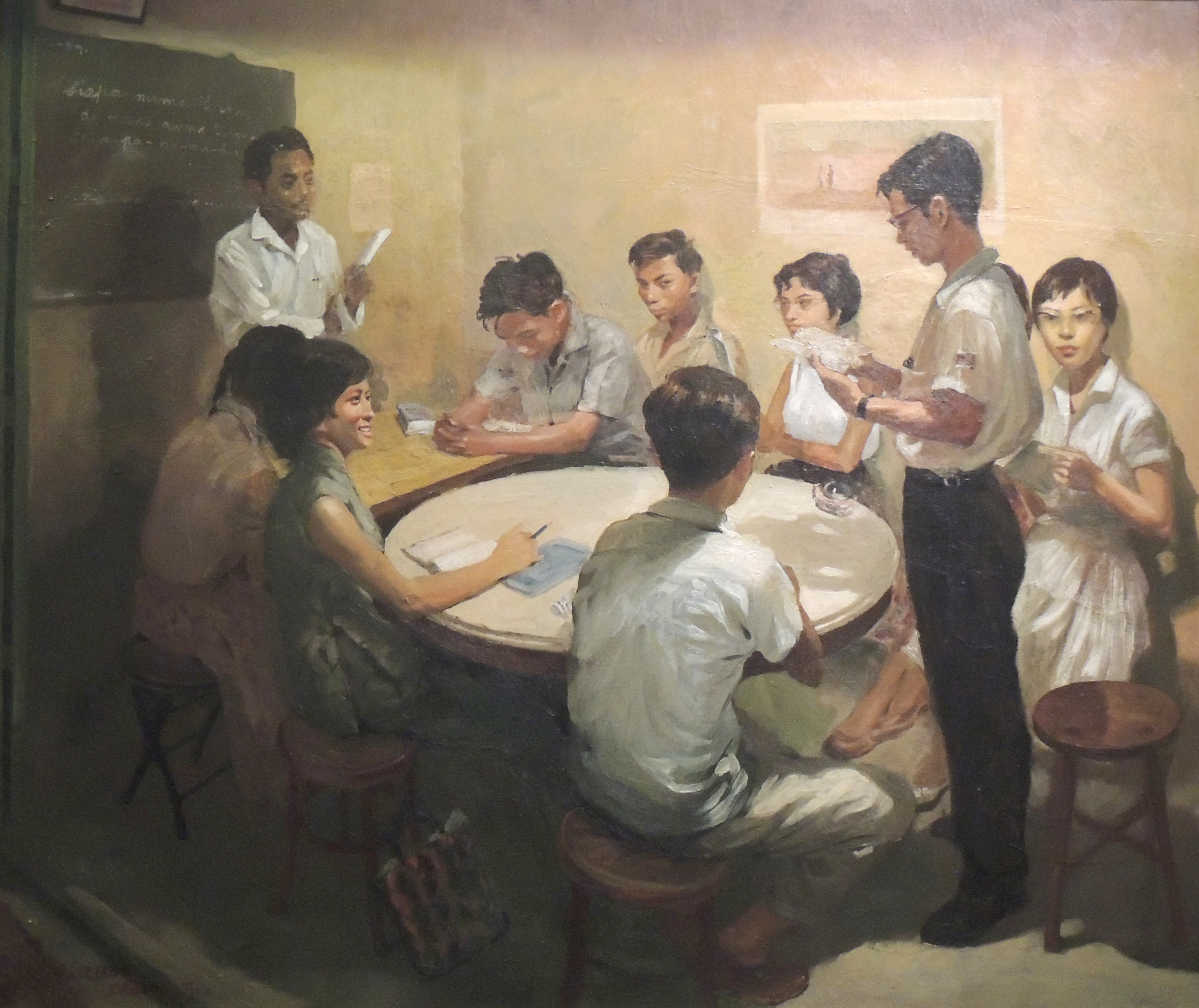
National language class (1959), Chua’s second work in the exhibition A changed world, could almost be a Mamma Andersson painting. The work describes an idea or proposal at a point that predated its actual adoption. National language class is painted ten to fifteen years before a new Singapore adopted two foreign languages as national languages although it wasn’t to be Malay by then, but Mandarin and English. Chua’s painting propagated the view that a new state needed room for the future and so too it needed the strength to make that room and change and so sometimes actively discard certain vernaculars and popular ways.
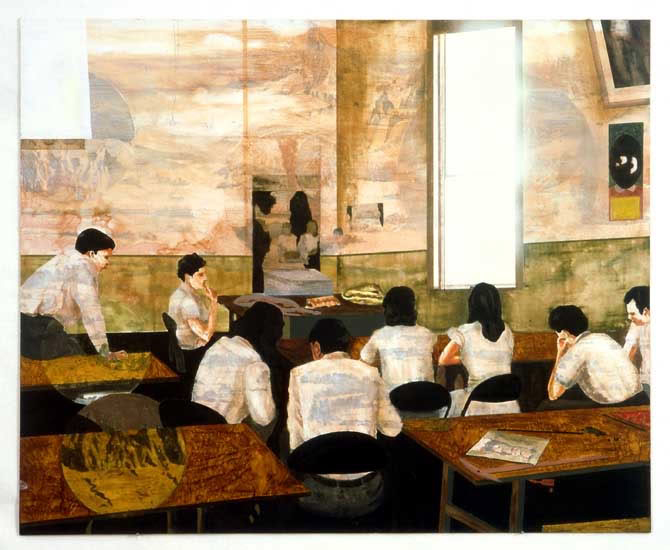
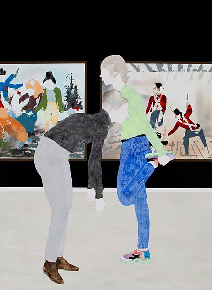
Equivalent contemporary pictures like, say, Mamma Andersson’s (with titles such as Ramble on or We are much closer than we ever thought), or Helen Johnson’s, with realist titles like History problem, are perhaps by contrast calculated to underwhelm slightly. Contemporary group pictures can resort to a kind of melancholic ‘the way “we” are’. As often there can be a backdrop of inaction, or boredom, or worse, a kind of fateful positivity which just makes me cringe. Chua Mia Tee’s group interplay is more demanding and comes from an environment that obviously was too. Among the deep aspiration there is still a level of uncertainty or irritation that is potentially dangerous and inciting—it’s an image of survival with a face and pressure.
Chua Mia Tee, ‘Epic poem of Malaya’, 1955. Image courtesy National Collection, Singapore
Chua Mia Tee, ‘Epic poem of Malaya’ (detail), 1955. Image courtesy National Collection, Singapore
Chua Mia Tee, National language class, 1959. Image courtesy National Collection, Singapore
Mamma Andersson, title unknown, 2005
Helen Johnson, ‘History problem’, 2013
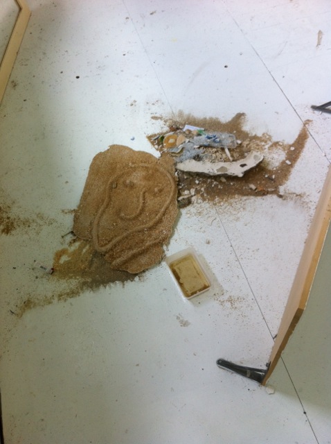
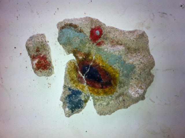
Sand brah
George Peeps a dude in a bazza down Bells Beach. A dog acknowledges George albeit insignificantly. Doggedly dog takes in terrain to the refrain:
‘Now it’s the last week of summer! Let’s focus, let’s take care of business! You know the rules, wake up, drink, eat, drink, work, drink etc. Let’s take care of business!’
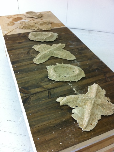
Meanwhile George gets stuck into the sand brah, feels it between his fingers, between his toes. Hand as spade, here is gesture, here is form. If there is a God he is surely watching now.
It’s alchemy time: the sea, moon and paraplegic shore break are to be the only witnesses of this act. George gets down close to the wet sand and penetrates it with spaded hand. His visions are embedded in the landscape, not happy to let them die he resorts to filling the reliefs with plaster in the tip of the high tide.
Using the high tide as a medium this way ensures they will not be fully obliterated by the force of nature.
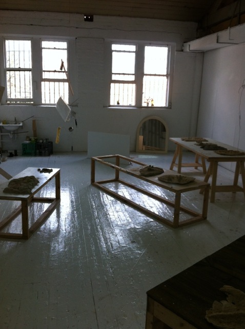
Instead of fading away peacefully, the million or so grains of sand traverse the highways of south-western Melbourne until they become grandiose and puffy under the critical gaze of Gertrude Contemporary.
George Egerton-Warburton, Dog, Gertrude Contemporary, Melbourne, studios 11 and 12, 7 September – 28 October 2013.
Back and forth
Do you like this quote or not?
I love the Plath quote.
‘If a neurotic is wanting two mutually exclusive things at one and the same time, then I’m neurotic as hell. I’ll be flying back and forth between one mutually exclusive thing and another for the rest of my days.’ Sylvia Plath, The bell jar.
Tell me why it’s on topic?
OK maybe it’s not on topic I just liked it because I was thinking about us writing this and the voices and the perceived judgment and the ‘tone’ of the writing that has its own little neurotic struggle going on within it as part of its own trauma … just thought it was a funny tangle of crisis. OK I understand. Perceived judgment and perceived objectivity. Words can’t be, should never be, props for work—they are as structurally unsound as any other mark, object. Words can seem like such contained concrete markers but I reject that! In that case, here are some words. They’re just words.
Soft eyes huh? Are these uncritical eyes or are these intoxicated eyes?
I was thinking that I hope it’s both, maybe uncritical is too loaded a term … ‘loose eyes’? Loose eyes so one doesn’t edit everything out and open enough to offer things up. They’re open eyes, sure. In season 4 episode 4 of The wire one investigator tells the other, you need ‘soft eyes’ on a crime scene. This is something Sarah Crowest talks about. I think it’s a willingness or ability to see with openness what is previously unseen. You make a decision to see with soft eyes. It’s not about a default—it’s more concerned with working against the default. Determinedly going towards an unknown. Making as looking, seeking.
I know I sound like a sap (how could you sound like a sap in comparison to the romance I just spewed up?) but it’s the same way you love or befriend another person—so you are searching for more things to love, you’re kind of hungry for that and then at the same time you’re trying to block out the bad bits: weird noisy eating, bad performance in the sack … etc.
Hungry eyes.
This made me think about soft ears, which is getting off topic too … soft ears for sound art … ? Ha. Isn’t that what any practice is doing? Art-making is a research. Editing has a place here definitely, but I’m more interested in the speculative process which precedes it. We have talked a lot about the importance of editing but then we’re both pretty neurotic—editing is a form of neurosis right? right?!—and maybe that’s why I’m interested in the more investigative—it could be a propositional squint ahead as opposed to the editor’s assessing squint. (Maybe this metaphor isn’t working very hard.) Then again, these happen together rather than sequentially. Tomma Abts said in an interview that ‘it’s just decision after decision—an ongoing process of editing … The making itself leads the way.’ (1) And maybe this is my question—if the process is so accumulative and kinetic then it seems frustrating for reception to be reductive and static—a dead end. By frustrating I mean stingy.
But then going way too far with this—we squint to make not only the edges fuzzy but to squeeze everything together—to Vaseline our lenses and allow ourselves the fantasy of the indeterminate better something-or-other …
Maybe.
My Mother used to say if you squint when driving down the main street of Seymour at night you can pretend you’re in New York. The wishful squint. But to go back, I’m not willing to let go of the value of proceeding without a predetermined outcome—the hungry eyes. If we’re not looking for something new what are we doing—confirming, affirming. My thinking about this way of working—process-based practice if we want to call it that—came from a conversation you and I kept returning to because of a healthy distrust maybe. Is trust a problem, are we at the old knowledge vs. faith crossroads?
OK here is an ugly question to avoid answering your ugly question: where does intuition sit? And how much value are we ascribing it? And how does training and how does theory hold hands with intuition? Oh so yukky.
OK this is good, look the ugly right in the face. I’ve been thinking about this idea of training and intuition holding hands a lot. To go back to Sarah Crowest, she writes about a very focused and determined way of using intuition as a method, a tool, to avoid affirming already-knowns. Perhaps, because maybe what we’re dancing around here is laziness (bad word? Flippancy?), it’s worth distinguishing intuition used in this way, from intuition used as a prop for style (am I going too deep into yuk here?).
To talk about this in relation to training—in Sarah’s great interview with Lizzy Newman, Lizzy talks about artists needing to address (I think she calls it an ethical requirement actually) the zone of unknown knowledge which she pitches against an overly prescriptive, didactic training at art school. Is this the right time to talk about the unconscious (gasp)? Which I’ve been wanting to bring up given your recent studies … Hmmm maybe I really like the idea of the subconscious doing the work.
This is a necessary part of psychoanalytic practice, everyone is taking mental notes in those sessions and the mark is made way down deep. I guess what I’m wondering is, when that ‘deep-down’ surfaces. And how much therapy/scrutiny is too much? And is this the question you are asking in the show?
I think process practices, or intuitive practices, are sometimes perceived as, and sometimes are stylistic, but I wanted to distinguish those that make a very contentious push for new logics, for research—which you can only push for by proceeding with undetermined outcomes. I wanted to think about abstraction as a means posing structural questions about our thinking and making. That is the first proposition, the first part. The second part is about intuitive practice, not through material investigation, but through associative thinking. But that is another conversation …
(1) Tomma Abts interviewed by Christopher Bedford, ‘Dear painter … ’, Frieze, no. 145, 2012.
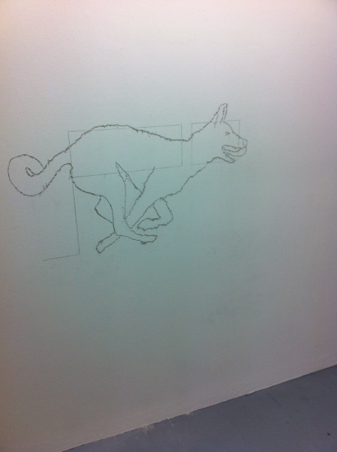
Typesetting
When something new is coming through, I click my fingers. My thumb holds straight as my middle finger bends curving off and against it. Pressing to connect—straight lines and curves. The sound doesn’t really matter. It is to create tactility, to physically remind myself that the timing has changed, bringing forward a syncopated new speed (a short line translation between two creative processes). My fingers as these bodily outliers materialise the emergent asymmetry of a tipping point, where in close proximity they catch like tinder.
T consists of straight lines, Y consists of straight lines, P consists of straight lines and curves, O consists of curves, G consists of straight lines and curves, R consists of straight lines and curves, A consists of straight lines, P consists of straight lines and curves, H consists of straight lines, Y consists of straight lines.
Setting type is a reminder of the potential of a physical process to imbed and implicate the content. As a structure it has the capacity to release the other qualities so they are open to explore, to be creative. As a process the structure is explicit (you feel the raised indentation of ink sitting on a surface and distinguish that it is not digital). This support enables decisions surrounding the form to be implicit as the smaller delights waiting to unfurl over time. The font style and point size establish the scale/ambition, tone and context. The ragging establishes a horizontal and vertical aesthetic and read; a key access point. The furniture locks the text in place to print well, a stabiliser that digital printing has abstracted (almost like the disappearing editor in journalism).
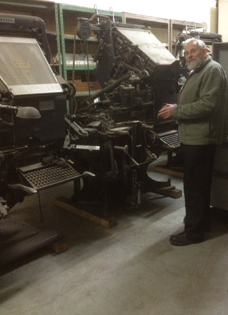
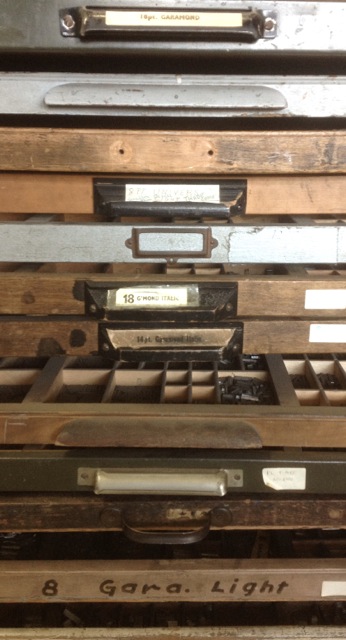
Setting type is a timely (costly?) process. The Melbourne Museum of Printing holds a collection of print presses, which have been left behind, often discarded. Thankfully director Michael Isaachsen has caringly held on and saved as many as he can. He has collected a group of Linotype presses in the back room, with the dream of one day re-establishing a typeset newspaper. Why set type when digital printing is so much faster, cheaper? Holding type in your hand you can feel its straight lines and curves. The process has the capacity to materially bring into focus the distinction between text and reading. Good typesetting encourages a good read. It is built.
Thanks to Will Holder, David Reinfurt, Abra Ancliffe and the Banff Centre for typesetting workshops and information during ALWAYS LIFT INKING ROLLERS WHEN PRESS IS NOT IN OPERATION. IF ROLLERS ARE LEFT TURNING ON THE DRUM THE INK WILL DRY FASTER AND THE ROLLERS WILL BE SUBJECT TO NEEDLESS WEAR residency.
Melbourne Museum of Printing
Melbourne Museum of Printing
Melbourne Museum of Printing
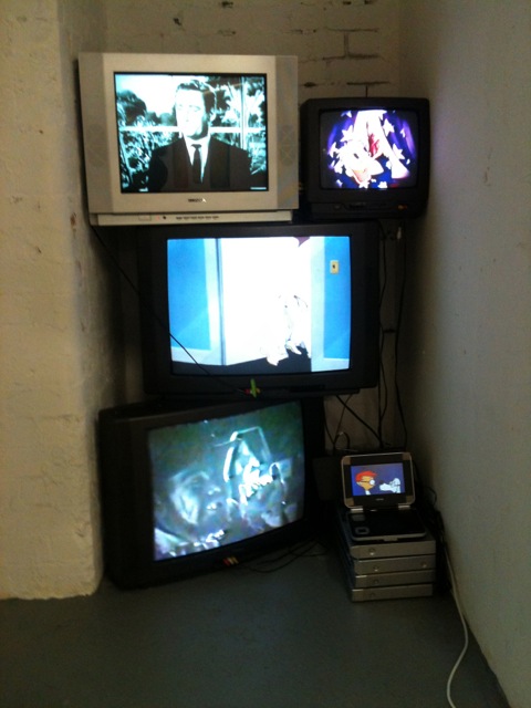
Xmas: Jordan Marani
Jordan Marani has piled five old TVs flickering afternoon programs to represent five brothers, including the ‘new’ one he’d discovered late. Black and white ‘Mr Ed’ is playing on the top screen so my guess is that must be an older brother. The little screen represents Jordy, because he is the youngest and it is at the very bottom, I suppose—according to the catalogue it’s showing the bulldog from Looney Tunes’s Chow Hound.
Xmas is a four-letter word is split in two halves with text works and recent portrait paintings on one side and at left/centre sixty or so small-scale works from as early as 1986 but mostly completed through the early and middle 1990s. These earlier works feel slightly strange now, marked as they are by time and a different regime of language, but I’m thinking too that the wider account Jordan plays out here—the exhibition and his act of self-historicising—is stirred by how long memories are so often missing in action these days. Only a few viewers or art professionals would have any recollection of these works I would guess. Jordan’s art is at one level contained within personal idioms and affections, but he is in fact an insider and ‘survey’-making says as much. In this sense making history on his own terms is purposefully set in the exhibition against today’s wider context of impossibly stacked attentions devoted to contemporary revisions.
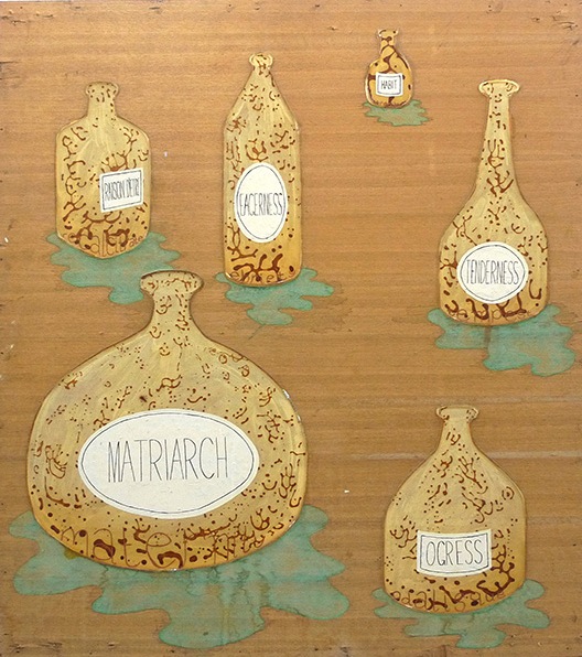
The actual stories Jordan ascribes to these early works, the first-person contacts they make and the abrupt, demonstrably close viewpoints, are calibrated as a glue or a binder from one to another. Jordy uses materials as binders. His blunt face-down of attitudes and upbringing isn’t just an invocation of family, brothers and absent parents, but creates a kind of physical blur or shorthand that flows across the exhibition. Cardboard cartons, tin can lids and artworks with words like ‘wogs’, ‘shit’ and ‘arse’ collapse into a very confined, pushed-together space so they touch. Greasy paint circa 1991 therefore equals honest: bereft but willing. Four letters equals foul but sincerely yours. You would have to close your eyes first but maybe there is an art stack too, another pile. Is this OK? The glue extends as a male sauce thing that is a point of fact more than right of exclusion and connects Jordan with a community of artists that would include Ralph Balson, Robert Rooney, Mike Nichols and Raafat Ishak.
The male thing actively looks to women too, for instance in a work such as Mother, 1991, that puts ‘habit’ in the same frame as ‘tenderness’. I like the poetics of these works. They are studied and reserved.
Jordan Marani, installation of stacked TV monitors
Jordan Marani, ‘Mother’, 1991
Jordan Marani, ‘Cunt’, 1990
Jordan Marani, ‘SHIT’, 1992
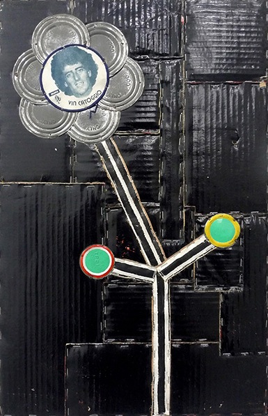
Jordan Marani, ‘Vinnipanni (Flowers for Cartoggio)’, 1993
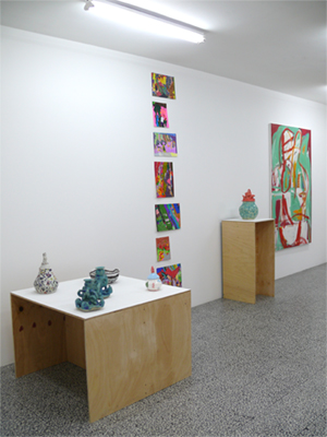
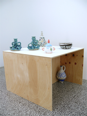
King for a day: ‘Heavenly stems’ at Neon Parc
These images are from the exhibition at Neon Parc, Heavenly stems, which has just closed. I want to draw attention to it because it echoes things I have been thinking about recently, and poses interesting questions about the nature of contemporary art and curatorship.
If anyone saw the exhibition they’ll know that it made a strange yet unavoidable kind of sense. It shouldn’t have worked, yet it did. I’d argue that this kind of feeling, at this current moment, is exactly the kind of feeling we should expect when we look at contemporary art exhibitions, big or small.
What I’ve been thinking is that not enough curators get it wrong or even risk doing so. Most exhibitions seem to be about reiterating the canon, or tracing already defined relationships in ways that echo local sentiment. But good exhibitions increasingly have a spanner in the works; some unexplainable aspect that really is just about a gut feeling. Correct me if I’m wrong, but this is how artists work too: suspend judgement, close your eyes, and perhaps that odd idea that you’ve been telling yourself is ridiculous might just be the way forward.
I’m not going to argue for these connections, or against them, but something in Heavenly stems was unavoidable. Put together a faux naïve modernist, an artist who would be classified, I guess, as an ‘outsider’ artist (if that is still the accepted term), and a long-out-of-favor Antipodean modernist and something happens. It’s not rocket science but it does disrupt an existing order. It points towards many more possible connections, all of which act against prevailing distinctions.
Heavenly stems, Neon Parc, Melbourne, 14–31 August 2013.
‘Heavenly stems’
Dick Watkins, ‘The metaphysician’, 2008, synthetic polymer paint on canvas, 183 x 152 cm. Courtesy the artist and Liverpool Street Gallery
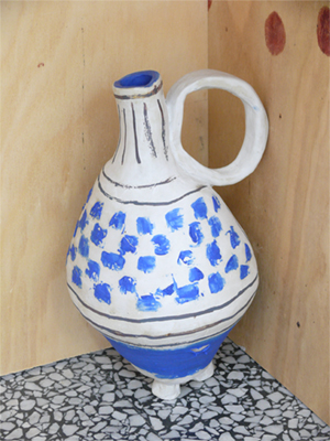
Angela Brennan, ‘Jug’, 2013, stoneware, 35 x 29 x 26 cm. Courtesy the artist and Niagara Galleries
Angela Brennan
Rebecca Scibilia, ‘Not titled (Red mountain)’, 2012, paint marker and marker on paper, 28 x 38 cm. Courtesy the artist and Arts Project Australia
Rebecca Scibilia, ‘Not titled’, 2010, felt-tipped pen on paper, 38 x 28 cm. Courtesy the artist and Arts Project Australia
Dick Watkins, ‘Sigmund Fraud’, 1998, synthetic polymer paint on canvas, 183 x 137 cm. Courtesy the artist and Liverpool Street Gallery
Under-performance
Jan Verwoert’s Exhaustion and exuberance is one of the great pieces of writing on contemporary creative culture, and not only because it is the first to bring together the ideologies of the Sex Pistols, Edgar Allan Poe and Spongebob Squarepants. It is the love-child of critical theory and self-help, and this writer returned to it after a recent visit from her villainous inner critic.
Though Verwoert is writing for and about our high-performance culture, there’s plenty in there for those just doing their thing. There’s something for anyone whose ‘I can’t’ is louder than their ‘I can’, or anyone questioning the legitimacy and ethics of their writing/curating/sculpture/photography/performance/lack of performance/opinion/preferred brand of laundry detergent/collection of sunglasses/badminton swing.
These photos were taken this month on the single dirt road that connects the Aboriginal community of Peppimenarti in the Daly River region, and the Stuart Highway, in the Northern Territory.
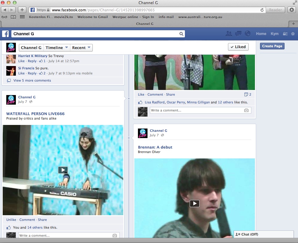
Public art = social space: A review of Sean Peoples’s ‘Channel G’
‘The Internet is by its essence a machine of surveillance. It divides the flow of data into small, traceable, and reversible operations, thus exposing every user to surveillance—real or possible.’ Boris Groys
Throughout June, West Space became a live-to-air studio for Sean Peoples’s social experiment Channel G TV. Over a period of nine days performances and pre-taped mayhem were broadcast via U-Stream accompanied by schedules, nightly updates and content appearing randomly on Facebook. Peoples and his collaborators created a multidisciplinary social arts experiment exposing the strengths and weaknesses of online platforms for artistic engagement. Interestingly Channel G was based at a public gallery but viewed primarily online. In this way Peoples challenged established arts audience codes by proposing the public realm of social media as a platform for public art. His open invitation to friends, associates and relatives resulted in the production of live content that included over 100 participants.
Groys’s theories of Arts Worker and Bertolt Brecht’s theories of Epic Theatre highlight themes that are marked in Peoples’s project. Groys writes: ‘the artistic project becomes a revolutionary project that aims at the total transformation of society’. One of Peoples’s mantras ‘no EGO, no PROBLEM’ acknowledges a similar desire to revolt against polemic definitions under the gaze of public scrutiny.
I wonder does the G experience improve upon our desire to scrutinize or question; does it address the percieved non-criticality of the net while also promoting the sprawling platform for engagement?
As an act, Channel G expresses a desire for research in an area arts practitioners often leave dormant or ignore. I wonder how Peoples’s social experiment fares with Groys’s thoughts: Can egos, faults and relationships (and their intermixing) become sources for engagement and gathering?
During its nine-day life span, Channel G became a site for reality (in which there were many broadcast moments of casual socialising) and questionable privacy expressed in the plurality of practice. In gallery form, the absconded studio played its greatest hits: 60 hours of demo footage looped on screen. Facebook uploads and TV playback showed participants playing, be it in a band or in a game; chatting, on a talk show or to the director or a friend. Formal moments were juxtaposed with personal acts—searches on computer, camera set up, dress up, clean up, measuring, adjusting, feeding (a pet or themselves), drinking, kissing and dancing: functioning topics.
I asked Sean a few questions via email and over the phone.
KM: How did you approach managing the show?
SP: I really took a non-arts focus when putting it together. Most of the decisions were technical in production. My job was making people feel at ease with what they were going to do. It was apparent there were complications associated with the format months before it became a reality. The idea of participants juggling set construction, dialogue, costumes and scene changes in tandem with others was inescapable. The mantra soon became ‘How do I do my best in this impossible situation?’
Perhaps it is brave to comment ‘I took a non-arts focus’ when presenting organisation as art, but this is the new way, to gather being the statement. Which encapsulates a direction we are heading, switching towards social interdisciplinary art that is process-driven, differentiated by communicative ‘non-art’ perspectives (enabled by a renewed appreciation of a range of media sources).
I’ll admit, I got hooked on the experience of Channel G. Watching the phenomenon develop and Peoples’s craft improve was a real pleasure. I took part, then asked Sean not to republish it. As an audience member, I enjoyed observing participants in the act of posing before an unquantifiable gaze.
Theories of audience distancing itself from the actor’s identity is exemplified in Brecht’s Epic Theatre approach, or ‘Verfrumdungseffekt/Alienation Technique’. Brecht believed emotional distance should be maintained in order to ‘effectively critique and evaluate the struggle between characters and so as to understand the social realities of narrative’. Unlike Brecht, Peoples’s audience chose to interact via social media (Facebook), enabling comments, messages or phone calls from the audience to foster response from performers. Unlike Brecht’s, Peoples’s suppositions did not seek to be moral. Rather, Peoples attempted to create a celebration for us, of ourselves and comment on the power of community to embrace difference.
Brecht wanted to break the notion of disbelief employed in theatre, with the audience able to acknowledge that they were witnessing performative fiction (entertainment) and as such were able to interact, communicate and alter performances accordingly—a feature of the Channel G transmission.
A critical performance with little preparation, an open journal without need for an editor, Channel G consciousness oscillated between: ‘who could be watching?’ and ‘what if people are watching?’ A few artists chose to share influences and to meta-perform: Anastasia Klose faced the camera staring passed it watching archive footage of Andy Kaufman (interviewing his ex) on screen while smoking. The green screen trick meant Klose met Kauffman with the YouTube clip screened behind her; Simon Zoric played Simon and Simon while Matthew Linde, Holly Childs and Christopher LG Hill created unsubtle text/sound performances that challenged poetics. Nathan Gray, Moontubers and Sarah CrowEST initiated live performances; Gray’s Ancient memories was an improvisational 8-piece scratch ensemble and CrowEST’s Mount activity utilised Arthur the cat searching for an object under a sheet. Masato Takasaka used computer-generated sound distortions to describe theories of the ready-made.
KM: I noticed the green scene was popular.
SP: Everyone loved the green screen! They were obsessed with watching a preview of themselves onscreen. They saw themselves in those spaces and acted as if in those spaces they weren’t present in the actual space. This caused an unconscious type of other’. I had a particular persona when people were asked to participate, come in and do their part—I was interested in what they were going to do, who with, the amount of time and what they needed. Most people wanted to explain why but I wasn’t interested in that. It didn’t matter if they were bad or awesome, if it was embarrassing that was fine. I suspected it would be in some ways, that’s why I created the wall from the front gallery to create privacy, for a sense of security. We created a few spaces, the green screen and a living room. It made the room (gallery) feel homely. Some people were really rehearsed and brought in their expectations about the camera angles and how the show would look, others would walk in and walk out and leave it up to me. The camera being there made some people feel embarrassed.
KM: How did the ideas for presentation come about?
SP: The concept of an unknown audience and the distortion of their usual practice and prepared art object as opposed to a spontaneous act was obviously challenging for some artists.
KM: What is your definition of ‘collaboration’ for the purpose of this work? Was it creating opportunities for presentation?
SP: I took a deliberate approach for the project to be seen as a collaborative effort. Channel G’s success was reflected by those participating and the programs they created. I didn’t want everybody’s hard work being solely a reflection of what I had done. I wanted to acknowledge that they had generated the work.
KM: Groys writes that ‘Jean-Paul Satre said hell is other people—life under the gaze of others’. What do you think this means in regards to Channel G?
SP: I feel like the project’s experience of ‘the eye’ was the reverse. It was supportive, the emphasis was to embrace all those mistakes.
Channel G, West Space, Melbourne, 21 June – 13 July 2013.
Anastasia Klose, ’13 minutes with YouTube video and a smoke’
Christopher LG Hill and his Poetry TV, ‘Performance as poetry’
Elevator, Michael John Joseph and Hannah Smith
Moontubers: Rebecca Jensen, Sarah Aiken, Natalie Abbott, Janine Proost
Matthew Linde ‘A rose by any other name’
Screen shot
de for
In the last month or so, we have seen leaders change, policies align and disgusting decisions imposed on the most vulnerable. Decline seems to be our modus operandi. If an empire is failing, how does it fall with the least possible pain?
Harriet Morgan’s exhibition with the same name, Decline at Top Shelf above Deans Art in La Trobe Street might have been asking the same thing—an omnipresent apocalypse with a glass of champagne. Nick Austin’s paintings of flying envelopes and Kate Smith’s three-part painting Art school point to a past, a kind of neo-nostalgia: one more melancholy than the other—a nuanced picture and unrecognisable painted forms in spaceless-languid-yellow. Alex Vivian’s Dirt swatch is a sliced soccer shirt flicked with filth and fixed with hairspray skinned over a neo-faux-doric-columned-new-bone-china-serving-dish registers painting in its past-particle-present—the ambiguity of polity evident in an array of decadence.
New improved qualities …
… reads the text on Janet Burchill and Jenifer McCamley’s painting accompanied by a chair.
Helen Johnson’s video as long as a pop song has a group of nameless voices discussing Badiou and Brecht in a context that’s not ours to be privy to. We see, not hear, violins played and a cat looks back at me spliced after footage of Karl Marx’s grave. I look down to my phone, a ‘fact’ reads: other than humans, cats are the only other species which likes getting things for free. While wondering what this might mean, the analytical screen and self-conscious spoken words remain synced, ‘I keep making the same point, fine, but … I don’t understand what an individual is. I don’t know what it is … ‘ But it is in the opening lines, ‘But aren’t the militants here precisely trying to prevent the young militant from taking this path’, that we find the dissension and the doubling in Decline.
To depose is to get rid of, dismiss or displace. De-pose on the other hand, might infer a colloquial reference to the stance of someone captured on The Satorialist blog. In either form, power is undermined—that of the leader by an action or that of the image (and beauty itself) by language.
Caligynephobia is an irrational fear of beautiful women, callophobia is an irrational fear of beauty and scopophillia is the ‘love of looking’.
The first may be evidenced in cinema, and the latter perhaps found in art: Abicare’s objects declare a different type of decadence than that which is found in Decline.
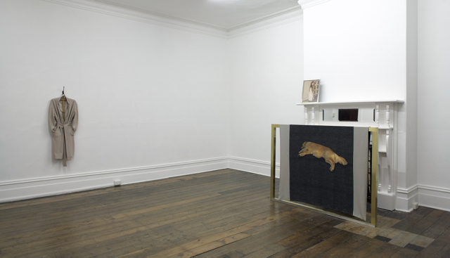
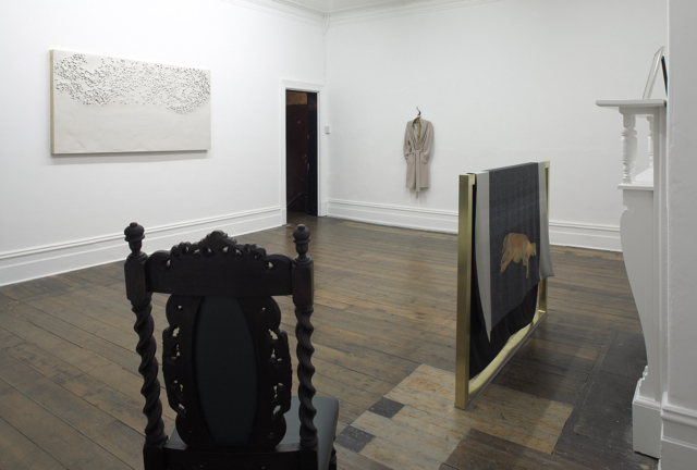
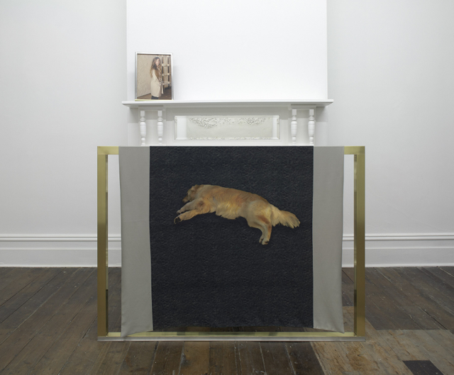
Decadence (Medieval Latin for ‘decay’) in Abicare’s work appears in the subtle arrangement of objects that point to one another and us, creating a space of suspicion between. A chair in the corner of the room. A cast of clay the size of a table-top, perforated by studio-based archery lessons framed on three sides with stainless steel and the other with bronze. Looking back at it, on the mantle above the disused fire-place rests a small framed photo of a woman wearing a beautifully made coat—the sartorial sign—that also hangs on a coat-hanger as you enter the space. In the photographic image, behind the woman modeling, hangs the perforated clay, exactly as it does now, as I the viewer stand, minus the coat, the build and the photogenic smile. The aforementioned frame is mirrored, but to scale. Before the mantle, in front of an unused fire-place, the stainless steal and bronze are echoed again but inverted. A silk wool scarf that depicts a golden retriever and her double is placed, not thrown—its material more vulnerable and volatile than the metal one usually expects to be used for a screen. From the vantage point of the chair, one sees all and all sees one.
Go-see is the models’ audition, success is not predetermined. A trophy-pose is held by the winner, failure is for another time.
Attention to detail, these fragments from a narrative, un-timed objects re-appearing and re-occurring. Power. Desire. Target. Capture. Game in all its forms. Fair and unfair.
Fiona Abicare, De-pose, Sarah Scout Presents, Melbourne, 27 June – 27 July 2013.
Fiona Abicare, ‘De-pose’, 2013
Fiona Abicare, ‘De-pose’, 2013
Fiona Abicare, ‘De-pose’, 2013
Fiona Abicare, ‘De-pose’, 2013
Fiona Abicare, ‘De-pose’, 2013
Fiona Abicare, ‘De-pose’, 2013
Alex Vivian, ‘Dirt swatch’, 2013
Alex Vivian, ‘Dirt swatch’, 2013
Kate Smith, ‘Art school’, 2013
Helen Johnson, ‘Er Brecht, wir Brechen’, 2008
Helen Johnson, ‘Er Brecht, wir Brechen’, 2008
Helen Johnson, ‘Er Brecht, wir Brechen’, 2008
Nick Austin, ‘Travelling envelope #10’, 2012
Ro Noonan’s parents’ fire-place guard
A Con Temporary image post on the book of face
Decline: Jennifer McCamley, ‘Homage to Thierry de Cordier (I have absolutely nothing to do with the 20th century)’, 1989; Luke Holland, ‘Warning’, 2013; Joshua Petherick, ‘Gutter’, 2013; Janet Burchill and Jennifer McCamley, ‘New improved, qualities’, 2007
Decline: Dan Arps, ‘Untitled (Green ambivalent up)’, 2012; Dan Arps, ‘Not titled atm’, 2011; Kate Smith, ‘Art school’, 2013; Nick Austin, ‘Travelling envelope #10’, 2012
Don Celender and The Kitchen
Portraiture study
If you could have your portrait painted by a famous artist of the past, or present, whom would you select? Why?
Don Celender
Picasso. Because my eyes are on one side of my nose.
Herb Caen
Don Celender surveyed part 2 comprises series of mail-out art, where Don Celender mailed out questionnaires to various communities (general and professional) asking them to respond to a series of questions about life, work, art and death. This survey presents Portraiture study;Art dealers’ selection of artists survey, Artists survey, Ignored and neglected artist survey part 2, Aesthetic experiences survey, Art movements, Critics’ choice, Organisational art movement, Corporate art movement, and Mass media art movement. Consisting of a trail of white A4-size pages nailed onto white walls, the exhibition has a monastic sparseness. The gallery’s monochromatic walls offer numerous threads of the individual responses and non-responses to Celender’s questions and their context in time and the art profession. Unrestrained by linguistic gymnastics, the ideas come through the text directly.
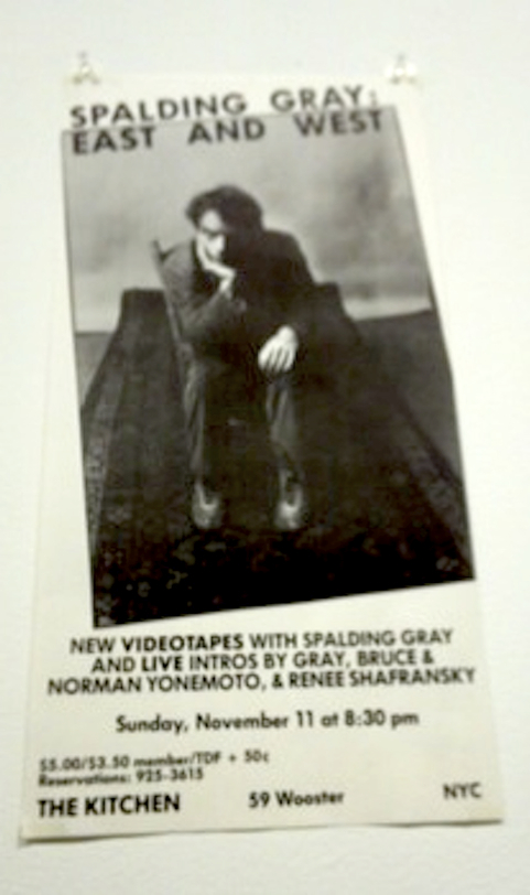
In 2011, for its 40th anniversary, The Kitchen presented an exhibition, The view from a volcano: The Kitchen’s Soho years, 1971–85, showing the programming history of The Kitchen over more than ten years. The show consisted of single-channel videos and other artworks presented alongside audio and print documentation such as press releases, photographs of performances and posters from the shows. Artists included Vito Acconci, Nam June Paik, Robert Ashley and Carolee Schneeman, along with the Beastie Boys (as a group of four, including drummer Kate Schellenbach) and many more. Memorable threads were early Tony Oursler—a video of Oursler interviewing a woman about alien abductions; Bill Viola figuring out what a camera does; and discovering the neurotic Spalding Gray. Once again, the qualities of the work and their context emerged succinctly, through language that was accessible. The press releases revealed the artists’ desire to lay out an idea they appeared to be grappling with and, like Don Celender’s surveys,The view from a volcano as an exhibition managed to retain its content through time (past and present) as an archive and as individual works of art.
Often with a survey or an archive, language can become a turbulent terrain where the desire to express is lost to stylisation, perhaps as a result of self-consciousness, or a perception that this type of work needs to be propped up. The Don Celender and The Kitchen exhibitions are reminders of the value, pleasure and poetics that can be gained by having work just stand—through language.
‘The view from a volcano: The Kitchen’s Soho years, 1971-85’
Jim Burton, ‘John Cage event’, 1973, performance. Photo: Kathy Landman
Poster
Poster
Press release
Alien in the mix: Bryan Spier at Sarah Scout Presents, Justin Andrews at Block Projects
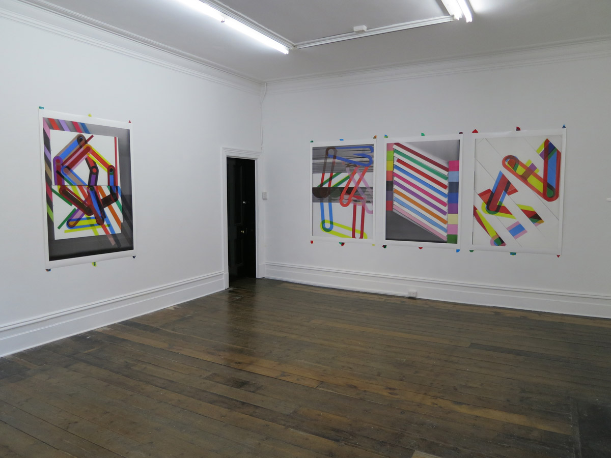
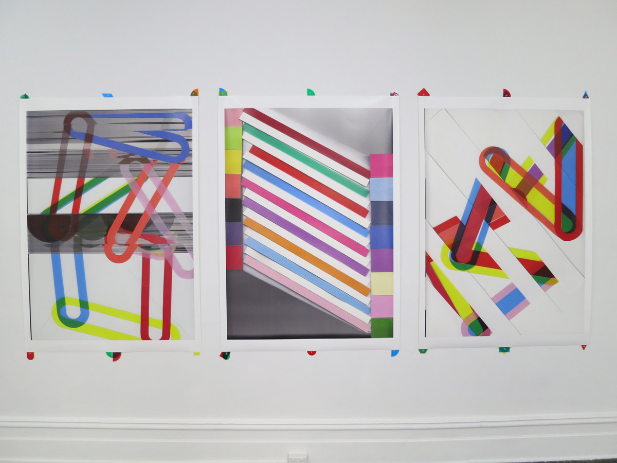
Bryan Spier makes narrative abstraction. If this sounds like a contradiction in terms, it just might be. But it’s the kind of contradiction that allows an artist to work in an impossible space and make something of it.
My understanding of what Spier means by narrative abstraction is relatively straightforward. Take his new exhibition of large-format giclée prints, Heavy images, currently showing at Sarah Scout Presents. In each work objects or planes are frozen yet their frame-based logic communicates a certain movement, a kind of sequential disruption that opens each composition. This is meant to be evocative; as Spier puts it: ‘past and future iterations haunt them’.
In these works form becomes a kind of character, one that the mind can’t help but attach to certain feelings or motivations. What might have been a relatively mute and coldly formal exercise instead begins to layer itself in a very human way.
A similar current runs through Justin Andrews’s exhibition at Block Projects; a linear, human logic that kicks against abstraction’s alien nature. It’s worth mentioning that both artists went through the same art school, and are part of the Canberra diaspora that includes Stamm’s own Trev Clay and me. But there’s more to it than that. If you sit in a studio on a daily basis balancing forms and adjusting colours, it’d better have some kind of feeling.
Andrews thinks about time in this new body of work, which strikes me as a similar project to Spier’s. He focuses on the idea of entropy; the disintegration of an ‘original’ as it is copied, repeated or remembered through the prism of time passed. Andrews takes this disintegration as a positive, as if the new and uncontrollable things that occur in this process hold some kind of secret meaning.
A self-authored text included in the show suggests he is thinking about his own history, trying to link up various interests and motivations across time: painting, music, the grainy reproductions held between the covers of a discarded art book. Artists can’t arrest time, but they can at least try to make sense of it. Again, it’s a matter of feeling and thinking and doing, each of these activities following and prompting the other.
There’s a pattern of making across the art world at the moment that most people involved would recognise. It’s materially driven and it relies on increasingly ‘minor’ gestures that seem guided by a kind of post-sculptural ideology. Through this kind of work artists and, by extension, audiences are required to invest more in less. If you run with it, reduction and material repeatedly reveal sequences of minor revelations. Although people rarely seem to make the connection, all this is the stuff of good painting. It echoes in the suspended moments that Spier and Andrews both render.
Bryan Spier, Heavy images, Sarah Scout Presents, Melbourne, 1–31 August 2013.
Justin Andrews, Block Projects, Melbourne, 27 July – 17 August 2013.
Brian Spier
Brian Spier
Justin Andrews, ‘Beyond time 2’, 2013, unique print on canvas panel, 39 x 54 cm
Justin Andrews
Arthur Boyd: An active witness
Lonsdale Street Roasters Saturday 13 July, 11.05 am
Brother: What do you want to do after breakfast?
Sister: I’m happy. Whatevs.
B: Good, because I’ve prepared an itinerary.
S: Let’s have it.
B: We start with a midday tour of Old Parliament House.
S: Who are you? Clark Griswold?
B: Don’t be like that. This is your first trip to Canberra. You should take the opportunity to explore the nation’s political heritage, beginning with the architectural bedrock of power and—
S: No way, man. I didn’t drive eight hours from Melbourne to visit parliamentary Sovereign Hill.
B: OK. How about Capital Hill? The nerve centre, the heart and soul of current policy and debate. The seat of our thriving democracy. There’s an exhibition of touch-screen kiosks where you can interact with senators!
S: You’ll find more heart and soul in a Nauruan mine shaft. Best minimise my interaction with senators and their seats.
B: We could do the 16 km lap of Lake Burley Griffin.
S: Old Parliament House it is.
—
Museum of Australian Democracy, Old Parliament House Saturday 13 July, 1.05 pm
Brother: Oi. You’ve been in Arthur Boyd over an hour. Don’t you want to see the Magna Carta?Or Malcolm Fraser’s favourite biro?
Sister: Not really. Listen, thanks for bringing me here. I really, really like this exhibition.
B: What’s so good about it?
S: Well. The curatorial premise is uncomplicated but engaging: ‘an active witness’. Boyd is an exemplar of the empathetic, affected artist. Dissatisfaction with the inhumanity of the world is common, sure, but how many of us possess the determination and fortitude to respond meaningfully to that frustration, to shine light in areas of darkness, throughout our entire lives.
B: How’s about that picture in the next room, the one of the guy with his dick out, pissing at the firing squad. Is that an empathetic response to the inhumanity of the world?
S: It’s satirical. It’s one illustration within the artist’s career-long commitment to exposing the debauchery and grotesqueness of war.
B: Hmmm.
S: See this work, Nebuchadnezzar being struck by lightning. Nebuchadnezzar is a figure from the Old Testament. Boyd frequently drew on myth for inspiration. But here, in this painting, the latent subject matter is grander even than the biblical content.
B: Do you think he’s pissing, or … you know … ejaculating?
S: Who?
B: The guy in the picture, in front of the firing squad.
S: Why would he be ejaculating?
B: Why would he be pissing?
S: War is absurd. There’s no place in it for your sophisticated brand of Socratic questioning. Now, pay attention. He painted the work in front of you after witnessing a Vietnam war protester set fire to himself in London.
B: Jesus.
S: This is Boyd’s timeless exploration of political and human folly. It is as powerful an evocation of hubris, anguish and guilt as you will see in a painting. Take another look, before we go.
B: The work is a powerful symbol of humanity’s vanity and failure during a time of crisis.
S: That’s very good!
B: I’m just reading from the brochure.
S: Right.
B: Says here that Bob Hawke chose Boyd’s Interior with an open door, Shoalhaven to decorate his office. He thought it was ‘well suited to moments of inner calculation’.
S: I bet an advisor chose the work, and wrote that response for him.
B: Would you take that gig? Senior Cabinet art consultant?
Arthur Boyd, ‘Nebuchadnezzar being struck by lightning’, 1968-69, oil on canvas
Installation view of ‘Arthur Boyd: An active witness’, showing two illustrations from his series ‘Spare the face, gentlemen, please’, 1993
To be outside, to be inside, to be free, to be bound, to be
Walking up to Kate Newby’s ceramic wind chimes at Between being and doing, a group show at Utopian Slumps, I was aware that I wouldn’t be able to hear them clink in the wind from inside the gallery. I was talking to the curator about another piece of Newby’s in which she traced two outdoor desire paths to where they each met and then filled the worn cross-path puddle with concrete. I thought it was an interesting action. The way Newby’s art works for me is its play on landscape; it wants to be outside and doesn’t really seem to need the gallery. Don’t get me wrong; it looks good in the gallery and brings the outside in, but it’s transient, ready to roam.
Last Wednesday night, Melbourne Nite Art happened and roam it did—a bunch of drunk women broke one of the chimes by using their hands to emulate a devastating wind. As the gallerist came to the rescue they fled with the broken chime. Out it went. I thought it was poetic in a weird way as Newby’s romance is elsewhere already. Off the grid.
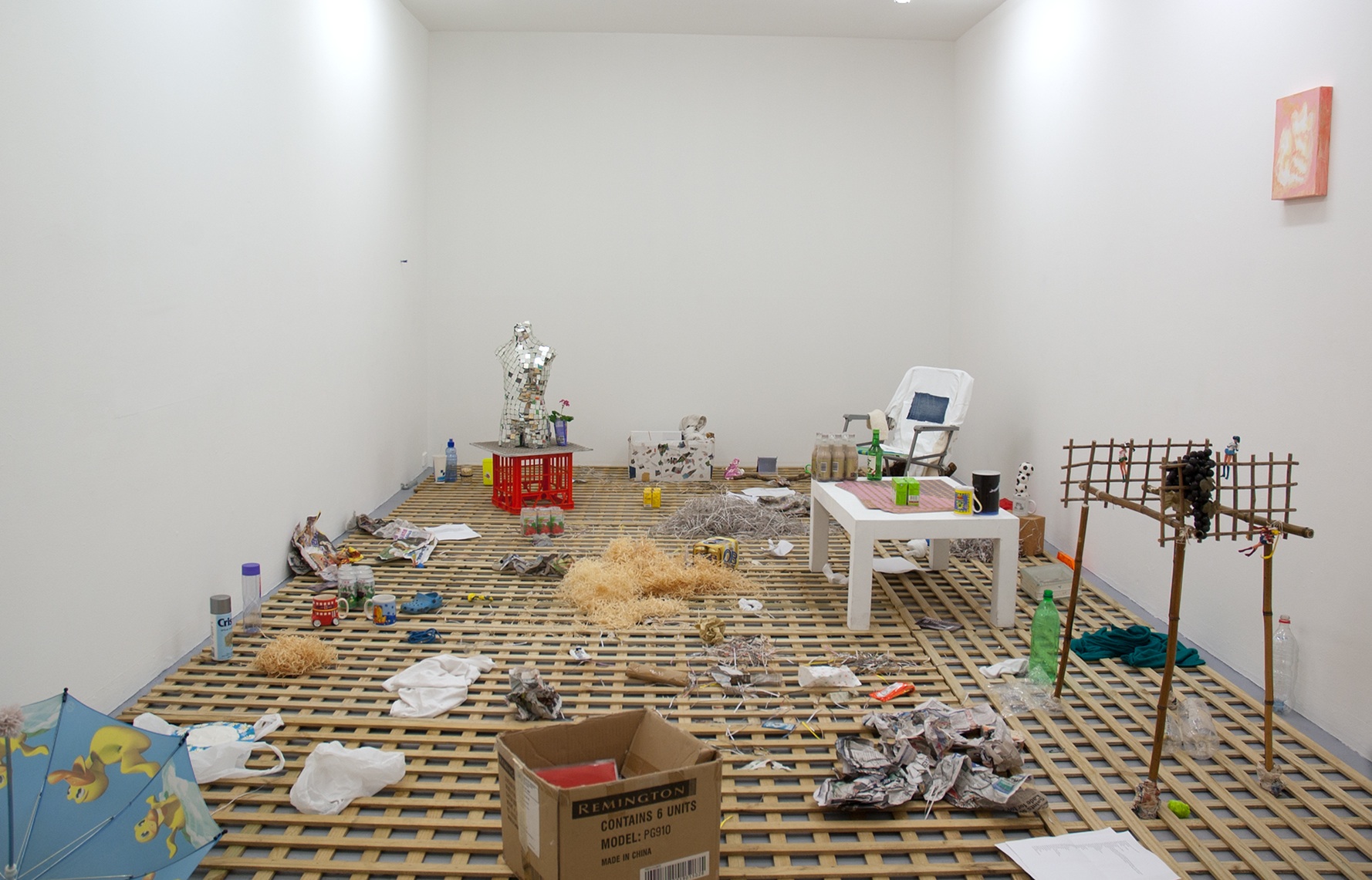
Free feudal barter store, Christopher LG Hill’s Studio 12 show at Gertrude Contemporary, has Hill filling the space with his own work; publications, paintings, sculptures, records, toys, collages, Asian milk drinks. The wooden lattice that covers the floor is like a tilled field from which the objects shoot upwards. Some things are more mulched down than others but these parts give nutrients to the work as a whole and there are some juicy fruits to be taken. Everything in the show is up for grabs and free. I took a mirror-tiled bust of an adolescent home.
And then there’s new work by Melinda Harper at Block Projects. Her paintings strike me as rich, like she needs what she paints. Each feels executed as though the finest things in life cost a bit but not heaps; cadmium red and yellow, cerulean blue, studio rent.
Harper’s painting style is nonchalant and frank. The aesthetic action versus its perceived monetary value; greasy tendrils of oil paint that crisp up where the masking tape hasn’t sealed thoroughly; the coolness of her one coat of oil paint. The work is not over-prepared like a lot of bad flat designer painting of the moment, it has soul. It’s done as it needs to be.
Between being and doing (Kate Newby, Joshua Petherick, Sriwhana Spong, Alex Vivian), curated by Brooke Babington and Melissa Loughnan, Utopian Slumps, Melbourne, 27 July – 17 August 2013. Free feudal barter, Christopher LG Hill, Studio 12, Gertrude Contemporary, Melbourne, 25 July – 23 August 2013. Melinda Harper, Block Projects, Melbourne, 23 July – 17 August 2013.
Kate Newby
Kate Newby
Christopher LG Hill
Christopher LG Hill
Melinda Harper
Melinda Harper
John Aslanidis—New York noise
JN: By 2003 you’d established the premise that you apply now, where you effectively paint intervals of sound or noise, right? Your paintings are non-objective in a way that correlates with artists such as Stephen Bram and Michael Graeve and reminds me in some senses too of Karl Wiebke. Though you’ve not exhibited in a focused way with any of these artists, have you?
John Aslanidis: I use sonic intervals. Bram uses a different methodology with a series of perspective points to orientate the surface. The connections with Wiebke would be in the paint surfaces and the material ways these unfold. By 2003 I felt I’d gone as far as I could in Australia. I’d studied in Sydney before moving to Melbourne, but the 1990s were a pretty lean time. Don’t get me wrong, there were a lot of good times, but artists emerging didn’t really get to consolidate (professionally and historically) back then. In terms of institutions I just had to go somewhere else.
JN: Your first solo exhibition in New York was in 2003 although you were already being regularly included in group shows.
JA: I’d been making trips as often as I could since 1999. In New York things were different—contemporary art plays out there in a different way. Exhibiting remains very important and of course there are just so many more galleries that the scene has scale and ebbs and flows in a way you notice. In New York too I feel there has always been a basic respect for the potential of studio practice and that hasn’t changed.
JN: The early exhibitions in New York and particularly your recent collaborations with Brian May led to new shows in Berlin? In the Berlin work, the wall of noise Brian May composed is played aloud in the space along with your painting. How did the collaboration work exactly?
JA: The sound is generative. Brian works with different software and calibrates the sound to colours and intervals in the painting. He measures the colour frequency in sound. The premise seems very simple but the outcome becomes quite complex where the sound warps against itself and across the painting. The sound recreates, it regenerates in an expanding loop, and the painting resonates in a similar way—visually or conceptually. The paintings have no edges in this sense or exist as a contingent proposition; every work is a cast of the same proposition.
JN: The system you use persists from painting to painting.
JA: The original idea was to achieve structure and consistency in terms of thickness and density and viscosity etc. Because I was working with these intervals I didn’t have to think about the painting as a whole, it composed itself or simply unfolded. Earlier on I didn’t correlate it explicitly to sound although it is a parallel that is very close now. I still use the same piece of scrap paper from years ago where I first plotted the system design and compositional intervals.
JN: It’s not so easy to account for the cross-over between sound effects and the abstraction of the painting. For me they are different types of thinking or sense that are converging. You were a resident at Location One in New York for a while too in 2011. How did this go?
JA: That year at Location One there were a number of us using sound which culminated in the end-of-the-residency exhibition curated by Claudia Calirman. A little while later I was included in Sound and vision at McKenzie Fine Art in Chelsea—that was with Gilbert Hsiao, Daniel Hill and Laura Watt. The great thing about that exhibition was the opportunity to meet with Daniel Hill. He is a musician and we were both interested in the movement between conceptual and perceptual thinking. This is the cross-over you are speaking about I think. The next year Daniel included me in an exhibition he co-curated with Ron Janovich called Emergence and structure, dealing with emergence theory. It toured through university museums in southern states.
JN: The Berlin shows were different initiatives?
JA: While I was at Location One there was a lot of interest in the Berlin work, which had gone ahead before I’d arrived there. Gilbert Hsiao had introduced me to Matthias Seidel and we organised to show the sound/painting collaboration with Brian May at Matthias’s gallery dr. julius in April 2012. Matthias Seidel later included me in FutureShock OneTwo: Internationale neue Konkrete as well.
After dr. julius I went back to New York and was talking to Juan Puentes at White Box. I wasn’t even sure I would end up showing there but through the gallery was meeting a lot of nice people. Eventually I had to fly back to Australia but just on my way out Juan offered that we actually show. So we came back later the same year and set up with just the one painting and Brian’s generative sound piece. I’d always wanted to have this show in New York and just put one painting into this big space and I think we did pretty well.
This is an edited version of a conversation in John Aslanidis‘s studio, August 2013.
Sonic network no. 9, White Box, New York, April 2012, and dr. julius, Berlin, October 2011
At the opening for Simon Zoric’s exhibition What I can and can’t do and what I will and won’t do, after being kind of startled by his carved wooden effigy, I was walking away from one of his works where Zoric had basically cut out the wall from his teenage bedroom because it contained the beloved Nirvana poster that needed to be shown. I was walking and thinking, ‘is it really from his bedroom?’, ‘how’s that ’70s blue paint’, ‘what’s with Nirvana?’, ‘it’s the ’90s again’, ‘Fuck, Kurt committed suicide’, ‘shit, I hope Zoric doesn’t die’.
At the precise moment of that last thought, I kicked the silicone cast of his Cock & balls. Zoric’s self-depreciating humor, quite obviously contagious.
On Saturday just past, I went to see Christos Tsiolkas talk about Class and Culture at Trades Hall in Carlton. I guess, other than being called a hipster, my question about class and its invisibility or slipperiness re-emerged—does the approach to definition un-render representation?
Kiron Robinson’s 8-minute video When I write I write for you begins with a sniff and ends with awkward laughter. It’s an 8-minute close-up of a tightly framed face. Reminiscent of John Cassavetes’s 1968 film Faces.
The Le Tigre song ‘What’s your take on Cassavetes’ begins with a kind of drawling voice:
we’ve talked about it in letters and we’ve talked about it on the phone,
but how you really feel about it, I don’t really know.
Which, however obtuse, seems relevant here.
Robinson’s short film, mini-doc, foray into a kind of cinéma vérité aesthetic straddles a monologue about family relations, siblings, age gaps and role models, footy, responsibilities, time and scale issues, pornography, masculinity, hierarchies and the need for an inability to take sides.
Robinson exhibited the work in an exhibition he organised called The big east, which involved seven artists exhibiting in two Scout halls in Heathmont on Sunday June 9 between 10 am and 5 pm.
I asked Kiron some questions, the first being, could I ask him some questions:
LR: OK. I’m gonna start really simply. How did the idea for the show come about?
KR: About eighteen months ago I moved out here (outer eastern Melbourne). It is not my ideal location and resulted in odd sorts of pressures in my life. As a result, I decided to make some work out of being in the middle/outer suburbs. When I started looking around I noticed there were lots of psychologically interesting spaces in the suburbs that I had not noticed before. The Scout halls I used, are two that I pass by on a run. Over about eight months of running by them, an idea emerged of what I could do, so I decided to see if they were open to being used and it turned out they were. The rest just grew from there.
LR: What I found interesting about the project was the way in which it forced us out of the safety of the CBD. There is an inherent irony in this, especially if we consider all the ‘danger, drunk’ talk of the media, ‘mayhem on the weekends’ blah blah. You turned us into Sunday drivers without cars or something. All the obvious, by-chance visitors are kind of amazing as well. Having worked out there at one stage, I liked catching up with my old boss again and hanging out with his kids in his hood.
The Scout halls were these interesting spaces where ‘contemporary’ seemed irrelevant. I know we talked about the upturned coloured plastic cups; Daniel Belfield’s Map easily blending in with the in-situ pin board; your film projected on a stand (can’t remember the word for this thing!) as if ready for rope-knotting demonstration; Eliza Dyball’s performance which could have been a team-building exercise; the Ryan sisters hiding from the world double-self-portrait-sculpture could have been real-kids playing real-games (albeit slightly sinister) and Cormick’s dirt-bike dinks slip easily into hoon territory. How did you choose the artists for the exhibition? And did you specifically choose the Scout sites for these artists?
KR: Yes, it is nice to be out of the CBD. It changes things in terms of whatever our expectations or preconceptions of the suburbs are and alerts us to our conceptions of art. I am alerted to this every time I go home (as I live down the road from the Scout halls.)
I was really stunned when the first visitors came by. I think up until the point of someone arriving I had been unable to marry up these two parts of my life, art and where I live, and having people turn up acted as a catalyst or a clash which alerted me to my own awkwardness in relation to how I see my life.
The Scout halls came first. I chose them really thinking about my own works (selfish yes), but then invited the other artists because of a psychological aspect to their works which resonated with the sites. I knew of all their practices obviously and like them as people and so thought it would be a good combo.
LR: I am going to latch on to something there about ‘liking the artists as people’. It is something I am interested in in terms of momentum and criticality. In some ways, it is traditionally opposed to the very notion of critical because its first encounter is recognising subjectivity and in some ways, the sentimental.
When you said ‘I knew of all their practices obviously and like them as people and thought it would be a good combo’, what is it about the combination of artists? I know there is a space of not-knowing that we are working in, or aim to work in, but what were you hoping to achieve though the exhibition and the relationship between the works?
KR: Mmm.
I have curated/organised a number of exhibitions. Basically it is about working with people I am interested in. I see it as an extension of my practice in that I do things and make work about things that I am interested in. I am not really into curating for the sake of curating. As such i feel no obligation to criticality. Rather, like my own work I just want to do something that interests me first and hope that others can also connect in their own way. It is the way most artists work I think. It is nice, as you kind of just put your subjectivity front and centre.
It is the psychological aspect of the Scout halls, which I think reflects a deeper psychology of the suburbs, what lies beneath, that I was really interested in and that I was hoping to draw out. There is an intrinsic anxiety within the suburban, the anxiety of the aspirational and it leaks out in all sorts of ways. I think partly I recognise this within myself and moving back to the suburbs has really heightened it in me. Maybe for me it is not so much the aspirational but the settling. The giving up that I associate with a regression of returning to a suburban setting. I wanted to work with that. There is a romantic aspect to the suburban that I was interested in as well. The Sunday drive, the ideal that it sells. I just find them a very tense place.
The big east, 3rd Heathmont Scout Hall, Melbourne, 9 June 2013.
Screen shot, Google search for Cassevetes faces
Screen shot, YouTube, Le Tigre, ‘What’s your take on Cassevetes’
Simon Zoric, ‘Nirvana’, 2013, poster, Blu-tac, bedroom wall
Simon Zoric, ‘Cock & balls’, 2013, silicone and crepe hair
Lane Cormick, ‘Only one way out of here’, 2007–13
Eliza Dyball, ‘Conformation in three parts’, 2013
Eliza Dyball, ‘Conformation in three parts’, 2013
Eliza Dyball, ‘Conformation in three parts’, 2013
Daniel Belfield, ‘A blanket woven from the laughter of my friends’, 2012, cotton
Daniel Bellfield, ‘Map’, 2013
Kiron Robinson, ‘When I write I write for you’, 2013, DVD
The cups in the 3rd Heathmont Scout Hall cabinets
‘Our Joey Scout Huturn Tree’ on the Scout Hall pinboard
Constant loss: ‘Third/Fourth: Melbourne artist-facilitated biennale’, and the 1980s at the NGV
To be honest, I thought that the NGV’s current show about the 1980s in the Melbourne art scene—Mix tape 1980s: appropriation, subculture, critical style—only transmitted the barest sense of the underlying social structure of the times. But then again, I wasn’t there. Afterwards I read Ashley Crawford’s review in The Monthly and although he notes that the energy and variety of the 1980s is ‘almost impossible to articulate comprehensively’, for him the exhibition ‘manages to embrace almost every aspect of this mayhem, and much of the vibrancy and energy of the period remains intact’.
So maybe success is in the eye of the beholder. Or—and I suspect this is more accurate—it’s easier to look back at something (a time or place etc.) if you already have first-hand memories of the subject. I assume Crawford was part of the fabric of the day, cutting his teeth as a critic and commentator alongside the artists, designers and critics whose works form the exhibition. Remove this nostalgic lens and what remains?
Of course the challenge that the curators behind Mix tape 1980s set themselves might be impossible, at least in the face of those in the audience for whom the 1980s remain a kind of mystery. I mean, how do you really communicate the meaning of a time and place retrospectively, especially when constrained by the collection policy of two decades ago?
I couldn’t help thinking about this in terms of another recent show that ‘surveyed’ a period—Christopher LG Hill’s Third/Fourth artist-facilitated biennale. Although the obvious difference between the two exhibitions is that Hill’s was embedded in a still-current moment, Third/Fourth rested under a similar nostalgic weight to Mix tape 1980s. By that I mean you felt yourself looking at this exhibition and thinking about a certain time and place. It just happened that the time was now.
If, judging by Hill’s exhibition, the best time to take the rear-view glance is just before the present merges into the past, then the best people to guide this view are those who still own the activities of making and thinking under review.
It’s not to say that Hill’s exhibition was anything but mysterious for those outside the recent pattern of art-making that it covered. But perhaps the fact it didn’t attempt to explain itself too clearly is what allowed it to accurately picture the underlying social aspect of a moment in the art world.
I couldn’t help picturing Third/Fourth at NGV as a kind of addendum to Mix tape 1980s. But then I wondered if these kinds of exhibitions fear institutions. Or is it the other way around?
Maria Kozic, ‘Self-portrait’ from ‘The bicentennial folio: prints by twenty-five Australian artists’, 1988, photo-screenprint, 60.7 x 47.8 cm (image)
Cool car park in Freo: Australian Centre for Concrete Art
The Australian Centre for Concrete Art is mostly 2D paintings on walls and not sculpted concrete as the name may suggest—big formal paintings on the sides of houses and shops in the CBD of Fremantle, WA. The original aim of the participating artists was to create a clique and define a distinction between their painting and that of their perceived copycats. As the project got underway, they transcended their chummy elitism and focused instead on rewarding the everyday viewer’s glance—the public person who opens their car door and peers up to see a 16 x 16 metre painting. In a way, it started as slightly pervasive, but the actually paintings hold a dignified respectful presence.
The AC4CA is like an open hive of living paintings. They get painted over in time, but during their lives within the grid-like streets of downtown Freo the paintings pop out into the pedestrians’ view, resembling characters due to their serial similarity. There is the mothership, a colossal painting commissioned by Alex Spremberg in the form of a 6-storey car park with conceptually painted ceilings, floors, columns and walls. A painting that has to be driven to be believed. There is a topographical offset to the landscape that surrounds it, the commercial zone, the horizon of the Indian Ocean and the massive cargo ships with their huge paint jobs. This urban beautification is feel-good and surreal in that the entire district of Fremantle feels oddly activated by painters engaging the high with low.
Artists involved in the project are Pam Aitken, John Nixon, Trevor Richards, Alex Spremberg, Julian Goddard, Andrew Leslie, Jurek Wybraniec, Helen Smith, Jan van der Ploeg and Daniel Gottin.
AC4CA project 16, David Tremlett, Cantonment St, Fremantle
AC4CA project 15, Jan van der Ploeg, Henry St, Fremantle
AC4CA project 7, commisioned by Alex Spremberg, Queensgate car park, Fremantle
AC4CA project 7, commisioned by Alex Spremberg, Queensgate car park, Fremantle
Funny games
The lingering stench of propriety and duty at the Heathmont Scout Hall was nearly as strong as the snags Kiron Robinson was cooking out the front. The framed colour photo of the Queen, the pine-panelled hall with honour boards, the texta instructions for the urn in the kitchenette, it was all there. Pip and Nat Ryan’s work in The big east, curated by Robinson, was like an amulet; both made of, and antidote to, the spirit of the Scout.
The sculpture sat in some dark place between the cultish initiation in the rec reserve car park, the smirking gags in the back row and the repressed angst of Scoutmaster. Speaking of grown-ups playing in a kids’ world, these adult figures in jammies and sleeping bags are about as cute as a double-dare suicide pact after lights out. A sculptural sardonic laugh, the work was an antidote to the dutiful and its absurdity soothed the pragmatic self-betterment that haunts the building. Flippancy keeps self-seriousness on the back foot.
The charts, codes, uniforms in the hall at Heathmont look a lot like all the other frameworks we build to face the terror of infinite choice. Laminated and framed on the wall, the Pathway to the Grey Wolf Award (tasks, skills, badges, rules for living) is the most basic of survival mechanisms; a self-imposed cell. We’re all agoraphobes. And handrails and cell bars are made of the same stuff. Painter Charline von Heyl describes ‘breaking the rules where there are none’ as a way of grappling with abstraction. Like a Scout gone rebel, the greatest freedom comes from having a rule to break, which is why the institution makes the best house of horrors.
The big east, 3rd Heathmont Scout Hall, Melbourne, 9 June 2013.
Pip and Nat Ryan, ‘slump’, 2013. Photo: Christo Crocker
Cub Scout Award Scheme Chart, the Pathway to the Grey Wolf Award, 3rd Heathmont Scout Hall
Ryoji Ikeda
I was reading about Ryoji Ikeda’s test pattern (No 5) as being perfect for iPhone documentation. How depressing. But it’s true, see my snapshots below.
Described as ‘a system that converts any type of data (text, sounds, photos and movies) into barcode patterns and binary patterns of 0s and 1s. Through its application, the project aims to examine the relationship between critical points of device performance and the threshold of human perception’. I’m not one for maths, but I am one for geometric abstraction. And critical points are, well, critical. But with such an undelineated and expansive data set, maybe the mesmeric power of this installation isn’t easily remembered now that I’m trying to do the work. And I’m reminded it’s important to do the work. Perhaps where the description above is actually ‘felt’ is in the midst of this installation where this giant barcode has a velocity beneath you; further encoding as well as encompassing your body within it.
I wonder about transmission of unspecified data being a valid or, worse, compelling starting point. Deconstructing of the ever apparent. (The experience and the press release needn’t correspond of course, but I went to thinking around Ikeda and suspect it’s important to put music brain on this rather than art brain. And I wonder if the difference between the two brains is an allowance for abstraction. Perhaps the experience of music is a more pure unfettered enjoyment in pattern-making, hinged more directly to its own form, rather than a historical world beyond the form. Of course so much has been written on this. But it did make me think how listening can be quick and repetitive, and looking can be a slower unfurling.
…Sometimes a blog link is as good a gift as you can get. I’m enjoying Love dog, even when it’s a bit maudlin:
The internet is so nerve-racking for me. I’m still not used to it. It’s like looking at an X-ray all day long—of yourself, of others, of a culture. Nothing feels safe. In an email, I ask my mother why even success (reblogs, retweets, viral attention) feels shitty on the internet. How I always feel sullied afterwards for some reason. How even when the response is good, it feels bad, and makes me want to hide even more than I already do. She writes: ‘But this is the disadvantage of publishing on line. With it comes instant gratification andinstant humiliation’. The internet doesn’t require you to have thicker skin. It requires you to have no skin. Which makes everything feel painful unless you learn to feel no pain at all.
…There is a (crowd-sourced) project called Printing Out the Entire Internet. MOMA’s first poet laureate, Kenneth Goldsmith has rented a 500 square metre gallery space in Mexico City, with 6 metre high ceilings to be filled with sheets of A4 paper. An homage to Aaron Swartz, the co-founder of Reddit. Of course the project is being slammed by organisations such as Change.org as a maximalist monument to unnecessary waste. But that’s Goldsmith’s argument, unnecessary waste to somehow quantify and monumentalise unnecessary waste.
Ryoji Ikeda, test pattern (No 5), 8 June – 1 July 2013, Carriageworks, Sydney.
Ryoji Ikeda, ‘test pattern (No 5)’
Ryoji Ikeda, ‘test pattern (No 5)’
Ryoji Ikeda, ‘test pattern (No 5)’
If you can’t say something nice
‘All that is necessary for the triumph of evil is that good men do nothing’, said Edmund Burke. Recently it occurred to me that this famous aphorism might have come to Burke on a visit to an exhibition of particularly dreadful paintings. Perhaps he scrawled ‘bad art happens when good people don’t point out that it’s bad’ on the toilet door of an eighteenth-century ARI and the whole ‘triumph of evil’ thing developed from there. Perhaps.
In the current issue of Artlink, Vernon Ah Kee decries the supposed proliferation of mediocre art from Aboriginal remote communities, and addresses the paucity of criticism that enables and sustains it.
Erudite and acid-tongued, Ah Kee has made a career out of inflammatory statements. But there isn’t much controversy here. It’s widely agreed that there aren’t enough people making the call on Aboriginal art. Many recognise too, that acclaim is often ‘well-intentioned’, incommensurate with the complexity or quality of the artist’s work. And the critical vacuum is not exclusive to Aboriginal art produced in remote areas. Not listed under ‘favourites’ in Ah Kee’s iPhone are those who argue that urban-based Aboriginal artists are over-represented in major exhibitions, and public collections.
Frequently the meaning and significance of work from remote art centres exists in language that is foreign and inaccessible to curators, critics, and audiences. When the work penetrates, it penetrates on Eurocentric terms. For instance, I’m an obnoxious American collector lamenting that ‘one sometimes confuses one’s Rover with one’s Rothko’. Or, I’m director of the Musée du Quai Branly, writing to Warmun Arts requesting that Lena Nyadbi lend her aesthetically pleasing designs to the tiles of my magnificently positioned roof. I disagree with Ah Kee when he suggests that these kinds of things mitigate the agency of Rover Thomas and Lena Nyadbi, as artists and people. Ah Kee has said ‘the only authentic Aboriginal people in this country are the urban Aboriginal people. They’re the only ones that behave autonomously’.
It’s been around forty years since a group of desert men were introduced to the contemporary medium of acrylic painting, in the settlement of Papunya, west of Alice Springs. Thought-provoking, inventive and genuinely compelling art is today produced by urban-based Aboriginal artists, and by artists working at Aboriginal-owned and operated (actually, not just notionally) art centres in remote communities. There’s mounting frustration with the preciousness and culture of entitlement that stymies discourse on all sides. Provocative quips about authenticity are tedious and obstructive, whether they slip from backward minds, or whether espoused by proponents of change.
A photograph I found on the internet of someone staring at the gap between two Mark Rothko paintings
A photograph I found on the internet of an eye-catching silhouette inexplicably wielding two paint-brushes in front of a Rover Thomas painting
Default: ‘Everyday rebellions’ and Frances Stark
Two good shows. Frances Stark’s My best thing and Everyday rebellions, the latter curated by Emily Cormack, are both like Kunstvereine exhibitions—spare and intelligent. Kitty Kraus in Cormack’s exhibition is very cool. A new pale white flooring. A heat bomb slowly unloading. The power left on. Degradation, gloom, linearity—the movement in the work is atomic or sub-atomic. The arrow of time moves in only one direction. Material resistance (‘rebellion’, writes Cormack) is a default setting.
Throwing salt onto metal, Virginia Overell speeds things up just for a little while, turning up the ‘more entropy/greater order’ dial so to speak. In the second room, Dane Mitchell waits for nonsense between systems. Substituting ‘the smell of an empty room’ for fixing chemicals, Mitchell alters our perception of the documentary mechanism of photographic paper from image to three-dimensional solid.
Frances Stark’s My best thing, 2011, at the Potter is close to Joan Jonas’s video Vertical roll, 1972, at Gertrude. During her chat-dialogue with an anonymous undies-wearing Italian, Stark interrupts to explain an art point, saying ‘… you have to do more that just use the tools’. It’s a cliché, she knows, especially when spoken out loud—too much the professor—but Stark for that moment is unsettled by her young cam-sex friend.
Joan Jonas’s 1972 classic manipulates not so much video but television technology. She makes the TV format her own, in much the same way that Stark uses online chat platforms. Jonas takes the tension found in a buggered TV’s rolling black bars, and visually imprisons the women pictured on the screen. Both Jonas and Stark use the energy of language expressively, but not as proof.
Malfunctioning screens like a Jonas-day TV are gone now anyway. Finished.
Everyday rebellions, Gertrude Contemporary, Melbourne, 11 May – 8 June 2013.
Francis Stark: My best thing, the Ian Potter Museum of Art, the University of Melbourne, 20 March – 2 June 2013.
Joan Jonas, ‘Vertical roll’, 1972, black & white, sound, 9:38 mins. Courtesy Video Data Bank, Chicago
Frances Stark, ‘My best thing’, 2011, single-channel SD video, sound, 99 mins
Naval gazing: The busy beaver Turing machine and Justene Williams
In computability theory, a busy beaver is a Turing machine that attains the maximum ‘operational busyness’ (such as measured by the number of steps performed, or the number of nonblank symbols finally on the tape) among all the Turing machines in a certain class. (Wikipedia)
With a beaver-like ethic, Justene Williams’s seven small monitors in the group show FX at CCP generate a machine-like image and sound of whirling activity. There is a lot of action, as the not-quite-stuck-down papier-mâché sets, figures, costumes and world heave with Germanesque robustness. The dancing figures look and move like Vikings, their strength generated from the hips with a slow metronomic measure. The tone never sets because every time you think you have it figured out, you realise it’s not quite right. It doesn’t quite work.
The monitors are packed with detail, as the videos construct the illusion of a work ethic, but don’t compute towards efficiency. You feel art—Monet, Seurat, Berlin—but the rhythm takes you somewhere else. If you stay long enough, you might stay forever, waiting and hoping it’ll get somewhere, that the cake will be baked and come out of the oven. It never does. Williams’s work hits off lo fi not as an apathetic romantic hipster naval gaze, but as a kind of despair, like when you beaver away in the studio with anything and everything that is around you and then realise in fright that what you have created is something like a black hole.
Williams seems at one level to invert the Protestant work ethic. But if the Protestant work ethic emphasizes hard work, frugality and prosperity as a display of a person’s salvation, when Williams’s works go a little bonkers, it feels like a Mercedes spinning out of control. How could this happen? Failed Fordism through troubling German (in)efficiency? It wasn’t supposed to be this way. And, in true Williams style, just as you register a bad feeling that it won’t work out, a figure will dance, have a light foot and you’ll laugh. Busy, busy, busy.
Justene Williams, ‘Berlin, burghers, microwave, Monet’, 2010, 7-channel digital video
Justene Williams, ‘Berlin, burghers, microwave, Monet’, 2010, 7-channel digital video
Justene Williams, ‘Berlin, burghers, microwave, Monet’, 2010, 7-channel digital video
Justene Williams, ‘Berlin, burghers, microwave, Monet’, 2010, 7-channel digital video
It’s not even a painting: ‘Like Mike’
Lob a rock into a well-attended contemporary art opening and you will not only become my hero instantly, you will hit at least one artist influenced by Mike Brown. Yet many have never heard of him and, of those who have, several would mistakenly consider him only a minor character in the narrative of twentieth-century Australian art.
Brown (1938–97) was Australia’s first major proponent of Dadaism and, later, graffiti art. He advocated spontaneous, collaborative art-making, long before it became a common part of so many artists’ lives. Ditto assemblage, appropriation and installation. Brown dragged modernism into the backyard of his Fitzroy terrace and thrashed it with a star picket, in the hope that no artist after him would have to question their right to make art. Outraged by the elite and commercialised art establishment, he was a man of absolute moral integrity, passionate about the accessibility of art and about creative freedom.
So what’s with the historical blind-spot? Richard Haese addresses this in his book Permanent revolution: Mike Brown and the Australian avant-garde 1953–97. After interviewing every Australian artist and art dealer born after 1920, all public gallery directors past and present, 218 curators, three-quarters of the living residents of Annandale and anyone who ever sold the artist pot, Haese concludes that Brown was an unwelcome guest at the dinner party of Antipodean art because of his indomitable rebelliousness against it. Had he made it past security, Brown would have spent the evening swearing at Nolan, Olsen, Drysdale and Whiteley, espousing the virtue of Dulux Quick Dry and ‘accidentally’ breaking Robert Hughes’s crystal ware.
What is remembered about Brown is that he is the only artist ever to have been successfully prosecuted for the crime of obscenity in Australia. In 1967, four years after Mary-Lou as Miss Universe was exhibited at the Art Gallery of New South Wales, he was convicted and sentenced to three months’ hard labour, which was eventually reduced to a $20 fine. Brown may have been unsurprised by the randomness and idiocy of the objection ‘on moral grounds’ that led to his conviction—‘It’s not even a painting!’ one AGNSW trustee is recorded to have said—but still, the response of his peers to the affair, and the coverage of the conservative press, damaged him irrevocably. He suffered a nervous breakdown, and never exhibited in a Sydney gallery again.
Like Mike is an adjunct curatorial project running in tandem with the current Mike Brown survey at Heide, and a playful intervention into the story of Australian art. While not suggesting that Brown was the messiah, curator Geoff Newton demonstrates that he was far more than just a very naughty boy. In this and other respects, Like Mike the project is like Mike the man—more significant than the farcical sideshow for which it will be remembered.
Newspaper clipping, ‘Sunday Mirror’, 1 December 1963, ‘The sometimes chaotic world of Mike Brown’
How the rich recycle their pleasures
I was a mind-wandering art installer working at Heide in 2007 when I discovered Mike Brown. His work made me wonder if he was exhausted all the time, exhausted from the hyper nature of his art-making, from the unhinged wrist spasms of his gestural painting, and the complex assemblages. His work gave off a warm afterglow of radiant energy from the hot act of making, remaining potent and ready to engage the viewer forty years on. Brown’s style is steeped in that 1960s through to 1990s pop-hippie-Oz-magazine thing. But Mike Brown’s work also transcends that time bracket and shares similarities with the art-making of today: the cool attitude, the material nature, the ‘hyper’ aesthetic, and the irreverence.
I remember installing Brown’s Kite. Once it was up on the wall everyone took a step back, the curators came in to see it. It was still controversial, still a big deal. Kite, consisting of an octagonal frame covered with collage and brush-and-ink writing, presents a charged yet eloquent dressing down of the mid-’60s Sydney art establishment and its stars. Mike went knives-out for everyone: Hughes, Klippel, Olsen, you name them. Brown declared the critics lame and the artists stagnant, and called on his peers to make progressive art.
How could you do that and survive in the Australian art world? As small as it is now and was back then? Those artists, critics and galleries he ran down in response to the Hungry Horse calendar of ’63 would surely have seen red and returned fire in career-stymieing ways. LOL.
Mike Brown the dude lived hard. He made beautiful work but was always poor. He fell in love, fell out of it; and celebrated the positive aspects of life, bringing to the fore slogans like ‘Power to the People’ and ‘the Miracle of Love’.
Mike Brown lived the artist’s life at the lofty heights that some freak out about. But his life seemed charmed if his work is anything to go by.
On Saturday 1 June Victoria Police removed parts of a larger installation by Paul Yore titled EVERYTHING IS FUCKED exhibited in the Like Mike exhibition at Linden Centre for Contemporary Arts. The action followed a complaint made to police. Paul was questioned by Victoria Police on Monday 3 June and subsequently released without charge on summons. The exhibition at Linden Centre for Contemporary Arts remains closed; a decision made by the Linden board of directors.
We sought the following comments:
Tamara Winikoff, executive director, National Association for the Visual Arts: As a long-standing defender of artists’ freedom of expression, the National Association for the Visual Arts (NAVA) has been vociferous in its condemnation of the latest raid by police, who seized the work of young artist Paul Yore from his exhibition at the Linden Centre for Contemporary Arts in Melbourne. NAVA asserts that within the law, Australian citizens have the democratic right to make judgements about what they want to see and respond to according to their own understandings and value systems.
In my forthcoming artsHub article I comment that, ‘Art pyromaniacs are people who ignite a cultural controversy and hide on the margins watching it burn. Pillorying artists is an irresistible sport for people with political motives or who are seeking the opportunity to stamp their brand on public morality. But human imagination is the fluid that leaks through the cracks in tired rules and outmoded ideas. It is not easy to quell the subversive power of parody and interrogative probing’.
In a series of forums around the country in 2013, NAVA will be asserting that Australian cultural expression must be protected against the personal ideological crusades and political point-scoring exercises of particular interest groups.
Mikala Dwyer, artist: The work Paul has created is from images and objects readily available everywhere. They are complex two-dimensional and three-dimensional collages that are made from many many hours, days and years of thoughtful intelligent speculation on the nature of the world we live in. They are in no way pornographic any more than the world is.
It is sad that the Linden Gallery shows so little faith in what it exhibits but even sadder and more perplexing that the police are called in to waste their time following bogus complaints and were even compelled to vandalise these extraordinary and beautiful artworks. Police time could be much better used following real dangers to the community.
But perhaps even more unbelievable is the extent this farce has travelled. It’s time it just simply stopped.
Robert Nelson, Monash University and The Age: Antiscandal. At first, I was angry. The persecution of Paul Yore is another regrettable episode that confirms the widespread backwardness of recent cultural history. The police may be obliged to investigate allegations but seizing artworks from an exhibition—which is clearly trying to hide nothing—is an absurdity that could only be justified on the basis that the exhibition puts somebody at risk. With what evidence did they make that judgement?
But have we as an art community done everything that we can to dispel the misconceptions held by the authorities and so many members of the public who abhor our liberality. When these perturbations arise, they are messy and invite unsympathetic and undesirable reactions. We prefer not to attract attention and hope for it all to blow over. We communicate poorly and take few steps to prevent another episode.
My own efforts on the topic propose a checklist of necessary criteria for invoking censorship. Further, I have made a submission (CI 235) to the Australian Law Reform Commission, where I detail the basis on which scholars and artists may legitimately consult material that might otherwise be incriminating.
Geoff Newton, director, Neon Parc, and curator, LikeMike: Galleries work in collaboration with artists not unilaterally. The conduct of Linden reflects poorly on that organisation as an artistic institution and in my view it will ultimately affect their ability to attract the sort of artist necessary to sustain a vibrant audience base.
Until this time we have trusted and been patient with the board but its continued lack of support and non-communication leave us no alternative but to take the following action. We will stage a peaceful protest tomorrow, Saturday 8 June at 10 am, at Linden Gallery against censorship in the arts.
Alexie Glass-Kantor, director, Gertrude Contemporary: Paul Yore is an early career artist dealing with images that emerge from a media environment that daily produces a deluge of mixed messages. The work is about the artist’s own identity and the work is intensely personal, it is not about pornography nor is it pornography. Often an image circulates but it can easily be taken out of context. Yore’s images have been circulating now for a few years, they are sexual and political but not about exploitation or pornography. They instead rely on the amplification of sexuality, chaos, and neuroses, underscored by complicated personal boundaries and trespass.
Historically the work can be read or perceived in relation to the contemporary practices of artists such as Juan Davila, Richard Larter, Del Kathryn Barton, Jean Michel Basquiat and Paul McCarthy. Exhibited in dialogue with the early works of Mike Brown it is important to acknowledge that that generation of artists was hugely influential locally. The sub/pop/cultural images that were key in Brown’s work are absolutely present in Yore’s works.
It is important that artwork is seen in context and I do not believe that the artist’s intention is to vilify or exploit children. There are situations where children have to be protected and as institutions we have an ethical imperative to do due diligence and act responsibility. I think that sensationalism, vilification and kneejerk reactions are counter-productive to intelligent discussion and create the kind of distraction where the artist and artwork become fodder for another agenda.
Charles Nodrum, director, Charles Nodrum Gallery: Quote: ‘the work contained collages such as a cardboard cut-out of a child with Justin Bieber’s head stuck on, urinating from a dildo into a sink’ (Pia Akerman, The Australian, 4 June 2013).
Questions: For the sexologist: 1) Since when has urination been classified as sexual? 2) How can anyone urinate from a dildo?(!)
For the judiciary, the legislators (and by extension, all of us citizens): a collage as described above can get the artist up to 10 years, yet paedophiles found guilty of multiple rape get less than that. Have we gone mad? And as for the above constituting child pornography, even the most pedantic logic-chopper would surely balk at that?
For the board of Linden: out of a large group show, small parts of one work were deemed to have possibly infringed the law—and were removed. Why close the whole exhibition? Why instruct staff to make no statements? Since when has locking up the venue and locking down debate ever resolved any issue? Since the offending material has gone, why not open the doors and let the public in?
Natalie Thomas, artist: We don’t want any trouble mate, but they started it! These bloody artists! I don’t know who they think they are and that pile of rubbish is taxpayer funded too! The bloody nerve of them! It’s not even a painting!
Are Australian artists allowed to comment on celebrity these days? Treating Pop stars like Justin Bieber or Sports stars like Thorpie satirically, irreverently or with contempt, will get big media backlash and inflame Public Opinion. You can have ‘Your Say’ and write in that artists are a bunch of freeloading wankers. Few make the link that most Industries are Government subsidized in one form or another.
Paul Yore recently had his work confiscated, taken by Police from Linden Gallery (in sleazy St Kilda). His work is not pornographic. I think ‘playfully visceral’ is a more fitting description. The work makes a statement and with the artworks’ removal, I reckon Paul has had his Human Rights violated.
After talking to a friend about the unfolding drama, we discussed the UN’s Universal Declaration of Human Rights (UDHR). Australia signed up to it in 1948:
Article 27
1. Everyone has the right freely to participate in the cultural life of the community, to enjoy the arts and to share in scientific advancement and its benefits.
2. Everyone has the right to the protection of the moral and material interests resulting from any scientific, literary or artistic production of which he is the author.
Jon banged on about Article 27: how it’s not ideal, but how it says just enough to dam this tide of reactionary hysterical censorship. This is Australian 21st Century Censorship. And the election will deliver what we expect. A Conservative, fiscally fixated landscape of church-goers with which to play.
Paul Yore, ‘Everything is fucked’, 2011, tapestry. Photo: Devon Ackerman
‘Kid candle’ and ‘Rocks’: Two works by Robin Rhode
In Robin Rhode’s short black & white film, Kid candle, a young boy, dressed for the street, leans in to light a candle.
The ‘candle’ is a simple line drawing sketched on the wall, or perhaps on a paper backdrop that stands in for a wall. Either way, the flame catches and we see a flicker of fire as a black smudge begins to grow. The boy blows on it and the black smudge gets bigger. Briefly you expect the flame to overtake the image and destroy it but it doesn’t. Instead the film loops; boy leans in, lights candle, blows, flame flickers, grows etc.
—
Around the corner is another work, Rocks. A man wearing ice skates and dressed in a suit skates in staggered freeze-frame over a broken concrete expanse, the entire sequence formed by still frames animated together.
It’s the kind of dilapidated public square that marks a certain kind of city teetering on the edge. Our viewpoint is back a bit and slightly above. Space is flattened—we see the surface of the square but only sense the city.
He’s a black man and although his movements are jerkily rendered, they appear carefully choreographed. Behind him ice cubes gather behind each push of his skates and mark out a scattered path. He holds a half bottle of whisky and an empty glass. Ideas and world play merge in and out of focus—rocks/on the rocks/diamonds/wealth/poverty etc. Whether or not these stick in any meaningful way seems beside the point.
The man makes one loop, crosses over, completes another and ends where he started. His trail of ‘rocks’, now melting in the sun, mark out a Möbius loop.
Robin Rhode, The call of walls, NGV International, Melbourne, 17 May – 15 September 2013.
Robin Rhode, ‘Kid candle’, 2009, black & white super 8 film transferred to HD digital betacam, silent, 1:3 mins
Robin Rhode, ‘Kid candle’, 2009, black & white super 8 film transferred to HD digital betacam, silent, 1:3 mins
Robin Rhode, ‘Kid candle’, 2009, black & white super 8 film transferred to HD digital betacam, silent, 1:3 mins
Robin Rhode, ‘Rocks’, 2011, colour HD digital betacam, sound, 2:45 mins
Robin Rhode, ‘Rocks’, 2011, colour HD digital betacam, sound, 2:45 mins
Robin Rhode, ‘Rocks’, 2011, colour HD digital betacam, sound, 2:45 mins
Hi mail, love Lisa
I think it was in 2006 that we at TCB art inc. decided to invite Rebecca Ann Hobbs, based in Auckland at the time, to curate a show at the gallery. We were keen to mix up the programming and eager to see things we might not otherwise see.
I
How to look
well, feel well:
First, you need
to find a
routine.
The exhibition One for the ‘other’ ended up being like a convoluted gift. Rebecca, herself invited, in turn invited fourteen of her favourite men to exhibit alongside her. Among them were Melbourne-based artists, friends and colleagues of ours and hers: Nick Selenitsch, Paul Knight, Christopher Koller, Brendan Lee and Kiron Robinson. The others were artists based elsewhere, mostly New Zealand, perhaps one in LA (1).
Three Nicks in one show.
Nick Selenitsch, whom I didn’t really know well at the time, assisted installing the works— quiet logic and confident ease.
I remember opening a homemade foam core box from Michael Lett as if it were a present, a gift. Upon opening I found a set of instructions, a woollen blanket and a $2 shop-esque thin plastic decorated tablecloth.
1. Rub blanket on wall
2. Spread tablecloth on wall.
Simple instructions, alongside a simple diagram, Untitled, by Simon Denny.
3. Fall in love with static electricity.
I lie. The third instruction does not exist. Perhaps saying it, overstates it.
If my memory serves me correctly, Nick Austin’s work arrived in a tube. Unrolling a carefully wrapped and painted tabloid double-page spread has a particular material quality to it: the newspaper and paint somehow merge to become another material—softer, more fragile, more plastic.
Note: Fall in love again.
The scumbled surface of Austin’s painting left only remnants of the daily dealings below its surface. Eliciting a kind of banal-melancholic humour, Austin’s painting A rhizome (2006) depicted a small piece of ginger (or was it tumeric?) contained by an almost-sloppy-peachily-painted round-edged-rectangle.
Quotidian beauty.
Jon Bywater might say, ‘As if to say: if that’s what you’re looking for, don’t look for it in the canvas. It highlights instead their simplifications, the analytical, human character of the act of painting’.
A couple of weeks ago, someone asked me who my favorite artist was. A strange question to which I am usually hesitant to respond—the answer can seem to be transient and allusive to both the questioner and questionee. Deciding to commit. If only allowed one, the parameters were set, I would say Nick Austin.
I said, ‘Nick Austin’.
Across the Tasman Sea, aided by intermittent internet searches and the occasional exhibition in Melbourne, I can be a fan. Electing Austin as a favorite, not the Firefox kind, means I might get to share some of his historical friends—Morandi, Cezanne, Giotto, Piero della Francesca—and wonder, would he share mine? Tony Clark, Vermeer or Sophie Tauber-Arp. What of Bonnard? De Stael? John Brack? What does he think of wacky Magritte paintings such as The ellipsis (1948)? Does he like Patrick Lundberg’s shoelaces?
Funny formalism for lovers. Empty absurdity for wanna-be vagabonds.
Hey Lane! Hey Col! Hey Moo! Who was that Mannerist that lived in the tree?
About a month ago, after some brief email conversations with Helen from Parsons’ Library Supply, credit card numbers and expiry dates, I received in the mail The liquid dossier.
Handwritten 45/200.
No expectations.
A humble-but-eluding-to-order Eastlight. Slimpick. Wallet. Foolscap in fact, Manila folder yellow in colour. Contained within it, an unbound book. A package. Some loose thoughts. Some points to, some points from—trajectories. Personal paraphernalia. Personable.
A list of items contained within—a room-sheet for a folder. A poster, a laser print, a risograph, photographs printed and enveloped in the equivalent of an Officeworks envelope. A very short PowerPoint film called Dentists on holiday with an improvised-jazz–accompanied-by-an-engine soundtrack on a DVD in a crystal case. A small sachet of coffee the size of a photo depicting a coffee cup the size of a small car. A postcard of a painting of an envelope flying.
Envelopes inside envelopes. Unread … no … wait … cannot be opened mail.
The green notebook was a gift, Jon Bywater writes.
He goes on: I find ways to use it as well as the laptop on which I usually write; sometimes, of course, just because it’s easier to carry and the only thing to hand, but it also creates a loose genre of notes.
The package is im or I’m perfect. And quirky in its everyday-ness, in its dossier-ness, rather than its archive-ness. This is like Christopher LG Hill’s Endless lonely planet or Jon Nixon’s Mike Brown research volumes 1 and 2.
But also not.
A very short letter to Bonnard dated 13 August 1925 reads:
Long Live
Painting!!!
In Friendship
Likened to what Patrick said, maybe our interest can lie in ‘a more social painting. A painting with a keener sense of duration. A painting which one day may no longer beg to be called by that name’.
A book with a keener sense of time, a book which one day may no longer beg to be called by that name.
(1) One for the ‘other’ was curated by Rebecca Hobbs. The artists included in the exhibition were: Rebecca Hobbs, Peter Volich, Phillip Maysels, Nick Selenitsch, Josh Stone, Dan Arps, Christopher Koller, Jon Bywater, Brendan Lee, Nick Austin, Paul Knight, Simon Denny, Kiron Robinson, Mario Garcia Torres and Nick Spratt.
(2) Jon Bywater, ‘Power nap’, in Nick Austin, The liquid dossier, designed by Nick Austin, Gilbert May & Duncan Munro, Lucky Stairs Studio, edn 45/200, published by Nick Austin & Hocken Collections, University of Otago, on the occasion of the exhibition The liquid dossier, Feb. 2013.
Simon Denny, ‘Untitled’, 2006, static electricity, woollen blanket, plastic sheet
Nick Austin, ‘A rhizome’, 2006, synthetic polymer paint on newspaper
Rene Magritte, ‘The ellipsis’, 1948, oil on canvas, Royal Museum of Fine Art Brussels
Nick Austin, ‘The liquid dossier’, 2013, at my house, on my coffee table with my new copy of Elizabeth Newman’s book, ‘More than what there is’ (published by 3-ply in 2013) underneath
Nick Austin, ‘The liquid dossier’, 2013
Nick Austin, ‘The liquid dossier’, 2013
Obiter dickta
The camera transforms its operator into a creep. The eye not pressed to the viewfinder holds a wrinkly squint. So the camera operator always appears as if she or he is semi-disgusted with what has been found in or orchestrated especially for the viewfinder. Long hours, for some, are spent like this. The squinting eye is only partially idle, guiding … seeing and not seeing … idling. And so it’s with this eye that we also witness Lane Cormick’s performance, within a busy exhibition opening, via which we are party to many other acts of observation, there is so much looking.
Nina Simone begins her performance at the 1978 Montreux Jazz Festival by adopting a graceful deep bend in a long black dress, her hands held in supplication for a few moments, while the audience applauds. Once upright she distractedly begins singing to herself or perhaps just mouthing the first phrase before she takes the microphone to begin performing. Be my husband and I’ll be your wife. There aren’t many shots of the crowd, most of the footage is a close-up of Simone’s face and there is one lingering shot of a cameraman hovering in the background, behind her grand piano. Be my husband and I’ll be your wife. Cormick holds a projector, displaying this footage of Simone now rendered orangey black, and he aims it at a woman I’ve never seen before. The woman wears a black singlet tucked up into her bra, so that her stomach and her lower back are bare, and available for projection, sorry the projection. Simone singing. Love and honor you the rest of your life. If you’ll promise me you’ll be my man. Simone’s eyes are wide open and wild. The woman holding and not holding this footage on her body as she moves across the space, she looks somewhere, but not at us, and not around the gallery and not at Cormick. If you’ll promise me you’ll be my man/I’m gonna love you the best I can.
The exhibition space, during the performance, compressed the viewing experience, more so than usual: in addition to the audience of bodies who lined the walls and occasionally shuffled past Cormick and his performer, the repeated xeroxed portrait of ‘lost’ soul musician Lee Moses served as a kind of compacted, coded and symbolic scenography. The floor was also recovered in a collage of cut-up Adidas tracksuits, black with white triple stripes, perhaps a reference to Jesse Owens, or perhaps not. Repetition and doubling served to draw the sculptural and the performative elements together in a loose twirl.
Cormick’s projection was a careful and relentless shuffle, to his subject’s eurhythmy or, even, whim. Over the 40 or so minutes’ duration, a twisting and turning to the comparative stillness of our spectatorship didn’t serve to fully communicate the connections between all these portraits: Cormick’s self-portrait as projectionist, the woman as dancer and as projection screen, Nina Simone, Lee Moses and even we, the audience, caught in the viewfinder of the guy documenting the performance.
Last month many of us experienced Yvonne Rainer’s ‘Trio A’ ‘transmission’ sessions in Perth, Melbourne and Sydney, as well as Kaldor’s 13 Rooms, where the celebration, reinterpretation and recontextualisation of 1960s performance practices and aesthetics (rather than politics) have been given an overwhelming cross-institutional tick. By contrast, Cormick’s performance is a refreshing turn about the room because there is sex in here, even if it’s not good sex. The performer is hunted down each time, while successfully falsifying relaxed and languid movement, playfully and seductively enacting pose and repose. But maybe that’s just your writer inferring seduction, based on at least one instance of slow motion tousling of her own hair, her exposed midriff and her disinterested gaze loosely focussed on the middle distance, that even regular opening-goers are never easily able to fake.
Lane Cormick, Janis, TCB, Melbourne, 27 March – 13 April 2013.
Exhibition and performance by Lane Cormick, 27 March 2013, TCB
Exhibition and performance by Lane Cormick, 27 March 2013, TCB
Exhibition and performance by Lane Cormick, 27 March 2013, TCB
Exhibition and performance by Lane Cormick, 27 March 2013, TCB
Exhibition and performance by Lane Cormick, 27 March 2013, TCB
Gotta dance
Tarantism by Joachim Koester is a film prefaced on letting go. Bodies writhe and lash around the screen in attempts to release themselves. Watching these photogenic bodies move around, we are hypnotised by the rhythmic metronomic projector throwing up the images. Hypnotic trances, when working well, open up sideline spaces, enabling the focal point to shift from the centre to the edge.
I Participate Wisps of hair flick through space, hitting the edges of the frame, cutting, yet always seductive. In these moments, intensity is not generated from within the torso, but instead expands beyond boundaries towards unknown trajectories: the rapture of letting go when you can’t see the function of the body, its extension into an abstract ideal, the whiplash of hair from a spasmodic head reaching beyond its line. An image hits off the body, off its form, and transmutes, to scratch the edges of a screen.
II Watch
A body is writhing on the floor while the other performers stand around and watch in a circle-like shape, a roda. Robert Hinton, writing in ‘Black dance in American history’, for the 1988 American Dance Festival Program booklet, distinguishes between dual audiences where, a) the dance can be created for the benefit of the dancers, where the experience for the audience is secondary, and b) the dance can be created for the pleasure of the audience, where the experience of the performer is secondary.
Here, in its rigidness, the polarity between the writhing dancer and viewing/inactive performers situates the space and the incongruity of this moment in Tarantism so that it feels like the edge of the peak. As the performers bandy together they cleave energy off one another to gather momentum for their tarantism. In the circle the inactive performers watch the active dancer’s seizure-like rapture as a precedent to perform, to dance. In this sideline, the investment, the articulation and the relationships shift. This is not to define the gestures, but to create a lineage and use it as a vessel for focus, to delve further, go deeper, get lost.
III Release
The dancers stop. Puffed out, breathing heavily, showing the exertion of their sustained performance. The panting completes the dance. Without it we can’t expel our own breath or even recognise we’ve been holding it.
Without it we can’t recognise what we’ve gotta do.
Joachim Koester, ‘Tarantism’, 2007, 16 mm black & white film installation, 6:31 mins
Joachim Koester, ‘Tarantism’, 2007, 16 mm black & white film installation, 6:31 mins
How to explain YouTube to a dead hare
You may not know this, but late in 2012, Anish Kapoor released a version of Psy’s ‘Gangnam style’ in support of the plight of Ai Weiwei. (Ai’s freedom from incarceration by the Chinese state is a pet crusade of click-happy slactivists the world over. You really must do your research before coming to my Stamm; I can’t spoon-feed you forever.) And not since 1984, when a Republican advisor said to Ronald Reagan, ‘Let’s put some heartland rock into this campaign—try talking about that patriotic Bruce Springsteen number with the cheerful birthplace affirmation’—has such embarrassment resulted from one man’s attempt to rouse the masses through song.
If a lesson can be drawn from these disparate musical forays, it is this: the appropriation of a pop culture phenomenon is fraught with risk, particularly for those who don’t know how to dance.
Joseph Beuys couldn’t dance but at least the man wrote his own material. In 1982, he produced ‘Sonne statt Reagan’, three minutes of anti-nuclear, anti-Reagan Euro pop featuring Jesus Christ on drums.
With little attention to the mainstream appeal of her work, Laurie Anderson has been exploring the relationship between technology and communication for over thirty years. An artist, musician and ceaseless innovator, her curriculum vitae reads like one written by an ambitious yet troubled adolescent avoiding their geography homework. To wit: Anderson invented a voice filter enabling her to speak in a masculine register; she invented a vegan fiddle bow; she was the first and only artist-in-residence at NASA; in 2007, she received an award for her ‘outstanding contribution to the beauty of the world and to mankind’s enjoyment and understanding of life’; and in 2010 she collaborated with husband Lou Reed to perform a concert at the Sydney Opera House—for dogs.
Anderson is a renowned raconteur. Fitting then, that the Anne & Gordon Samstag Museum of Art’s survey exhibition The language of the future was selective, intelligent, engrossing and affecting—testament to the power of expert storytelling. At the opening, Anderson spoke of the death of her grandmother while playing an altered violin and balancing in skates atop two blocks of melting ice. I’m told that she was reluctant to have the performance filmed, most likely to privilege the experience of her attentive audience. Or maybe she’s seen enough crappy video on the internet, and suspects that YouTube is where avant-gardism goes to die.
Laurie Anderson, The language of the future, the Anne & Gordon Samstag Museum of Art, University of South Australia, Adelaide, 1 March – 19 April 2013.
Laurie Anderson, ‘A story about a story’, 2012, artist book, hard cover. Photo: Sam Noonan, courtesy Samstag Museum of Art, University of South Australia
Laurie Anderson, ‘A story about a story’, 2012, artist book, hard cover. Photo: Sam Noonan, courtesy Samstag Museum of Art, University of South Australia
Laurie Anderson, ‘From the air’, 2008, single-channel video projection, clay figure, dimensions variable. Photo: Sam Noonan, courtesy Samstag Museum of Art, University of South Australia
Totally none of my business
I wanted to make work that looked synthetic and graphic in its depiction of space, being heavy on the ‘Modern Painting’ trip (dominantly hard-edge abstraction) and also looking as if the compositions have been constructed in real space, sculptural and landscape. A melding of paradoxical spaces. The works have a play on a light source which reveals a certain sense of depth by the fall of the shadow, while the shadows themselves in some cases are wrong and allude to some fakery or bad coding on a video game or CGI. The paint is treated thickly and stresses to retain and exaggerate the coarseness of the bristle.
Trevelyan Clay, For the shadows fall, OK Gallery, Perth, 13 June – 14 July 2013.
Trevelyan Clay, studio, 2013
Trevelyan Clay, not yet titled, 2013, oil on linen, 56 x 75 cm
Trevelyan Clay, not yet titled, 2013, oil on linen, each 56 x 75 cm
Trevelyan Clay, not yet titled, 2013, oil on linen, 56 x 75 cm
Trevelyan Clay, not yet titled, 2013, oil on linen, 56 x 75 cm
Talk it out
The performance show I should’ve stayed in Sydney for was Work out at the MCA. What I stayed in the MCA for was William Eggleston’s video work Stranded in Canton, 1974—documentary photography turns absurd trip that held me far longer than 13 Rooms. I shouldn’t have been surprised that a packaged blockbuster of performance work was upsetting.
The 13 Rooms problem that really stuck was substitution (there were a few others—see below). Substitution of the artist for another performer is problematic when the hinge of the original work was the artist’s reclamation of agency over her own body. This hinge is almost completely reversed in the re-objectification of women’s bodies through the replacement of a very particular body (subject) with any other hired female body (object).
When Abramovic pins herself to the wall, nude in a spot light, for indefinite periods of time she exerts agency. When a number of anonymous women are paid to do the job for her they become objects of a higher authority. About turn. It’s just not the same thing to watch someone paid to suffer, as it is to watch someone who chooses to suffer.
Repeat re Joan Jonas’s work.
The substitution problem isn’t specific to 13 Rooms, but put it in the mix with the contextless mist of that exhibition and the crux of the work is hard to find.
So, re-presentation of performance over time.
Tino Sehgal’s This is new, 2013, was the only work that shirked the curatorial heavy hand. The invigilator who said ‘O’Farrell comes out for gay marriage’ was the single performer in the show not choked by the shuffling factory line.
I’ve been waiting a long time to be Sehgaled, so there was that too.
Sehgal, who doesn’t allow documentation of his works and only verbal sales agreements, has got something in this no paperwork no photos please policy. Radical immaterialism. Radically visible evasiveness too.
Re-performance and controlled transmission were also rolled out at the Trio A workshop held recently at VCA. Yvonne Rainer has a very particular way of facilitating the ongoing life of her iconic 1966 dance work. I sat down with Ash Kilmartin and Eliza Dyball to talk about their involvement in a workshop run by one of Rainer’s ‘transmitters’, Sarah Wookey. Eliza and Ash spoke of, and in, the language of Yvonne and Sarah—check in, tune up, take away.
Speech and the body. We talked about trying to close that gap—a gap that is wider for most of us than it is for a dancer. Eliza recalled an exercise where they each notated the dance and another participant then performed those instructions. The result was apparently often miles from the intention, which speaks of shift through the subjectivity of language.
Ash perceives in dance culture an acknowledgment that over time a work will change since it is passed down through the body and every body is different every day: ‘you’re not the same body two days in a row’. Sehgal and Rainer both transmit their work primarily through speech and both use the body and voice to either allow for or resist a shift in the work over time. Choreography expects another body to perform the work. And choreography acknowledges time. For those reasons Rainer’s and Sehgal’s works have a built-in protection against misrepresentation over time. Choreography not as a means (of instruction) but as a method (of making).
Sehgal controls the form, as Ash pointed out, and the content of the work is allowed to re-form each time it is performed. If the form of the other works in 13 Rooms were preserved, the content was all talk.
Postscript
My rant about 13 Rooms includes, and this is an architectural as well as communication hitch, that the lack of context given about the works meant we became voyeurs popping in and out of the 13 white boxes like it was a freak show. The poetic and political was lost to the spectacle.
Also, the ‘coincidence’ that when I visited the exhibition each of the works involving women had the performers passive—often nude—and in those involving men, the performers were active. I went to the catalogue—the last hope—to find essays by four men and no women’s voices. But that was just a coincidence too so it’s cool. Lazy curatorial non-decisions left a bad aftertaste.
And (last one, I promise) what a slap in the face that the opportunity to contextualise Australian performance practice in this canon of significant international works from the last thirty years was used to show work by the very early career Clark Beaumont duo (not that their work isn’t strong and interesting—which is beside the point) rather than acknowledge the key works of this mode from recent Australian art history—Rrap, Parr, Stelarc …
13 Rooms, Kaldor Public Art Projects, Pier 2/3, Sydney, 11–21 April 2013.
William Eggleston, ‘Stranded in Canton’, 1973, video, 77 mins
Marina Abramovic, ‘Luminosity’, 1997, re-performed for Kaldor Public Art Project 27: 13 Rooms, 11–21 April 2013
Sarah Wookey performing Yvonne Rainer’s ‘Trio A’ at Viva! Art Action, Quebec, 2011
TV Moore’s ‘The dead zone’ at AGNSW
In New York in February I saw the exhibition NYC 1993: experimental jet set, trash and no star, which I wrote about briefly for Stamm. Perhaps the most interesting thing for someone from my generation (born 1980) was its attempt to historicise 1993—a ‘period’ from my own lifetime. There was a bank of video monitors on the upper floor that grounded the included artworks through that year’s daily news cycle and emphasised the fact they were made in time, bound by real events from the prosaic to the extraordinary.
Last week in Sydney I saw TV Moore’s The dead zone, a work from 2003—exactly a decade later. Now a decade old itself, I wondered if it too was somehow emblematic of its time. What did 2003 look like in the art world? Was it any different from 2013?
Moore’s work achieved some profile when it was first exhibited. I think it was reproduced in Art & Australia and RealTime, most likely other places too. My feeling is that at the time I only ever saw reproductions and read about it, but nonetheless the work entered into my understanding of early millenial video art in Australia and lodged there.
The work is lo-fi in a considered way, a quality that in hindsight feels like it speaks of the period. Three years earlier Shaun Gladwell had shot to acclaim with the balletic skateboarding of Storm sequence. As with Gladwell’s use of slow motion, Moore employs a similarly simple trick during editing; a figure running (and stumbling) through the streets of Sydney in the cold light of dawn is filmed backwards then replayed forwards.
This effect grants the slowed-down action a certain heaviness and emphasises gesture and movement in interesting ways. It’s also strikingly cinematic, but in a way that remains non-specific. By this I mean that the work recalls any number of moving-image sequences yet these are never fully articulated; if there is a narrative it remains off-screen.
This calculated ‘fuzziness’ of intent leaves The dead zone open to interpretation. Its representation of urban anxiety is undeniably bordered by the SARS crisis of 2003 and the memory of September 11’s falling towers, but all this remains non-commital. Any gravity it might touch on is instantly defused by the feeling that Moore seems equally aware (perhaps more so) that the grainy urban vista of his work is also the stuff of zombie movies and rap videos.
In fact, the film-maker Spike Jonze used a similar backwards/forwards editing trick in 1995 when he directed the video to the Pharcyde’s ‘Drop’, a direct echo that reveals how culture circulates and how artists like Moore work.
For me this reference locates The dead zone perfectly—the pathos that carried ‘Drop’ in 1995 retreats just the right distance to become inflected with the kind of nostalgia that might justify its reinterpretation in 2003. This lapse also allows its dominant motif—figures moving through urban streets—to collect other references to events both real and imagined, to in a sense become populated with transient memories of the intervening time. Popular culture merges with the real world, but in doing so the features of each blur together and are rendered hazy. Unpegged from anything specific, The dead zone just might be about anything at all.
Is that what 2003 looked like?
TV Moore, The dead zone, 2003, dual-channel DV/DVD, John Kaldor Family Collection at the Art Gallery of New South Wales, Sydney.
TV Moore, ‘The dead zone’, 2003, dual-channel DV/DVD, colour, sound, each 3:30 mins
TV Moore, ‘The dead zone’, 2003, dual-channel DV/DVD, colour, sound, each 3:30 mins
TV Moore, ‘The dead zone’, 2003, dual-channel DV/DVD, colour, sound, each 3:30 mins
Paddle-pop populous and farcical femme-fatales
Mario Armando Lavandeira, Jr, aka Perez Hilton, had his first child on 16 February this year, appropriately named Mario Armando Lavandeira III—the mother a surrogate, the conception facilitated with a donor egg.
Cloning, copying, reproduction, redemption.
Gossip, someone says, is the production of something from nothing. A kind of Warhol-infused neo-Faustian bargain. A dialogue with the devil—aesthetics ‘n’ ethics. A schematic backdrop to mundanity.
Sue Dodd’s Best of: a survey of Gossip Pop, presented ever so briefly at Techno Park Studios, was a Mike Kelley-Day-is-Done-esque (minus the absurd narrative) immersive installation, which transformed the once kindergarden into a kind of lo-fi-sci-fi video-file den. Seductive and silly, the ambitious three-room installation presented several new satirical video works alongside a Gossip Pop compilation. At times droll and occasionally sardonic, Dodd’s performed and animated New Weekly (or is it Women’s Weekly?) chants an absurdist yes or no response to a series of speculative rumors—the slippery pages of the gossip mag become Beckettesque in a Quad kind of repetitive way—the outcome unimportant while the pattern is prolific, the irrelevancy of the question Is it true? existentially revealed.
Amongst the humorous and self-reflective multi-channel-but-on-a-telly-not-projected installation, backdropped and furnished with faux-silver-forms-cum-stage-props, a kind of melancholic void pervades—Gossip Pop may perform on the empty stage surrounded by her looped-video ghosts. Dave Hickey suggests Warhol wants us to be redeemed by representation. Dodd repurposes the voices of digital deities whom we consume, digest, passively accept and occasionally ignore. Twelve dead musicians: Kurt, Janis, Jimmy Hendrix, Morrison, Michael Hutchence, Winehouse, Nico, Karen Carpenter, Bon Scott, Freddy Mercury, Sid Vicious and Brian Jones, resuscitated, re-animated, brought back to life on a vertical flat screen, just managing to declare in a catechistic whisper—
Sue Dodd, ’12 Most wanted’, 2012, single-channel video with stereo sound
Sue Dodd, ’12 Most wanted’, 2012, single-channel video with stereo sound
Sue Dodd, ‘Fame puppet’, 2010, single-channel video projection with stereo sound
Sue Dodd, ‘Gossip Pop may perform’, 2013, microphone, mike stand, NW magazines (2004–13), portable PA, laptop with iTunes visualiser playing selected Gossip Pop songs play-list on shuffle playback, duration: 58 mins, headphones, cardboard, silver tape, 240 x 250 x 250 cm
Sue Dodd, ‘Encyclopedia of Gossip Pop’, 2013, 8 single-channel videos with stereo sound, looped playback, headphones, cardboard, silver tape, 378 x 197 x 262 cm
Sue Dodd, ‘Gossip Pop may perform’, 2013, microphone, mike stand, NW magazines (2004–13), portable PA, laptop with iTunes visualiser playing selected Gossip Pop songs play-list on shuffle playback, duration: 58 mins, headphones, cardboard, silver tape, 240 x 250 x 250 cm
The cultivator: Hou Hanru
Two images from Hou Hanru’s Melbourne lecture last month stayed with me. Hou is the curator of this year’s 5th Auckland Triennial,If you were to live here …
The first was an early black & white image from his student days in Beijing through the 1980s. The image he projected showed students standing on ladders pasting handwritten bill-posters all over a building—all over its façade. Hou used the image in the same way an artist might show early formative work. The picture was equal-parts building, student crowd and big-character text climbing the walls. Hou said it was the sort of activity he was involved in all the time in Beijing in the years before the events of Tiananmen Square. As a precursor it gives some practical reason for his preferences for display and process, which typically involve a melange of institutional partnerships, public excursions, interdisciplinary workshops, residencies and collaborations.
In the same week that Hou spoke at Asialink, I found myself in front of Stephen Bush’s painting Cultivator, of the same era as Hou’s student days. It’s a terrible gesture to draw equivalences too quickly, but I imagined Hou’s project and the Bush running in conceptual parallel, as method or critique of culture or civic progress. The painting has a faintly suspicious feel about it—hard to place, but an aspect that might in the 1980s have been called ‘postmodern irony’.
The second of Hou’s images that took my interest followed discussion that in contemporary China there are now something like 12,000 new museums under construction or almost completed.
This image was a diagram of how Dutch architect Rem Koolhaas planned to implant a museum in a new residential development in Guangzhou. Koolhaas and Hou had negotiated with a local developer to reposition an initial idea for a museum space, shifting it from a sequestered interior forecourt to an accessible rooftop position. Koolhaas had come up with a design that linked the rooftop museum via lifts to a street-front foyer with project spaces and studios inserted at middle height in the building. To me it is interesting too that this museum, like most new cultural initiatives in Asia, was a private initiative. From the developer’s viewpoint, the art museum helped brand the complex through the design and construction phases of the building in a way that was attractive to new residential buyers. Once well-established, I am guessing that the museum would be given over to the future collective residential ownership.
‘If you were to live here … a conversation with internationally renowned biennial curator Hou Hanru’, with Natalie King, Utopia@Asialink, Sydney Myer Asia Centre, Melbourne, 15 April 2013.
Big-character posters, China
Stephen Bush, ‘Cultivator’, 1987, oil on canvas, 132 x 198.2 cm, National Gallery of Victoria, Melbourne
Rem Koolhaas’s design for Times Museum, Guangzhou, China, 2005
Winners and grinners
It’s Archibald season, so if this issue lacks its usual rigour, be mindful of our distraction. Your Stammers have just emerged from two weeks huddled around a transistor radio, listening for any forecast of what excellence and sheer invention we might expect from the nation’s most prescient art prize, and awaiting the announcement of which artist is painting at the very vanguard of contemporary art. We took turns holding the aerial to the sky, and slept in shifts. The unbearable apprehension and hope of those days dissolved our differences and bonded us for life, in a way that recalled the lead-up to last year’s US presidential election—we prayed for reward of equivalent magnitude.
All right, yes, I’m joking. I’ll write nothing more on the reliably uninspiring Archibald because a) one should regard with suspicion those opinions one shares with Christopher Allen, and b) as a target for invective, it’s pretty low-hanging fruit.
When it comes to taking the piss out of the art world, no one boasts so comprehensive an arsenal as Richard Bell. Following are just three of his weapons, on show at MUMA’s Richard Bell: Lessons on etiquette and manners:
1. The cheap shot
Playing a Freudian therapist in Scratch an Aussie (2008), Bell is asked by his own therapist why he became a psychiatrist. His reply? To offset expenses he incurred producing work for the (notoriously mean) Biennale of Sydney.
2. The Louis Theroux
In Broken English (2009), Bell weaves through the crowd at a lavish GoMA opening wielding a microphone and all the propriety of an unhooked grenade. From the art world’s who’s who—happy to momentarily indulge a famous black artist—Bell solicits insights on the idea of an Aboriginal treaty. Stunned interviewees leak their inner dickheads.
3. The sting in the tail
Into the neat, accordion-style folder that I imagine he owned, Freud would have filed the ironic re-appropriation of Bell’s theorem (Trikky Dikky and friends) (2005) and the famously unsettling idiom ‘Aboriginal art—it’s a white thing’ of his Scientia e metaphysica (2003) under ‘tendentious humour’ for the weight and seriousness of their content. Bell’s acerbic, penetrating indictment of the categories which underpin Australian art production and reception is one of the great contributions to our nation’s critical discourse.
That Bell’s art is his passion, his medium for anarchic expression and his bread and butter adds a rich ambivalence to its humour. It was largely because he had been a finalist in several Australian art prizes that we were left aghast by the somewhat unorthodox method he employed to determine the winner of the Sulman—Archibald’s awkward cousin—two years ago. Suffice that Bell is as likely to be named on a future judging panel as Kanye West is to be encouraged to speak without autocue on a live-to-air telethon for survivors of a natural disaster. To his delight.
Richard Bell, ‘Bell’s theorem (Trikky Dikky and friends)’, 2005, synthetic polymer paint on canvas, 180 x 480 cm
Washing machine
Alex Vivian has been making work at home. Watching the TV, in front of the fan, making things he’s collected go through processes. He conditions things. The works in this show are four small collages on ‘snack plates’ atop $2-shop canvas stretchers and a hat on a pedestal. The collages use a lot of materials to build up their presence. At first view from across the room they read like paint, deep, murky and worn. There is no paint, but Vaseline over square patches of coloured fabric gives a similar impression. Op shop jumpers, polar fleece and the nose of Goofy (which appears like the coarsest Band-Aid ever) are treated with Vaseline, dirt and toilet paper. The hat too has been thrown in the washing machine with a handful of toilet paper, making it wilt and abstract.
The process is one of public sublimation for Vivian. The snack plates he collects in Melbourne second-hand shops have a hypnotic bodily formality to them and a serial nature, alluding to masses of eaters. The toys and jumpers are like skins. Collectively, the rubbed-in dirt, Vaseline and toilet paper are the grubbiness of shared pasts. These abandoned and collected things feel frozen in time, ready for hell. Through his processes Vivian extends and amplifies the decay of their ‘lives’ within the gallery’s white walls.
Alex Vivian, Dirt season lookbook, Sutton Gallery Project Space, Melbourne, 7 March – 6 April 2013.
Alex Vivian, ‘Shrug #1’, 2013, dirt, PVA glue, tissues, ceramic plate, stretched canvas, men’s jumpers, polar fleece, fixative, 19 x 20 cm
Alex Vivian, ‘Unisex pullover #1’, 2013, dirt, PVA glue, tissues, ceramic plate, stretched canvas, men’s jumpers, fixative, 19 x 20 cm
Alex Vivian, ‘Unisex pullover #2’, 2013, dirt, PVA glue, tissues, ceramic plate, stretched canvas, men’s jumpers, fixative, 19 x 20 cm
Alex Vivian, ‘Shrug #2′, 2013, dirt, PVA glue, tissues, ceramic plate, stretched canvas, men’s jumpers, polar fleece, fixative, 19 x 20 cm
Alex Vivian, ‘Hat’, 2013, tissues, peak hat, metal stand, 112 x 20 x 20 cm
Voice-over
In May 1985 an Australian woman and her husband working for the UN were kidnapped in Pakistan and held hostage. At some point during the months of search and negotiation the Australian Government flew the woman’s parents to the Afghan border and an area they believed the hostages to be. The helicopter touched down and the woman’s father stood looking out at the mountains. After a while he called, ‘Hello’.
I thought about this call out into space after seeing Danae Valenza’s call-and-response work in North Melbourne. Valenza’s operetta reinterpreted Kyu Sakamoto’s 1961 pop hit ‘Ue o muite arukō‘. Also in 1985, the Japanese crooner was killed in the Japan Airlines Flight 123 crash, the largest ever single aircraft crash. It lends a cruel irony to the title of his hit single, translated as ‘I will walk looking up’ (and continuing, ‘so that the tears won’t fall’).
Two sopranos sung Valenza’s work to each other across Errol Street, one standing on the balcony of the Town Hall Hotel above regulars in the bar, and the other in an upstairs window of the opposite building. A cappella singing is hard to beat for a spine tingle. The unmediated medium—straight from the heart or at least the sternum. The simplicity of two people singing to each other went down easy in the quiet Saturday afternoon when most people in earshot were picking up some milk or putting on a load of washing at the laundromat.
It might have been a background accompaniment to your steak Diane at the Town Hall or the reason for your visit to Errol Street. Valenza’s work was without presumption that it had something to teach or that you might be better off having heard it (‘benevolent’ public art is my pet hate). The inconsequentiality of a tune sung and the deep lightness of a pop song made this bit of public art poetic not pushy. This was the anti-declaration voice.
—
The public intimacy of the voice was also in the reading of Fayen d’Evie’s text work ESSENTIAL MAKE-UP REPAIRS/I asked her if she had a favourite perfume and she replied ‘Chances, by Chanel’. An actress read the narrative to a packed front gallery at the opening of Can’t quite pin it down at TCB earlier in the month. The text recounts in third person the experiences of a transsexual woman over the course of many years and relationships while she becomes herself.
In the context of an abstraction show, and one of all women, this narrative helped refocus what was happening on the TCB gallery walls—abstraction working hard to get out beyond the break of the easily known and the clearly defined. d’Evie’s text work spun gender and abstraction outward into wider fields.
Danae Valenza, Operetta after Sakamoto, performed as part of Action/response: Falling, Dance Massive, 23 March 2013.
Can’t quite pin it down (Fayen d’Evie, Suzie Idiens, Mia Kenway, Heidi Kozar, Fiona Morgan, Renne Jaeger), TCB, Melbourne, 6 – 24 March 2013.
Dane Valenza, ‘Operetta after Sakamoto’, 2013
Fayen d’Evie, ‘ESSENTIAL MAKE-UP REPAIRS/I asked her if she had a favourite perfume and she replied ‘Chances, by Chanel’, 2013, text and reading. Photo: Ross Coulter
The whole lot: ‘Theatre of the world’ at MONA
The simplest signs or gestures, like […] lines of paint or holes, whether they come from an Aboriginal woman artist, or from Papua New Guinea, or from an Italian artist, Lucio Fontana, can all become symbols of the whole of the totality, that is, the representation of immaterial life.
Jean-Hubert Martin, 2012.
Responding to prompts to describe what she painted, the late Anmatyerre painter Emily Kame Kngwarreye famously stated, ‘(the) whole lot … that’s what I paint’.
This eliptical statement can be traced throughout the considerable literature on Kngwarreye’s work. It’s generally established that she was referring, in a holistic sense, to Alhalkere, her traditional country, and all that it embodied to a senior Anmatyerre woman of her generation.
But the provocation that her words hold for an art world inflected by the historical dominance of modernism still endures, a kind of ghost that haunts her work’s reception and points to another, more fraught possibilty.
Here ‘the whole lot’ becomes a statement of affinity, proof of art’s universal aspect.
This would go something like, ‘painting, and in particular abstraction, can heroically embody everything, even as it swings closer and closer to an apparent nothingness’.
This ‘doubling’—evident in so much work like Kngwarreye’s—is endlessly fascinating but it ultimately does your head in. The contradictions are almost immediately compounded by the historical anxieties that are still so apparent in Australia. So it’s not abstraction, but it is, or it is abstraction, but it’s not.
—
In his brilliant, sprawling exhibition Theatre of the world, just closed at MONA, Jean-Hubert Martin not so much ignored these difficulties as conflated them. Prevailing categories were endlessly dismantled only to be recast in new light, opening the doors to a kind of free-associative rollercoaster of sights and sensations.
He said somewhere that ‘the pleasures of a museum should be like that of a concert hall, or theatre’. I’d hazard that his exhibition was more unique than either; a dizzying experience where a kind of naïve enchantment quickly became the only common baseline.
On Martin’s stage a line is never just a line and art’s universal aspect is a given. Paintings like Kngwarreye’s become nodes within a vast network that traces new, more propositional ways of thinking through time. As an exhibition you might have hated it for its audacity if it hadn’t succeeded in such a compelling and entertaining way.
Steve McQueen crossed over in 2008 with Hunger. Gillian Wearing did it in 2010 with her doco/art film Self made, which got neither a major release or a spot in a film festival in Melbourne. On 17 March, at LongPlay in North Fitzroy, Doc(c)o Club returned with a screening of Wearing’s film.
A couple of friends-slash-film-making-colleagues have recently started this film club. Modeled on the reading-group-cum-book-club phenomenon, Kim Munro and Amanda Kerley began Doc(c)o Club with the idea of screening seminal, rare and innovative films that could generate discussion and dialogue. While Doc(c)o Club centres around screening and discussion, Amanda and Kim’s other project, Camera Buff Movie Makers, brings together makers interested in the production of short, essayistic films that question the limitations of documentary making. With funding for documentary film-making becoming harder to get, these projects have provided a way for Amanda and Kim to focus attention and help grow divergent ways of thinking about and telling non-fiction stories.
Amanda and Kim have both engaged in documentary practice. Kim began her foray into the field with the short musical documentary, The rise of Leatherman (2008), following this with Nerve (2011), a made-for-television (in particular the ABC) documentary about the London-based Australian artist, Paul Knight, and his project to find two strangers interested in having sex upon meeting. Together, Amanda and Kim have worked on the short campaign documentary Save the Hope Street bus (Keep our hope alive), made last year following State Government funding cuts which saw the axing of the shortest bus route in Melbourne. The ‘economically irrational’ cuts to the service meant some 150 elderly citizens could no longer be self-sufficient.
Gillian Wearing’s Self made is a cross-over film. By utilizing processes and approaches not unlike her previous works, Wearing made a documentary film that not only traverses a kind of self-help, cathartic-reality TV genre but also a film that, in the end, tends to the dramatic theatrical. Wearing’s doco becomes drama as she weaves together scenarios determined by the film’s own participants and the workshops they have participated in with Sam Rumbelow, a method acting teacher. Scenarios involve a man who has planned his own death and identifies with Mussolini as his on-screen alter ego, a depressed and repressed middle-aged woman who becomes the heroine of a 1940s love story (this reminded me somewhat of Claude Chabrol’s 1970 film Le boucher), and the complicated relationship between a daughter and father, which is replayed via the restaging of Shakespeare’s King Lear. The process of fictionizing self-emanated facts highlights the difficulty of representation—in particular, Wearing’s participants’ complex relationships with themselves and the world.
The participants’ privilege of being able to cathartically engage with their past or present internal conflicts and then reshape that conflict via method acting reminded me of Salvoj Zizek’s 2011 article ‘Shoplifters of the world unite‘, published in the LondonReview of Books. The text examines the sloganless actions of the London rioters reacting to the shooting of Mark Duggan and their relationship to the European debt crisis through Zizek’s typical Marxist-Hegelian lens—those outside organized social space express discontent through ‘irrational’ outbursts of destructive violence. The rioters’ unspeakable and unrepresentable conflict with the present eventuated in several days of violence and looting; this was a space between rational and irrational, the representable and the unrepresentable, tentative and potentially volatile.
Unrepresentable.
If Wearing’s film can be considered a fictional cinematic portrait of the lives of seven Londoners, I see a parallel with Colleen Ahern’s exhibition Cortez the Killer at Neon Parc this month (previously written about by Hannah Mathews for Stamm). This two-year project has seen the production of more than thirty portraits of a man based on the Neil Young song of the same name, a man Colleen can only imagine. The song references Hernán Cortez, a spanish conquistador who conquered Mexico for Spain in the sixteenth century. The song utilizes a historical narrative and then shifts to what seems like a personal first-person narrative. Colleen has painted the image of this man she cannot see and of whom there is no photographic portrait in existence.
Oil paint can be a slippery, manipulative medium. Sometimes the portrait is a collaged mash-up of faces, another is clearly a painting of someone (whom I am privileged enough to know is Colleen’s daughter) masked with a taped-on moustache and goatee. In the exhibition, we are presented with thirty questions of what a portrait is, what it can and what it can’t be, whether finely glazed and reminiscent of a Velásquez or loosely painted, facial features rendered awkward. I can’t help but think of the Shroud of Turin, or Robin Williams’s character Harry in Woody Allen’s Deconstructing Harry, a man who literally slips out of focus: portraits, pictures and leaps of faith.
In the end, through these works Colleen forces us to make our own assumptions as to who is being depicted and we name them accordingly: the Dave Grohl one, the Alex Vivian one, the Tony Abbott one. What we are left with, perhaps, is the melancholic loss embedded within an endless project. Painting a portrait is difficult at the best of times, but painting the portrait of someone whom one has to imagine, building the face, the structure, the tonality, the touch, is surely near impossible. Colleen gives us thirty paintings about the impossibility of portraiture and representation and the challenge of historical memorialization. Her serialized, fictional portrait of one person becomes a collection of individual portraits of a faceless many.
Note: Kim and Colleen are both very good friends of the writer. Gillian is not.
Colleen Ahern, Cortez the Killer, Neon Parc, Melbourne, 13 March – 6 April 2013.
(1) Something something video something was an exhibition curated by Blair Trethowan and Jarrod Rawlins and presented at Artspace, Sydney, in 2003 and Uplands Gallery, Melbourne, in 2002.
Screen shot of online image search results for ‘Gillian Wearing “Self made”‘.
Amanda Kerley and Kim Munro, ‘Save the Hope Street bus (Keep our hope alive)’, 2012, production still
Amanda Kerley and Kim Munro, ‘Save the Hope Street bus (Keep our hope alive)’, 2012, production still
Colleen Ahern, ‘Cortez the Killer’, 2012
Colleen Ahern, ‘Cortez the Killer’, 2012
Colleen Ahern, ‘Cortez the Killer’, 2012
New ACCA
‘Exhibitions that don’t have an inventive display feature are doomed to oblivion’, says Hans Ulrich Obrist. ACCA rebuilds its exhibition formats all the time, every time. There’s never been a baseline for its architecture or ambition, no opportunity for being nil, no bare bones—although ‘tin shed’ might suggest otherwise. Martin Creed’s The lights off (2005), was perhaps the nearest this gallery came to bare bones, but even then the lights were only turned off down the back in the art spaces.
New13 suffers from this lack of emptiness. Do architects design for emptiness? Can exhibition designers empty a space? Surely artists are concerned with gaps and disparities—slow lanes, fast lanes, material dexterity. The always-on hum of production-jazz adds a fog to any space. The artists in New13 seemed caught in the ACCA format, rather than any chance of the other way round.
ACCA was running a radio advertisement for New13 that I heard on 3RRR and the voice-over went something like, ‘come and see the art stars of tomorrow’. You have to be kidding?
From an artist’s perspective it’s worth asking, what is the point with New13? What is being learned or invigilated? Alex Martinis Roe, for example, might be better served by being included in the more conceptually defined Gertrude Contemporary exhibition Loosely speaking. Conversely, any of the Gertrude exhibiting artists might have been commissioned for New13. As an event, it could have paralleled something like Action/response in North Melbourne last month. Shock-horror, New13 could have comprised women exclusively, whereupon this impertinence might finally have had a serious structural airing (celebrations aside).
Melbourne’s fifteen years of boom-time museum building must surely be over. There are now so many larger scale art institutions: RMIT, Ian Potter Museum of Art, ACMI, NGV Australia and International, ACCA, TarraWarra, Heide and MUMA (I think that was the chronology), all of them entirely capable of affecting and nurturing content. So now, or soon, there is a chance again at an old phase, where priorities go back to content.
New13 (Benjamin Forster, Jess MacNeil, Alex Martinis Roe, Sanne Mestrom, Scott Mitchell, Joshua Petherick and Linda Tegg), Australian Centre for Contemporary Art, 16 March – 12 May 2013.
Linda Tegg, ‘Tortoise’, 2013
From left: Sanne Mestrom, ‘Still life with nine objects, 1954’, 2013; ‘Still life with small white cup on the left, 1931’, 2013; ‘Weeping woman’, 2013
You need a bad operation
As Dr Octagon (aka Kool Keith/Dr Dooom—all personas fabricated by American rapper Keith Matthew Thornton) said, ‘you need a bad operation’. This was just before he gruesomely cut the body open, with ensuing sounds of screams, blood spurts, farts and confusion.
Robin Hungerford’s video, The fix, showing at Bus Projects in the exhibition Thank you very much, is a reminder of how over time artists have pursued the ritualised and bloody ‘bad operation’ genre as a rite of passage. Hungerford’s crude self-operation locates him in this motley crew, which includes Dr Octagon/Dr Dooom, Dana Schutz and the quintessential John Bock. At its most Bockish, The fix is agitatedly funny, especially when Hungerford sneers at the catching rips of his stockinged flesh (the Stanley knife just isn’t sharp enough). Once all his original organs have been removed, Hungerford’s hand rests in a pool of his own blood, finding comfort there. But the most insightful and amusing moment comes when Hungerford attempts to piece himself back together again. Because his flesh can’t quite hold the new organs, his symmetrical crucifix-like self-portrait is seismically pushed and pulled in and out of form.
In Thank you very much, curator Channon Goodwin has first and foremost presented the artists. So while this is an eclectic show, the presence of the artist is evident in all works. The show’s tension is created out of the way these artists manoeuvre us around the space, from the gentle nudging of Tim Woodward and Ms & Mr, to the jarring shoves of Erika Scott and Hungerford. The space we have for consideration is negotiated via fluctuations in pressure applied in this way.
I was shoved into Hungerford’s space, where I found the image of the operation compelling, but I left feeling as though I had been exposed to more. Through the operation I had glimpses of Hungerford himself as his expression responded abjectly to the conceptual gestures self-inflicted on his body. I was reminded that we are never merely looking at works of art, but also at the artists, and shouldn’t forget their influence over our perception of what is going on.
Like all good bad operations, the performance had to be crude, and I chuckled and snickered at all that had been exposed. But while I also had the feeling that it had been done to me—that I’d been cut somehow—I didn’t really know how I had been marked. Who was I in this farcical act? Why did I love the bad operation so much? Then a tune wafted through my memory …
‘Milton the monster’, 1965–68, produced and directed by Hal Seeger
I realized that, if in luck, with this kind of work we might feel as though we have seen and been Professor Weirdo … and Count Kook … and Milton … (all and none).
Thank you very much(Adam Cruickshank, Robin Hungerford, Katie Lee, Ms & Mr, Dell Stewart, Erika Scott and Tim Woodward), Bus Projects, Melbourne, 26 February – 16 March 2013.
Robin Hungerford, ‘The fix’, 2011, video
Dr Octagon, ‘General Hospital’, 1996
Dr Dooom, ‘R.I.P. Dr Octagon’, 2008
Dana Schutz, ‘Face eater’, 2004
John Bock, ‘Im Schatten der Made (In the shadow of the maggot)’, 2010
John Bock, ‘Im Schatten der Made (In the shadow of the maggot)’, 2010
Group portrait
Atul Dodiya’s Kochi–Muziris Biennale installation in a disused laboratory comprised upwards of 200 framed photo-portraits standing on half-size partitions and benches, and hanging on walls. Snapshots taken with a digital camera showed mainly artists and other participants in the Indian art scene, all the individuals in ones and twos and threes, interspersed with the odd art-historical figure and a few David Attenborough-style wildlife pictures.
As a giant, glorious collective portrait of a community, Celebration in the laboratory was multidimensional but reminiscent too of all those many earlier group portraits of artists. Dodiya’s installation was hugely inclusive and at a point intimate, but struck me as capturing a pathos now bypassed elsewhere. The Indian scene (this scene described by Dodiya) is I guess roughly an equivalent size to the Melbourne scene, all up, but I couldn’t think of such a project being conceived, let alone staged, in Australia.
Celebration in the laboratory communicated something of the purpose and confidence of the Indian contemporary art scene in its current state. People seem to know one another. Infrastructure, like the architecture, is generally very low to the ground. Cross-generational networks are visible. Shared knowledge and enthusiasms between artists matter.
International art events are like international airports. If you have one, people come. If you don’t, they won’t. It’s the event design that needs to be right. The Kochi–Muziris Biennale was the inaugural Indian biennale, and it was also the first opportunity I know where you could get to see serious volumes of contemporary Indian practice and come to some awareness of its details yourself.
Atul Dodiya, ‘Celebration in the laboratory’ (detail), 2012
Atul Dodiya, ‘Celebration in the laboratory’ (detail), 2012
Atul Dodiya, ‘Celebration in the laboratory’ (detail), 2012
Atul Dodiya, ‘Celebration in the laboratory’ (detail), 2012
Atul Dodiya, ‘Celebration in the laboratory’ (detail), 2012
Falling into a hangover. Don’t show images fast
So I’m wondering …
I was in Greece recently talking to two brothers about the situation there, and they presented Sweden as a utopia. Social democracy. It worked. Did it work? Could it work over a sustained period of time? How might you get some?
One month later I was in Klaipėda, Lithuania, at Falling from grace, a contemporary Swedish art group show based on the hangover of post-social democracy. An exhibition expressing the fall towards a lower economic standard of living in Sweden. A fall from grace for whom? For the rest of us who wish we were there, symbolically if not in reality?
Magnus Petersson’s series Sealed comprises photographs of scaled views of the Swedish family countryside home, a disappearing tradition. As models they present an ideal to aspire to. The rooms reflect a warm, soft, all-enveloping glow, which Petersson has referred to as ‘a soft Hammershoi or Tarkovsky-like afternoon glow’. Coming from the other side of the world, it felt like Vermeer—a glow from inside a house, warm and suggestive of a robust life unburdened by a harsh sun or thongs. Like all models, the images have a stillness to them, and this renders their time fixed, dead, historical. While I was drawn in by the glow and symmetry, I couldn’t help but feel like I missed the party. That I had come too late.
Ninia Sverdrup’s videos Urban scene XII: petrol station andUrban scene XIV: corner store, felt like an antidote to being too late. The work was slow. A fixed camera captured the happenings at a petrol station at night, a corner store during the day. The videos were based around ‘to have time for’, a luxury. The images had the slow plod of a moving Philip-Lorca diCorcia urban/suburban environment: nice light, easy life, boring possibly. So, while beautifully rendered, without the sound they seemed common and easy to pass by and dismiss, but once I put on the ear-phones, the sounds of these scenes began unfolding. I felt the push-pull of the tension of nothing but life happening. Certain sounds were heightened, not of conversations, but of the space, the creaks and moans of these urban environments. These scenes began to suggest that to have time (which is always a luxury), is to enable better hearing, better light and easier daily rituals.
Kalle Brolin’s Images of debt, in contrast, was fast. So fast that the microfiche whirled in a blurred Citizen Kane-like flurry. Brolin presented a video-portrait of a child (Mattias Abrahamsson) who had been portrayed in a Swedish newspaper throughout his life up to adulthood as a metaphor for changing levels of national debt in Swedish society. In the style of Seven Up!, the video showed how each year the newspaper would show an image of Abrahamsson growing and a note showing the corresponding size of the national debt. Brolin contacted Abrahamsson and his video was interspersed with a running commentary of Abrahamsson’s experiences and present life. As each year rolled through, the microfiche whirled forward and you felt analogue time passing, a historical medium showing a lost time. Images of debt managed to capture the discomforting way in which economic circumstances can make us feel we are more statistical data than human beings. Seeing a young man discuss how at times he didn’t really want to have his photo taken, and how ‘they’ came into his home, I began to feel that I was seeing the crevices in a symbolic ideal. The fall.
So, coming from Australia and knowing how I/we like things slow, I couldn’t help but wonder who we are. Are we Sweden, with a good social-democratic life and economic fortitude, or will we always aspire towards contemporary Europe and its diminishing middle class? In 2013, will we be the party or the hangover? And at what speed and in what light will we show our images?
Falling from grace, Klaipėda Culture Communication Centre (KCCC), Lithuania, 18 January – 21 February 2013.
Magnus Petersson, ‘Sealed’, 2005
Ninia Sverdrup, ‘Urban scene XII: petrol station’, 2011, HD video, 8:30 mins
Kalle Brolin, ‘Images of debt’
Beam me up Scotty (1): eulogy for a leader
So, my favourite tweet from the evening of 23 February came from @FakePremierTed a couple of hours before the official 7 pm kick-off for the 24-hour White Night event. Premier Ted Baillieu (albeit Fake) dutifully declared: ‘White Night Melbourne tonight. As Arts Minister, I have to smile at the hippies and pretend I like them. The things I do for opera tickets’.
Which got me thinking, as I periodically do, about the idea of culture by osmosis and the probability of this event acting as a blanket-cum-diversion-strategy for a neo-liberal cost-cutting agenda. Why? Because surely it’s cheaper to put a whole heap of cash into a one-night affair than invest in quality art education and its long-term effects. There does seem to be an inherent irony in a situation that elevates Ted (the real one) as our culture-loving leader when he is also the head of a party that has slashed funding and, as such, access to TAFE education, resulting in the closure of visual arts courses that don’t appear to make money or result only in vocational activities that make the one-eyed economics-focussed establishment happy (2).
This is why there is something about Liang Luscombe’s complex social-functional-design-object artworks (3) that rings true. A shelf to use, coins to steal food with and some things that just need to be said. Yes Our TAFE does need to be saved because if funding to TAFE is not returned, if we don’t consider the type of arts education we are providing (and receiving) at all levels, then the next generation of artists may be spawned entirely from the upper-middle classes who make fake coins from mining and reside and eat wherever and whatever they like. Actually, why would these people even bother becoming artists? Regardless, you know where I am going. We live in a complex space of masked stealing and failed state obligations: file-sharing, crowd-funding, health and education cuts.
I know you like the arts, Ted, and were moved to ‘sing’, but you were watching opera while ‘the people’ were doing a Zumba class.
Not that I am averse to Zumba. Heck, I spent a good six months taking a class twice a week in a temporary gym/stink-box at the Carlton flats—and loved it. I’m happy to dancercise to tracks-that-you-only-hear-in-supermarkets-but-somehow-know-all-the-words-to for two hours a week. Perhaps I’m too cynical. I love crowds and I like art, I’m just suspicious of Ted’s motives and pissed off about the TAFE cuts. To be frank, rather than shuffle through the laneways of Melbourne ‘looking for culture ’cause I’m told to’, I’d much prefer to meander through the Edinburgh Gardens and come across an absurd shrine to Mick Edwards (or Swami Deva Pramada as he was also known), contributor to the first four or so albums by ELO who was killed when a 600 kg hay-bale rolled onto his van in 2010.
A folly such as this (the shrine, not Edwards’s death!) is perhaps harder to contextualise. Sure, I might know when to pop over to the picnic-cum-opening for cheap beer and a chat with friends. Even more so, I like knowing that Aunty Joan, who has lived in North Fitzroy since day dot, might chance upon Oscar Perry’s hay-bale atop a previously sculpture-less plinth (4) that she has walked past umpteen times and ponder the recently deceased Edwards, rekindle her love of ELO, go home and put on her copy of Eldorado, play air-trombone to the fanfare at the beginning of Boy Blue, and then sit and reminisce to the title track while drinking a portagaff and googling art and contemporary prog. Aunty Joan may of course prefer Woody Guthrie and Russian Caravan tea, and might instead google the why, what and where of hay-bales spontaneously combusting.
1. From a bumper sticker reading ‘Beam me up Scotty, there is no intelligent life form on this planet’, which spawned our abridged and shared evacuation chant. The phrase was apparently never actually uttered in the Star Trek series, but we all know it and as such it’s perhaps an example of cultural osmosis.
2. See Ann Stephen’s address to the AAANZ conference in November last year about the importance of TAFE in fostering an inclusive and rich culture.
3. Liang Luscombe’s Jonas Bohlin (from Spring Street, the office and the vending machine), 2013, was exhibited in Navel-gazing, curated by Brooke Babington and Melissa Loughan at Utopian Slumps early this year.
4. Plinth Projects is a new artist-run public-art venture codirected by Daniel Stephen-Miller and Jeremy Pryles assisted by a gang of other artists including Sam George, Carla McKee, Ben Ryan and Isabelle Sully. The project, launched on 3 March, is funded by the City of Yarra. The committee isn’t paid but the artists exhibiting get a fee.
White Night Melbourne documentation courtesy Piero and a conversation we shared on the night of 27 February 2013, Meyers Place, Melbourne
Liang Luscombe, ‘After Jonas Bohlin (from Spring Street, the office and the vending machine)’, 2013, mixed media, 40 x 45 x 180 cm. Photo: Christo Crocker
Liang Luscombe, ‘After Jonas Bohlin (from Spring Street, the office and the vending machine)’, 2013, mixed media, 40 x 45 x 180 cm. Photo: Christo Crocker
Oscar Perry poses with Yarra Mayor, Cr Jackie Fristacky, Plinth Projects opening picnic. Photo: Kobie Nel
Oscar Perry, ‘Harvest showdown/Early classics, hits and rarities’, 2013, Plinth Projects opening picnic. Photo: Kobie Nel
Oscar Perry, ‘Harvest showdown/Early classics, hits and rarities’ (detail), 2013. Photo: Kobie Nel
In the hood
I first saw a reproduction of In the hood by David Hammons in the late 1990s, in a Phaidon publication called The art book. Still at school, my experience of art was limited to a love of Brett Whiteley, Jean-Michel Basquiat (as memorialised by Jeffrey Wright in Julian Schnabel’s then-recent film) and perhaps a few other things I can’t readily recall. In hindsight, The art book was an editorial undertaking doomed to be a selective failure: a full-page reproduction of Hammons’s work was bound together with alphabetically arranged examples from the entire history of Western art as if sense could be made from a random throw of the dice. But this contrast meant In the hood stood out simply because it echoed well beyond the canonised art history the editors had largely chosen to surround it. Its ideas arrive in sharp focus yet as a ‘work’ it is barely there. Perhaps because of this combination of difference and pitch-perfect clarity, when leafing through the book choosing ‘favourites’, In the hood would invariably fall into my late-adolescent top five.
Now in a private collection, In the hood was recently installed at the New Museum in Experimental jet set, trash and no star, an exhibition that attempts to historicize the year 1993 in New York City. In a nice, if obvious, example of the art of curating, In the hood was presented alongside Gabriel Orozco’s Yielding stone, a work of similar material restraint and clarity (and another ‘favourite’ of sorts). Both works display that good ideas can be carried by the slightest of means. Like the exhibition itself, this pairing was at once deeply meaningful and frustratingly oblique.
David Hammons, ‘In the hood’, 1993, athletic sweatshirt hood, wire
Gabriel Orozco, ‘Yielding stone’, 1992, plasticine ball, street debris
Backyard shed jams
The centre-piece of Tim Price’s painting show in the back room at Utopian Slumps appears to be Backyard open city, which is the idyll, a utopian idea of a painted backyard. Happy painter, crafty as he is, all-consumed by his perspective of the scene. There, deep in middle-class contemplation, a responsibility to be cynical seems to arise.
The other three paintings will take you further afield of the pastoral. We’ll never be any good gives us a big old shit on an aeroplane apparently pushing aside a Francis Bacon self-portrait while Gina’s Dad surveys the Pilbara. More topical oddities occur in Bonus points, which shows a politician or miner with armed guards chilling with Aboriginal elders. Lastly, 500 ml mother brings us all home to the domestic lounge room where a deflated figure passes out as another figure sets up in front of a mirror/tablet to ponder their own worth. These are contemporary happenings rendered introspectively, caught in frame, making for a wholesome image for the artist. The paintings’ characters and situations suggest there is political observation without a pronounced message—perhaps it’s hidden in code. This could be frustrating to some, as if not quite enough: ‘Why go there and not go all the way?’ But within the ideal of Prices’s painting, the actual painting comes first and the political subtext later in a way that might prompt further enquiry and conversation.
While these paintings are deep, luminous and virtuosic, they are not conventionally fine. The aesthetic has a strewn-all-overness. They look quick, spilt, but equally can be considered slowly. The space is either beautifully defined or obliterated. The thin layers of cheap acrylic retain the texture of the canvas and allow Price to play with notions of painting as luxury.
Here, painting is backyard shed jams where the artist embeds himself within the world and keeps outside conversations rolling. In the tone of the late Robert Hughes, I conclude: Luxury goods as they are, there is a luxury they are not afforded.
Timothy Price, Nice painting, nice price, Utopian Slumps, Melbourne, 9 February – 2 March 2013.
Tim Price, ‘Backyard open city’, 2013, synthetic polymer paint on canvas, 70 x 90 cm
Tim Price, ‘We’ll never be any good’, 2012, synthetic polymer paint on canvas, 76 x 102 cm
Tim Price, ‘Bonus points’, 2012, synthetic polymer paint on canvas, 61 x 80 cm
Tim Price, ‘500 ml mother’, 2012, synthetic polymer paint on canvas, 65 x 90 cm
Comfort grunge
Despite appearances, grunge is deeply optimistic; it knows that the sacred and the profane cohabit (what a relief) and that if there’s enlightenment to be found in this world, it’ll be found at the bottom of a pizza box.
Woodstock cans were the currency of choice at teenage paddock parties. As funny and cringe-inducing are Stuart Ringholt’s crushed alcho-cans, Aerosol Woodstock, aerosol Heineken, 2009. With their drinking end replaced by a spray nozzle, these cans are some of my favourite works by Ringholt for both their succinctness and absurdity—the fuel and the medium of vandalism is one and the same. Delinquency one stop shop. The heavy-handedness consumer goods often bring to the art party is shirked off by the agility of Ringholt’s economic material poetry.
Hany Armanious’s Pizza box, 1989, records the ruminations of someone, probably the eater of the pizza (was this a shared or a solo meal?), in red texta punctuated by cheesy oil spots. The photographic print, edition of a trillion trillion, is the map of a mind gone off-road. The nonsensical notes are names, places, dates or addresses, references to the Bible and an Australian media mogul, the Star of David and a swastika. ‘Stolen ritual’ is underlined and given a tick. Inebriation and enlightenment aren’t such strangers and this is transcendence any cheap way you can get it. Does that make art, religion and a high the holy trinity? Whether the diner was stoner or shaman makes no difference because we’re used to joining the dots or allowing them to go unjoined. The scribblings finish with ‘you understood’, and yes I do, I really get you right now.
Stuart Ringholt, ‘Aerosol Heineken, aerosol Woodstock’, 2009, aluminum, plastic, each 15 x 8 x 8 cm
Hany Armanious, ‘Pizza box’, 1989, inkjet print on paper, edn of a trillion trillion, 50 × 50.5 cm
Period piece
I am afraid of silence I am afraid of the dark I am afraid to fall down I am afraid of insomnia I am afraid of emptiness
Is something missing? Yes, something is missing and always will be missing The experience of emptiness
To miss What are you missing? Nothing I am imperfect but I’m lacking nothing Maybe something is missing but I do not know and therefore do not suffer
Empty stomach empty house empty bottle The falling into a vacuum signals the abandonment of the mother
This text is faint, it’s also behind glass—so it’s glary—and despite its oversized type face it requires pause. Occupying the same room is a collection of blunt, padded bodies suspended from a wire frame. Bourgeois’s overstuffed fabric forms are the opposite of the gallery’s hard architecture.
This confessional mode, in its restraint and control, and its sporadic, embarrassing release, acts like a kind of Butoh. Simultaneous channelling and restraint demands either great concentration or great drunkenness.
In an interview recently, Lena Dunham summed up the flawed character she has written for herself in the television series, Girls, as ‘a few years younger’ than herself. What exists in the lag between day one and the time when we start to form words in order to communicate haunts our speech and writing, to our advantage and disadvantage. Unfortunately, we can’t control who looks on. Fortunately, this gap gives us a mode of truth and freedom.
So let’s just say we’re making artworks that are barely disguised objects or tools for self-analysis. Let’s say we’re curating our biographies and hang-ups in an attempt to work them out a little. Let’s say that as writers we’re struggling not just to describe the material we are commissioned to, but rather struggling to describe ourselves. I guess this is all more compelling via a knotty, unresolved, self-questioning.
Louise Bourgeois, ‘Blue days’, 1996, cloth, steel, glass
Survival stories
Remote Aboriginal communities are sites of polarity. Yirritja and Dhuwa, Garth Brooks and Azealia Banks, boundless flood-plains and land permits, transcendent beauty and Third World squalor. Were you a privileged white girl with an art-history degree you might find a two-year stint at one of the epicentres of this opposition—a community art centre—divergently exhausting and exhilarating. You might feel your education building moment-to-moment, in tandem with new awareness of your ignorance. You might return to Melbourne feeling inadequate, barking at anyone who dares ask for your opinion on the intervention, thawing out in a puddle of tears.
Warwick Thornton’s 14-minute film installation, now showing at ACMI after premiering at dOCUMENTA, is based on Bertolt Brecht’s Mother Courage and her children. Set against the carnage of the Thirty Years’ War (ask me why they call it that—it’s the only piece of war-related trivia I ever remember), the play follows a morally bankrupt canteen-lady whose decisions lead to the deaths of her three children. Brecht’s text illustrates the mercantile nature of war. It asks reader and audience to contemplate what price Mother Courage pays for her survival.
Believe it or not, Brecht’s apocalyptic, ideologically complex play is also seriously funny. After an attack leaves her daughter permanently disfigured, Mother Courage consoles her by pointing out that she won’t be the first girl raped by soldiers. Later, rumours of peace send Mother Courage into a funk, representing nothing more than her own financial ruin. Presumably Brecht was having too much fun writing the awfulness of the title character to provide a satisfactory explanation for his naming another one ‘Swiss Cheese’.
Thornton’s Mother Courage sits cross-legged on a mattress in the back of a dilapidated camper-van somewhere on the outskirts of Alice Springs, slowly filling a canvas on her lap with coloured dots. Her stoicism cuts against the fidgeting of her young grandson, squashed in beside her—polishing off Cheezles, drinking no-name cola, twiddling the volume knob of his ghetto blaster. A DJ dedicates his broadcast to Aboriginal prisoners.
Thornton sees his matriarch as ‘an empowered, resourceful sort who is reinventing herself and her culture’. I’m inclined to see her more as a victim of the worsening social reality of remote communities than an agent of cultural prosperity. In any case, Mother Courage captures the compromises made by those whose survival is at stake, and the disconnect between the conditions under which ‘tradition-based’ Aboriginal art is made, and the art market that consumes it. If none of that interests you, be seduced by one Central Desert boy’s aspirations to air guitar virtuosity.
Warwick Thornton, Mother Courage, ACMI, Melbourne, 5 February – 23 June 2013.
Warwick Thornton, ‘Mother Courage’, 2012, film installation
Warwick Thornton, ‘Mother Courage’, 2012, film installation
Warwick Thornton, ‘Mother Courage’, 2012, film installation
Warwick Thornton, ‘Mother Courage’, 2012, film installation