How to quieten the mind

Lately my brain has been full of the effects of change and heat and nervous anticipation, and even in the quiet moments it is hard to find even a minute or two of contemplation from which an original thought or opinion might form itself into something worth spinning into the outside world. The last thing anyone needs is yet another mediocre observation from a brain full of scattered and racing thoughts.

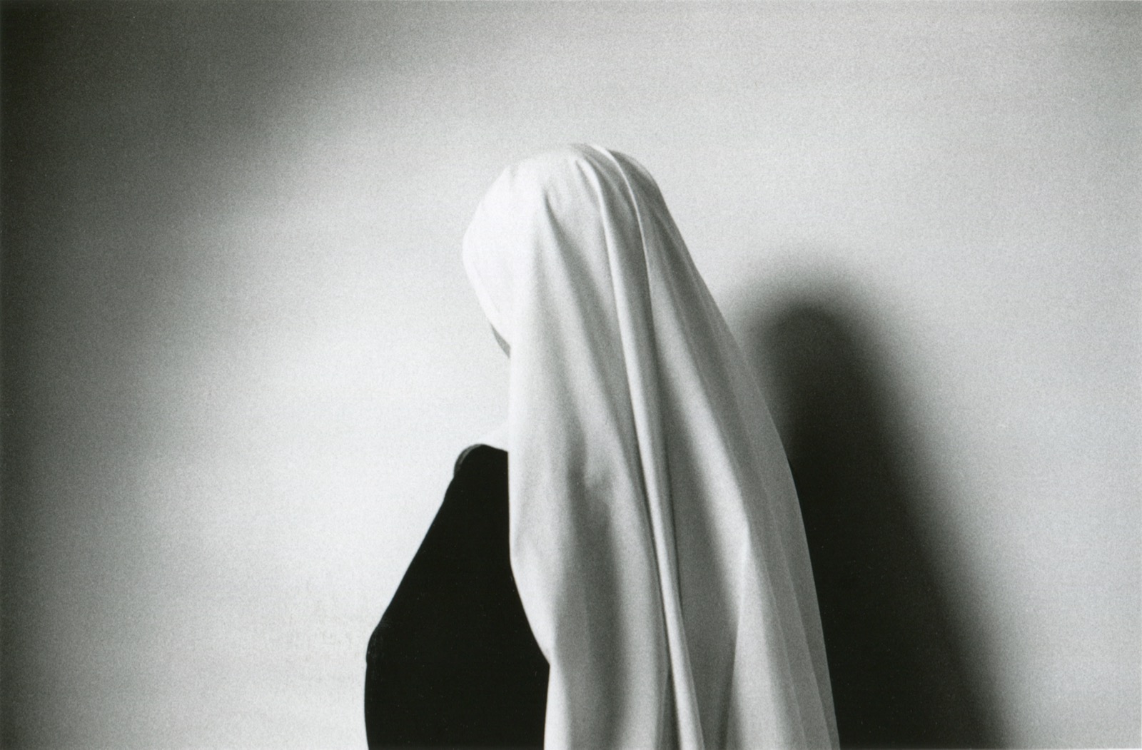
When the present becomes too close to bear like this, the past comes into sharper focus. From this swirling mire of idea-less exhaustion came a memory of a first encounter with a work that really struck me as remarkable and true. Anne Noble’s The white veil of a novice “Our habit signifies complete detachment from the things of this world” is a black and white photograph from a series taken while in residence with Benedictine nuns in a London convent from 1988-90. It’s a portrait of a young nun, but also a mysterious study of light and form. The veil and its folds sit at the centre of this small work, which is barely 20 centimetres wide; a tiny  sliver of the side of a face can also be seen. The drape of the folds is determined by the curve of the novice’s head, as still as marble. A dark shadow and an equally dark habit are voids against which the white veil sits. The wall is blank; a shadow settles across its left side. Its subject is thoroughly self-contained.

My memory is that I first saw this photo in a gallery in an old house on a hill in Auckland that is no longer there, but I can find no record of that now. Maybe we make memories to comfort ourselves. Either way, I would love to be sitting in front of it in that real or imagined place now.

Anne Noble, ‘White Veil of a Novice’, 1988, edition 22/30, Selenium toned silver print. Image courtesy of Two Rooms
Anne Noble, The white veil of a novice “Our habit signifies complete detachment from the things of this world”, 1992, black and white photograph, 131 x 196 mm


Alit on the flax

Someone posted a Colin McCahon painting on Facebook recently and I found myself feeling that familiar deep-seated response I get whenever I encounter his work, even as Facebook fodder on a phone screen. It’s a kind of nostalgia for a country you no longer live in but have unconditional love for, a feeling that is utterly lacking in critical thinking. It’s guided by the same part of my brain that makes me cry whenever I encounter tui in pohutukawa trees.

Aotearoa New Zealand is currently in the process of deciding whether to change the country’s flag. I’ve tried to think about this critically, without lurching immediately into the McCahon-response, but it’s hard. After an exciting and probably deeply misguided democratic call-out for designs, a shortlist of forty was chosen. Now it’s been whittled down to four.

Three of the four flags that will go to a referendum to then decide which will be put against the current flag are variations on a singular theme – silver ferns – with and without reference to the red and blue of the old flag, and the southern cross. But not the silver fern-on-black flag that has become a ubiquitous alternative seen on rooftops and out of the windows of utes every time we win the rugby, because too much black carries potentially unsavoury associations, apparently.

And the fourth?

Well it’s a black koru, which is a young fern, unfolding.

Suddenly that which is much loved has become politicised, branded and polemical in the most banal way. This touches my McCahon-response wellspring deeply in a way that I don’t like. What do I want from the flag? The kind of feeling I get when I read this excerpt from a poem by Toss Woollaston in McCahon’s Toss in Greymouth, 1959:

alit on the flax
a tui at dusk
and broke the late evening open with song.

Flag Consideration Project, Referendum One, 20 November – 11 December 2015; Referendum Two, 3 – 24 March 2016, New Zealand.

Official renderings of the final four options in the New Zealand flag referendum. Image: ONE News


The suffocating genre-blue: On being wrong

I feel compelled to write about science fiction, which is something I really don’t know much about. Whilst recently bedridden with the flu I watched more episodes of Battlestar Galactica than I care to relate. Suffice to say that by the time wellness again washed through me, my mind was a loop of Bear McCreary and Richard Gibbs’ musical themes from the series – all taiko drums, mantras and the piercing, single note repeated in the theme for Cylon Number Six.

The reason I don’t know much about science fiction is because, despite my curiosity for most things, I used to ignorantly reject it on artistic grounds. I dismissed it as the ‘blue’ genre, just as fantasy was the ‘brown’ genre. These pervading colour-ways were indicative of limiting, banal and recurring narratives I did not want to subject myself to inhabiting, I thought.

Battlestar was indeed blue, but I pressed on and on, further into its operatic scope; its faster-than-light jumps and bleak, AI dystopia filled with flawed characters. Yet Battlestar ended very badly, in an overblown, mawkish, simplistic way. In its worst moments, it was filled with bright, life-affirming green that made me actually pine for the return of the suffocating blue genre I had always scorned.

I also realised I was quite wrong about the colour genre assignations when I finally read Ursula Le Guin’s The Left Hand of Darkness, which is overwhelmingly white: a swirling, overwhelming, devastating blizzard of a book which encases you in a deep, white blanket of sorrow. These misconceptions prove to me in a very humbling way that you can construct a deeply ignorant critique of complex things via visually trained excuses.

sciencefictionblue
Science fiction blue


Bright light wakes you early in the tropics, which may reduce anxiety

I escaped a tropical downpour into Hito Steyerl’s Too Much World. The rain came straight down like a wide curtain, heavy and loud. Inside, the overriding mood was Scepticism Inc., a meta-melange of corporate training video, hotel room cable TV, real estate fly-through, political message, financial collapse, weather report, biography and probably even more than this.

Until the last room, where I sat in a grey-walled space, watching conservators picking and scratching at a wall in a room in a Frankfurt university, in search of the myth or reality of Adorno’s Grey. Their slow, white-coated labour of incremental excavation half a world away was projected onto a screen split into four vertical boards propped against the wall, as if ready for removal at any time. A provisional idea expressed in material form.

A few weeks later, Ross Manning’s mechanical mobile, Memory Matrix and Antiquity (for synchronized multichannel video) 2015 reached down into the same gallery space from the ceiling, projecting colour calibration screens on the floor from decommissioned projectors. These slowly colliding and intersecting readymade test-patterns of light were without subject matter, beyond themselves.

Melbourne in late autumn was all of its clichés: crisp, cool and dark and full of everything. In the final room of Kaleidoscopic Turn at NGVA, the magnetic video tape floating between two whirring fans in Zilvinas Kempinas’s Double O 2008 drew a hovering frame around Elizabeth Newman’s Untitled 2013 on an adjacent wall. Newman’s minimal work featured a section of slumped and sagging fabric – the result of a simple, three-sided, rectangular cut – which seemed to resist the tenuous optimism of this constantly suspended drawing in space. The gesture delivered a material scepticism, quietly yet insistently spoken.

Hito Steyerl, Too Much World, Institute of Modern Art, Brisbane, 13 December 2014 – 22 March 2015.

Imaginary Accord (Agency, Vernon Ah Kee, Gerry Bibby with Janet Burchill and Jennifer McCamley, Zach Blas, Ruth Buchanan, Céline Condorelli, Peter Cripps, Sean Dockray, Goldin+Senneby, Raqs Media Collective, Ross Manning, Marysia Lewandowska and Hito Steyerl), Institute of Modern Art, Brisbane, 11 April – 11 July 2015.

The Kaleidoscopic Turn, National Gallery of Victoria (Australia), Melbourne, 20 March – 23 August 2015.

'Too Much World', IMA. Image: Kyla McFarlane, Instagram
‘Too Much World’, IMA. Image: Kyla McFarlane, Instagram

'Imaginary Accord', IMA. Image: Kyla McFarlane, Instagram
‘Imaginary Accord’, IMA. Image: Kyla McFarlane, Instagram

'The Kaleidoscopic Turn', NGVA. Image: Kyla McFarlane, Instagram
‘The Kaleidoscopic Turn’, NGVA. Image: Kyla McFarlane, Instagram