Against nature—Charles Lim and ‘Sea State’

We have a personal bomb shelter in our flat in Singapore; most homes do here. It’s a hard thing to reconcile. In my mind household bomb shelters are something that Hollywood invented via nuclear disaster movies such as The Road. Sure bomb shelters seem a long way from Charles Lim’s Sea State Singapore Pavilion exhibition, but then again it’s possibly a straight line.

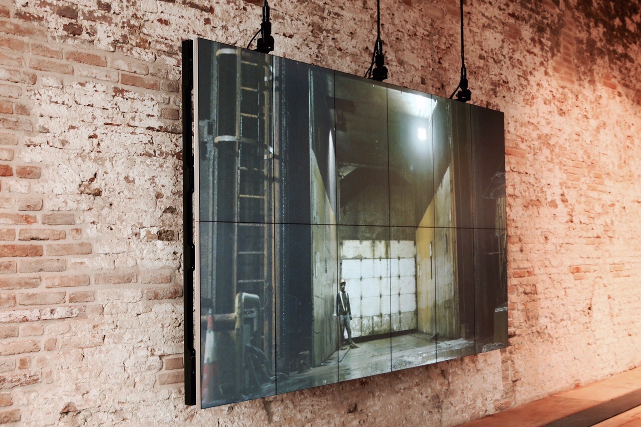
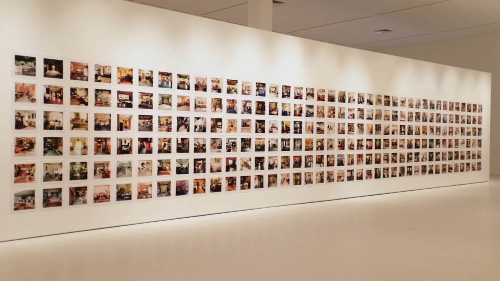
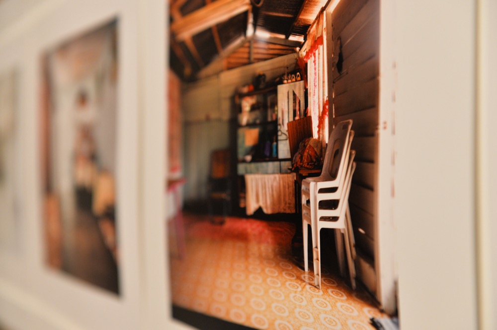
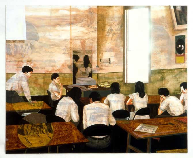
Charles Lim’s artworks in Venice are in the main film and documentary material displaying Singapore’s endless land-reclamation activities and island geo-engineering. Singapore is highly engineered in the same way many newly emergent global cities are. Like other national pavilions though, it’s hard to get at exactly what is at stake.

The last artist I remember who confronted the triumphalism of national pavilions at Venice was Hans Haake in 1993, where he smashed up the Nazi-era German Pavilion. He lifted and broke all the stone flooring leaving it a place of disorder and latent violence, and adorned a photo of Hitler in the portico in remembrance of the visit to the building in 1938 and in the main pavilion wrote ‘GERMANIA’ over the top of it all.

So what about Sea State? Well it’s not smashing anything up. And it’s not anything like a Hans Ulrich Obrist-style ‘post-planning’ zone that is applied to other globalising Asian cities. Sea State by contrast is coherent and shaped. Its ideal is a fluid but dissipated sense of subjectivity. It is not declarative or demonstrative, quite the opposite.

It is a fact that wherever you might dig a hole in Singapore you will invariably come upon broken concrete and tiles, or kampong detritus and what was once foreign dirt. In a slightly double-schizoid way Shabbir Hussain Mustafa, the curator of Sea State, goes quite a way to dissuade intuitions that land-reclamation practices are in some way an unnatural act. In this he is aware of regional sensitivities where land possession arguments are involved but in my mind there is nothing particularly spooky about Sea State, even where Charles Lim twirls the stick a little in drawing attention to Pulau Sajahat translating as ‘Evil Island’.

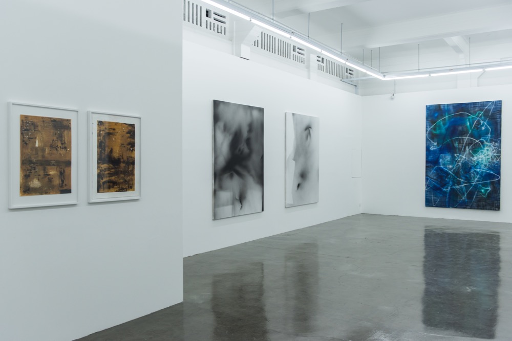
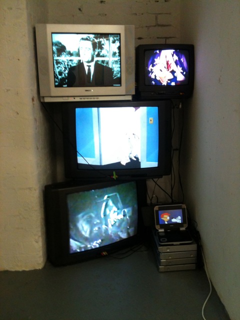
The Sea State aesthetic is in large part cinematic and monumental. It is mesmerising and technologically intoxicating. Charles Lim has an intriguing knack with presentation where he strips away the black cover plastics from commercial screen equipment to leave sheer naked glass and metal.

From an international perspective what stands out with Sea State is the geo-political parallels in the South China Sea. China’s historic sea claims do in fact reach down just north of Singapore and the familial connections and social pathways and trade movement via the seas up and down these coastlines are arguably ageless in the scheme of things. Sea State entwines itself within these broader political and cultural relations. Lim’s is not however the only contemporary geographic conception of place for Singapore. Another contrast for example is Singaporean/Malaysian film-maker Sherman Ong’s recent projects, where he imagines the possibility that some day Singapore and Malaysia will become one again. Many would see this though as a rather forlorn possibility.

Charles Lim, Sea State, Singapore Pavilion, 56th International Art Exhibition, Venice Biennale 2015, Italy, 9 May – 22 November 2015.

Charles Lim, 'Sea State', Singapore Pavilion, Venice Biennale 2015
Charles Lim, ‘Sea State’, Singapore Pavilion, Venice Biennale 2015

Regulation Singapore bomb shelter, circa 2005


Free action

A figurine of Nelson Muntz, Simpsons class bully, stands primed with a baseball bat. This was the exhibition publicity.

The installation followed suit with a new monstrous 40-metre wall diagonally bisecting the entire gallery. At the very back, on the side hidden from the entrance, a baseball bat is chained to the wall. And sure enough, when you take a swing, the sound of the hit is amplified to boom through the gallery. The wall reacts like a drum, with the volume soaking up the violence, even making it seem less.

The second Institute of Contemporary Arts Singapore work was Spectral arrows, Marco Fusinato’s 8-hour noise-guitar-splatter-concrete performance, presented with his back to the audience. The Singapore label Ujikaji Records is to release a recording of the event.

Both these works buy into the tension Fusinato creates in monumentalising and aestheticizing political gestures of ‘action’ or ideological resistance, unnerving connections between action and effect. Fusinato’s works often propose one sense or type of thinking by amping up and intensifying another. Fusinato holds open an ambiguity between the physical realisation and another thing he introduces, which comes from a different world or thinking. He pushes politics into physical expression.

So at the ICA Singapore a potentially symbolic act of inviting visitors to literally tear into a gallery wall is set against the amped-up thunder and comedy of the chain and baseball bat, and an eight-hour intensive noise-Tsunami literally collides with the audience to weed out all but a few.

The attraction in recent sound and electronic artwork is in the potential for new anonymous forms, ‘anonymous’ in the sense that these new forms are shaped in part by conditions that are not contingent upon us, or the artist for instance. Disaffection and disillusionment lead a similar conversation in discourses around contemporary painting and painterly abstraction. Noise is physical and generally unaffected by social objects. But temporal conditions of practice, such as duration or something being done too long, do force through. Situations count as well, as much for the people involved: an underground music scene for the non-workers, get-up-lates and intense types, for instance. Social conditions agitate abstract loops and feedback.

Conditions of practice lead to another sense of thinking about ‘anonymous’ forms. To read Fusinato’s works as aesthetically unassailable, or for their immersive effect alone, would be to overstate, as though ‘aesthetic’ implies a totalising procedure. The poetic in Fusinato’s work has a background and special characterisation in music and with other artists. A particular example would be Gary Wilson, et. al., whose revitalisation of Suprematist structures evolved into something of a shared usage and thinking. Fusinato’s poetic and conceptual precedents give leverage to ‘conditions of practice’ so that it is not necessary to overstate or constantly seek to lock down radical conclusion in place of an expressive moment and action.

Marco Fusinato, Constellations, Institute of Contemporary Arts Singapore, LASALLE College of the Arts, Singapore, 14 August – 29 September 2015.

Marco Fusinato, Spectral arrows, Institute of Contemporary Arts Singapore, LASALLE College of the Arts, Singapore, 30 August 2015, 4:00 pm to 12:00 midnight.

Marco Fusinato, Constellations, 2015, photo: truphoto.com
Marco Fusinato, Constellations, 2015, photo: Olivia Kwok

Marco Fusinato, Constellations, 2015, photo: truphoto.com
Marco Fusinato, Constellations, 2015, photo: Olivia Kwok

Marco Fusinato, Constellations, 2015, photo: truphoto.com
Marco Fusinato, Constellations, 2015, photo: Olivia Kwok


Taking notes

A little while back, Terry Smith (Discipline, no. 3, 2013) described the ‘comedy of disciplines’ that is the contemporary art scene. His hierarchy went like this:

cultural studies
art theory

———-

art history
art criticism
curating
collecting
art dealing
studio talk
art making

What’s interesting is how Smith draws a line these days between the theorising of the top two and those further down. He was actually in the process of dissing Nikos Papastergiadis for what he read as an arrogant and too-simplistic review of Smith’s own recently published books. He was saying that theory has less veracity in the art world than it once did, and that at best it communicates from the edges of the scene.

A series of seven video recordings of a symposium titled Speculations on Anonymous Materials at the Fridericianum, Kassel, in 2014 is available on YouTube. The videos introduce five speakers, mainly contemporary philosophers, discussing the trend of ‘new materialism’ thinking and the argument along the lines that the existence or non-existence of natural objects is not contingent upon us. The ‘anonymous materials’ of the title is meant as well to catch something of the way contemporary artists are more and more using strangely tangential materials in artwork.

These videos are a beautiful six hours where each speaker attempts to describe their very complex thinking to an audience comprised largely of artists and art professionals. Terry Smith writes about the potential of artists being contingent upon the worlds around them, meaning I think that there is an obvious dependency, but the stretching to connect that happens can be madly entertaining.

One of the speakers at the Kassel symposium, Iranian philosopher Reza Negarestani, proposed that artists are essentially ‘inference jumpers’, necessarily and inexplicably jumping from one inference to another. And for him the problem lies in artists ‘over-extending conceptual resources’ to the point where, he argues, artworks need objects. Conceptual practices were too often simply art by contract. For Negarestani, art is heuristic, and has nothing to do with rote learning.

In Going Public (2010), art theorist and historian Boris Groys jumps one step further to shift the politics of art by moving past ‘the spectator’s attitude’, and its associated aesthetic privileging of the audience and viewer. Groys instead proposes the viewpoint of production and writes of the necessity to build a poetics of the producer.

Groys sees the aesthetic attitude (i.e. the spectator’s) as culminating in a sociological understanding of art. He makes clear the subordinate position that the art scene allocates to production vis-à-vis consumption. Almost everyone’s interests in contemporary art tend towards collaborative, participatory practices and tactics of project-making.

Groys suggests that we are all invariably producers nowadays. The internet makes nonsense of twentieth-century aesthetic constructs to do with the demands of contemplative viewers. There are no idle viewers any more in any real sense. ‘The politics of art,’ he argues, ‘has less to do with its impact on the spectator than with the decisions that lead to its emergence in the first place.’ It is not a conversation about where art comes from and what it looks like, and art installations are not site-specific.

Terry Smith, ‘Contemporary Art and Contemporaneity: Reflections on Method, Review of Reviews (Part 1)’, Discipline, 2013, no. 3, pp. 191–200.

Speculations on Anonymous Materials, introduction by Susanne Pfeffer & Armen Avanessian, participants Maurizio Ferraris, Markus Gabriel, Iain Hamilton Grant, Robin Mackay & Reza Negarestani, Fridericianum, Kassel, January 2014, YouTube, nos 1–7, viewed June 2015.

Boris Groys, Going Public, Sternberg Press, Berlin & New York, 2010.

Mernet Larsen, 'Taking Notes', 2004, acrylic, tracing paper and oil on canvas, 122cm x 127cm
Mernet Larsen, ‘Taking Notes’, 2004, acrylic, tracing paper and oil on canvas, 122 x 127 cm


Modern zombies

What is it about zombie paint? Or this show at Arndt in particular? Sure, it’s the cool, distanced abstraction that has come to epitomise New York influences, especially the way they’ve revived the big 9’x6’ format canvas. Most artists’ work, too, hones down a single, sometimes beautiful, line of thinking.

There is a temporal necessity I respond to. These zombie painters feel like they waste plenty of time, or have plenty of time on their hands. Or maybe it’s that they spend more time talking and thinking about what they might be doing than actually doing what they do. I don’t mind this. There is something healthy and satisfying in environments where there is always a lot of talk.

Zombies are thankfully not team productions either it seems, and by working alone at the end this adds something ‘felt’ and affirming and implies something existent and in the world with you. These artists propose material physical weight, even as this accentuates the thinner repetitive history of what they are doing, so the double effect carries a sense of pointedness and willingness but is still actually an open breath.

Yet some of the propositions (paintings) were so slim as to be simply daft. It kills me they can get away with it.

Needless this revival of ‘the big 9’x6’format’ has another correlation of sorts in an exhibition down the road at the NTU CCA Singapore.

Simryn Gill’s installation of grids of square photographs along monolithic walls draws a straight line with conceptual/minimal tactics of the 60s and 70s. There are no interferences, or spatial slang or wandering at all. Photographs of Malaysian living-room interiors, decaying unfinished building sites and dissected tropical leaves are presented in serried mono-pattern.

It’s a strange installation: a confluence of authority and critique that comes across as slightly acerbic, or astringent. The actual spaces and experience that Gill reads colloquially via the photographs are attenuated up against the ambivalent effect of hard grid formations and monumental walls — possibly here is a point, I can’t be sure.

The sense of existent emptiness and distance comes with an awareness of the contemporary art gallery. Gill’s practice looks to a certain feasibility in this. The exhibition is a collision of place and space. Gill fends off any suggestion of seeking solace or further clarity in specific pictures, or thinking one might inevitably ‘get closer’. Like she says, it might be a matter of hugging the shoreline.

Simryn Gill, Hugging the Shore, NTU Centre for Contemporary Art Singapore, 27 March – 21 June.

I Know You Got Soul (Phoebe Collins-James, Liam Everett, Amy Feldman, JPW3, Kika Karadi, Hugo McCloud, Joshua Nathanson, Alex Ruthner, Diego Singh, Marianne Vitale and Jeff Zilm), Arndt, Singapore, 19 April — 21 June.

‘I Know You Got Soul’(installation view, foreground Amy Feldman), 2015. Courtesy Arndt Singapore.
‘I Know You Got Soul’ (foreground Amy Feldman). Image courtesy of Arndt Singapore

‘I Know You Got Soul’(installation view, foreground Kika Karadi), 2015. Courtesy Arndt Singapore.
‘I Know You Got Soul’ (foreground Kika Karadi). Image courtesy of Arndt Singapore.

‘I Know You Got Soul’(installation view, middle-ground Jeff Zilm), 2015. Courtesy Arndt Singapore.
‘I Know You Got Soul’ (middle-ground Jeff Zilm). Image courtesy of Arndt Singapore

Simryn Gill, ‘Dalam’, 2001 installation view. Courtesy of NTU Centre for Contemporary Art Singapore
Simryn Gill, ‘Dalam’, 2001. Image courtesy of NTU CCA, Singapore

JN_Image5_SG_Dalam 4
Simryn Gill, ‘Dalam’ (detail), 2001. Image courtesy of NTU CCA, Singapore

Simryn Gill, ‘Jambu Sea, Jambu Air, 2013, offset printed publication, Roygbiv editions, Sydney. Courtesy of the artist. (Reference to Like Leaves, 2015)
Simryn Gill, ‘Jambu Sea, Jambu Air, 2013, offset printed publication, Roygbiv Editions, Sydney. Image courtesy of the artist. (Reference to ‘Like Leaves’, 2015)


Chua Mia Tee’s Singapore

Singaporean artist Chua Mia Tee’s Epic poem of Malaya (1955) is a history painting of the sort we rarely see anymore—so many aspirations and doubts in the same frame. The image is of students sitting on the ground outside, under a tropical sky, listening and watching a young man speak—a teacher perhaps. It’s a scene that at its surface feels very contemporary. There is a currency today of artists imagining everyday group scenes—in a classroom or kitchen or at a tea party where people interact or just coexist —to describe or interrogate or enact what we share between us. In the context of 1955 the proposition of these students was the design of a state and the possibility of building nations. Or at least Chua Mia Tee was thinking through these propositions with this painting.

What’s unusual in Chua’s work is that there is complexity in the relations displayed between the students listening. There may be shared aspirations but these are not anxiety-free or uniform. There are different reactions and Chua is anticipating these differences collectively. The faces are not evenly focused; it’s a classroom after all. The fly on the man’s shoulder in the foreground anticipates another unmanageable spirit inconsistent with civic schemes. (On the same arm there is also what looks like an inoculation scar.) These qualities subtly distinguish the painting from more recent examples.

National language class (1959), Chua’s second work in the exhibition A changed world, could almost be a Mamma Andersson painting. The work describes an idea or proposal at a point that predated its actual adoption. National language class is painted ten to fifteen years before a new Singapore adopted two foreign languages as national languages although it wasn’t to be Malay by then, but Mandarin and English. Chua’s painting propagated the view that a new state needed room for the future and so too it needed the strength to make that room and change and so sometimes actively discard certain vernaculars and popular ways.

Equivalent contemporary pictures like, say, Mamma Andersson’s (with titles such as Ramble on or We are much closer than we ever thought), or Helen Johnson’s, with realist titles like History problem, are perhaps by contrast calculated to underwhelm slightly. Contemporary group pictures can resort to a kind of melancholic ‘the way “we” are’. As often there can be a backdrop of inaction, or boredom, or worse, a kind of fateful positivity which just makes me cringe. Chua Mia Tee’s group interplay is more demanding and comes from an environment that obviously was too. Among the deep aspiration there is still a level of uncertainty or irritation that is potentially dangerous and inciting—it’s an image of survival with a face and pressure.

A changed world: Singapore art 1950s—1970s, National Museum of Singapore, 25 October 2013 to 16 March 2014.

Chua Mia Tee, Epic poem of Malaya, 1955 (Image (c) National Collection, Singapore)
Chua Mia Tee, ‘Epic poem of Malaya’, 1955. Image courtesy National Collection, Singapore

Chua Mia Tee, Epic poem of Malaya, 1955 — detail (Image (c) National Collection, Singapore)
Chua Mia Tee, ‘Epic poem of Malaya’ (detail), 1955. Image courtesy National Collection, Singapore

Chua Mia Tee, National Language Class, 1955 (Image (c) National Collection, Singapore)
Chua Mia Tee, National language class, 1959. Image courtesy National Collection, Singapore

Mamma Andersson, unknown title, 2005
Mamma Andersson, title unknown, 2005

Helen Johnson, History problem, 2013
Helen Johnson, ‘History problem’, 2013


Xmas: Jordan Marani

Jordan Marani has piled five old TVs flickering afternoon programs to represent five brothers, including the ‘new’ one he’d discovered late. Black and white ‘Mr Ed’ is playing on the top screen so my guess is that must be an older brother. The little screen represents Jordy, because he is the youngest and it is at the very bottom, I suppose—according to the catalogue it’s showing the bulldog from Looney Tunes’s Chow Hound.

Xmas is a four-letter word is split in two halves with text works and recent portrait paintings on one side and at left/centre sixty or so small-scale works from as early as 1986 but mostly completed through the early and middle 1990s. These earlier works feel slightly strange now, marked as they are by time and a different regime of language, but I’m thinking too that the wider account Jordan plays out here—the exhibition and his act of self-historicising—is stirred by how long memories are so often missing in action these days. Only a few viewers or art professionals would have any recollection of these works I would guess. Jordan’s art is at one level contained within personal idioms and affections, but he is in fact an insider and ‘survey’-making says as much. In this sense making history on his own terms is purposefully set in the exhibition against today’s wider context of impossibly stacked attentions devoted to contemporary revisions.

The actual stories Jordan ascribes to these early works, the first-person contacts they make and the abrupt, demonstrably close viewpoints, are calibrated as a glue or a binder from one to another. Jordy uses materials as binders. His blunt face-down of attitudes and upbringing isn’t just an invocation of family, brothers and absent parents, but creates a kind of physical blur or shorthand that flows across the exhibition. Cardboard cartons, tin can lids and artworks with words like ‘wogs’, ‘shit’ and ‘arse’ collapse into a very confined, pushed-together space so they touch. Greasy paint circa 1991 therefore equals honest: bereft but willing. Four letters equals foul but sincerely yours. You would have to close your eyes first but maybe there is an art stack too, another pile. Is this OK? The glue extends as a male sauce thing that is a point of fact more than right of exclusion and connects Jordan with a community of artists that would include Ralph Balson, Robert Rooney, Mike Nichols and Raafat Ishak.

The male thing actively looks to women too, for instance in a work such as Mother, 1991, that puts ‘habit’ in the same frame as ‘tenderness’. I like the poetics of these works. They are studied and reserved.

Jordan Marani, Xmas is a four-letter word, Daine Singer, Melbourne, 28 August – 5 October 2013.

Installation
Jordan Marani

Installation of staked screens
Jordan Marani, installation of stacked TV monitors

'Mother', 1991
Jordan Marani, ‘Mother’, 1991

'Cunt', 1990
Jordan Marani, ‘Cunt’, 1990

'SHIT', 1992
Jordan Marani, ‘SHIT’, 1992

'vinnipanni', 1993
Jordan Marani, ‘Vinnipanni (Flowers for Cartoggio)’, 1993


John Aslanidis—New York noise

JN: By 2003 you’d established the premise that you apply now, where you effectively paint intervals of sound or noise, right? Your paintings are non-objective in a way that correlates with artists such as Stephen Bram and Michael Graeve and reminds me in some senses too of Karl Wiebke. Though you’ve not exhibited in a focused way with any of these artists, have you?

John Aslanidis: I use sonic intervals. Bram uses a different methodology with a series of perspective points to orientate the surface. The connections with Wiebke would be in the paint surfaces and the material ways these unfold. By 2003 I felt I’d gone as far as I could in Australia. I’d studied in Sydney before moving to Melbourne, but the 1990s were a pretty lean time. Don’t get me wrong, there were a lot of good times, but artists emerging didn’t really get to consolidate (professionally and historically) back then. In terms of institutions I just had to go somewhere else.

JN: Your first solo exhibition in New York was in 2003 although you were already being regularly included in group shows.

JA: I’d been making trips as often as I could since 1999. In New York things were different—contemporary art plays out there in a different way. Exhibiting remains very important and of course there are just so many more galleries that the scene has scale and ebbs and flows in a way you notice. In New York too I feel there has always been a basic respect for the potential of studio practice and that hasn’t changed.

JN: The early exhibitions in New York and particularly your recent collaborations with Brian May led to new shows in Berlin? In the Berlin work, the wall of noise Brian May composed is played aloud in the space along with your painting. How did the collaboration work exactly?

JA: The sound is generative. Brian works with different software and calibrates the sound to colours and intervals in the painting. He measures the colour frequency in sound. The premise seems very simple but the outcome becomes quite complex where the sound warps against itself and across the painting. The sound recreates, it regenerates in an expanding loop, and the painting resonates in a similar way—visually or conceptually. The paintings have no edges in this sense or exist as a contingent proposition; every work is a cast of the same proposition.

JN: The system you use persists from painting to painting.

JA: The original idea was to achieve structure and consistency in terms of thickness and density and viscosity etc. Because I was working with these intervals I didn’t have to think about the painting as a whole, it composed itself or simply unfolded. Earlier on I didn’t correlate it explicitly to sound although it is a parallel that is very close now. I still use the same piece of scrap paper from years ago where I first plotted the system design and compositional intervals.

JN: It’s not so easy to account for the cross-over between sound effects and the abstraction of the painting. For me they are different types of thinking or sense that are converging. You were a resident at Location One in New York for a while too in 2011. How did this go?

JA: That year at Location One there were a number of us using sound which culminated in the end-of-the-residency exhibition curated by Claudia Calirman. A little while later I was included in Sound and vision at McKenzie Fine Art in Chelsea—that was with Gilbert Hsiao, Daniel Hill and Laura Watt. The great thing about that exhibition was the opportunity to meet with Daniel Hill. He is a musician and we were both interested in the movement between conceptual and perceptual thinking. This is the cross-over you are speaking about I think. The next year Daniel included me in an exhibition he co-curated with Ron Janovich called Emergence and structure, dealing with emergence theory. It toured through university museums in southern states.

JN: The Berlin shows were different initiatives?

JA: While I was at Location One there was a lot of interest in the Berlin work, which had gone ahead before I’d arrived there. Gilbert Hsiao had introduced me to Matthias Seidel and we organised to show the sound/painting collaboration with Brian May at Matthias’s gallery dr. julius in April 2012. Matthias Seidel later included me in FutureShock OneTwo: Internationale neue Konkrete as well.

After dr. julius I went back to New York and was talking to Juan Puentes at White Box. I wasn’t even sure I would end up showing there but through the gallery was meeting a lot of nice people. Eventually I had to fly back to Australia but just on my way out Juan offered that we actually show. So we came back later the same year and set up with just the one painting and Brian’s generative sound piece. I’d always wanted to have this show in New York and just put one painting into this big space and I think we did pretty well.

This is an edited version of a conversation in John Aslanidis‘s studio, August 2013.

Sonic network no. 9, White Box, New York, April 2012, and dr. julius, Berlin, October 2011


Default: ‘Everyday rebellions’ and Frances Stark

Two good shows. Frances Stark’s My best thing and Everyday rebellions, the latter curated by Emily Cormack, are both like Kunstvereine exhibitions—spare and intelligent. Kitty Kraus in Cormack’s exhibition is very cool. A new pale white flooring. A heat bomb slowly unloading. The power left on. Degradation, gloom, linearity—the movement in the work is atomic or sub-atomic. The arrow of time moves in only one direction. Material resistance (‘rebellion’, writes Cormack) is a default setting.

Throwing salt onto metal, Virginia Overell speeds things up just for a little while, turning up the ‘more entropy/greater order’ dial so to speak. In the second room, Dane Mitchell waits for nonsense between systems. Substituting ‘the smell of an empty room’ for fixing chemicals, Mitchell alters our perception of the documentary mechanism of photographic paper from image to three-dimensional solid.

Frances Stark’s My best thing, 2011, at the Potter is close to Joan Jonas’s video Vertical roll, 1972, at Gertrude. During her chat-dialogue with an anonymous undies-wearing Italian, Stark interrupts to explain an art point, saying ‘… you have to do more that just use the tools’. It’s a cliché, she knows, especially when spoken out loud—too much the professor—but Stark for that moment is unsettled by her young cam-sex friend.

Joan Jonas’s 1972 classic manipulates not so much video but television technology. She makes the TV format her own, in much the same way that Stark uses online chat platforms. Jonas takes the tension found in a buggered TV’s rolling black bars, and visually imprisons the women pictured on the screen. Both Jonas and Stark use the energy of language expressively, but not as proof.

Malfunctioning screens like a Jonas-day TV are gone now anyway. Finished.

Everyday rebellions, Gertrude Contemporary, Melbourne, 11 May – 8 June 2013.

Francis Stark: My best thing, the Ian Potter Museum of Art, the University of Melbourne, 20 March – 2 June 2013.

Kitty Kraus, ‘Untitled’, 2006, lamp, ice, ink. Photo: Jake Walker

Joan Jonas, ‘Vertical roll’, 1972, black & white, sound, 9:38 mins. Courtesy Video Data Bank, Chicago

Frances Stark, ‘My best thing’, 2011, single-channel SD video, sound, 99 mins


The cultivator: Hou Hanru

Two images from Hou Hanru’s Melbourne lecture last month stayed with me. Hou is the curator of this year’s 5th Auckland Triennial, If you were to live here … 

The first was an early black & white image from his student days in Beijing through the 1980s. The image he projected showed students standing on ladders pasting handwritten bill-posters all over a building—all over its façade. Hou used the image in the same way an artist might show early formative work. The picture was equal-parts building, student crowd and big-character text climbing the walls. Hou said it was the sort of activity he was involved in all the time in Beijing in the years before the events of Tiananmen Square. As a precursor it gives some practical reason for his preferences for display and process, which typically involve a melange of institutional partnerships, public excursions, interdisciplinary workshops, residencies and collaborations.

In the same week that Hou spoke at Asialink, I found myself in front of Stephen Bush’s painting Cultivator, of the same era as Hou’s student days. It’s a terrible gesture to draw equivalences too quickly, but I imagined Hou’s project and the Bush running in conceptual parallel, as method or critique of culture or civic progress. The painting has a faintly suspicious feel about it—hard to place, but an aspect that might in the 1980s have been called ‘postmodern irony’.

The second of Hou’s images that took my interest followed discussion that in contemporary China there are now something like 12,000 new museums under construction or almost completed.

This image was a diagram of how Dutch architect Rem Koolhaas planned to implant a museum in a new residential development in Guangzhou. Koolhaas and Hou had negotiated with a local developer to reposition an initial idea for a museum space, shifting it from a sequestered interior forecourt to an accessible rooftop position. Koolhaas had come up with a design that linked the rooftop museum via lifts to a street-front foyer with project spaces and studios inserted at middle height in the building. To me it is interesting too that this museum, like most new cultural initiatives in Asia, was a private initiative. From the developer’s viewpoint, the art museum helped brand the complex through the design and construction phases of the building in a way that was attractive to new residential buyers. Once well-established, I am guessing that the museum would be given over to the future collective residential ownership.

‘If you were to live here … a conversation with internationally renowned biennial curator Hou Hanru’, with Natalie King, Utopia@Asialink, Sydney Myer Asia Centre, Melbourne, 15 April 2013.

Big-character posters, China

Stephen Bush, ‘Cultivator’, 1987, oil on canvas, 132 x 198.2 cm, National Gallery of Victoria, Melbourne

Rem Koolhaas’s design for Times Museum, Guangzhou, China, 2005


New ACCA

‘Exhibitions that don’t have an inventive display feature are doomed to oblivion’, says Hans Ulrich Obrist. ACCA rebuilds its exhibition formats all the time, every time. There’s never been a baseline for its architecture or ambition, no opportunity for being nil, no bare bones—although ‘tin shed’ might suggest otherwise. Martin Creed’s The lights off (2005), was perhaps the nearest this gallery came to bare bones, but even then the lights were only turned off down the back in the art spaces.

New13 suffers from this lack of emptiness. Do architects design for emptiness? Can exhibition designers empty a space? Surely artists are concerned with gaps and disparities—slow lanes, fast lanes, material dexterity. The always-on hum of production-jazz adds a fog to any space. The artists in New13 seemed caught in the ACCA format, rather than any chance of the other way round.

ACCA was running a radio advertisement for New13 that I heard on 3RRR and the voice-over went something like, ‘come and see the art stars of tomorrow’. You have to be kidding?

From an artist’s perspective it’s worth asking, what is the point with New13? What is being learned or invigilated? Alex Martinis Roe, for example, might be better served by being included in the more conceptually defined Gertrude Contemporary exhibition Loosely speaking. Conversely, any of the Gertrude exhibiting artists might have been commissioned for New13. As an event, it could have paralleled something like Action/response in North Melbourne last month. Shock-horror, New13 could have comprised women exclusively, whereupon this impertinence might finally have had a serious structural airing (celebrations aside).

Melbourne’s fifteen years of boom-time museum building must surely be over. There are now so many larger scale art institutions: RMIT, Ian Potter Museum of Art, ACMI, NGV Australia and International, ACCA, TarraWarra, Heide and MUMA (I think that was the chronology), all of them entirely capable of affecting and nurturing content. So now, or soon, there is a chance again at an old phase, where priorities go back to content.

New13 (Benjamin Forster, Jess MacNeil, Alex Martinis Roe, Sanne Mestrom, Scott Mitchell, Joshua Petherick and Linda Tegg), Australian Centre for Contemporary Art, 16 March – 12 May 2013.

Linda Tegg, ‘Tortoise’, 2013

From left: Sanne Mestrom, ‘Still life with nine objects, 1954’, 2013; ‘Still life with small white cup on the left, 1931’, 2013; ‘Weeping woman’, 2013


Group portrait

Atul Dodiya’s Kochi–Muziris Biennale installation in a disused laboratory comprised upwards of 200 framed photo-portraits standing on half-size partitions and benches, and hanging on walls. Snapshots taken with a digital camera showed mainly artists and other participants in the Indian art scene, all the individuals in ones and twos and threes, interspersed with the odd art-historical figure and a few David Attenborough-style wildlife pictures.

As a giant, glorious collective portrait of a community, Celebration in the laboratory was multidimensional but reminiscent too of all those many earlier group portraits of artists. Dodiya’s installation was hugely inclusive and at a point intimate, but struck me as capturing a pathos now bypassed elsewhere. The Indian scene (this scene described by Dodiya) is I guess roughly an equivalent size to the Melbourne scene, all up, but I couldn’t think of such a project being conceived, let alone staged, in Australia.

Celebration in the laboratory communicated something of the purpose and confidence of the Indian contemporary art scene in its current state. People seem to know one another. Infrastructure, like the architecture, is generally very low to the ground. Cross-generational networks are visible. Shared knowledge and enthusiasms between artists matter.

International art events are like international airports. If you have one, people come. If you don’t, they won’t. It’s the event design that needs to be right. The Kochi–Muziris Biennale was the inaugural Indian biennale, and it was also the first opportunity I know where you could get to see serious volumes of contemporary Indian practice and come to some awareness of its details yourself.

Atul Dodiya, Kochi–Muziris Biennale, Kochi, Kerala, India, 12 December 2012 – 13 March 2013.

Atul Dodiya, ‘Celebration in the laboratory’ (detail), 2012

Atul Dodiya, ‘Celebration in the laboratory’ (detail), 2012

Atul Dodiya, ‘Celebration in the laboratory’ (detail), 2012

Atul Dodiya, ‘Celebration in the laboratory’ (detail), 2012

Atul Dodiya, ‘Celebration in the laboratory’ (detail), 2012


Traumatic acts and therapeutic structures: A few ideas in, around and associated with Stamm

by Jonathan Nichols & Amita Kirpalani

I

The idea of a ‘traumatic object’ is around and can be found lurking in conversations about dOCUMENTA (13). Between us this year, the language of trauma is closer to being caught up with what happens with art making and art writing. Which is slightly different.

As I read it, because I didn’t see it, dOCUMENTA (13) used broader associative ways to identify traumatic objects: stories etc. (For instance, I suppose Lee Miller didn’t pinch Hitler’s toothbrush.) Association is key. Early on we introduced in Stamm Jan Verwoert’s take on trauma and art making as to do with a mechanics of empathy, which is closer to the way I understand it.

The idea of place is important here. The traumatized object is something which suffers the pressure(s) of place. Outward as well as inward pressure. Stamm was established to apply the pressure of regular writing against exhibitions which occur largely within a few city blocks. Supporting this set-up is a collection of voices that clash, jar and don’t quite align. Not to represent a cross-section, but rather to associate, since most of us are looking not only within but, crucially, beyond a particular local ‘scene’.

II

Hal Foster suggested recently that we are fatigued with a rhetoric of avant-garde ruptures, breakings, tipping points and are now preoccupied with stories of survival and persistence. I’m seeing the vogue of ‘old and new art’ together as to do with seeking a clearer sense of temporality in art making (time and space). This is also though a retreat in part from contemporary practice. Hal Foster says the times are for changing, and ‘radical new’—in the sense that he holds to modernist values—is not being looked to so much post-2008.

III

We’ve been talking about process as trauma and regularity as therapy. The same way an exhibition space offers a regularity of event and venue. I like the idea of the exhibition space operating as the office, rather than the studio operating as the office. Labour within the studio is trauma but the presentation of an object that has been produced in this context compounds the issue.

Heightened, compounded and, perhaps worst of all, very known: an exhibition space is mutable and contains a show, but as well it can impose its character, it’s a mutable enterprise or can, on occasion, background a work in ambivalence. In the way that a gallery is a kind of stave for the art, the idea of the text is a stave too. It too can hold up an artwork and offer its own rescue. It can also shut it out and down of course and play the games of hierarchy: a counter-discourse of ‘destruction’ and destructive acts. A therapeutic structure, be it writing (as in Stamm) or an exhibition or gallery, can rescue the traumatic object.

IV

If writing more generally is proposed as a therapeutic structure, we might look at art and artists that further interrogate this idea of collaboration and direct reference to therapeutic, cathartic structures. Some favourite examples:

The Telepathy Project
A Constructed World
Nat & Ali’s therapy session screen at Hells
Sophie Calle
Marina Ambramovic
Stuart Ringholt
Anastasia Klose
Chiara Fumai
The greatest tragedy of President Clinton’s Administration, Mike Kelley
Otto Muehl
Mike Parr
Dani Marti
Rose Nolan

V

Cairns. Little stacks of rocks, a kind of tourist graffiti that populates historical monuments and natural wonders. These are temporary markers of an individual experience. But there is deceit at play too. Technically this individual act is a collective experience and the residue, the cairn, undoes the ‘naturalness’ of the vista.

This style of publishing—a collective, monthly posts, 300-word count (rarely adhered to), with few other ‘rules’—is its own little stack of different-sized pebbles. Perhaps to be knocked over soon after its construction, imminently dismantled. Marking the viewing, the experience. Sometimes contributing to it, sometimes littering. Balanced and not.

Kate Smith, Sutton Gallery, 12 October – 10 November 2012


Kate Smith’s empire

Sutton is one of the few galleries in Melbourne still willing to underwhelm.

The space was so sparse, I didn’t have a clue until I was up close to the six or seven works on canvas board propped vaguely around the walls. What were canvas boards ever supposed to be about: amateur utopia, the art proletariat, easy travel (always better stacked)? Of course now though they’re about the contemporary precedents.

Modern painting is one of the few sports in the art scene that can modulate a negative, or speak of decline, provoking value judgements about production and posing questions like: do we need it in the first place? Good questions for 2012. And slacker abjection for Kate Smith also clears the path of all that masculine indebtedness.

Maybe early on all you can do as an artist is get the main propositions in place. It’s enough to do that.

What’s on the painted surface matters less. A friend said ‘palette paintings’—anything so long as the results are sufficiently empty to represent not much at all, or at least come across as incidental. Although these works manage still to be laced with the after-effects of that new ‘empire of painting’ at the ANU Canberra.

Having a show in a senior gallery can be more important in an artist’s career than the show itself. This is something the artists Kate Smith unavoidably recalls—Imants Tillers, John Nixon, Store 5 et. al.—most likely also understood very early on. It gratifies the gallery but is understood in an entirely different way compared to where a show as scant and minimal is held in an artist’s space or less secure gallery.

Kate Smith, Deep privacy/convex, Sutton Gallery, Melbourne, 12 October – 10 November 2012.

Kate Smith

Kate Smith

Kate Smith, ‘Mechanic holds to reams of white paper’, 2012, oil and synthetic polymer paint on canvas, 20.3 x 40.6 cm

Kate Smith, ‘Orange reserve’, 2011–12, oil and synthetic polymer paint on canvas board, 20.3 x 40.6 cm

Kate Smith, ‘No meaning tattoo’, 2012, oil and synthetic polymer paint on canvas, 25.4 x 20.3 cm


John Spiteri

Social climbing

The title of John Spiteri’s recent show at Neon Parc, Still life social climber, could be referring to himself, in a self-deprecating way, but I imagine there is a little salt meant for the audience too.

I wonder what social climbers do, besides being a little blank? Watch being watched. Join in carefully. Show they’ve got the wares. Make a move, get a step ahead—not too far ahead though ’cause they want to be included. Make the next move, there’s the game, something everyone will see and recognize. Maybe Spiteri is suggesting art in Melbourne is a bit like this.

Spiteri’s last show at Chert was titled The house of hair—the full hair-shirt for hard-nut Berliners. I can see that.

All this reminded me of something I read about Francis Alÿs recently, where he was quoted saying, ‘However elliptical you want to be, you have to make contact … The paintings are a way to trap in the viewer’. Alÿs’s exhibition was titled A story of deception, and the writer was hesitating about who was the object of this deception and if Alÿs was at some level disingenuous.

Abstract painting

John Spiteri’s Melbourne exhibition comprised a series of absolutely intriguing and original small paintings on linen. I first noticed their strange quietness—the works seem so reductive. There was a slight feeling of ambivalence and ambiguity. It’s something that you read in the way he has handled the painting process, not so much in the final images of the paintings, which are actually very stylish.

Each of the works is a series of deletions and revisions (or reverses) in paint. The linen starts unprimed before each new layer is put down and allowed to dry for a while. Spiteri has then washed away most of any new surface (what he doesn’t like?) to eventually get a build-up of sedimentary increases of rubbing out on top of rubbing out and only minimal colour. The upper layers include very simple gestures, like doodles, in the paint, never too heavy. There are scratches and bits of line-work and coloured-in bits—not quite absent-minded scribble.

There is a lot to see.

Spiteri’s process of attrition has a bit of ‘horse cure’ for me but he is clearly interested in the structure of the paintings and in finding new means. The abstract in the work, the absence or emptiness or randomness, is actually an opening. Spiteri looks for authenticity in entropy. Each painting is casting for a lesser degree of order (or greater order, if you think about it).

John Spiteri, Still life social climber, Neon Parc, Melbourne, 22 August – 22 September 2012.

John Spiteri, ‘Denim & lace’, 2012, oil and enamel on canvas

John Spiteri, ‘Dirty secrets’, 2012, oil and enamel on canvas

John Spiteri, ‘Permanent blue’, 2012, oil on canvas

John Spiteri, ‘Living for the night’, 2012, oil and enamel on canvas


Konnichiwa Osaka

Osaka feels like a very cool city, cosmopolitan. I often found myself thinking, any minute the locals will just break into something I can understand, but of course it didn’t happen.

Real Japanesque at the National Museum of Art, Osaka, looked at the practices of artists born after 1970. It comes way after super real and superflat. It felt international, contemporary, but was not looking to the West. An accompanying text actually suggested Western art practices were at an impasse—that contemporary art in the West hit a wall around 2000.

There were no black rooms, no heavy production or technically complicated stuff. The curators wrote that these artists were interested first in the idea of how a work of art could be ‘new’. What would that be like? They suggested that this newness, for these artists, is about returning to earlier Japanese art and configuring displays that assume an inquisitive audience.

Nine artists only, given huge airy independent spaces, more like a solo exhibition each—extraordinarily generous in terms of similar survey projects.

Speediest (but still slow) were the prop-sculptures of Maoya Kishi built in situ.

Middle-speed were the documented performance works of Taro Izumi. These were smart and seemed to allude to or expand on some of the conceptual thinking shared throughout Real Japanesque. Maybe everyone agreed with this guy. There was a library machine for writing and erasing. A Richter-effect machine. A face wipe-out machine. What was left of a live rabbit interview, and some strange Franz West-type toilet closet.

Slow-time though, was the body of Real Japanesque—it was Zen-time, jazz beat time, measured by full stops and commas, transitions by breath, colour registrations, stains and material translation.

Katsuhisa Sato, Teppei Soutome, Kazuyuki Takezaki, Mayuko Wada—Blinky Palermo babies. Beginning or ending, winding, aimless, blue window, noise, He and She, Kyo accent, Water side and is it the daybreak?—some titles.

With these last artists it was as though you passed a gate and the senses untangled and began to travel individually, your eyes dilated, picking out movements and hints from zone to zone. Making-time ravelled up as much as unravelled and opened and extended a sense of the present to include future and past.

It felt good.

Real Japanesque: the unique world of Japanese contemporary art, National Museum of Art, Osaka, 10 July – 12 September 2012.

Maoya Kishi (artist installing)

Katsuhisa Sato

Katsuhisa Sato

Katsuhisa Sato, ‘Noise’, 2010

Teppei Soutome

Mayuko Wada

Taro Izumi, ‘Corset (library)’ (detail), 2012, video and timber construction

Mayuko Wada


Bradd Westmoreland—wet

In January 2009 Bradd Westmoreland painted this crazy huge frieze titled War & peace around three walls of a small studio space I’m attached to in Fitzroy as part of a very local, very diverse, summer series of impromptu weekenders. The full catastrophe was equal part dance of life and cycle of destruction painted over a couple of days. The weekend before, Alicia Frankovich had roped and literally harnessed the entire studio building in a live performance titled Lungeing chambon. It too was a type of dance.

Too few ‘wet’ artists manage to connect with or show an interest in the main settings of contemporary art practice. They are happiest being all stoic and hog-tied to the symbolic conditions of the studio, thinking they are on a higher plane, or something like that. They don’t cheerfully fit the concrete politic contemporary art finds easiest, but also strangely don’t engage well with its impermanent and haphazard conditions. Even a word like ‘painterly’ once actually suggested a relative idea of clarity rather than an exhaustively complete one. Westmoreland’s War & peace frieze was a rare example in Melbourne of an artist ‘crossing the river’ so to speak.

In 2010 Westmoreland painted a second wall painting at the Ian Potter Museum of Art for the exhibition There’s no time. The painting, Night’s bright song, was in a room alongside John Spiteri’s early works on glass and ‘calendar’ paintings on board. The motif Westmoreland constructed was like a gigantic snake-charming scene. He had again carefully flipped onto the gallery wall the working routines he’d established in the studio, something that provided a loosely held subjective presence in the work.

Each of these two wall paintings were curious if for no other reason than their mechanisms involved nothing of the more familiar ‘wall drawing’—architectural notation or string piece or photographic projection—de rigueur structural incursions all. Westmoreland’s art is more to do with the absence of a premeditated structure or conception or approach than just a casual, loosened or relaxed art procedure. But of course that is not completely true either. There are clearly broader codes at work and repatriations of a sort. For instance, at Westmoreland’s Niagara show earlier this year, it dawned on me (belatedly) how close his paintings are to the work of the late Peter Walsh. The precepts seem to play out in a similar way.

Bradd Westmoreland, War & peace, Beyond the Green Door, Melbourne, summer, 2009.

There’s no time: John Spiteri, Mira Gojak, Karl Wiebke, Bradd Westmoreland, the Ian Potter Museum of Art, the University of Melbourne, 17 November 2010 – 13 February 2011.

Bradd Westmoreland, In the light, Niagara Galleries, Melbourne, 7 February – 3 March 2012.

Bradd Westmoreland, ‘War & peace’, 2009

Bradd Westmoreland, ‘War & peace’, 2009

Bradd Westmoreland, ‘Night’s bright song’, 2010, synthetic polymer paint on wall

Bradd Westmoreland

Bradd Westmoreland, ‘The optimist’, 2010/11, oil on canvas, 33 x 24 cm

Bradd Westmoreland, ‘Blue boy’, 2011, oil on canvas, 55 x 40 cm

Peter Walsh, ‘Deposition’, date unknown, oil on canvas, 106.5 x 91.3 cm


An interview with Azam Aris

1. The duck and the moon

Azam Aris: They are actually trying to do this here now—send an astronaut into space. Not just for scientific experiments but because of the idea that there has to be a Malaysian in space. That is OK for me. It’s actually good. You can create this image in education, in high schools. The moon is a kind of Malaysian dream. It is costing a lot of money this astronaut. But there are many stories about the moon. In fact moonlight is a potent energy in Malay.

So I like to create characters and images to make a story happen. With this story there are two plots. This is the first one [image above] with the general on the lunar surface. And this is the second [image below], where the general faints after giving orders and then everybody changes into a style of duck, with splayed legs and peaks. I like the duck, but it’s not about the duck so much as I just wanted to change the scene from the military style of the first plot.

I’m not really thinking about what the duck is. I just wanted a weird thing. The casts and these sets will be the basis of final works that will be painted.

2. Cleaning

Azam Aris: This is another storyboard of the ducks for a different work. The acting is different but the characters are the same. They are throwing something, pouring something into a big pool (a sink), and the other one is turning on the tap. It’s all about making things disappear, evidence disappear, making everything clean. So the concept is cleaning, black money or whatever.

3. Aliens

Azam Aris: My work is to make connections … so with this work it’s a mobile: this arm on the drawing is going ‘tuk tuk tuk’, moving, the hand with the axe is rotating to cut the wood. He’s burning the alien. That’s the story.

4. Wall and fence

Azam Aris: It’s like a partition for your own side. Actually it’s like going to the backyard. I’m creating the small garden that people can’t see unless they are out the back. That is where things happen.

It’s a similar kind of story in wayang kulit. Wayang is the shadow theatre and kulit is the animal skin on the puppets. In wayang kulit they understand that there is more going on backstage. It’s where the gamelan is, and the tok dalang is the puppet master: the man who controls everything. I’m trying to use this concept with this idea of the backstage, the hidden place, the secret place where the action actually happens.

There is another aspect to this image of the fence too, somehow, where I’m thinking about the wall in the Middle East: the Muslim wall in Jerusalem. I’ve used this fence image as a backdrop in a lot of work.

Azam Aris, 23 June 2012

Azam Aris is a resident artist at Rimbun Dahan, Kuang, Selangor, Malaysia, through 2012.


Raafat Ishak’s ‘decadence’

Around 1994 Raafat Ishak and I were interested in the French word décadence and its local translation, which had been flipped to read ‘decline’, in the magazine Art & Text. The magazine’s usage was ‘The decline of the nude’. This became the basis for an exhibition where we re-flipped the title back to The decadence of the nude.

Installing though, Ishak didn’t focus on the nude drawings he was first considering but instead painted a design directly on the wall down low in a corner of the gallery. The image was very stylised in the way that he was used to working except for this section where you could clearly see a kangaroo humping an emu.

I’ve often thought Ishak divides up the concepts in his paintings. His art is a strange collision of facts and feelings, but it’s the facts he lays down most clearly first. With the Decadence exhibition he turned the sense of the word towards presumptions of contemporary nationalism and the identity cults and tropes around belonging that they oblige. (Not long after this show he painted ‘send me home’ in billboard-size letters on the outside wall of the same West Brunswick gallery.)

One of Ishak’s very earliest paintings he’s said is a painting of his mother and concerns another form of estrangement. I don’t have a reproduction of the work but my recollection is that it is something like the second image I’ve included below (a photo I took yesterday on the highway to Johor Bahru in southern Malaysia). Ishak based his painting of his mother on signage, very much like this, for a women’s toilet—although his was a red female design on a white canvas and copied from local toilets at the VCA or somewhere. The Ishak painting was a hugely sad existential work—something very hard to pull off these days—although I imagine some audiences could disagree and mistake the same components of the work as the product of a basic lack of empathy or inhibition.

Just recently, with his 2011 show at Sutton Gallery, Ishak has come back to nudes. They are hidden under the miasma of ‘a rigorous speculation on abstraction’ (did I ever understand what this means? I’m not sure!), and he’s named each painting after a soft-fleshed tropical fruit. The works are gorgeous but although it’s hard to see what is going on exactly I get the sense there is a bit of toilet humour here too: Mr Nude Descending a Staircase along with Mr Stinky R Mutt. And once again I think it’s actually lower down (beyond?) the chain of reasoning that we might find the work’s true feeling.

Raafat Ishak, wall painting, ‘The decadence of the nude’, Ocular Lab, 2004

Public toilet sign on the highway near Jahor Bahru, Malaysia

Raafat Ishak, ‘Papaya’, oil on canvas, 2011


Atlas: Andrew Hurle

Andrew Hurle’s work in Post-planning is about human imagination and its roots in pathology. There are six artworks: four small constructions (models), some more unfinished looking than others, and two prints about A3 size and pinned.

The works are installed as a group on a stage or rostrum built of black stained timber sheets—a display device designed by the curator and a consultant architect. The stage mimics some of the material effects you notice elsewhere in Post-planning but as well blurs the edges of where the artist’s work finishes.

Each of Hurle’s works takes as a lead his recent research into economic and banking systems. He describes this as ‘the subject of counterfeit, the psychology of wealth and the various anxieties that formulate in prosperity’s shadow—such as loss, theft and bankruptcy’.

The titles give an indication—there’s a wedged replica inkjet Postbank headquarters, Hellesches Ufer 60, 10963 Kreuzberg, Berlin for instance, and One Chase Manhattan Plaza, NY reminds me of Thomas Schütte’s Basement sculptures circa 1993. The most intriguing works perhaps are the two plainly exquisite inkjet prints pinned to the backboard and titled Guthaben (Ghost account), 2011. Hurle has lifted somehow and replicated page blanks from Nazi bank passbooks used by Jewish inmates in concentration camps.

What I like about Hurle’s interest in modelling is that it’s not confused with crafting or used as a vehicle for generational pathos. His sculptural models are still in large part schematic, closer to actual architectural models in their making and proportions. What is different is how Hurle incorporates his complex understandings of 2D printing technologies into the designs. You might argue these ‘models’ are actually 3D images.

Hurle is a printing specialist and as such has a very heterogeneous and gregarious curiosity about images and image reproduction. His image awareness is like an atlas. Images are a place and point of orientation as well as promising forms of knowledge. In Post-planning Hurle is particularly focused on images that are pernicious or rendered speechless or are aphasic.

Andrew Hurle, various works, Post-planning: Damiano Bertoli, Julian Hooper, Andrew Hurle, Alex Martinis Roe, Michelle Nikou, Ian Potter Museum of Art, University of Melbourne, 31 March – 22 July 2012.

Andrew Hurle, ‘Guthaben (Ghost account)’, 2011, inkjet print on paper

Andrew Hurle, foreground: ‘One Chase Manhattan Plaza, NY’, 2011, inkjet print on polystyrene, synthetic polymer paint, card; third from left: ‘Postbank headquarters, Hellesches Ufer 60, 10963 Kreuzberg, Berlin’, 2011, inkjet print on paper on aluminium and polystyrene

Andrew Hurle’s works in ‘Post-planning’, 2012


Background/middle-ground/foreground: Speaking about art

by Jonathan Nichols & Hannah Mathews

JN: I was a bit disappointed with the Ute Meta Bauer talk last week. It was interesting to hear about her choices and curatorial influences but not much of an insight into the ‘why’ behind her preferences and ideas. It would have been interesting to hear about her current work at MIT and ideas for the Royal College where she said she has authority to reorganise. She came across as more a senior management figure than a curatorial figure. Maybe she could have presented a ‘before’ and ‘after’ organisational chart of MIT for instance or spoken about her objectives for the reorganisation of the Royal College. But instead her focus was on the curatorial work she has undertaken and the influence of Dada and early Constructivism on this.

HM: I didn’t get to see this talk but I had been looking forward to it. It was the most recent public lecture given by a slew of international visitors to Melbourne over the past six months. Having such an active lecture program has been exciting. I’ve felt like I’m living in a big city again! You make a good observation though. It sounds like Ute Meta Bauer’s talk followed your usual public lecture format: chronological, explanatory, PowerPoint, Q and A. I wonder what brief she was given? Perhaps this could have inspired more interesting content. We have been presented with different formats by other speakers though, mainly artists. I’m thinking of the Austrian artist Peter Friedl who presented his lecture ‘The impossible museum’ out at Monash while he was here for the Melbourne Festival. And also Philip Brophy and his series of lectures presented on the nude as part of the recently opened Adelaide Biennial. Both were more performances that adopted the lecture format. Berlin writer Jan Verwoert’s talk in Melbourne recently was also akin to this. He kind of threw a cultural drift-net out through art, film and popular culture to illustrate a proposition.

JN: There has been TJ Clark (London/NY), Chris Kraus (NZ/NY/LA), Paul O’Neill (UK) and Olaf Nicolai (Berlin). It has been great—and I’m wondering too why the rush of blood this last six months? But I agree Verwoert is a player. Meta Bauer even commented on this as well. For me though his ‘performance’ was not so important—I saw the Melbourne lecture not the Adelaide keynote ‘Anti-material materialisms’. His conversation about trauma and art making—a mechanics of empathy—reminded me of Pierre Klossowski in essays like ‘On the collaboration of demons in the work of art’ (1981) and even some of the thinking you get in Geoff Dyer’s book Jeff in Venice, death in Varanasi (2009). (Both rare fish.) What I like most is the objectivity Verwoert seeks in the project of art making, for instance, where he says something like ‘concentrate on the hand and eyes—you don’t need to sacrifice the body every time’. It sets a different type of agenda.

HM: His use of the word ‘mandate’ struck me. If I understood correctly he was saying that artists don’t need a mandate to validate their practice and they don’t need to prove their authenticity constantly. It’s OK to have space between self and art, and it’s even better to let every piece come out and form a whole of its own accord over time rather than forming it into some resolved intention of practice. I found that understanding and generous. Funny thing is, so many artists choose to attach themselves to a mandate. Very few seem comfortable to let only their eyes and hands do the talking. Where has that come from?

JN: Wow, it’s true this word ‘mandate’ is out and about. I was in India in January and the word was used there. I’m pretty sure Verwoert is saying mandates are plain wrong-headed when it comes to art—mandates are just not part of the mechanics of an artwork. Something has shifted post-2008. The idea is that if there is a mandate in place (where an artist follows a predetermined position or entitlement) how can the ‘art’ ever overcome this determination—the artwork could only ever be subservient to these issues, offering nothing more.

And true, so many artists have attached themselves to politically acceptable mandates. It’s terrible and maybe will all come to shame.

HM: You mentioned the German artist, Olaf Nicolai, earlier. He’s a senior artist, a thoughtful and considered one. His grasp on his own practice and its relationship with the world around him is critical yet philosophical. He knows deeply, yet holds lightly. The lecture he gave on his work at the Goethe Institut in October was premised on this position. How did this sit with you in comparison say to the talk by Irish artist/curator/educator Paul O’Neill?

JN: Olaf Nicolai is pretty cool and I don’t think he’d be surprised by the sort of content Verwoert speaks about. Paul O’Neill’s curatorial dictum of ‘background/middle-ground/foreground’ scared the daylights out of the crew I sat with. But I think O’Neill knew how demeaningly tight his curatorial prescription was and I got the sense he wanted to leave well remembered in sunny Melbourne. It was way more out there and radical than what I heard from Ute Meta Bauer. Looking back, it makes me think Verwoert might say something like: ‘Paul O’Neill’s trauma is about class and poverty’.

Ute Meta Bauer, public lecture, MUMA Boiler Room Lecture Series, 21 March 2012. Jan Verwoert, ‘Breaking the chain: thoughts on trauma and transference’, MUMA Boiler Room Lecture Series, 6 March 2012 (and ‘Anti-material materialisms’, Adelaide Festival Artists’ Week, 2 March). Paul O’Neill, ‘The exhibition-as-medium, the exhibition-as-form: three principle categories of organisation: the background, the middle-ground and the foreground’, MUMA Boiler Room Lecture Series, 24 October 2011. Chris Kraus, public lecture, MUMA, 14 October 2011. Olaf Nicolai, artist’s talk, ACCA/Goethe Institut, 7 October 2011. Peter Friedl, ‘The impossible museum’, Monash University/ACCA/Goethe Institut, 19 October 2011. TJ Clark, ‘The art historian and the poet’, the Wheeler Centre, 15 June 2011. Philip Brophy, ‘Colour me dead’, Parallel collisions: 12th Adelaide Biennial of Australian Art, AGSA, 3 and 4 March 2012.

Ute Meta Bauer

Jan Verwoert

Paul O’Neill

Chris Kraus

Olaf Nicolai

Peter Friedl

TJ Clark

Philip Brophy


Doom and gloom: Ronnie van Hout

Through Hany Armanious’s Venice exhibition you can find your way around the back to MUMA’s latest collection rehang.

Into the middle of the room you look straight at two mini-figures dressed in pyjamas. Attached to both heads is an identical Ronnie van Hout painted skin face. They look a bit like Olaf Nicolai’s Oedipus (c. 2002) or a Charles Ray mannequin or any other of all those weirdly proliferating mannequin-type sculptures.

Ronnie van Hout and Hany Armanious were both part of the early grunge set in Australia. They share the humour.

Doom and gloom (from 2009) is a little chewed up and slightly coarse but I like work that can be seemingly irresolute or ill-mandated. It has the feel of two little male siblings sharing the same familiar smelly bedroom.

But there is another feeling there too about Van Hout begetting another Van Hout, about repeating himself. I get this as a deeper down type of unease, not just about a child’s physical health, but what else they’re carrying along.

At the opening Ronnie said, ‘you can’t do things too well cause otherwise they think it’s about craft’.

I don’t think he really cares who ‘they’ are.

Self-conscious—contemporary portraiture, MUMA, Melbourne, 1 February – 7 April 2012.

Ronnie van Hout, ‘Doom and gloom’, 2009

Ronnie van Hout, ‘Doom and gloom’ (detail), 2009

Ronnie van Hout, ‘Doom and gloom’ (detail), 2009