The joke is that you can’t find a television in Fitzroy. The joke is that the arts scene doesn’t know what Delta wore on The Voice last week, or who won the Masterchef finale. So it seems most amusing that we have Transmission, Ryan Trecartin and Tracey Moffat’s Art Calls showing at the moment, and that you can’t get through your pale ale without someone recounting the latest Amy Schumer interview or sketch they’ve seen. We are all watching films on our laptops, and there are laws against it.
In Olivier Assayas’ 2015 film, Clouds of Sils Maria, Juliette Binoche plays an ageing actress, and the narrative begins to fold in on itself when she is asked to play a corporate boss who has a disastrous affair with a manipulative young woman working for her. The crisis for Binoche’s character Maria is that, as a younger woman, she played the ingenue. Several stories are nested within the film, and the snakey clouds of the Maloja serve as a suffocating metaphor.
There are a series of scenes where Binoche’s character Maria reads lines with her assistant Valentine. Rehearsing scenes of seduction force a stranglehold, and the result is that Binoche is either amazing or terrible. I can’t be sure.
“I am big; it’s the pictures that got small”. In Billie Wilder’s 1950 film Sunset Boulevard, silent film star Norma Desmond (played by Gloria Swanson, herself a former Queen of the Screen) is an actress whose celebrity faded with the advent of talkies. Joe Gillis, a washed-up screenwriter, rouses Desmond from reclusivity, and for a time lives in her gigantic LA mansion, becoming absorbed in her delusional comeback through their ‘young’ romance. The film is a collage of fact and fiction, and Swanson’s ability to play a self-knowing caricature feels incredibly contemporary. These types of mise-en-abyme ricochet around women and film, perhaps because it makes for the perfect tragedy.
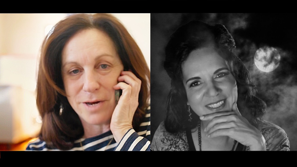
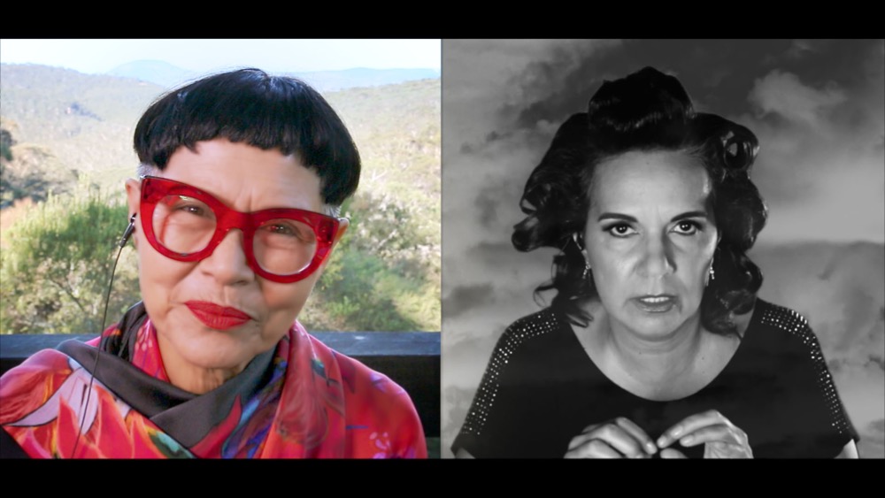
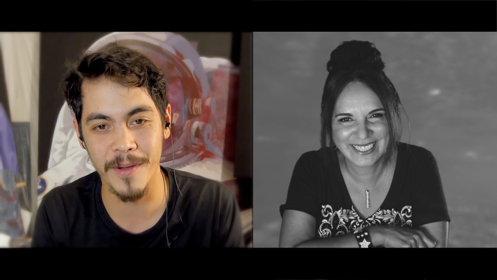
Art calls is made for the smallest silver screen of all – the computer screen. Originally made for the ABC website, the black and white work plays well on the wall at CCP. Moffat is warm, witty and knowingly ‘fabulous’. Billed as her ‘homecoming’, the work has her skyping with established artist Destiny Deacon, emerging artist Adul Abdullah, filmmaker Janina Harding, and designer Jenny Kee to name a few. A tone is set with the opening Dadaist sequence, these too are nested narratives and faux-intimate interplay. The interview mimics the studio visit, but we are aware both interviewer and interviewee are playing to the gallery.
Tracey Moffatt, Art calls, CCP, Melbourne, 3 July – 6 September 2015.
Tracey Moffatt, ‘Artcalls’, chapter 22, Tracey calls Abdul Abdullah
Important objects: A conversation with Lynda Draper
Tom: By any chance did you see that email I sent you at the horrendous hour of 1:30am?
Lynda: Yeah I saw it at 3am! I had a bit of a think about what you asked [laughs]. It’s quite strange having to speak about what I do, having to put it all into words. I get so uptight about it…
TP: Don’t worry, most of us do.
LD: Yeah but then you even wonder what it is you do and why… You know how sometimes people have a really specific thing they say about their work? You know, commenting on this or that, or I want to make the world a better place because I make this stuff.
TP: Yeah but I think it’s quite normal. How about we start with your process then. I really want to know how you think your process begins.
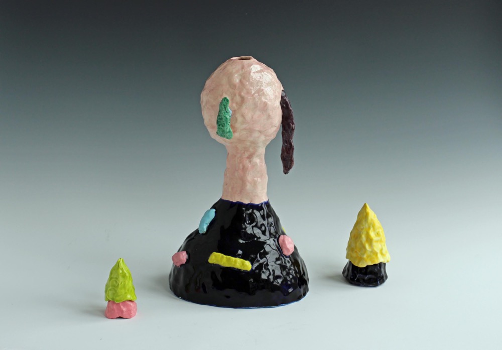
LD: I was thinking about it in relation to the Genie Bottle works [currently on show at the National Art School Gallery, Sydney]. Being invited to exhibit in TURN, TURN, TURN made me really think about working with clay over the past thirty years.
TP: In what way?
LD: Well, my work really has evolved and changed due to life circumstances and experiences. At one stage when I was undertaking my Masters, it went through a period where it became quite controlled and uptight and laboured. Thinking about that recently, I realised it was about a loss and change and a reflection of how Australia has changed during my lifetime. Lately as things have evolved, I’ve been looking back to some really early processes, to reintroduce colour and a sense of play and really push the tactile qualities of the clay.
TP: So when you talk about control, you’re speaking about the bodies of work using white porcelain [produced between 2007-2012]?
LD: Yes, the white porcelain works, with the found objects.
TP: I suppose you could attribute ideas of ‘control’ to the simplicity of the line and lack of colour in the work? Plus they’re meticulously made!
LD: Yeah, when I was making that work I was thinking about the power of them as simple objects and the way they embody all these memories and anxiety and a sense of loss and nostalgia. And even though those works look quite different to everything since, the ideas have carried through. I’ll always be interested in the relationship between the material and the spiritual world.
TP: What is it about turning an idea or a memory into an object that interests you?
LD: Well, to me, making these works is sort of just reinforcing the importance and power of inanimate objects around you, but questioning that too, questioning their value. But you know, I think as you go through your life you go through weird, changing relationships with objects and the way they track your life. They’re like markers of time and of the people around us. We’re always looking at them and we continue to absorb their qualities.
TP: Do you mind if we go back to what you said about the works reflecting what’s around you?
LD: I suppose the series of Genie Bottles are probably a good example of that, as I made those as a reaction to a friend who had concerns about their future and I wanted to find a way through with the work, even in a light-hearted way.
TP: And there’s so much symbolism of stored energy that can be associated with an object like this. So are the recent figurative works always referencing people you know? Like, if the work is called Jen, is it always based on a Jen around you?
LD: [Laughs] Kind of, because subconsciously it’ll be about who I’m thinking about at the time. But not always. I mean some of them are named after people I’ve known in the past, people who are no longer around.
TP: Finally, what do you think is next for your work?
LD: At the moment there’s quite a bit in the studio, so I want to explore some relationships between multiple works in bigger settings. For a long time I would go about making things as stand alone objects but now I’m thinking about how certain elements can be placed together in different ways, so we’ll see.
TURN TURN TURN: The Studio Ceramics Tradition at the National Art School, National Art School Gallery, Sydney, 5 June – 8 August 2015.
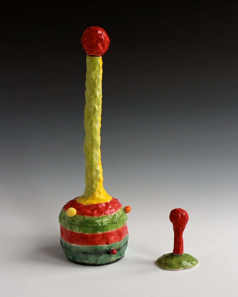
Lynda Draper, ‘Self Portrait with Hair Down’, 2015, earthenware, various glazes, 39 x 25 x 35 cm. Image courtesy of the artist and Gallerysmith, Melbourne.
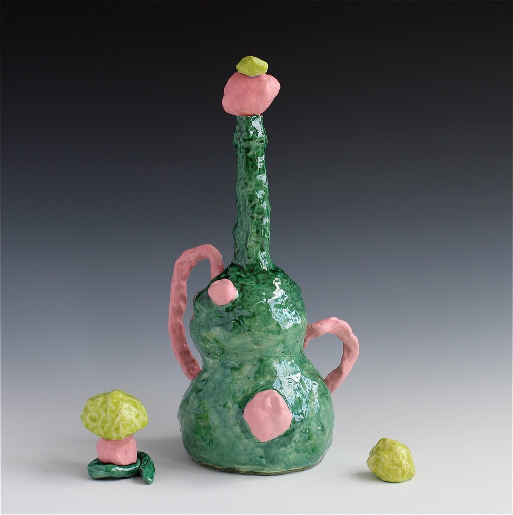
Lynda Draper, ‘Emerald Genie Bottle’, 2014, earthenware, various glazes, 46 x 35 x 27 cm. Image courtesy of the artist and Gallerysmith, Melbourne.
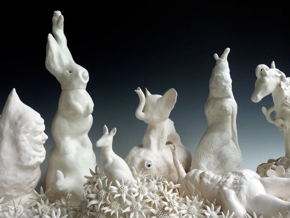
Lynda Draper, ‘Home Altar’ (detail), 2010, hand built porcelain, multiple glaze firings, 50 x 150 x 60 cm. Image courtesy of the artist and Gallerysmith, Melbourne.
Lynda Draper, ‘Genie Bottle’, 2014, earthenware, various glazes, 50 x 35 x 35 cm. Image courtesy of the artist and Gallerysmith, Melbourne.
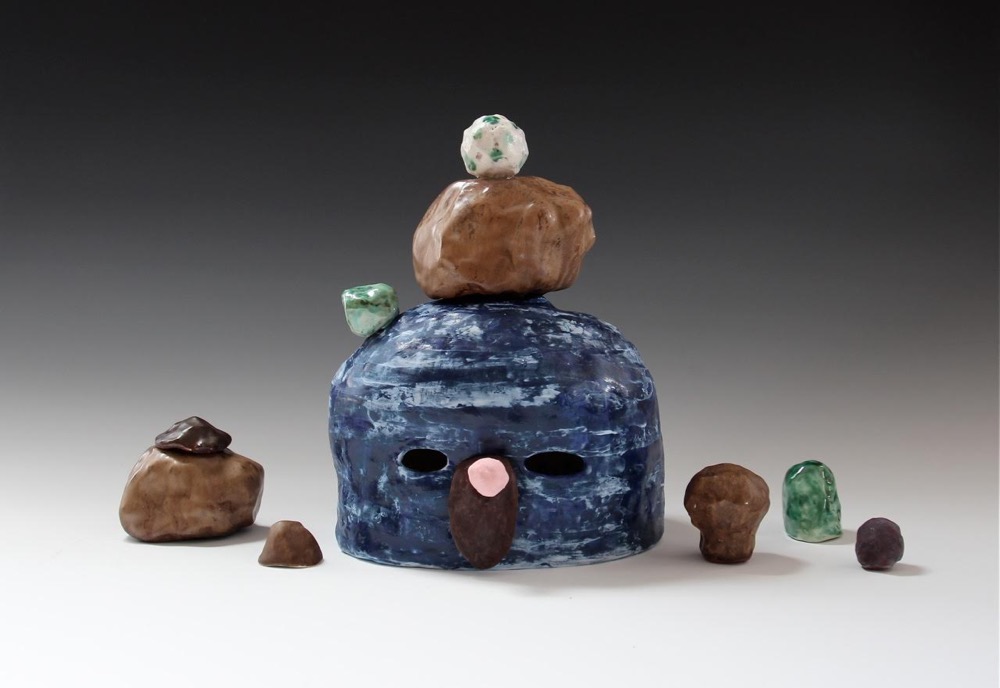
Lynda Draper, ‘Mel’, 2014, ceramic, various glazes, 30 x 50 x 20 cm. Image courtesy of the artist and Gallerysmith, Melbourne.
Art versus craft, the final word
Dear Stamm,
I graduated from the VCA’s Bachelor of Fine Arts in 2014 and I now work primarily in the field of ceramics. At the opening of my first group show, I was asked whether what I make is craft or art. I’m not sure I know what the difference is. Can you help?
Bethany
Dear Bethany,
Thanks for your enquiry.
Academics and curators agree that in this post-disciplinary age, with unprecedented lateral movement across all fields of creativity, the difference between art and craft is less clear than ever. They are, of course, wrong. The categories are distinct and immutable and determining which one your practice falls under is easy – just apply any of the following five tests.
1.
Take your wedding ring off, tie it to a piece of string, and hang it over one of your works. If it swings in a circle, it is craft. If it swings back and forth, it’s art.
2.
Did you draw on technical knowledge and a repertoire of skills to complete a work with a meticulous degree of aesthetic realisation? If you answered yes, you’re making craft. Or, does it resemble something on the reject pile at a Sophia Mundi humanities fundraiser? If so, it’s art.
3.
To which of the following statements do you most relate?
a) I think people understand me most of the time.
b) I think people understand me some of the time.
c) Monkey monkey Paddledust is hiding in my scarves.
a or b = craftsperson
c = artist
4.
In a reboot of the film adaptation of Cormac McCarthy’s The Road, what would Viggo Mortensen do with one of your works if he found it in a shelter recently abandoned by cannibals?
a) Drink tea or cordial from it.
b) Burn it for fuel. There is literally no other purpose it would serve in an apocalypse.
a = craftsperson
b = artist
5.
How do you feel after a session in your studio?
a) Happy.
b) As though I have unwittingly opened a wormhole to a universe of existential questioning. That flock of screaming lambs I wanted so much to leave behind stalk me at every turn. While I am heavy with the realisation that this path is a solitary one, I know it is the only one of any worth.
a = craftsperson
b = artist
There you go, Bethany, the difference between art and craft. Good luck with your career, whichever one it is.
Best wishes,
Suzette
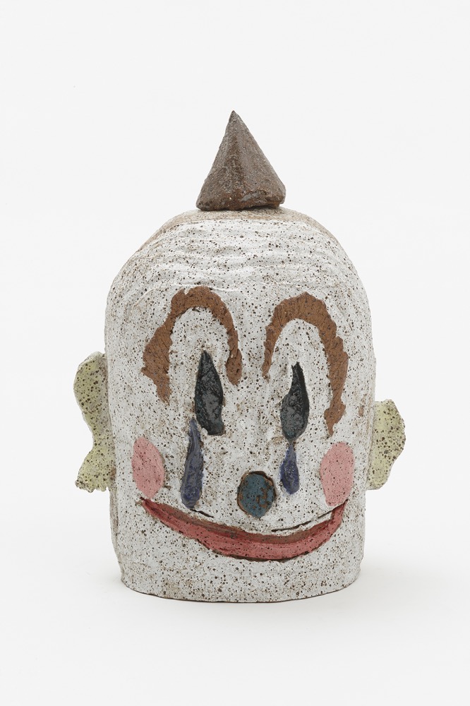
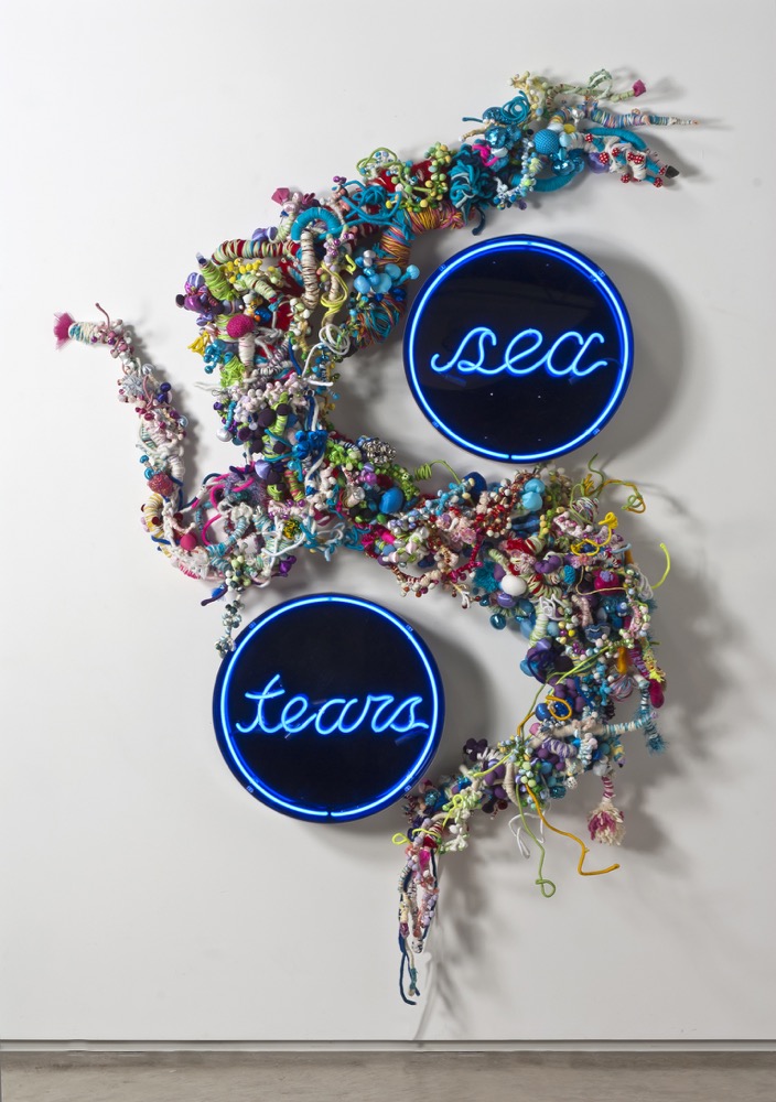
More love hours, Ian Potter Museum of Art, Melbourne, 21 July – 11 October 2015.
Rhys Lee, ‘Carpet clown’, 2014, glazed earthenware, 25 x 22 x 18 cm. Courtesy the artist and Nicholas Thompson Gallery, Melbourne.
Hiromi Tango, ‘Sea Tears’, 2014, mixed media, neon, Perspex, wool, donated fabric, paper, wire. Courtesy the artist and Sullivan+Strumpf, Sydney.
Loompanics, Bik Van der Pol and how to fake an arts residency
Of course, the most important thing is to appear busy and active. Around midday, make it look like you have left the building already. Wear sunglasses to suggest you have been on a walk and not in bed watching Amy Schumer videos. Buy food and drink in advance and produce it at regular intervals to suggest you have just been to the shop rather than drinking a bottle of Chardonnay and eating instant noodles in the bath.
The artists Bik Van der Pol visited this week and spoke about their 2006 project Fly Me to the Moon in which they exhibited a moon rock in a small tower of the (then-closed) Rijksmuseum, allowing access by way of guided tours. The rock had been presented to the former Dutch prime minister during a visit by the three Apollo 11 astronauts after the 1969 moon mission. NASA had, by 1970, distributed over 100 moon rocks to countries all over the world. Three years later, in 2009, the lunar rock was subsequently exposed as a fake which was actually nothing more than a lump of petrified wood of unknown provenance. The wood is still kept in the collections, a bit of tree forever associated with the moon.
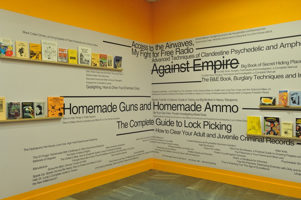
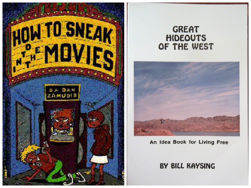
It was a treat to be reminded of Bik Van der Pol’s practice which I admire for its strong methodological research base, sense-making Dutch finish with a tabasco dash of quirk and wry smile. The first work I experienced was the 2007/9 Loompanics library at Van Abbe Museum which exhibited 140 books by the now defunct subversive US publisher: How to Disappear Completely and Never be Found, Surviving On The Streets, How to Make Driver’s Licenses/ID on Your Home Computer, How to Hide Things in Public Places…
Bik Van der Pol, Loompanics library, Plug In #28 Pay Attention, Van Abbemuseum, Eindhoven, The Netherlands, 2 June 2007 – 1 November 2009.
Bik van der Pol, ‘Loompanics’, book covers
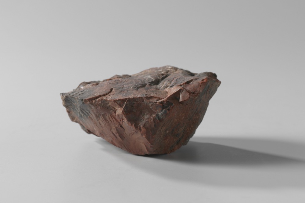
Apollo 11 Lunar Module. Photo: NASA / Apollo 11 [Public Domain], Wikimedia Commons
Fake moon rock at Rijksmuseum. Inscription on plaque: ‘With the compliments of the Ambassador of the United States of America J. Williams Middendorf II, to commemorate the visit to the Netherlands of the Apollo-11 Astronauts Neil A. Armstrong, Michael Collins and Edwin E. Aldrin jr. RAI International Exhibition and Congress Centre Amsterdam, 9 October, 1969.’
Bik van der Pol, ‘Loompanics’, 2001/2008, installation view. Courtesy of Van Abbemuseum, Eindhoven, The Netherlands
Earlier in the year I traveled to Los Angeles. Nothing major, just two weeks in and out of the city, a little bit of time in Desert Hot Springs, on the edge of Joshua Tree National Park.
Probably the most commonplace thing you can say about the city is that you spend a lot of time in a car. Even noticing this pegs you as an interloper.
It’s true though: much of what you see scrolls past your car window, lit up at night or bleached out by bright light during the day. It’s a strange feeling made more so by the cumulative effect of the thousands of LA-based films and TV shows – the fantasies that put the city centre stage.
Experience at one remove. Familiar unfamiliarity.
I spent much of my visit wondering what it would be like to live in a city mediated back to you in real time.
Even the ‘real’ aspect of the place has always struck me as heightened, familiar only in its distance. I recall OJ Simpson standing trial for murdering his wife, the roadside beating of Rodney King and the riots that followed. That city was a videotape of a hate crime. It was news footage of urban looting, of endlessly un-spooling freeways traced by spotlight. It too bled into the movies, and vice versa.
Mike Davis, the historian that people like to say LA had to have, sees the city as a vision of hell on earth. He writes like someone who loves the place, but this only means he sees it more clearly. In the brilliant coda to his otherwise unrelated essay White People Are Only a Bad Dream, he goes pretty much as far as you can, positioning it as the embodiment of a pending apocalypse.
For him LA is emblematic of an “already visible future when sprawl, garbage, addiction, violence and simulation (has) overwhelmed every vital life-space west of the Rockies”.
This too is now a commonplace observation, banal almost. The real place claims it without pause, swallows it whole and spits it out as entertainment. (See for example the ongoing spate of LA-set apocalypse movies). But surely there’s truth to it nonetheless. If I knew LA better I’d fall in line with Davis. I’d argue that somewhere within its civic borders the simultaneous horror and promise of the American frontier finds its logical contemporary expression: that part of the city’s appeal is surely the sense that even its most beautiful, ascendant moments are cut through by an undercurrent of latent disaster.
William Pope.L, Trinket, The Geffen Contemporary at MOCA, Los Angeles, 20 March – 28 June 2015.
William Pope. L, ‘Trinket’, 2008. Courtesy of the artist and Mitchell-Innes & Nash, New York, USA.
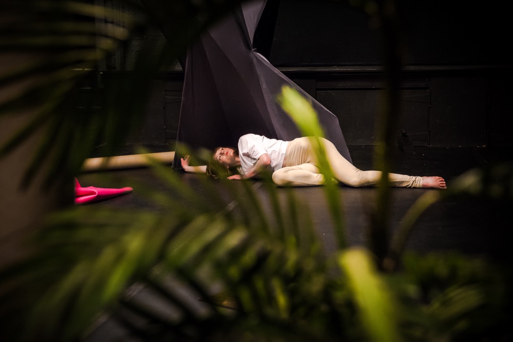
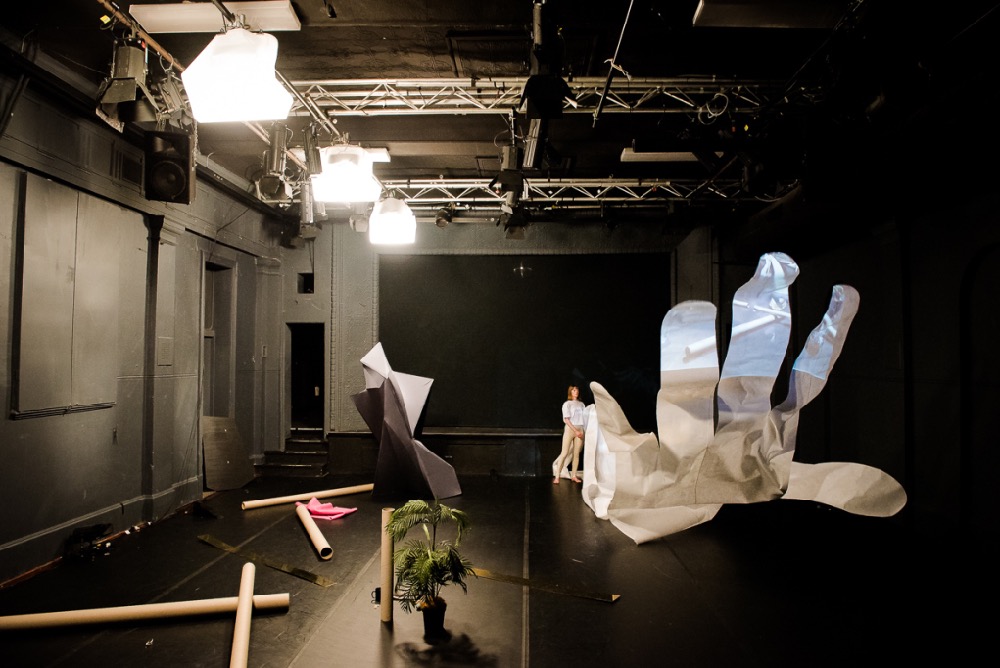
Sarah Aiken ‘Set’: Prestidigitation or so I like to imagine
An effective architectural plan can realise through floor plans and elevations a solid three-dimensional building. We imagine it forming in our minds and in that moment qualities of abstraction occur. Once initiated in this trickery, we can carry it with us anywhere. Might we become trained in our capacity to imagine more, to handle more?
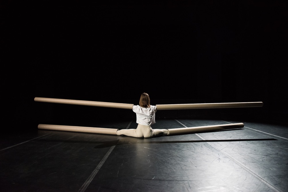
Sarah Aiken, ‘Set’, 2015. Photograph: Gregory Lorenzutti
I like to imagine that Sarah Aiken’s Set, performed at Dancehouse, built space using the tropes of Romanticism, through the use of her newly extended limbs, vignettes and spatial illusions. The performance consisted of Aiken attaching tubular limbs to her arms and legs, which not only moved with her, but also became set props within the space. In Romanticism, the introduction of the the pointe shoe as appendage led to the lifting of the length of tutus to reveal the foot, as well as an emerging focus on female dancers and the extended line of the body. In Set, Aiken extended the length and scale of the exterior limbs to new dimensions. Through these appendages the body was scaled up to set proportions, which then threw out the scale of the theatre. Too big? Too small? Not sure? Look again.
Sarah Aiken, ‘Set’, 2015. Photograph: Gregory Lorenzutti
I like to imagine these extended limbs were a bit like her hair: blunt, sharp bangs. When coupled with her red lipstick, and her languid timing as she moved into various vignettes, she threw out a kind of 1980’s Helmut Newton posturing. Strong sharp women who maybe wear blunt sharp shoulder pads for fun (or maybe a little power). Initially I found the vignettes a little trite, but actually they worked well as accents to lead us through the performance. Through their laconic timing in the piece they created a pause, drawing attention to the design and conceptual propositions of the work.
Sarah Aiken, ‘Set’, 2015. Photograph: Gregory Lorenzutti
I like to imagine the spatial illusions or trickery came through with the construction of three spaces existing simultaneously. It felt like stepping into a Frances Stark work, whilst simultaneously still being in the audience, and so challenged my sense of embodiment, but in the best way possible. Singular and multiple at the same time, moving through tenses. Could I be stretched? Could I handle more? The prestidigitation of Aiken walking between these objects, was constructed with enough material clunkiness and glitching that it revealed the illusion and effectively honed our focus between real and perception.
At times it was dense (maybe a little heavy), but like Ntone Edjabe says in the House of Truth, “Good. Sometimes this is better.” Or so I like to imagine.
Sarah Aiken, Set, Dancehouse, Melbourne, 22 – 26 July 2015.
I feel compelled to write about science fiction, which is something I really don’t know much about. Whilst recently bedridden with the flu I watched more episodes of Battlestar Galactica than I care to relate. Suffice to say that by the time wellness again washed through me, my mind was a loop of Bear McCreary and Richard Gibbs’ musical themes from the series – all taiko drums, mantras and the piercing, single note repeated in the theme for Cylon Number Six.
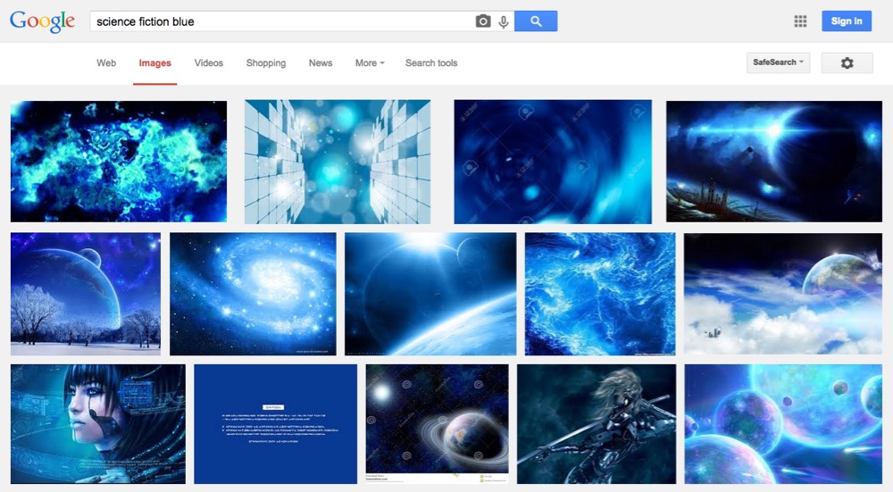
The reason I don’t know much about science fiction is because, despite my curiosity for most things, I used to ignorantly reject it on artistic grounds. I dismissed it as the ‘blue’ genre, just as fantasy was the ‘brown’ genre. These pervading colour-ways were indicative of limiting, banal and recurring narratives I did not want to subject myself to inhabiting, I thought.
Battlestar was indeed blue, but I pressed on and on, further into its operatic scope; its faster-than-light jumps and bleak, AI dystopia filled with flawed characters. Yet Battlestar ended very badly, in an overblown, mawkish, simplistic way. In its worst moments, it was filled with bright, life-affirming green that made me actually pine for the return of the suffocating blue genre I had always scorned.
I also realised I was quite wrong about the colour genre assignations when I finally read Ursula Le Guin’s TheLeft Hand of Darkness, which is overwhelmingly white: a swirling, overwhelming, devastating blizzard of a book which encases you in a deep, white blanket of sorrow. These misconceptions prove to me in a very humbling way that you can construct a deeply ignorant critique of complex things via visually trained excuses.
Science fiction blue
Taking notes
A little while back, Terry Smith (Discipline, no. 3, 2013) described the ‘comedy of disciplines’ that is the contemporary art scene. His hierarchy went like this:
cultural studies
art theory
———-
art history
art criticism
curating
collecting
art dealing
studio talk
art making
What’s interesting is how Smith draws a line these days between the theorising of the top two and those further down. He was actually in the process of dissing Nikos Papastergiadis for what he read as an arrogant and too-simplistic review of Smith’s own recently published books. He was saying that theory has less veracity in the art world than it once did, and that at best it communicates from the edges of the scene.
A series of seven video recordings of a symposium titled Speculations on Anonymous Materials at the Fridericianum, Kassel, in 2014 is available on YouTube. The videos introduce five speakers, mainly contemporary philosophers, discussing the trend of ‘new materialism’ thinking and the argument along the lines that the existence or non-existence of natural objects is not contingent upon us. The ‘anonymous materials’ of the title is meant as well to catch something of the way contemporary artists are more and more using strangely tangential materials in artwork.
These videos are a beautiful six hours where each speaker attempts to describe their very complex thinking to an audience comprised largely of artists and art professionals. Terry Smith writes about the potential of artists being contingent upon the worlds around them, meaning I think that there is an obvious dependency, but the stretching to connect that happens can be madly entertaining.
One of the speakers at the Kassel symposium, Iranian philosopher Reza Negarestani, proposed that artists are essentially ‘inference jumpers’, necessarily and inexplicably jumping from one inference to another. And for him the problem lies in artists ‘over-extending conceptual resources’ to the point where, he argues, artworks need objects. Conceptual practices were too often simply art by contract. For Negarestani, art is heuristic, and has nothing to do with rote learning.
In Going Public (2010), art theorist and historian Boris Groys jumps one step further to shift the politics of art by moving past ‘the spectator’s attitude’, and its associated aesthetic privileging of the audience and viewer. Groys instead proposes the viewpoint of production and writes of the necessity to build a poetics of the producer.
Groys sees the aesthetic attitude (i.e. the spectator’s) as culminating in a sociological understanding of art. He makes clear the subordinate position that the art scene allocates to production vis-à-vis consumption. Almost everyone’s interests in contemporary art tend towards collaborative, participatory practices and tactics of project-making.
Groys suggests that we are all invariably producers nowadays. The internet makes nonsense of twentieth-century aesthetic constructs to do with the demands of contemplative viewers. There are no idle viewers any more in any real sense. ‘The politics of art,’ he argues, ‘has less to do with its impact on the spectator than with the decisions that lead to its emergence in the first place.’ It is not a conversation about where art comes from and what it looks like, and art installations are not site-specific.
Terry Smith, ‘Contemporary Art and Contemporaneity: Reflections on Method, Review of Reviews (Part 1)’, Discipline, 2013, no. 3, pp. 191–200.
Speculations on Anonymous Materials, introduction by Susanne Pfeffer & Armen Avanessian, participants Maurizio Ferraris, Markus Gabriel, Iain Hamilton Grant, Robin Mackay & Reza Negarestani, Fridericianum, Kassel, January 2014, YouTube, nos 1–7, viewed June 2015.
Boris Groys, Going Public, Sternberg Press, Berlin & New York, 2010.
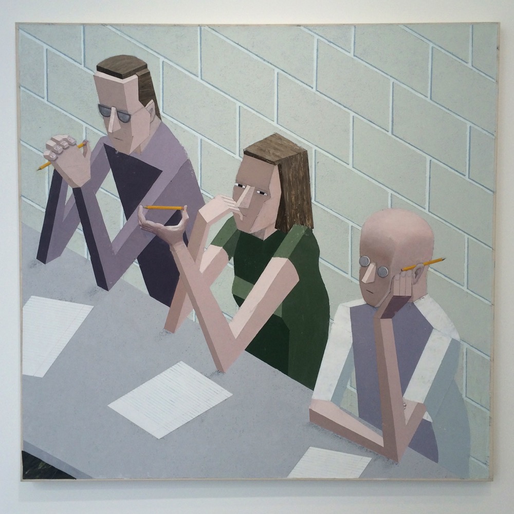
Mernet Larsen, ‘Taking Notes’, 2004, acrylic, tracing paper and oil on canvas, 122 x 127 cm
The impossibility of describing Trisha Brown’s ‘Scallops’ (1973) without moving the body
Five bodies stand in a large room.
Standing on blue-grey-speckled linoleum, toe, ball, heels, skin stretched not too tight, weighted.
The toe that rests next to the big toe is longer than the latter.
Equal pressure in, up, out and down
Arms hang
The smallest toe on the right foot is cuddled under its neighbour.
Standing in a line, soft pressure connects bodies along the outer arm from the shoulders to the fingers.
Arms held off the body.
Large curtains conceal most of the east-facing wall of floor-to-ceiling mirrors.
Perhaps canvas, a sort of rubbery or waxed canvas that I could wipe down?
Heavy.
Voluptuous.
Rubbery.
Heavy in the sense that if a figure stood behind it, the form of the figure would be without detail, without nuanced character; would not mould to the body like silk glides onto and over.
The focus is open and soft.
Along the north-facing wall, the figure on the far right of the line up steps right-leg-right. The left steps right across the body, pivoting on the right foot, spinning the figure around 180 degrees.
Like the inner point of a fan or the elbow of a wave, the axis shifts, and the figure on the end moves slightly, slowly.
Maintaining contact along the arm, the group move in unison, semi-circling at different speeds and variable distances to maintain the overall form.
The success of the simplest scallop is the outward awareness of the group. If the leading axis moves too quickly without taking into account the distance travelled by the flanking figures, excess energy is expended to keep up.
The scallop waves, ripples and settles. Still
Rippling, the right leg steps behind into the space, the memory of the right foot of the figure beside. Turning on the left foot, then step left-foot-right.
There is an Inside Amy Schumer sketch that I have been watching over and over: a woman bumps into a friend on a New York sidewalk, and compliments her on her looks, but in the ensuing moments the friend subverts the quality that was praised by firing off a list of negative aspects she sees in herself.
New female acquaintances pass by and join in the routine of annulling the compliment just paid by describing all the freakish faults in their own appearance. The dynamic is broken to disastrous effect when someone accepts the praise at face value.
When I receive a compliment I also can’t help but say something to my detriment. It’s almost like an out of body experience, where you observe your mouth snappily issuing either a sarcastic comeback or changing topic altogether.
What is wrong? It’s like saying sorry to someone that has elbowed you on public transport by mistake: you should not be the one apologising. It’s like when you write job applications and are rejected, the paranoia creeps in and you start thinking something must be wrong with you. I was talking to a female friend, who is also in the arts, and we were comparing notes on how undervalued we feel, in comparison to male colleagues, even after ten years of professional experience. I see women doing things at their best, with total dedication, for less money than their male counterparts, and this is exactly what the system is not only exploiting but often counting on. It’s becoming like Greece with the Troika – pretty unsustainable. Maybe we should call a referendum in the arts, too? But please let it not be run by e-flux – the EU for criticality – which ends up creating hegemony and homogeneity.
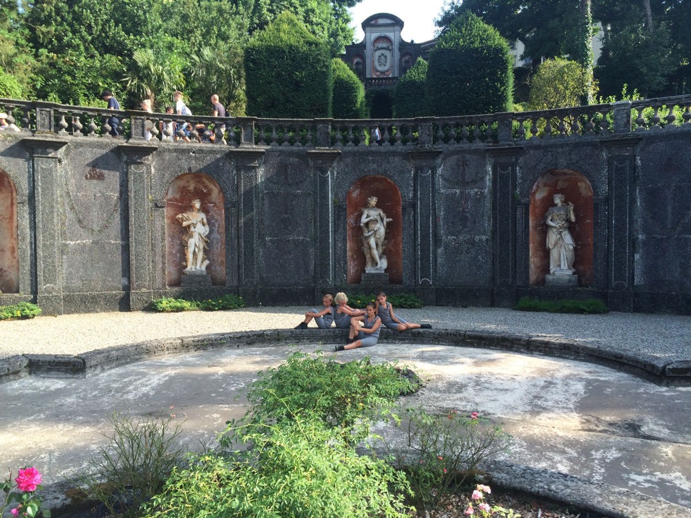
Alexis Blake, ‘Conditions of an Ideal’, Cross Performance Award (winner), Villa San Remigio, Verbania, Italy 2015
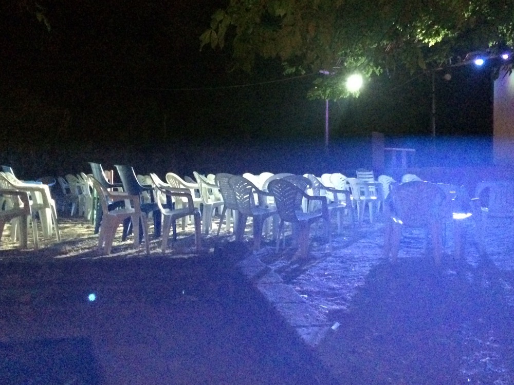
Outdoor arena, Garbatella, Rome, Italy 2015
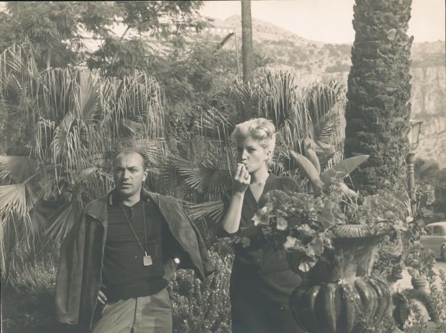
Michelangelo Antonioni’s photos from Sicily around the filming of L’Avventura with Monica Vitti, Italy 1960
A tale of two cities
The tenderness of the Korean summer, with typhoon traces on top of a “viral” atmosphere imposed a different rhythm to the city of Seoul and its surroundings. It almost looked like it was ordained to re-discuss the paradigm of the big city, with stories that go back almost a hundred years.
The astute observer would be delighted to discover the layers that are hiding in the creation of Seoul as we know it today: utopia, visionary planning, the battle with modernity, the heaviness of the past, the spirit of the community. These states of mind transgress everyday living and impose an augmented reality where the position of the individual is constantly being evaluated.
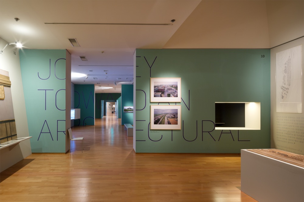
It was in the exhibition Experiment of Architopia, organized by the National Museum of Modern and Contemporary Art Korea at the headquarters in Gwacheon that I discovered extraordinary documents about four utopian projects: Sewoon Sangga, Heyri Art Village, Paju Bookcity and Pangyo village. These controversial urban narratives were intended to launch a unique modernist view of Korean architecture, based on notions like the connecting shopping arcade, community and arts, and a symbolic social space for culture – all forming, respectively, a “landscape of desire”.
Sewoon Sangga, a 50m-wide and 1 km-long mega-structure, was supposed to connect two neighbourhoods in the central part of Seoul, rendering a totally new way of seeing and fragmenting space. It was the visionary and idealist forty-something mayor of the city, Kim Hyun Ok together with the courageous architect Kim Soo Geun, aged only 35, who had made the plan for this complex which would shelter private commercial initiatives. Unfortunately, the objectives of the space were not made clear from the beginning and the theory behind the construction was too vague to gel with Seoul’s urban planning demand. The misuse of the space affected its identity and by 2008, many of its buildings had been demolished. The recent talks and presentations around this unfinished project prompted the government to restart the discussion around Sewoon Sangga, with the clear wish to revitalize the area.
The confessions of an architect recorded on a video that was presented in the exhibition made me think more about the idea of community. The architect was talking about Paju Bookcity and how he and his collaborators were imagining it: when you walk on the street and you notice that your neighbors have left their shoes at the entrance and they are inside the house, whispering, it means that you must be silent and walk on by without disturbing them because they are making love and they shouldn’t be interrupted. As I see it now, to have an industrial city dedicated to the production of books of such sensitivity shows that the discourse around it was stronger than the real capacity of the place.
In The Unfamiliar Boundaries of Paju Bookcity (2010), architect Hyungmin Pai states: “Paju Bookcity emerges upon both the Western tradition of architecture as a symbolic art and the idea of landscape as a political and artistic instrument … As the site of such multiple intersections, it is a worthy experiment for investigating the possibility of how architecture may function in the creation and continuous transformation of identity and community in contemporary urban formation. From the inception of the idea of the book city in the late 1980s to the completion of the first phase in 2007, Paju Bookcity has been part of the changing political economy of Korea. Its particularity as a planned urban area can only be understood in the context of Korea’s recent culture of city building.”
Nowadays, many book companies once located in the centre of Seoul have moved to Paju Bookcity, although the construction has never been finished according to the masterplans and ideas of the architects that hoped to validate Korean Modernism.
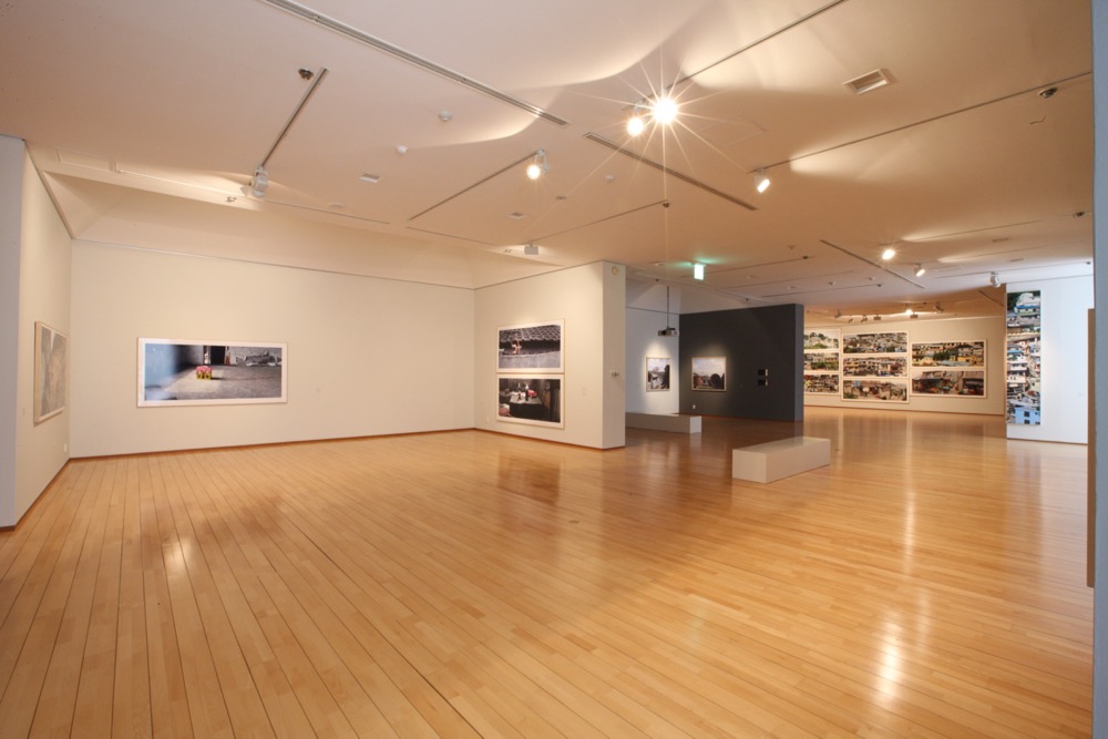
Photography is one of the most valid instruments for documenting the changes around us, allowing a critical distance for the viewer to evaluate the past, present and future of a certain segment of life. City We Have Known, another exhibition produced by the National Museum of Modern and Contemporary Art, Korea and featuring the works of two renowned Korean photographers, Kang Hong Goo and Area Park, thematises the city of Seoul by focusing on the remnants and memories of the old city. While Goo (b. 1956) examines the ways in which residential landscapes are transformed by processes of urban development, Park (b. 1972) is interested in the relation between the city and the individual as social system.
In his research on cities and living, Henri Lefebvre, like Bachelard before him, theoretised the relation between people and the houses they built. He wrote about the disappearance of the “house of yore”, which served as a means of integrating thought, memory and dreams. It is through creative actions that cities attain specifity; by inventing and sculpting space, the individuals render it with rhythm and consistency, appropriating the real structure of the city.
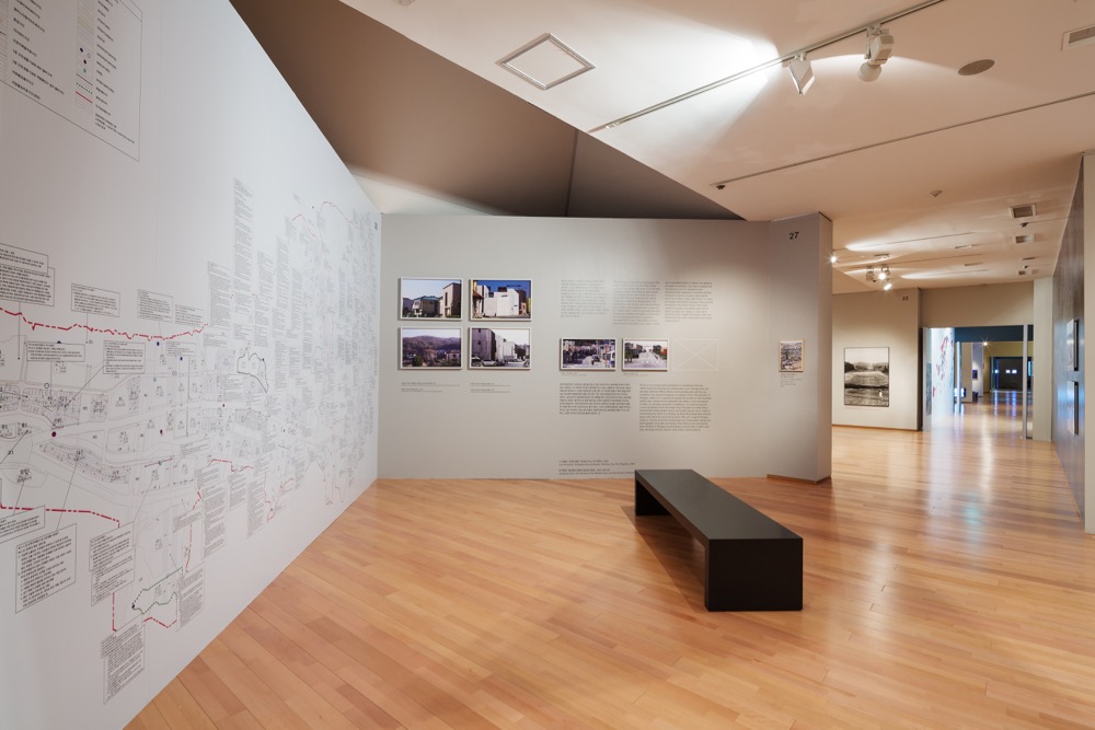
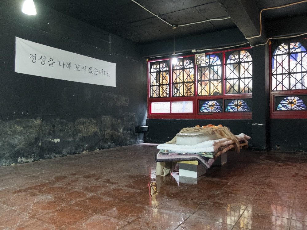
In an attempt to appropriate the past of the port city of Incheon, Korea’s third most populous city after Seoul and Busan and also a location that has experienced many historical transformations since the Stone Age, not to mention the Japanese occupation and the strategic position it held during the Korean War, a group of ten artists (Garam & NewNew Kim, Soo Hwan Kim, Gemini Kim, Hyemin Park, Suk Kuhn Oh, Su Hyeon Woo, Oops Yang, Saem Lee, Mita Jeong and Ji Hyun Jeong ) researched and occupied abandoned houses, where they intervened in various ways, in order to raise awareness about areas that are slowly disappearing. As the broken window theory says, one empty house in a region leads to another empty house.
The project, addressed to cultural agents that have an interest in locality, individuality and site-specific work, had three parts: Punk Detective Agency, where the agency workers were detectives chasing traces of local history, memories or incidents and archiving them; Temporary Property Manager, a mobile bureau that introduced empty houses to artists for a short occupation, allowing anybody who had an interest to use them; and Temporary Tenants (11 Empty Houses Project), a title given to the artists who exhibited their art works in each of the empty houses. The houses belonged to old people who had no heirs or whose heirs lost interest in the “tired” houses. After the owners had disappeared, the houses remained empty, with vestiges of the former owner standing as inspiration for the creative minds. The local market, Yongil Jayu, played an important part in their demonstration as it was the meeting point for artists, curators, merchants and their customers, allowing art and exchange to co-exist in a natural and often unexpected way.
The micro-management of any city requires different types of economies that can’t be reduced to building or conquering space in a strategic manner. The dwellers have always kept their eyes open for possibilities, refining their condition and inscribing new behaviors for those who know how to communicate with the cities.
Experiment of Architopia, National Museum of Modern and Contemporary Art, Gwacheon, Korea, 30 June – 27 September, 2015.
Experimental project in the empty houses of Incheon City, (Garam & NewNew Kim, Soo Hwan Kim, Gemini Kim, Hyemin Park, Suk Kuhn Oh, Su Hyeon Woo, Woops Yang, Saem Lee, Mita Jeong and Ji Hyun Jeong), 139 Yonghyun-dong, Nam-gu, Incheon, Korea, 17 June – 28 June, 2015.
‘Experiment of Architopia’, 2015, Architecture Gallery, MMCA, Korea. Courtesy of MMCA Korea.
‘Experiment of Architopia’, 2015, Architecture Gallery, MMCA, Korea. Courtesy of MMCA Korea.
‘City We Have Known’, 2015, MMCA, Korea. Courtesy of MMCA Korea.
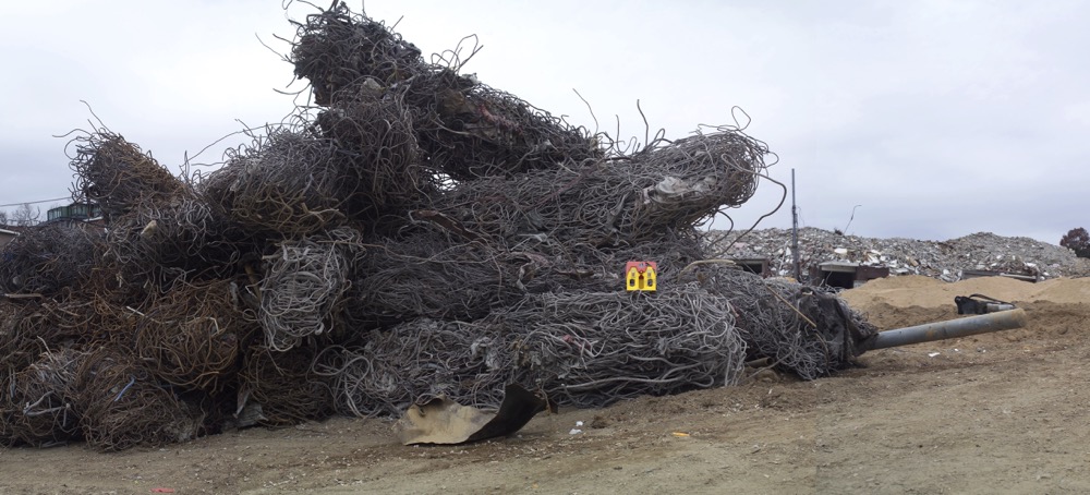
Kang Hong Goo, ‘Mickey’s House–Iron Rods’, 2005-06. Courtesy of the artist and MMCA Korea.
‘Temporary Tenants’, intervention by Woops Yang, 2015. Courtesy of the artist.
‘Temporary Tenants’, intervention by Soo Hwan Kim, 2015. Courtesy of the artist.
‘Temporary Tenants’, intervention by Gemini Kim, 2015. Courtesy of the artist.
Punk Detective Agency, 2015. Courtesy of the artists.
![Apollo 11 Lunar Module. By NASA / Apollo 11 [Public domain], via Wikimedia Commons](https://stamm.com.au/wp-content/uploads/2015/08/SaW_Apollo-11-Lunar-Module.jpg)